
Statistics
We looked inside some of the posts by ghostboy-gamedev and here's what we found interesting.
Average Info
Notes Per Post
258
Likes Per Post
209
Reblog Per Post
48
Reply Per Post
1
Time Between Posts
9 days
Number of Posts By Type
Photo
1
Text
10
Last Seen Tumblr Blogs


Fun Fact
In February 2021, Tumblr had 518.6 million blog accounts.
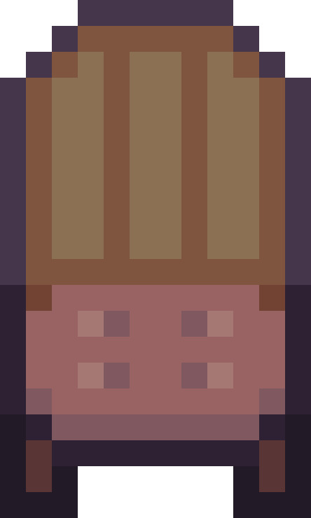
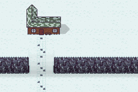
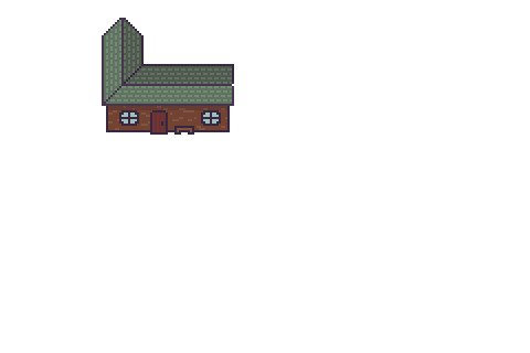
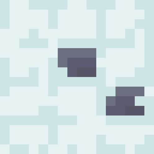
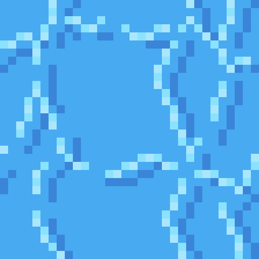
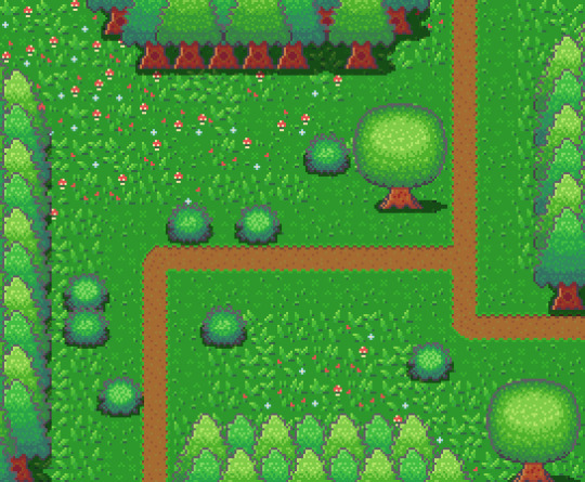
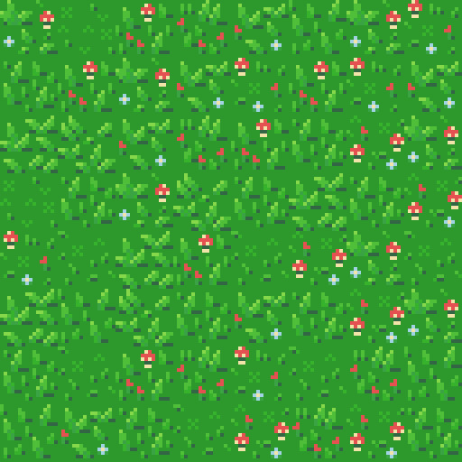
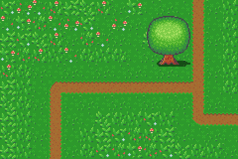
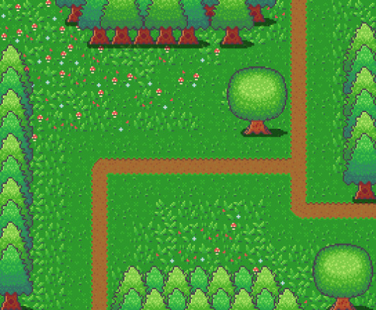
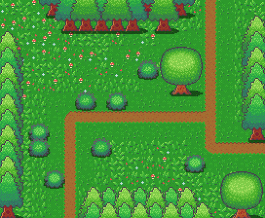
Photo

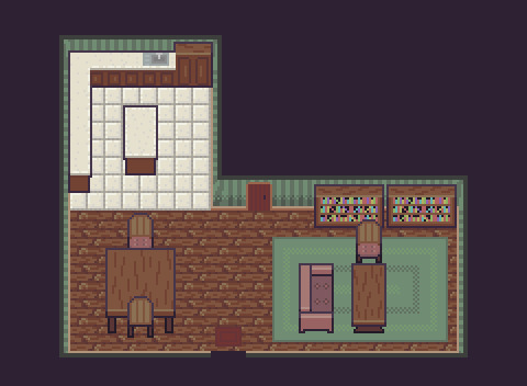
The complete ‘Cozy Cabin’
11 notes
·
View notes
Text
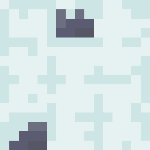
Learn Log #7 - Cozy Cabin (Interior)

This week I continued with my Cozy Cabin, now focusing on the interior. I learned how to make wooden and tile floors, walls and various objects of furniture. I’m pretty happy with how this week went but I still have room to improve.
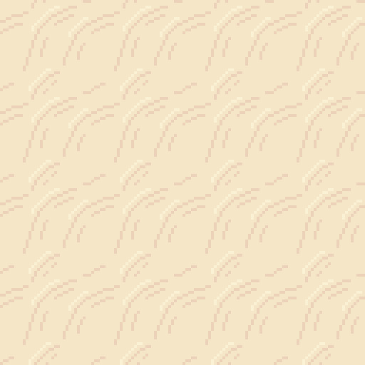
Flooring
I felt like a wooden floor would be most appropriate for a wood cabin. I started by making a brick-like texture, as described in my last Learn Log. The difference between wooden planks and bricks is that, while bricks will be roughly the same size and fit into a consistent pattern, wooden planks are more random and varying. Therefore, within the first stage of my tile, I outlined a couple of wooden boards with different endpoints.
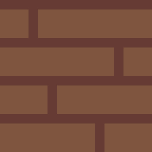
The tile still looks very consistent and too much like brickwork, however. To fix this up, I removed some parts of the wooden boards to show chips, defects, and age within the planks.
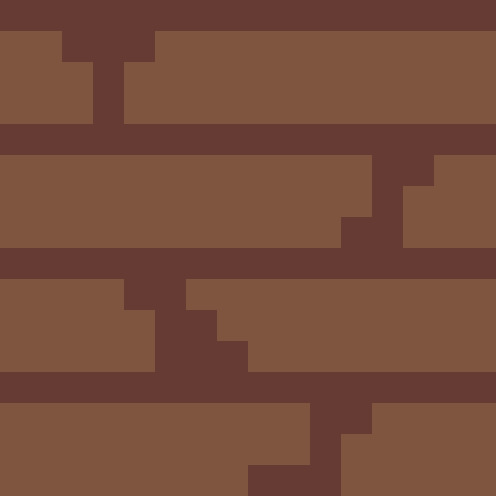
This turned out pretty well, so I decided to finish the tile by adding details to the boards. I did this by adding darker areas to the board, making it appear more natural. I also added darker crevasses within the cracks and adding a few highlights on the left edges of the board.
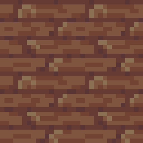
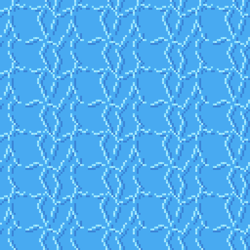
The image above is a repeated 32x32 of the finished tile, and I think it came out looking pretty good. There was a good chance that this tile would become quite repetitive, but I was hoping this could be covered up by furniture within the room. I then decided to move onto the tile flooring.
I had made a tile pattern within last week’s Learn Log by merely using a simple grid for a pathway. I decided to use the same grid technique but with slightly different dimensions of each grid cell. Below is the simple grid pattern I started with.
I added shading to the image, highlighting the top-left corner of the tiles and shading the bottom-right corner.
Lastly, I added detail to the tiles by simply adding variation within the previous shading I applied to the tile along with some scattered darker pixels. Below is a 64x64 repeating image of the finished tile and I really like how it turned out. I feel like there was a lot of depth in it and it seems like it will tile well without getting too repetitive.
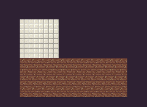
I then organised these tiles into the desired shape of my cabin, starting off the piece for this week.
Walls
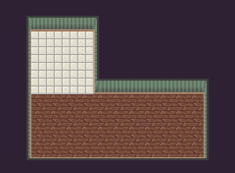
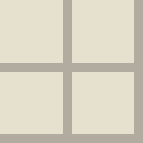
This was the room once I’d added the walls. I’m starting with this because the walls were very complicated to add. I first started with a flat wall (shown below) to begin as a basis for the room. I copied this image around the tops of the room and started constructing the walls from there.
I added shading at the bottom of the wall as I did with the cliff face last week to emphasis verticality and added a skirting board to establish a partition between the walls and floor. I then added a narrow side wall and joined these sides with a somewhat curved corner piece. Having a flat transition, fitting the right-angled nature of the corner, made a bizarre corner that would only suit one of the two walls (either the top or side wall). To solve this problem, I decided to create curved corners. The curved corners still feel weird but it’s an ok mid-ground, I think.
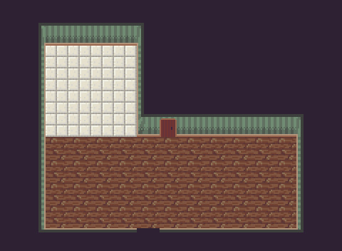
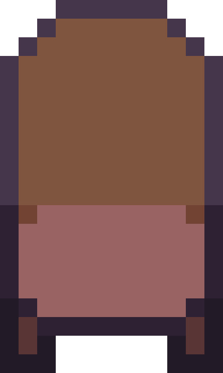
Finally, I added in a door and a hole in the bottom wall (acting as an interactable exit) to make the room seem a little more realistic. Most rooms have entries and exits after all.
Furniture
There will be a lot of furniture added to the scene so I can’t go over each bit piece by piece, but I will go over two pieces of furniture for this piece: a chair and a bookcase.

As always, the first step is outlining the shape of the chair. It looks a bit strange, but I basically split the chair into three parts starting with an oval seat and then building a chair back and legs of this base. Chairs are a bit of a strange shape, so it will look better with colour and shading.
I then added some base colours and shading to the chair, and it begun to look a bit more chair-like.
Finally, I added some small extra details to flesh out the chair further, such as a pattern in the back of the chair and embroidery within the cushion. I think it looks good to go, next up is the bookcase.
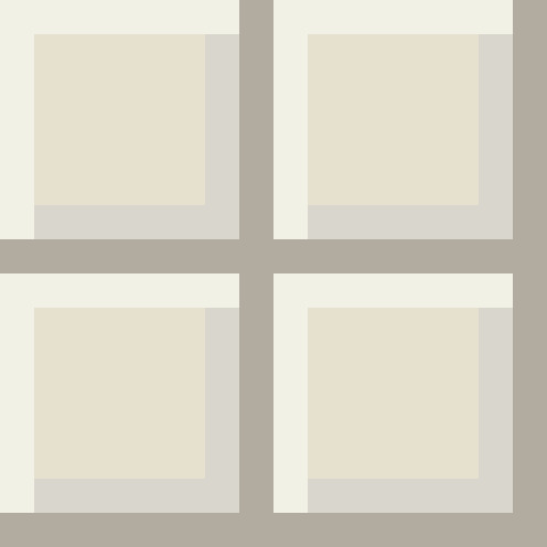
The bookcase basically follows the same fundamental process as the chair. Here I outlined the shelves of my bookshelf and left a large area up the top to later highlight depth. I didn’t do this for the chair as the back of a chair is relatively thin compared to the top of a bookcase.
Next was the basic shading and colours. It now looked like a fairly lovely bookcase. I used a highlight to outline the top edge rather than the black outline. I only wanted to use the black lines to separate different parts of an item (for, example the chair seat and legs) and to highlight the potential collision box of the sprite (to highlight the image has a physical presence). I think this worked pretty well and it looks nice too.
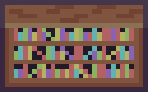
Finally, I added books and wood markings (similar to the house exterior from last week) for some extra detail. I was pretty satisfied with both of these items of furniture, so I got working on the rest (using the same foundational processes) and added it all into the scene.
The scene completely changed with the addition of furniture. More life and colour was brought into the scene, really fleshing out the whole environment. It also distracted from the repetition of the floor tiles (the green rug in particular assisted with this).
Conclusion
Overall, I’m pleased with how this piece turned out. I think I need to develop more consistency in the detailing between tiles and objects such as furniture. Perhaps a larger tile size might have allowed me to add more detail into the furnishings. I’m also unsure how I feel about the walls in the scene; whether I should have added the corner curves and detail to the side walls. I’m also gonna try a few more techniques with furnishings in the future. They seem a little flat, and I’m not sure if that edge highlight was the right move. Despite these issues, I’m actually pretty happy with this week’s piece. It kind of feels like an actual environment that I could picture within a game.
In next week’s Learn Log, I’ll be adding some characters into this scene, filling it with actual (fake) life. Looking forward to it!
My learning and this blog post wouldn’t have been made possible without these fantastic resources. Go check them out if you wanna learn some stuff about pixel art!
How to Pixel Art Old Wooden Floor Boards by TutsByKai
Tutorial: Pixel Art Wood Floor Texture by Michel Mohr
Tutorial: Pixel Art Tile Floor by Michel Mohr
Pixel Art 101: Furniture by Pixel Pete
Bookshelf Pixel Art Tutorial by TutsByKai
Pixel Art Table Tutorial by TutsByKai
9 notes
·
View notes
Text
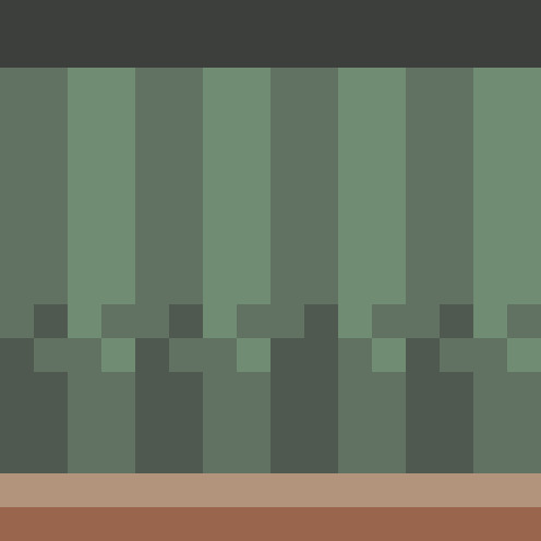
Learn Log #6 - Cozy Cabin (Exterior)
I’m finally returning to learning pixel art after taking a short break! This week’s Learn Log will focus exterior of my Cozy Cabin, covering my learning about houses, snow tiles, stone tiles and brick tiles.
House
I wanted to start with the house as I feel like that will determine how large I should make the canvas. I decided to return to 16x16 tile sizes after the beach piece and used this as the basis for my house.
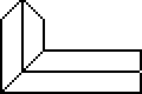
First, I drew the roof outline as the size and shape of the roof will determine the size and shape of the building. You can certainly start with the building, however, during my practice, I realised that I much prefer starting with the roof. The shape does look a little weird, but I’m hoping that with the addition of shading it’ll look a lot nicer.
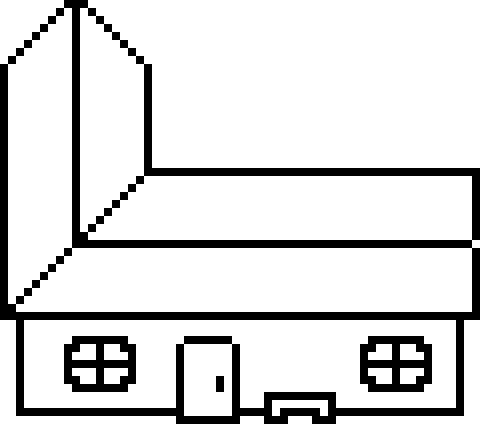
After the roof, I drew the outline for the building. I left a little of the roof hanging over the sides of the building to represent a gutter overhang. Once the rectangle shape of the building base was done, I added details including the door, a bench and two windows. I stuck the door out to make it clear that it can be interacted with to enter the house. Making interaction clear is crucial in the graphical design of videogames, so this is an excellent way to do so with doors, I think. The door should roughly be the size of the characters entering them. In this case, my character was the size of one tile (16x16), so the door was just underneath those dimensions. I then added other key features to the building, including the bench and windows to remove the empty space that would make the building seem odd.
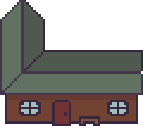
I then added some colours and shading to the building to better display depth. The back of the roof and top of the building is shaded to display the reduced light hitting these areas. Meanwhile, some areas of the roof outline are highlighted to emphasise the sunlight is hitting areas with direct light.

Finally, I added details to the building to provide the viewer with more information. The roof was detailed with a simple brick pattern to give viewers the idea it is made of slate tiles. A simple brick pattern is simply composed of an alternating grid pattern with ‘bricks’ usually being stacked on the gaps between the ‘bricks’ of the line below.
I then wanted to make the walls and door of the building out of wooden planks. With the door, I did this by alternating shading with vertical lines which worked well. This could also work for the wall; however, I wanted the building to seem a little older, so I drew sporadic lines across the building in a lighter colour. This made the door seem solid while the wall was worn down.
I decided to make the canvas 240x160 pixels and placed my house inside.
Snow
Snow is very similar to sand, and a snow texture can be made with wavy lines as described in the last Learn Log. However, I think a grassy snowfield can also be created by using grass techniques with two shades of white. The colours used for snow can’t be a bright, saturated white but they also can’t be too dark, or it will seem unnatural. A highly desaturated, slightly darkened, bright blue seems to work well. After a bit of tinkering around, I made the tiles shown below:
This image is a 64x64 made up of smaller individual 16x16 tiles that can be placed separately. I think it looks pretty good, but it is a little flat. I guess I’ll set it into the scene and continue with these tiles.
I also added some snow to the building to make it fit into the environment better.

Stone
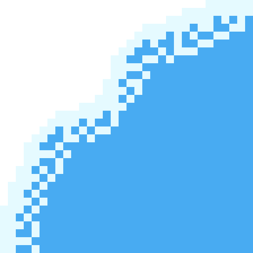
I wanted to transform these snow plains into a mountain range, so I created stone tiles for a cliff face. To create these tiles, I started by selecting two grey colours before drawing stone shapes (deformed ovals and circles).
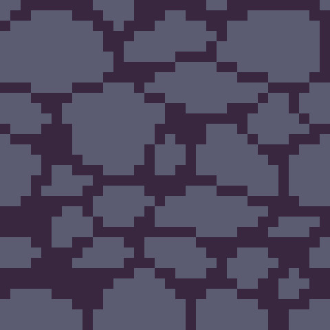
I then added lighter and darker shades to the rocks to add shading, along with some brighter highlights to show where sunlight reaches in-between the cracks.
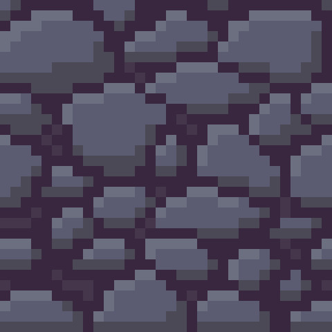
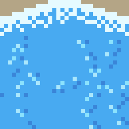
Finally, I needed to make this tile fit within the snowy environment. I decided to add a snowy overhang to the top of the cliff-face and icicles stemming from stones. I also added some dithering to each stone to make the shading appear more natural.
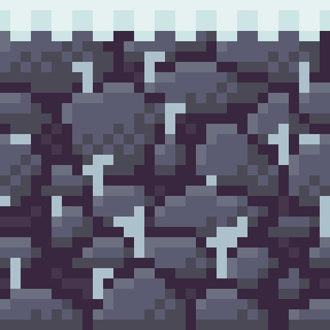
I was fairly happy with the tile, so I decided to add it into the scene for a quick test.
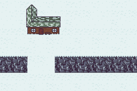
There was not a clear sense of depth here, making it seem more like a stone wall rather than a cliff. To add additional depth, I added a darker snow outline around the tiles and added shading onto the tiles. This shading should be a gradient with more light hitting the top of the cliff and less hitting the bottom. This also goes for the path to give a sense of elevation. Dithering is an excellent way to better transition these gradients. I also added a shadow to the building as I added the rest of this shading.
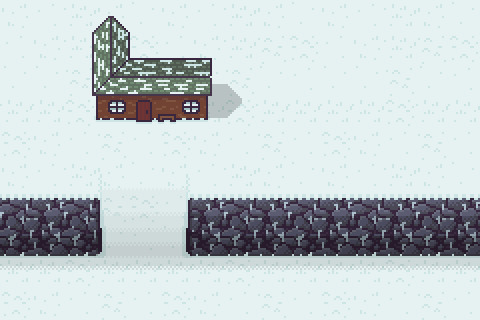
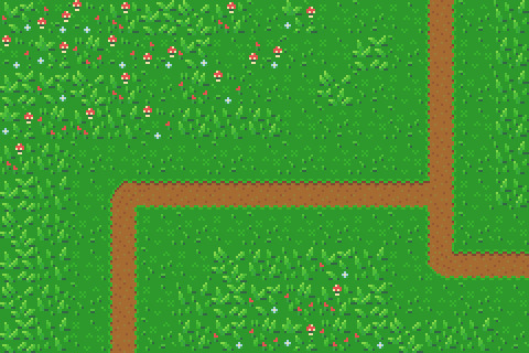
Path
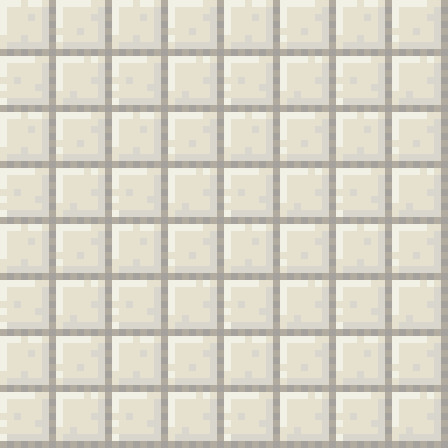
To make the path I first made a grid texture with the same greys from the stone tile (to keep the palette minimal) and shaded each rectangle in the grid as I did with the stone tiles.
I then made two tiles with different snow cover to alternate between when laying out the path. I kept two bricks in the path tiles clear and utilised the darker snow colour to ensure the grid pattern is still present.
I finally added the path to the canvas and was pretty happy with how it turned out, so I called it there.
Conclusion
I definitely struggled with this week’s piece. The snow feels a little flat due to the limitations of working with white/off-whites which kind of sets the whole environment off a bit. The background was ok, but that depth really would have made the environment a lot better, I think. I particularly struggled with the cliffs. Trying to highlight the elevation to the next area of snow was quite tricky. Next time, I think I’ll use specific tiles representing a staircase or ramp rather than shaded standard tiles. Finally, while the house looks nice, it still feels off. I think I’ll have to do more tinkering with buildings to better understand what I can do to improve the shape of it because right now I’m quite unsure. Overall, it’s a good start. My work on the man-made tiles was quite decent, but I need to improve with my creation of depth and snow tiles.
That concludes this week’s learn log. Next week I’ll be covering the interior of the Cozy Cabin including floors, walls and furniture.
My learning and this blog post wouldn’t have been made possible without these fantastic resources. Go check them out if you wanna learn some stuff about pixel art!
How to Make a Pixel Art House by TutsByKai
How to Pixel Snow by TutsByKai
How to Create a Brick Texture by TutsByKai
How to Make a Pixel Art Stone Texture by TutsByKai
Tutorial: Pixel Art Tile Floor by Michel Mohr
16 notes
·
View notes
Text
Yo
Just gonna take a quick break from blogging as work and uni assignments pile up. Next learn log post will be here in 4 weeks
1 note
·
View note
Text
Learn Log #5 - Sandy Shores

Before I begin with this post, I just want to say a quick thank you for all the support on the last learn log. I didn’t expect to get to 10 notes let alone over 100 so it was a really exciting and pleasant surprise. I got some nice comments too which I really appreciate. Thank you, everyone.
On my 5th week learning pixel art, I learnt how to make sand tiles, water tiles and rocks. I actually made this piece with 32x32 tiles instead of my typical 16x16 which was an interesting challenge but I enjoyed working with and learning from it.
Sand
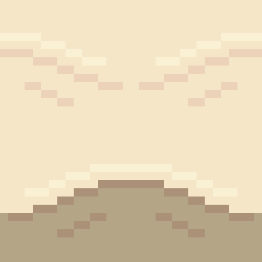
When I started with the sand I, of course, started with my typical 16x16 tile size. I made a shoreline tile which had mounds of sand pushed back by the ocean’s waves which are shown below.

Making sand tiles, I soon realised, was going to be trickier than making grass tiles. I mentioned last week that with grass and similar environments you can make multiple small tiles and then place them in a scene in a variety of ways. However, with textures like stone, sand and water the design or condition of a tile should realistically have some impact on neighbouring tiles. As such one tile’s design might be repeated across the entire environment. Some pixel art software allows a tiled view so you can design the tile ensuring tiles connect and aren’t repetitive – unfortunately the software I use does not have this view. Therefore, I did a similar testing method to the grass last week where I copy+paste the tile across a larger canvas.
You can clearly see that this 16x16 tile forces mounds to be a bit to round and close together. This is when I decided to make the shift to 32x32 for this piece.
Above is my first 32x32 shoreline tile. You can see the larger size allows the mounds to space out a bit more and stretch so the mounds don’t feel as large or round. The two lines pointing into the mound are present to provide some sense of depth going into the mound. I decided to test it out and see how it looked.
This test looked a lot better, so I was satisfied with the design. Within the test, you can see it is quite repetitive. This is partially because the tile doesn’t do well with vertical repetition - making repetition more apparent. Additionally, I think the repetition might be a little less obvious when wedged between wave and beach textures. You might also notice the mounds are now slightly separated. This is because the mound has reached level ground and thus a hump would not be visible. The disconnection between mounds makes the tiles a bit less man-made, thus, a bit more natural. I decided to make a few final modifications on the shore tiles and finish it up.
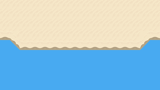
You can see here I added a highlight to the tops of the mound and darkened the first mound. The highlight is there to emphasise that the mound is sticking out and thus hitting more light while the darker colours were simply added as that sand will be freshly wet. I decided to add these tiles into a larger canvas to separate the water and the beach.

I added a blue background just to have a representation of water within the scene. Next, I needed a separate texture for the beach and tiles to connect the shoreline diagonally.
I wanted a separate texture for the beach because: A) the shoreline tile did not do well repeating vertically, and, B) the shoreline and the beaches of a coast look quite different. Obviously, if I made a pattern of mounds going horizontally or vertically like the shorelines I would run into issue A quite quickly so I decided to make mounds moving diagonally.
I made this beach tile using the colours of the final shore tile. I simply drew some squiggly lines diagonally with my mouse, removed the doubles from these lines and made sure the lines connected. I then used the same testing method as before to test the repetition of the tile.
This test is a mess. Some of the lines don’t connect and the mounds don’t feel smooth, rather, they feel choppy. Don’t worry, this is bound to happen if you use a mouse and maybe even if you use a drawing tablet and pen. So, I used this test to smooth out and fix up the lines as shown below.

Ahhh much better! The mounds look much nicer now. The texture looks a bit repetitive but not significantly so. The next step was to just add some more details now that I was happy with the pattern.
I added some highlights to and disconnected the mounds like the shoreline. This did increase how repetitive the tile looked but I did feel as if it was worth it as the change adding more depth to the texture.
I added in the beach textures and then fixed up the diagonal shorelines. The diagonals were canvas adjustments rather than individual tiles which of course wouldn’t work in a game engine like Unity, however, I’m sure I could make tiles of these diagonals once I created them in the canvas. Overall, I’m pretty happy with the beach so far. It’s a bit blocky right now but that might change once I add the water.
Water
I wanted the water in this piece to have a tropical island feel to it. I used the blue water texture I had picked and a white colour to draft a pattern I was happy with.
I felt this tile had a similar pattern to pictures of tropical beaches I’d seen online so I decided to go with it.
The test shows that this pattern is really repetitive due to the large square in the centre of the tile. This was pretty concerning; however, I wasn’t sure how I could really fix it up without starting the tile over. Sometimes you’ve just gotta let stuff go, so that’s what I did. I hoped that a few small adjustments would decrease the repetition of the tile.
I changed the white lines into two shades of light blue. This would hopefully make the lines less contrasted and the repetition less noticeable. I used two shades of blue to somewhat portray water that was dynamic in some sense, because of bubbles or the flow of water. This two-tone approach wouldn’t really affect the repetition.
I then added the same set of lines in a darker tone. I think water should have both highlights and shadows. It adds a bit more detail and even depth into the texture. This would hopefully also reduce repetition, but I wasn’t so sure.
Finally, I cut the lines similar to the sand. It’s unnaturally for all the water to be directly connected and it definitely emphasises that it’s a man-made repeating pattern.
I think this new tile looked a lot better. Particularly because of the change from the white colour which contrasted far too strongly. There is still noticeable repetition, however, I was happy enough with this tile to move onto the waves.

The waves were easy enough. The wave should approximately match the shore’s sand mounds because the mounds were created by the waves. I used this pattern up the top with a very light, almost white, blue to represent the crashing ocean foam. I used some dithering into the standard ocean colour to create the foaminess. At the top, I just added the wet sand colour because the waves were not covering that area. I continued the ocean tile pattern into the waves a bit just to make sure there wasn’t some strange abrupt stop into plain blue.
Once the ocean wand wave tiles were done, I added them into the scene.

Of course, the first thing you notice in this picture is the missing diagonal waves, however, you also notice the strange stillness in the wave tiles. Its strange that the pattern continues unaffected like that when the waves are colliding with the shoreline. Additionally, there is a significant lack of depth in the image.
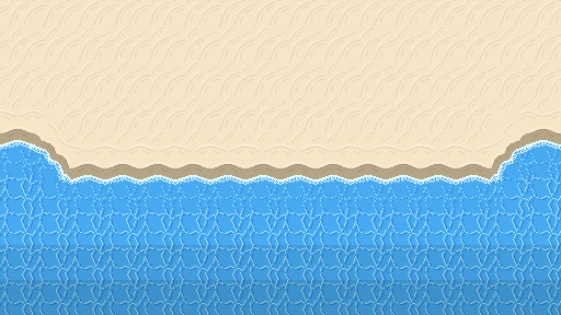
Here’s a fixed version of the beach. You can see I added the diagonal waves and changed the wave tiles so that the pattern is scattered due to the crash. The new wave tile means that while the pattern doesn’t stop abruptly, the water doesn’t seem still and lifeless. I darkened the two back lines of tiles to show that the water is getting deeper. Next, I needed to add a bit of variety into the beach.
Rocks
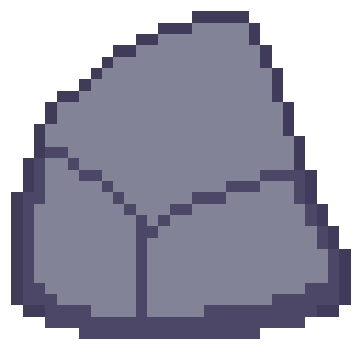
The first stage in making the rocks for the beach was drawing an outline of the rock with a few segments to show off either cracks in the rocks or the shape of the rock. Rocks aren’t perfectly smooth or round so you have to make rocks with that in mind.
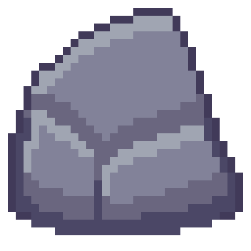
Next is to add some shading to the rock with highlights and shadows. Removing dark outlines and replacing them with shadows is a good idea as it feels more natural rather than drawn.
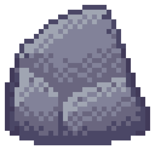
Like I just mentioned, rocks aren’t perfectly formed, and their shading should reflect that. I used dithering to add some texture to my rocks and added some small cracks and divots with darker pixels invading the space of lighter pixels.

I made another two rocks and spread them through the scene. Rocks on the beach were given a small shadow and rocks in the water were given a water collision line so that they felt like part of the scene. I was happy with the rocks, but the beach could still do with a bit of life.
Crabs/Conclusion
Anyone else think crabs are pretty cute? Snip snip. I didn’t do touch-ups on this piece, but I did add crabs! I feel like they finish up the scene nicely.
I’m fairly happy with this week’s piece. Practicing dithering was quite fun. The textures are a bit repetitive and that is definitely something I’m going to have to think about going forward – different methods of reducing repetition in certain tiles. Additionally, I did a lot of modifications within the canvas rather than building the scene tile by tile. While making this piece did give me a lot of practice, I won’t be able to make pixel adjustments in a level. I’ll need to develop an understanding of what I exactly need for a level and then make tiles for my needs. Overall, while I enjoy looking at this piece it has given me some food for thought about how I’m going to build my levels and create the art required for that task.
That concludes this week’s learn log. Next time I’m going to be tackling a bigger task – learning how to make houses, furniture, snow, stone and man-made textures. This might mean I skip a week of posting or split the piece across two posts as I’ll be making both the interior and exterior of a cozy cabin on a snowy mountain.
My learning and this blog post wouldn’t have been made possible without these fantastic resources. Go check them out if you wanna learn some stuff about pixel art!
How to Pixel Art Sand by TutsByKai
Pixel Art 101: Water by Pixel Pete
How to Animate Water by TutsByKai
[Let’s Pixel] Water Tiles by HeartBeast
Pixel Art 101: Rocks by Pixel Pete
[Let’s Pixel] Boulder by HeartBeast
[Let’s Pixel] Lava Rock by HeartBeast
12 notes
·
View notes
Text
Learn Log #4 - Grassy Grove
On week 4 of my pixel art journey, I learned how to make objects of nature including grass, bushes and trees. Unfortunately, I had to postpone this to this week when the learning and blog post was set for last week as I was just preparing for a return to university (it’s all online – social distancing dw). Anyway, I ended up making the forest scene you see above, and it was a lot of fun. I think that the GUI elements last week had a focus on technicality and exactness. Letters are very rigid, and we have somewhat set ideas about what each character should look like. However, nature is more flexible and therefore logic isn’t as heavily involved.
Tile Sets
Before jumping into the actual elements of this week’s piece I want to talk about making pixel art tiles. You will have probably noticed that the nature scene is quite rigid like each element is set into a box. This is because I’m learning pixel art to make games and games often use tile sprites to build their environment.
Tile sprites are the floors and sometimes walls of the environment. They often loop or repeat to cover the environment, however, some engines have tools allowing game designers to build environments tile by tile.
In the first case, the tile sprite will have to be created with its looping in mind and details may be added to provide variation in the environment. However, these added details may highlight the repeating the pattern and the more a detail sticks out the obvious the repetition becomes. Additionally, smaller tiles will repeat more frequently, and this also shows repeating textures.
The second scenario requires variation to be created from the creation of multiple tiles. This is great for creating variation; however, the tiles will also have to line up with each other which may be trickier for more rigid surfaces like rocks or bricks.
Since Unity has a tile builder tool and I was creating a natural environment where tiles wouldn’t need to line up so clearly – I decided to go with the second option.
The size of the tiles may also dictate the size of the rest of the game. For example, a bush may be 1 tile large in terms of level design, so the size of that bush is determined by the size of the tile. This also goes for the player whose sprite will typically range from 1 tile to 2x2 tiles. I decided to just make my tiles 16x16 as I enjoy learning within that space.
Grass
A grass tile is typically made of a green background with blades of grass texturing the surface. Many people may open up a couple of green canvases and start texturing them with green lines, however, there’s a much better way to do things I think. Since we’re working with 16x16 tiles there’s a limited number of shapes that look like grass and are small enough to fit within the tile. So, if we make a bunch of lines in green then we have blades of grass that we can copy and paste into each tile (the blades should typically be a lighter green as light will be hitting them).
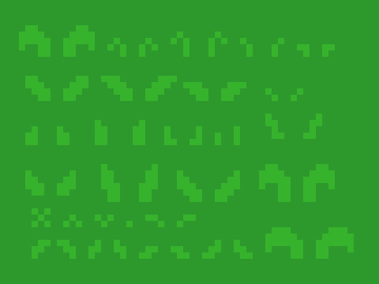
However, having blades of grass like this make tiles look flat. Adding shading will fix this issue by giving the grass depth, however, more complicated shading will obviously make the background more complicated which can affect the readability of your game.

Each blade of grass can now be copied into a 16x16 canvas to make grass tiles. I made 4 grass tiles shown below putting approximately 10 blades into each tile. I made each tile with different elements of the environment in mind such as short grass, long grass, bushy grass and leafy grass.
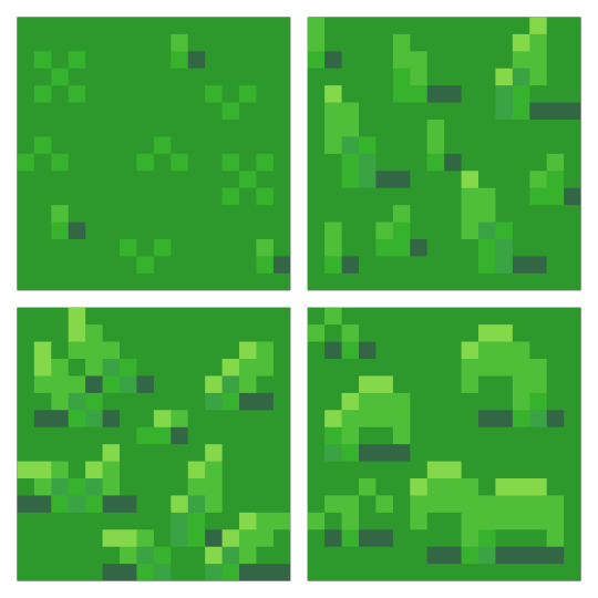
With these tiles, I created a larger image to test the repetition of the tiles. The repetition wasn’t a big issue; however, I didn’t think the leafy grass fit with the rest of the grass, so I decided to leave it behind for the next stage.
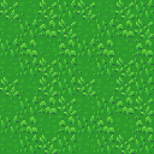
Next, I was going to add an extra tile for each of the current textures to reduce repetition as well as two flower variants for each tile type to add some colours into the textures. I did another test of the tiles’ repetition and overall look and it looked good but somewhat cluttered though I figured that this wouldn’t be an issue when I deliberately place the tiles rather than randomly scatter them.
I had in my mind the type of scene I wanted to make for this week, but it required dirt paths. Luckily this wasn’t an issue to make. I made two variations of the straight, one-way paths as they would be tiling and altered one of these tiles slightly to make the curve and intersection tiles.

I then assembled these 15 tiles into the image below.
Trees
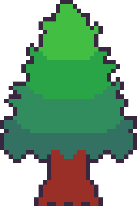
Next, I wanted to add some plant life which would involve trees and bushes. I decided to do trees first as they would be larger than the bushes. First, I started with the shape of the tree which would be fairly basic. I made a rough tree trunk shape to start with and topped it with a circle that was a little squished before refining the shape a little more to get what’s shown below.

I then added colour into the tree. A simple brown for the bark and 4 shades of green for the leaves. These greens were made by colour picking the base green background and hue-shifting it towards yellow so the tree would stand out more from the background.

The colours are organised into ovals to help give the tree a sense of depth. The dark shades wrap around the edges of the tree to show the tree’s roundness. The colour thins out as it goes around because you’re viewing the shaded leaves from a side-on perspective.
Next, I blurred the lines between these circles by mixing the colours slightly. This was the start of adding leaves onto the tree. Quickly after that, I added more detail to the leaves by spotting the head of the tree with lighter greens. The details added were in ‘leaf-like’ shapes like hearts, single lines, and arrows. They don’t look like leaves individually and can’t receive much detail themselves (such as a stem) but together they make the tree look nice and bushy. I also added some detail to the tree trunk including shading.

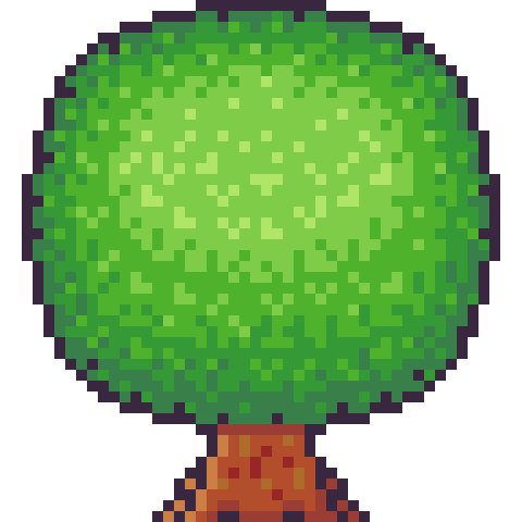
The tree trunk seemed a little off when I checked it out with the image I had so far, unfortunately. So, I added some extra trunk at the bottom along with a nice shadow. This shadow was the colour black at a transparency of 127 (or half transparency). This works really well as a quick and easy shadow on detailed background, but it does, unfortunately, mean the shaded area is not hue-shifted as typically preferred. The final product is below.
Looking at this sprite you may think it would be difficult to construct a game environment due to the leaves, trunk shape and shadow involved. However, we can place each section down as a separate 16x16 tile with the main trunk tile being a collider and other tiles not having a collision box (like decoration tiles – we don’t want players to run into tree leaves). This works out really well, and I focused on the main trunk tile when positioning the sprite in the piece. Which is shown below.
However, the scene below is bit lonely so I thought I’d add some pine trees as a level border. The process of the pine tree is similar so I won’t describe each step but will show the images. This time around I did shape the tree a bit more wildly with branches and leaves sticking out from the tree. I also hue shifted towards bluer colours rather than the more yellow colours I used in the round tree.
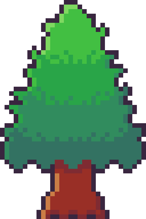

Next, it was time to add more trees into the scene and add some grass beneath them. I made the grass beneath them short grass simply because it looks a bit neater than the other grass types.
I think it looks pretty neat! I made a pine tree variant by swapping the colours with that of the round tree for some variation which worked as a nice, easy trick. But it would look livelier with some bushes.
Bushes
You might have looked at the trees just before and thought, ‘That kind of looks like a bush on a stump.’ That’s because the techniques used to make bushes and trees are typically very similar depending on the style of the game. Since we’re using a 16x16 size which is somewhat limited they will likely turn out in roughly the same way.
I started with a circle shape that was modified at the bottom to be a bit flatter. This will hopefully give the impression that the bush is touching the ground and rounds out on the top
I did a similar process in colouring the bush as I did with the tree, however, I used fewer colours as I didn’t have as much room for highlights with the bush. The colours used are actually the same as those in the pine tree.
I then adjusted the outline to give the bush a wilder feel as well as texturing the inside of the bush to create the appearance of leaves.
The bush still felt a little flat, so I added highlights to the top of it to add a greater sense of depth. The highlight was rounded towards its end at the bottom to enforce the rounded nature of the bush. This required me to add another outline tone for highlights which I might apply to other elements of the picture. I was pretty happy with the bush, so I made another for variation and added them into the picture with some shadows.
The picture looked pretty good, but I thought some touch-ups might make it just that little bit better.
Touch-Ups/Conclusion
To touch up the piece I added some more trees for denser looking forest, added the lighter outline colour to the tress and expanded shadows around some of the pine trees. I’m pretty happy with how it turned out. I think the shadows could use some refinement at the top border of trees. I also think that top border highlights the repeating pine tree trunk which could also be changed to tile better. I do wish my bushes were a bit leafier than shrub-like, however, I think my ability to make leaves on both bushes and trees will improve as I practice. I also think a 32x32 base picture would allow me to make some more defined leaves. The lighting on the pine trees also uses a different technique to the round tree so next time I’ll try to be more consistent with that. Overall though I’m happy and I quite like the outline highlights as they make the image a bit softer.
That concludes week 4 of learning how to make pixel art. Next week I’ll be looking at sand, water and rocks to make a top-down beach scene.
My learning and this blog post wouldn’t have been made possible without these fantastic resources. Go check them out if you wanna learn some stuff about pixel art!
How to Draw Tiled Pixel Art by TipTut
Creating Variation in Pixel Art TutsByKai
Pixel Art 101: Grass by Pixel Pete
How to Make Pixel Grass Tiles by TutsByKai
RPG Grass Background Tiles by HeartBeast
Pixel Art 101: Trees by Pixel Pete
[Let’s Pixel] Tree by HeartBeast
[Let’s Pixel] Spruce Tree by HeartBeast
Pixel Art 101: Bush by Pixel Pete
203 notes
·
View notes
Text
Learn Log #3 - GUI
This week I studied various elements of Graphical User Interfaces (GUI) including text, logos, buttons and cursors. For practice, I made a mock-up of a fantasy RPG menu which turned out alright. Apologies for the late post. I was a bit busy this past week. Hopefully this doesn’t cause a delay in next week’s post but we’ll have to wait and see!
Text and Font
To practice my font making skills, this week, I tried to make readable fonts in the smallest sizing possible. My reasoning behind this is letters might be read in large passages of text, so a smaller size will likely be required – especially for small menu spaces such as inventories.

Above was my first attempt which used 3x4 pixel letters. While many of the characters were recognisable, a good number were not. The ‘M’ and ‘W’ were utterly unreadable, and some of the characters were difficult to read, like ‘S’ and ‘X’. I decided to move up to a 4x5 size.
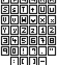
With this slightly larger size, I attempted to make both uppercase and lower case letters, most of which worked pretty well. While most characters such as the ‘S’, ‘E’, ‘3’, ‘Z’ and so forth benefited from the extra pixel in the Y-axis – characters were still needed an extra pixel along the X-axis. Characters such as ‘M’ and ‘W’ were still basically unreadable, and characters such as ‘T’ and ‘I’ were difficult to align along the even number of pixels. To fix this, I moved up to 5x5.
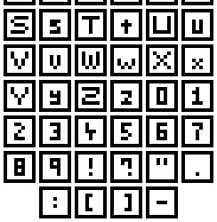
Finally! I have successful ‘M’s and ‘W’s! From this test, I really think that there are a few principals for creating nice fonts. 1) If you know or unsure about if the letters ‘M’ and ‘W’ are involved then make the canvas size for each letter at least 5 pixels wide. The same can go for characters like ‘S’ with regards to height. 2) Make the canvas size an odd number along the X-axis to better align specific letters.
With this last font set, I was also able to size the canvas for different types of characters differently. Capital letters occupied the full 5x5 canvas, lowercase letters occupied a 3x4 canvas (except for the ‘M’ and ‘W’ which had to be 5x4), and numbers and symbols filled a 3x5 canvas. I did this so readers could better distinguish between uppercase and lowercase letters, and similar characters like ‘O’ and ‘0’. I’ll have to see what it’s like an actual game later, but I think it’ll be a pretty useful trick.
I do think I will be able to make larger fonts than this and size them down in the Unity engine. Even if this is the case, I think this worked pretty well as practice within tricky boundaries.
Logos
I think logos and titles are pretty crucial to a game. They plaster the cover and main menu of the screen, and I’m sure we can all think of a few memorable logos we’ve seen in games. So, now that I’d practised making text I wanted to make a banner logo for my Itch.io page. The first thing I did was a little sketching on paper before converting it to a small pixel art concept, as shown below.
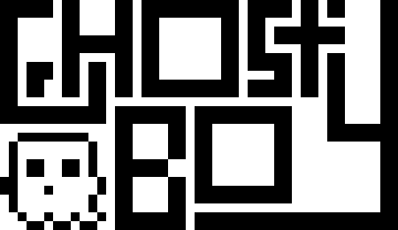
The recommended banner size for Itchi.io is about 900px wide. I was not going to start here, so I decided to do my rough draft at 45x26 and detail it as I scale up. I made this draft by implementing the concepts I really wanted first and building around that. I knew I wanted to include the ‘S’ wrapped around the ‘T’, so I started there and worked my way through the logo. I also wanted to include a little ghost, so I left a space for it in the bottom left corner. Next, I wanted to add some detail and hollow out the letters, so they were white with a black outline. This is useful as it means the letters are both white and black, allowing the logo to be read on dark and light backgrounds.
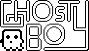
To add the detail, I scaled up the previous logo by 400%. This allowed me to round out the edges and create a nice ‘blocky-but-smooth’ look. I also adjusted the ‘G’, ‘T’ and ‘S’. The original ‘S’ and ‘T’ combo made the ‘S’ seem a little bit strange, but this new version was a lot better. With the hollowed out ‘G’ I made it seem like it was beneath the ‘H’ which I thought was a nice effect. I left one of the ends of the ‘Y’ very blocky to make it seem like it had been interrupted by the T. At this point the logo was 180x104, so I scaled it up by 500% to reach 900x520 before adding more detail.

If someone were to ask me, ‘Hey, should I make a 900x520 pixel art logo dealing round edges and circles?’ I would slap them. In fact, I’ve slapped myself because I did precisely this, and it took ages. At smaller sizes, circles can easily be adjusted, viewed, or manipulated to trick the viewer into thinking they are looking at a round edge. When you need to make 4 circles, the largest being 220x220 this becomes insanely difficult. Looking back on this issue I definitely should have used anti-aliasing - I completely forgot about it if I’m honest. The ‘O’s didn’t even come out looking that great. They look quite boxy – definitely should have used anti-aliasing. I have regrets.
Luckily the other letters turned out much better. I did adjust the ‘Y’ also as previously the logo read ‘Ghosty Boy’ rather than ‘Ghost Boy’. This did make the canvas 840x520, but I don’t think it’ll be a noticeable change. I’m pretty happy with it, especially after all the time it took. I may revisit the logo at another time (especially to fix up those ‘O’s).
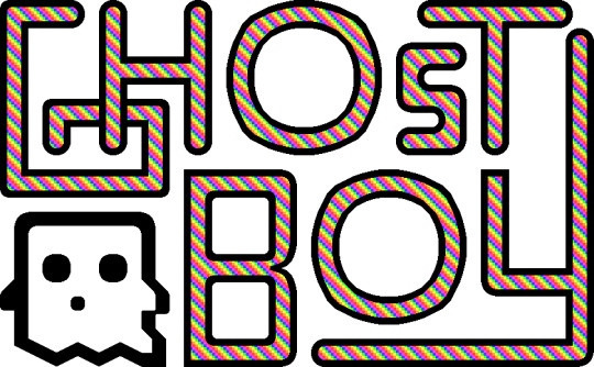
Above is the final logo, I added the pattern used in my profile picture (slightly desaturated to make it easy on the eyes) to the insides of the letters and called it a day (or 3 days. I hate the letter ‘O’).
Buttons
So, we’ve got our game’s font and title, what we need now are some buttons for interacting with the menus. To practice making button sprites, I decided to make link buttons for social media sites. I started by making the designs of the buttons, as shown below.

I started with small, white 9x9 designs of each social media sites’ logo on a background of their associated colour. I wanted the buttons to be small (to be put on the sidebar of a website) and completely circular. The Itch.io logo could not fit onto the small size, so I made a rough-looking videogame controller instead.

I then expanded these designs into a larger 13x13 circle which I would later turn into the button. Not much happened in this step but this.

And the buttons were done! I shifted the logos of each button upwards before adding a shadow and highlight line on the bottom. Buttons require some sense of depth or separation from the background to show that they can be interacted with. This is really all that’s needed, but more detail can be added to make the button look more appealing.

I added a shadow around the back of the buttons to emphasise the edges of the buttons, separating them from background. I then added some more detail to the highlight to make the button seem shiny and draw attention to it. By alternating between highlights and normal tones, the button appears metallic. Finally, I changed the white logos to a light yellow so the white didn’t seem too bright.
Overall, I’m pretty happy with how the buttons look. The colours on the Itch.io button are a bit desaturated which conflicts with the metallic look. This is due to the colours of the actual logo being quite desaturated. If I were to return to it, I would change it to be pink or orange to capture a similar colour but make the button as bright and eye-catching as the others.
Cursors
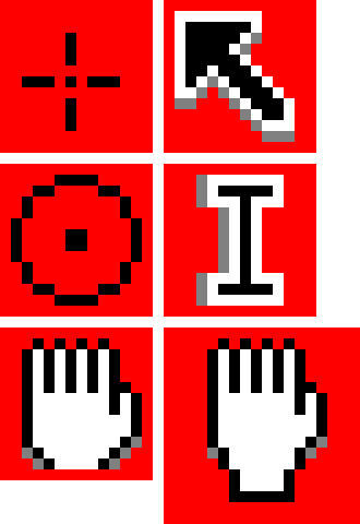
There’s not much to talk about in regards to cursors. The default cursors of PCs and Macs are pretty good, however, adding a custom cursor image to a game makes it look really cool I think – even if it’s just a simple adjustment. I tried my hand at making some cursors. The circular points make fitting cursors for shoot games as they’re reminiscent of a gun scope. The hand cursor is a little tricky to do in a small space and might not be worth it as cursors need to be small. Like I said regarding text - if Unity has an option to scale down cursors that will make things much easier. These are some simple ones, but I’m sure there could be more eccentric designs even within these cursor shapes.
Assessment
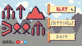
So, for this week’s learning assessment, I wanted to make a mock-up fantasy RPG menu based on the items I made last week. This was definitely not a lazy excuse to use the same colour palette and 100% a sincere artistic decision.
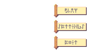
The first thing I started with was the buttons. It is crucial a menu’s buttons are clear and easy to read so they should dictate the size and presentation of the rest of the screen. I really liked the scroll item from last week, so I decided to make the buttons scrolls. This made the addition of depth more complicated, but I think I did an alright job by adding a shadow bottom right of the scroll.
For the text on the buttons, I wanted to delve into the fantasy aspect and use rune-like letters. I had to tread a fine line between clarity and the desired aesthetic of the letters which took a lot of trial and error, but I think I got there in the end.
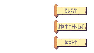
I then scaled up the buttons to add some further detail to the scroll and the runes. I thought the plain white background looked pretty bland so I decided to make a background.
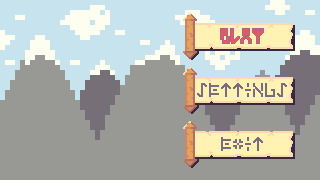
I made a mountain range as a background for the menu and changed the text of the ‘PLAY’ button to an outlined red. I kept the background quite simple as this week’s topic was interfaces, and I was concerned that a detailed background might distract from the interface elements. I turned the ‘PLAY’ red because I wanted to give the impression that the option was being selected. I had ample empty space to the left of the screen, so I decided to create a logo for the game to fill that space.
[photo]
After some more trial and error with different rune letters, I created this logo giving this fake game the title ‘Mt Doom’, inspired by the mountain range background. The rigid rune style really gave the title a more menacing feeling which was good. The ‘O’s used looked a bit weird as I had trouble turning them into a rigid rune style. I increased the size of the logo to add more detail and popped it into the menu screen.
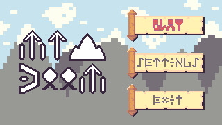
The extra detail made the runes look a bit nicer. The ‘O’s were still off but did fit the rest of the font a little better after adjustment. My biggest concern was how out of place the whole logo looked. This was quite clearly because of the pure white colour used for the letters. I could change this to the white within the colour palette; however, this colour was used in the background, so I decided to match the selected button and use the colour red for the logo.
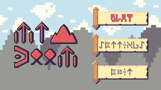
The red made the logo really pop while fitting in with the rest of the piece. Additionally, some light shading on each of the letters made letters stand out even more. I also moved the black outline of the text slightly to the right to make it feel more like a shadow rather than just an outline. Unfortunately, I didn’t feel like the logo had a grand enough presence for its purpose and menace to shine through. To fix this up, I digitally resized the logo by approximately 133.33%. Now, digital resizing really works well for stuff like 200%, 500%, 1000% and so on because it just adds pixels. However, a resize of 150% means you are resizing the image by 1 and a half-pixel which is not possible. This creates jagged, messy lines – but I decided to give it a shot because why not?
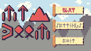
To my surprise, the sizing was perfect, and the messy lines actually worked somewhat with the aesthetic. The shading did get messed up a bit, and if I were to do this again I would go back and adjust the shading, but overall I actually think it improved the piece. Finally, I decided to add a cursor, a watermark and social media buttons into the piece, as shown below.
This watermark and the social media buttons do look a bit out of place in the piece, but I think that works in their favour. It draws attention to them and makes it clear that these are not part of the game or menu. This is particularly useful as those social media sites will open an external tab so showing they’re not part an internal part of the game is important.
Looking back on this piece, I do wish the background had more detail. Initially, I didn’t add it so the interface was clear and this may have worked. Still, the fact the background is very simple makes it aesthetically different and distracting. Also, while the scrolls were a nice concept, they could be designed to have more depth and a better select state. Overall, what I took from this practice is that this design process of ‘Buttons to Background to Logo’ is quite useful, but I do need to make adjustments as I go through each stage in the process.
Conclusion
That concludes week 3 of learning pixel art. In week 4, I will be diving into environments starting with grass, trees, bushes and some other features of nature. I’m really excited to build pixel art environments, and I think I’ll enjoy it more than this week as I got a bit sick of making letters over and over again.
My learning and this blog post wouldn’t have been made possible without these fantastic resources. Go check them out if you wanna learn some stuff about pixel art!
Creating A Pixel Art Font by TutsByKai
How to Make a Pixel Logo by TutsByKai
Pixel Art 101: Buttons by Pixel Pete
How to Animate a Button by TutsByKai
How to Make Pixel Art Cursors by TutsByKai
0 notes
Text
Learn Log #2 - Pixel Art Basics 2
This week I continued learning the basics of pixel art and ended up making some pretty alright-looking RPG items. The topics covered this week were colour, shading and dithering and you can read about them below.
Colour
To understand colour in pixel art, you first need to understand colour. Colour theory explains the existence, and relationships, between the primary colours (red, blue and yellow) and the secondary colours (green, orange and purple). These colours and everything in between appear on the colour wheel, which we’ll get to in a second. What’s important to know is that these different colours can contrast against each other, complement each and give off different moods. I’m not going to go into depth but having some understanding of colour theory is essential in creating any artwork, including pixel art.
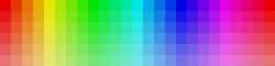
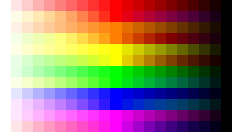
Anyway, that colour wheel I mentioned is vital to pixel art. Every digital art program you use for pixel art will include some form of the colour wheel which will allow you to select colours for your artwork. Below I’ve made a rough image of a colour bar with the very left pixel starting at hue 0 and the furthest right being hue 360 (each pixel increases hue by 15).

You’ll notice that hue 0 and 360 are both the same red. This is because a revolution around the colour wheel has been completed and we’re now back at square one. Remember that even in bar form this is a colour wheel – this information is key to utilising the colour wheel.
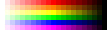
Now, looking at these colours, your eyes might start to tear up a bit. They’re very bright and harsh. If we put two contrasting colours, such as green and red, next to each other, this would only get worse. This limits our creativity and makes our games a bit irritating to play. So, if we lower the saturation and value of the colours a bit, it can make our pixels pleasant.
You’ll see here that I’ve reduced the value by 10 points making the colours a little darker and more comfortable on the eyes. You can also see the saturation decrease the further down the image the pixels are. Desaturation can also make your pixels less harsh. However, keep in mind that adjusting value and saturation will affect the mood of your game. Lighter, brighter games give off a friendly vibe while darker, desaturated games will give off a more serious vibe. You can also use these techniques on black and white pixels if you replace the white with a highly desaturated yellow and the black with a desaturated, dark purple as shown below.
Finally, if you’re looking for what colours to use in your pixel art piece or video game here’s some advice. 1) Make a colour palette – this will serve as a constant reference for what colours you’re using in the art. 2) To develop a palette, make a mock-up of your art – this will help you pick colours that work together and create a cohesive mood. 3) Remove unnecessary colours – keeping your colour palette simple or simplifying it as you go will make animation easier and make the art less noisy.
The final thing I’ll say is; use the HSV (Hue, Saturation and Value) measures and forget about RGB (Red, Green, Blue). I used RGB before this week and it pails in comparison to HSV. It might take some time to get used to, but it is crucial for nice shading, which I’ll explain later on.
Shading
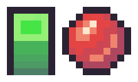
To discuss shading, we’ll be using this box and this sphere. Of course, they don’t really look like a box or sphere without shading, but we’ll get to that.

Someone starting out with pixel art, like myself, would usually just adjust the saturation and value measurements of the colour to achieve a brighter or darker tone. A lower saturation will give off the impression of brightness even if the value is at 100 by moving closer towards white. Meanwhile, decreasing the value moves the colour towards black making it darker. These new colours would be applied as shadows and highlights and often with gradients moving between the colours.
However, there is a much more interesting method of shading called hue shifting. In an environment, we will have a light source which may not be 100% white light. With hue shifting, we move towards the hue of the light source for brighter colours and for darker colours we move away from that light source (typically towards the opposite colour). This is why it is so important to ditch RGB and remember the properties of the colour wheel. Below are some examples of the different types of shading: the first image is of standard shading, the second is of hue shifting, and the third is a comparison.

You’ll immediately notice hue shifting is a lot more colourful and nicer to look at than standard shading. You’ll also see some colours seem a bit off (yellow, for example, shifts too far green and orange. This is because I simply followed the numerical values of the colour wheel. When using hue shifting, DO NOT do this. It can help a bit if you need guidance, but if you strictly follow the numbers, you’ll end up with weird colours. Go with your eye and what looks best.
Now let’s apply hue shifting to our box and sphere.
Looking much better! You’ll also notice I added another highlight to the sphere. This is because the sphere is also receiving indirect light bouncing up from the ground.
The formula for hue shifting goes:
Lighter = Hue Shift – Saturation + Value
Darker = Hue Shift – Saturation – Value (you can instead add saturation if you want brighter shadows)
The extent to which you manipulate these values will be part of your art’s style.
Dithering
Another method of shading used in retro machines that can still be used today is dithering. Dithering is used by alternating between colours in a pattern to trick the brain into thinking that the colour present is a combination of two different colours. There’s a couple of different ways to dither such as:
Uniform dithering – alternating each pixel between the colours
Pattern dithering – making a pattern transition between the colours
Random dithering – scattering the pixels randomly
Dithering is useful if working with limited palettes and works great with larger pieces. However, dithering between similar colours might not make a difference, and too much dithering can make an image noisy.
Week 2 Practice
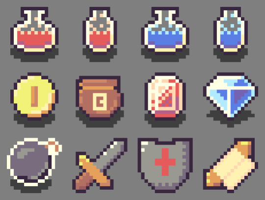
I wanted to make some fantasy RPG items for this week’s practice following HeartBeast’s and Davit Masia’s videos on item and gem icons. The first thing I did was create a colour range, as shown below. To make this, I picked out the six primary and secondary colours on the colour wheel and adjusted them to a tone that fit what I wanted. Next, I hue shifted them to create two brighter and two darker tones each.
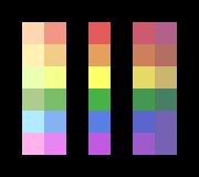
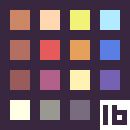
This range allowed me to easily pick and choose colours for my colour palette. If I felt any of the colours from the range needed to be different, I just adjusted them in the palette. I decided on working with a small palette for the twelve items I was making and choose 16 colours as I was working in a 16x16 space. Within the palette, there are fifteen grids with the colour white and fourteen others. The sixteenth colour used was the black outline surrounding the palette.

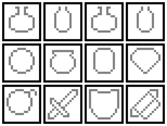
I based these colours off a list of ideas I had which include health and mana potions, currency (coins, a bag of coins, gems), and weapons (bombs, sword, shield, spell scroll). To test out the colours I’d picked for my rough palette, I made line art of the items and roughly coloured in each item (Note: the grey background was not part of the colour palette).
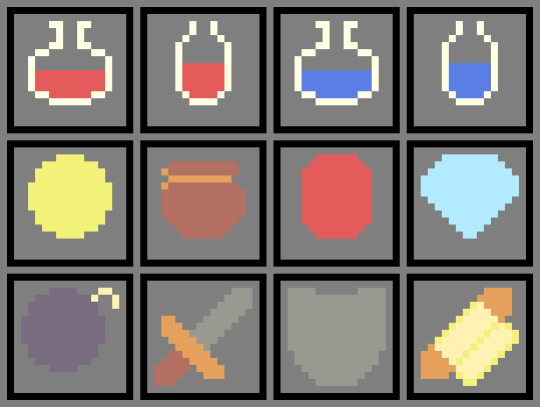
I assessed what I had and realised I wasn’t going to use green anywhere. I removed both shades of green from the palette giving me two spaces if I needed any new colours. I then proceeded to add more detail to the icons, including shading, and outlined each object so they stood out from the background. After a while, I realised that I needed some more brown tones as the coin bag and sword lacked some necessary shading. I used the new two spots in my palette for a lighter tone and a darker tone and finished my items.
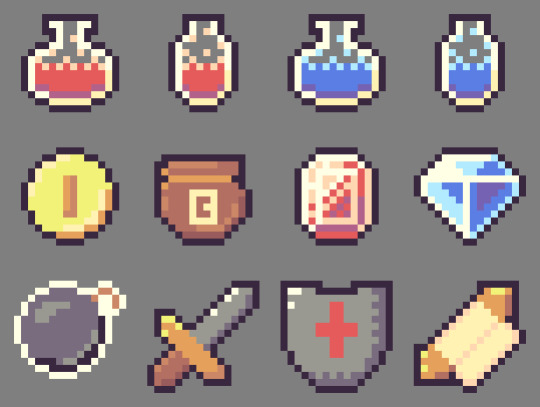
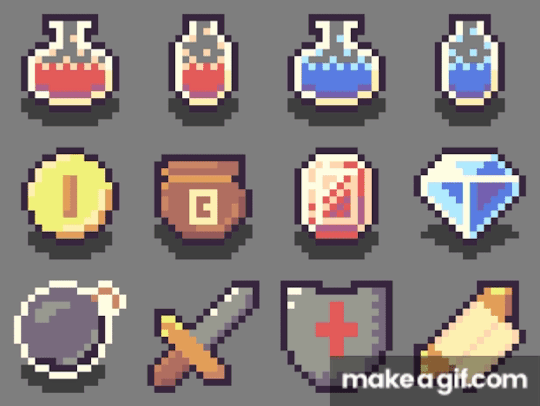
Now that I felt happy with my items, I quickly added a small shadow beneath each of the items I’d consider ‘pick-ups’ and animated them into a little GIF (apologies for the watermark). This was where I completed the piece.

Reflecting on the piece, I think the items look pretty good. The form of the sword could use some work – the addition of the outline made it a bit big, turning it into a toy sword. Also, the shading of the coin, bomb and shield could all be a bit better, but I feel like I did an ok job with the limited palette.
The End
So, that concludes this week’s learn log. Next week I’m moving away from learning the basics and starting with GUI pixel art including logos, fonts, buttons and cursors so follow my blog if you’re interested.
My learning and this blog post wouldn’t have been made possible without these amazing resources. Go check them out if you wanna learn some stuff about pixel art!
Pixel Art 101: ‘Colour Palette’ by Pixel Pete
How to Colour Pixel Art by TutsByKai
How to Pick Nice Colours by MortMort
Pixel Art 101: ‘Shading’ by Pixel Pete
Hue Shifting in Pixel Art by Brandon James Greer
Dithering and Pixel Art by Armitage Games
[Let’s Pixel] 18x18 Item Icons by HeartBeast
How to Start in Pixel Art by Davit Masia
5 notes
·
View notes
Text
Learn Log #1 - Pixel Art Basics 1
So this was the first week of learning pixel art! This week I had a look at some very broad concepts such as Size, Style and Lines. I’ll start with the first two topics because I feel like they’ve got quite a strong connection.
Size & Style
So if you’ve ever looked into pixel art you’ve probably heard of terms like 8-bit, 16-bit and 32-bit but you might not be sure what that exactly means. These were various processing architectures involved in old school video games. I’d say an allure of pixel is the recreation of old video game styles so these terms reflect their respective art styles. Basically, these terms explain ‘Oh I’m going to go for the style of the NES’. Here’s a great Reddit post basically explain it better than I ever could. You could also argue that it connects to the size of the sprite be it 8x8, 16x16 or 32x32 - some people use the terms as such and so will we in this post.
So that’s all well and good but how do you pick a size for pixel art? Well, from my learning this week not only does it depend on the style/complexity you’re aiming for but also your skill level and sprite concept. As we just discussed video game styles play a big role but if you’re not aiming for anyone style then concepts such as colour palette and outlines do too. For example, if you have a limited colour palette or need outlines you might need a slightly bigger sprite to fit in the detail you need - which brings us to concept. If your sprite needs to be expressive, for example your game is story-based, you’re going to need enough size to fit the expression. A trick to figuring this out is making the smallest detail or the facial expressions as small as possible while maintaining your preferred style/level of detail and working out the size of the sprite from there. Of course, this all connects back to skill level. If you’re not that comfortable with pixel art don’t start with big 128x128 sprites. Start with 16x16 or 32x32 first. These larger sprites also make things much more difficult to animate and are a lot easier to mess up.
Going further into style, I want to quickly discuss 1-bit pixel art or minimal colour palettes. 1-bit pixel art is a two-tone style meaning it only uses two colours throughout the piece. This is an interesting style to work in because you have that new level of restriction. For example, how do you convey different materials with only two colours? The use of patterns is really useful for this but they can’t be too confusing or complex also. In general, these minimal colour palettes make animation a lot easier but can make readability a little difficult if you have a lot of things going on.
That’s the last thing I want to touch on - readability. Whenever you make pixel art make sure it can be read - especially if it’s for video games. Making interactable objects outlined or enemies a specific colour is a great way to do this. Readability should be the first priority.
Practice #1 - Resizing Logos

These 16x16 logos are based upon the Barbarian and Warlock class symbols in Xanather’s Guide to Everything. I tried using them to follow TutByKai’s tutorial on sizing symbols from 16x16 to 32x32 but they proved to be to difficult for me to size properly. Here they are for you to check out though! In the end I managed to practice sizing in practice #2 and #3.
Lines
When I was studying about line-work this week I found it funny that rather than learning what to do, I learned what not to do. I think this is because we all have a rough idea of what a pixel art line should look like but not what makes a line look wrong or weird. The main culprits for this are called ‘doubles’ and ‘jaggies’. Note that these are not rules you have to follow and if using doubles or jaggies actually helps convey meaning then you can definitely use them
Doubles are when a line doubles up, usually as it curves or turns an angle. This can make the line weird as it begins to look more blocky or the extent/where the doubles are is inconsistent (for example shifting between inside and outside a circle). A good fix for this is anti-aliasing but that will be discussed shortly.
Jaggies are when pixel don’t within an established patter for example if you had a curve going: 2pxX 1pxY, 2pxX 1pxY,2pxX 1pxY, 3pxX 1pxY, 2pxX 1pxY, 2pxX 1pxY. That 3px line is going to look weird (also sorry couldn’t be bothered to make a quick reference picture online). It may work for irregular terrain such as nature but with man-made objects and more spherical/round objects it just looks strange.
Anti-aliasing (AA) is a pretty useful tool. You can think of it has a half-pixel. However half-pixels don’t exist so it’s really just a pixel roughly the colour between that of the line and the colours next to it. This is useful for fixing up those doubles or making more detailed curves/angles. You’ve got to be careful to not to overuse it as otherwise things will just begin to look messy. Also don’t just stick it across the whole outline - remember this is to be used like a half-pixel for curves. Don’t forget, just like more complex colour palettes you have to animate anti-aliasing too which makes things more difficult.
Finally, I have a few tips for outlines. Firstly, outlines must reflect the nature of the contents (point object = pointy outline). Secondly, fill in any voids within the outline as it can be distracting. Outlines can also play a big role in the way your character is seen by others and how they pick up on the nature of the sprite.
Practice #2 - Robert
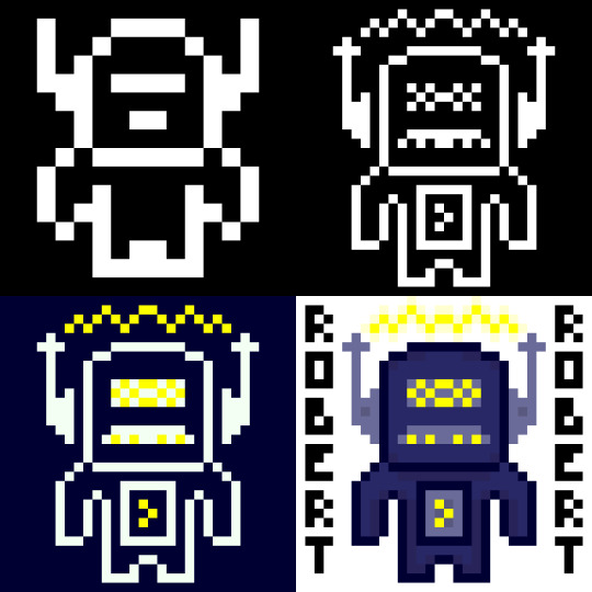
So I made Robert yesterday for my practical this week. I’ve presented him here in stages of the spriting process so I’ll just talk through each stage.
So in this stage I started with a 16x16 canvas. As you can see Robert has very little detail due to the small canvas size and 1-bit colour palette. You can kind of tell he’s a robot from his head, if I were to just have him in 16x16 I might want to make the shoulders or a bit blockier to represent that. I did try to do that on the outer pixel of the hands but they kinda felt like wings. When you do pixel art in this smaller sizes each pixel and colour becomes much more important.
So in this next one, while I had the same colours I resized him digitally to 32x32 and added in a lot more detail which you can clearly see. His antennas are now away from his head to make it clear that his head isn’t just a weird shape. I couldn’t do that in stage 1 because 1px there was about 1/6 (?) of his head width. Now that it’s 1/12 (?) I can separate the objects while making it still feel attached. These antennas had some extra detail thrown in but I really like the details on the face. It starts to portray a personality - I think the mouth looks like a mustache so that with his name makes him feel like some kind of ‘Dad-bot’. Also I was able to make the body feel a little more robotic while still remaining humanoid
This stage I just adjusted the the two colours and chucked yellow into the palette. It definitely gives off a completely different but I feel that maybe I should have used a different yellow colour as it is a bit bright. The addition of yellow does make the waves above Robert’s head look like electricity rather than some sound waves or something else which shows how one colour can change a lot.
Finally, in this stage I dived into the colour palette. This change meant I could directly attach the antennas again and also add some detail with slight colour changes (including some shadows below the head and inside the body). Overall, while I think stage 4 looked nice I am particularly fond of stage 2 and the ‘Dad-bot’ vibe it gives off. Sometimes less is more.
Practice #3 - Joey

So, I loved making Robert so much I wanted to try again with the colours flipped. This time I was inspired by Brandon James Greer’s 1-bit video to make a character portrait.
So since this was going to be a portrait I needed to start with his expression as it was important I had that nailed down. I wanted to go with a confused look with one eyebrow raid and the other furrowed down but when I added the mouth it seemed a little weird. I decided to keep it though because I wanted to see where it’d go. The expression took up quite a bit of space so I didn’t have much room for other stuff in the 16x16 canvas.
When I resized Joey’s expression I didn’t do it digitally like I did Robert’s body. In stage 1 the facial expression took up a large portion of the canvas size and if I resized it then that some issue would exist. Instead I decided to redraw the face slightly sized up. I wanted the mouth to show teeth so it needed to become 5px tall rather than 4px. Based off this I made the eyes 1px higher and wider to a 2x3 size. I decided to keep to keep the eyebrow width but I did lengthen them so they’d retain their expression. I also spread out the elements and added a nose. As I gave Joey a head I realised that his expression gave me a classic ‘Wolfenstein’ or ‘Doom’ portrait feeling so I went off that and gave a similar haircut and armour in the style of the original Doom. It looked pretty good although if I was to leave him in this style I might make the armour less intricate and focus on adding texture to the different components. Additionally, as there it’s 1-bit the teeth did look like giant lips.
The piece really came together when I added colour (I was too excited to do a minimalist palette style). I tried to keep the colour palette down to a minimum so the piece didn’t get too overwhelming. For example, the armour only uses three shades of green - one being the outline which is also used for the eyes and mouth. I actually didn’t choose black for the mouth because it contrasted too heavily with the white which took attention away from the rest of the picture.You’ll also notice I used a double on the left eyebrow. I did this on purpose to make the right eyebrow point seem thinner and more furrowed downwards. I tried a couple of iterations of the eyebrows and I think I liked these the most.
In this stage I just added some more detail including texture, the scars and some shadows. Basically, I chucked out any hope for a minimalist palette. I added the shadows with another layer that had a reduced opacity which worked ok. There’s not much to say about this other than I feel like this stage had a lot more depth and it was definitely my favourite of the four. Sometimes more is more.
Learning Resources
My studying and this blog post wouldn’t have been possible without these amazing resources. Go check them out if you wanna learn some stuff about pixel art!
What makes art 8, 16, 32, 64 bit?
What Size To Make Pixel Art by MortMort
What Size is Pixel Art? by Brandon James Greer
How to Choose Pixel Art Resolutions by TutsByKai
Creating Pixel Art from an Object by Brandon James Greer
Pixel Art 101: ‘Styles’ by Pixel Pete
Pixel Art 101: ‘Game Boy’ by Pixel Pete
1-Bit Pixel Art Techniques by Brandon James Greer
Minimalist Palette in Pixel Art by Luis Zuno
Constructing Lines and Curves in Pixel Art by Brandon James Greer
3 Pixel Art Techniques/Common Mistakes (Doubles, Jaggies & Outlines) by MortMort
Basic Anti-Aliasing for Beginners by MortMort
0 notes
Text
Study Update
I’ve been reviewing my plan for studying pixel art and I now believe I have a solid plan. I’m going to spend 9 weeks studying pixel art with each week focusing on a different theme or elements as follows:
Pixel Art Basics 1
Pixel Art Basics 2
GUI - Text, Icons, Buttons and Cursors
Grassy Grove - Forest/Nature Tiles and Objects
Crabby Shores - Water, Sand and Rocks
Cozy Cabin - Snow and Man-Made Tile and Objects
Pixel People - Designing and drawing characters
Animated People - Going into the animation
Special Effects - Animated effects and a review of what I’ve learned
I’m planning on studying 0.5-1 hours on Sunday, Monday and Friday each. Friday will also have a 2 hour practical where I make a larger piece, or collection of pieces, of pixel art based upon the theme of the week. This will be published on Saturday in a weekly ‘Learn Log’ where I detail my learning for the week, upload anything I made in the process and link the resources I used for learning. Gonna try to see if I can start this Sunday! Fingers crossed!
PS. Study plan may change as I go but I’ll post updates if that happens
0 notes
Text
Starting up
So, this is the first post and introduction to my blog. I made this blog to log my study into game development and development of any future games I make.
When I was younger, I was kinda obsessed with making games in GameMaker and then Unity. None of them were any good but I had a lot of fun and I originally wanted to do it as a career. While I’m not interested in working in game dev at all now, I do want to rekindle that old passion of mine and learn to actually make good games - not half-baked, buggy prototypes.
So, what’s the plan? Game development is obviously comprised of coding, graphics, game design and music/sound so I’m planning on learning each stage (save game design) separately in this order:
Graphics (Pixel Art): So, I decided to learn pixel art graphics because all my previous games used pixel graphics and I want to build on my prior experience. Additionally, I feel a 2D game will be easier to program for my first attempt. After I feel comfortable making pixel art for games I’ll move onto;
Coding (C#): The reason I’m learning code after pixel art is for a couple of reasons. The first is, from previous experience the art of a game really influences how a game is designed (e.g. the physics behind a character’s movement will be influenced by their design and animation). The second being, many Unity-based programming tutorials aim to walk you through the creation of a project which of course involves graphics. The reason I’m using C# is that it is the programming language Unity uses. Once I’m feeling good about coding, I’ll start to make my first game and then;
Music/Sounds: I’m going to leave this until my first actual project because while sound is important to making a good game, it’s not necessary to make a game like the other elements and I just want to dive into game dev. This will also be my biggest challenge as it’s the element I have the least experience with.
So yeah that’s the plan. I’m planning on learning game design sporadically as I go in the form of study and practice. Once this post is made, I won’t immediately start learning game dev. I’m going to take some time to organize my learning and I’ll post an update with more details on my study plan. Currently I’m thinking stages 1 and 2 will take 3-4 months if there are no interruptions but we’ll see.
1 note
·
View note