Note
can you please tell us how you made peaches? (it's real real real nice btw)
Thanks very much! There's no big secret to how Peaches was made, the only tools I used were paper, pencil and pens, Photoshop, and a text editor to write the HTML, styling and JavaScript to make it all work.If I remember this right, the whole process was:1. Write the story2. Record the story3. Decide how quickly the images would pass while the story was being told4. I wrote a small program that then marked elapsed time on a giant image. So every 50px (or something) a line would be drawn down the image and then marked with the time that part of the image would appear.5. Using this marked image, I then started to roughly sketch the whole story in Photoshop, and played this in a prototype player with the audio so I could improve the pacing.6. Once I'd settled on the story layout, I started drawing it properly. I printed out the whole banner of the story on sheets of A4 paper (I'd print it all in cyan - will explain this in a sec) and started refining the drawings from pencil sketches to ink drawings.7. I'd refine each drawing in stages, scanning it in, removing the previous stage (easy to do in Photoshop as the base was cyan and the new layer was grey/black), and then print the drawing out again, but this time in cyan, repeating the process until I had the finished ink drawing. I'm not sure I would do it this way again or recommend this approach now. 8. With the finished ink drawing, I'd then colour it in with big flat colours (very therapeutic). I did this until the whole story was drawn and colored.9. At around this point I received the final music from Toby and then put it together with the narration.10. Now it was just a matter of programming all the special bits, like images fading out, handling pausing, saving progress with cookies, and general design stuff until I was happy with it.So yeah, I think that just about covers it!
5 notes
·
View notes
Text
UX/UI notes on Super Mario Maker
I'm between jobs right now, so last week I spent an ungodly amount of time playing Nintendo’s Super Mario Maker.
For those of you who don't know what that entails: Super Mario Maker allows you to create your own 2D Super Mario levels and share them with the world.
As such, it's a really interesting piece of software: it's the extremely familiar Mario game wrapped in a much thicker of layer of software designed with creation, organisation and sharing of levels in mind. You can't quite call it a game, and you can't really call it an app either.
It's also been designed for a hardware interface that has a touch-resistant screen and stylus, a variety of hardware controls including face buttons, rear-triggers, and directional analog controls, and may or may not have two screens available (Super Mario Maker can be played entirely on the Wii U's GamePad).
All of the above means the developers of Super Mario Maker can do a lot of interesting things with the UX and UI that nobody else can really get away with. It folds in visual grammar from the videogaming world to create a really unique player experience.
These are my notes on the most interesting and problematic parts of the UI and UX.
Splash Screen
Wii U titles present a static image when booted up, a lot like iOS apps. Most Wii U titles I've played skip straight to a title screen, but Mario Maker uses it to tell you what day it is and present a little animation. Most of these animations are simply short and funny, with Sunday’s standing out as a call to action:
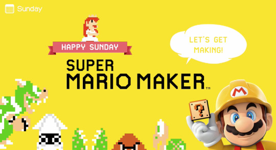
It's a small thing, but why show which day it is at all? this isn't diary software, nor is any of its functionality related to dates. But I'd argue it’s the first stab Super Mario Maker makes at convincing you that it’s more than a game.
The Title Screen, and a tale of two control methods
The title screen has two options: 'Play' and 'Create' on two clapperboard shaped buttons.
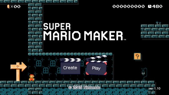
Instinct suggests you can play the level shown in the background, but pressing the d-pad to move Mario does nothing. Pressing A to make Mario jump does nothing. Doing either of these things focuses 'Play', the option on the right. So how do you play the level in the background? By tilting the left analog stick.
Typically this kind of stick is used for 3D games — it's much better suited to games with 360 degrees of movement. So using it to control a 2D Mario game feels kind of weird. Fotunately you can switch back to the d-pad after triggering the title screen play-mode, but that seems like unexpected behaviour too when it didn't do anything before.
The crux of the issue is that much of Super Mario Maker’s UI can be controlled with two input methods: the directional and face buttons on the Gamepad, or by using the Gamepad’s touchscreen.
Admittedly, this is kind of nice in places. Instead of finding and tapping whatever obscure thing it is that navigates backwards, you can just press the B button. You can also use it to trigger commonly used modes in the editor quickly, like copying or erasing.
In most cases in Super Mario Maker, these kinds of traditional controls are reallly intended for power users, so I don't think they should let it hijack the first menu the player comes across: they should have let it show the player the immediacy of Mario Maker’s playfulness by letting it control Mario right away, and leave the option of pressing the Start button for people who’d rely on buttons for the title screen.
(To be fair, selecting Create here takes you immediately into the course creator with a very brief transition. It's a great example of the immediacy I mean)
One detail that I think does a great job of emphasising the importance of the touchscreen is that tapping the screen here will magic some enemies into the otherwise barebones level. This tells the player: 'Hey, the stylus makes things in this'.
Course Creator
The course creator is the heart and soul of Mario Maker, and what a heart and soul it is: musical, intuitive, and bonkers. It's a realy victory, and I won't go into everything about it as it goes rather deep, but just the things that I noticed.
Opening the Course Creator directly from the title screen gives you a random small, emptyish level to start from. This is nice, but I feel like not opening directly to your last edited course is a missed opportunity.
The touch interface shows the value of a stylus better than any other software I've used. I've heard people make fun of the cheap plastic stylus the Gamepad uses, but spending a few hours with Super Mario Maker really reminds you how imprecise and sloppy touch control with fingers is.

The TV screen shows a giant hand or cat paw image on it as you place elements on the Gamepad. This makes it way more understandable and entertaining to watch as a bystander. Having only a white hand or an animal paw is a notable flub. I’ve been told that you can actually select way more hands — many skin tones, left or right-handed, or one of several cat species. Wow!
Putting an element on the course makes a tiny robot voice say the name of the thing you're putting down in a way that harmonises with the music in the background. It sounds like it'd get old quickly but it doesn’t: it's very satisfying and fun to 'sing' along with the very recognisable music this way.
The undo button is a dog that woofs whenever you press it. It makes no intuitive sense whatsoever, but you quickly associate the woofing sound with the functionality.
The 'power' features in the UI are quite impressive: modifier buttons for copying, multi-selecting and erasing, and even a toggleable trail of Mario’s path. It makes working with this software for… extended… periods a lot more pleasant.
Every now and then some gnats will fly out of a random UI element. Swatting them triggers a hidden and very difficult gnat-swatting game with levels and a boss. Try sneaking that into your next client’s project.
There are a lot of elements that can be placed on courses, so you only have 12 directly available at any given time. You can reorganise the palette (triggering an adorable UI in which the icons sprout legs and march around), but it’s a source of continual frustration that I cannot touch and drag an element directly from the view showing all elements, and instead have to select a sub-palette, and then drag the element I wanted. You could reduce a lot of tapping this way.
Course World
Nintendo has only recently seemed to grasp online services, with their services possessing odd and seemingly arbitrary limitations and sometimes frustrating UI. Course World is a step in the right direction, but leaves a lot of room for improvement. It's the most problematic part of Super Mario Maker by far.
Currently you can find and play new courses in a variety of ways:
Randomly, with a "100 Mario Challenge" that puts you through a gauntlet of player-made courses of wildly-varying quality (usually bad).
Through a course-oriented menu with options like "Featured", "Most Starred" and "Up and Coming".
By searching through 'Makers'.
By entering Super Mario Maker’s equivalent of a URL, which is sadly a 16 digit alphanumerical code.
The problem with all of these is that it’s very hard to find good courses with the built-in tools. This means that you turn to the web to find good courses and end up using the 16 digit code option. Otherwise it's a bit of a lottery.

The most popular courses now all have titles like "don't move" and "automatic course", in which you let go of the controls and marvel at the course maker’s ingenuity in using all of Mario’s elements to create a Rube Goldberg machine that plays itself out for you. It's novel the first time, but quickly loses its ability to impress. Given that Nintendo already seems to be deciding the difficult of courses based on how many attempts are made on courses in relation to how many times they've been cleared, they should also do similar filtering for levels where players don't have to press any buttons.
Adding filters for Courses/Makers would go a long way too: being able to find a course by difficulty, or by how many medals the maker has would be a good start.
Course World’s UI is solidly designed enough here, it just needs more options. There’s space for them and existing controls already show precedent for what could be done.
Comments made during play are shown on courses themselves from the point they were made. This works until the comments reach a certain number, at which point they all overlap and it becomes completely unreadable. The option to show the comments on either the TV, GamePad, both or none is commendable.
I also realise we live in a world where critical feedback is shunned, but starring every course you comment on seems a bit too saccharine.
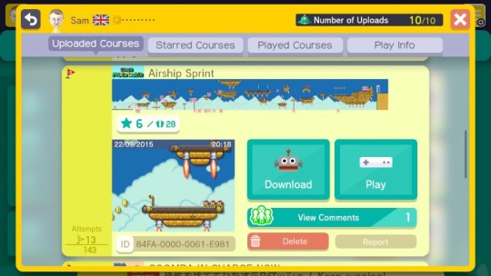
This is a bit meta, but you can see where players have died on your levels — albeit on a tiny graphic, and excluding any sub-levels your course may have. An in-course viewer for these kinds of detail would be great.
Miscellaneous
The UI that you manage, save and load your courses from is — of course — a giant robot. I don't have much to say about it other than the detail that it organises your courses into 'Worlds' of 4 courses — an organisational detail that is not seen anywhere else in the software. Hopefully it suggests that uses will be able to bundle their courses into sets in future updates.
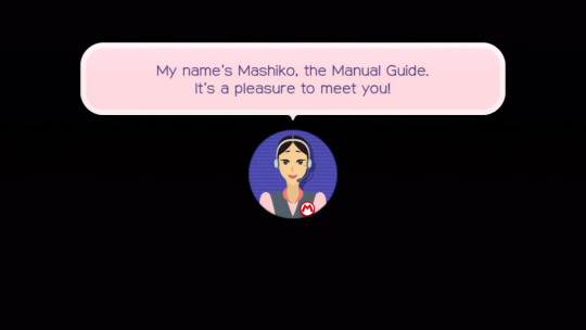
The digital manual bundled with Super Mario Maker is fun, helpful, and even contains some genuinely insightful advice from the developers on how to make some good courses. But it features this weird mascot character called Mashiko who looks like a call centre lady and seems a bit… I dunno. I don't like her. What you can’t see in the screenshot above is her mincing facial animation.
It's really striking how much more software Super Mario Maker is than any other Nintendo title recently released. Nothing says this more to me than the tiny X buttons found all over the windows in Super Mario Maker’s UI. It's interesting seeing Nintendo deal with this kind of UI complexity.
Pressing buttons that navigate around the main sections have a wonderful animation that makes the text jump up in a wave, synchronised to a musical scale. This kind of visual-auditory polish is really what I think of when I think of 'delightful' (barf) UI design, and I wish we could get away with it more on other platforms. I suspect we could if we exercised a little more restraint. Twitterrific on iOS is a good example of UI sounds done tastefully.
It might seem like I have a lot of gripes, but I honestly feels this is one of Nintendo’s best efforts in non-game software design. We can only hope Nintendo’s next console’s OS is half as good.
Now I’m off to make some more courses!
6 notes
·
View notes
Note
will we ever see the end of peaches?
Probably! A project like Peaches is never truly given up on, it’s just been at the bottom of the todo list for a while.
2 notes
·
View notes
Note
Is there a peaches forum? And if not, could there be? Translating shavian. 𐑐𐑰𐑗𐑧𐑟!!!!!
Cool! It’s worth the (small) effort — many clues will be laid bare to you, and you’ll have a whole new way to read and write. 😎
I’m afraid there’s no Peaches forum, and no plans to create one. Closest thing we’ve got is this here blog, and I think it’s enough for now given my sloowww pace with things.
1 note
·
View note
Photo
Fantastic.
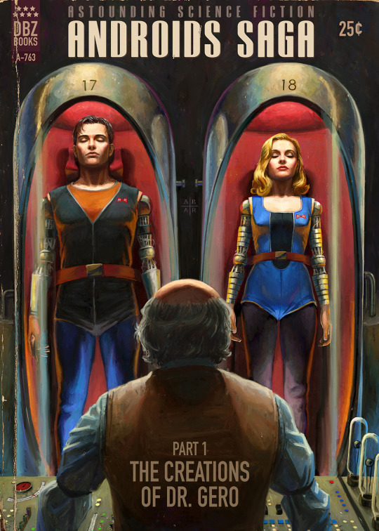
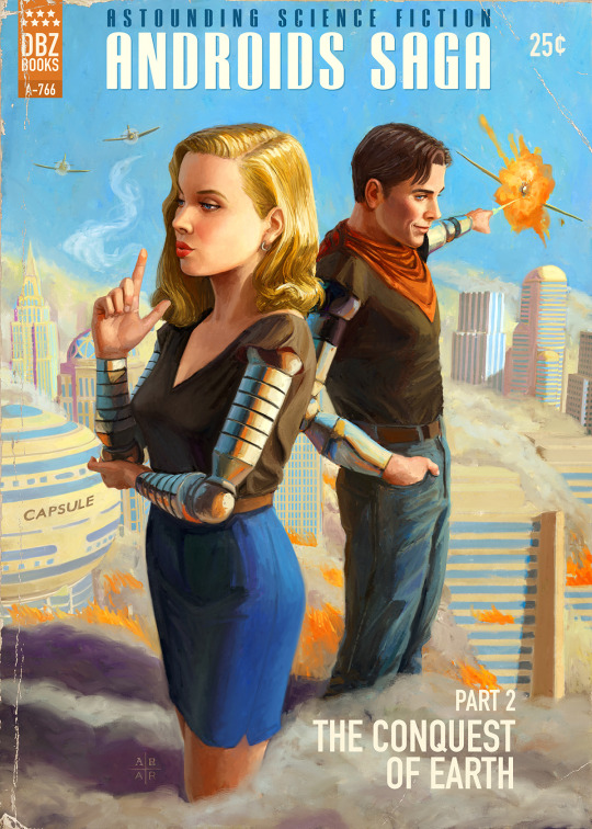
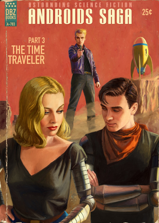
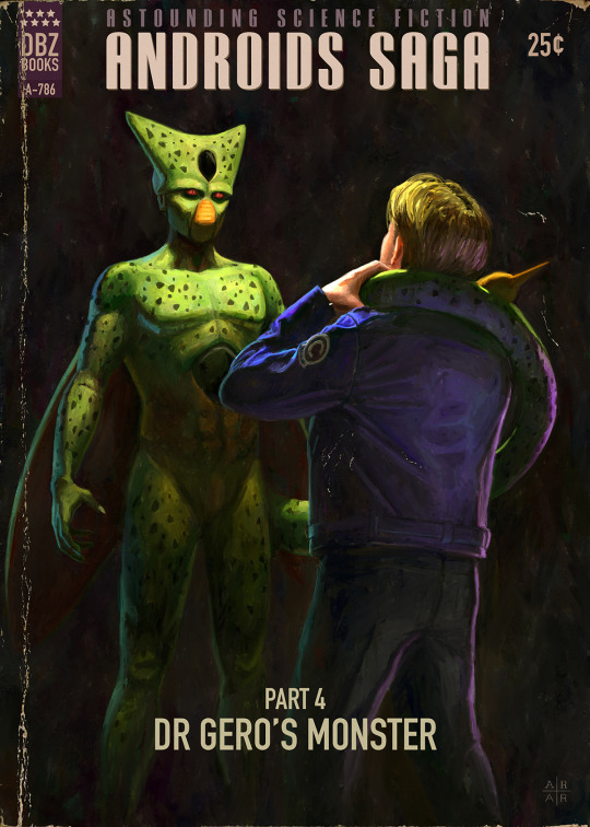
The Androids Saga: Dragonball Z Pulp Covers
Created by Ástor Alexander. Prints available for sale on Society6. You can also follow this artist on Tumblr and Twitter.
68K notes
·
View notes
Link
Yesterday I posted my first Comique developer diary, which explained what Comique’s highest priority is, and an idea for how to solve it without going completely mad. tl;dr: Comique needs to be available on all devices, but to make that work I need to bundle several different projects into just...
7 notes
·
View notes
Text
Comique Dev Diary 28/3
Lately Comique’s blog has been mostly posts about new comic releases (which is how it should be, imo). But I don’t want you to think I’m not working on new projects for Comique — in fact, it’s all I’m working on right now! But it’ll be a while before these efforts see the light of day, so I’d like to start sharing my progress — my unfinished, ugly, malleable progress — with you on this blog.
I’d like anyone who’s interested to be able to enjoy and understand these posts, so I’ve tried to write this in a way that requires as little knowledge about programming as possible (though there might be little nerdy notes here and there for those who are interested). Let me know how I fare.
Going beyond iOS
It’s clear Comique needs to expand beyond iOS if it’s to be a truly useful app for comic makers and readers. So what to do? Start working on the Android version, right?
… right?
When I started working on Comique a year ago, there was just the iOS app (written in Objective C, a language used exclusively for Apple’s platforms). But there also has to be a way to get comics on there, so I made a web app for comic makers too (written in Ruby, a popular language for web development). Finally there had to be a website for potential readers to browse the catalog (also written in Ruby), and for various reasons, that’s another website.
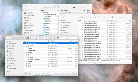
That’s already three different codebases, sharing very little code with each other. And keeping each codebase healthy and productive requires maintenance and care — otherwise it starts to become difficult to work with, like an unruly garden.
There’s just one person working on Comique (hello!), and I want using Comique apps to feel excellent. But I’m not sure I could do that if I added a fourth garden to take care of in the form of an Android app. Three feels like too much already, and I’m not able to hire any helping hands.
But if Comique is gonna be for realsies, as they say, it’s got to be everywhere.
Comique everywhere, but also in as few places as possible.
My plan is to work towards just having two codebases:
The native iOS app
A fully featured web app where:
Comic makers can make their comics, like on artists.comique.co
Comic readers using any device can browse, buy and read those comics.
That’s a lot of responsibility for an app. Tomorrow I’m going to post about how I’ve started building it, and what kind of progress I’ve made in the last few weeks. I’ll do my best to keep it interesting and get some videos of super ugly, in-progress features!
10 notes
·
View notes
Photo
I wish I could make this. But maybe you still can.
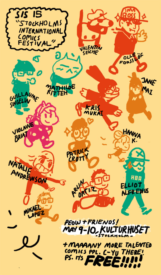
Oh! So.. We just wanted to share this quickly.Its.. all the people that will be sitting at our table at some point during Stockholms International Comic Festival. Its the same weekend as TCAF, but we are so so so luck and happy to have a great group coming over for the festival! airfortress, olleforsslof, blackyjunkgallery, catneep, krismukai, janemai, veesdumpingrounds, natalie-andrewson, boysfantasy, hannakdraws, arlinortiz, elliotalfredius, also mkllpz who writes great comics (including Nava!).
The festival usually waits kinda late until they drop their list of guests so we kinda just wanted to share a little!!!! We’re also excited because the decadence gang and CBSP gang is also coming over … so.. YAH! HIGH FIVE
218 notes
·
View notes
Photo
I’m pleased as punch about how Comique’s library is growing. And soon you won’t even need an iPhone to join in.

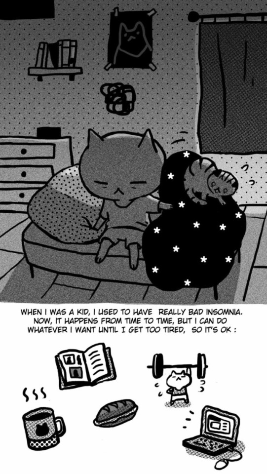
Kitteh, by Mathilde Kitteh:
Dis is Kitteh’s journal (1st entry).
I’m really proud to welcome Mathilde Kitteh (catneep) to Comique with her first comic, Kitteh, which is FREE! This is a beautiful, journal-style comic complete with Mathilde’s lovely, whimsical style. We’re pumped to have her on Comique.
Get it here — like I said, it’s free! Freeeeeeeee!!!
433 notes
·
View notes
Photo
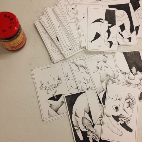
More snaps of an upcoming comic from kelseyborch — these little pages look so cute!
17 notes
·
View notes
Photo
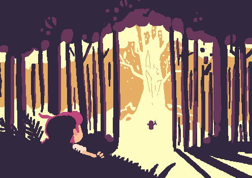
After a very long break, I've finally updated my comic, Peaches.
Like I said, it's been absolutely ages since I did anything for this comic (or any comics in general), so reading through it again I saw all kinds of things that made me ask "what on earth was I thinking?!"
I'm not sure this update answers that question.
12 notes
·
View notes
Photo

I've just released a new version of talking-text, a jQuery plugin that recreates that old school RPG dialog effect for the web.
What's new in this version? Sound. talking-text now makes sound as it types, converting characters to tones for a lo-fi Animal Crossing-esque effect.
There's a few other little features too, like callbacks and things, but even if you're not into programming, I'm hope you'll get a laugh out of the page I made for it.
Also it's released under the MIT license, so it's free for anyone to use and modify!
7 notes
·
View notes
