
Don't wanna be here? Send us removal request.
Statistics
We looked inside some of the posts by hamatim2 and here's what we found interesting.
Average Info
Notes Per Post
1
Likes Per Post
1
Reblog Per Post
0
Reply Per Post
0
Time Between Posts
15 days
Number of Posts By Type
Text
6
Last Seen Tumblr Blogs


Fun Fact
Kazakhstan’s Minister of Communications and Informatics has blocked the Tumblr site because it contained 60 sites of terrorism, extremism, and pornography in 2015.
Text

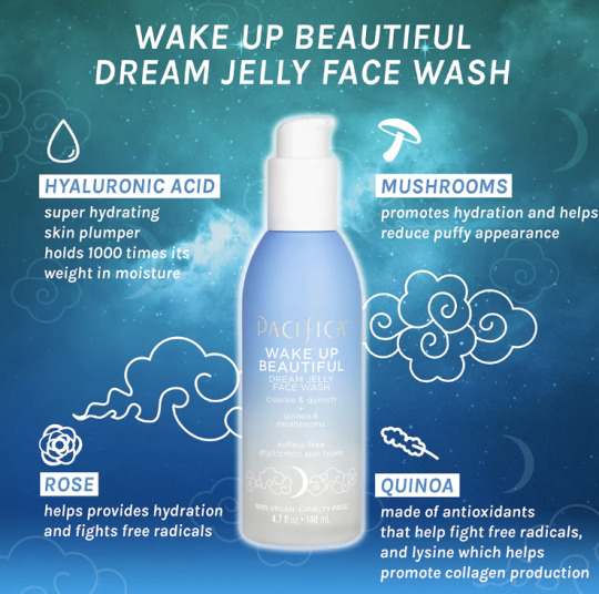
For the infographic the underlying agenda is this aspect of use of a "dreamy" aspect in the product. It makes it seem as though this product is what you will need to "wake up beautiful". It uses all these different ingredients that are deemed to be healthy although these are not the only ingredients within the product. Many brands similar will use graphics like this to promote a product to make people believe it is very healthy and the path to a good complexion. That being said many of these products have harsh or bad ingredients if you look closer on the ingredient list and not just on the graphic.
For the Meyers cleaning spray, it is no surprise that the graphics on the bottle are very visually appealing and a recognizable brand. Outside of that though no one would need to know the brand when seeing the shape of the bottle to know what it is. If you know this brand you know that all of the shapes of the bottles are very similar to one another along with the typefaces they use. They keep everything in a similar range so it is not trivial for a consumer walking down an isle to recognize this brand and remember they like it.
0 notes
Text
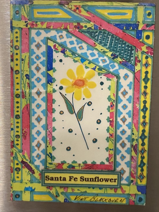
Complementary Colors: Santa Fe Sunflower magnet, featuring a vibrant array of colors that catch your eye against the hues of different blues and greens and yellows.
Analogous Colors: The Four agreements book with the colors blue orange, yellow, green and some hints of other shades and colors.The analogous colors create a cohesive and harmonious design, making it visually appealing and easy on the eyes for the reader.
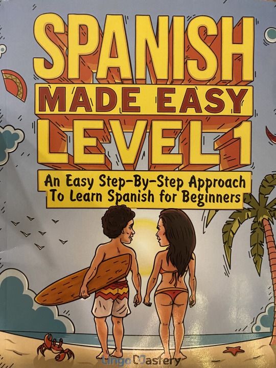
Cool colors : The Spanish learning book with the colors blue and yellow and some hints of other shades and colors. The cool colors convey a sense of calmness and tranquility, creating a serene and inviting atmosphere for the reader to want to engage with the material.
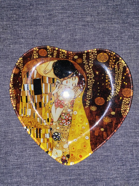
Warm Colors: A decorative plate inspired by the artwork of Gustav Klimt, featuring warm colors like gold, red, and orange. The warm colors evoke feelings of calmness, adding a sense of warmth to the surrounding space.
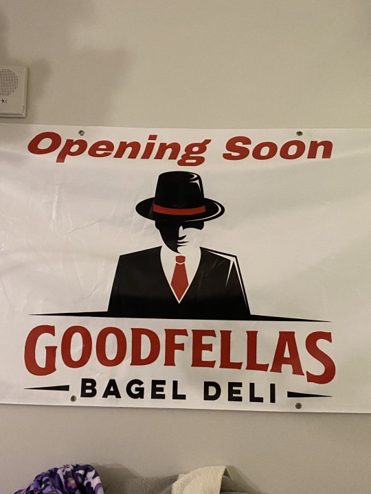
Communicate importance: A large sign for the grand opening of a restaurant called GoodFellas with bold, contrasting colors such as red and white and black. The high contrast and bold typography of the sign instantly grab attention of the viewer, signaling the significance of the event and inviting people to join.
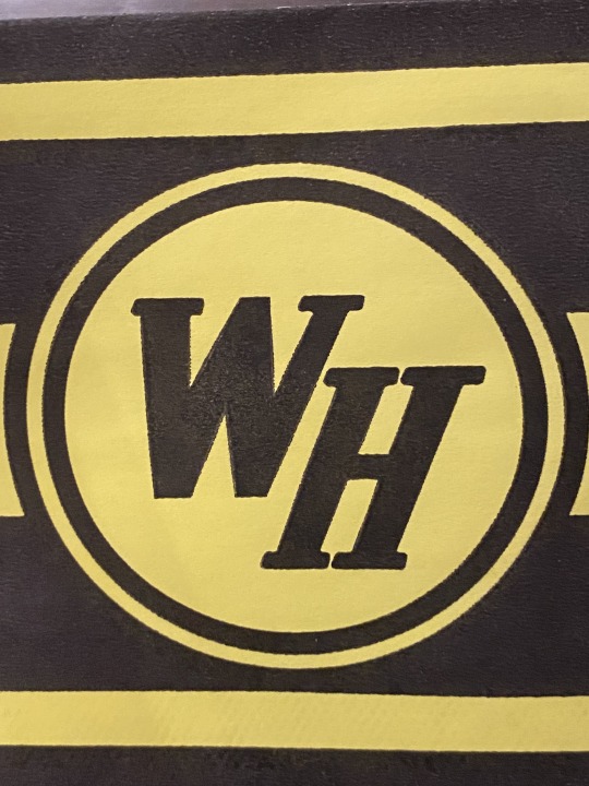
Gestalt: Waffle house Logo: with elements grouped together based on the principle of proximity, with the circle and lines all parallel with each other, even the letters stay "on the line" with the frame.
Active Figure: A magnet featuring an optical illusion design where the foreground and background appear to shift depending on the viewer's perspective. "Canta Y no llores" sing and dont cry in spanish, with playful designs to signify the meaning.
Historical Reference : The image of Handala a cartoon created as symbol of Palestinian resistance. Handala has become a significant symbol in not only the MENA region but also around the world as a symbol of Palestinian resistance against their occupiers.


0 notes
Text
DESK LAMP: A desk lamps functionality is designed to provide focused illumination for certain tasks such as reading or writing. Its denotative meaning lies in its practical purpose of lighting up a specific area for a certain reason.
DESK LAMP: Beyond the practical use for the dest lamp it can symbolize much more than that in certain occasions. It can signify (connate) focus, pondering and creativity. It could now even be compared to the pixar logo! A lamp connotes human reason, creation, and activity. A lamp lights up a space to promote thoughtful action from a human.
The virgin mary is a great example of an iconic function. People no matter religion recognize the Virgin Mary, who is a figure often found most in religious christian or catholic churches. She symbolizes motherhood, purity, and. the power of God. For believers she symbolizes hope and guidance.
This hydroflask has a clear indexical function with its and is connotated with hydration and keeping a beverage cold. When you see someone with a hydroflask it provides the notion that the person prioritizes their hydration The observer can make lots of conclusions seeing a hydroflask and understanding its indexed functionality.
The Kuffieyeh is an strong symbol in the middle east. It originated to protect the top of the head from the blazing heat and sun. The details of the scarf show a thick line which symbolizes the iconic trade routes, the fishnet pattern symbolizes the Levantine fishermen on the Mediterranean waters, and the olive branches are a symbol for resilience, strength, perseverance, and loyalty. Throughout time the Scarf became a symbol for Palestinian resilience and resistance in the face of their occupiers, working as a symbol of Palestinian identity and the struggle for self-determination.
This is a traditional hand crafted Arabic keepsake wooden box. These types of boxes and designs date back centuries. inspired by the rich artistic heritage of the region, each box carries with it a sense of history and tradition, representing the craftsmanship and cultural identity passed down through generations.


0 notes
Text


although very simple, this michigan state invitation is very rhythmic, the simplicity in the lines, the spacing in between columns, and the repeated font style is a great example.
Sugar Comes from arabic shows the typography heirarchy very well. This cover emphasizes the main aspects of the book Sugar and Arabic as that is what the idea of the book is derived from as well as the historical importance. Subheadings are smaller emphasizing the point of the author.
"Palestinian" written on the cover of palestinian costumes is a great example of letters with an ascender. The L, T, and even the I, all ascend further than the imaginary line of symmetry.
4. This book Aristotle on the motion of animals has a very visually attracting use of the descender typography using two different languages. I specifically enjoy that there is a symmetrically appealing font in english contrasted to the more smaller font chaotic look behind it. Descender typography shows in both languages in different forms.
5. The red dress project seen around campus, has many letters with a counter. The red really allows this to be strong.
6. This PEMEX logo does the cross bar but a little untraditionally which I appreciate. Rather than a crossbar at the top of the letter it continues using the E onto the next for an effect that is very easy on the eyes
7. the two kombuchas show different ranges of a large X height especially Agua De Kefir. You can see the large X heights on letters like L B D F H
8. these two sets of meaningful poems, have a perfect example of small X heights. The dip in measure is only slight.
9. This book Aristotles ethics cover title very much resembles the Bauhaus design. Characterized by the simplicity but most importantly the clean lines and symmetry . I like this Example because it still adds a creative touch to this simple symmetrical logo
10. This magnet conveys through the font that the wood was carved, this gives it a sense of person meaning and communal meaning in terms of the culture of Island life on Turks and Caicos.


0 notes
Text


Using different sizes and colors the mouth wash packaging helps to create a sense of hierarchy within the bottle, drawing the consumer's eye to certain things before others. Through varied scales, spacing, and fonts, it differentiates the different elements within the packaging, utilizing space and colors. To capture immediate attention “fresh breath” is seen in a big orange text box right in center, this is to catch the eye using something deemed as desirable. While secondary information like ingredients are seen smaller in other areas once the consumers attention is already obtained.
2. The flag of Montenegro made into this magnet was done with contrast specifically in mind. You can see this in the meticulous placement of the lettering in comparison to the crest in the center of the flag. Adjusting the spacing to create this simple balance that is appealing to the eye.
3. Taco Cat Goat Cheese Pizza, uses a simple yet effective form of contrast. With the lines symmetrically placed as well as the words, with the clean font, all letters are balanced and in line with each other.
4. The book does a great job of contrast and attracting the eye. With the traditional yogi inside what looks like an atom, illuminating from the center creates a gradient into a dark black color. The text use accentuates the space as well as the purpose of the book.
5. The body oil packaging uses contrast in the symmetry of the bottle. The space is efficiently used to create a chic and clean looking product. The varied scales, text sizes, spacing, and rotations (bumpy lines) , the overall packaging design becomes visually appealing.
0 notes
Text


1: Jimmy Johns Typography Graphic Design for their popular Kickin' Ranch. Uses colors to catch the eye without making it seem cluttered, does a great job of explaining the product in an appealing way.
2. Arabic/Spanish childrens book cover, Uses fun typography, colors, shapes, and images, to portray the point of the book in a fun way to grab the audiences attention.
3. Raos jar, uses bold typography, while making use of imagery in a way that conveys tradition within the product (using an old looking family owned italian restaurant). Keeps it simple, yet portrays the product well.
4. liquid death cans: Clearly the graphic design team took their job seriously with the liquid death graphic design on the cans. There is immense detail on the can from the different colors depending on flavor, the unique typography and imagery as well. They did a great job creating a visual for their brand.
5. Playing cards from budapest hungary, These cards are beautifully designed with graphics that resemble traditional hungarian print, each card is printed very unique as shown on the Ace. A mix of typography and print.
1 note
·
View note