
Don't wanna be here? Send us removal request.
Statistics
We looked inside some of the posts by hnd1areillyben-blog and here's what we found interesting.
Average Info
Notes Per Post
20
Likes Per Post
18
Reblog Per Post
2
Reply Per Post
0
Time Between Posts
13 days
Number of Posts By Type
Text
17
Last Seen Tumblr Blogs


Fun Fact
In 2020, 44% of users from Denmark used Tumblr daily.
Text
Structure Evaluation
This project heavily involves architecture, and the way in which I approached the project was in a minimalistic manner. Having both a higher vantage point and being the perfect distance away from the subject can often prove to be challenging, and through reconnaissance I was unable to find very many positions on the streets surrounding the building. Rather than changing my ideas, I instead chose to ensure that I had plenty of manoeuvrability within cropping the image so that I could correct the distortion in post-production. I attempted to minimise the amount of perspective distortion by trying to aim my lens to become level with my subject, and I think this went well due to the reduced amount of post processing / corrections.
For the interior shots of the building I had already envisioned what sort of images I wanted to acquire, and due to the building (the college) having a huge range of minimalistic angles and beautiful opportunities for light to find its way to illuminate the modernistic details, I was able to gather a great range of photographs. I chose a day where the weather was clear skies with intermittent cloud cover, and the time of day ranged from 11am to 1pm. The reason why I chose this time of day was so that I could have the light overhead at noon. One of my shots was of the roof windows of the college, with the light shining through casting a shadow of the frames onto the wooden details. With the sun shining through at this specific angle, I was able to capture the shadows slightly adjacent to the angle of the wooden boards. Another reason why I chose this time frame to shoot was so that I could capture images of the exterior of the building where the sunlight illuminated the front and sides of the building.
The second interior I captured was an angular shot facing upwards towards where the ceiling and wall of the entranceway meet one another, combined with the glowing purple neon sign that brings alive the distinct purple hue that is associated with the college. After shooting this image, I had the idea to create the canvas with some of the images being the same hue of purple, which would further create a similar feeing across the array of images. One of the images required was to be a full shot of the whole exterior of my chosen building. Granted, I followed the brief and captured a full shot in which I corrected the perspective, yet in the end for my printed canvas I chose a cropped version of the front facing exterior at a different angle as it suited the canvas a lot better.
Overall the project went quite well, and I thoroughly enjoyed shooting the architecture, yet if I was to combat this project once more I would attempt to capture a more effective full building shot so that I could complete the canvas according to the brief.
1 note
·
View note
Text
Structure: An Architecture Brief
Another side project due for Portfolio 3. This time the main focus is architecture and it is proposed to challenge us to create an ensemble of images showcasing exterior and interior shots of modern architecture. I have chosen images that realistically display modern buildings found in Glasgow, due to the fact that i know Glasgow very well and it is the only major city of modern influence nearby.

This image seems to be of a wide angle but cropped down, which in terms of cropping factors, makes the building itself appear larger and a lot more intimidating. With this wide angle view, there is the fact of distortion that, again, plays in the buildings favour: bringing to the frame, an additional sense of the building being taller than it realistically is. The photo has been shot at what seems to be the golden hour of sunset, judging by the bright blue sky, and soft orange glow upon the tallest stories of other buildings in the reflection of the main focus. This orange glow works perfectly with the artificial orange cast lights in the bottom right corner, creating a continuously linking photograph.
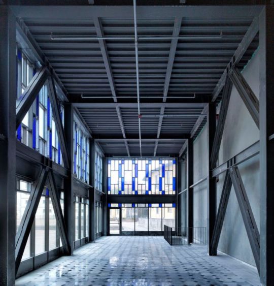
This photograph seems to be shot with a telephoto lens due to the lack of distortion, straight leading lines and a very compressed looking view point. The use of utilising the leading lines within this tall glass-clad corridor, has worked well in the photographer’s favour. The amount of light that floods the room isn't too over bearing, yet it is enough for the room to feel clinical and minimalistic: due to the sensible use of light in this image, and by utilising a time of day in which the sun is not too strong, and is at a position in the sky through the clouds that perfectly shines through the glass, the image is of a strong candidate for a very powerful architectural image.
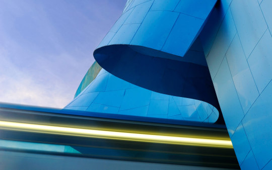
The colours in this photograph are what seem to be the main focal point upon first glance. The wonderful blue sky with an additional form of wispy sirrus clouds, helps to paint a soft and cotton-like background. This is especially important as it doesn't distract the viewer from the rest of the photograph with the strong contrast, and instead sets up the form of the building and other vibrant colours with a fading cloud cover. The angles, curves and the strong beam of eye catching light that belongs to the building itself are very sharp and clean, which with direct sunlight, has emphasised the strong modern colour scheme. The materials the building is made of are very reflective looking, so the photographer has had to take extra care in planning this shot. Ensuring that the sun does not create a glare, yet lights up the composition perfectly.

Again, another use of leading lines, alike the corridor shot from before except this time the photographer has used a wide angle lens instead of a telephoto. The reasoning behind this is to show this walkway in a view in which it appears a lot longer than it really is. This adds a new sense of depth where the viewer can become entranced with looking down the centre of the image (almost like the hyperspace jump effect from Starwars). The time of day in which the photograph has been taking almost appears to be a little past or before midday; depending on the positioning of the building. The reason why this is noticeable, is the shadow of the wall, and the slight offset of shadowing from the pillars and exposed beams towards the right. This is effective at creating more leading lines for the viewer to follow.
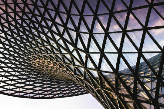
Last but certainly not least is this image of a building curved in stature, with geometric triangular frames on top of the glass of the building. This seems to be shot just before the golden hour of sunset, with the reflection of the sun not being too strong upon the frame, and the beautiful blue to purple gradient in the sky towards the top of the image. The curved and angular architecture of the building meet in the centre where the distortion of the change in direction comes into play. In terms of commercial uses, this photograph may not serve a purpose for promoting the building formally, but when used for creative promotions, this image successfully highlights the selling point of this fine piece of modern architecture.
0 notes
Text
Illuminate. . . research
A small side project for portfolio 3 - The basis of the project involves night time, ambient light and artificial light. There are many approaches to this sort of photography. Some photographers would take on the project in a minimalistic contemporary fashion, others in a more ‘Tableau Vivant’ (living picture) style, or perhaps a more colourful and gaudy scenario. I have researched 5 different images from photographers either credited or unknown - but I have focused on their approach, and the feelings that come with each image.
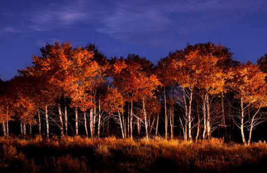
Dave Black - Evening Aspens:
“15 Minutes after sunset there was a little bit of ambient light. I stood on the right outside of the frame”.
This quote from the photographer has highlighted the two most important facts for the project we will be doing: Illuminate. At dusk there is a window of light, one where the surroundings are dark yet the sky is a deep lilac blue colour, or depending how lucky, a nice warm orange coloured sky. In this image the photographer has brilliantly used the orange tones of the aspen leaves and the grass to compliment the blue sky above. By shining the trees from outside the frame at the right, the light has added texture to the leaves rather than shining from face on and giving it a flat appearance.

Unknown photographer (alike the first image except slightly different)
Unlike the photograph of the aspens from before, this photograph has been shot with the same technique but under a different set of circumstances. Where The first photographer shot exactly during the peak time of dusk to create the image, this photographer has shot at night time on purpose to create a similar effect. What you can’t see very clearly, is that the sky is lit with stars. Despite there being a lack of colour which is sometimes unattractive, the stars in the night sky help to differentiate it from the other photograph. The photographer has shot upwards to the trees, and has shone a light slightly ajar to the angle of the shot to add some perspective and depth to the leaves. Through directing the light in this manner, there is a huge array of detail within the depths of the foliage which helps to create an impactful photograph.
John Meloy - (Painting with one light) tutorial
This photograph is a little different to the others as this one is a Composite image. The photographer has shot a long exposure as usual for the background and for the base of the subject. As the subject has a lot of difficult angles the photographer has painted with the light to cover the whole basis, and has then used post processing to stitch them together. It has resulted in there being a colourful sky, and the perfect amount of soft external light creating an aura of light around the subject. The direction of the light in this image hasn’t been made as clear as the other examples because it is a composite of many different directions and applications of light. As a result of this digital stitching from many directions and intensities of light, the photographer has created a final image that lives up to the title of painting with light.

Unknown photographer (Found on a forum a while back)
In his image there is a lot going on in terms of light. The photographer is using the same prime time dusk coloured sky, and is using a very sharp external light to turn his image from a silhouette into a scene of light. The photographer as shot from a low angle shooting upwards towards the subject with the sky in the background. This has created an effect which attracts your eye more sternly towards the subject that is lit up. By applying the light in a sharp fashion, it emphasises the shape and form of the subject. The light itself has been applied from the right side of the composition, creating a shadow on the object where it compliments the highlights: as a result, the image has gained a sense of form and thus doesn’t look flat an unappealing.
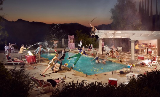
Ryan Schude - Tableau Vivant technique
This is a very unique use of external light; Tableau Vivant is the French for Living picture, which is a style of photography made popular by the likes of Gregory Crewdson and Ryan Schude. Schude, Los Angeles based photographer and Crewdson, have both adopted a cinematic style of photography. Filling a scene with actors / actresses with specific roles to be played in synchronisation to the photograph, using purposely placed lighting that at the exact moment the photograph is taken it will fulfill its purpose, and by shooting the image at the exact point in time of day where the sky is the perfect colour... With every part of the scene meticulously planned out like a film scene, the photographer is able to create an image that is so successful in every way. Each light has been directed in a specific way to make sure that every subject that requires the attention of the human eye has the perfect balance of exposure, intensity and this helps back up the story of the image.
1 note
·
View note
Text
Move it - Final film (Alone time)
vimeo
Shot on Canon 7d + 24-105 f4 / Edited with Adobe Premiere Pro (custom colour graded)
I thoroughly enjoyed shooting this short film and post processing through Premier Pro. The story itself was different to my original idea, which unfortunately fell apart. This was my plan B, yet I actually feel more pleased with the final edit than I think I would have done with the original idea. I haven't had much experience with filming, other than for weddings and commercially, but with using this slight experience in combination with my love of movies, I was able to create something of a short film.
The song I used in the background is ‘Charlie Countryman’ from the motion picture soundtrack of ‘The Necessary death of Charlie Countryman’ which was beautifully composed by Christophe Beck.
I have loved shooting in this format of film making, I plan to shoot more personal short projects in the coming months to experiment with stylisation and techniques
1 note
·
View note
Text
Personal Reflection/Evaluation
BLOCK 1 - - -

Clean white project :
In starting the year, this as the first major project set in the studio, where it involved us having to research various studio lit portraits that reflected the brief.
It was a challenge figuring out how the lights interacted with the background and the camera, how to create a clean white background whilst also setting the camera at the right settings.
After getting to grips with the lights, it became enjoyable to try and replicate the research image by controlling the light with various attachments and such.

Seeing the light :
A series of four portraits shot in broad daylight, in essence capturing different qualities of light and applying the light to people of different genders and ages.
I really enjoyed this project, which I believe was very underappreciated, because at the time I was a little bit under confident with speaking to people. Due to my work title, and by having to approach strangers to photograph in this project, it really boosted my confidence which is always a plus!

Who Am I? :
The personal project for things that describe who we are. The goal was to create a canvas with 3 images in the form of a triptych.
One image being a self portrait, another being a location that means something to us or has a special place in our hearts, and an object that holds personal significance.
I loved this project as it allowed me to be creative and express my passions through photography in the same way I imagine my passions in my own head.
OVERALL ****
The first block was very insightful due to learning my own way on how to research for projects and various reports. Learning some new techniques was also very helpful, and learning how to process / develop / print through the film medium was an incredible journey. I settled in nicely with the class, the lecturers and the workflow, which would continue to be true all the way through.
BLOCK 2 - - -

Catch me if you can :
Originally meant for block 1, but recommended to be submitted by block 2, Catch me if you can, was a sports based project where I would shoot an array of photographs of a live (ticketed) sports event.
The shoot itself went incredibly well, couldn't be more pleased with the results in terms of photographs... in other aspects, the project almost failed very badly.
To describe where I went wrong, I must express my brief moment of stupidity during a morning where I was changing the battery in my Canon DSLR... in the battery compartment, there lies the significantly smaller battery that keeps things like user settings, date/time and things like that saved to the camera so that its the correct date and time and things like that. I stupidly took it out by mistake and placed it back in (not knowing the consequences) I then set the time and didn't have time to set the date properly, making it obviously incorrect.
After shooting it appeared to be that the event was shot before the brief, but after an explanation of my errors, it was soon overlooked and became okay again.
Gift :
The second major project shot in the studio, we were given an object by our lecturer and told to create a still life image within, showing off the image in an abstract manner
in my case I was gifted a razor, with a strange two toned rubberised, plastic ribbed texture. placing it on warped reflective sheet of thick Perspex plastic.
By using a modelling lamp with blue gel in the background and a set of barn doors to the right side of the set, I was able to capture a silhouette of the objects form, and also light up some detail.
the blue background that appeared like harsh waves with highlights, makes the image feel cold, and when combined with the look of the object and its reflections, results in a harrowing still life.
I really enjoyed this project as it further allowed me to become creative with the studio.

Recycle :
The basis of this project was to shoot a still life in the studio of something that was used, or old.
I have always loved the look of old style renaissance art paintings from the 17th century and roundabout that era of time, I wanted to recreate that sort of image, with the same lighting which would then produce the same emotional response to viewers.
I got to learn different attachments for the lights and their purposes, for how to effectively light the still life. By using a soft box to emulate a natural warm summers afternoon light sweeping in from the right side, a snoot attachment for an overhead light to light up the details in the wicker basket, book and coins, and finally a barn doors to bring out little details in the background.
If I was to shoot this project again I would have brought the still life further forwards away from the background to allow for better background lighting, but in terms of the style I was going for, the end result was very effective.

Movie poster :
I absolutely loved this project, shooting the segments of the poster separately, editing (especially editing).
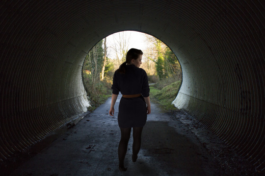
I chose to shoot through a tunnel, which was full front lit by natural light, and where the other end of the tunnel leaked in a lot of light too.
I then replicated the direction of the light in the studio with shooting a full body portrait of my model (which was, granted, a challenge and also recommended not to do by the lecturers), but in the end it worked out very well.
I stitched the model into the background, and spent some time one night learning how to create realistic fog through photoshop, and adding in small details that made the image look very ominous.
I added text in for the movie title and other miscellaneous actors and date of release. For the main title I chose a base font and applied a slight gradient from grey to white, then by using the smudge tool I was able to distort the text and allow it to fade slightly, and also smudged the other fonts to make them appear unique and more personalised for the genre.
Unseen and move it :
Move it, the short film project, has went very well so far and should be on time for the block 2 deadline, I really enjoyed shooting the film and researching techniques and ideas. I believe that my video skills aren't the greatest and do need some work, but I still enjoyed the project none the less!
Unseen.... I am absolutely loving the creative scope with this specialised photography. I have always been interested in surreal photography, using the infrared spectrum of light, and after shooting with converted cameras, I feel like I have finally found a very keen interest in the specialised world of photography. I think I might pursue infrared photography for my personal project.
Live project :
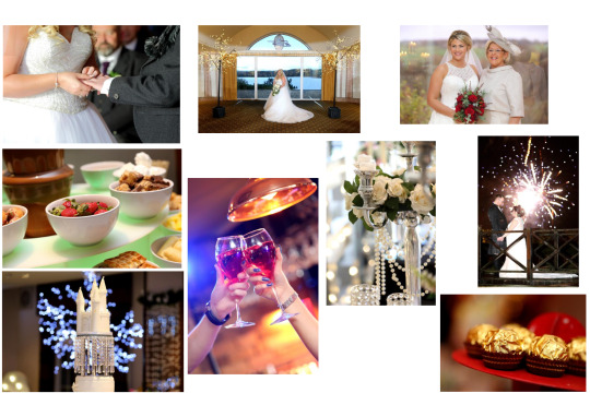
I work part time at the weekends as a wedding photographer / studio assistant for commercial, wedding and various events. For the live project I was able to use images I had shot for clientele work to become my submission for Live.
I absolutely love the experience of this sort of photography - photography part aside, I just love being a part of someone's most memorable day, and capturing the journey for them to look back upon and relive their wedding combined with my love for photography allows me to use my photographic skills to not only create wonderful images, but also apply them skills to my job.
I feel like the course and my job go hand in hand, learning so much about photography over the past year through both the course and my job, has made me incredibly confident in shooting lots of different subjects, and has fueled my passion and drive for photography.
1 note
·
View note
Text
Movie Background... so far

After looking through multiple location shots, I have came to the conclusion of using this landscape oriented view from the exit of an abandoned railway system - turned cycle path...

The reason why this portrait of my model has been shot without a purely white background in this image was to control the exposure. I have shot in multiple exposure settings and various lighting set ups so that I can choose between them.
this is just an idea of the sort of image I may end up with - THIS IS NOT THE FINAL IMAGE - the portrait needs to be refined a lot cleaner, perfectly.
For the mean time this is close to a final draft.
1 note
·
View note
Text
An update to the movie poster. . .

After a while of researching ideas, and compiling a plethora of failed background images, I came to the conclusion that changing from a double exposure idea would suit my genre and style a lot more effectively.
The idea for a Tunnel-like movie background came to me after going on a walk one day, a walk through an abandoned railway tunnel system. I came to the conclusion of somehow incorporating this creative idealism into my background whilst still adhearing to my original Neo-Noir / Thriller movie.
The colours of the poster should be very dark and undistracting, leaving the viewer to understand the feelings behind the poster and the intended genre.
0 notes
Text
Contact Sheet for Final “Gift” image. . .


Before choosing my finalised image, I have arranged a folder of my final shoot for the project.
At this time, my pathway for creating a contact sheet is not working so I have had to just take screenshots so I can look over them as a whole. I will need to look over them further in more detail in order to choose my final image.
1 note
·
View note
Text
Short film ideas. . .
Alcohol Advertisement :
https://www.youtube.com/watch?v=58lCTpyevVQ&list=PLHZonTbPOTeNY-Xq7cdOXR_BCekbujgLu&index=12
“Two Wrongs” - Simon Cade (CadeVisuals / DSLRGuide) :
https://www.youtube.com/watch?v=d56WjqYnCc4&list=PLHZonTbPOTeNY-Xq7cdOXR_BCekbujgLu&index=13
View - Leave a comment (short film) :
https://www.youtube.com/watch?v=nnK-RHLszHI&t=152s&list=PLHZonTbPOTeNY-Xq7cdOXR_BCekbujgLu&index=14
PICTURE DAY :
https://www.youtube.com/watch?v=7tronhPRNM0&list=PLHZonTbPOTeNY-Xq7cdOXR_BCekbujgLu&index=15
IMAGINE :
https://www.youtube.com/watch?v=4gVcI_0T5l4&t=64s&list=PLHZonTbPOTeNY-Xq7cdOXR_BCekbujgLu&index=16
I have an idea for my short movie, involving ICE SKATING. . . Perhaps a story of ice skating for the first time again? or a person once in love with the art of figure skating - on the ice again. (shots of the skates, preparation, hesitation, movement.)
to be a silent film? with maybe a track of music dubbed over the video
“Tonya Harding (D Major)”
https://www.youtube.com/watch?v=PUvVjWR3zTQ&list=PLHZonTbPOTeNY-Xq7cdOXR_BCekbujgLu&index=18
6 notes
·
View notes
Text
Almost Nothing... Research
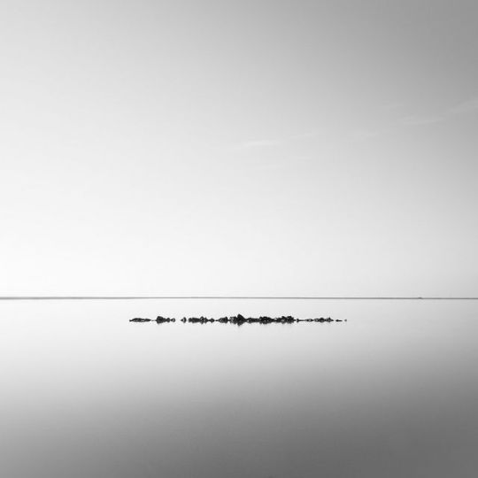
In this image, it is apparent that there is quite literally “Almost Nothing”. It is unusual for an image with a top heavy composition (an abundance of sky visible) to be considered technically powerful, but for a lot of techniques and styles of photography, it adds a new perspective. For example, in this image the points of interest are the rock formation in the centre, and the horizon line that lies behind. This incredibly simplistic image is of the sorts that I would like to base my project on.

This image is almost a blank canvas with the exception for the two birds perched atop a building’s edge in the bottom left corner of the image. I really like the abstract concept of this photograph because it moves every distraction from the composition. All that is left in the image is all that the photographer wants to convey. I want to reproduce the ideas of this image, with concentrating on only one subject and removing focus from anything else.

Leading lines. An upwards perspective. Reflections. The sudden angles of this image create this incredible canvas of minimalism, Within this already powerfully composed image, the combined contrast has helped to create this thought provoking photograph. Just by looking up you can see a new perspective that is unusual and interesting to the human eye. I want to further convey this idea in my next project.
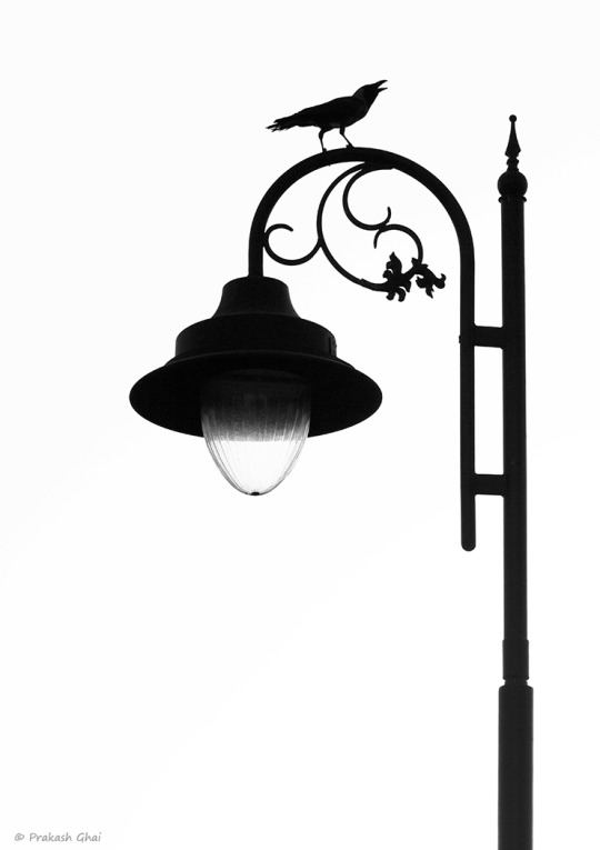
A silhouette of something so elegant and detailed can have such a symbolic and powerful meaning when contrasted with a clean white background. Being isolated from any other distractions can make what would be a rather busy image, into one of instant attraction. I would like to use this philosophy and try to create an image along the same lines, ones with impact.
1 note
·
View note
Text
Film Genre : Neo-Noir / thriller / fantasy...
The idea of a double exposure ties in nicely with the setting of emotions, and centralises the story upon perhaps the development of a character or the themes within. My chosen genre of movies are the alternatively stylised films that leave you with questions requiring an answer, or are so worth watching that they result in you feeling more fulfilled.
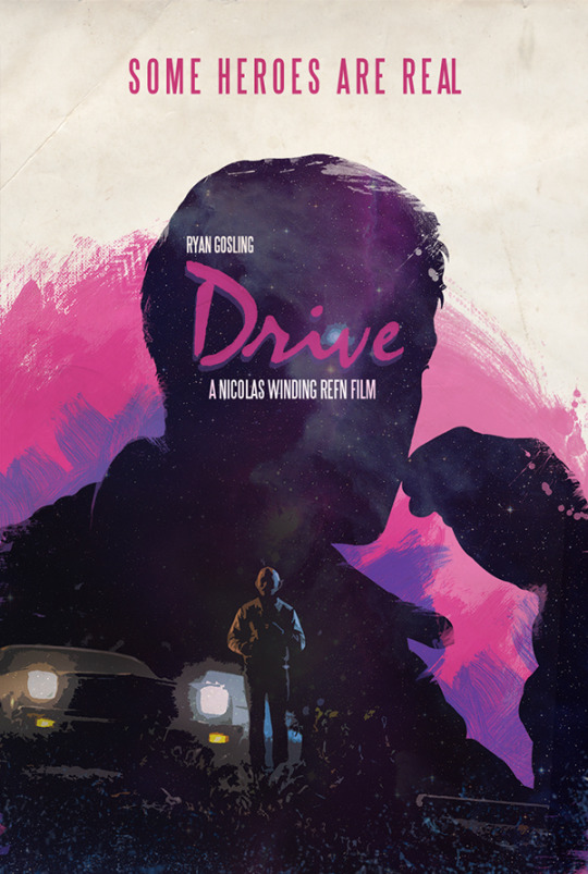
For example, "Drive" is one of my favourite movies, simply because it does not rely on the overuse of dialogue in every scene but instead highlights every scene with creative compositions and colours which places the viewer on a constant state of intrigue and awe. (similar to 'Bladerunner' and the newly released 'Bladerunner 2049')
I want to shoot a background that is incredibly detailed, and brimming with hints towards the story. A very angular and focused scenario would tie in perfectly to compliment the neo-noir film style, as it would be in contrast to the rather shaped portrait(s) that I will shoot closer to the time.
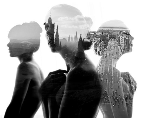
I am considering layering more than one portrait in the same 'clean white' image, and then creating multiple double exposures within the one canvas. Doing this can allow me to include the background in two or more different perceptions..

FILM NOIR = NEO NOIR SETTING.... In the 40s, film noir was considered to have a thriller plot, with long coats and to evoke a very secretive atmosphere, little amounts of dialogue and lots of eye catching elements that made cinema interesting and thought provoking. This is the sort of film genre that I find the most intriguing, yet a modern take on the beginnings of cinema has created Neo-Noir, a genre in which the principles of creating a successful movie remain the same, but adapt to modern media.
1 note
·
View note
Text
Portfolio 1 - Final prints..

Notes on Portfolio:
With the exception of the ‘Catch Me if you can’ canvas, all have been submitted for evaluation. (will be submitted for portfolio 2)
For ‘Clean white‘ I have submitted two variations, the one on the right emulating the original inspiration more accurately.
1 note
·
View note
Text
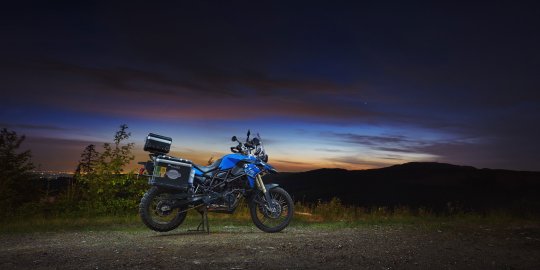
Catch Me If You Can - Research
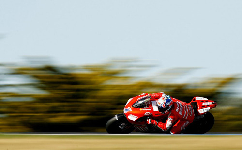
The technique used in this photograph is called ‘Panning’ and is widely popular within the sports photography community. The way to achieve this incredibly eye catching style is to track the focus of the moving subject with the camera and - at the same speed of the subject - follow it up until the desired spot and take the photograph. By using a shutter speed of around 1/30th through to 1/60th, the camera has the ability to capture the detail of the subject whilst blurring the background in the direction followed.

By using a telephoto lens, photographers are able to capture close ups of subjects. In racing photography this can be useful as it creates a perspective that focuses entirely on the desirable. In this image, the motorbike and rider are both unobstructed, meaning that the viewer is able to view the entire picture without any further distractions. I plan to use this to my advantage in this project as, when combined with other techniques it can create some interesting outcomes.

Whilst looking oddly similar to the ‘panning’ shot from earlier, the photographer has combined a longer exposure which has created an image that includes trails of light leading inwards towards the frozen subject. Looking at this image is incredibly satisfying as there is so much vibrancy in the focal point yet I believe that this technique would be more successful at night time so that the lights on the moving subject continue to create the added impact of leading lines.

This is an example of using a wide focal length, but at the very extreme. The reason why this technique is such a hit or a miss is because with such a wide scope, the viewer often misses the focal point and instead begins to wander off and notice other things. If the technique is executed properly, the end result can be equally as desirable when in comparison to any other image. I plan to maybe use wide angles for my project, but maybe not as wide, depending on the subjects and conditions.

Frozen movement. With a fast enough shutter speed, achieving a creative photograph that stands unique from any other, can be difficult, but when given the opportunity to capture something in a frozen state that usually wouldn't be seen with the naked eye... That's when a photograph can turn something of a concept into visual eye candy for anyone to gaze upon. Capturing the wheel spin and the smoke from a car during a race can turn a hazy obstructed mistake into a dramatically detailed display of perfection.
1 note
·
View note
Text
First Contact Sheet.

Spending a morning in the dark room, after having developed a roll of film for “clean white”, I have created my first contact sheet.
0 notes
Text
Significant...

14th June 2015 - The first photograph I had taken solely out of interest in photography as a way to express my ideas and feelings. Not the first photo I had taken, but the first meaningful one.
I first became interested in the idea of photography from the techniques using slow shutter speeds. A few years ago I never knew the name of the technique, nor how you could achieve it. I just called it a “silky blur”
Growing up, my uncle had been the designated photo-taker, memory-catcher. And that really inspired me to start picking up a camera and capturing them too. Looking through photo albums and seeing old memories printed before my eyes sparked this dream of mine to capture the memories of everybody around me.
Upon first researching slow shutter speeds, I was so amazed at the variety of techniques in photography, and I started to slowly build up a reputation with my art teachers at school for showing a passion and skill at that young age. I was offered to do the higher photography course a year early, which would then prepare me for college and provide me with a substantial job working with a photography business
0 notes
Text
Clean White Test Run

These photographs are two of the many which are the result of a test run for the clean white test run today. In many ways I can improve the studio set up in our final run, to ensure that the photos look exactly the way I want them to.
In this case, I want to create a much softer gradient of light on the left side of the subject, whilst retaining a harsh shadow on the right (See bottom picture).
Another idea for conveying my idea, is by using a beauty dish to create a very impactful image.
2 notes
·
View notes
Text
Clean White - Research
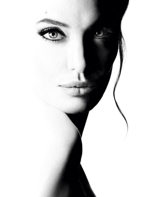
This image of Angelina Jolie is an example of high key black and white studio portraits. The harsh shadows down the diagonal line in the centre against the clean white background create this incredibly detailed composition. The right eye (on the left side of the image) is an attractive focal point which I think creates this dramatic effect.

This image has almost entirely muted tones with the exception of the eye. There is a fade from the white background and the white fur-like head dress on the subject, which emphasises this soft atmosphere. The eye is highlighted within a striking black outline which draws your eyes deeper in the image, where you start to notice the slight smile and thus creating an emotion within.

Straight away upon first glance, you can just feel the intensity of the model’s stare. An effective yet simple portrait, that delivers so much ferocity with only the eyes. The clothing that the model wears, are coloured black which add to the contrast of the black and white. Overall I think this image perfectly conveys my interpretation of “Clean White”, the raw emotion is something I would love to capture in my own project.

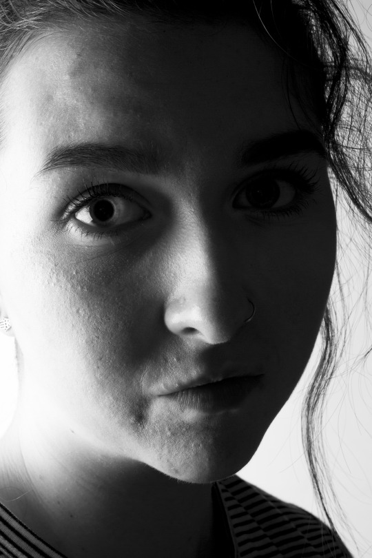
Again, another example of capturing the emotion of a subject. The difference between this rendition and others, is the position of the facial features. The mouth slightly opened bearing hints of teeth, arguably to some people a very personal aspect of themselves. This image feels like it connects on a very personal level, perhaps the exact emotion the photographer attempted to convey, something of which I would like to try and do in my work.

The final image addresses a level of humour often lacking in clean white portraits, an unconventional yet effective portrait. the direct eye contact with the infant makes this image so much more powerful, as in this moment the child has taken a moment from being distracted and the photographer has ended up with this incredibly creative image. Despite not having access to a baby - nor headphones in this design - I would like to enrich my project with humour too.
2 notes
·
View notes