Collection of fanfic typesets. Fantypesetting? Who knows. See this post to know more.
Don't wanna be here? Send us removal request.
Statistics
We looked inside some of the posts by in-collection and here's what we found interesting.
Average Info
Notes Per Post
183
Likes Per Post
135
Reblog Per Post
48
Reply Per Post
0
Time Between Posts
23 days
Number of Posts By Type
Text
17
Last Seen Tumblr Blogs


Fun Fact
Tumblr’s website traffic is steadily declining.
Text
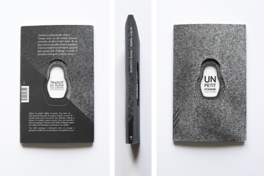


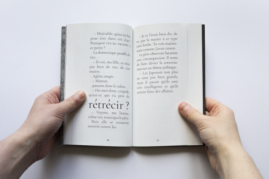

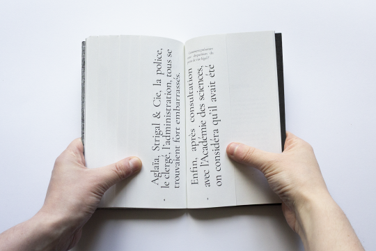


Un petit homme (A Little Man)
a short story written by Fyodor Sologub in 1907, translated in French by Christine Zeytounian-Beloüs and published in 2021 by Tendance Négative.
I haven't talked about Tendance Négative yet on this blog. It's a French publishing house run by 6 volunteers, with a main collection consisting of classic texts re-edited with a brand new (and unique) page layout, always meant to embellish the story, of course. The book design is by Clément Buée.
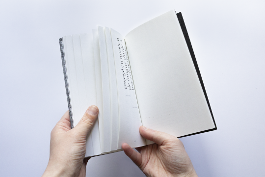
Here, A Little Man is the tale of a man feeling emasculated by the size of his wife, until he one day finds a way to make her smaller and smaller... and in turn the pages get smaller and smaller. The size of the type also follows this pattern.
Overall, this was a short read. The story is very bleak but the design makes it a fun read. The book is also pretty cheap. Yes sorry it's in French not English but look at this book design.
4 notes
·
View notes
Text
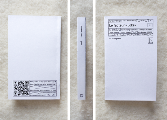
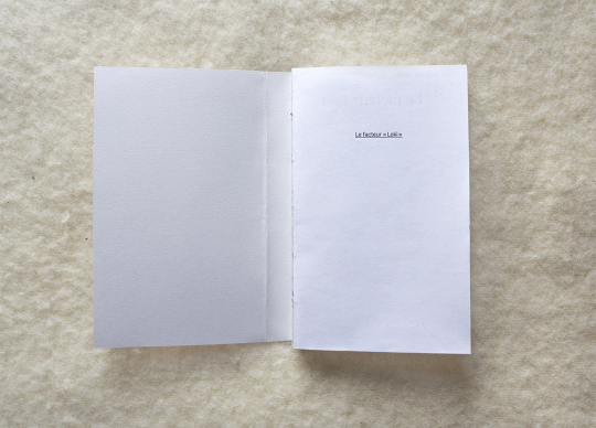
Le facteur « Loki » by @hito76
Stargate SG-1 (1997-2007) | Sam Carter/Jack O'Neill | 27,950 words | 256 pages

You can see the full typeset HERE.
You can also print it if you want a copy for yourself, I provide printable files below. The book is 11x18cm AKA 4,3"x7,1" & is bound with a coptic stitch. Mine's printed on 80gsm grey recycled paper & 210gsm grey paper for the cover.
DOWNLOAD THE FILES / PRINTING & BINDING GUIDE
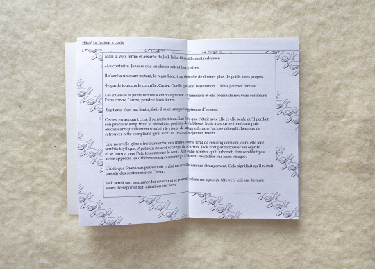
This typeset breaks quite a few rules. First, it's a fic in French, and second it's not hosted on AO3, so I had to adapt the cover a little bit as best as I could. I don't intend to make this a habit, but this fic is quite special to me. Without getting too much into because it's very personal, it is one of the fics that introduced me to the world of fandoms, and I just had to typeset it.
What I tried to make is something less based on the text and more based on my memories of my first read-through. Those memories are fairly old and, I'm sure, very skewed by time and by my own feelings about the fic. They evoke mostly nostalgia and wonder at the fic and absurdity and annoyance at how inconvenient it was to read it. I invite you to click to link at the top to take a look at what it still looks like. That's a look people who where on Internet at the time (2007-8) will be quite familiar with: rough, clunky and blocky, full of awkward compositions and bright colors.
I tried to have all of that in the typeset. Surreal beauty, because this fic was nothing short of a miracle for me, mixed with weird clunkiness and inconvenient things, like the absence of folio (page number) which is really annoying but that was very much the way things were. The only clue you had as to where you were in the fic was how deep you were in the webpage. Good luck closing the tab and then finding where you left off lol.
Another example, I quite liked how at the time scene breaks were sometimes written with the pairing's initials - meaning JSJSJSJS. So 2010s.
Of course, there is also the text laid out on the full spread. Inconvenient? Hard to get printed? In bad taste? All of those, but that's kind of the point too. Stupid and beautiful. I hope I captured some of that.
This is also my biggest typeset so far. Nearly 2cm thick! It sure makes for such a satisfying book to hold!
One final note. I am not sure about the word count, actually. I usually take the count provided by AO3, but this time AO3 is not in the equation, and Word is giving me a number different than InDesign's. I went with InDesign's as it seemed more accurate but. Who's to say.
#bookbinding#ficbinding#fanbinding#book design#typography#typesetting#blog#graphic design#my typeset#stargate#stargate sg1#sg 1#sam x jack#typeset
27 notes
·
View notes
Text
very sorry it's taking me forever to post IN6 even though i've finished the book over a month ago or something, i've been putting it off because it's not essential to post it for the book to exist and it's actually such a great feeling. to not have to post for your art to exist. ya know. if you know you know. wishing that for all creators out there who feel the need to post a piece. your art can exist on its own
0 notes
Text

Finished the binding for IN6 and wanted to share it cause that is definitely the biggest coptic binding I've ever done! And a big coptic bind is always pretty.
11 notes
·
View notes
Text
Just got myself some INCREDIBLE books. Need to take pictures to show them here asap.
1 note
·
View note
Text
Precisely 256 pages + cover.
IN6 is going to be over 250 pages! Omg. That's over twice as big as the biggest typesets so far! Can't wait to hold that thing in my hands.
3 notes
·
View notes
Text
IN6 is going to be over 250 pages! Omg. That's over twice as big as the biggest typesets so far! Can't wait to hold that thing in my hands.
3 notes
·
View notes
Text
I'm 80% sure I've got my concept for IN6 finalized but something is holding me back and I think it's the knowledge that the typeset is weird as fuck in a way I haven't done yet. I might be scared to show the world what I have created.
1 note
·
View note
Text

Théo Van Rysselberghe's (1862-1926, Belgian neo-impressionist painter) signature, a little logo made of his three initials.
3 notes
·
View notes
Text
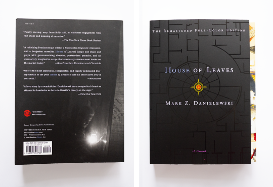


House of Leaves, by Daniel Z. Danielewski, first published in 2000.
Below the cut, some thoughts on the typeset. Warning for: very long, minor spoilers, pedantic writing, and me talking out of my ass.
House of Leaves, why the typeset is weird and what it creates
House of Leaves, book of genre indeterminate (1), is a cult book that has been talked to death, and I probably won't be saying anything new about it. Still, as a paragon of ergodic literature and of weird typesets, it certainly deserves a place here - and some commentary, for those who will discover it.
First, as it stands to reason we cannot talk about the form without talking about the content, I must confess to you that I did not read this book. I have tried - and am still trying - but so far I have failed. I can still say some words though I am sure they would be different had I actually read the whole thing.
With that said, here is a summary of the story:
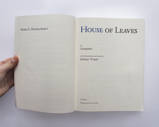
The Navidson family moves into a house which they find is bigger on the inside, among other weird quirks. The patriarch takes his camera and films his exploration of it. This documentary became found footage found and described by a man named Zampanò. Zampanò's description was then organized and annotated by a man named Johnny Truant. Johnny's manuscrit was then found and edited by a mysterious editor. And thus the book House of Leaves, by Zampanò and Johnny Truant, was published.
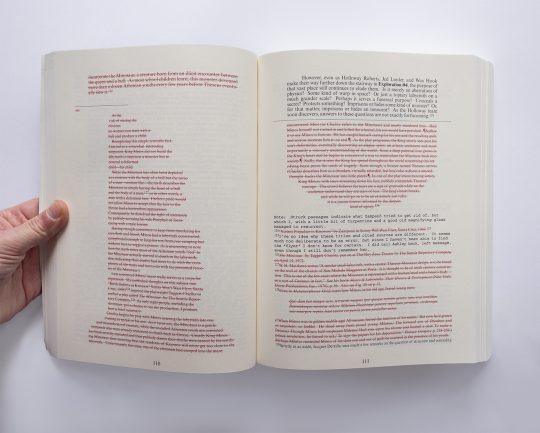
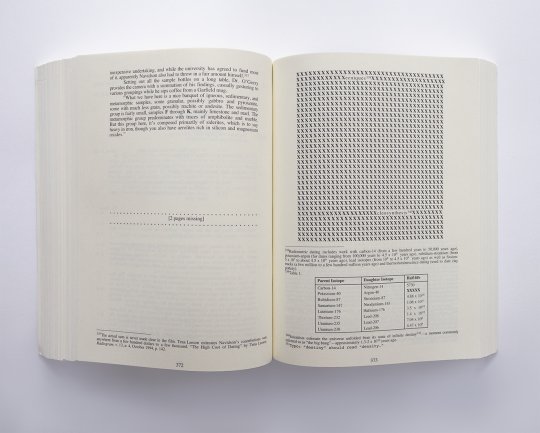
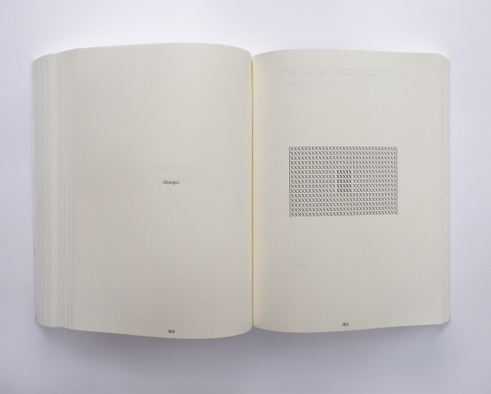
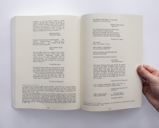
Suffice to say this book is complex and obscure, a layered metafiction written by a fictional character who knows he is writing a book that someone will eventually, hopefully, read one day. On top of this, there are also nearly 200 pages of appendices and over 450 footnotes (2). Some footnotes go nowhere, make no sense, have footnotes of their own, are several pages long, or will talk about something else entirely, creating several narratives happening at the same time. Some passages are in braille, in morse, hidden in codes and puzzles, to the point that the french translator claimed he couldn't have translated the book without help from dedicated fans to decipher those puzzles (3). All over the book, you can find evidence for several possible theories, and all those theories contradict each other, yet they all seem to exist at the same time.
Once again... this book is complex and obscure. I don't think it'd be going too far to say that no one truly understands it, except for the author. It is purposefully obscure, and it is not meant to be understood intellectually (4). Its goal is elsewhere (5); it is a book that exists beyond comprehension.
With all that said, we can talk about the typeset (6). The first thing to say is that the typeset is visually just as obscure as the story. The second thing to say is that it is obviously not random.
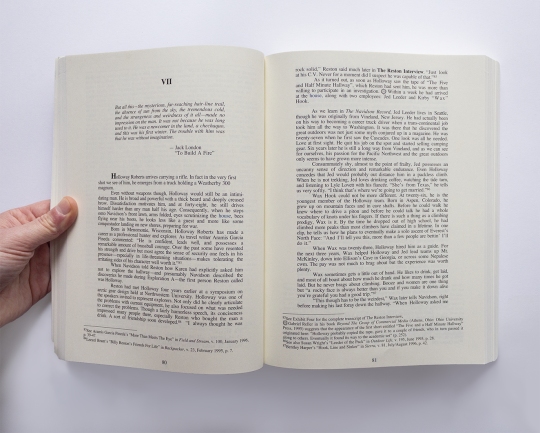
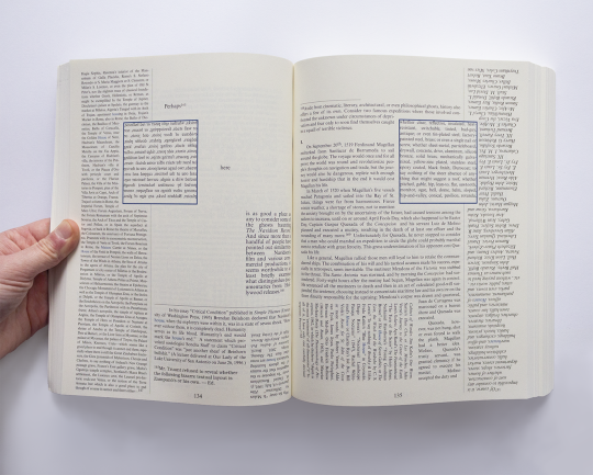
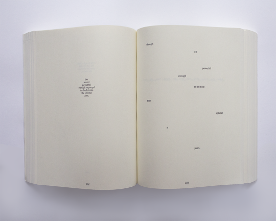
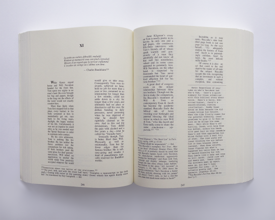
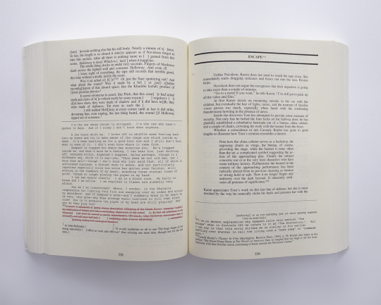
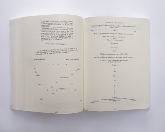
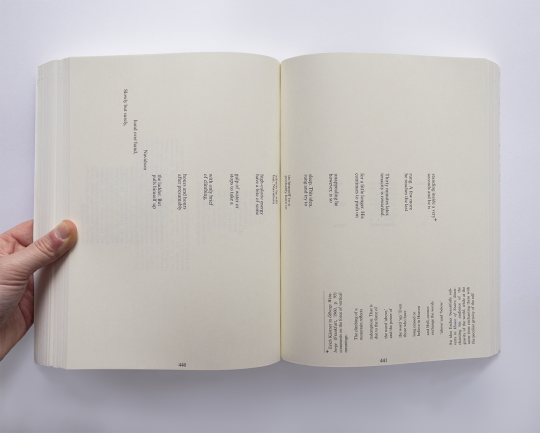
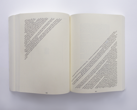
The ergodic nature of the book is one very noticeable, physical layer (7). The reader will have to turn the book 90° clockwise, or 180°, or 270°; sometimes they’ll have to use a mirror to read reversed text; sometimes the text is circular - the book requires physical handling and you become acutely aware of the weight and presence of a 700-pages long book. Sometimes the text is dense and requires several minutes to go through the page; sometimes there will be one sentence stretched over two pages for an entire chapter, which requires rapid page flipping (8) - this is rhythm, created by the amount of text on the page, which is of course not random either; when Navidson is exploring the ever-expanding house, the text becomes scattered, with a sense of loneliness, foreboding, unpredictability since each page will be scattered differently. Those passages provide an entirely different reading experience than that of the denser parts.
Moving on, we have another layer created by the typeset: Johnny Truant, when he finds Zampanò's notes, described how they were in bits and pieces, some in tiny unreadable scrawl, some crossed out. He had to make sense of all of this the same way we have to try to make sense of the text on pages where it is literally going in all directions - where to begin? where to go? - or when it is crossed out. Johnny discovers some (most?) of Zampanò’s footnotes are fictitious, as he thinks is the entire Navidson record, and similarly we have to try to decipher what reference is real or fake (9), which one is important or one. There is a mise-en-abyme (10) of our reading experience.
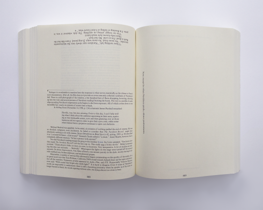
Do not think easily Johnny is here to help us though, because much like Navidson gets lost in the house, much like Johnny loses himself in Zampanò’s notes, his own footnotes will regularly go on pages long tangent about his recent hook-ups, losing us in the plot. This of course is felt in the typeset: after a passage with Navidson that has approximately 6 words per page for about 20 pages, we reach a 5 pages long, as dense as can be footnote where Johnny describes how he got his prostate fingered. Much like the subjects of the two POV could not be more different, we the readers are also getting whiplash from the difference between the two typesetting and the two different behaviors and rhythm they demand. As you can see on the pictures, it's like this for the entire book: there never is any solid ground, neither in the plot or the typeset. The reader is lost in it: since each POV has its typeface, it can create a visual mess where it's hard to find the tiny little superscript indicating a footnote (especially since some are hidden).
Now for another layer (last one, I promise), here is a small spoiler for the ending of the Navidson record. At the end, when Navidson is lost in the dark of the house’s maze, he has a book with him: House of Leaves (11). Obviously, there is no way Navidson could have a book about his unfinished documentary, yet there it is, at the deepest layer of the story within the story; the main character of the one layer who cannot possibly know anything about any other layer has the book, which has everything, the ultimate mise-en-abyme, and this thread which goes through the entire narrative loops back to us. How? Well, what is the house, if not the book?
What is the house, if not the House of Leaves, if not the book, which is House of Leaves? And, well, of course the book is the house of leaves. The book is House of Leaves. But there is a difference between House of Leaves and being the house of leaves, isn’t there?
There is no doubt the book looks like the house; it is bigger on the inside (12), it is a labyrinth made for people to lose their footing, it is three-dimensional (13), its typesetting is ever changing, unpredictable.
In turn, the book's effects are like that of the house: you are lost in it, you cannot grasp it, you cannot hope to catch all of its codes and puzzles, doing so would drive you mad, much like it drove Navidson, Zampanò, and Johnny mad.
And even more, surely the house is the main character of the book - every iteration of the word house is in blue - and, much like the hotel in The Shining, it is alive (and driving people mad). Yet it is not a house, not even diegetically: Johnny strongly suspects the documentary to be fake, as do most fans of the book, and so there is no evidence of its existence. The only time the words “House of Leaves” appear are when we realize Navidson inexplicably has a copy, and in a poem in an appendix that reads: “this great blue world of ours / seems a house a leaves / moments before the wind.” Not a house. More like a world. What appears at the end of the book - Yggdrasil, the world tree, also known as the ash tree, while the house apparently sits on Ash Tree lane. And what happens to Navidson’s copy of House of Leaves? He burns it (14) and turns it to ashes (15).
And of course, it is the house of Leaves; leaves like the leaves of a tree, a book full of leaves of paper which, much like the house, is a labyrinth which would drive crazy anyone trying to get to the bottom of it for it is the House (17). And the typeset in all of this; well, could the book be the house without it? If it wasn’t bigger on the inside, if it wasn’t a maze, if it didn’t compel people to try to understand it through its uniqueness? If the first page only credited Danielewski and not Zampanò & Johnny, if it didn’t even try to look like Johnny’s manuscript?
Without this, the final layer of the story would be broken: the layer which encompasses all other, where the reader that puts their hands on Johnny’s manuscript, finally edited and published by the mysterious Editor, is us - the house of leaves finding its way to us after going through all the layers one by one, before going back to Navidson in a complete, eternal loop, because the house of leaves does not care for logic or for what is possible. It’s a case of the form, beyond being made for the content, also creates the content; without it, the content is incomplete. Without it the book is not (the) House and the loop is broken (18).
------------
(1) Described at times as a horror story, a romance, a satire, a gothic fiction, a postmodern book, etc.
(2) Exactly 450 numbered footnotes, and then more using special characters.
(3) x
(4) When the french translator asked the author to tell him about the book's puzzles and hidden codes for the translation, Danielewski answered "have fun". x
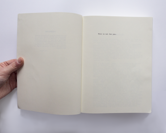
(5) It is explicitly said to not be for us (see the third image of this post): this is not a book we are meant to grasp.
(6) A fun fact: it was typeset by Danielewski himself, who did not trust anyone else with it.
(7) In ergodic literature, nontrivial effort is required to allow the reader to traverse the text. From wikipedia.
(8) And that is without mentioning the several appendices which require you to go to the end of the book and back.
(9) While also figuring the third category, the reference that is real within the story and fake in real life. All of this can prove itself tiresome when some footnotes are two pages' worth of name listed without any breaks.
(10) A story within a story; our story is Johnny’s story. From French, meaning literally “placed into an abyss”.
(11) It is also described as a 736-long pages book, the exact same amount of pages the IRL book has.
(12) And indeed the cover doesn’t reach the edge of the inside pages.
(13) Of course the object that a book is is three-dimensional, but the words inside are too: some passages go through the page (and multiple pages at that). More specifically, in that blue square you can see above in the pictures.
(14) He burns it for light in order to read the book - plenty to say about that though I won’t, this is long enough.
(15) Yggdrasil also defies logic, is a tree of “terror” (etymologically speaking), a tree that holds up the world, that is the center of the world itself. In most beliefs, reaching the center, while illuminating, is a hard journey (16). What does Navidson do, except search for meaning by going to the center of the mysterious house’s labyrinth, which eventually drives him mad?
(16) That sentence is said by Zampanò himself in one of his footnotes.
(17) The Shining could never; it stops at the hotel being alive.
(18) And indeed, all translated versions of the book look the exact same, despite how arduous this makes the translation process. There is also no ebook version, since it needs to be paper (leaves). And though I’m sure somewhere a normie version exists, I doubt you could call it House of Leaves. In a roundabout way, it is also its typesetting which has made the book famous - making sure the two could never be parted at least in people's mind.
48 notes
·
View notes
Text
I just wrote 1,7k words for the next reference post I will make here (hopefully this week/tomorrow) *huge sigh* aaaaaaaahr.
2 notes
·
View notes
Text


Title cards in Mandy (Panos Cosmatos, 2018) (x)
#ressources#typography#mandy#mandy 2018#film typography#title treatment#title card#graphic design#graphic design references
43 notes
·
View notes
Text
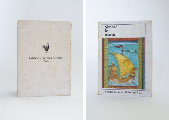
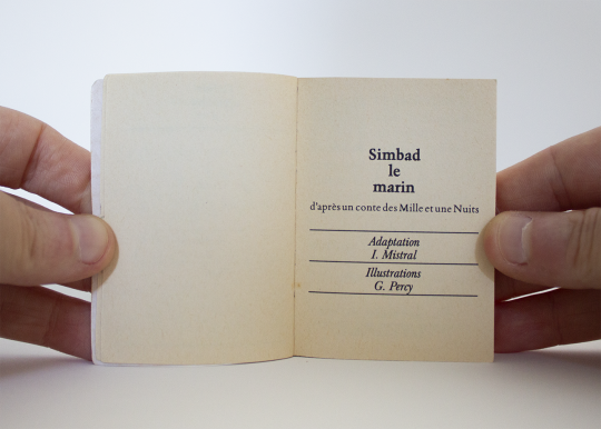


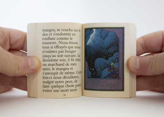

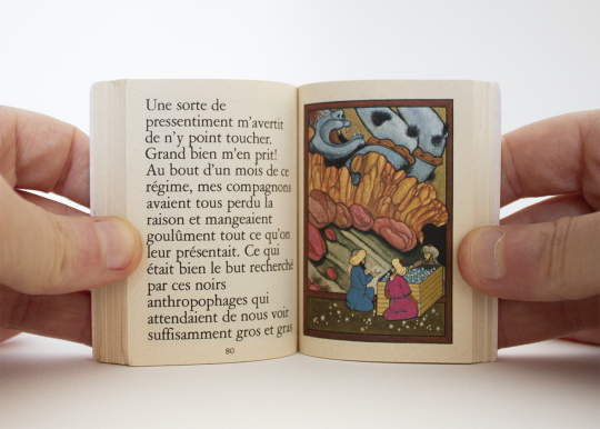


A tiny, old, worn book.
Simbad le Marin, Jacques Riquier Editions, 1976. 7x5cm / 2,75"x 1,97"
2 notes
·
View notes
Text
A little update thing.
I haven't posted in a while but the blog & the collection aren't abandonned at all. I focused on another project + got basically stuck on a stupid idea for IN6 all this time.
I think I'm somewhat back on track for IN6?
I saw two (2) typos in IN5 I'm gonna have to fix!!!!!!!
Also man IN5 really is an unhinged typeset. What the fuck.
2 notes
·
View notes
Text
Les références - an Instagram of worldwide, historic, sometimes lesser known graphic design references (text in french).

2 notes
·
View notes
Text


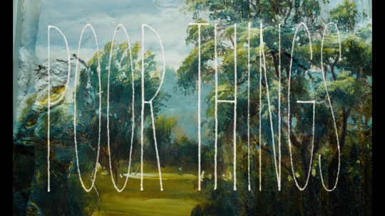
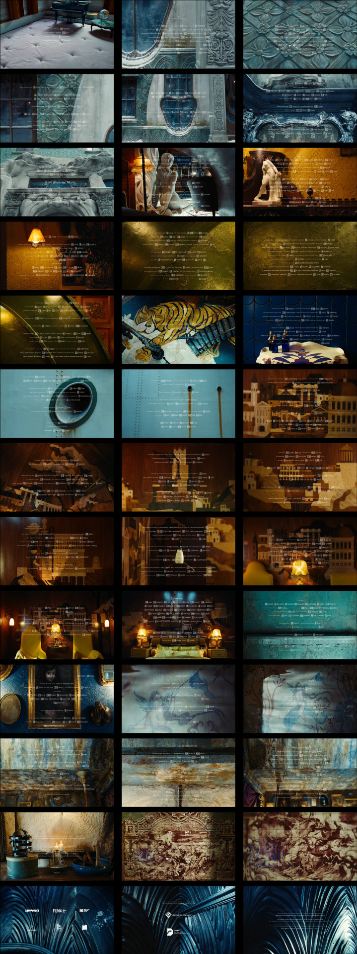
Typography in Poor Things (Yórgos Lánthimos, 2023): opening credits.
#typography#poor things#yorgos lanthimos#cinematography#opening credits#cinema#movies#blog#ressources
15 notes
·
View notes
Text
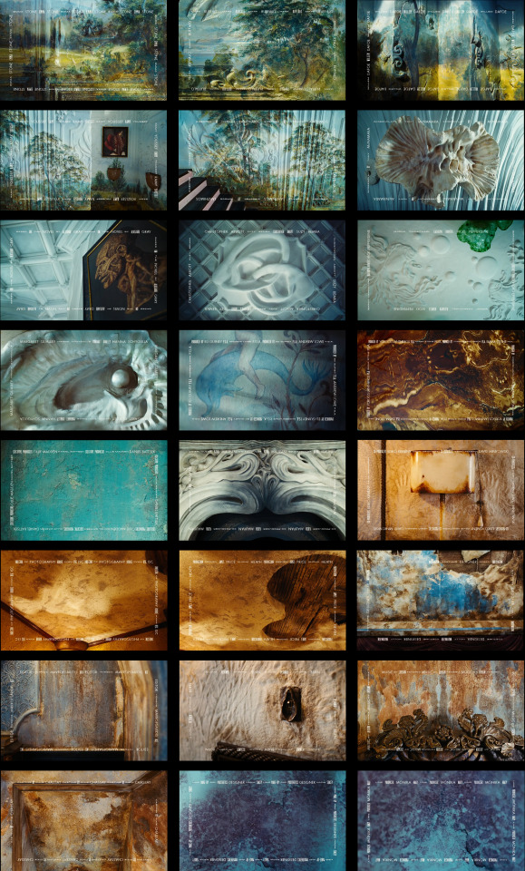

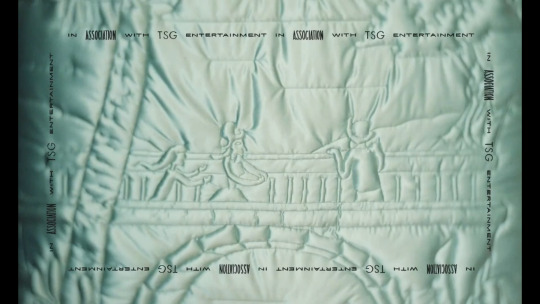
Typography in Poor Things (Yórgos Lánthimos, 2023): every shot of the end credits, in order.
#typography#poor things#yorgos lanthimos#movies#end credits#cinematography#cinema#blog#ressources#if that isn't one of the most beautiful end credits ever made
16 notes
·
View notes