
Don't wanna be here? Send us removal request.
Statistics
We looked inside some of the posts by interiordesigncambridge and here's what we found interesting.
Average Info
Notes Per Post
3
Likes Per Post
3
Reblog Per Post
0
Reply Per Post
0
Time Between Posts
15 days
Number of Posts By Type
Link
2
Text
8
Last Seen Tumblr Blogs


Fun Fact
There were a total of 171.5 billion posts on Tumblr in 2019.
Link
Articles on interior ideas for a living room list off to-do lists that offer a one size fits all solution to decoration but what if you desire a living room ‘with character’?
#interior design#living room design#interior design for living room#sitting room decor ideas#living decor ideas#interior ideas for living room
0 notes
Link
One year has passed since the release of Interior Design Masters Season 4 with Alan Carr and the new season is on its way. I thought it was an opportunity to reflect on my time on the hit tv show. BBC One’s Interior Design Masters Episode 1 was about how sustainability can be a key […]
#interior design#sustainability#sustainable design#interior architecture#interiors#bbc one#alan carr
1 note
·
View note
Text
Colour Of The Month ( Orange ) by Interior Design Cambridge
This month at Interior Design Cambridge we pick Orange as our ‘Colour of the Month’. It is often a colour that is widely regarded as “difficult to use”. On the contrary, orange is a colour that brings feelings of well-being and positive energy, warmth and even calmness with some tones. Orange is a colour that spans ranges from peach to burnt orange to terracotta.
“Whatever you do, do not use it as an accent wall!” says our founder Buse – “that has been a no-go for years”. At Interior Design Cambridge we recommend that you go all or nothing with orange. Buse elaborates “I think it is best used in one room, to make a statement. It could be a room that requires a cinematic feel. This room might be a living room, an office or even a dining room that is itching for an essence of English heritage”. Depending on your location, architectural features and decor, this colour may be exactly what you are looking for.
1. Which direction is the sun coming from??
East and West facing rooms get warm yellow light at certain times of the day. This will maximise your warm orange hue, and as shadow falls onto the room bringing with it a hint of bluer tones, the warmth of the orange will make the space feel welcoming and full of comfort. North north-facing rooms needs warm paint colours to bring the room out of the “cold room conundrum”. The light within north-facing rooms are a cool tone and will often feel colder when you enter them. South-facing rooms are the opposite. Often known as “sun-kissed rooms”. These rooms do well when you control the use of warm paint colours or pair them with colder colour matches.
2. Would I enjoy being cocooned?
There is an interesting debate I often have with clients when we pick out the “feel” of a space. When presenting more cinematic, dramatic or darker schemed rooms, a client once said to me — “it looks like nobody happy lives here”. He had a preference for modern, brighter spaces of course but it did get me thinking. When I look at a space – the question we should be asking is, would I be happy here? Often, we get tied to aesthetics as designers but forget how we feel – and what is required of that space to make us feel a certain way? This is what we should focus on.
3. How bright is too bright?
Another question that I think is essential with the colour orange is this: how bright is too bright? I think the common misconception in a space is that our eyes will get tired of a specific colour. A paint colour, however bright, will always be background noise however bright it is. We rely on decor, artwork, furniture and objects to take centre stage within a room. This happens, no matter what the colour of the room is. Therefore, as Buse says “in my book, no colour is bold — it will just serve as your new norm”.
Here are Interior Design Cambridge‘s orange paint colour picks for 2023:
Farrow and Ball – Charlotte’s Locks
Earthborn – Flower Pot
Lick – Orange 02 Matt
Lick – Orange 03 Matt
Written by Interior Design Cambridge
#interior design#interior styling#interiors#interior architecture#interior decor#interiorstyling#decor#home decor
0 notes
Text
Bringing Colour and Interest to Your Living Spaces: 4 Tips from an Interior Design Masters Contestant
My name is Buse the founder of Interior Design Cambridge – former contestant on BBC Interior Design Masters 2022 and a full-time interior designer in Cambridge. Here are my tips to bring interest, warmth and colour into my client’s living spaces. Let’s say you are trying to transform your living space from an all-grey developers interior to something that reflects your personality and style, or maybe you just watched the latest And Just Like That series and got inspired by Carrie’s insane apartment! Either way, I’m here.
Embrace Colourful Accents
Okay, firstly, I am all about adding a solid textural and natural base before talking about details however we are starting from the bit I usually end with here. Consider your base — if you’ve got an all-grey type of foundation you can go one of two ways. One, go colourful! Pick two or three accent colours that work harmoniously with each other and BOOM – you’ve got some character! Alternatively, and I do think this is a more timeless and elegant solution; you may know what I’m going to say, my motto, is ADD WAMTH. Here you can look at incorporating more natural colours, browns, terracottas, and whites and add hints of an accent colour where appropriate.

(Image Credit: Abigail Ahern)
Layer Texture
Now this comes in many forms and is a word interior designers love to throw out there. It hints at materiality. Essentially, what we mean by this is mixing materials with high levels of interest together. An example of this is a plush velvet chair, with a boucle sofa, and a knit throw spilling out of a wicker basket, sat next to a sleek glass coffee table with an antique brass ornament on top. I’ve listed 6 different materials, all with their textural properties, all that once played next to each other will help the other singgg.
Patterns
Getting the right patterns can be a tricky business. This is where samples come into play. The key here is to mood board collect as many samples as possible from patterns that you may like, lay them next to each other and see if they work well together! Add your paint samples and some of your hardware in too and that will be your personalised scheme!

(Image Credit: Abigail Ahern)
Meaningful Objects
I grew up in a house where my father was an antique collector. When my father passed away, I always knew that when I bought my home those antiques would come along with me. The way I set up my home and designed it was based on the knowledge that these objects would be there. Your past and your present should all be present in a well-designed home. This could include places you’ve travelled and objects you’ve collected there, rocks you collected from that time you went to the beach, and that chair your friend gave you that you are very fond of and is super comfortable. Objects are things we bring along the way as we continue our lives. Don’t underestimate them! They are important.
If you are looking to have a consultation to talk through how to bring further interest into your home, you can book a personal consultation here at Interior Design Cambridge.
Written by Busé
#interiordesignmasters#interior designer#interior design#interiors#decor#interiorstyling#interior styling
0 notes
Text
How To Pick the Correct Paint Colour for your Home in Cambridge
To pick the right paint colour for your home can be overwhelming along with all the other decisions necessary to complete a project. At Interior Design Cambridge we have an entire service for the “colour consultation” of your home.
Consider your space
We have some basic rules that should help you when you pick out the colour to suit your space. Firstly, start by considering the room as a whole, look at the lighting, the scale and the current finishes of the space. You must consider counter tops, floor finishes, rugs and even existing furniture. Everything needs to harmoniously speak to each other. Of course, if you are starting a project from scratch, you have the advantage of deciding on all of your core materials and will have full rein on which colours will go with your space.

Set a Mood and Design Style
Set a collection of images that inspire your “look” is also very important. With clients at the beginning of a project at Interior Design Cambridge we like to put together Pinterest/ Houzz boards to set the tone of each room. We ask clients to identify what part of each room they like the most and get very specific on taste and feeling. This is always a nice exercise to do on your own at the very beginning of deciding what you want your home to feel like.
Order your Paint Samples
The next step is ordering many, many samples. When you go to paint shops, it can usually be incredibly overwhelming. You may have a colour mind that you were convinced of online and it looks totally different in store. The best thing to do here is buy as many samples as possible and paint them on different sections of the room you have in mind.
One section may be by the window sill where there is plenty of light; another may be in a darker corner of the room. First things first, you must consider the lighting of the room. Which colour looks best with natural and then artificial light you currently have. Other things to look at are: Would the colour look good painted on the ceiling? Does it go well with your skirting boards? Should you consider changing the colour of these too? How does it look against all of the other current objects/materials within thee room?
At this stage I do usually find a colour will stand out to you against the other samples and you’ll come to a decision naturally.
If this is proving to be difficult, or you have a particularly difficult space that you are working with – you can book a colour consultation here at Interior Design Cambridge where we will come over to you home and provide one-on-one personalised recommendations for your space.
Written by Interior Design Cambridge
#colour consulting#colour consultation#paint#painting#interior design#interiors#home design#home decor
0 notes
Text
Sustainable Halloween Decor that will be Relevant After Halloween
We should all have a more sustainable approach to this time of year. Collections of itty bitty things that are annoying to store, reuse and hard to match with current decor just collect dust. Festive seasons such as halloween decor are where waste and unnecessary spending is at it’s highest. If you are looking for classy yet classic home decor ideas for Halloween then Interior Design Cambridge can help you out.
Here are a few tips on how to be sustainable this Halloween:
1. ADD LANTERNS TO YOUR DECOR TO GIVE A COZY YET SPOOKY FEEL
Why not include some vintage lanterns in your decor this halloween? Lighting is always important to create a spooky aesthetic – This year invest in nice lanterns that you can hang or place on the floor that will be useful for you as permanent decor in the house. This cast tall loop lanterns by Olivia’s is our favourite item to invest in this Halloween. Additionally, adding foliage, wreaths and garlands can help make your home feel decorated and be swapped in as charismas and fall decor also.
DIY TIP: To add an extra level of spook you can DIY an orange sticker filter onto your lanterns glass which can easily be peeled off once halloween is over.

(image credit: Next)
2. INSTEAD OF CARVING, LOOK INTO PUMPKIN PAINTING THIS YEAR
Forget about the messy and time-consuming task of pumping carving this year and try something different. Paint your pumpkins ? Here are the rules:
It’s important to stick to picking three core colours. The most popular colours this season are brown-ochre, warm neutrals and bold reds which make an interesting combination for the base of your halloween decor ideas. Buy paint samples from a close by paint shop. If you live in Cambridge, Farrow and Ball have paint sample for £5.50 that would be perfect for this particular thing! If you pop into the showroom they have physical samples of all of their current range of colours – you can see how they would look paired together.
Colours we picked out from their range are:
1. London Stone by Farrow and Ball 2. Rectory Red by Farrow and Ball 3. Indian Yellow by Farrow and Ball
3. DECORATE WITH CANDLES
It’s simple. Candles can be romantic or spooooky. For halloween it important to keep the the decor simple yet impactful. If you choose to use candles in your decor then go all out; bring out all the tea light and pillar candles you own. If you don’t already have some, you can invest in some beautiful taper candles with a candle holder. It is a decor item that will serve you all year round. For example, look at this beautiful candle by Curious Egg.
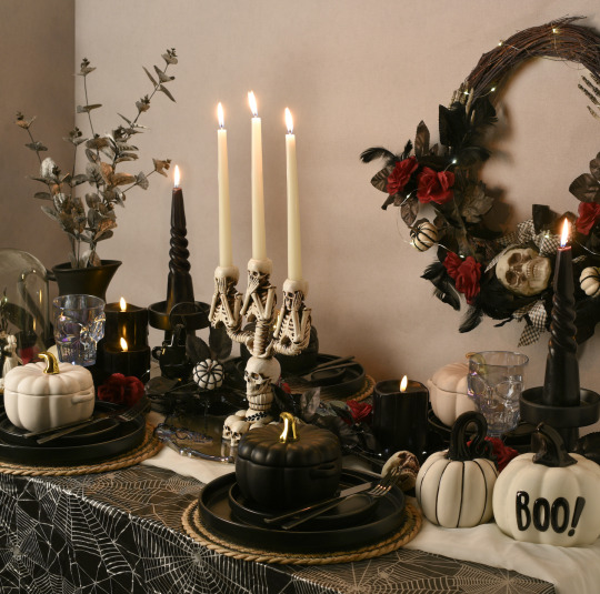
(Image credit: The Range)
4. BE ON THE LOOK OUT FOR MORE UNIQUE HALLOWEEN DECOR
Etsy has vast options for halloween decor that give a “homemade feel” without having to get the glue gun out. Have a scroll on what you might be able to find on there. We had our team at Interior Design Cambridge pick out their favourite halloween decor items. You can easily use some of these item later on in you table scapes or rising on you fireplace mantle in the long-term.
PICK ONE – Pumpkin Candles PICK TWO – Personalised Decor PICK THREE – Honeycomb Pumpkins
in essence, ditch the plastic cheap decorates that you store in the attic to only bring out once a year and look at smarter decor options that will be relevant all year round.
Written by: Interior Design Cambridge
#interior design#halloween#halloween decor#halloween decorations#halloween decor ideas#interior styling#interiorstyling
0 notes
Text
How To Make Your Cambridge Home More Autumnal
You know when you walk into a home and it has got all of the required autumnal feels. It’s got bouche couches, wooden decor, wicker, pumpkin-spiced vibes with a log burner to match. I am personally all about the autumn season as it has all of the colour schemes that are my favourite — in essence it’s all about the earthy browns. The spaces we like to inhabit in the autumn are usually warm, calming and cosy spaces that help us get away from the increasingly cold weather that will befall us in the coming months.
On the calendar, autumn begins on the 23rd September. Admittedly I will jump-start getting over-excited and preparing for autumn in the first week of September as my birthday approaches. I can’t help myself, the jumpers get larger and my socks get pulled up higher. But enough about me — Here are the top four interior designer tips from Interior Design Cambridge to welcome you to autumn this season.
Number 1 Materials
Let’s be honest, Autumn is all about the beauty of nature. Natural materials are celebrated and. rightfully so in this season. The best way to bring this into the home is by adding organic patterns materials and colours of the outside world in. These can include natural wood, wool, wicker, and leather alongside greens and hints of blue.
Number 2 Forage the Outdoors
Less time outdoors means you need more plants and foliage in your space. It’s time to swap out fresh flowers for earthy-toned, dried flowers, this could include dried lavender and pampas grass. You can even forage around your back garden and bring in some of the beautiful oranges, reds and yellows that surround your outdoors.
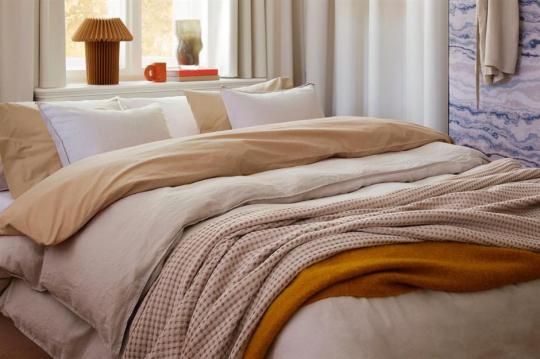
Number 3 Bedding is Everything
As the weather starts getting cooler we all have a moment where we store away our thinner duvets and bring out their indulgent goose feather counterparts. Once the passing of the baton has taken place, why not add extra layers to your bedding with a quilted bedspread, large knitted blankets and throws? At Interior Design Cambridge we recommend layering to the max and having a standby basket nearby to unload the layers you don’t need. It’s time to cosy up and bring out all your blankets.
Number 4 Soft Furnishings
An upgrade in soft furnishings is probably the easiest way you can change up your interiors seasonally. It is time to move away from lighter and brighter colours that you may prefer in the summer, to earthy and darker colours for autumn and winter. With small changes in decor, pillows and throws.. your space will look and feel completely different! Candles and blankets are key here — Get creative!
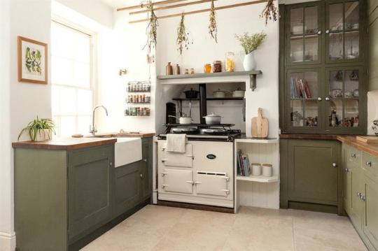
Number 5 Cosy up their kitchen
Decor-wise the kitchen is always somewhere that is always overlooked as it is also a very practical space that needs to function well. I always find that a kitchen that is designed well together with an aesthetic appeal is where I feel most inspired to cook. The kitchen function is about the outdoors being invited into our homes, into our meals. Why not add some seasonal products such as sage, mint, spinach, parsley, basil and rosemary? Inspired to cook yet?
Written by Interior Design Cambridge
#interior design#autumn#fall season#fall vibes#interior architecture#interior styling#interiors#autumn aesthetic#fall aesthetic#autumn vibes#autumm#interior decor#interior designer#kitchen design#custom bedding#office
0 notes
Text
Breast Cancer Awareness Month 2023
“On Wednesday’s, we wear pink” has turned into “for breast cancer awareness week ,we wear pink!”. Join us this week at Interior Design Cambridge as we are all wearing Pink for breast cancer awareness! All the shade and all of the styles.
A message from Breast Cancer Org is in “October can feel different for each of us — some wear pink to celebrate, some quietly observe the month, some feel grief, and some feel unseen or misunderstood. We want to normalise it all.”
The colour pink has taken over our collective consciousness this year with the release of the Barbie movie and all of the excitement that has come with dressing up for it. Women, children and grown men have all joined in the spirit of THE PINK REVOLUTION. Here at Interior Design Cambridge we thought we would get our designers to post about their favourite Pink inspired Interiors to boost moral and get everybody in the spirit of fostering hope for those struggling with Breast Cancer.
Our Designer Buse’s Best References

Our Designer Sophie’s References

Click here to see our mood boards on Pinterest
Donate to support free resources and programming for people affected by breast cancer.
Written by Interior Design Cambridge
#interior decor#interior architecture#interior design#interior styling#interiors#interiorstyling#interiordecor#decor#breast cancer awareness#pink#pinkcore#farrow and ball
0 notes
Text
Picking The Right Size Artwork For Your Interiors
Artwork is always tricky business! For some it is very personal, for others it’s just an afterthought that needs to be added to cover up bare walls. Either way, the artwork you chose for your space is an element that has one of the biggest impacts on your home. In this blog, I will explore some tips for picking the artwork for your space.
1. Size is everything. This is a science — The size of the artwork you choose should be proportional to the wall or space it will be displayed on, we know this but how EXACTLY do I calculate this?
The first step is to measure the height and width of the wall. Next, multiply the measurements by both 0.6 and 0.75 – the rule of thumb is wall art should take up about 60% to 75% of your wall. The second step is to hang it at “your” eyeline. This is should be hung at 150 cm from the centre of your photograph to the floor.
2. Now you know the rules, break them! Oversized pieces can make a bold statement, while smaller pieces can create a more intimate feel. Consider the scale of your furniture and the overall dimensions of the room when selecting the size of the artwork.
3. Please consider the mood and atmosphere! What is your vibe? If you want to create a calming and serene environment, opt for soothing and tranquil pieces with calming colours. On the other hand, if you’re looking to add energy and vibrancy to a space you should consider bold and colourful artwork or go the other way and pick stark black-and-white artwork. This will definitely have an impact!
All in all — remember finding good artwork takes time and energy. Be patient and these rule by us at Interior Design Cambridge should help you along the way!

#interior design#home decor#homestyle#art#interior styling#interior architecture#interiors#interiorstyling#interior decor#living room#decor#furniture
0 notes
Text
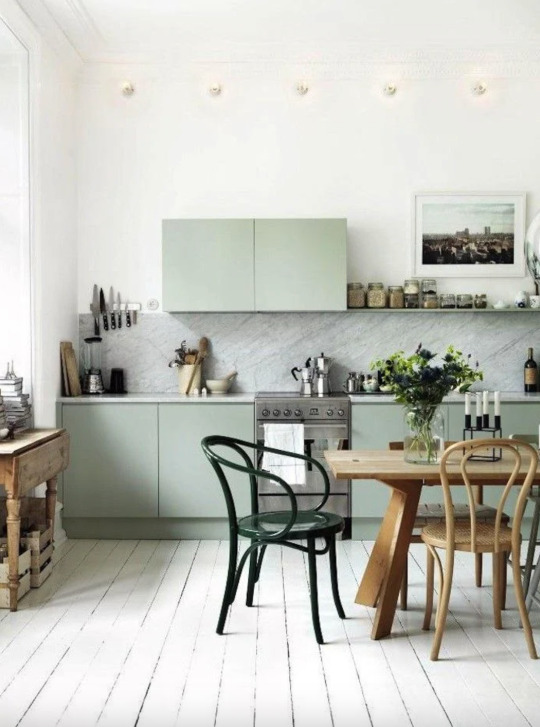
Colour of the Month ( Sage Green ) by Interior Design Cambridge
Here at Interior Design Cambridge, we are starting the month off with the core colour to create “calm interiors”. If you are unsure and would love a calm, warm and inviting atmosphere almost instantly — sage green is your best bet; a safe, and easy option in my opinion that doesn’t push the boat out too far. Paired with natural woods, whites and hints of blue you will have the ultimate “yoga retreat” experience in your home. If you would like to give your home an “English country home experience” you can use a darker-toned sage green paired with browns or blacks as an accent.
At Interior Design Cambridge we love using greens in a bedroom or hallway however you can also use sage as a 'pop' or accent in your space, rather than blend into the colour scheme. When designing we usually start with core natural colours as a base - and sage green is the ultimate soft, subtle and a colour that is very prevalent in nature.
Here is founder and BBC One's Interior Design Masters Contestant Busé’s favourite sage greens this month have been :
Number 1 —FARROW AND BALL FRENCH GREY

Number 2 — LICK GREEN 02 MATT
Number 3 — COAT PAINTS: PARK LIFE SAGE GREEN
Number 4 — COAT PAINTS: YARD HAZY GREY GREEN
Colour I would pair it with would be :
Tumeric yellow, dark blue (colour sample), white for a summer feel and forest green to add depth and interest to a space. Incorporating dark or lighter wood tones work very well against this colour.
Written by Interior Design Cambridge
2 notes
·
View notes