
Statistics
We looked inside some of the posts by irisjaycomics and here's what we found interesting.
Average Info
Notes Per Post
246
Likes Per Post
163
Reblog Per Post
78
Reply Per Post
5
Time Between Posts
2 days
Number of Posts By Type
Text
3
Photo
14
Last Seen Tumblr Blogs

coachoutlethandbags2016newm-blog
Coach outlet handbags 2016 new - Coach next clearance online sto
2 posts


Fun Fact
Total funding amounts to $125.3M.
Text
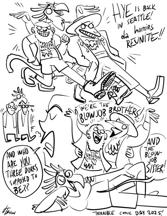
da homies reunite ft. nero and hye
14 notes
·
View notes
Photo


FROM THE ARCHIVE: Neon Badges
More badges! Designed for Rocky Mountain Fur Con in 2015, NEON badges were an attempt to do something rigid and "graphic design-y" with handmade materials. I also just had a bunch of cool fluorescent paper I wanted to use, ngl. https://www.patreon.com/posts/archive-edition-130022081
#iris jay#badges#furry#furry badges#convention#commission#illustration#original character#patreon#archive#archive edition#neon#rocky mountain fur con
5 notes
·
View notes
Photo


FROM THE ARCHIVE: Subliminal Badges
Biggest Little Fur Con's 2015 (excitingly high-concept!) theme was "corporate dystopia", so I did SUBLIMINAL badges- fake ads featuring clients' characters with glow-in-the-dark messages painted over them. Check alt text to see which said what! https://www.patreon.com/posts/archive-edition-130022081
#iris jay#badges#furry#furry badges#convention#commission#comms#illustration#original character#patreon#archive#archive edition#subliminal#glow in the dark
6 notes
·
View notes
Photo


FROM THE ARCHIVE: Scrimshaw badges
YOU THOUGHT I WAS DONE? WRONG! We've got so many more badges to cover! Like these SCRIMSHAW badges from Furlandia 2015, the most Portland-ass commissions I've done to date. (No whale, seal or walrus fursonas were harmed in the making of these!) https://www.patreon.com/posts/archive-edition-130022081
#iris jay#badges#furry#furry badges#convention#commission#comms#illustration#original character#patreon#archive#archive edition#scrimshaw#furlandia
5 notes
·
View notes
Text

My podcast guest host residency on ON THE SHOULDERS OF GIANTS for GHOST IN THE SHELL: STAND ALONE COMPLEX continues! Look, I'm not saying a lacy, racy lingerie drawer with a gun, several grenades and a fake ID hidden the bottom is my gender specifically, but it's definitely a gender that left a BIG impression on me the first time I saw this show. Please listen!
https://osgpod.com/posts/2025-05-13-0047-plus-0048-GitS-SAC
#ghost in the shell#gits:sac#stand alone complex#on the shoulders of giants#podcast#mechs#cyborg#cyberpunk#big pharma#AI Sentai Tachikoman
7 notes
·
View notes
Photo
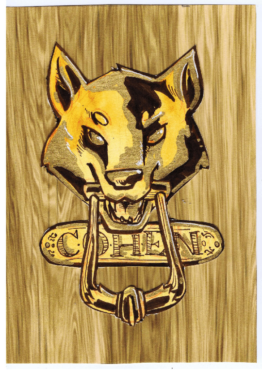
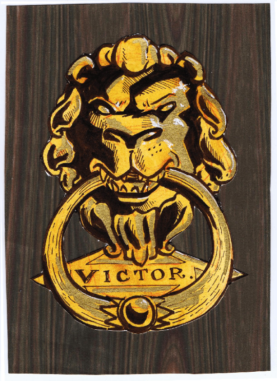

FROM THE ARCHIVES: Knocker Badges
FC 2015's theme was... Victorian mystery? I think? I was fully in the "new badge style every fur con" groove at this point, and figured rendering fursonas as brass door knockers would be a novel way to fit the theme. Kinda strange in hindsight! https://www.patreon.com/posts/archive-edition-130022081
#iris jay#badges#furry#furry badges#convention#commission#comms#illustration#original character#patreon#archive#archive edition#knocker
12 notes
·
View notes
Photo

New Iris Jay Email Newsletter!
A new IRIS JAY EMAIL NEWSLETTER has been sent out to patrons and folks on the email list! You can read the current one here: https://patreon.com/posts/130735113 And you can sign up for future newsletters, sent straight to your email inbox, here: https://irisjay.net/newsletter
#iris jay#newsletter#email#conventions#announcements#patreon#comics#cartooning#TCAF#Kobold Art Market#Outsider Comics#Seattle Trans Pride#trans#Anthrocon#furry#pride
2 notes
·
View notes
Text
Cool writeup for an April Fools thing I did for Iron Circus a while back! Small correction: this was for a fake Smut Peddler anthology, not a Filthy Figments anthology. Judging by how cool these came out, though, maybe someone should make this for real sometime...
Hey Look At This Comic: Smut Peddler Presents Pitch Black
I can't remember how we got on the subject of the comics that my friends Iris Jay and Nero Villagallos O'Reilly did for an old Iron Circus april fools bit. maybe we were chatting about Megan Delyani's blank frame comic Spaces, which I wrote a whole review of last year, but it might just as easily have been talking about comic structure generally. cause we're huge nerds. being a huge nerd, I was all over the premise of the joke: a fake kickstarter for a Filthy Figments volume full of comics with all blacked out panels.
it's a great gag, a full webpage duping the Kickstarter layout, with a fun tongue in cheek explanation: comics don't leave enough up to the imagination, there aren't enough interpretive gaps for the reader, so to fix that Filthy Figments will publish a bunch of Pitch Black comics where YOU have to provide the visuals. Joke, maybe, but it lends credence to frame-focused models of comics reading: it's not the images that make something a comic, but the breakdown of page space into discrete units. So goes one theory, anyway. How do these pages fare without their images?

Lin Visel deploys a regular grid of long, thin columns, with a kind of horizontal capital at the top. The speech bubbles drive a lot of the action here and there's a sense of simultaneous movement across the bottom, with the bubbles breaking the panel borders at the top and the sound effects flowing into each other below. So, there's an interesting division between the upper strip, which is relatively subdued, a moment of reassurance that exists almost in its own zone before the rush of the bottom. And, as we'll see with a bunch of the others, in the absence of images the style of the text, the shape of the word balloons, and the font colors all become more crucial to conveying what's happening (sex, to be clear). That's already a lot going on with a series of black panels.

I love how Iris's comic bakes an explanation for the blacked out panels into its narrative. The apparently dominant character gloats that her streaming site won't let her actually display the brutal force-fem pegging she's giving to some shitty gamer bro. Sure enough, at the bottom of that panel there's a black and white video control interface and LIVE signal. Text alone and the design of the speech bubbles transforms the whole diegesis of that second panel, from the floating omniscient "camera" of the other panels to a webcam. Which is crazy because don't forget, there is no diegesis at all. It's all black!
There's so many great touches in this. I love the fact that the tongue in cheek panel containing the "guy's" internal monologue ("I can feel my epic skills draining away with every thrust... along with my masculinity!") is not just a second panel on the upper strip but an inset, separating out this moment of more intimate first person experience from the more remote view of implied fucking. And look at the flowers in the final orgasmic speech bubble! This is a total tangent but I feel like a lot of older attempts at structuralist comics decomposition wanted a firm line between the panel, the image, the characters, the speech bubbles, and so on. But comic elements can constantly interpenetrate, with the apparent domain of text becoming more complex graphical elements. Also, what a cute way to depict orgasming so hard you get turned into a girl. Head full of flowers. :)
It's incredible what you can achieve without breaking Tumblr's draconian terms of service at all.

Robin Tess offers a more straightfoward humorous panel, which lets me catch my breath after Iris's hot and heavy speech bubbles. Yet, this could have been a straightfoward 2 x 3 grid, couldn't it? 6 panels? Instead, this joke about over-engineered jargon names for what could just as easily have been called a "fuckmachine" (left delightfully up to the imagination) gets its core pacing from an irregular panel format. The premise is introduced in a big splashy full-strip panel at the top, the elaboration takes up the middle row, and then the bottom, in two equal panels, displays the two part punchline. I like the subtle way the middle row panels get progressively smaller. It increases the tension as we move toward the release of the punchlines, in a way that could be easily obscured by the panel contents if the page wasn't all blacked out in this way. Like Delyani's work, it makes me want to see notable comics blacked out. It could offer a whole new perspective on the medium's language.

Speaking of which, Nero uses a series of tall regular panels that suddenly POP into one that seems to squirt across the page, the other panels moved to allow for the white negative space to show off the irregular splash of the panel edge. This could be the silhouette of literal fluid, but I also like the idea of a frame that just has this kind of irregular energy. The comic structure itself becoming unruly and fluid to highlight a climax is a staple of many comic genres, but I'd say that I see it deployed most consistently by adult creators, who seem more willing to throw page literalism to the wind in order to achieve heightened expressivity. And once again we've got this escalation to a climactic panel. Typing this up I actually realized I don't have a specific idea of what I think the visual for these panels is or should be. Part of the excitement comes from filling in the blanks, to be sure, but that's true of any comic, which requires us to engage in closure to make sense of the transition from panel to panel. No, it's the drama of the reveal of the vibe plug one character apparently has been hiding, the invitation to intimacy, and finally the release, all achieved through dialogue physically arranged on the page. I don't think this would really make sense at all without the visuals that ARE there--the buzzing sound effect that moves across panel borders and is simultaneous to rather than sequentially arranged between lines of dialogue, and the incredibly suggestive final panel shape. Even without apparent visuals, this is visual storytelling.

Abby Howard wraps things up with the most abstract of the pieces, one that doesn't use frames at all but implies panel contents simply through the convention of word balloon tails. The result is a disorienting dark mass. It's hard to know what exactly is happening here and actually I'm having a hard time imagining what the last visual is "supposed" to be. It sort of is what it is: groping claw marks raking a black void. It's part of the april fool's joke, but it's a creepy one, and it feeds into the final joke of the page: that all this overthinking, all this trying to make sense of black panels, has worn you out, made you vulnerable to the Dark. Well, looking at everything I typed up here, I can't deny the inevitability of this end. Time to get in the maw!
Actually I think this end uncovers the close relationship that comics and hypertext narratives or more experimentally formatted texts have to one another: the space on the page becomes, itself, a signifying element and a way to direct the flow of the story. It's a shame that this is, I think, still considered a bit gimmicky in the realm of professional publishing and criticism. We have all these tools we've barely employed for storytelling, made far more accessible than in the days of having to manually set type!
Well, maybe it'll all have its day in the sun, or I suppose night in its new moon, soon enough. With an increasingly puritanical treatment of sexuality in society and on the internet, maybe we'll ALL have to black the action out of our comics and leave the frames to imply what we socially no longer want to see.
Pitch Black: Comics Code Authority approved!
you can read more reviews in the Hey Look At This Comic tag and support me on Patreon at least until they get my ass for being an adult writing about comics for other adults.
132 notes
·
View notes
Photo


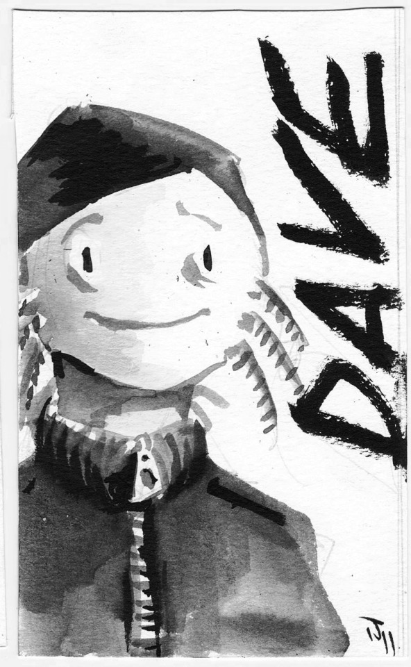
FROM THE ARCHIVE: Floppy Badges
BADGES! These were from 2014's cyberpunk-themed Rainfurrest-- Seattle's own beautiful, doomed furry fiasco. I wanted to do something special for this con since cyberpunk is My Whole Deal. These are still some of my favorite badges I've ever done! So, so cool!! https://www.patreon.com/posts/130022081
#iris jay#badges#furry#furry badges#convention#commission#comms#illustration#original character#patreon#archive#archive edition#floppy#floppy disk#retro computing
6 notes
·
View notes
Photo
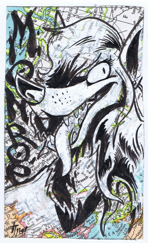


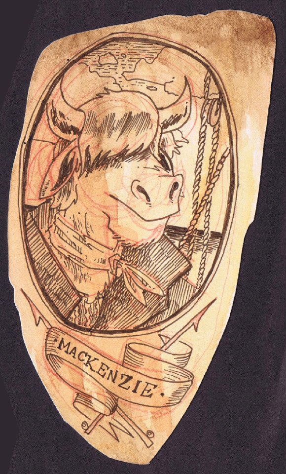
FROM THE ARCHIVE: Map Hi-C Badges
MORE BADGES! These were a variant HI-C badge style that I exclusively did at Rocky Mountain Fur Con 2014. If I recall, the theme was "travel", and I love any excuse to make art out of salvaged materials. You can kind of tell where I clipped some of these from! https://www.patreon.com/posts/130022081
#iris jay#badges#furry#furry badges#convention#commission#comms#illustration#original character#patreon#archive#archive edition#hi-c#map
7 notes
·
View notes
Photo


FROM THE ARCHIVES: Heart Badges
More blasts from the past! FWA 2012's theme was "Love"-- that's it, just love-- so I did these cute candy heart badges in watercolor and pen. I gotta do more watercolor stuff sometime, the colors on these turned out so nice!
#iris jay#badges#furry#furry badges#convention#commission#comms#illustration#original character#patreon#archive#archive edition
11 notes
·
View notes
Photo


FROM THE ARCHIVE: Glitch Badges
MORE FURRY BADGES: My GLITCH badges were originally for Midwest Furfest 2012, but I brought them back wayyyy later for Further Confusion 2020! I know a commission is going to be good if I feel like I'm getting away with something while I'm making it. >:3 https://www.patreon.com/posts/130022081
#iris jay#badges#furry#furry badges#convention#commission#comms#illustration#original character#patreon#archive#archive edition#glitch#digital
4 notes
·
View notes
Photo


FROM THE ARCHIVE: Yearbook Badges
My YEARBOOK badge style premiered at MFF 2012. These required clients to consider a first AND last name for their fursonas, as well as what they were like in high school. Some clients hadn't considered this, others got REAL into the worldbuilding. Fun fun! https://www.patreon.com/posts/130022081
#iris jay#furry#badges#furry badges#convention#commission#comms#illustration#original character#patreon#archive#archive edition#yearbook
9 notes
·
View notes
Photo

SICKOS SELECTION #2 is in its final seven days!
SICKOS SELECTION #2 is in its LAST WEEK! If you haven't gotten this amazing bundle yet-- over 500 pages of exquisite smut by 21 fantastic creators, INCLUDING my poly dyke body horror comic FLESH HIVE, all for a crisp $20-- now is the time! Buy, read, enjoy~ https://itch.io/b/3018/sickos-selection-2-
#iris jay#sickos selection#erotica#nsfw#comics#itch#sale#bundle#illustration#prose#flesh hive#promotion#independent
0 notes
Photo


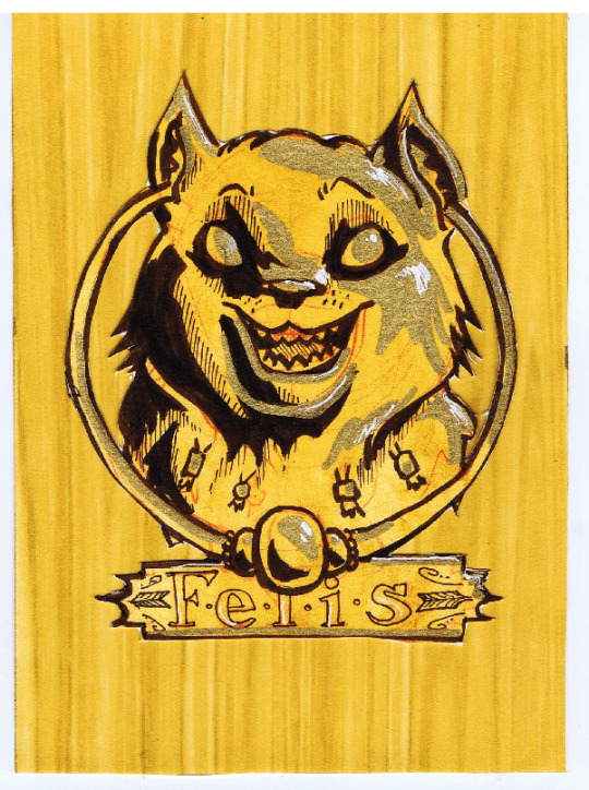
FROM THE ARCHIVE: Gilded Badges
MORE BADGES: These GILDED badges made their debut at Anthrocon 2012! This was during the peak of my Traditional Materials Freak era, so I did these in sepia ink with a proper crowquill dip pen on watercolor paper I'd treated with a wash of golden ink. Fancy! https://www.patreon.com/posts/130022081
#iris jay#badges#furry#furry badges#convention#commission#comms#illustration#original character#patreon#archive#archive edition#gilded
5 notes
·
View notes
Photo


FROM THE ARCHIVES: Wash Badges
More furry badges! WASH badges were a short-lived offering for FWA 2011, conceived when I was deep in a watercolor brush pen phase. They look a little plain to me these days, but I'll never not love me some expressive brush lettering. https://www.patreon.com/posts/130022081
#iris jay#badges#furry#furry badges#convention#commission#comms#illustration#original character#patreon#archive#archive edition
7 notes
·
View notes
Photo


FROM THE ARCHIVES: Long Badges
More from the vault! LONG BADGES made their debut at Anthrocon '10, and were my most successful badge style. These oversized badges featured full body illustrations- a big selling point, especially for clients who didn't have a lot of art of their fursona yet. https://www.patreon.com/posts/130022081
#iris jay#badges#furry#furry badges#convention#commission#comms#illustration#original character#patreon#archive#archive edition
14 notes
·
View notes