
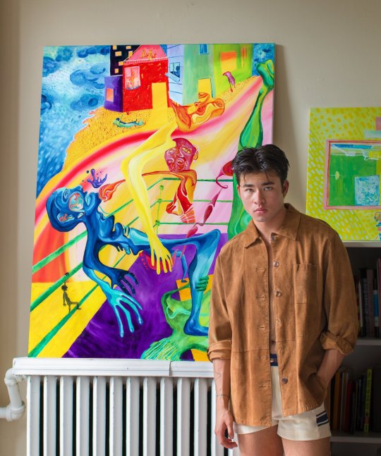
"nothing is trivial. i wish i didn’t have to sleep." rmit comm design '22 | they/them
Don't wanna be here? Send us removal request.
Statistics
We looked inside some of the posts by iwishididnthavetosleep and here's what we found interesting.
Average Info
Notes Per Post
135K
Likes Per Post
77K
Reblog Per Post
58K
Reply Per Post
130
Time Between Posts
11 hours
Number of Posts By Type
Text
1
Photo
15
Link
1
Last Seen Tumblr Blogs


Fun Fact
Tumblr was created by web developers David Karp and Marco Arment.
Text
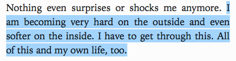
final journal entry ???
this semester has been intense, and Long - but at the same time it’s gone so quickly. moving online was something none of us anticipated right up until it was clear it was going to happen, which i think put a real dent in my motivation towards coursework for a hot sec. in the first month of online learning, i felt rlly disconnected from my teachers, peers, and work, and my main thought was - hey, i didn’t sign up for this!
but i’m glad i stuck through it! i think as creatives, it’s vv important to be adaptable and fluid in terms of changing situations and requirements, and it was good to know that literally every student across the world was in the same boat.
i’m disappointed i’ve barely been able to get to know the friends i made in those first two/three weeks - obviously there’s ways of connecting via online methods, but as a Bad Texter and Anxious Person, i find them a bit exhausting.
i appreciate that we’ve had to keep this journal - it’s made me more aware of what i want to be putting into the world as an artist and designer, and other design/art i want to connect with. as well as that, i’ve been able to see some of my design process develop and grow, though it’s only been a few months since uni started.
kind of dreading sem2 at this point, but at least we’ll be better prepared this time! i’ve got our first studio, and lifted restrictions on hanging out to look forward to, so even if campus remains closed, i should be able to see my new pals !
@ everyone andy’s 11.30 monday class ur all legends and we make an Excellent group imo !
and remember kids - everything will be okay :)
#design#rmit#communication#if i repost this in like six hours its just because ive found something else i want to add to my blog#much love fellas#student#communication design
30 notes
·
View notes
Photo
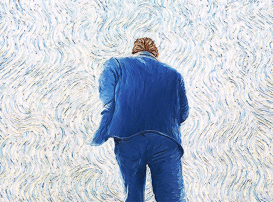
feels relevant for this strange world we’ve been living in these past few months.
i wish i could’ve got my hands on a copy of keith haring journals while i was working on my assignment! hopefully i’ll be able to find it when bookshops are doing a little better, but it would have been cool to have that extra peek into his brain while i was trying to find the words for my responses !
Keith Haring Journals, February 15, 1989
49K notes
·
View notes
Photo
the bg paint in studio ghibli films is consistently stunning throughout all their big pictures - kiki’s delivery service, my neighbour totoro, spirited away, princess mononoke. it’s so lush and detailed , it takes on a life of its own!
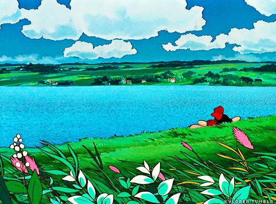

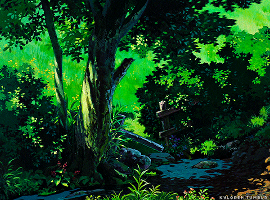
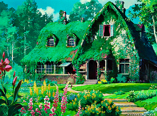

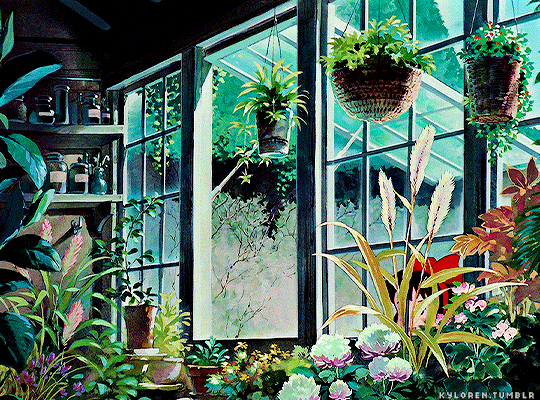

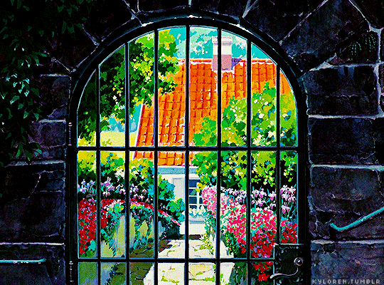
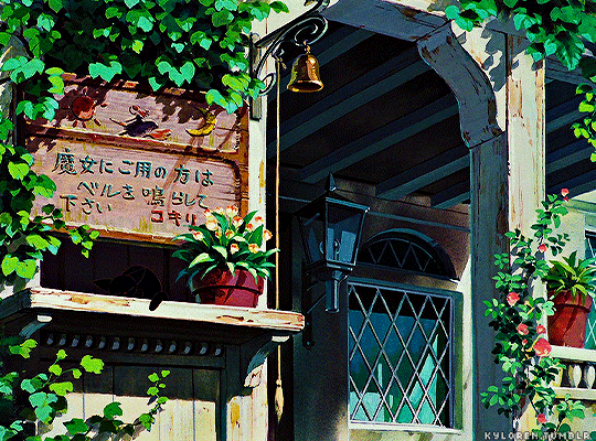

cottagecore in KIKI’S DELIVERY SERVICE / 魔女の宅急便 1989 | dir. Hayao Miyazaki / 宮崎 駿
35K notes
·
View notes
Photo
speaking of film, here’s another animated film which i love!
it also relates to our zines to an extent, in terms of the line between replicating another art style and drawing from it in your own work. ie into the spider-verse draws on a comic book style as inspiration, while loving vincent attempts to reproduce the work of vincent van gogh as film.
Loving Vincent (2017) dir. Dorota Kobiela, Hugh Welchman
49K notes
·
View notes
Photo


creative inspiration - film
my final class for the semester is a specialist on creative ideation - last class, we were prompted to think about what inspires us creatively. obviously there’s a lot of things which inspire me as a designer and artist, but i think one of the main ones is film, and, in particular, animated film. so im gathering screenshots of some of my favs, and obviously spider-man: into the spiderverse Has to be on that list.
this is one of my favourite films of all time, and as a designer and aspiring visdev artist, it’s a goldmine. every frame is a work of art, and the film as a whole is this beautiful symphony which brings background, character, colour, comic book, illustration, film, and Art together seamlessly.
91 notes
·
View notes
Photo
in actively practising anti racism, we have to recognise not only death+violence faced by Black communities , but Black joy, Black art, Black creatives - Black life .
(p sure these photos are originally by julio donoso)
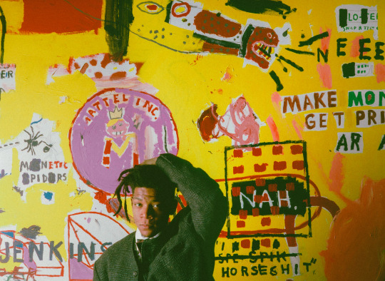
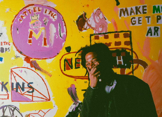
Jean-Michel Basquiat in front of one of his painting made during an exhibition at the Yvon Lambert Gallery in Paris, France - January 11, 1988
1K notes
·
View notes
Photo
i was just looking through the jean-michel basquiat tag this morning and this JUMPED out at me. amidst the wave of black lives matter movements across the globe , yeah, now’s the time to get educated, get informed, get involved.
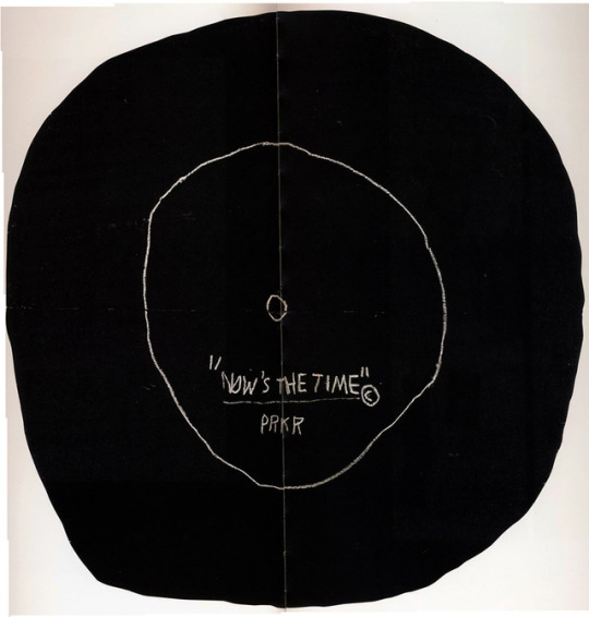
Now’s The Time, Jean-Michel Basquiat, 1985.
844 notes
·
View notes
Photo
yes female creatives !!

Communication Design Lecture - Week 13
A tribute to women ! Heck yes! This week in our lecture with Andy and Karen we went through a summary of everything we have learnt this semester and all the progress we had made in our creative thinking processes. In my last blog post I will summarise my studies however for now I want to touch on some of my favourite female designers which Karen talked about on at the end of the lecture. Karen briefly spoke on the inequalities women face in the design industry and encouraged us as emerging female designers to do our due diligence and go check out the work of others thus support the industry. I’ve had the privilege of checking some out and posting some of their content above. I can wait to continue to indulge myself in the works of these designers. I have written a short summary of research of who these leading female designers are and what they do below.
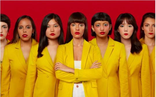
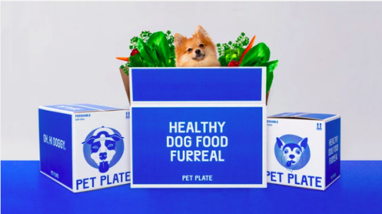
Jessica Walsh
Jessica Walsh is a New York based designer that launched her creative agency WALSH. Her company helps make up the 1% of creative industries founded by women. She also states on her website that 70% of design students are women yet only 5-11% of creative director positions are held by women. She competes to defy the odds and help shape the design industry for the better. I also personally love her design style as she often plays with bold demanding colours. I have an example of her fur-real branding project above. More information and these images can be found her website; https://andwalsh.com/info/.
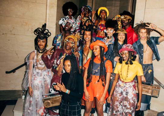
Tolu Coker
We touched on the work of Tolu Coker in our lecturer this week and her work astounded me! She is a British Nigerian Designer that has built a uni sex fashion brand around the ideas of inclusivity, diversity and social responsibility. What I love most about Tolu Coker is how she merges together her multi disciplinary practices of artisan craftsmanship and innovative technology to create something totally new and interactive. Above is a photograph representing her graduate clothing collection. More information can be found at her website; http://www.tolucoker.com/new-page
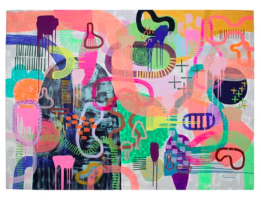
Tiff Manuell
At the end of the lecturer Karen encouraged us to pass on the information of our favourite designers to our peers and keep the conversation moving. For me I have two particular designers that I adore including Tiff Manuell and Rachel Burke. I believe I am drawn to these artist because of their playful use of colour and materials. Tiff Mannell is based out of Adelaide in South Australia where she incorporates her skills of painting, making and sewing. In her own words the goal of her work is to “work freely with colour with no boundaries”. Above is one of her original canvas based works! More information and her collections can be found through her website at; https://tiffmanuell.com/pages/about.
2 notes
·
View notes
Photo


loveis wise
another artist highlight! loveis wise is an queer+black la based illustrator . i rlly rlly love the childlike quality of their work - their art explores social issues, but does so in this really pure, and heartfelt way.
[https://www.instagram.com/loveiswiseillu/ http://loveiswise.com/]
2 notes
·
View notes
Photo


lecture 13
karen’s discussion in the lecture this week of diversity in design + her list of female artists was really valuable to me. it’s all well and good to say that you have a focus on decolonising design, but as long as you’re only showing + discussing the white male history of the industry, those words are kind of worthless! decolonisation doesn’t happen by itself !
in keeping with the theme of that lecture, i thought i would highlight some of my favourite queer + poc artists!
the work i’ve attached (from https://twitter.com/chellamanart?s=20) is by trans + deaf artist chella man. his work is fun +weird+cool, and most importantly, it explores identity, power, liberation, and intersectionality. his art is primarily an expression + exploration of his trans +deaf identities, his relationships, and his presence in a white cis male world.
3 notes
·
View notes
Link
ask me anything
here she is, finally! to be honest, i’m not entirely happy with the end result, especially after seeing other people post their own really amazing + visually incredible works. but anyway, it’s done!
one of my favourite things about this assignment would have to be playing with how i could incorporate keith’s style into my own work, and also being able to research + explore so much about one of my all time fav artists:’)
#design#rmit#rmit design#communication design#ask me anything#zine#art#artists on tumblr#keith haring#issu
6 notes
·
View notes
Photo

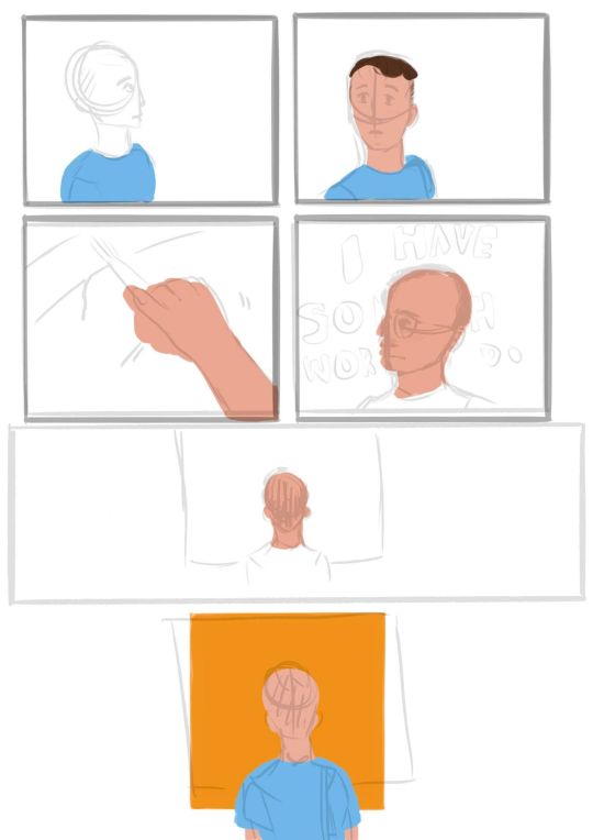

ask me anything - process
here’s some more wips from my zine process! i stg i feel like this assignment took just MONTHS. it certainly took a few years of my life i’ll tell u that .
2 notes
·
View notes
Photo


ask me anything - process
excuse the APALLING sketches, they were just a way for me to put my ideas to paper before moving to procreate, where i worked on the bulk of my comic.
i have no idea why this page in particular went through such huge change from initial sketch to final product, but through my whole process it was just The Page That Wasn’t Working. to an extent, i am kind of glad i changed it so much, because i’m really happy with the end result. it’s probably the question / response im most passionate about, which is perhaps why it took so long to get right.
9 notes
·
View notes
Photo


ask me anything - process
not strictly design related, but still important - these are all the questions i developed through my research. i found it difficult to know what would be the right kind of q to ask, but ended up just going with what i found important +what i would ask keith haring, if he was revived for a minute or two.
ironically, that kind of mentality is what inspired my decision to do a comic set at the ngv - going to he +basquiat’s exhibition was something i found truly valuable, and if i had to interview a dead guy, i should at least be allowed to revive him for a hot sec to ask him some qs.
the final 2 images are the script i worked from as i illustrated my zine. the responses changed somewhat in my final piece, as i switched some words here and there and just tried to best replicate the voice i had in my head of what keith’s responses would sound/read like.
2 notes
·
View notes
Photo


ask me anything - process
now that my zine is done (!!!!), i’m going to go through my process. i should have been doing this as i worked on it, but what can u do !
this is my initial brainstorm/research of artists + movements for the subject of my zine. if u have keen eyes/can stand to read my awful handwriting, you’ll note that i’ve written ‘this list is so white+male i can’t stand it’ in the bottom corner. this was something i struggled with in a big way with this course in particular - its focus on design history has only highlighted to me how much focus is placed on the white+male parts of design history. i found it really difficult to find historically significant artists of colour and female artists that i wanted to write on beyond their status as a figure of change in the industry. i’ve made posts on this before, and it’s made me more determined to discover and connect with more diverse history.
ANYWAY, in my research, i ended up having to choose between my two favourites - keith haring, and the silence=death poster, and was tossing up between them for WEEKS. both have social significance now and at the height of the aids crisis/ post stonewall queer culture in new york. i ended up going with keith as i felt the scope of questions was much broader, but i think the history and influence of the silence=death movement is so so significant and fascinating. this [https://www.villagevoice.com/2017/06/20/how-six-nyc-activists-changed-history-with-silence-death/] is one of my favourite articles that i read in my research, + i would highly recommend it to anyone interested in queer history/ the intersection of art +social activism!
0 notes
Photo

ask me anything - wip
i found it really interesting last week to be able to go through everyone’s works in progress! there’s such a huge range of diversity in terms of medium and method for this project in our class alone, and i loved being able to see everyone’s different styles and approaches to the task. it’s one of those things about art + design which can be so so intimidating (seeing other’s work and how they tackle a design) and can sometimes be a trigger for us to compare ourselves with others and to put ourselves down about our own work. i felt this to an extent, but at the same time, the pieces everyone shared have been so different that they’re not really comparable at all!
also, i really appreciated andy challenging us to make productive comments on other’s work - until then, i’d just been posting WOW I LOVE THIS SO MUCH, and making an effort to go back to those comments and try to articulate what about the design i liked and found effective was a really good thing for me to have practised, and i’m keen to continue posting constructive comments again in the future!
6 notes
·
View notes
Photo


social justice in design
light tw for police violence /
i think i may have found my niche in socially aware+present design! this is a series of illustrations by courtney ahn design [https://www.courtneyahndesign.com/] highlighting white privilege and how it impacts individuals of different races respectively. my own social media pages at the moment are entirely comprised of designs and messages on what white allies can do to help acknowledge and fight against systemic racism following the filmed murder of george floyd.
i’ve seen this particular set of illustrations before, but they cropped up again on my feed so i thought they would be good to share here. they’re comprehensive, accessible, insighful, and helpful, which is what i believe design in this area must aim to be. designs like this are so important as they break down huge and complex issues like white privilege and allow them to be accessed and understood by anyone. this in particular simplifies the issue in a way which encourages action and educates its audience, allowing them to confront how they benefit from white privilege and from systemic racism.
2 notes
·
View notes