
Don't wanna be here? Send us removal request.
Statistics
We looked inside some of the posts by jenniedesignblog and here's what we found interesting.
Average Info
Notes Per Post
1
Likes Per Post
1
Reblog Per Post
0
Reply Per Post
0
Time Between Posts
11 days
Number of Posts By Type
Text
17
Last Seen Tumblr Blogs


Fun Fact
130K people were victims of a chain letter scam that affected Tumblr in May 2011.
Text
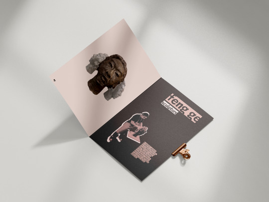
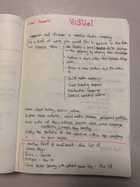
Analogue Portfolio – Part 2 (written reflection and conceptual Intent)
First, I chose green and pink as my main colors, but when I tested whether these colors aligned with AAA rules, they didn’t work well. So I switched to pink and black because I really like how these two colors combine.
I selected the typefaces Livingroom and FF Mate to connect with the grad show since we primarily used these fonts for the show. I incorporated a magazine and pop-art style. I played with typography and fun layouts featuring large empty spaces because I enjoy clean yet playful designs. I added highlight boxes behind text to try something different (many designers are experimenting with this trend), and I think it looks better than plain text.
I also used a crossword game concept on my front and back covers to make my portfolio feel more fun rather than overly structured. I also used saddle stitch to bind the portfolio give a personal touch on it.
The projects I included feature three digital designs and one sculpture, showcasing my dual role as a designer and sculptor. This also reflects my grad project, and showcase my interest about making sculpture.
My portfolio’s vibe hints that I’m a creative person with wild ideas that I bring to life—and that I’m a cool designer and sculptor. My main audience is grad show visitors, as I designed this portfolio specifically for the show and want them to make that connection.


0 notes
Text
Analogue Portfolio – Part 1 (research component)
We were assigned to create a physical portfolio for the grad show to let people flip through while they visit our studio space.
First, I researched analogue portfolios online, and most of them were fun and not super formal. Some artists used letter folders, tape, cardboard, or fabric to make their portfolios. I made some moodboards to picked out the colors and style I wanted to use for the portfolio.
I really liked the ones that combined text or pictures on mylar pages with regular pages. I thought it would be really fun if I handwrote each project's description on the mylar sheets, and it would reflect the theme of our grad show where everything has a kind of living vibe.
Then, I started to plan out the overall layout and referenced some magazine layouts. But as I tried to lay it out, I ran out of time to design two ways of design for one page, so I deleted the idea of adding mylar sheets to the pages. But I still want to making sure the portfolio didn't look boring.


1 note
·
View note
Text
UI & UX – Part 3
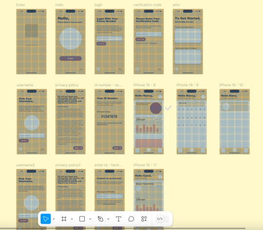
This app does not require a password to create or log into an account. Instead, it guides users through verification using their phone number and a text verification code. From my experience, they often forget passwords or they wrote on a notebook, so I don’t think password is necessary. If users do not want to provide their phone number, they can skip this step and go directly to selecting their user type.
I created two different versions of this app—one for seniors and another for their family members or caregivers. Since seniors are often sensitive about apps tracking their location and may worry about their information being stolen, I designed their version to minimize the appearance of tracking. I also added a privacy policy page when they try to log in, as seniors tend to be wary of apps that might acess their data. On the family or caregiver side, they will be able to see the senior's location and access more detailed health summaries.
I also incorporated a daily mood check for both seniors and their families. If a senior isn’t feeling well, their family can take notice and keep track of their daily well-being.
For the profile page, I wanted to keep things as simple as possible, showing only the necessary sections. For example, seniors can read the privacy policy as many times as they need to feel reassured that their information is secure.
For the login pages, I primarily used a slide-in prototype, moving from right to left. The "Check-In" and "Call Emergency" buttons are large for easy access. The "Check-In" button requires only one click, while the "Call Emergency" button requires two clicks—the second one is kind of confirmation for emergency calls (because when people gets old, their finger will swollen so they might accidentally press the button). I used a dissolve prototype for those buttons because I think it creates a smooth effect and adds an animation.
Check out the app on Figma: https://www.figma.com/design/sAu5S7v6cAbZIpe6at3nqG/Cares?node-id=23-213&t=jdKDGQzIOuwnmxum-1


0 notes
Text
UI & UX – Part 2
The colors I chose for this app are yellow, red, and orange because these are colors that seniors can see more easily. I also chose Arial as the main typeface because it is simple and universal, "Arial is generally considered a good, easy-to-read font for seniors due to its sans-serif design and clean lines, which make it easier for people with low vision to process." The font sizes are even, with the smallest size being 12pt. Since this app is designed for seniors (70+) and their family members or caregivers (who might be 50+), using larger text ensures better readability.
The logo for this app is house-shaped, with a heart shaped senior figure inside. Since the app is called Cares and is related to healthcare, I wanted to incorporate a heart symbol so that people immediately recognize it as a health-related app. I included the senior figure with a cane to represent old age. The house symbolizes seniors who live alone, and I tried to design it in a way that resembled a person using their arms to support the elder, but it didn’t turn out what I want.
Next, I started sketching each page. The sketches weren’t very detailed, but they helped me remember how I wanted the layout to look. After that, I moved on to creating wireframes in Figma because I prefer working on-screen. It also allowed me to develop directly from the wireframes and save my time.
In this app, all icons, buttons, graphics, and other elements are larger than those in typical apps because it is designed for seniors. I want the app to be simple, clear, and easy to navigate, with a guided login process (If I had more time, I would add more detailed guides or tips on the Home and Profile pages).


0 notes
Text
UI & UX – Part 1
This is the second assignment for Applied Art & Design II. We are assigned to create a mobile app to study UI & UX design. The mobile app is supposed to relate to or support the community of Medicine Hat
For my mobile app, I decided to create an app for elderly residents in Medicine Hat. The idea came from my neighbor—an eighty-year-old man who lives alone, while his children live far away. His daughter always worries about something happening to him without anyone noticing. I want to create an app that allows seniors to check in daily for their well-being, makes it easy for them to call for emergency assistance, and enables his daughter to check on him anytime, anywhere.
(Class notes: User flows/task flow: transitioning from strategy to design. Task/user flow example: liking a YouTube video. Consider these aspects:
Visibility: Can I see it?
Feedback: What is it doing now?
Affordance: Does it give a clue? (e.g., buttons)
Mapping: The relationship between controls and their effects in the real world.
Constraint: Restricting user interaction to help them focus on what they should do next. (Class example: Instagram login, where the password field only appears after the username is entered.)
Consistency: Similar operations, similar design elements, and typography. (Class example: Google icons use the same design style and colors, but too much consistency can make it difficult for users to recognize which icon is which.)
Teacher-recommended book: Don Norman's 6 Design Principles.)
Then, I researched how many elders live in Medicine Hat. There isn’t an exact number for 2025, but the Government of Alberta provides a general estimate: " The seniors' population in Medicine Hat was 12,332 and is expected to be 15,342 by 2024. For every 1,000 seniors in Medicine Hat, 401 lived alone, and 287 lived with a partner."
What other people/apps are doing for them: https://www.rescusaveslives.com/blog/7-popular-apps-for-seniors-who-live-alone/. One of the apps is called "Snug Safety." It is a free daily check-in app that is easy to use and has a big green button on the home screen to encourage users to check in daily. Another app that I really like is Apple's Health app. It is clear, easy to understand, and helps users track their daily activities. These design ideas are very useful for elders, as they may not be familiar with technology. The app should be easy to understand and use while maintaining consistency.


0 notes
Text
Digital Portfolio – Part 4
Jan 27, 10 PM
I kept updating my website and experimenting with different versions to decide which one to feature at the top.
When I clicked on the mobile icon to preview the mobile version of my website, I noticed a big issue—the layout looked completely different from how it was displayed on desktop. I think this happened because my images and text were aligned left and right, but the mobile layout didn’t recognize that structure properly, causing weird column stacking and excessive empty space between sections.
To fix this, I first removed the extra spacing between sections on the desktop version to see how it would affect the mobile layout. Then, I added three spaces between each section and checked the mobile preview again. (I forgot to take a screenshot of this—cry emoji.)
Jan 29, 9 PM
We had a portfolio critique today. I decided to remove Yulin's book because when I mentioned that I wasn’t sure about keeping it on my website, my teacher suggested that I would have more work to showcase later this semester.
Since removing one PNG from the homepage made the overall composition look empty and unbalanced, I illustrated a letter "J" (since my first name starts with J) to fill the space. This element links to the About page.
I also finished adjusting the awkward spacing between sections on the mobile version. Now, it looks much better and more organized.


0 notes
Text
Digital Portfolio – Part 3
Jan 15, 2025 7 PM
Today, we shared two example websites that we chose for our small assignment. I jotted down some ideas and sketches while we went through them.
First, I was thinking about adding color to my website because I want it to feel refreshing and stand out from others since most people tend to use black and white. While reviewing my projects, I noticed that I’ve used green quite often. I decided to select a grayish-green as my main color and cream yellow for better readability.
Next, I planned to showcase five pieces: lululemonGOLF, Meow, Jennie in Medicine Hat, The Treeplanter’s Ball, and Yulin’s book cover (though I’m unsure about this one since I don’t think it’s a strong piece). I started refining some of my projects by improving details, adjusting mock-ups, and redesigning certain elements.
Jan 20, 8:30 PM. Jan 22, 4 PM
I started combining and sketching ideas for the homepage. I’m thinking of doing something similar to Tico Tian (the first portfolio example I found) by cutting out the products and converting them into PNGs, then displaying them on the homepage. I also think it would be super cool if the products could be animated or move when the mouse hovers over them.
For the project page, I want all projects to share the same structure but with different picture galleries since Cargo provides various gallery options. I experimented with different layouts and found one I liked: starting with a large mock-up image, followed by a section where the image is on the left and text on the right, then switching sides in the next section.
For the about page, I began by introducing myself and my specialties. On the right side, I included a photo of myself along with a link to my resume page. However, my classmates gave me feedback that I should either remove the photo or replace it with a more professional one. Since I didn’t want to use a professional portrait, I decided to delete the photo.
Once I finalized the layout, I built the website by adding columns to the pages, inserting images, and adding text where needed.
The first problem I encountered was that my CV was in black and white, while my website had a green theme. When I placed the CV on the page, it looked like two completely different styles. My solution was to remove the actual CV file and instead type the content directly onto the page for a more cohesive look.


0 notes
Text
Digital Portfolio – Part 2
Jan 11, 2025 4:18PM
In my Applied II class, my teacher recommended some better platforms for creating a digital portfolio. These included CargoCollective, Format Portfolios, Carbonmade, Readymade, etc. I have chosen to use Cargo to build my website because many professionals use it, and it’s a platform that allows artists, designers, and other creative professionals to build and host portfolio websites.
He also showed a video of an online portfolio critique that helps designers receive feedback from professionals to improve their websites and work. The person presenting their work in the video is named Chi Hao Chang, and I really like his work and the way he lays it out. I checked out his website after class: https://chihaochang.com. I liked the way he documents the development of each project—there aren't too many words, but not too few either in the process.
I also researched tips on how to make a good portfolio website:
General Tips:
Pick projects that display your full range of skills.
Show how you got from the initial concept and idea to the polished product.
Choose projects that are "real," not mockups.
Include something unique that we don’t see in other portfolios…etc.
Domain Name and URL:
Avoid free options that result in messy URLs.
Avoid long or complicated domain names.
Avoid using a name or branding that makes your portfolio look like a studio or agency…etc.
I also found a post on Reddit that I think is helpful. It offers suggestions for new grads on how to improve their portfolios, shared by professionals: https://www.reddit.com/r/graphic_design/comments/1cziwoj/hey_new_grads_your_portfolio_needs_work/.


0 notes
Text
Digital Portfolio – Part 1
Jan 11, 2025 11:16AM
In Applied Art & Design II, we were given the first project to create a web portfolio and update our resume. The first small research task is to find two amazing web portfolio examples related to the field you want to work in and that interest you.
I found a portfolio that I really like: https://ticotian.com. Her portfolio is not boring, and the layout is very well-organized. I think it's super smart that she displays her works/products right on the homepage as if they are hanging, which is something new that I haven't seen in other portfolios. She only includes a paragraph about the meaning of each project but doesn’t show the development process, which makes me really curious about how she created those works—they are awesome.
Another portfolio that I like is playful: https://amandinereynaud.fr. My favorite part is her work page. When you move your mouse over the beginning of the page, a bunch of images of her work appears, which I think is super cool. However, her website is a bit too slow.
I have also found a third one: https://www.sebastian-martinez.com. I think the colors are super cool, and the scrolling interaction is interesting—I haven't seen other people do that in a portfolio. But there isn’t much process shown, and you can't click on the works he has done. It looks more like a studio website rather than a portfolio website.


0 notes
Text
Brand Identity – Part 3
Overall, I think this project will be a good piece to put in my portfolio, and it is my favorite project through over this semester. The project is to make a canned cat food brand, make style guide for the brand, and a product for the brand.
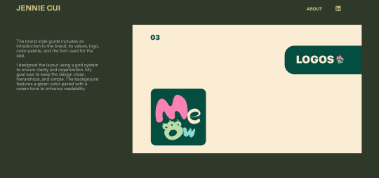
Logo: I illustrated the wordmark logo in Procreate because I wanted to make the logo look cute, and the app includes many circular and rounded elements.
Style guide: I used a grid system for the layout of the style guide. I tried to make the design clean, hierarchical, and simple. The background color uses the main color, the same as the one used for the app, along with a cream color for readability. I adjusted some areas after handing in my assignment, like adding another title background element on the LOGOS page and playing with different layouts on that page and the COLORS page.
APP: The main colors used for the app are green and grey, with some crayon-colored elements from the logo. I chose green because the brand is associated with natural food, and grey is used for most apps. The app is inspired by AliExpress, Chewy, DoorDash, and Shein. The main goal is to make the app understandable, legible, accessible, and readable.
• The discovery page includes ads to promote products, different flavors of canned cat food for customer choice, and an on-sale items list to encourage purchases.
• The shopping page consists of a block/area for items waiting to be purchased by customers with an empty shopping cart graphic to visually convey the message of an empty cart without requiring text. There is a recommendation list under the shopping cart to encourage purchases.
• The shipment page demonstrates that we have our shipping system, and allows customers to track their packages. The map displayed on the app uses Apple Maps (I was trying to create my map but ran out of time).
• The account page includes a profile picture, account settings, shipment tracking, order history, etc.


0 notes
Text
Brand Identity – Part 2
The name of the brand is MEOW. I named it because it is a brand that sells cat food, and I couldn't come up with any other cute names.
We were assigned to make a logo with a wordmark, symbol, or monogram. I decided to make a wordmark logo but in a cute way.
Firstly, I tried to draw a cat face using the letters of MEOW as outlines, making the cat's nose, eyes, and hair with the letters. I really liked the second design, but it didn’t read as MEOW, and I wanted to include elements that represent nature. So, I added a fish to make it look like a cat is eating a fish, and I tried to simplify this logo, but it didn’t work well. Secondly, I tried to make a similar design to "I love NY" or "LOVE" because MEOW has four letters. It looked really good, and I also tried replacing the "O" with a cat head, but it didn’t work well either. Then, I played around with composition, layout, and color in the illustrations.
I started to develop my app. I chose SF Pro Display as my typeface because it was designed by Apple, it is consistent and legible, it includes nine different weights, and most mobile apps use SF Pro Display. I looked up how other brands develop their apps, like AliExpress, DoorDash, Shein, and Chewy. I sketched their home pages, cart pages, account pages, category pages, and map pages. Then, I started designing the app in Figma and watched tutorials.
For my style guide, I tried to add a cartoon cat character to my brand and style guide, but I didn’t have enough time to develop it. So, I made another style guide that is simpler, cleaner. Looked up how does other companies make their style guides on a website called Branding Style Guides. The final style guide was also inspired by Eric’s style guide because I really liked some of the colors and layouts he used.


0 notes
Text
Brand Identity – Part 1
This is the final assignment for the Applied Art and Design class. For this project, we were assigned to make an identity logo, a style guide, and a product for a brand.
My first idea for this project was design a package for canned cat food. But I also needed to design a website or app to include in my portfolio. Then, I thought I should force myself to make an app because I would be lazy to make one later, so I made an app for my canned food brand as my product.
The reason for making a canned food brand for cats is that the current canned food for cats on the market is mostly made with a lot of artificial colors, flavors, and preservatives. "Just like in human food, artificial additives in cat food can potentially lead to health problems. Some to watch out for include BHA, BHT, ethoxyquin, artificial colors, and propylene glycol." So I want to make canned cat food made with natural ingredients without artificial additives.
The app includes the home page, (categories, if I have time because there are too many elements on this page), shopping cart page, shipment page, and account settings page. The app is designed to be accessible, legible, and easy to understand. The reason why I made a shipment page is that food made with natural ingredients will go bad pretty soon because it doesn’t contain artificial preservatives, so the shipping system should be fast. So I made a page to showcase that we have our own shipping system, and it's fast.


0 notes
Text
Visual Presents – part 4
The final outcome turned out well; I really like it, especially the billboards—they look real.
Color: I chose blue, green, and cream yellow-green. Green represents grass, trees, and energy; blue represents the sky; and cream yellow-green (i chose it because it fit between the other two colors). Together, these colors are rich and vibrant.
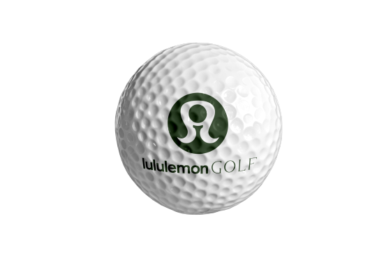
Logo: I decided to redesign Lululemon’s logo by adding elements of a golf ball and tee to indicate that this logo represents lululemonGOLF. Considering that Lululemon started by making women’s yoga apparel, I used the shape of women's had and body to represent this.
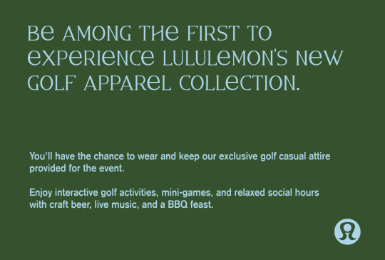
Billboards: I "borrowed" the billboard concept from their previous project, using images of Lululemon’s newly signed golfers, Min Woo Lee and Yana Wilson. I included phrases like "Golf like never before, unleash the power within" to inspire people to try Lululemon’s golf products and to play golf. The billboard also includes information about the launch event, aiming to create a elegance and energetic vibe.
Invitation Cards: I tried to maintain the same vibe as the billboards, so the invitation cards are essentially smaller versions of them. However, the cards include more specific information about the event and guidance for attendees on what to prepare before the event.
Guest Passes: I made two types of passes: one for regular guests and one for VIPs. I wanted to distinguish the VIP pass without making it look too different. I used green as the main color for the VIP pass because it conveys a more luxurious feel than the cream yellow. The design mainly features typography, as Lululemon often focuses on type rather than graphics (though, somehow, the guest passes ended up not matching the billboards and invitation cards, cry emoji).
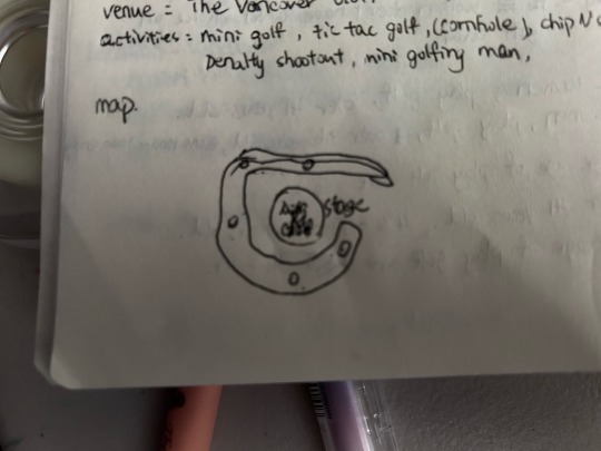
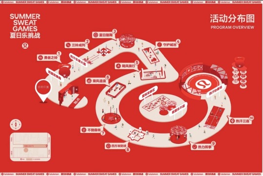
Map: The map is created in a 2.5D style, inspired by a map Lululemon used for a fitness event in China, and also because I’ve always wanted to try 2.5D. The map shows the locations and names of the fun golf games, using the same color scheme with varying shades of blue, green, and cream yellow-green. (the map is also not matching billboards and invitation cards vibe.)


0 notes
Text
Visual Presents – part 3
I chose the Riviera Country Club as the venue for this event. The reason is that this venue offers a private, luxurious, yet relaxed environment for the event. The date I selected is Saturday, June 7, 2025, because it marks the start of summer—it won’t be too cold or too hot, and the grass and trees will be green.
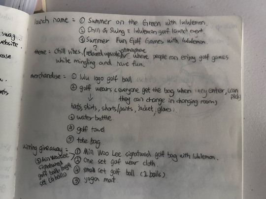
The initial event names I considered were: Summer on the Green with Lululemon, Chill & Swing: Lululemon Golf Launch Event, and Summer Fun Golf Games with Lululemon. But I didn't end up using any of them, haha. The final name I chose is Lululemon Golf Launch Event—I think it's more straightforward, clearly indicating that it’s a Lululemon product launch focused on golf, and it keeps things clean.
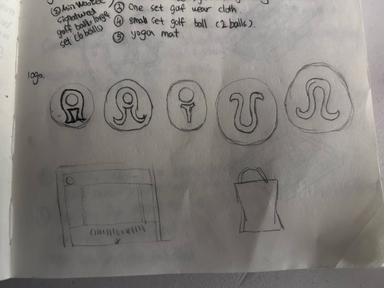
I also planned to create merchandise for attendees as giveaways, including golf balls with the Lululemon logo, hats, gloves, water bottles, towels, and tote bags. However, there isn’t quite enough time to make all of these (laugh-cry emoji), I used one week – 11 hours (Oct 21, 23) to research on golf, lululemon and product launch event, decide colors, remake the logo and narrow down what I should design for the event, and used two weeks – 32 hours (Oct 28, 30, Nov 01, 04, 06, 07, 08) to do the actual design, find mockups and do the mockups.
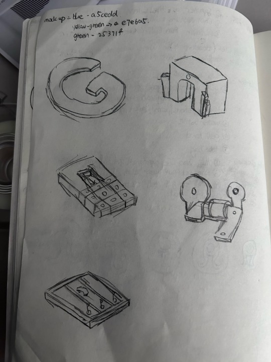
I wasn’t initially planning to redesign the logo, but I saw that other classmates had redesigned theirs, so I started with a spontaneous idea—to add a golf ball and golf tee, since I decided to make this a golf launch event, and it needed some golf elements. I tried replacing the upside-down water drop in the current Lululemon logo with a golf ball and tee. I experimented with a couple of different designs; please see the picture below. For the text in the logo, I kept Lululemon’s bold sans-serif font and added "GOLF" in uppercase with a serif font behind it (I actually got this idea from NIKEGOLF). I then played with different text compositions, but lululemonGOLF looked best.
For the colors, I chose hues from the mood board I made. The overall color scheme in the mood board is blue, green, and cream yellow, so these three became the main colors I used for this project.
For this launch event, I created:
Two golf balls
Two billboards
A couple of invitation cards
Two guest passes
One activities overview map: The map is in 2.5D. I’ve always wanted to try 2.5D, as it’s quite popular in design trends right now but haven’t had the time until now. I thought this was a good opportunity to try it, especially since Lululemon made a 2.5D activities overview map for an event they held in China.
I still have other items to create, like smoother ephemera, stickers, and beer cans, etc. I actually began by looking at mockups first and then used those files to develop the designs. I feel that working this way gives me guidance on what to design and makes it easier for me to maintain a consistent visual style (I have too many ideas and not enough time, haha!).


0 notes
Text
Visual Presents – part 2
After deciding to go with Lululemon, I conducted more specific research on its history, mission, target markets, and visual language.
History: "Founded by Chip Wilson in Vancouver, Canada, in 1998, Lululemon is a yoga-inspired, technical athletic apparel company for women and men." Their first designs were made for women to wear during yoga, but now they also design apparel for yoga, running, cycling, training, and other sports for both women and men.
2. Mission: "Lululemon is a leading brand for people around the world who want to live a healthy and active lifestyle."
3. Target Markets: Lululemon’s primary customers are "typically people in their mid-teens to mid-thirties, largely yoga enthusiasts who value work-life balance and an active lifestyle." Lululemon is now increasing its focus on menswear, as men tend to be more loyal to specific brands, and their average purchase amount is higher than that women.
4. Visual Language: Lululemon uses typography and imagery as its main visual elements. "Lululemon’s typography-covered shopping bags and other applications, including environmental graphics for its headquarters and stores, as well as a special line of apparel, allow customers to literally wrap themselves in the brand's motivational language. The typography is arranged in a modular structure and used expressively to emphasize words and statements."
Then, I came up with the idea of creating a golf wear/product launch event for Lululemon, as they are currently shifting focus from women to men, and they started selling golf apparel in 2022 but not many people know about it.
Some research about golf and product launches: 123 million people play golf worldwide. Men are primarily the players, making up 75% to 77%, while women make up only 22% to 26%. The average age for women playing golf is 66.2 years, whereas for men, it’s between 36 and 44 years. People who play golf often own companies with 100 to 1,000 employees.
Things needed for a product launch: choosing a venue, theme, elements related to the product, event activities, swag/ephemera, social media posts/posters/billboards/invitation cards/email newsletters/press releases/websites.
I looked at NikeGolf's shoe launch. They held the event indoors at a brewing company, invited a few influencers to attend, and gave it a party/club vibe. They provided attendees with swag bags, giveaway bags, goodie bags, and the shoes.
Lululemon doesn’t always host serious or professional product launches; they often include sports activities as part of their launches. After that, I thought I should create a golf product launch with lots of games and no boring speeches. I think getting people to try the golf apparel is more effective than using presentations to explain the quality of Lululemon's golf products.


0 notes
Text
Visual Presents – part 1
This is the second assignment in Applied Art and Design. For this project, we are tasked with designing or redesigning a project that aligns with what a company we would like to work for might do, approaching the project as if we were a member of their team. I spent 6 hours deciding which company I should go with and also did some general research on them in week one (Oct 14–16).
I have three directions I would like to explore: advertising agencies, design studios, and companies like Arc'teryx, Ralph Lauren, and Lululemon (I’m not sure what type of companies they are officially classified as). My first choice, or dream, is to work for a large company like Arc'teryx, Ralph Lauren, Lululemon.
Then, I narrowed it down to choosing one company from each field and did some research on these companies:
Lululemon: Lululemon is a Canadian-American multinational premium athletic apparel retailer. They provide technical athletic apparel, footwear, and accessories for yoga, running, training, and most other activities. Their job opportunities are organized into four areas: retail stores, distribution centers, guest education centers, and store support centers. The store support centers are where I would like to work. "Our Store Support Centres are home to functional teams that help our stores thrive, including Product, Brand, Technology, Digital, Finance, People & Culture, and Legal."
WPP (Wir and Plastic Plc): WPP is an advertising, public relations, technology, and commerce holding company. They "offer clients a comprehensive range of communications, experience, commerce, and technology services" and are considered the world's largest advertising agency group. They offer a wide range of job opportunities, such as creative director, digital designer, UI designer, and product designer.
2 x 4: 2 x 4 is a design studio and consultancy based in New York City and Beijing. They help companies with rebranding and developing strategies for type, marketing, and content. Their services include brand architecture, branding, campaign creation, creative direction, interior design, and exhibition design. Their clients include well-known brands like Miu Miu, Prada, Starbucks, Instagram, and Chanel. Not many people know them, so they still have open positions for roles like motion designer, graphic designer, and interns. I really like their modern branding style, and I believe I could learn a lot about business, marketing, branding, and design by working at 2 x 4.
Finally, I chose Lululemon as my final decision because they offer good employee benefits, I always buy their products, and I love yoga (laugh-cry emoji). They provide free fitness/yoga classes, a 60% discount for full-time and 40% discount for part-time employees, and paid time off!
The main reason I chose Lululemon is their focus on typography, composition, and a clean style for their branding and graphics. Personally, I prefer play and work with typography over graphic design, so I think Lululemon would be a perfect place for me to work.

0 notes
Text
Vernacular Design
This is the third exercise of the assignment. For this exercise, we need to find 20 examples of vernacular design in the community of Medicine Hat.
I researched that vernacular design follows three main principles:
Constraint: Using materials that are locally available (like wood, straw, brick, stone, and earth) to build structures and designs. "Indigenous builders use local culture and materials to guide their processes instead of years of formal schooling."
Thrift: Utilizing old, reliable, and inexpensive materials to construct buildings and designs. "Viking longhouses, Amish barns, or American bungalows aim to get the most building for the least amount of material, money, and time."
Durability: Using natural, durable materials to create buildings that don’t need constant repairs. "Cape Cod houses, for example, would not have had additions put on if the main core of the building needed frequent, costly repairs due to perishable parts."
To find my examples, I walked around the neighborhood and paid attention to what people in the community were doing. Most of the examples I found primarily reflect the principles of constraint and thrift.
(only 8 examples posted below)


0 notes