
Don't wanna be here? Send us removal request.
Statistics
We looked inside some of the posts by jiangzoe and here's what we found interesting.
Average Info
Notes Per Post
1
Likes Per Post
1
Reblog Per Post
0
Reply Per Post
0
Time Between Posts
13 days
Number of Posts By Type
Text
6
Last Seen Tumblr Blogs


Fun Fact
Tumblr has been providing a Korean-language service since 2013.
Text


This is a data that I collected for my Science lab class. The topic is on 'The Impact of Background of Memory Recall During Studying". This data shows that there are no significant relationship between listening to music while studying and not listening to music while studying. But there were only 20 participants so the data can't be justify whether music really helps with studying or not. I think this is an example for the last module "data visualization".
2.Häagen-Dazs exemplifies a cohesive brand identity through its meticulously crafted design system, evident in its packaging and branding. Central to this system is the iconic Häagen-Dazs logo, characterized by an elegant cursive font and a gold color scheme, evoking a sense of luxury and quality. Consistency is maintained through a black and gold color palette applied uniformly across packaging, complemented by a sophisticated serif typeface for product names and descriptions. Typography is carefully arranged, with attention to alignment, positioning, kerning, and the use of caps for optimal readability and brand recognition. Pictures of the yummy ice cream make the packaging look fancy and appealing. This helps Häagen-Dazs keep its posh image and makes people remember and like the brand.
0 notes
Text


1.Apple Logo:The Apple logo is a stylized depiction of an apple with a bite taken out of the right side. It consists of a simple, iconic silhouette with smooth curves, typically rendered in a monochromatic color scheme. Denotatively, it represents the fruit itself, with its distinctive shape and the recognizable missing bite.
2.Apple Logo:The Apple logo, a stylized apple with a bite taken out, symbolizes innovation, creativity, and luxury. It represents Apple's commitment to cutting-edge design and user-friendly products, evoking feelings of excitement and admiration. The bitten apple adds a playful touch, suggesting non-conformity and pushing boundaries.
3.Stop Sign:The stop sign serves as an iconic symbol with a clear function: to command vehicles to halt. Its octagonal shape, bold red color, and prominent white letters spelling "STOP" make it instantly recognizable and universally understood. As an icon, the stop sign conveys its message without the need for language, ensuring consistent communication of traffic regulations and promoting safety on the roads.
4.Recycle Logo: The recycling symbol, with its three arrows forming a triangle often encircled, directly signifies recycling. This simple shape visually represents the cycle of reuse and repurpose, guiding towards sustainable practices. When people see this symbol, it reminds them of responsible disposal and encourages participation in recycling efforts, making it a clear marker for eco-friendly actions.
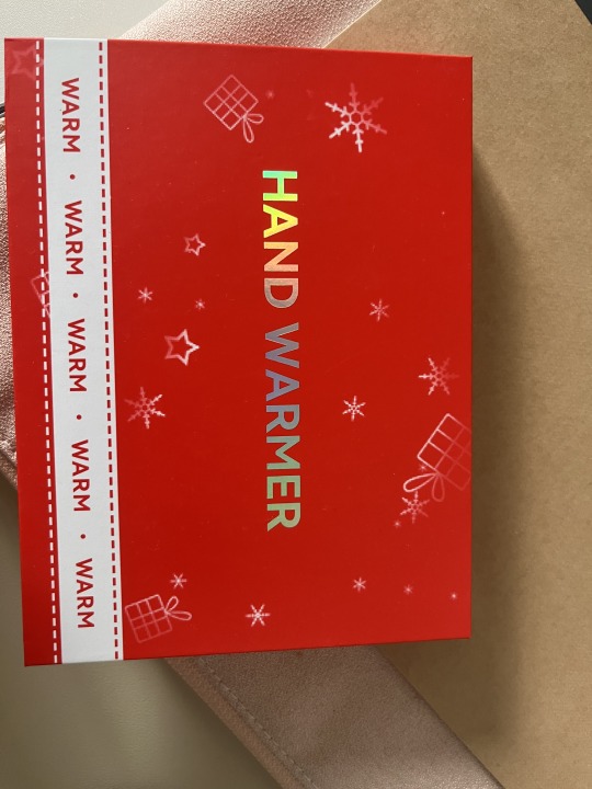
5.Handwarmer: The handwarmer product, with silver letters on a red background and white snowflakes, symbolizes warmth, comfort, and the holiday season. The red color makes it feel warm and lively, while the silver letters add a touch of elegance. The snowflakes remind us of winter and holidays, making it cozy and festive. Overall, this design promises warmth and comfort during cold days, bringing holiday joy to mind.
6.You Can Be A Stock Market Genius Book: Caption: This book cover has a vintage style, making us think of old times when the stock market was mysterious. The light bulb suggests it holds the secrets to understanding stocks. The yellow background feels positive and exciting. And the money at the bottom reminds us that stocks mean wealth. Overall, the use of a past style in the design signifies credibility and implies that the book offers enduring wisdom for success in the stock market.
0 notes
Text
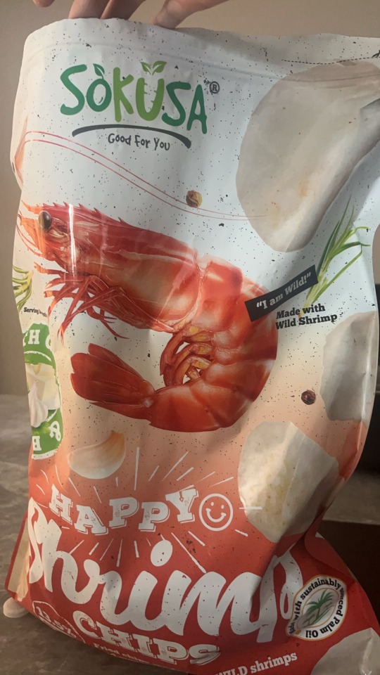
Sokusa Happy Shrimp-This font helps communicate more than the words do themselves, it uses fun curvy typography to show the fun and yummy of the shrimp chips.
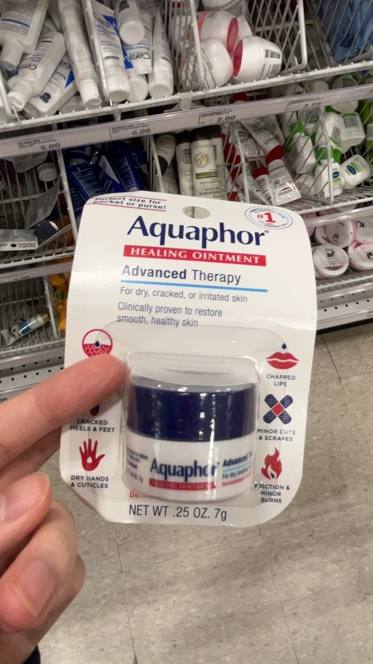
2.Aquaphor: The "q" and "p" is an descender in the design.
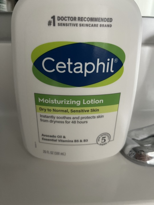
3.Cetaphil: The "t" is an ascender in the design.
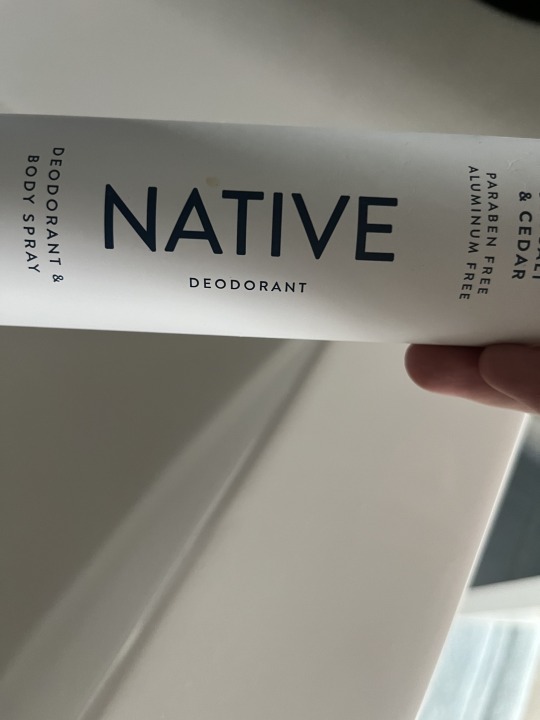
4.Native: This design could be considered as "modernist" because it's easy to read and can be used in all situation.
5.Hand Warmer: The "H", "A", and "E" are crossbars in this design.
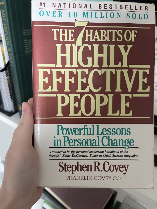
6.The 7 Habits High Effectve People Book:
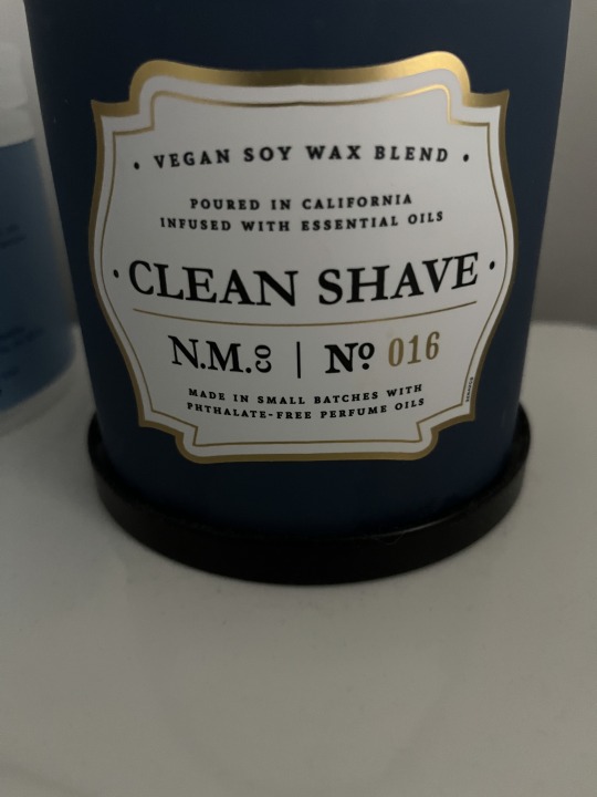
7.Candle:These letters have a small x-height and small ascenders.
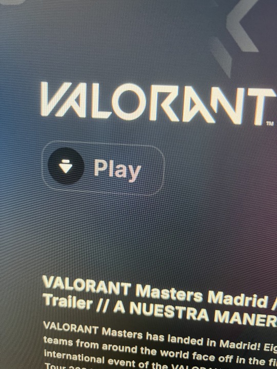
8.Valorant: Rthym is evident in this Valorant title photo because some letters are crossed by others. It also have a very unique spacing to it too.
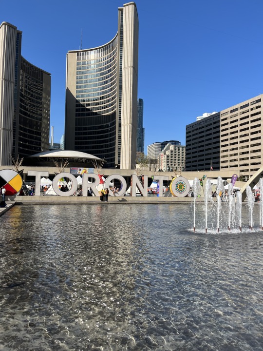
9.Toronto:These letters have a large x-height and large ascenders.
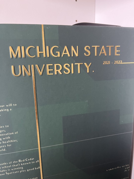
10. Michigan State University: The big MSU typography hierarchy is on the top of the book emphasize that this book is from Michigan State University
0 notes
Text


Valorant Valentine's Day- This is a bundle that was released on Valentine's Day. It's mainly using the color blue and pink for the card. What attracts me is the different hues they used for each card. There is pink and then it gets light and lighter.
2. Spotify- At the end of every year, Spotify will send out the top songs you listened to. They used mostly cool shades, which means the graphic design piece is predominantly composed of cool colors, the designer may be aiming to convey specific emotions, moods, or associations commonly linked with these colors.
3. Sangrito Wine- This juice wine logo uses warm colors for its logo. It's using yellow, orange, and red to illustrate the owl. I think they used these specific colors to make it fun. This is mostly for people who just started to drink wine. Using red, yellow, and orange can create a sense of excitement and enthusiasm around the wine brand, suggesting that the wine is lively and full of flavor.
4. Theraflu- This is medicine for cold. They use yellow and blue. The design is conveying yellow for the day (sun) and dark blue (night). OS it would be easier to differentiate which medicine to eat during the day.
5. Oreo- The color of the Oreo is mostly blue with a white splash in the middle. Inside the Oreo in the middle, there is a big red bold letter ( MEGA STUFF). They are trying to convey that there is more stuffing than the regular Oreo pack.
6. MSU Career Handbook- This MSU graphic design uses different hues of green for its cover. It also uses white for the wording, so students will be able to find information. It conveys the importance of job finding.
7. This is a book that I found in my house. It uses vibrant colors like pink, yellow, green, blue, and red. I think the author purposely uses these colors to represent emotion and action.
8. Soy milk- Yellow and blue are complementary colors, meaning they are opposite each other on the color wheel. This creates a high level of contrast, making elements stand out. The use of yellow and blue can contribute to a brand's visual identity, making it stand out on shelves and creating a cohesive and memorable look for the products.
0 notes
Text


The Canadian Goose Logo- The jacket logo is like a special stamp on the jacket. It's a round emblem with red, white, and blue colors that stands out on the jacket's arm or chest. The colors make it easy to notice. Inside the circle, there's a white map of the Arctic, showing the brand's connection to cold places. The words "Canada Goose" are written boldly in white, making them easy to read. Sometimes, the logo is raised or embroidered on the jacket, giving it a special feel when you touch it. All these things make the logo special and represent Canada Goose on their warm winter jackets.
2. Machi Machi- The logo is a puppy holding the drink. This is well known bobo place in Asia, especially in Taiwan. This is a very simple logo like Momo Tea, theres only one color and it's black. However the typography is simple, it gives me the comic sans typography. Playful and fun style. However, there is a blue scribble blog circle on top, gives a unique and not to plain feeling.
3. Momo tea- The graphic design logo for this bubble tea area is cat. It's simpler and easy to remember. The typography for this gives off a playful vibe and a chill vibe like what cats usually gives off when they are around you. Logo designs often incorporate symbols or images that convey specific meanings or resonate with the brand's identity. So cats are associated with various qualities such as playfulness, curiosity, or relaxation. If a tea brand chose a cat in its design, it could be to evoke a sense of comfort, warmth, or a cozy atmosphere often associated with enjoying a cup of tea. The color used is also very simple, just black and white. The cat is on top of the logo name.
4. Cruisin Kitchen- this was a food truck at my high school. The color used for this logo is bright vibrant colors. The typography of this logo was also unique. All the letters are not the same size, some are longer and some are shorter. The typography is also in the middle of the truck so it's easily to see. On the side 9background) there are like rain stripes looking striking down. Most of the weight is on the left side, there are more rain stripes on the left than the right,
5. Carhartt's logo- is tough and easy to recognize. The brown color and bold letters of the brand name, usually in uppercase, make it stand out. The logo often includes symbols like the 'C' or 'square-C,' showing that Carhartt is all about real and durable workwear. The tough font and symbols tell you their products are strong and built to last. When you see the Carhartt logo on their clothes, it means you're getting something sturdy and authentic, made for hard work.
0 notes
Text


Image 1: Poster Design- This poster was designed last semester for one of my Graphic design class. The goal was to design your own event poster of Global Design style. This poster was suppose to pretend that MSU College of Arts and Lettering was your client and they are asking you to create a poster for an upcoming event.
Image 2: Gift Cards- This represents graphic design through a visual elements. The design includes a nice arrangement of colors, fonts, and images that make the card attractive. Graphic designers use their skills to create a layout that is easy to read.
Image 3: Exit signs with different small restaurants like McDonald's or Speedway on the expressway show graphic design in action. These signs use colorful logos and clear writing to help drivers quickly spot their favorite places. The signs are set up so that important details stand out, making it simple for drivers to see where they want to go. By using these visual tricks and making everything look consistent, graphic design helps drivers find their way to the right exit and enjoy their meals or services
Image 4: The User Experience Team of One- This book is a book that I am currently reading in on of my XA class. This book talks about the different jobs including graphic design. The overall layout of the book represent graphic design through its cover design, layout, and overall representation.
Image 5: Brush lettering- I took notes using brush lettering letters for my notes in one of my Science class I took last semester. I think brush letter is an excellent example for graphic design because it represents typography. Graphic designers use brush lettering to create visually appealing and personalized designs.
1 note
·
View note