
Statistics
We looked inside some of the posts by joedesigned and here's what we found interesting.
Average Info
Notes Per Post
82
Likes Per Post
51
Reblog Per Post
30
Reply Per Post
1
Time Between Posts
3 days
Number of Posts By Type
Photo
11
Video
1
Text
4
Quote
1
Last Seen Tumblr Blogs


Fun Fact
The most popular pages on Tumblr are about Minecraft, GIFs, and David J. Peterson.
Photo
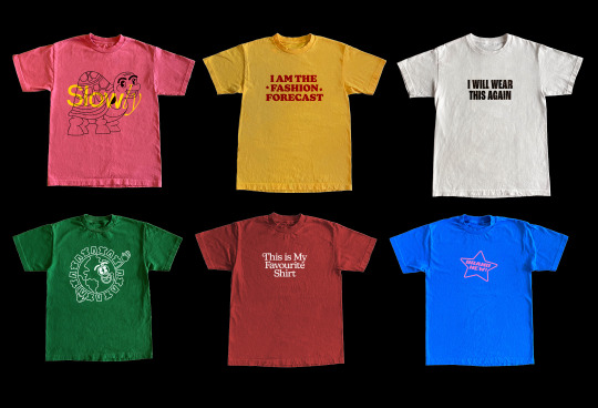
Design Examples / Possibilities
Here are some mock ups I’ve made with the final graphics I designed. I wanted to see how the graphics would look stand alone but also what they’d look like mix and matched. I really love how they’ve turned out, and I think theres a lot of potential for what my ‘customer’ can do with the range of graphics I’m providing.
5 notes
·
View notes
Photo


Second Print / Stencil Test
I was super excited to do a print test with the stencils and stamps I’d laser cut, so I went straight home and started experimenting. I tried out a variety of techniques, including fabric marker, fabric paint and stamping with fabric paint.
I found my most successful run was with the stamps using the fabric paint. I found that when I used the stamps I got exactly the type of print I wanted, which was no bleed, clean edges and a slightly worn out look. I think the slightly worn, degraded look really helps to communicate the irony of the phrase ‘Brand New,’ which is exactly the intent. Overall I felt like I had much more control over the design when using the stamp, so I think moving forward I’m going to make all the slogan graphics stamps.
The stencilling didn’t go to plan. I found that with both the fabric marker and the fabric paint, there was a bleed and it just looked messy and handmade. I think that stencils will work best with spray paint (I’m yet to test) and I think going forward I’m only going to stencil the bigger, more ‘statement piece’ graphics.
#rmitjournal#printing#stampmaking#stencilling#JOESAOCSKO#design#fashion design#typography#copywriting
1 note
·
View note


Photo

Graphic Ideas - Text Graphics
Some graphic ideas for stencils/ stamps. I’m still playing with the phrases I want to use, I definitely want to make sure thew text is powerful. Theres some phrases in this brainstorm that I think are cop outs, things that are more shocking than meaningful. I want phrases that are both.
0 notes
Photo

Graphic Brainstorming - Slow Fashion
Beginning the design process for the stencils and branding. I’ve decided to call the brand ‘Slow Fashion’ or ‘Slow’, (opposite of fast fashion.) I want half the stencil designs to be made up of the direct/ blunt phrases I’ve talked about previously, but I also want some of the graphics to be lighthearted and more symbolic.
Here is what I’ve got so far graphic wise. It’s still very early stages, but you can see the type of direction I want to move in. I really like the earth in the top right corner, and will definitely be refining that into something or other!
#JOESAOCSKO#graphic design#design#graphics#sketches#fashion design#fashion#design activism#activism#rmitjournal
0 notes
Photo


Keith Haring - Design Activism Through Symbolism
#JOESAOCSKO#rmit journal#design activism#keith haring#art#design#symbolism#symbol#fashion#fashion design
5 notes
·
View notes
Photo

Paris Hilton Wearing ‘Stop being Desperate’ Tank
(an edited version of this image has also circulated the internet, in the edited image her shirt reads ‘Stop Being Poor”)
Similarly to the Viktor and Rolf dresses I posted earlier on my blog, the message on this top uses humour and bluntness to communicate it’s message. The phrase is so blunt that it’s unclear whether or not Hilton is wearing it ironically, which I think makes the design so much more interesting and polarising.
I want some of the clothing stamps / stencils I’m creating to include phrases that confront the reality behind fast fashion, but I think framing the phrases in such a literal and blunt way can be super humorous and effective.
#JOESAOCSKO#rmit journal#paris hilton#pop culture#fashion#fashion design#design#design activism#activism
0 notes
Text
Project Proposal - Week 6
We are now deep into our second project, which is to propose a design response (to an issue of our choice) that seeks to provoke a change.
After completing the group assignment, I’m definitely interested in the issue of fast fashion and overconsumption, capitalism, consumerism etc. I believe that the issue of overconsumption trickles into most aspects of our lives, and that is something I’d like to change.
Over the last week or two I’ve thought a lot about how I can create something that will provoke real change. Miram and Hannah have prompted us to dissect the issue, our audience, our ‘call to action’, which has been really beneficial. After many discussions and lots of research I think I’ve concluded that the call to action for my design is to help people understand the real value of their clothing. I think if people became more mindful about their purchase habits, it could really make a drastic change.
The next challenge is to figure out a realistic, effective and sustainable way to evoke this change in people. I went back and forth with a couple of ideas. I originally had an idea to create a publication that was the embodiment of waste in book form. I wanted the entire book to be filled with pictures of trash, cheap clothing and other pointless, disposable items, but I quickly realised that this would just be contributing to the problem, rather than providing a solution to it.
I think shifted towards fashion more specifically. I’ve always been eager to design for clothing and merchandise, and it feels as though this class is the perfect opportunity for that. I started thinking about how I could raise awareness about the horrors of the fast fashion through clothing, and came up with a few ideas.
Side Tangent: A big challenge during this stage of my design thinking was figuring out how I wanted my audience to react to my final communication. I talked to Hannah about it and it became clear that I didn’t want to guilt trip people. Yes, I wanted to shed light on the severity of the issue, but i didn’t want to overwhelm people into thinking theres nothing they can do it create change. This became a super important consideration for me and honestly completely reshaped my project.
After taking all of this into consideration, I’ve landed on creating a type of ‘fashion toolkit,’ that includes graphic stencils, stamps and (maybe?) stickers that users can apply onto their existing clothes. I also want to create an accompanying online campaign to help the product gain traction.
So that’s the extremely basic explanation. I have a lot to figure out still, but I think that is the core idea of my final project!!! Yay!!!!!
0 notes
Text
An inspiration behind my ever changing final project. I know I want to use fashion and textile in some way to communicate my activism, and I find this 2019 Viktor and Rolf collection super interesting. I love the humour this collection has, its shockingly direct, but also seems misplaced and surprising.
I’d love use humour in my project to advocate for change, I think it’s the most effective way to get peoples attention, and is much more positive than using guilt or fear. I want to call out / expose the fast fashion industry / consumers but I want to do it in an entertaining way, I think that’ll make my final communicate more powerful and influential.


viktor and rolf haute couture ss 2019
#JOESAOCSKO#rmitjournal#viktor and rolf#fashion#high fashion#activism#modernism#design activism#design
70 notes
·
View notes
Photo

Trying to figure out my intended audience and who I am designing my assignment for. This is an empathy map, which was an activity we did in class to try and flesh out our audience.
It’s honestly super nerve racking to think about how I’m going to effectively influence and persuade people with my design. While talking with Hannah I realised how much of a challenge this assignment will actually be. I think I’ve realised that what we are attempting to do in this class is change people ethics and values, which is a super hard thing to do.
1 note
·
View note
Photo

Week 4 - Agents of Change
Week 4 was presentation week! Our first assignment was a group research assignment, where we were asked to research an issue and find design activism that is combatting said issue. Our group focused on climate change / the environment, and I researched specifically about non-renewable energy.
........
0 notes
Text
Dale Hardiman - Lamp


Last Friday I visited the Melbourne Design Fair: Collectible Contemporary Design. The exhibition showcased all sorts of different industrial design, mostly unconventional furniture pieces. This elaborate lamp by Dale Hardiman symbolises much more than a piece of furniture that provides light.
The lamp ‘belongs to a series of experimental works (that are) assembled from various found and discarded objects, furniture, and industrial waste. Intentionally made to look rough in contrast to the stylised goods of modernist design, (the) lamp is covered with coloured synthetic polymer paint to draw attention to the prior waste that lies beneath. Hardimans experimental work is a comment on Modernisms less desirable effects, characterised by the acceleration of consumerism, waste and environmental degradation. - Melbourne Design Fair
I thought I’d share this artwork because i think it’s a pretty accurate depiction of design activism. Hardiman has combatted the issues of overconsumption, waste and pollution through the design of this lamp. The lamp acts as a piece of art, which means it garners more isolated attention and analysis, especially in a gallery environment.
#JOESAOCSKO#rmitjournal#study notes#journal#dale hardiman#industrial design#design#design activism#melbourne design week#melbourne design fair
0 notes
Quote
Are we doing enough as a profession to address the critical challenges of our time?
Design as Activism: A Framework for Actions in Landscape Architecture Education
An excerpt from an article we were assigned for reading. This article really opened my eyes to the power and influence design can have on society if used correctly. It’s a valid question, and something that I’ve thought about a lot over the last few months especially.
I had an epiphany one day last year and realised that a lot of the design I consume, create or aspire to create is unsustainable or contributing to waste, overconsumption and capitalism. This was a depressing conclusion to come to, and for a time I was asking myself how I would ever really contribute sustainably and ethically to the world as a designer.
I think in some ways landing myself in this class was meant to be, as the whole purpose of the class is to explore design that promotes change. It’s inspiring to read articles like this because it validates my feelings surrounding the state of design, but also encourages me to participate in valuable and influential design.
0 notes
Text
Week 1 - Agents of Change
I’M BACK...
I’ve decided to re-purpose this blog and use it as a digital S.K.O (Student Knowledge Object) for my ‘Agents of Change’ Studio. I loved adding to this blog during my first year at uni and found it super easy to keep up with, so gonna try and use it in the same way for this class and assignment!!
Going into this class I wasn’t very excited to be honest. It wasn’t a class that I’d put down as a preference, and I was kind of randomly thrown into it. Week 1 was good because it allowed me to become more familiar with what exactly the class entails. I met Miram (In person!!!!!!!) and Hannah (online, isolating), which was nice. Miram went through the basic outline of what the class entails, including all the assignments and expectations.
In this class I’m keen to explore how design can be used to push activism. I’ve done a lot of studio classes that focus on very ‘surface level’ design, (packaging, board game design, publication design) and although I think I learnt valuable things from those classes, I’m excited to explore how design can be used more directly to change the world.
I’m excited to maybe explore design through the lens of fashion this semester, as both Miram and Hannah have lots of experience in that field. It’s definitely an area of design that I find overwhelming, but I think it could be really beneficial to lean into those overwhelming feelings!!
#journal#JOESAOCSKO#commentary#study notes#design#fashion design#design activism#activism#rmitjournal
0 notes