
Don't wanna be here? Send us removal request.
Statistics
We looked inside some of the posts by jotpixel and here's what we found interesting.
Average Info
Notes Per Post
1
Likes Per Post
1
Reblog Per Post
0
Reply Per Post
0
Number of Posts By Type
Text
1
Last Seen Tumblr Blogs


Fun Fact
After the announcement of the deal with Yahoo!, there were 170K signatures of unhappy Tumblr users petitioning to prevent the sale in 2013.
Text
Does Kerning Really Matter?
Learn What is Kerning and How to Properly KERN your Text.
If you Prefer Learning through video WATCH IT HERE

Kerning is the Space between individual letters or characters and it has to be just RIGHT. Too Tight or too Wide Space needs Adjustment.
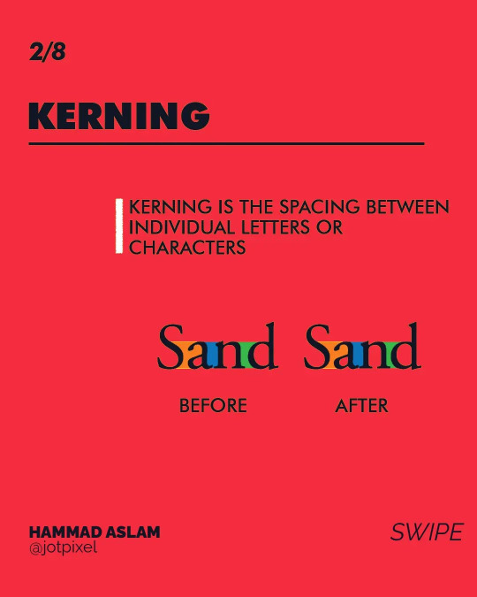
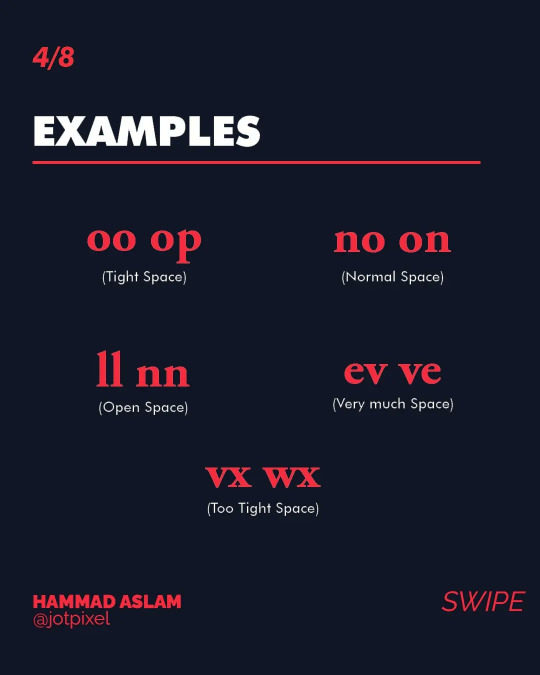
There are a lot of Character Pairs that need adjustment and some of them are listed below in the image.

Some of the Kerning Pairs Examples includes "oo", "op", "no", "on", "ll", "nn", "ev", "vx", "wx". You need to always look for these pairs and adjust the spacing between these letters.
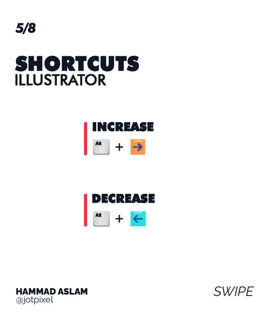
While Adjusting Kerning in Adobe Illustrator you need to remember some of these Illustrator shortcuts to help speed up your work. The shortcut is mentioned in the image.
There are 2 types of Kerning adjustment in Illustrator. Optical vs Metric. Metric Kerning is the mechanical calculated Kerning and you don't need to always rely on this. Optical Kerning refers to Kerning adjustment made visually.

The best way to KERN your text is to use the 3 Letter Rule. In this rule, you need to adjust 3 letters at a time starting from Left to Right. The Illustrated Demonstration is in the image.

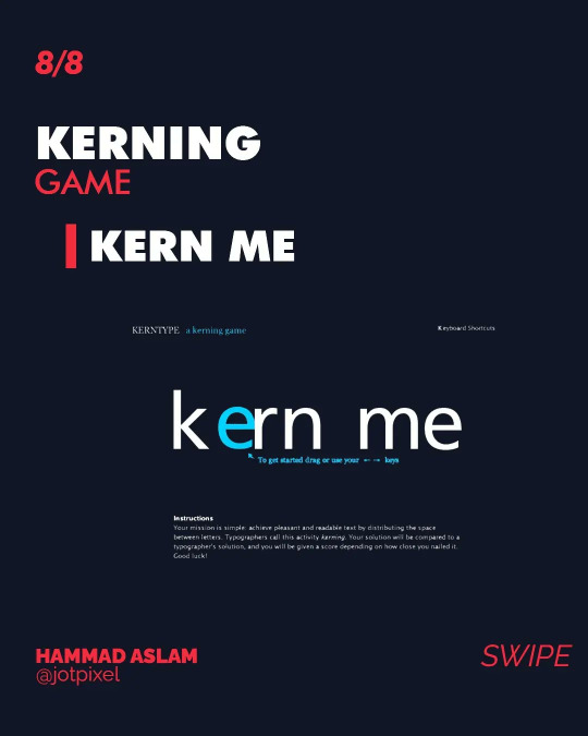
If you think you have enough GRIP on Kerning then this game will help you gain confidence. Do give it a try.
Thanks for making it to the end. If you like my content don't Forget to Like, Share & Follow.
My Social Links:
Instagram: http://instagram.com/jotpixel
Tiktok: http://tiktok.com/jotpixel
YouTube: https://youtube.com/channel/UCPx70o4eX20ruIR6NodK-QQ

#typography#kerning#tracking#fonts#graphicdesign#photoshop#illustrator#typographytutorial#adobe#branding#graphic design
1 note
·
View note