
Last Seen Blogs
jkt48
JKT48

kinwagrow-blog
Kinwagrow

ectoblud
on my last 3 braincells

bexutyindexth-blog
Let's Make a Beautiful World

qianqian1168-blog
facemask
Text
I have always been interested in the printmaking process of Collagraphy. This genre of printing allows room for experimentation, surprising mistakes and interesting outcomes. I’m also interested in Collage making and Collagraphy is a great way for me to combine the two. Even when drawing on paper, I usually feel the need to add something physical to it, to create a texture or create something more tactile. Throughout this research for collagraph artists I have learned more about the genre and I am excited to progress and experiment now that I have inspiration. I enjoy the process of finding day to day objects around me, and to find out how they take ink and print. To create a collagraphy print it’s imperative to correctly and properly prepare your ‘plate’. Your plate is a firm surface which can be scored, etched and different textured paper,gels and paint can be added to create an image. You can transfer your chosen image the plate as if creating a Lino cut image. You must use the correct glue to when building your plate and you can also use string, buttons etc as long as the material used isn’t too soft or absorbent which will affect the inking process. The plate image is then sealed with gloss or varnish (also the back and sides to prevent curving of the plate when being washed). The inking process can be the relief or intaglio method (adding ink on top of the image or adding ink into the image and wiping off then using a press similar to the etching method) I have chosen three artists and of the three I was happy to find Donald Stoltenberg. I also was happy to find information on Atelier 17, a famous print studio in Paris and later New York, set up by a British artist, Stanley William Hayter. He encouraged lots of experimental ways of printing and encouraged artists such as Sue Fuller.
Donald Stoltenberg
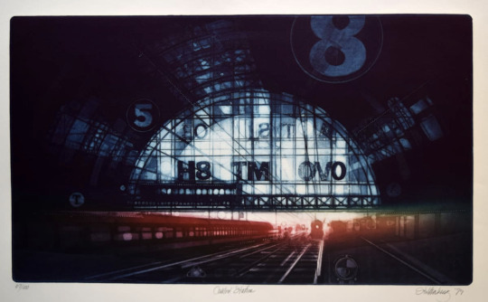
Donald Stoltenberg’s collagraph ‘Central Station’, immediately sets the scene. The viewer feels caught up in a timeless romantic narrative filled with anticipation and excitement. We cannot see other passengers which eludes to a journey or travel out-with the humdrum and the rat race. The warm red and orange hues and bright white of daylight from the archway are enticing as if there is another life outside of the dirty smokey city. The title ‘Central station’ reflects the mood of the occasion, perhaps we are waiting to meet a friend we’ve not seen for a long time or we are taking a long train journey. We, as the viewer are given the choice to create the story...the train arriving - who are you there to meet? There is a huge sense of anticipation surrounding this image.
The scene seems to be dateless, could be 100 years ago or yesterday. The image has a heavy vignette and this gives focus to the huge archway of the station entrance and gives the viewer a sense of smokey hazy station. The train to the left of the image... is it arriving, departing or stationary? We are able to create our own narrative and that’s why I feel this image is of a romantic nature.
Stoltenberg trained as a graphic designer before starting his career as an artist. The artist also had a passion for architecture and maritime structures. He has published books in his career, popular books being ‘The Artist and the Built environment” and Collagraph Printmaking. Although Stoltenberg was a successful collagrapher and printmaker, later in life he dedicated his life to watercolour and oil painting as these techniques were less laborious, although his subject matters remained the same. (Destroyer At DryDock for example and can been seen in the link for the Anderson Gallery)
The addition of the bold text and numbers seem to act like a calendar or stopwatch - the countdown to a rendezvous or a holiday. The number 8 seems to be a favourite of Stoltenberg as we see this figure of 8 in his train triptych. Stoltenberg also favours a circular object when fixing his collagraph plate. We can see the circle plays a vital role in many of his other works. (Shipyard 1982, Warship, Wooden bridge, Relic and Coin collection again, in the link provided). The lettering in the station’s large arch window are not recognisable or familiar, therefore I would presume that due to the technique of collography, the letters were used purely for aesthetic reasons rather than for any symbolic reason. With this collagraph, the fonts and figures would have been deliberately chosen in order to sit well on the plate.
The Artist has achieved a sense of movement with the train lines and carriages moving from the foreground of the image into the distance. He has also achieved the sense of direction and movement with the hazy shadows from the outside of the station tunnel. The artist has used both vertical and horizontal lines overlapping giving a sense of the enormous structure of the station and how it seems to loom or envelope the trains and passengers. The glass archway is almost central to the image and our eye is led to the incoming train with it’s white dot as a light. The viewer easily places themselves standing on the platform in anticipation...
Works Cited
ARCHIVE, ARTWORK. “Art Collection from Anderson Gallery - BSU.” Artwork Archive, 2021, www.artworkarchive.com/profile/jay-block/artist/donald-stoltenberg. Accessed 8 Mar. 2021.
“Donald Stoltenberg.” Wikipedia, 18 May 2020, en.wikipedia.org/wiki/Donald_Stoltenberg.
“Zullo Gallery - Current Exhibit.” Www.zullogallery.org, www.zullogallery.org/printmakers_page_1.html. Accessed 8 Mar. 2021.
KATHLEEN BUCHANAN
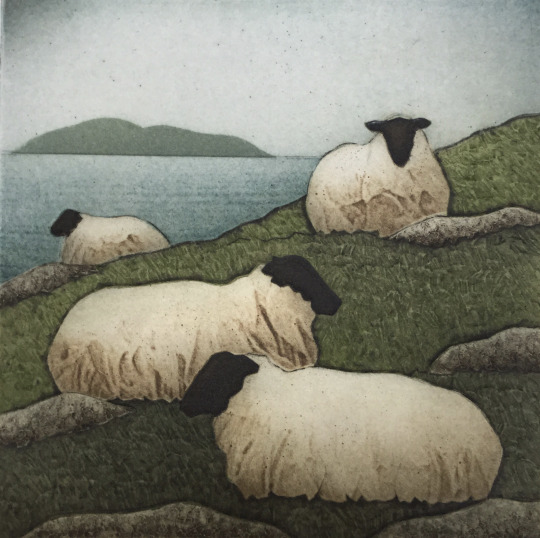
This image is by the Collagraph artist Kathleen Buchanan. Titled ‘Flock and Sea” is conveys a sense of silence and serenity - a slow pace. We find ourselves in quietness, stopping to appreciate the landscape on a hazy Scottish island perhaps.
The sheep are in a restful mood, however there is a humorous element to them. Our eye is drawn to the crumpled sheep coat - like an old paper bag, random like litter in the lush green grass being anchored by the boulders. In a light hearted way we could see that the boulders are preventing them from sliding down the hill. There is also a sculptural feel to the sheep’s coats which gives them a comical look, like they’re are wrapped up in a duvet keeping warm.
It’s Spring time but still cold, the slight haziness and speckled effect in the blue of the sky reminds me of the Scottish midge fly buzzing around with the sheep unperturbed.
The sheep are relaxed, reminding us of the harmonious relationship between nature and animals.
The viewer cannot see the eyes of the sheep, but Buchanan has caught the personality of sheep - one always seems to be curious or suspicious. The distant sheep of the flock could be the dreamer or the outsider - the ‘black sheep’. The other sheep make the viewer feel ignored by the deliberate positioning of the animals .
The boundary line, between the sea and the hillside divides the image. There are many outlines in this image - around the boulders, the sheep coats and the island - giving a sense of heaviness and solidity.
Kate Buchanan, by profession is a biologist and her background in science links well with printmaking. Both fields of study involve great observational skills and this is obvious with her great understanding of the natural landscape and its inhabitants.
Works Cited
Design, Doug Felton Web. Kathleen Walsh Buchanan Fine Art Printmaking | about Me. www.greysealpress.com/about. Accessed 8 Mar. 2021.
SARAH AMOS
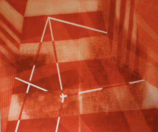
Sarah Amos, is a master printmaker who divides her time between Australia and America and her art combines collagraphy with mixed-media or more recently, stitching. Her recent work is based on images from the vast Australian landscapes. This collagraph is from 2011 and is not so typical of her recent work however it immediately caught my attention. The title is called Little Red Wonder and it’s an apt title. There’s no obvious narrative, but the artist evokes nostalgia, and grabs your attention through the colour and lines and form alone. So many words spring to mind on viewing this image - it feels like Christmas. It’s candy canes and gift wrapped boxes under the tree. It’s like a hazy red glow of the fairy lights and the warm fire. The image reminds me of sweeties and paper straws, strawberry shoe laces, and toffee apples at Halloween. The geometric lines and shapes and the vibrancy and the mottled marks conjure up visions of and old-fashioned circus and the high trapeze -the big top. Or a slice of cool watermelon or Summer Cup cocktail. The white lines, in strange directions, as if holding up the makeshift tent, cosy and warm, safely camping in your bedroom. The image is fairytales of Dorothy and her ruby red shoes and The Queen of Hearts in Wonderland all in one box of wonder.
As much as the image gives a sweet naive impression, we can also imagine the polar opposite. The colour red is a very symbolic colour, maybe the artist chose this particular hue of red to translate an emotion. Could this be an angry expression with the jutting disjointed lines. The lines are hard and edgy and there is no flow. Is the emotion aggression - the white lines in the centre of the image seem to puncture the composition - like exposed bones through blood. The viewer feels small, as if we are underneath a structure and it feels looming and foreboding. The two blocks each side of the image seem to be leaning in and are imposing.
With the nature of collagraphy, the inking and printing process almost always gives a dreamlike quality, a little hazy but alway an honest and sincere image.
Reference list
AMOS, S. (2021). Master Printmaker | Sarah Amos Studio. [online] sarahamosstudio.com. Available at: http://sarahamosstudio.com/index.php [Accessed 8 Mar. 2021].
Bunyan, D.M. (2001). Sarah Amos. [online] Art Blart. Available at: https://artblart.com/tag/sarah-amos/ [Accessed 8 Mar. 2021].
0 notes
Text
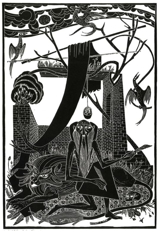
St.Jerome
Artist - Alasdair Gray Photo relief 2017
Alasdair Gray, prolific polymath, has acheived great success in creative fields as literature , poetry, mural artistry and illustration. He once described himself as a ‘verbal and pictorial artist’. This particular art work, he originally created as a woodcut in 1955, studying as a young man at the Glasgow School of Art. It is perhaps evident in the subject matter of this image that Gray had a lot to say and he was trying to communicate pictorially. For example, we can presume that the wise guru like character at the centre of this image is St Jerome. St Jerome is the patron saint of translators - amongst others such as librarians. St Jerome was an important figure in history as he played a pivotal role in translating the Bible from Greek to Latin. He is responsible for opening the debate of how to translate - literally word-for-word or translate the sense of the text. I feel like Gray has included St Jerome with two quills and black blank writing board as he wants the viewer to know he has something important to convey but he wants the viewer to look deeper into the image to decipher the meaning.
The layout of the image is important as the viewer is drawn to the direct stare of the St Jerome’s eyes which are also in line with the brick wall behind him. The image is heavier and dense to the lower part of the image with the majestic looking Lion, what looks like a tribal hand made patterned rug and foliage. These natural images stand in contrast to the modern brick built walls behind him. Gray has also created a stark contrast between the natural elements of the bare tree branches weaving through the brick work. The imagery lightens as we take our eye up to the top section where we see tree branches propping up the material for shelter, being a perch for the birds and two branches almost seem to be cradling the sun amongst the clouds in the sky.
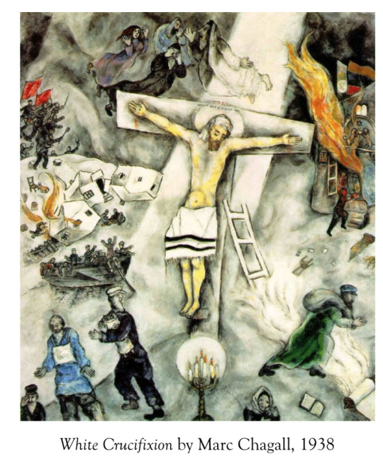
Gray has used many individual images in a symbolic way. For example, the three birds, the skull, the fire and candle all seem to portrait a religious or mythical story or fable. The birds are Phoenix like and we are reminded of the Greek folklore or myth of the Pheonix rising strong from the ashes, symbolising an emergence stronger from a bad situation. This myth can be linked with the fire and flames on the brick wall. The candle suspended about the mans head,as if a light-bulb moment, symbolises enlightenment and peace perhaps. The skull on the otherhand is difficult to interpret. My initially thoughts were the the use of the skull as a Momento Mori. However as much as death is inevitable, perhaps Grey was trying to convey a warning within the image and placed the skull encircled at the forefront of the the image. I also feel that the form and artistic style give a sense of a direct message. Black and white, no grey areas. Gray has created flat, bold lines. Depth of the image seems to be used more at the middle of the image with the angular walls creating an unfinished room or shelter. The clouds, smoke and bird’s feathers provide the sense of movement, lightness and freedom. The lion and the man seem to be more flatter and grounded. I feel that Gray has deliberately used this monochrome, flat image to which he has created a border (rather that a frame) as if to create a primitive religious picture that you may see in a church or bible. I can see this image almost as a religious stained-glass window in a church, allowing a person to understand a lesson or parable. Gray’s work and this image in particular reminds me of the symbolic work of Marc Chagall, especially White Crucifixion 1938. Also below I have included another similar work by Gray - a lithograph dated 2008, which I feel is similar to to St Jerome image in that is highly symbolic and in monochrome.
Overall, there may be many interpretations of this art work. I have to bare in mind that Gray was a much younger man, and was of a different generation so the meaning it had for him then may be different from now. However, for me, I feel it relates to the the conflict between man and nature. The contrast between the natural environment of the lion and St. Gerome and the enclosed modern brick building. I feel the image warns us (mankind) not to encroach, impose or try to change nature. If we continue on this path, we either face death (as symbolised by the skull) or we can rise like birds and fly looking after our planet. However, Gray, at the time of creating this image may have just wanted to tell the story of St Jerome who apparently went into to the desert to find peace and to write, and who was also known for taking a thorn from a lions paw. Given what we know about Alasdair Gray however, I feel he had so much more than that to say.
Reference list
https://literature.britishcouncil.org/writer/alasdair-gray. (n.d.).
Kadhim Al-Ali (2015). St. Jerome’s Approach to Word-for-Word and Sense-for-Sense Translation. [online] ResearchGate. Available at: https://www.researchgate.net/publication/335638360_St_Jerome [Accessed 22 Feb. 2021].
The Sutton Gallery. (n.d.). The Sutton Gallery. [online] Available at: https://www.thesuttongallery.com/ [Accessed 22 Feb. 2021].
www.lyonandturnbull.com. (n.d.). Lot 58 - ALASDAIR GRAY (SCOTTISH 1934-2019). [online] Available at: https://www.lyonandturnbull.com/auction/lot/58-alasdair-gray-scottish-1934-2019/?lot=219994&so=0&st=&sto=0&au=9108&ef=&et=&ic=False&sd=1&pp=24&pn=3&g=1 [Accessed 22 Feb. 2021].
www.mutualart.com. (n.d.). Gray Alasdair | THE FAUST LEGEND | MutualArt. [online] Available at: https://www.mutualart.com/Artwork/THE-FAUST-LEGEND/8657942987FEA4DA [Accessed 22 Feb. 2021].
https://www.instagram.com/p/CLjhQr2F6RC/?igshid=10m3mw16cnqfw
instagram
6 notes
·
View notes
Text
First Daily Newspaper
In 1702, The Daily Courant, the first daily newspaper was written by a woman named Elizabeth Mallet, although it is said that she wrote under a male pseudonym. ‘The daily courant’ was a single sheet of paper with daily news events printed on two columns and on the reverse adverts were placed. In 1695, due to the lapse in the Press Act of 1662, streets in and around Fleet Street in London at this time flourished with nearly 200 printing establishments. Although the first daily newspaper was printed in 1702, it is fair to say that there were other pioneers before this time notably Wynkyn De Worde who produced 800 books. Newspapers flourished in the Industrial Revolution and along with technological advancements, allowed giant printing presses being able to print around 10, 000 sheets per hour. Around this time wood cut engravings were used to convey reporters illustrations of the news events. The majority of the newspapers only printed in black ink due to it being inexpensive. As technology advanced through the years and with the invention of more modern methods of printing, newspaper companies fell into decline. This was due to the archaic printing presses being expensive to run and were also manually operated.
Works Cited
“Fleet Street | Hidden London.” Hidden London, hidden-london.com/gazetteer/fleet-street/. Accessed 25 Jan. 2021.
“History of the Printed Newspaper.” PsPrint, 2009, www.psprint.com/resources/history-of-the-printed-newspaper/.
Judge, Ben. “11 March 1702 – the World’s First Daily Newspaper Published.” MoneyWeek, Mar. 2015, moneyweek.com/383504/11-march-1702-elizabeth-mallet-daily-courant-first-daily-newspaper.
---.

1 note
·
View note
Text
Printmaking TIMELINE
LITHOGRAPHY
A type of printmaking invented around the time of 1769, by a German Playwright, Alois Senefelder. As a playwright Senefelder created this form of printing in order to duplicate copies of his scripts. Lithography is based on the principle that ‘Oil and Water do not mix’. Senefelder found that if he applied a greasy/waxy substance to a flat stone, primarily limestone, then inked over the stone, he could take a copy of the script written in wax as the stone would soak up the ink and only the ink left on the surface of the wax would be transferred on to the paper. The word lithography comes from the Ancient Greek word ‘Lithos’ meaning stone. Progress was made in later years from using stone to metal plates, first zinc then copper . There are two types of lithography, one where other print process (offset lithography) are needed and original lithography where the artist draws directly on stone. This true work can be determined by its irregularity of the dots of ink. Due to being able to create and duplicate with ease and inexpense, the process of lithography was embraced by both commercial sectors such as press and advertising and also artists such as illustrators and portraitists. In the 1890’s, with more technological advances coloured ink began to be introduced. Below are images of lithograph art work by a famous lithographer artist Louis Lozowick. And also and image of an example of a limestone with image to be printed.


https://www.metmuseum.org/toah/hd/lith/hd_lith.htm
http://www.differencebetween.net/technology/difference-between-lithograph-and-print/#ixzz6kU6FDHXT
2 notes
·
View notes
Text
Block Two Art&Design Context
Pamela has asked class to give initial thoughts on printmaking to kickstart ideas for next blocks brief.
Q. Do you have a favourite printmaking image?
A. I have way too many favourite printmaking images to list! I love the work of Louis Lozowick, and his lithograph prints from the ‘Diesel Era’. Louis Lozowick (1892 – 1973) was a Russian-American painter and printmaker. He is recognized as an Art Deco and Precisionist artist, and mainly produced streamline, urban-inspired monochromatic lithographs in a career that spanned 50 years. I admire the atmosphere the images present and the scale of the buildings such as the bridges and sky scrapers.


Q. What type of printmaking inspires you?
A. I am inspired by experimental, multilayered abstract work. Mainly monochromatic, and using mixed media such as spray paint, Indian ink, block inks, Gesso, wax and any other experimental materials that create depth and texture. I also like printmaking that can use Recycled material which often produce abstract and unexpected results. I love working with Indian Ink and water which create unique and surprising results. I am inspired by printmaking techniques that are not seen as traditional, but are seen more as impetuous and impulsive, such as mark making, which can convey an enormous sense of energy and personality.
Q. Who inspires you?
A. I follow a few artists on my Instagram Account but I will briefly mention the following artists, Marco Reichert, Nicholas Eva and Dave Eva.
Of these artists I most admire and am inspired by Marco Reichert. He is an international artist from Berlin. His work involves an amazing combination of modern mixed media such as spray paint, oil and ink and in conjunction with his own handmade ‘Machine’ element which draws and creates precise elements to the work. His work has been described as “paintings that juxtapose the seemingly randomness of abstract painting with he precision of technology”
https://instagram.com/marco_reichert?igshid=1jypp1de0bzd9
This is the link to a Gallery which houses Richert’s work and this is my favourite work.
https://youtu.be/XjyDU8gCcnQ
youtube
Nicholas Perra creates beautiful abstract images some monoprints usually using only ink on paper or card.
https://instagram.com/nicholas_perra?igshid=tmqlyf4rjmev
Dave Eva’s work I admire and inspires me but his method is not one I am familiar with. His amazing images are created using the Photogram technique, were various objects are exposed to photographic paper, giving almost an x-ray or negative effect.
https://instagram.com/daveevaphotograms?igshid=15oig67wz20km
3 notes
·
View notes
Text
Printmaking TIMELINE
LITHOGRAPHY
A type of printmaking invented around the time of 1769, by a German Playwright, Alois Senefelder. As a playwright Senefelder created this form of printing in order to duplicate copies of his scripts. Lithography is based on the principle that ‘Oil and Water do not mix’. Senefelder found that if he applied a greasy/waxy substance to a flat stone, primarily limestone, then inked over the stone, he could take a copy of the script written in wax as the stone would soak up the ink and only the ink left on the surface of the wax would be transferred on to the paper. The word lithography comes from the Ancient Greek word ‘Lithos’ meaning stone. Progress was made in later years from using stone to metal plates, first zinc then copper . There are two types of lithography, one where other print process (offset lithography) are needed and original lithography where the artist draws directly on stone. This true work can be determined by its irregularity of the dots of ink. Due to being able to create and duplicate with ease and inexpense, the process of lithography was embraced by both commercial sectors such as press and advertising and also artists such as illustrators and portraitists. In the 1890’s, with more technological advances coloured ink began to be introduced. Below are images of lithograph art work by a famous lithographer artist Louis Lozowick. And also and image of an example of a limestone with image to be printed.
https://www.metmuseum.org/toah/hd/lith/hd_lith.htm
http://www.differencebetween.net/technology/difference-between-lithograph-and-print/#ixzz6kU6FDHXT
2 notes
·
View notes