
Statistics
We looked inside some of the posts by k00294467 and here's what we found interesting.
Average Info
Notes Per Post
21
Likes Per Post
19
Reblog Per Post
2
Reply Per Post
0
Time Between Posts
2 days
Number of Posts By Type
Text
17
Last Seen Tumblr Blogs


Fun Fact
China blocked Tumblr because of pornography and censorship problems in 2013.
Text
Final Album Cover
The Final redesign of London calling by The Clash. ____________________________________________________

____________________________________________________ I'm very happy with how it came out. The font I used for the main text is Gabriel Weiss' Friends. I thought I was going to scrap the idea of the words being overlaid on the picture, but I am happy to have it brought back in the final design. The font of "The Clash" is the same font used on the original album cover - 'London Presley'. The middle of the drums looks a bit awkward with the block of colour, if I was to redo I'd fix that. Also, I would have like the outline of the drums to be more vibrant. While the Tumblr quality makes it looks worse, I feel like I spent too much time drawing the drums to get washed out.
Overall, I'm happy with the colours and composition. I hope I was able to represent the album well enough to others.
____________________________________________________
The original:

____________________________________________________ Everyone's album cover on Display:

____________________________________________________
#lsad#art#graphic design#album redesign#album cover#album art#album#london calling#the clash#redesign#digital art#music
1 note
·
View note
Text
Last few steps
----------------------------------------------------
I completely forgot to add the clash's name onto the first album cover, but we move. I like how this looks, but it feels very plain. I want the blue and red to work, but I'm finding it hard to find a good background colour for it.

I changed to the Gabriel Weiss friends font and tried out more drop shadows. I used a filter on the font to make it look like it was bursting out of the drums, but it didn't look as dramatic as I was hoping for. I love the colour on the splashes as opposed to the plain black.

This one brings back the see through font, which is one of the things I was hoping to have in the final piece. There's an issue with the drop shadow when saving the picture, it makes it super blocky. Lowering the size of the shadow fixed this problem - which took a while for me to figure out.

Overall, I'm loving the vibrant colours of the last image, the line work peaking through the type and I don't get a sense that something's missing. I'll be going with the third image and make a few more changes for the final Cover art.
----------------------------------------------------
#lsad#art#graphic design#album redesign#album cover#album art#digital art#the clash#london calling#music#vinyl
0 notes
Text
Different Styles
---------------------------------------------------- After colouring it in with a textured brush, i purposefully roughly selected the colouring on a layer and moved it so it wasn't aligned with the line work. I love the texture and placement, it makes it feel like a misaligned spray paint.

----------------------------------------------------
Using the darken filter on the typography, it lets the line work peak through. I really like the look of this and hope it makes it to the final artwork.

---------------------------------------------------- I wanted a spray paint texture surrounding the drums to make it look less plain and push the graffiti idea. I preferred the second look, so I went and put the warning sticker on it to see how it looked.


---------------------------------------------------- I then moved my focus onto picking colours. They were all kind of clashing together, so this part was quite difficult to do. I also messed around with filters to try to get a new sense of how I could colour it.


---------------------------------------------------- Leaving the colour alone for now, I went back to try to fix the typography to maybe help with separating it from the background colours. I really love how the drop shadow looks on the text, it really makes it pop out.

----------------------------------------------------
#lsad#art#graphic design#album redesign#album art#album cover#album#london calling#the clash#design#graffiti
0 notes
Text
Moving to Digital
----------------------------------------------------
I drew out a set of Drums and picked a font from my earlier typography practice. Then I scanned these at the printer and put them onto my tablet to start redrawing and fixing up.


---------------------------------------------------- I used different tools such as one for making oval shapes, duplicated lines and layers, the transform tool, switched opacities for easier tracing and more. I've never scanned an image to draw over before, so it was cool to try.

---------------------------------------------------- Since it's the main illustration, I want to add as much detail into the drums as I can After putting in the raw image of the typography, I could slowly see it looking more like an album.

----------------------------------------------------
#lsad#art#graphic design#difitaldrawing#digital art#typography#london calling#the clash#album redesign#album cover#album art#album#design
0 notes
Text
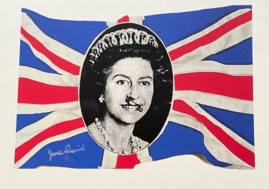
Artist Research- Jamie Reid
----------------------------------------------------
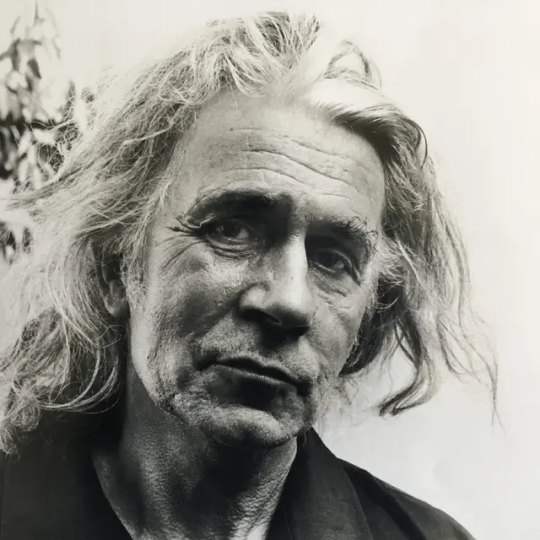
Jamie Reid is a British artist and anarchist who gained prominence for his significant contributions to the visual aesthetic of the punk rock movement in the 1970s. He is best known for his iconic artwork created for the Sex Pistols, including the design for the "God Save the Queen" single cover and the "Anarchy in the UK" poster. Reid's work often incorporates collage, ransom note-style lettering, and political imagery, reflecting his rebellious and anti-establishment ethos. His art played a crucial role in shaping the punk subculture and continues to influence contemporary visual culture.
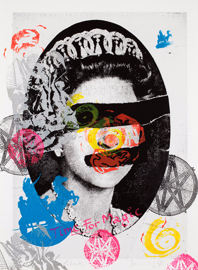
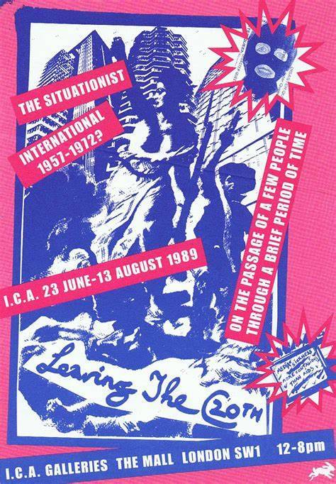
Jamie Reid and The Clash were deeply rooted in the London punk scene of the 1970s, with Reid's artwork becoming synonymous with the movement and The Clash emerging as one of its most influential bands. Their shared geographical and cultural background further solidifies the connection between Reid's work and The Clash's music, illustrating their mutual engagement with themes of rebellion, social commentary, and the punk ethos of challenging the status quo.
----------------------------------------------------
3 notes
·
View notes
Text
Tom Collins Studio Visit
- - - - - - - - - - - - - - - - - - - - - - - -
We visited Tom Collin's sign making studio. The studio itself was full of life and plenty of typography. It was such an interesting and fun experience.

- - - - - - - - - - - - - - - - - - - - - - - -


I took a lot of pictures of the decoration. There was so much to see.
- - - - - - - - - - - - - - - - - - - - - - - -


I loved the long robot drawing up on the pole. Everything's so random, but it all fits together nicely.
- - - - - - - - - - - - - - - - - - - - - - - -


- - - - - - - - - - - - - - - - - - - - - - - -

We had our own turns of writing out typography, taking inspiration from around us. We practised using a Maulstick, which is a tool used to help keep your hand balanced while painting.

- - - - - - - - - - - - - - - - - - - - - - - -
0 notes
Text
Last 2 Thumbnail Ideas
---------------------------------------------------- From the feedback I got on these, I found that this one was too illustrative and full, with no room for text. I did have an idea for text, but the fact that I hadn't put it in the image when drawing kinda proves this statement. The fender p bass also hits it very gentle, I should've put more of an impact on it

---------------------------------------------------- This one was the better one that I'm deciding to work further on. It's a little basic, so I want to improve on the idea. Not straying far from the original cover's broken instrument, but still changing it up.

----------------------------------------------------
#lsad#art#graphic design#typography#london calling#the clash#thumbnail sketch#sketch#design#album art#album redesign#music
0 notes
Text
Artist Research - Faile
----------------------------------------------------

Faile is a renowned artistic collaboration between Patrick McNeil and Patrick Miller, originating from Brooklyn, New York. Their work is characterized by a distinctive blend of street art, pop culture imagery, and collage techniques. Faile's art often incorporates elements of urban culture, such as graffiti, stencils, and wheat paste, creating visually striking compositions that resonate with viewers worldwide. Drawing inspiration from punk aesthetics and DIY ethos, Faile's pieces explore themes of consumerism, media saturation, and the human experience.

"Sub Rosa" series Faile's rebellious street art and The Clash's punk rock music share common ground in their ethos of challenging societal norms and embracing urban culture.

"Savage/Sacred Young Minds" series ----------------------------------------------------
0 notes
Text
Gallery Trip
---------------------------------------------------- Here are a few of the pieces that were on display:


----------------------------------------------------

While it was between three, I think this was my favourite one. I'm not sure if it was, but it looked like an ink painting, which I love to use for art - so it definitely caught my eye. We were asked to write a word that we think of while looking at our favourite piece, for me, I think of the word 'Peace'. It looks like a very peaceful place to be at, with sounds of water running by you. ----------------------------------------------------


----------------------------------------------------
0 notes
Text
Four Thumbnails
---------------------------------------------------- This one I do like, but it is a bit basic. The typography looks thrown in too. For the broken instrument, I drew the same type that Simonon broke on the cover - a fender p bass. The colours again are to represent the Union Jack.

----------------------------------------------------
I went from one of my earlier ideas for this with the fire behind him. I wanted a schoolboy look to represent the youth aspect, and the lighter in his hand to show him as the cause of the fire. This hopefully comes across as a rebellious and defiance act, but I think it feels a bit off. The text I made up, but I do like the look of it.

---------------------------------------------------- I'm not happy with this one, but I wanted to develop the temper idea and make it more interesting to look at.

---------------------------------------------------- I was developing an earlier thumbnail, and I swapped the orange flames for blue to get rid of the tacky look I feel it had. The blue shows the emotion more intense, too. The type is a bit basic, but I didn't want to overwhelm the image. I like how the 'N' in calling mixed with the flames to tie it in.

----------------------------------------------------
#lsad#art#graphic design#london calling#the clash#thumbnail sketch#sketches#album redesign#design#illustration
0 notes
Text
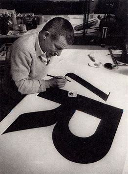
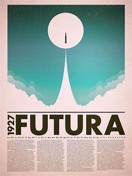
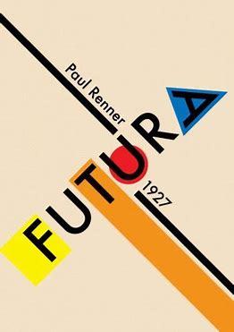
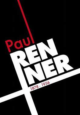
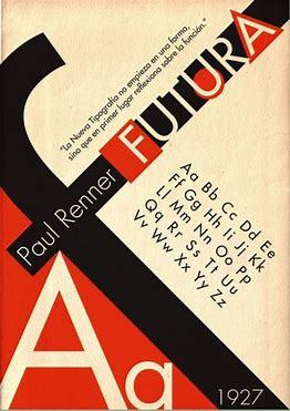
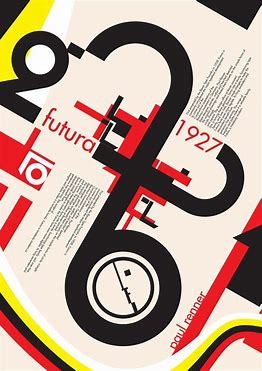
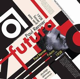
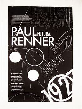
Typographer Research - Paul Renner
------------------------------------------------
- - - - - - - - - - - - - - - - - - - - - -
Paul Renner, born in 1878, was a German graphic designer and typographer celebrated for his groundbreaking work in modern typography. His most enduring legacy lies in the creation of Futura, an iconic typeface with its sleek lines and geometric simplicity.
- - - - - - - - - - - - - - - - - - - - - -
- - - - - - - - - - - - - - - - - - - - - -
In 1927, Renner introduced Futura. Futura swiftly gained popularity, becoming synonymous with the Bauhaus movement and modernist design ethos. During World War II, Paul Renner faced challenges due to his opposition to the Nazi regime's cultural policies. His books were banned, and his printing press was confiscated. Despite these obstacles, Renner persevered, continuing to contribute to typography through writing and teaching.
- - - - - - - - - - - - - - - - - - - - - -
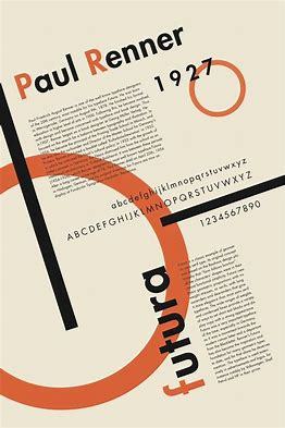
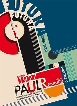
------------------------------------------------
#lsad#art#graphic designer#graphic design#poster#design#typography#text#font#futura#research#graphic art
10 notes
·
View notes
Text
Mood Boards and Collage
- - - - - - - - - - - - - - - - - - - - - - - - - - For my mood board I collected these images from various magazines, that reminded me of London Calling. Rebellious, Punk and urban were the words that were coming to mind when picking them out.

- - - - - - - - - - - - - - - - - - - - - - - - - - Here's my digital mood board with images I collected off of Pinterest and put together on Canva. I went for a clear punk rock vibe and the original pink and green colours from the album. The pictures of teens to represent how the album tells you to enjoy your youth. Of course some British pictures, and It's hard to see here, but top right was some grunge typography.

- - - - - - - - - - - - - - - - - - - - - - - - - -
Finally, my collage. Done from my earlier magazine mood board and some extra tools. I tried to make it look less blocky, but I found it hard to cut up the images any more than I did, because I wanted the full view of it. The yellow jacket guy I feel is the main piece, being the brightest colour paired next to the red. The picture of someone cutting their hair is my favourite one, this is a bit of a stretch, but it makes me imagine that their doing it to defy their parents and take control in expressing themselves. What most punk styled teens would tend to do.

- - - - - - - - - - - - - - - - - - - - - - - - - -
0 notes
Text
Typefaces and Surfaces
------------------------------------------------

I went around Limerick looking at the different typography and textures. I had to collage a word based around our album, so I went with Defiance - which I feel is very fitting. I just edited it together online after struggling to find a collage apps that would put 8 photos side by side like this. 😭
------------------------------------------------
Here are the full words and some extra I took. The coke one I purposefully searched for just because one of the songs names is Koka Kola. Also looked for Elvis albums due to the album being referenced off him.


------------------------------------------------
And here are the textures that I felt would be fitting to the album. The street textures, grittiness, some graffiti which suited very well. The red man traffic light was to describe the restraint that the album's trying to break from. Most are road and street images that I felt just describes the urban style.


------------------------------------------------
#lsad#art#texture#textures#font#text#typography#collage#street#urban#graphic design#album#punkrock#defiance
3 notes
·
View notes
Text
London Calling Presentation -
------------------------------------------------


------------------------------------------------
#lsad#art#graphic design#elvis presley#london calling#presentation#punk rock#rock#new wave#band#album#album cover
1 note
·
View note
Text
More Thumbnails
- - - - - - - - - - - - - - - - - - - - - - - - - - I'm quite happy with how these turned out. After getting feedback, I found that these weren't the best options for this album, but hopefully I will be able to use them later for inspiration.

- - - - - - - - - - - - - - - - - - - - - - - - - - These two and the gun one are my favourites. The left is a bit basic, but I took the inspiration from my icon sketch of 'temper'. I love the composition in the hand drawing and how the typography wraps around the hand. The minimalist style I'm a big fan of.

- - - - - - - - - - - - - - - - - - - - - - - - - - In this one ID change the bottle and type on it, but I do like the colours of the orange typography and how it matches the breakfast.

- - - - - - - - - - - - - - - - - - - - - - - - - - The right one is a bit too violent looking for this album, but I do like the look of it a lot, these both go back to the caught red-handed phrase.

- - - - - - - - - - - - - - - - - - - - - - - - - -
0 notes
Text
Quick thumb nailing Sketches
- - - - - - - - - - - - - - - - - - - - - - - - - -
The top four ideas were judged by the class, and the bottom four I did based on the feedback.

The two bottom left ones are my favourites. The one with fire surrounding the face I feel could turn out interesting. I think looking at broken instruments would be a good reference to the original cover where Paul is smashing his bass - - - - - - - - - - - - - - - - - - - - - - - - - -
0 notes
Text
Typography
- - - - - - - - - - - - - - - - - - - - - - - - - -
I practised different type of typography. I think for the album I want a similar font to the original 'London Presley'. So big blocky type is what I was most interested in. I did have fun with trying out different styles though.

I moved to blue and red colours for representing the Union Jack colours, since London is in the name. Again the big blocky ones I was most into, as well as simple kind of skewed style.

I wanted the rebellious vibe and nothing fancy- I feel like it's the best match for this album. - - - - - - - - - - - - - - - - - - - - - - - - - -
3 notes
·
View notes