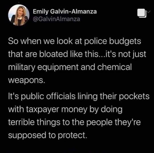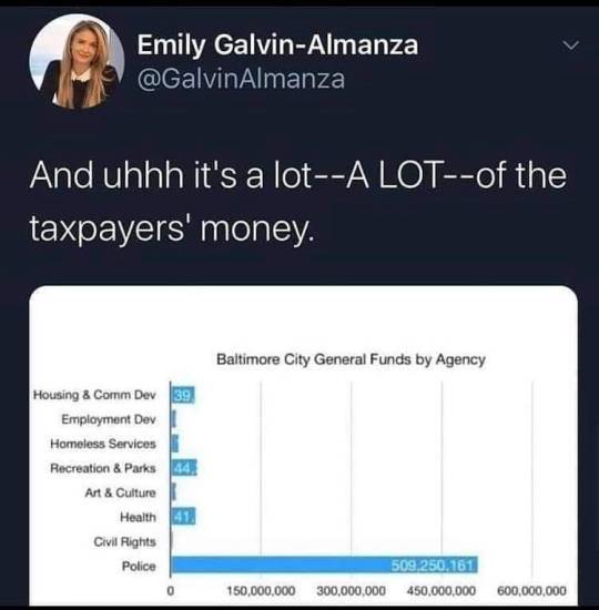
kaestralblade
[🌐⦁ ashe.com 🗕 🗗 🗙 ]
25 • vrchat: ashe-to-dust • disc: ashewebsite • twitter: kaestralblades • current interests: fashion, vrchat, modded minecraft, 3D creation stuff, dumb tv and video game opinions • my last name is website
150 posts
Don't wanna be here? Send us removal request.
Last Seen Blogs

nastynanaathome
Untitled

samofftheair
Off air

bubbleteaop
BubbleTeaOP

ma-zayn-malik
Zayn Malik

jwteagle
Untitled
Text
had a dream amy sherman palladino made a new tv series and it was basically journalism maisel. except she was way more obnixous and i think she was played by cheryl from riverdale
there were two locations i remember - a dark room with a glass wall and a table in the middle like a conference room. the lights were like an interrogation room. also there were desks facing the glass wall surrounding this table. they had a musical number here about how she was a journalist and she was in the big city and she was incredibly clever and also very rich she had a cousin (played by kim pines) that came to visit from alaska that wore a giant blue snowcoat and everyone joked about how smelly and uncouth she was.
when journalism maisel went to go to fancy department stores (she liked to spend money on fancy clothes) they wouldn't let her cousin in and they would yell at her for being bad and unrefined. the joke was classism basically i remember one store which was underground and you entered through this huge back archway and went you went inside it looked like the house from tron (the ceilings were all blue and white and stuff) and the aisles were tall and huge and art nouveau-y.
there was a group of boy scouts being marched around in circles one of the shelves. maisel's cousin wanted to go in and the dude (who was like the guy from suite life of zack and cody) was like NOOOO you're SO UNREFINED you can't come in" and she was like "but my cousin journalism maisel comes in all the time" and he was like no but not you and she was like "okay can i come three steps in" and he was like "okay fine". journalism maisel was then all like haha oh my goud my cousin what are you gonna do.
the series was planned for four seasons of 8 episodes and was cancelled after the second season. it was named "Edited" or one word or something. it had a 65% on rotten tomatoes and the second season was rotten and rated worse than the first season
#dream#the marvelous mrs. maisel#amy sherman palladino#amazon#kim pine#riverdale#cheryl blossom#journalism#midge maisel
1 note
·
View note
Photo

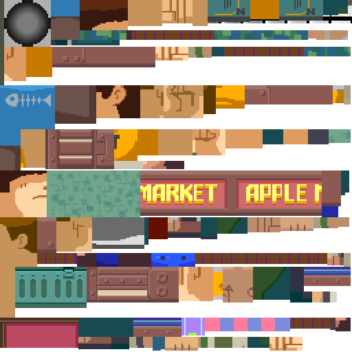
Guide to that elusive “PS1-pixelated-lowpoly”(but not really)
With the videogame playing population growing up we’ve finally broke from pixel-art nostalgia into the broadly called “low-poly” nostalgia. On closer look this broad categorization gets further described as “PS1 pixelated textures low-poly”, which is a bit better, but still is a really broad and a pretty wrong description of this style that’s so dear to a plenty of game-playing and game making individuals these days. I’ll try to dive into some of the technicalities and examples of this style in the attempt to find it’s characteristics and some actual technical requirements to meet this style.
Let’s start with the obvious, calling it PS1 low-poly is wrong, mostly because the same games were release on Nintendo 64, Dreamcast and PC. More so, games released later can be put into the same category, plenty of NDS or PSP games fit into the same style and adhere to the same economy principles. The only real surface level thing unifying these games is the game size, that is, the games came on CDs. The advent of a DVD format really changed up how the games look, so the graphical style we’re talking about here is called CD-3D in smaller circles.
First let’s look at the games that fit the criteria would give you some information to describe the style, textures are obviously small enough to have visible pixelation (hidden by texture filtering) and models are obviously low-poly (that is around or less than 500 triangles for a character), but let’s see what doesn’t seem so obvious. Here’s Spyro and Crash, fan favorites
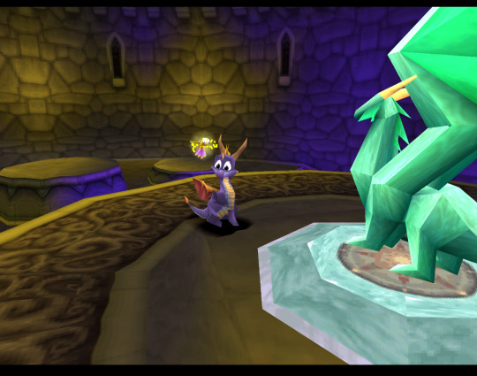
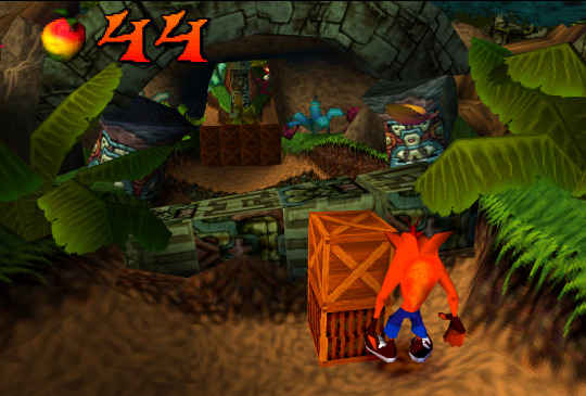
Both games check both points we’ve noted before, but what’s not obvious to an untrained eye is that these games both extensively use Vertex Color, the thing you’ll notice more and more in other games we’ll talk about. Vertex Color is absolutely simple, each vertex of a mesh can be assigned a RGBA value and they’re then linearly blended with other vertex colors. Notice how in Spyro the yellow and purple light is placed on places where texture is repeated, following that you can eyeball where the wireframe is and then you’ll see that the vertex color is used to simulate lighting. Crash himself is filled with Vertex Color, it’s a cheap way to avoid using textures, while having some control over the color of the thing, instead of it being a solid chunk. If you search-engine around you can also find some really fascinating notes on the development of the original Crash and the tricks they’ve pulled! The more ingenious way to use Vertex Color is to take a look at Spyro skyboxes:

Notice how the clouds are diamond-like in shape and are linearly gradiented to the next point in the wireframe.
Vertex color was used extensively and fell off with the increasing complexity of the meshes, delegated mostly to technical masking of stuff like foliage, it’s still a powerful tool for lower triangle counts.
Textures
Now, let’s talk about the textures. Pixelated textures look nice and crisp these days, at the age of 1080p being the norm, turning texture filtering really makes the games look crisp and feel right
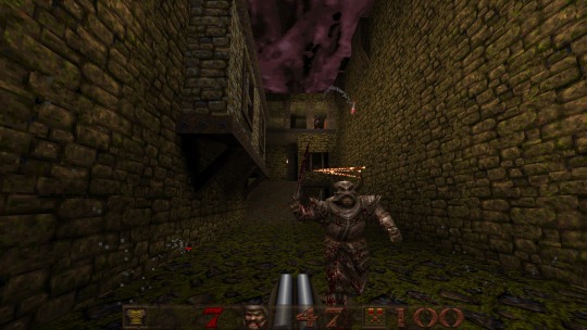
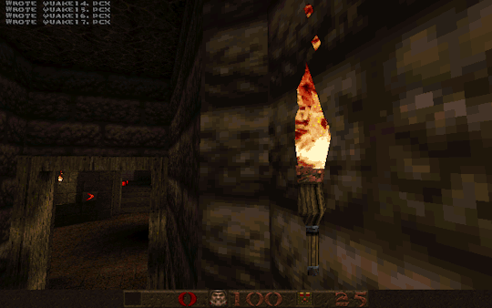
Quake 1 is a perfect example of CD-3D style, often undeservingly forgot in discussions about this style.
But this makes us forget that the textures were often authored with texture filtering in mind. Careful step gradienting to make textures seem smoother after being filtered is a craft in itself.
Texture filtering is not bad in itself, some games look better without it these days, because of the display resolutions, but it’s still a valid tool to apply, it can help push low-res texture a bit higher and produce a softening effect make those 4 pixels into a round circle or improve a visual effect.
Of course, some games took a deliberate approach of avoiding smudged look, like Megaman Legends, for example.
Via a very deliberate texture economy and unwrapping the developers were able to produce very crisp and pixel perfect textures (slightly warped by the infamous PS1 rendering), that look absolutely astounding when you render the game in a modern resolution. Pixel-aware UV Unwrapping, is being used in most games that are considered the pinnacle of CD-3D style, this technique is so powerful, that it was used to great effect in PS2 era games, PSP games and even modern games like Guilty Gear (for a different effect though). Let’s take a closer look,
As you can see, our character is unwrapped in square pieces in such a way that a straight line on a texture will produce a straight line on a model. While Vagrant Story is an absolutely perfect in execution of this technique, it’s also used in a same way in Megaman Legends
While I couldn’t find a reliable tool that works with modern 3D modeling software to allow pixel perfect alignment, just using a UV Checker will produce great results. This method also requires some thought put into your topology before unwrapping, but it’s strong point is that you can make changes into your unwrapping and geometry easily, making little tugs won’t break the whole thing.
As you can also note, Vagrant Story textures are authored in a single atlas, while Metal Gear Solid separates this atlas into smaller chunks like this:

Allowing for easier unwrapping, since you can unwrap into the full UV space and then change the size of the texture to scale your results. The other important thing is that you probably want your characters in a T-pose when you’re unwrapping, since this allows for easier use of normal based unwrapping, considering your model would be authored with 4 to 8 sides for limbs and torso it could be box unwrapped and then tweaked for optimal results.

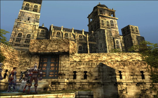
Silent Hill 1 used the same technique, and is also regarded as one of the best looking PS1 games.
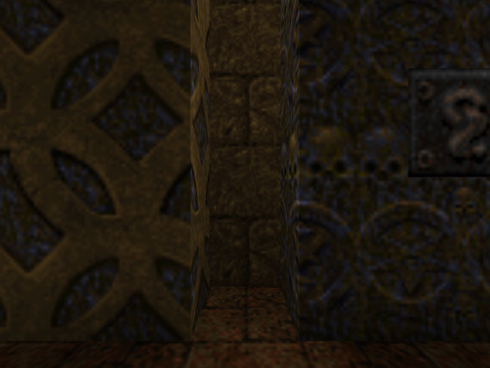
While this is the best practice for this kind of look, it’s absolutely not required, Quake 1 used a really loose flat unwrap:
But it’s still looks bloody amazing in the end.
While the topic of using UV Unwrapping for crisper result is endless I’d also love to bring your attention to a certain Jet Set game
It also uses the same technique as Megaman Legends, but it tops it off with some cel-shading, producing crisp, stylish and iconic look.
Here’s some technicalities: Character textures are usually 256x256 for main characters, 128x128 for other characters, character usually have ~100-120 colors per full atlas. MGS breaks down the atlas into chunks so each chunks is usually 8 colors. So when authoring textures, make us of Indexed Color image mode or Save for Web.
Now let’s move from character textures to
World textures
Universally regarded as best looking CD-3D games share the same trait, not only the characters look amazing, but the environments too. Despite hard limitations, the environments look very much affected by lighting. A lot of the times this is achieved with this one simple trick that was only improved with modern technology. That is, a lot of the lighting is baked into the textures
While this limits you on the amount of lighting scenarios or makes you produce more same-ish assets this certainly elevates the look. While nowadays baked lighting is not something that exciting, it’s also being done on a separate “layer”, so there’s no need to make a separate texture for every lighting scenario, however the resolution of a lightmap should not be higher than your texture, to not produce a cheap and uncanny effect. You still want to bake some fake lighting into your texture, which contradicts the rules of PBR, but since you’re not using normal maps, rules of PBR should not apply in the same way.
The other important tool to use, is the one we’ve talked about, that is, Vertex Color. Vagrant Story uses to great effect, while it’s environment textures don’t have lights baked, they use vertex color extensively to create a variety of moods and lighting scenarios.

Using best texturing practice, Vertex Color and making sure your lightmaps are matching resolution to your textures will produce the best results.
Now let’s talk why I don’t advise using a lot of normal maps for this style. The simple answer, it’s somewhat difficult to produce a normal map that will work with an unfiltered look, but it’s somewhat manageable to do it if you’re using texture filtering. The issue arises when you try make your normal maps unfiltered, this will make your result either a mess or a bunch of visual noise. If you’re trying to make sharp pixel-perfect textures and then will try to make normal maps to match you’ll get very harsh results. The only way I can see it working somewhat nice is to make a normal map that’s less detailed and then use it texture filtered to give some volume to your objects, while not trying to chase pixel details.
The suggested method is to do a rough sculpt -> bake it down -> use ambient occlusion and other masks to author a texture map with more details. Then use a detailed texture and less detailed normal map for optimal result.
As a closing thought, let’s talk about the
Meshes
A lot of the time you can visually trace the wireframe of things, this makes it easy to pin the style as “low-poly”, but how lowpoly it really is?
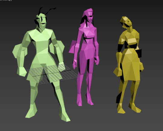
Characters in Vagrant story average 500 triangles per character. Characters in MGS go from ~450 for minor characters to ~650 for major characters. So 500-600 triangles is a solid baseline for a main character in a third person game.
This limit brings out some great restriction for every aspiring 3D artist. You have to know your limb deformation techniques (search-engine “Limb Topology” and browse around the polycount wiki to find some great examples and deformation ready examples), but as you might’ve noticed, some games decided to not wrestle with skinning and deformation and straight up detached the limbs or even made their characters out of chunks. This is perfectly noticebla if you compare the OG Grim Fandango and the remaster, where they botched the shading and you can see the bits in all of their glory.
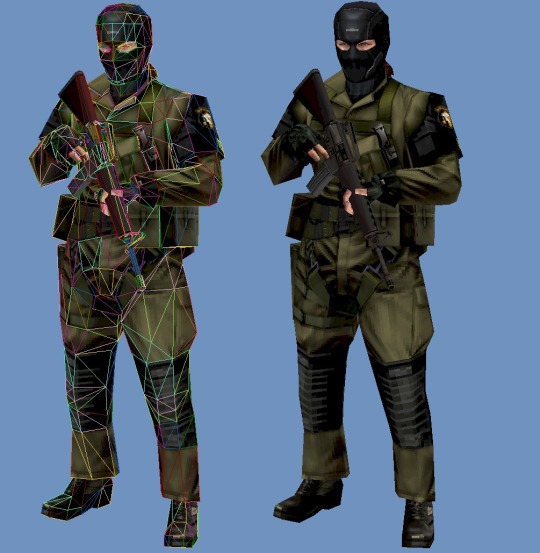
Another easy example is Metal Gear Solid. Characters arms are separate from their torse, but this is covered with other geometry or they’re of the same color and shaded closely.

This way of doing it was used in a number of other games and allows for unlimited range of motion, while not looking weird.
It’s easy to fall into the trap of adding more triangles and loops, but if you’ll follow the rule of “if it doesn’t add to the silhouette, you don’t need it”, you’ll keep to the style. Zoom out often and if an edge doesn’t add anything from the distance and is not critical to the deformation in a character, you really don’t need it.
These principles are so solid they’ve been alive for decades, in fact, one of the best looking PSP games “Peace Walker” sticks to these principles very closely, for example this soldier is just around 1500 triangles
Spilling out of the “low-poly” territory it’s still made with the same economy principles used in CD-3D style, making use of every bit of texture and every triangle available.
Here’s another game of Metal Gear variety, Metal Gear Solid 2 is a direct heir to the design philosophy of MGS1, perfectly pixel-aligned unwraps allow for crisp detailing:
Another honorable mention goes to Animal Crossing on Nintendo 64
Animal Crossing combines meshes and sprites masterfully, uses pixel-aligned UV unwraps and makes up their own trick when creating landscape.
By unwrapping the repeating texture on each triangle of a hexagon they create these smooth patches of sand without the need for big or unique textures. It’s only 64x64 and 9 colors, but the mileage you can get out of it is insane!
And this honestly sums up the CD-3D style perfectly, it’s the style governed by economy. There’s no need for insane textures for sharp lines, and millions of colors for smooth gradients. Now of course all of these are not rules, but recommendations, you can certainly bend the rules and improve on some aspects. Before we go, here’s some more pictures to get you inspired.


6K notes
·
View notes
Text
introducing: the apple i Shit. the apple i Cum. here at apple we think you shoudl cum and fuck a lot. come here: come to apple. come fuck. the #iPhone14Pro out now
0 notes
Text
Whipping out a can of spray paint at the Sunday matinee and spraying my crotch the whole time to banish the SINS of the flesh. The lightboard director notices and starts pelting me with tic tacs
0 notes

Text
my friend took in a stray and she’s the cutest kitty ever but he named her oil so whenever he sends a picture of her me and my other friends look like we’re roleplaying as the US military
260K notes
·
View notes
Text
Ring Ring Ring! Mister White Get The Phone Call! Pick Up The Phone!
3K notes
·
View notes
Photo

IS THIS BASED OFF WHAT I THINK IT'S BASED ON


Half-Life Coloring book! FulL TiMe FUN@$#q!#!!!!
543 notes
·
View notes
Text
Just found the funniest photos ever from my 15th birthday party

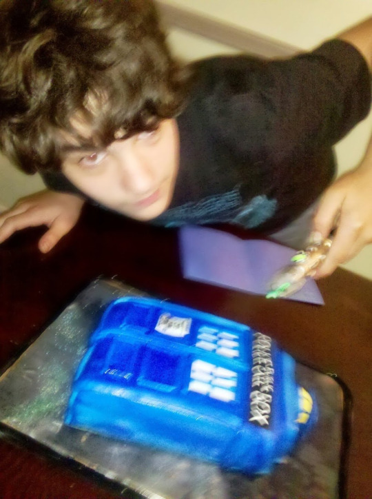
#doctor who#tardis#11th doctor#idk#15th birthday parties#you like that??? is that a tag you like???#15th birthday parties?????? does the algorithm like that?????? do you crave that information????? do you just want to read and read and rea
6 notes
·
View notes
Note
Do you like existing?
I am lonely
it breaks me darling 💓
but i don't want to not exist
#I FOUIND IT AGAIN#I LOVE THIS POST SO MUCH#whenever i feel really awful#like “should probably be readmitted” awful#i think “it breaks me darling but i don't want to not exist” and i feel so incredibly better#funny pages#cw depression#cw suicidal thoughts
13 notes
·
View notes


Text
Doctor Who The Star Beast thoughts,,, spoilers under the cut!
honestly loved the idea of the metacrisis being passed down an awful lot, it was a great twist and led a great deal into talking about how lovely donna's family is. i also loved the beginning of the episode - it did a great job showing a wonderful young trans person, a loving supporting family, and the things she deals with from her school mates.
but.. makin that metacrisis deal be about how incredible she is because she's nonbinary because shes the metacrisis and therefore neither and both... come on dude. it felt like they were trying to make her so special and important and legendary because she's nonbinary and please. no no no. please no. we don't need that. please don't do that.
I loved the episode otherwise. I liked the new sonic, the weaponized wheelchair was very fun, very kind, and very camp, and the bit b/w the doctor and donna was great.
But I really am worried about how I'm gonna get harassed because of the messaging of this episode. Because it DOES suck. And everyone around me is gonna make sure I know about it. And it's also gonna be a big mark on the episode when i go to rewatch it.
#doctor who#the star beast#doctor who 60th anniversary#doctor who spoilers#donna noble#tenth doctor#david tennant
8 notes
·
View notes


Text
one time i stuck a tooth inside my ear and i couldn’t get it out and i had to go to the emergency room. they tried a lot of stuff for several hours and i was sobbing and my parents were exhausted and eventually some nurse joked i should tilt my head to one side and jump on one leg and it came out
0 notes
Text

idk if i've ever shown this before here but this is the best thing i've ever made when i was high
0 notes