
Statistics
We looked inside some of the posts by kaisermakes and here's what we found interesting.
Average Info
Notes Per Post
3K
Likes Per Post
2K
Reblog Per Post
739
Reply Per Post
25
Time Between Posts
1 month
Number of Posts By Type
Text
17
Last Seen Tumblr Blogs


Fun Fact
Tumblr has been providing a Korean-language service since 2013.
Text
The!! Boy!!


Half man, half drow, all bad-at-parties
(also featuring @slowedmountains 's portrait, and an attempt to crip their sketch style)
99 notes
·
View notes
Text
A while back, one of the product owners I work with was learning a bit of design and had been asking me about colour theory. She was frustrated that there was so much wild and conflicting advice about colours in digital products and was asking for some help figuring out how to choose the right option.
I wrote this screed for her and forgot about it - but my husband brought it up the other day as some of the funnier bits of writing he's seen on the topic - so here it is so it doesn't die on slack, and so that others may enjoy it.
Disclaimer: these are the opinions of a somewhat crotchety senior product designer who's interfaced with one too many marketing departments over the last 15 years.
--
Colour theory is funny. I’ll illustrate what I mean with a few examples about how you can go about choosing a colour pallet.
All of these are completely valid examples I’ve seen professional designers do.
Method 1: 'I Swear to God This is a Science'
Best for insecure stakeholders, when there’s other designers with Opinions who aren’t responsible for delivery but don’t mind making your life harder, or when you don’t really have any idea but want to sound smart.
Step 1: Holy fuck, colour has meaning! It’s the foundation for all human understanding! You don’t understand, it’s genetic!!!! (It’s not.) I’m going to look up and make a mood wheel for all of the colours just to remind us (and the marketing team) that blue means sad and yellow means energetic. Then I’m going to choose colours that unequivocally reflect our brand values while also making male consumers age 15-25 salivate without knowing why!!!
Step 2: Holy crap these look like shit, I hate my job and also my life!!!
Step 3: It’s science tho! I’m doing science! I’m going to ignore that our primary colour means ‘death’ to 99% of south asian cultures they just don’t understand western science!!!
Method 2: Vibes
If you are one of god’s favourite graphic designers and were born under favoured stars, and, much like a bat and the bat of a moth's wing, you can eco-navigate to the perfect solution based on vibes. Every rough colour combination turns to silk in your beautiful, blessed hands. Washed out pallets become pastels. Intense ones become ‘juicy’. New and seemingly endless combinations of colour make their way to you like wild birds lighting atop your hand. You (and I do mean [coworker], and others like [coworker]) struggle to describe the alchemical process that takes place in your beautiful, pristine mind. It’s just a vibe.
Step 1: Be born highly sensitive to vibes
Step 2: Don’t not be born highly sensitive to vibes
Method 3: Comparative Research Says the Best Primary Colour for This Product is Probably Yellow or Blue, Again
You were not born able to detect vibes, but you do know how to use google. You know who your enemies are and you know the colours they keep. You know the answer to your colour problem is not enemy 1's or enemy 2's, but a secret third colour that is at once different and better than their colours. Perhaps more vibrant, or something complementary - that would really blow them out of the water. Your killing blow will be the health app in atomic orange while they’re still on operating-room blue.
Step 1: Know thy enemy
Step 2: Know thy brand
Step 3: Briefly consider stealing their colours whole-cloth. This shit isn’t copyrighted. (Unless it is)
Step 4: Instead inevitably end up going for something similar but slightly different in a way that makes you blush when you describe it to a stakeholder
Method 4: It’s Seasonal, like House Paint
You are not god’s most perfect designer, but like the remora, you know that the designers of method 2 cast off enough chum that if you hug to their belly long enough you can suck up enough morsels to get by. Entire app ecosystems have been supported by these apex predators, and if it’s good enough for them - by god - it’s good enough for you.
Step 1: Be born slightly sensitive to vibes
Step 2: Be slightly too lazy for the third method but not entirely too lazy not to choose something that looks like a sparkledog.
Step 3: Apply enough of the first method to not look like an idiot when a stakeholder asks how you came up with a nice pallet in a day.
Method 5: ‘It’s all Made up, Nothing Matters’
When I’m stuck in a rut, colourwise, I always think back to this one exercise we had to do in school. We had these pantone cards. They smelled like shit and cost $200 when I was trying to make a sandwich last for two days at a stretch. I hated them. We would use them for exercises where we had to identify complementary or tryptic colours or would pick one at random and be asked to mix paint to match quickly to help us learn practical art skills.
One time, however, our teacher had us pick two at random. There were about 400 of these things and a lot of ‘two at random’ were usually some combination of shit-brown and Lisa Frank Aqua. I think I got something like dull purple and blood red. All these combinations sucked. Next, she wanted us to make a design that took these colours and made them into something - an ad, and illustration. We were collectively mortified.
But as we worked, something odd happened. You get used to them. You get used to the bizarre combination and they start to make sense beside one another. You might have to compromise and make sure they only overlap in certain ways for visibility’s sake, and by the end of the exercise they were almost unique. Iconic. We were forced to use non-standard combinations and off the back of them produced some of the more unique and attractive work we’d done in the module to date.
Think of the colours you’re used to seeing together - do they actually look good together? Or have you just seen them together in branding since forever until suddenly they made sense. Check out some south asian or Chinese branding. It’s jarring for us because the combinations can be really vibrant - but for them it’s the local vernacular.
This doesn’t necessarily mean that any random two will do, but to me it was a lesson about expectation and acclimation. Colour is a language, and it means different things to different people. That doesn’t mean you can’t plan for it, but it does mean that the rules aren’t as hard and fast as some designers make them out to be.
--
Joking aside here's my actual advice, having used all of these at one time or another.
When I start on somewhere new or have to design colours for something, my first step is learning the local vernacular. What does colour mean to the people who’re using it already. Because it’s a shared understanding and not an absolute. Comparative, or better, competitive research is better for this than the first method because that's what users will be familiar with. Once you’ve got a handle on the key colours and their meaning, you can then go out and put them through a vibes-lense and find an attractive pallet that houses them.
/2cents
44 notes
·
View notes
Text
I share a studio in town with some friends, and each year we delight in hiding chocolate eggs all over the studio. This is my favourite hide to date...


14 notes
·
View notes
Text

Something that isn't work, courtesy @bitegore
13 notes
·
View notes
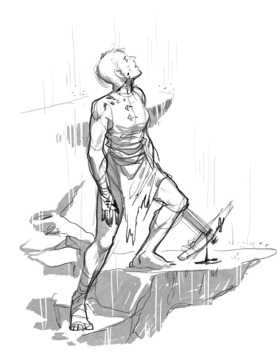
Text
My half-drow blood hunter for a local DnD game! I couldn't find a good head for his model- so I gone and sculpted one on Nomad.
Can't wait to be disrespected on the sword coast!!


40 notes
·
View notes
Text


A silly submission comic for a discord roleplay community thing I'm not quite sure how to link.
Fun fact: the Dog-folk in this little bit of the desert do their maths in base 8 - as they've only 3 fingers and a thumb (. ❛ ᴗ ❛.)
350 notes
·
View notes
Text

Have a very silly WIP - experimenting with a comic that works on square ratios for a roleplaying group I'll probably set new records for slow posting to.
265 notes
·
View notes
Text
I don't tend to share much in the way of personal stuff - but this is the place where I post the stuff I'm proud of making, so here's the best thing yet (and ever.)

57 notes
·
View notes
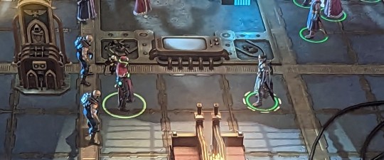
Text

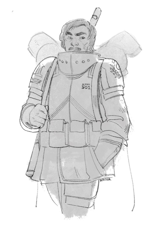
(Still alive) and also playing in a Warhammer Old World Campaign! My Warlord and his second.
160 notes
·
View notes
Text
And so the vicious cycle continues!! My husband (who wrote the strip, but he was just a cool bud at the time) and I absolutely adore your art, @kitto-paint . We've been sending it to each other whenever we see a new bit of it in the wild!!
What with the Roguetrader CRPG consuming me and all my friend's lives, I figured now is as good a time as any to re-share these from an age past.
It was a labour of love in more ways than one - I met my husband collaborating on this project! Thanks Buck!
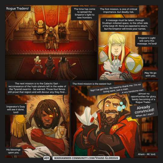
More beneath the cut!
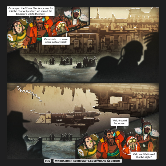


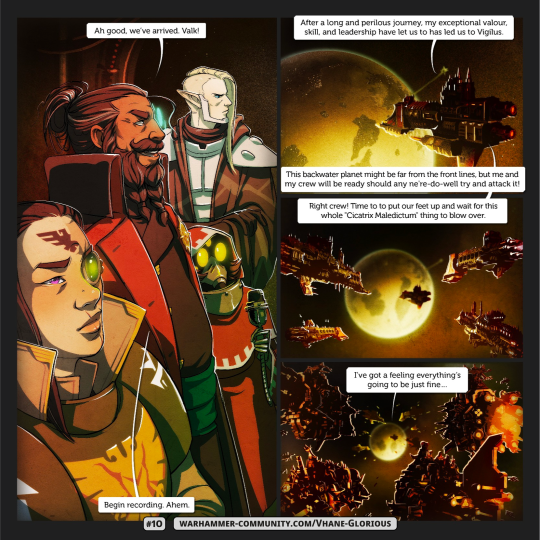
613 notes
·
View notes
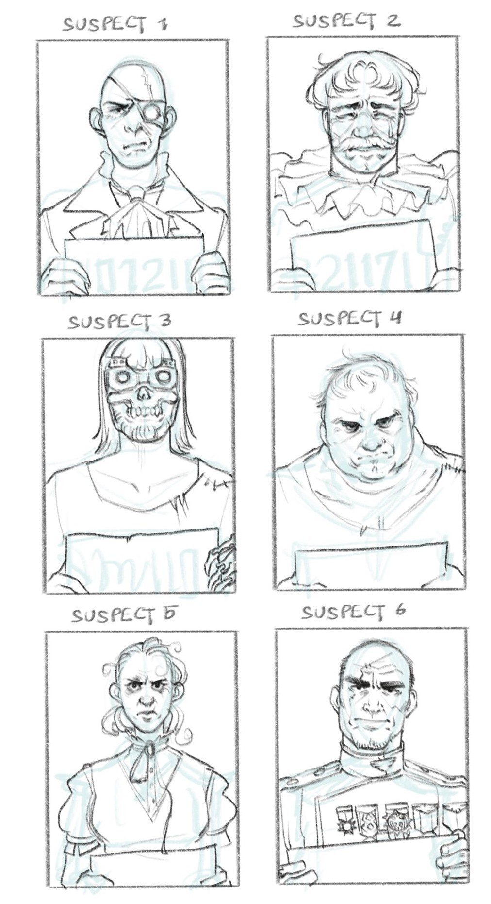
Text


A collection of silly doodles I've done for my recent DND game
46 notes
·
View notes
Text
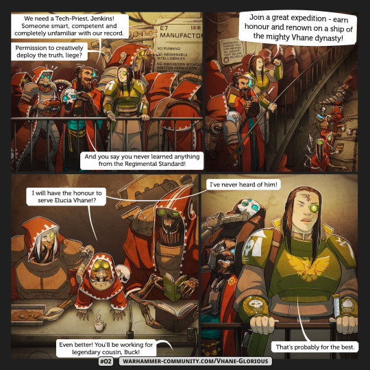
What with the Roguetrader CRPG consuming me and all my friend's lives, I figured now is as good a time as any to re-share these from an age past.
It was a labour of love in more ways than one - I met my husband collaborating on this project! Thanks Buck!
More beneath the cut!
613 notes
·
View notes
Text
When the local cloth is about to throw hands

Tightly cropped to avoid spoilers, but this dialogue had me howling.
234 notes
·
View notes
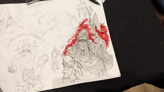
Text
Not dead, still drawing daft Warhammer things

119 notes
·
View notes
Text
I'm bad at posting my work these days, but here have a tortle I drew for a new friend.

215 notes
·
View notes
Text
I finished a nifty project!
I'll explain a little better later but have a neat bitty from it.
67 notes
·
View notes
Text
In the UK? Some say hi this next weekend!
I made a neat thing so I had an excuse to table again! The whole project is published under a creative commons licence, so it's meant to give beginning storytellers or RPG players fun prompts or a layup on a new character.
Plus the character cards are all shiny, so that's fun.
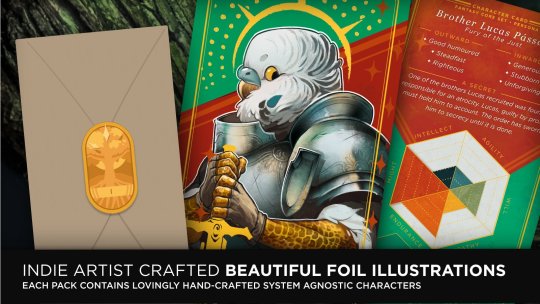
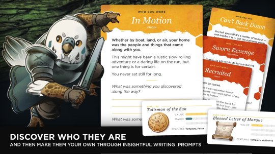

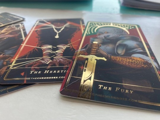
I've always wanted to have a piece printed with foil finishing, so this is a real treat. Turns out it's pretty easy to have done these days too.
34 notes
·
View notes