
knartstuff
KingisNitro's art stuff
A sideblog of IAmKormi for art references and similar stuff.
Hopefully these help you if you stumble upon them! Here is a list of tags I use.
197 posts
Don't wanna be here? Send us removal request.
Last Seen Blogs

1nfinita
Infinita
mosmanalder-blog
Mosman Alder
1nfinita
Infinita

ashforddarchershee
Untitled

mimipuppet
just a lurker
Text
not gonna lie if you are like me and suck at coming up with poses using vintage sewing patterns for inspirations is so helpful for interesting poses that still display the character in a seeable way here are some examples of my favorites
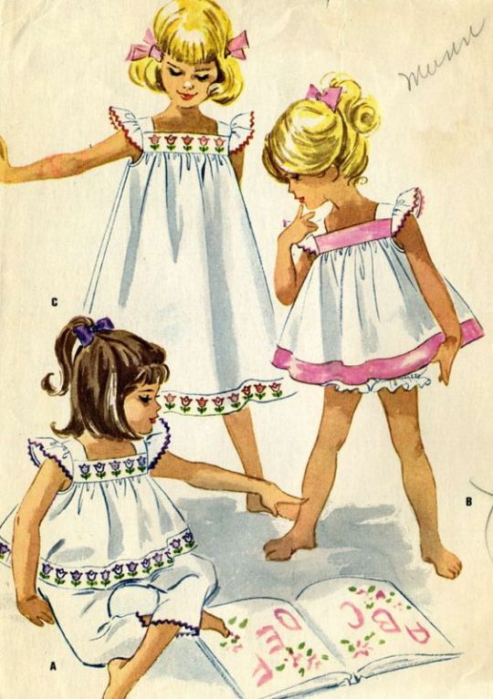


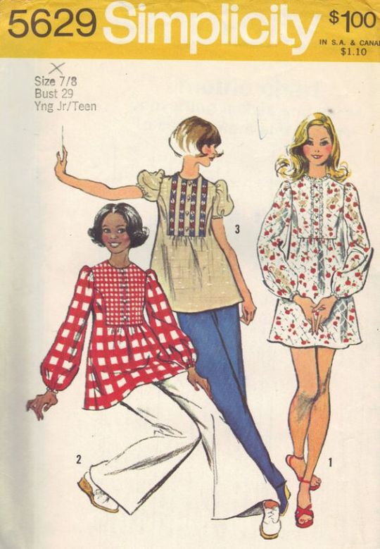
because they are literally drawn in a way to show off their outfit but still be interesting and not boring
66K notes
·
View notes
Photo
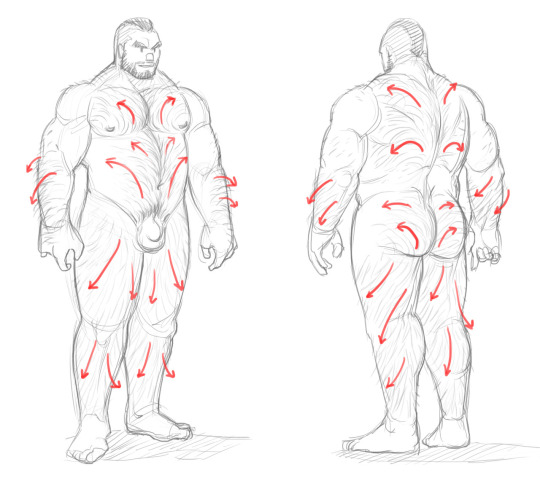
I’ve seen this guide for (male) body hair and thought I’d share it here.
4 notes
·
View notes
Photo

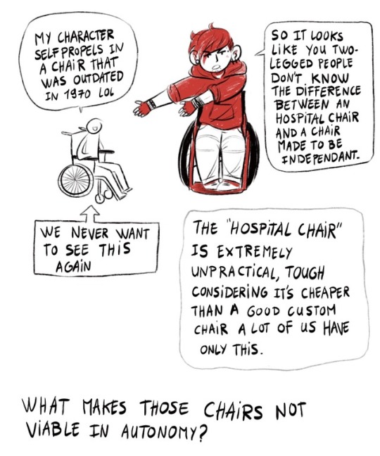

It’s here !! The guide for two-legged people who don’t know how to draw wheelchairs !!!
7 pages of infodump !
Disclaimer : I don’t know everything, I have one (1) experience of wheelchair user who used both bad and good chairs, and I share what I learned.
Image description :
1) Calvin in his wheelchair saying “yo” under a huge title “how to draw manual wheelchairs properly by Calvin Arium, a wheelchair user comic artist”.
2) A character says “my character self propels in a chair that was outdated in 1970 lol”
Calvin says “so it looks like you two legged people don’t know the difference between an hospital chair and a chair made to be independant”
an arrow point the crapppy chair, saying “we never want to see this again”
a bubble says “the hospital chair is extremely unpractical, tough considering it’s cheaper than a good custom chair a lot of us have only this”
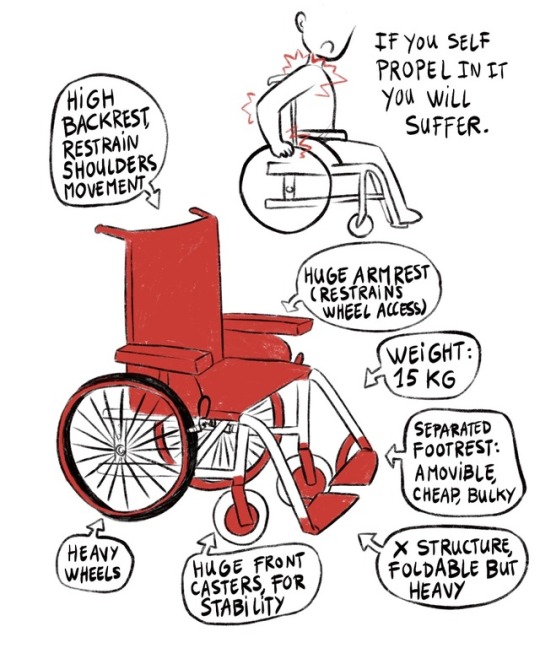
3) a character hurt himself trying to reach the wheels of the hospital chair. Several arrows point why the chair is unpractical : “high backrest restrain shoulders movement” “huge armrest restrains wheel access” “separated footrest : amovible, cheap, bulky” “x structure, foldable but heavy” “huge front casters for stability” “heavy wheels”
4) Several arrows point an active wheelchair (the KSL by Küshall) : “usually no armrest” “a low backrest allow more movement” “light, design, ferning expersive” “special cushion to avoind injuries” “knee angle is usually 90°” “one single piece of frame, sometimes entirely welded” “weight : from 4 to 10kg” “often rigid” “center of the wheel is the center of gravity” “higher quality wheels : less spikes”
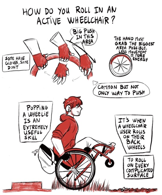
5) A hand grab different parts of the wheel, pushing harder in the second half. Bubbles says “some have gloves, some don’t. The hand must grab the biggest area possible. Less movement = more energy. This is a common but not only way to push.Calvin is on his back wheels, rolling on grass and dirt
bubble says “popping a wheelie is when a wheelchair user rolls on their back wheels to roll on every complicated surface.
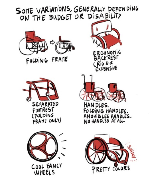
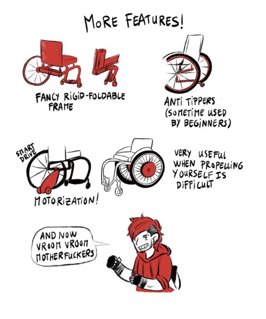
6) several drawings illustrate the folding frame, the ergonomic but rigid and expensive backrest, the separated footrest (only for folding frame), the handles, the folding handles, athe amovibles handles, or no handles, the cool fancy loopwheels, the pretty custom colors
7) More Features ! The fancy rigid-foldable frame, the anti tippers (sometimes used by beginners), the motorization (wheels, smart drive) when propelling yourself is difficult
Calvin says “and now vroom vroom motherfuckers”
148K notes
·
View notes
Photo

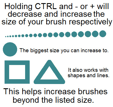
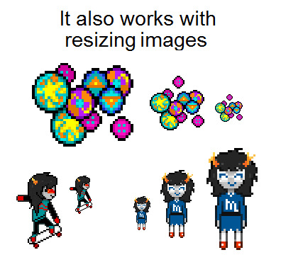

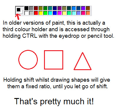
look how sophisticated that title is
i’m pretty sure most people know of all this, but there’s probably the odd thing that people don’t know about!
81K notes
·
View notes
Text
HEY THIS IS IMPORTANT whats your favorite place to find drawing references?
210K notes
·
View notes
Photo
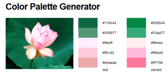
So I just found this page in my bookmarks and thought I’d share!! It’s a color palette generator, if anyone is looking for, so go nuts!
3 notes
·
View notes
Photo
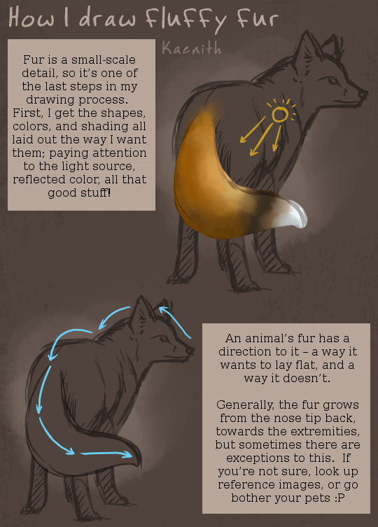

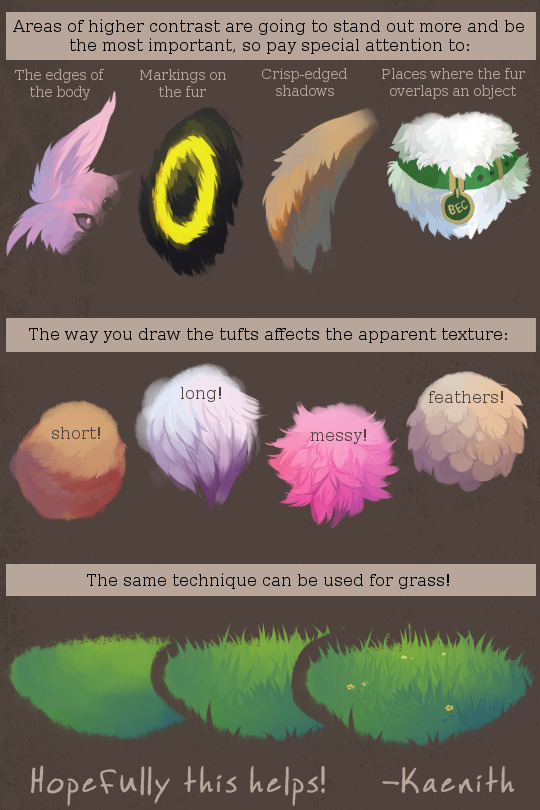
@ryuumajora replied to this post and said:
Gosh I love how you make things look so soft and fluffy. do you have any tips or tricks to help make things look kinda like fur like in this picture?
So here’s my process for drawing fur!
Also, something I failed to mention in the tutorial itself: I use a plain round brush most of the time, and this tutorial doesn’t require any special brushes, but I do occasionally use a bristle-brush with this technique. Here are the settings for that, if you’d like to give it a try!

13K notes
·
View notes
Photo
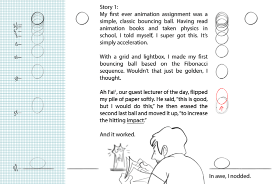


1. Ah Fai was a chief animator for McDull’s animated features. He’s super cool. Ultimate senpai.
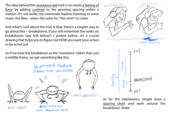
2. Previous post on breakdowns right here
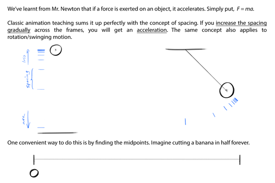
Some thoughts on acceleration and force
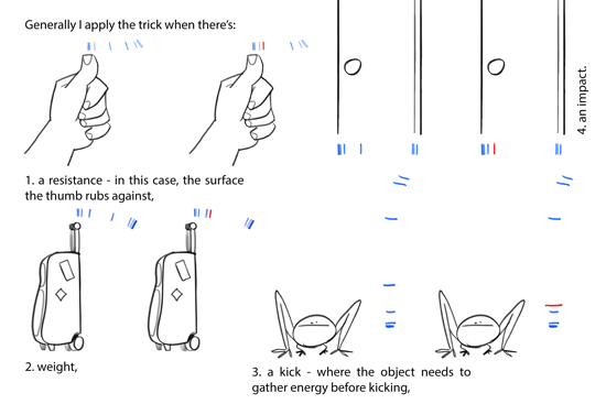
I presented this in the order of how I slowly understood the trick of delivering force - first an abstract concept of impact taught by Ah Fai, then a more complicated discovery on the acceleration pattern, last back to a more abstract concept of breakdowns.
Like I’ve previously stressed, 2D animation is everything but one single approach. There’s no one rule that rules them all, but interchangeable ideas with math, or physics, or music, etc. There’s no “perfect” animation either, but what is perceived as organic and dynamic. E.g., using the Fibonacci numbers to animate didn’t bring me a perfect animation! On the other hand, a tiny change in the pattern could already make the feeling of force so much more powerful.
Not so much of a tutorial than a personal experience. I hope you find this interesting hahaha
156K notes
·
View notes
Text
how the fuck do legs work i don’t
119K notes
·
View notes
Photo
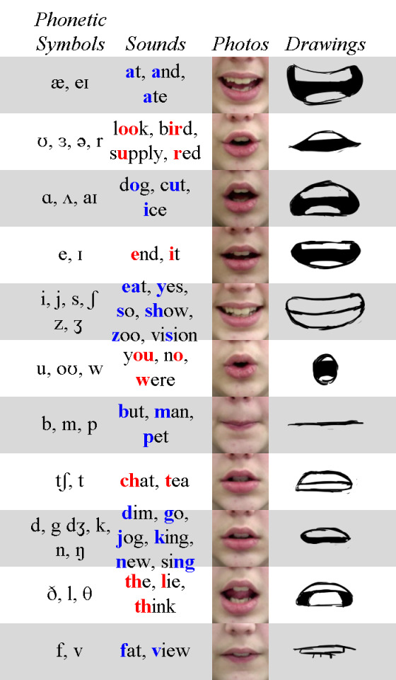
Phoneme Chart by TheEndIsNearUs
357K notes
·
View notes
Text
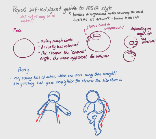
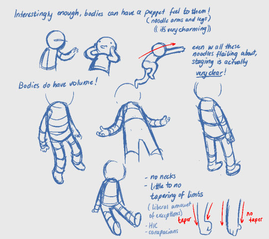
this is by no means a comprehensive guide and just covers the most basic structure that i’ve observed. But it was fun to make. Simple styles may look easy but are actually pretty challenging so make it look good xux

29K notes
·
View notes
Photo
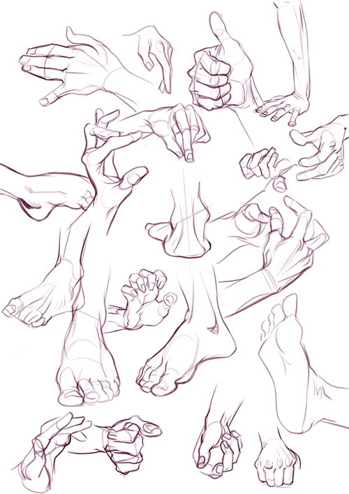
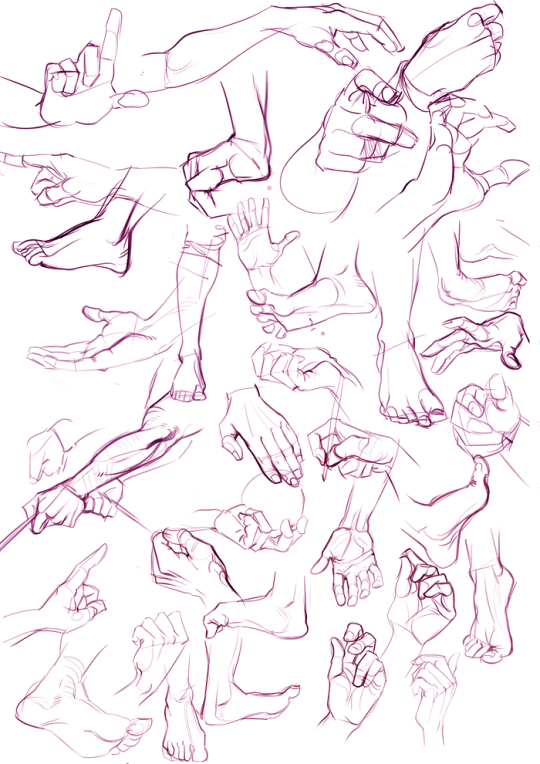
some hands and feet practice sketches, used this site - pixelovely
12K notes
·
View notes
Photo

NEW AVAILABLE ART PROGRAM
It seems to be a mix between SAI and photoshop, simplified. It even has a stabalizer that works even with the mouse.
Best of all, it’s free, and works for both Mac and Windows.
To give it a try, head right on down to http://firealpaca.com/
204K notes
·
View notes

Note
what are your brush settings they look so smooth and nice im gonna cry
54 notes
·
View notes
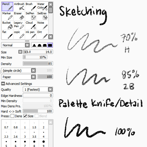
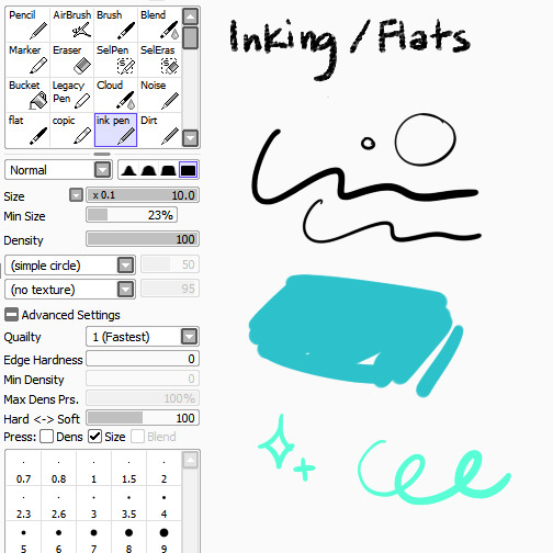
Photo
since a few people asked, here are my brushes i use most!
17K notes
·
View notes
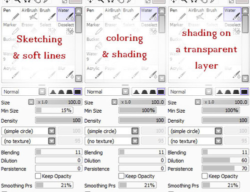
Photo
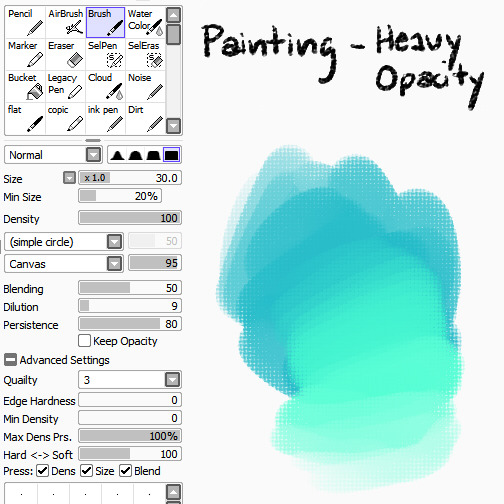

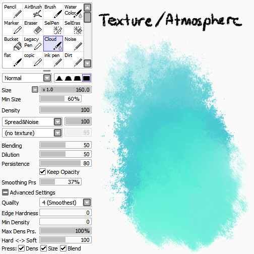


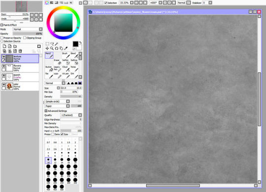
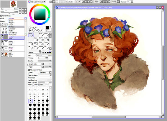
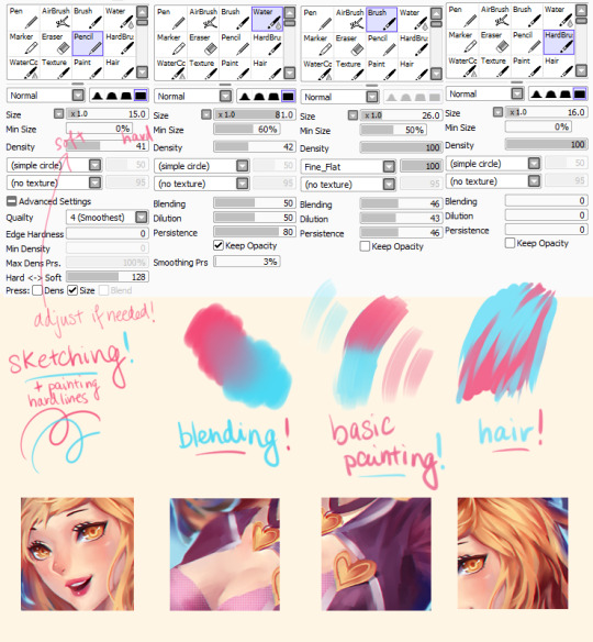
I’ve been getting a lot of asks lately about the brushes and textures I use in my work, so here’s a BIG FAT REFERENCE POST for those of you who were curious! Bear in mind that I’m really lazy and don’t know what half the settings do, so don’t be afraid to experiment to figure out what works best for you :>
BRUSHES
Pencil
I use the pencil tool with SAI���s native paper texture both for sketching and for applying opaque color with no blending. Lower opacities give it the feel of different pencil hardnesses, while full opacity makes it more like a palette knife, laying down hard-edged, heavy color for detail work or eventual blending with other brushes.
Ink Pen
Mostly made this because I’m lazy and I didn’t want to have to keep turning my textures off/opacity up when I wanted to ink something (even though I don’t do it very often), or lay down flat colors. I find the line quality to be much more crisp than Photoshop, and you can manually adjust in-program stabilization to help smooth out hand wobbles.
Round Brush
The plain ol’ brush tool acts as sort of an in-between for me in terms of brush flow. It’s heavier than my usual workhorse brush, for faster color application and rough blending, but not as heavy as the pencil tool, which has no blending at all. I like to use the canvas texture on this brush to help break up the unnatural smoothness that usually accompanies digital brushes, but it works just fine without.
Flat Brush
A brush tool set to flat bristle is by far my favorite to paint with. I don’t use any textures with it because I think the shape of the brush provides enough of that by itself. I use it for everything from rough washes to more refined shaping and polish. It’s just GREAT.
Watercolor
Best used for smooth blending, washes, gradients, and smoky atmospheric effects.
Cloud
Basically a grittier version of the watercolor tool, because too much smoothness weird me out. Good for clouds and fog, as the name suggests, or just less boring gradient fills.
TEXTURE OVERLAY
To further stave off the artificially smooth look of digital painting, I almost always overlay some sort of paper texture, and it’s almost always this one, which I scanned and edited myself. You’re all welcome to use it, no permission required!
Using overlays in SAI is just as easy as using them in Photoshop. Just paste the texture into its own layer above everything you want it to apply to, and change the layer mode to Overlay. That’s it!
Want a more prominent texture? Up the contrast. Something more subtle? Lower the contrast or reduce the layer opacity. You can also use a tinted overlay to adjust the overall palette and bring a little more color unity to an otherwise disparate piece! Just be aware that too much texture can hurt the readability of the work beneath it, so I’d err on the side of subtlety.
Hope that helps!
-L
124K notes
·
View notes