
leohs-collection
58 posts
collection of references! :)
Don't wanna be here? Send us removal request.
Statistics
We looked inside some of the posts by leohs-collection and here's what we found interesting.
Average Info
Notes Per Post
527K
Likes Per Post
308K
Reblog Per Post
219K
Reply Per Post
258
Time Between Posts
8 days
Number of Posts By Type
Video
1
Text
8
Photo
5
Note
3
Last Seen Tumblr Blogs


Fun Fact
Tumblr was acquired by Yahoo for $1.1B in 2013.
Video
i have no idea how tiktok works but i made a tiktok. wanted to share my technique. hope it helps some people
[app: clip studio paint on an ipad]
[final art used in video]
20K notes
·
View notes

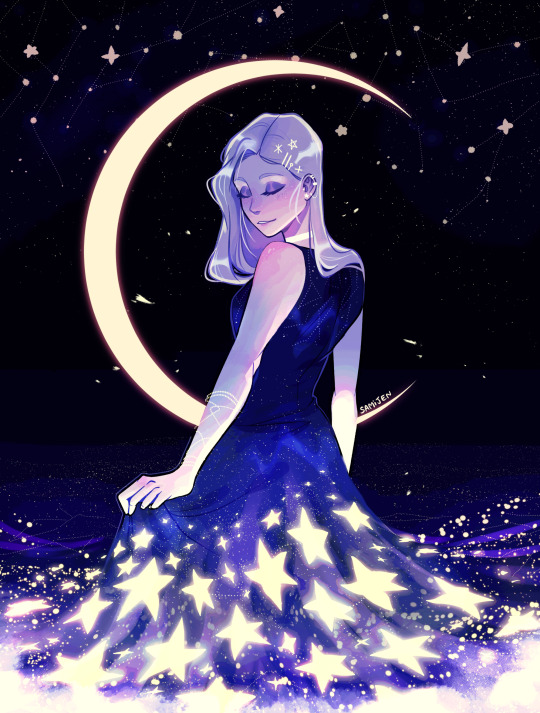


Photo
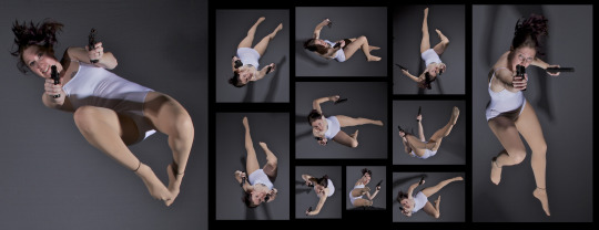
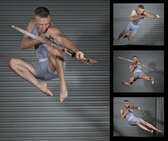
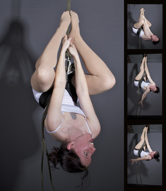
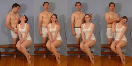
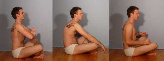
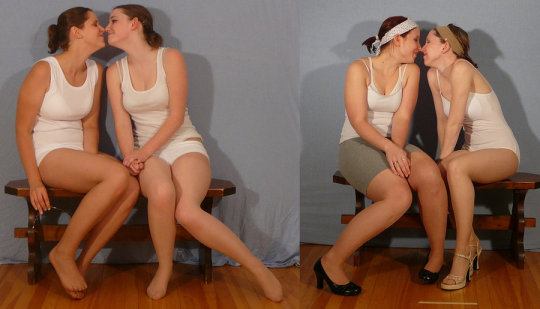
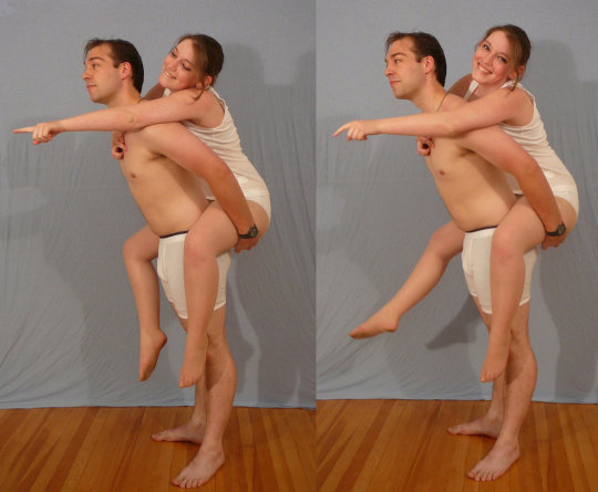
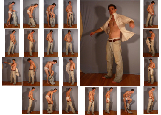
SenshiStock’s gallery consists of millions of pictures that are free to use as reference.
General Drawing Poses Sit and Kneel Dramatic and Reaching Drawing Poses Magic and Hogwarts Drawing Poses Staff Weapon Pose Reference Hammer, Axe and Bat Pose Reference Sword Weapon Drawing Reference Small Bladed Weapon Pose Reference Gun Weapon Pose Reference Bow and Arrow Archery Stock Foreshortening and Perspective Poses Dynamic Flying Falling Action Poses Deafeated or Laying Drawing Poses Magic Crystal Magical Girl Wand Weapon Transformations and Dance Cards Back Pose Reference Pin Up Inspired Poses for Drawing Performances Poses Life in General Poses Fights and Fighting Pose Reference Leaning Poses Classic Sailor Senshi Poses Wings Sailor Moon Villains Pairs Romance or Couples Pose Reference All the Male Stock Hanging Stock Drawing Reference Three or More Groups Instruments Mirrors Whip Technobabble
439K notes
·
View notes
Note
What brushes do you use in Procreate? I saw your faq but I don’t understand😭
i use a lot of default brushes but here are some of my other faves
https://assets.clip-studio.com/de-de/detail?id=1702959
https://assets.clip-studio.com/de-de/detail?id=1739109
but hey i could spend days downloading brushes from here there are so many good ones !!
*edit i overlooked you meaning procreate lol i use CSP !!!!
123 notes
·
View notes
Note
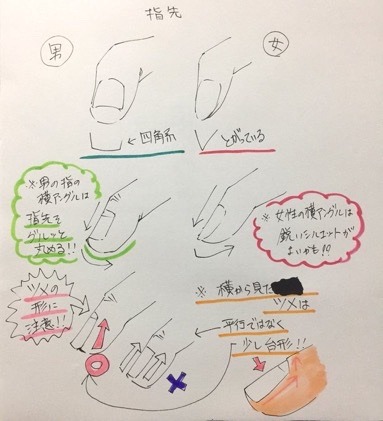
Hello, I watch your stuff over on Fa, and I wanted to ask as a learning Animator, how do you come up with your colors and lighting in your work, especially in your complete scenery images?
I’m not sure how to answer other than practice! I used to have an extremely difficult time selecting colors, everything would just come out like mud and none of the colors worked together. Honestly it’s a lot of just.. developing your eye for color and experimenting and finding out what works and what doesn’t.
As for setting color schemes, I just pick whatever I think would suit the mood or feel for the picture. I’m very fond of heavy shadows and intense lights. Try finding some good scenery blogs to get ideas, god knows I’d never make it if I didn’t have decent sources of photography to look at to understand how light works and the way different lighting effects the colors of the environment because I don’t leave my house much haha. The things I focus most on are a dominant color and atmospheric perspective. Most of my drawings have a very obvious dominant color, and I’ll choose colors that will relate well to that dominant color. Subtle variations of saturation and value of the same color can have some really nice effects and color relativity is your BFF when learning to use color. One helpful thing I do a lot with one/two hour scenes is coloring something in its base/normal lighting colors and using a layer over the top on either multiply, screen, luminosity, etc (whichever looks best and suits the image, you just have to experiment) with whatever the dominant color is. This is helpful for colors that are difficult to adjust to a contrasting lighting color (like greens always stump me). Also take advantage of laying a flat color and using the hue/saturation slider to adjust it and see how it looks at different saturations, values, hues, etc. The selective color adjustment tool in photoshop is a big help if you need some last minute adjustments.
Gah this is getting rambly because I’m not sure how to explain or help since it’s just something I’ve had to learn slowly over time and haven’t felt confident with until.. probably just this past year. But I hope any of this is helpful!
42 notes
·
View notes
Note
Not sure if you still answer or look through your asks, but what advice could you probably recommend for just improving with art time and efficiency? I've seen your work on FA, and they're so gorgeous for only 1-2 hours of work!
It just takes a lot of practice dedicated specifically to that honestly! 1-2 hour drawings are the bulk of the commission work I get, so I’ve been working at them for a little over a year now.
As you work you begin to find shortcuts and techniques to do things more quickly. I’ve cut out lineart completely by sketching cleanly and using my sketch lines as lineart rather than inking over a sketch on a separate layer. I do this even for cleaner drawings as well. For flats it helps to make sure you have no gaps in your lineart so you can select the area outside of your lineart and invert and flood fill the selection, saves way more time than manually filling your lineart. Take advantage of learning all your blending modes for layers too, as they’re a big help with color schemes.
Becoming facile just takes repeating something over and over and over. You begin to learn the way things look and it starts taking less and less effort/time to get something to look right. Hell I struggled even getting a decent character drawing on a flat background when I started doing this.
If you start doing timed drawings for practice, you’ll improve! I started out doing the 69min challenges for HxH, and it evolved into me taking on 1-2 hour drawings for commission work. If you’re in a fandom, hunt around for a 69min group on twitter and take part in it! Outside of that, you can just do it for fun on your own.
78 notes
·
View notes
Text


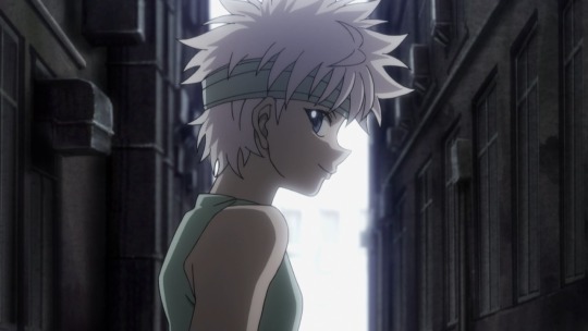
twt @killuaoutfits
6 notes
·
View notes
Text

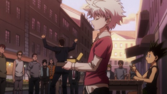


twt @killuaoutfits
10 notes
·
View notes
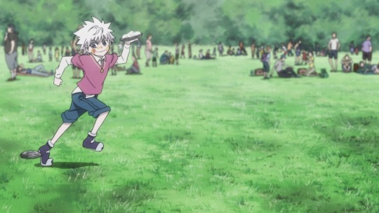
Text


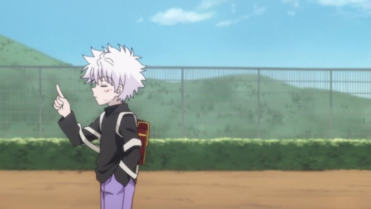


twt @killuaoutfits
6 notes
·
View notes
Text

https://twitter.com/hanari0716/status/1306534894076440576?s=21
0 notes
Photo

Name: Kana Fukuzawa
https://droptokyo.com/freshsnaps/ID/?id=274868
42 notes
·
View notes


Text


https://twitter.com/hanari0716/status/834347056063844352?s=21
0 notes