
an archive of resources mostly aimed for the roleplaying community by lightly navi | faq
Don't wanna be here? Send us removal request.
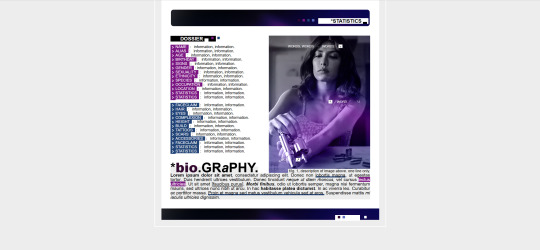
Statistics
We looked inside some of the posts by lightlysources and here's what we found interesting.
Average Info
Notes Per Post
58K
Likes Per Post
32K
Reblog Per Post
26K
Reply Per Post
129
Time Between Posts
22 hours
Number of Posts By Type
Text
17
Last Seen Tumblr Blogs


Fun Fact
Tumblr was the first site to host the blog for President Barack Obama in 2011.
Text

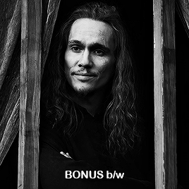
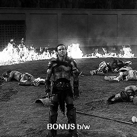
417 ICONS OF TRAVIS VAN WINKLE IN FUBAR S2.
Icons of Travis Van Winkle + his character's pet pig in Fubar s2. are available for download/purchase on my Gumroad for FREE/PAY WHAT YOU CAN. These icons were made with my own screencaps which you can download HERE. The download will contain two sets of the same icons, one set at 100px and the other at 75px. These icons are lightly sharpened and will pair well with any coloring psd. They can also be used on their own.
👤 ACTOR INFO: Travis is white (unspecified) and was born in 1982
⚠️ WARNING: guns, blood
🚫 DO NOT use for paid commissions, celebrity/real person rps
💖 YOU MAY resize, using coloring psds, textures, and borders.
📄 CREDIT: like/reblog this post and credit @byroncapped
2 notes
·
View notes
Text
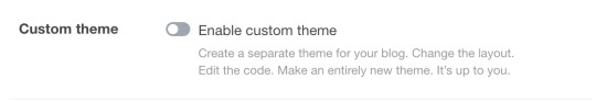
I just made a new sideblog and found out this setting is disabled by default.
This means that ALL new blogs will NOT have a [username].tumblr.com page. Not only that, but they will not have any themes besides the mobile-default.
As someone who really likes custom themes and Tumblr still having a fully customizable profile page, please turn this on!
You can make a website for your tumblr blog that is entirely your own!
Finding posts on your URL.tumblr.com page is much easier due to the ability to use your Archive and url.tumblr.com/tagged/[tag] pages!
Visiting your mutual's tumblr pages will become much more fun if they do the same! I used to always associate blogs with the themes they had, but that's sadly not possible anymore :(
If Tumblr themes die out, it will truly be an end of an era for the internet, and the future will hold only mobile-orientated, endless-scroll design devoid of personality.
Even if you don't like themes, this is a move that almost destroys Tumblr's origin as a blogging website and showcases the takeover of social-media-sameness.
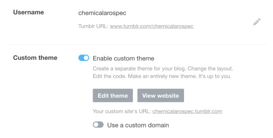
Having your own URL and custom theme is fun! Try it today!!!
Edit: I focused on promoting custom themes but I do encourage people to simply turn on this setting for the URL. You can pick a free tumblr theme or even leave on the tumblr mobile-orientated default!
#rpc#i remember when the only way to browse a blog was via the desktop theme#dash view wasn't a thing until relatively recently
30K notes
·
View notes
Text
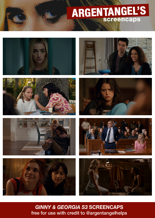
GINNY & GEORGIA S3 SCREENCAPS
all screencaps are free to use with credit to @argentangelhelps!
you may edit to your liking for personal use (icons, edits, promos ect)
do not use for : celebrity/real person rps or paid commissions, everything else is up to user discretion. (don’t make me change this rule). if you want to use these for icons on your own rph even for free, please message me.
the zip files are free to download through DROPBOX !
LIKE OR REBLOG IF YOU SAVE OR USE!
24 notes
·
View notes
Text
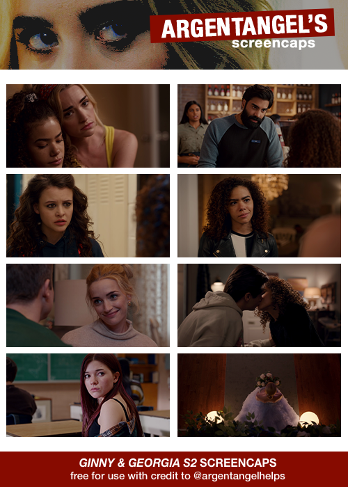
GINNY & GEORGIA SEASON 2 SCREENCAPS
all screencaps are free to use with credit to @argentangelhelps!
you may edit to your liking for personal use (icons, edits, promos ect)
do not use for : celebrity/real person rps or paid commissions, everything else is up to user discretion. (don’t make me change this rule). if you want to use these for icons on your own rph even for free, please message me.
the zip files are free to download through DROPBOX !
LIKE OR REBLOG IF YOU SAVE OR USE!
15 notes
·
View notes
Text
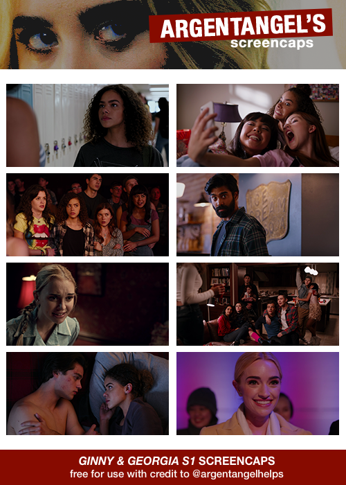
GINNY & GEORGIA SEASON 1 SCREENCAPS
all screencaps are free to use with credit to @argentangelhelps!
you may edit to your liking for personal use (icons, edits, promos ect)
do not use for : celebrity/real person rps or paid commissions, everything else is up to user discretion. (don’t make me change this rule). if you want to use these for icons on your own rph even for free, please message me.
the zip files are free to download through DROPBOX !
LIKE OR REBLOG IF YOU SAVE OR USE!
16 notes
·
View notes
Text


psd coloring : 𝐏𝐒𝐃 𝟔𝟕𝟐 : 𝐃𝐑𝐄𝐀𝐌𝐄𝐑
a free psd coloring i made & spend my time on on my deviantart ! feel free to adjust layers if you want to. just keep the credit to me still ! it might not work on all colors the same. this psd coloring comes with some adjustments !
PRICE : none. free <3 hmu if you want the mediafire link as for this psd, you dont have to join deviantart to get it. just like or reblog when i provide you the link on chat!
40 notes
·
View notes
Text
i'm in the indie side of tumblr rp, so i don't use gifs, but i have to say that seeing people's gif packs is one of the best ways to pick a new faceclaim for a character... thank you gif makers
#maybe some indie blogs do but feels more of an rpg thing? anyway excellent way to pick fcs to simply browse gif packs#especially as someone who picks based on -vibes- not on known quantities like hair colour or even ethnicity
0 notes
Text
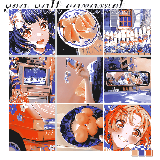
sea salt caramel: coloring made by @imbermagnvs. credit if using. coloring whitewashes dark skin but can be adjusted to be suitable! psd was made in photopea and will work best in photopea.
requested by @cuisinekuga <3
51 notes
·
View notes
Text
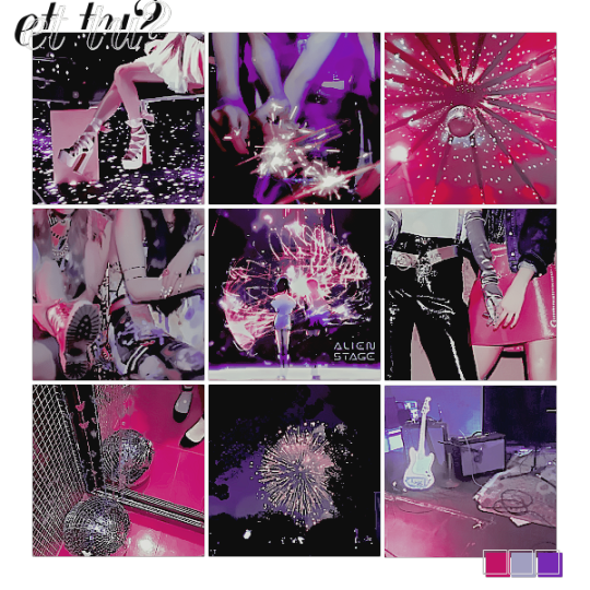
et tu?: coloring made by @imbermagnvs. credit if using. coloring whitewashes dark skin but can be adjusted to be suitable! psd was made in photopea and will work best in photopea.
requested by a very patient anonymous requester <3
45 notes
·
View notes
Text
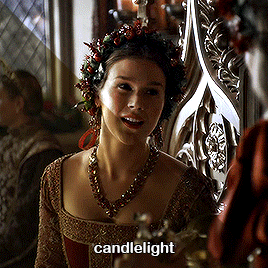
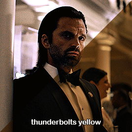
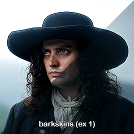
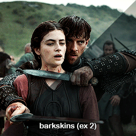
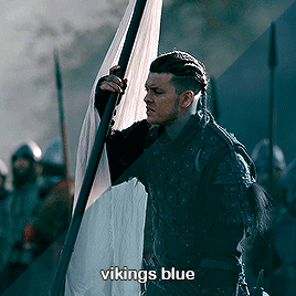
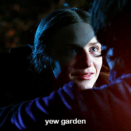

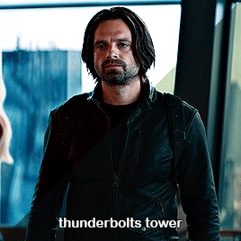
Eli's big preset pack!
Finally I have decided to make a little pack of some presets Includes:
7 colour presets
+ a bonus b/w preset
+ and another bonus captions (font: Ariel Rounded MT Bold)
Let me know if there's a specific scene you want a preset of, or a particular show. Please like/reblog if you download. I can be tagged in your creations at #userdickon Notes on the presets below the cut Download here!
The presets may need modifying to truly suit certain scenes, but hopefully this will be a helpful starting point.
My personal favourite here is the barkskins preset. As you can see, it can be used in multiple different shows. I discovered making this, that the thundbolts tower preset may also work for similar scenes, although I found it a little magenta for them (easily fixed though) The vikings preset may not work for every shot of those (hellish) scenes.
96 notes
·
View notes
Text
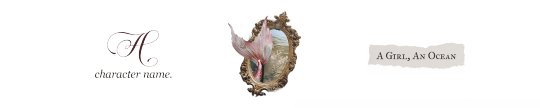
tail. free icon border featuring georgia and bright marching as fonts. DOWNLOAD ON PAYHIP.

dreamlike. free icon border featuring times and bright marching as fonts. DOWNLOAD ON PAYHIP.

under the sea. free icon border featuring times and carmila as fonts. DOWNLOAD ON PAYHIP.

tidal. free icon border featuring georgia and borias signature as fonts. DOWNLOAD ON PAYHIP.

true blue. free icon border featuring american typewriter and rock salt as fonts. DOWNLOAD ON PAYHIP.

porthole. free icon border featuring georgia and rosvelit as fonts. DOWNLOAD ON PAYHIP.

DETAILS & TERMS.
no colorings included to optimize for folks using ready-made icons.
crediting is required. you don't have to tag me, but it is appreciated – i'd love to see your creations.
please don't redistribute, and like/reblog this post if you plan on using these resources.
if you like these, consider tipping me!
69 notes
·
View notes
Text
BEGGING for graphics/theme makers to be transparent about it if their resources aren't free. please, please, say it on your post if your theme code/psd coloring/etc. costs something. bonus points if you name the price, but at least say it's premium.
nothing wrong with charging money for your work, but please be honest about it.
#rpc#the amount of times i reblog something only to have to delete it later because i realise it was premium content#(i only share free resources here)#why don't people disclose this on their posts?#like... i've paid for themes and psds both many many many times#i don't mind premium content at all#it just feels super dishonest to get people to click on your stuff only to find out after that it's not free
2 notes
·
View notes
Text
Rent firing gunshots:
I love dark and problematic themes in fiction
Somebody’s taste in fiction says nothing about them morally
There is no wrong reason to enjoy dark fiction, and a person’s reasons for liking dark fiction is their business, not yours, mine, or anyone else’s
Requiring someone to show their trauma card before you can absolve them of their alleged thought crimes is cop behavior
12K notes
·
View notes
Text
CARRD TEMPLATE #011 - [ PALOMINO. ]
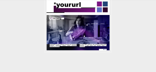
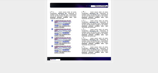
this is a FREE carrd template for roleplaying purposes, made with single muse blogs in mind. #011 ( live preview here ) is base account friendly, utilizing less than 50 elements. this carrd contain a landing page, a rules page, an info page, a mains/exclusives page, and a whole lot of text-based jank. this carrd is mobile viewable.
how to obtain : you can get this carrd template ( here ). the minimum price is set to $0 - FREE. if you would like to support me, that is also appreciated. my carrd referral code is somresources.
adjust size and cropping of images in carrd as needed (containers are set to max height, or it's meant for gradients). you'll have to import gallery icons as images, just make a solid color square.
please refer to the post linked in my pinned for troubleshooting. reach out if you have questions. please do not remove credit.
27 notes
·
View notes
Text
Please read your partner's rules!

Read the rules before you follow someone, and re-read them once every while to make sure you don't accidentally overstep boundaries or use triggering topics that may make them uncomfortable! It may seem like such an obvious thing, but it is actually a serious and rampant problem that people in fact DON'T read their partner's rules.
If someone has a password, then send it. You also have to message partners to send memes and prompts in, so don't tell me sending a password is a problem. Read these rules, send that password. If the password is an IC thing, clarify in your message that you only send this to confirm that you read the rules and don't want to make a big thing out of this.
If someone has an interest checker and it is a mandatory part of their rules, just fill it out. It can make it easier for your partner to decide which muse to send you if they run a multimuse and it shows that you read the rules and are genuinely interested in interacting with the other. If someone asks for specific things to be tagged, then tag them! Don't trigger your partners and then pull a surprised Pikachu face when you end up blocked. Respect your partner's demand for trigger warnings if they have them in their rules. Also, keep your tags simple! TRIGGER TW / TW TRIGGER. That's it. No fancy letters and emojis needed.
Too small text? Can't read? Message your partner and ask them for an alternative if you can't read their rules. I'm sure they can set up a doc or carrd for you with the rules in normal font-size without the use of obnoxious fonts and colors. It's all a matter of communication, which is and should be a basic thing in the RPC.
Please read the rules. Show your partner respect.
#rpc#don't follow people whose rules you don't agree with#it costs nothing to simply NOT FOLLOW if you're not going to adhere to something in their rules
88 notes
·
View notes
Text


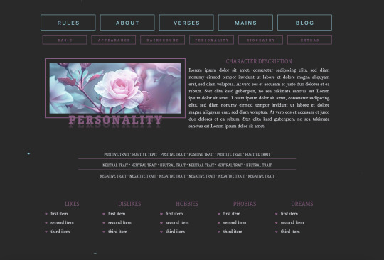
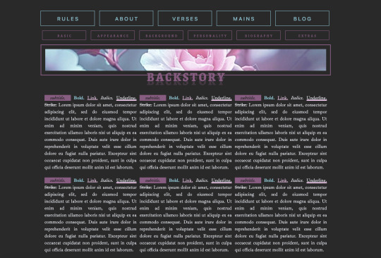
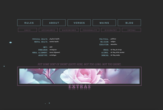


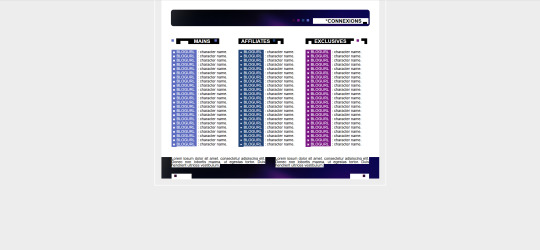
🐝 * ― 𝐂𝐀𝐑𝐑𝐃 𝐓𝐄𝐌𝐏𝐋𝐀𝐓𝐄 𝟎𝟐𝟗: 𝐋𝐀 𝐕𝐈𝐄 𝐄𝐍 𝐑𝐎𝐒𝐄. ( got inspired and decided to make something new. the preview can be found here. it's a single muse template with a rules page, an exctensive about page with multiple section, a verse page with sections, and a connections page. due to the number of elements used, this template requires at least a pro lite account. if you want to upgrade, feel free to use my referral code KB4W13V3, as it helps me out. )
― HOW TO USE
please don’t claim this as your own, and don’t delete the credit. you can change it’s size or color but it should stay where it is.
of course, you can edit all the colors, sizes, fonts, etc. however you like.
to get this template please click here. it’s on a pay-what-you-want basis, so it is possible to get it for free if you set the amount to 0. ( if you’d like to leave a little tip, i'd very much appreciate it, though. )
actual image sizes don't matter since carrd scales them to fit but you can see examples of the image sizes i’ve used in the demo to get an idea for the dimensions. or just try your own and play around with the settings to get the desired outcome.
if you have any questions about how to edit it, just send me a message, and i'll try to explain it to you.
157 notes
·
View notes
Text
honestly, especially in the current state of the world, you all have GOT to kill whatever puritanical voice inside your head keeps insisting that if something is erotic it has no social, artistic, or intellectual merit.
stop acting as if someone can’t enjoy both erotica and literary fiction or classics. it’s not some dichotomy.
stop acting as if erotic art can’t be poignant and meaningful. and that includes all erotic art - not just fine art.
stop insisting that sex scenes or erotic material ruin movies and shows just because you, personally, get icked out watching it.
no, not all erotic art is high art, and not all erotic art is meant to invoke deep intellectual discussion - but insisting that makes erotic art valueless, a disservice to intellectualism, or whatever else - does nothing but add fuel to a fire built on conservative ideology.
16K notes
·
View notes