Don't wanna be here? Send us removal request.
Text
On Tech Support
On May 5, 2023 I got a call that changed my life.
I had just accepted a job offer to work for the Browser Company of New York!
I walked up the stairs to our apartment with great news and my wife told me to sit down. My Mum had called. My Dad had to be rushed to the hospital. He was bleeding internally and it looked like he was suffering renal failure. We flew out to be with him and my Mum. He passed away 9 days later.
My Dad is one of the reasons I’m good with computers.
Dad went to college to learn how to use computers back in the 70s — this was back when computers would take up whole rooms and you had to input commands with punch cards.
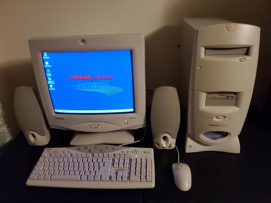
He brought home our first home computer in the late 90s; a chunky Compaq Presario that clicked like a bottle nose dolphin as it chugged along. The Compaq was mainly for his side hustle (a carpet cleaning business) and for me and my brothers to do our school work (the side hustle was helping to pay our school fees), but it quickly became my direct portal to the skateboarding article on Encarta and pokemon.com.
Dad’s main job was the night production manager for the Royal Gazette — a job he had for close to 40 years. He would often talk about how he missed the sound of a newsroom. The clacks and thunks of typewriters, the ringing of phones, the chaos of people coming together to make a paper every day. I couldn’t imagine how the Gazette could ever have been a loud place when I would visit him at work. It was deafeningly quiet! He would plop me in front of a computer to play Minesweeper and the only sounds you could hear were my mouse clicks.
Since Dad worked at night, he had a good chunk of hang time waiting for the paper to be ready to go to production. He would listen to internet radio stations, read interesting articles and forward dirty joke emails from his coworkers. When I left home for university my procrastinating study hours and his work hours would sync up. We would email each other links to cool music, videos, articles and, since I was old enough, the odd dirty joke email forward. But we mostly just chatted.
We started saying “I love you” over email
He was a great writer — he wrote just like he spoke — and both of our conversation styles lent themselves to the time delayed back and forth of email. I say something, you read it and think about it, you send a considered response back with a little something extra. Repeat.
We started saying “I love you” over email. We were always close, but we both had a hard time talking about our feelings especially when I was a teenager. Being apart, but still staying in touch over email gave us the space to feel comfortable saying we loved each other. We had no trouble saying it after that — it was one of the first things we said to each other when I could finally come home for Christmas in December 2022.
Tech is very expensive where I come from (about 30% more expensive than the US), so whenever I go home I roll up like Tech Santa with a bag full of laptops, tablets and phones. The Compaq Presario was long gone and Dad’s laptop had seen better days. Dad was a long time Windows user — he wrote his memoirs in Microsoft Word — so he was keen to stay on something familiar.
I got him a Surface Laptop 3. I walked him through setting up Windows 11. I arranged his bookmarks bar in Chrome so he could quickly access his email, Facebook, Youtube and, most importantly, his memoirs which we’d uploaded to Google Drive. He was so happy to have all of his stuff moved over to his new computer and relieved that his memoirs were properly backed up.
Going through his browser after he died was some of the most heartbreaking work I’ve ever done
After he passed away I helped my Mum with the gut wrenching task of cleaning up Dad’s digital life. I made sure she had access to his email and important logins so she could deal with closing accounts and adjusting billing names. I also memorialized his Facebook page to ensure it didn’t get hacked and start spamming friends and relatives with crypto scams.
Dad had several strokes leading up the internal bleeding and renal failure in May 2023. Honestly back in Christmas 2022 he had only recently recovered from his last stroke and he wasn’t quite himself. Going through his browser after he died was some of the most heartbreaking work I’ve ever done. The bookmarks bar that we had carefully set up together was riddled with duplicates — Facebook, Youtube, Google Drive over and over spilling out into a drop down menu. My Dad knew his way around computers. He had been using them since they took up a whole room. I knew some damage had been done after the strokes, although he was very good at hiding it and I don’t think I was ready to admit it at the time. But with him gone and looking into his computer, his window to the world, I couldn’t deny what I had known for at least a year. My Dad had strokes, my Dad had internal bleeding, my Dad was dying, my Dad was gone.
These things — computers, web browsers — they’re not just inert tools waiting to be picked up and used. The more you use them, the more they become a part of you and you of them. The laptop lid gets scratched, coffee is spilled onto the keyboard, cords become frayed, bookmarks get bundled up into folders to be forgotten, passwords get scribbled on sticky notes and then reset again, tabs sit open for months just in case, URLS and search queries are typed in repeatedly just because you’ve built up the muscle memory — facebook, youtube, google drive, pokemon.com.
We’re all about to be new at this again
A developer friend of mine once said to me, “the future is here and we’re all bad at it”. University level STEM students don’t know how file paths work, they don’t teach kids to type anymore and more and more jobs across a variety of fields require some degree of computer literacy. Everyone is expected to just know how to use computers, but as my Mum would say “I’ve never had a lesson!”. As we head into the next phase of computing — where you work with the computer instead of simply using the computer — much of your interactions will be through AI language models, but even the people building those don’t really know how they work. We’re all about to be new at this again — new at computers, new at web browsers, new at everything. Now more than ever, we’re all going to need some help. Hopefully that help comes from someone who understands what you’re going through, what you’re trying to get done and can meet you where you’re at.
What we’re building is so much more than just a portal to websites
On June 5 2023 I started a job that changed my life. I started working at the Browser Company of New York!
I help to build Arc, a product that I love, with some of the most talented, thoughtful and inspiring people I’ve ever met. I helped bring Arc to Windows, so people like my Dad could use this very special browser that feels like my home on the internet.
I truly feel like I’m doing the best work of my life and that’s because what we’re building is so much more than just a portal to websites. It’s where you do your work. It’s where you hang out with friends. It’s where you pirate anime, do your taxes and send emails to your Dad.
It’s where you live your life. As we continue to build I hope to be that human voice on the other side of the computer that helps you feel like Arc is for you, for your stuff, for your life. I want to help Arc feel like home. See you on the internet ✌️ Love you, Dad!

3 notes
·
View notes
Text
Arc Boosts are rad!
So, the Browser Company just released a big update to their Arc browser that more fully fleshes out the Boosts feature and it's really cool!
The new Arc Boosts 2.0 provides a simple no-code interface to tweak a webpage's CSS so you can do fun things like update fonts and colours or hide ads or other unwanted visual elements of a page. Arc will save these Boosts for specific websites and you can share them too.
They're kind of a cross between a browser extension and the occasional manual fiddling I would do in the inspector to remove or change an annoying element on a webpage. The fact that you can save and share them is 🤌
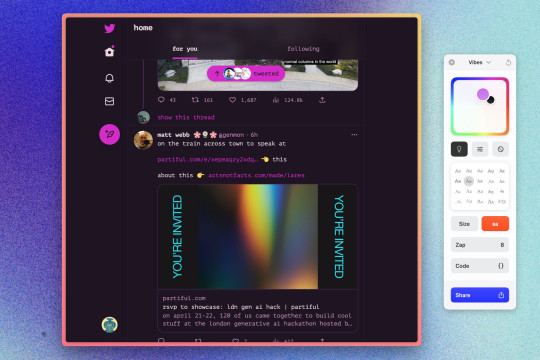
Here's a quick one I made for nytimes.com to remove the ad images and switch to dark mode.
I also really like this simple Gmail Boost I found in the Arc Boost Gallery. You can check out the release notes here, FAQ here and The Verge's David Pierce did a nice write up on the new feature here if you want to learn a bit more 😊
1 note
·
View note
Text
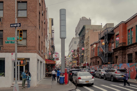
Our Blade Runner present
1 note
·
View note
Text
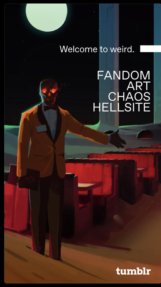
Btw @staff the Tumblr Welcome to Weird campaign work is A+++
Curious if this was in house or through an outside agency 🤔
1 note
·
View note
Text
The Best Burner Phone is an Apple Watch

Yeah I said it. Fight me! (Don't actually fight me😅)
I have eyed the Light Phone, the Punkt phone, the Nokia 3310 3G. I've thought about rocking an iPad Mini with cellular data. I've flirted with the idea of a goddamn pager. Anything to get me away from the ever present anxiety rectangle of doom that is the modern smartphone. I didn't get any of these (although I would love to play Snake and listen to MP3s on the Nokia 3310 — just look at how sick this thing is!).
I got an Apple Watch. And y'all, it's the best.
Okay, so the Apple Watch isn't actually a burner phone. It's more of a chill vibes, low stress, limited functionality device. It's basically a powered up wrist iPod that can make phone calls.
But honestly that's as good as you're going to get as cell providers rapidly work to decommission their 3G networks ,ruining my Nokia feature phone fantasies. With the Apple Watch I can send messages, listen to music, play podcasts, check off reminders, view calendar events, track a workout, pay for stuff, turn on my lights...oh and make phone calls. It lets me do just enough and get back to whatever I was doing — helping me avoid getting locked in a phone hole of pseudo productivity and passive consumption. Ironically, strapping a smartwatch to your wrist physically frees you from your phone as Allison Johnson puts it here:
"For me, embracing the smartwatch life makes me feel like I’m in charge of my phone rather than the other way around. I don’t need it on my person at all times anymore"
My phone lives on my desk or in a bag. I actually find it annoying to have it in my pocket now. So much so that I'm looking into getting a cellular Apple Watch in the new year so I can fully leave my phone at home most of the time.
With my Apple Watch on, my phone has become what I think it was always really intended to be — my field computer. A device small enough, yet capable enough, to get some stuff done when I'm out and about, but nothing more. It's a small change, a perceptual change, but it's been hugely impactful to me. The phone moving from the everything device back to a functional gadget in my arsenal of tech tools has helped put all of my devices into functional context. Phones are for outside, tablets are for the couch, laptops are for laps and desks and watches are well, for your wrist.
0 notes
Text

The answer starts with the browser’s defining feature: tabs. Fisher doesn’t hate tabs — in fact, he helped popularize them. But he hates that using a modern browser involves opening a million of them, not being able to find them again, and eventually just giving up and starting all over again. “I remember when tabbed browsing was novel,” Fisher says, “and helped people feel less cluttered because you don’t have as many windows.” But now, “even when I use Chrome,” Fisher says, “I get a bunch of clutter. At some point, I just say, ‘Forget it, I’m not even going to bother trying to sort through all these tabs. If it’s important, I’ll open it again.’” Browsers need better systems for helping you manage tabs, not just open more of them.
From The Verge's profile of Darin Fisher of The Browser Company who are building the Arc browser — formatting edits mine.
Image from Wired
1 note
·
View note
Text
Remove People in the Background
Google's Pixel phones and Google Photos have a feature called Magic Eraser that can remove people (and animals?) from your photos.
While This is nothing new for digital photo editing — Google's just made this dead easy to use for those of us without photoshop skillz — watching product demos people being raptured out of the backgrounds of photos is...unsettling.

Not that wanting a photo of your kid on the beach, alone, gazing at the sea, the treacherous sea is wrong per se. It's just that removing evidence of all other humans in a photo after we've gone through a respiratory pandemic that killed many, many people smacks a bit wrong.
Pandemic aside, I think this feature brings up a lot of bad things about what it means to take a photo right now. Photos are evidence that you are the main character in the movie of your life. You, your kid, your dog, your stuff, is the focus. Everything else is set dressing — a reflection of you, your power, your status.
Again, this is not new. We have aristocratic oil paintings, the walls of Egyptian pyramids, tapestries and so on.
What is new is how easy it is to create the 21st version of Henry VIII eating a turkey leg and how easy it is to share that image with your friends, family, enemies, exes, side pieces.
What's more is that these images come with meta-data, like geo-location tags, so you can know exactly where 21st century Henry VIII got that tasty looking turkey leg, go there, snap your own pic and get similar clout. This got me thinking about a great Caity Weaver piece about #VanLife
"To prepare for this regular-shaped mission, I threw myself into the #VanLife corners of TikTok and Instagram. Accounts of popular “vanlifers,” as they are known, are an infinite reservoir of gorgeous, unpeopled scenery previously encountered only in desktop backgrounds: sunrise canyons, sunset oceans, high-noon highways that stretch on, carless, forever."
The piece goes on to describe the throngs of people Caity and her travelling partner had to fight through as they tried to grab idyllic shots of themselves, the van and nature.
The goal is the pic, but when that's everyone's goal that's a problem. If only we could disappear these fools out of the photo, right?
I don't blame Google for creating a technological solution to a problem. The camera on the Pixel phones has been a defining feature of the product since gen 1 and their machine learning smarts are increasingly becoming a key part of all of their products, consumer or otherwise. They spotted a problem and created a solution that is genuinely useful (I imagine) for their users.
It's just that the desire to remove others from your photos, from representations of your life, just feels gross, y'know?
1 note
·
View note
Text

"The bigger issue, though not the only one, is that the internet allows people to speak to each other at a scale unprecedented in human history. The shortcomings and tradeoffs of the laws governing that speech have never been so evident, and their troublesome edge cases never so numerous. And instead of trying to reckon with a new world, the people who make and enforce those laws have abdicated their principles and responsibilities in favor of wielding raw power — and, often, abdicating a lot of their common sense as well."
From Adi Robertson's showstopper How America turned against the First Amendment
0 notes
Text
From The End of Alcohol | WIRED
One of my favorite stories from the rooms was told by a 12-stepper who noticed a friend reading The Art of Happiness, by the Dalai Lama.
“I doubt I’ll read it,” the guy said, morosely. “Can you just tell me the secret?”
“You’re not going to like it,” his friend replied.
“Oh no. It’s not—”
“Yep.”
“Please say it’s not.”
“It is.”
“It’s ‘help other people,��� isn’t it?”
“Uh-huh.”
“Fuuuuck.”
0 notes
Text
The Yellow iMac is Fire and You Can't Tell Me Otherwise
Apple announced new iMacs on 4/20 and people have opinions about the design.
I've read complaints about the chin (sure), the white bezels (uhhh), the stand (okay...), the colours (what!?).
I really feel like these aesthetic gripes fully miss the point of this design.
This is not office equipment; this is furniture. I mean, just look at the yellow one!
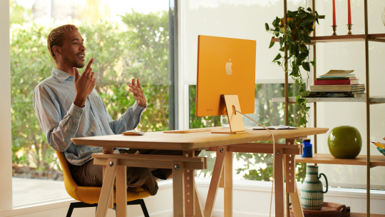
I feel like a lot of detractors are thinking of this computer as something that will live on a desk in an office and never to be seen by others. Fair enough. That's typically what we do with desktops. But that's not the story Apple is telling with this design.
Apple's promo images and videos show the new iMac in bedrooms, living rooms, offices, kitchens (I love a kitchen computer!). And, unlike any other all-in-one desktop, you'll actually want to put an iMac in those rooms.
"Computers aren't just for spreadsheets or for tucking in the drawer when you're done. They can be a part of your identity same as your clothes and your furniture. You use them just as much, so why not?" - Michael Heilemann, principal designer at Squarespace
The new iMac isn't just a functional and expressive design piece for the home, it'll look just as good at the front desk of your business.
Back when I used to go places and do things my main encounters with iMacs were in small, design focused businesses. The fact that the back of the iMac has the brighter colour is a dead giveaway that Apple is aware of this market and designing for them. Who wouldn't want their front desk computer to match the business brand colours?
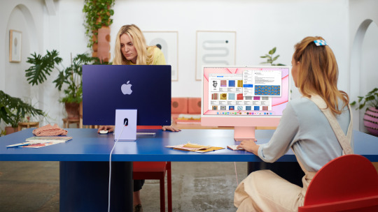
I could give a little more leeway to the design detractors if the iMac was slow and clunky as a computer. And to be fair, the reviews aren't out yet so we don't really know how it performs.
We do know, however, that Apple's M1 chip inside the iMac rips on the Mac Mini, Macbook Pro and Macbook Air. I don't think we have anything to worry about with the iMac in terms of performance.
"Apple's goal is modern retro, but a breath of sunshine -- or a bright yellow iMac -- is certainly appreciated after a year of pandemic and unrest," - Avi Greengart, an analyst at Techsponential
A computer that looks this good and potentially performs as well as its siblings is a colourful recipe for joy. After a long year+ being stuck inside the last thing I want to bring into my life is a another silver or black rectangle. If I'm going to be stuck on a computer for the majority of my work and social life, it better be a computer that makes me smile.
0 notes
Text
✂Copy/Paste on Phones is a Power User Feature 🖌
Copy/paste occupies this weird space as being completely innocuous and tremendously important. I joke that it's 90% of my job and apparently I'm not the only one who feels that way.
I once asked a coworker at my old job to copy/paste something on their phone and send it to me. They didn't know how.
I was shocked.
I canvassed the rest of our coworkers to see if anyone knew how to copy/paste on their phone. The vast majority of them did not.
Why is copy/paste on phones a power user feature?

Well, for starters text manipulation on phones sucks.
Text is still hard to select on a touch screen. It's difficult to maneuver your cursor around (yes, even when you use the virtual trackpad). Once you have managed to select the text you want to manipulate you have to play a delicate game of touching in just the right way to get the option to cut/copy/paste/select all.
Still, we do type on our phones a lot. But what are we typing? Usually short bursts of text. Notes, search queries and most importantly messages. Lots of messages.
Messaging apps, anecdotally, are the main apps people are typing on their phones. The typing is conversational and spontaneous, so it's unlikely you'd be pasting in text from another source.
It's also unlikely phone users will have two or more text rich apps or documents open at the same time and need to move text from one to the other. The phone medium doesn't really lend itself to that behavior.
(Multitasking on mobile devices is for another post. I have some thoughts!)
It's starting to sound like copy/paste on phones is a power user feature. Heck, Apple didn't even include it on the iPhone until 2 years after it launched.
So why was I surprised?
A phone’s form doesn’t necessarily dictate its function, but it definitely dictates its perceived function.
My phone is a computer running an OS and by extension it should have typical computer-running-an-OS capabilities like copy/paste.
To my old coworkers, their phones are, well, phones. They're computer-like, but removed from say a desktop or a laptop. (What's a computer, anyway?)
To me copy/paste is something so commonplace, so obvious, so boring that I took for granted as something everyone would just assume to use on their phones. I have a decades long history of using computers -- a luxury my former coworkers may not have had en masse and certainly a luxury that a majority of the world’s new internet users don’t enjoy.
I return to this episode from my old job often because it really challenged my biases about how I think about tech and highlights the importance of empathy in the design process.
So yes, copy and paste on phones is a power user feature.
0 notes
Text
🔔On Slack & Opting Out of Chaos 🔕
I love Slack. I consider myself good at Slack. I think it's a much better way to communicate by text for work than say, email.
Still, Slack has problems.
I think the main problem is that you need to opt out of a lot of Slack defaults in order to make Slack useable.

The reason I'm good at Slack is because I've taken the time to customize my Slack experience.
I've turned off specific @ mentions (@here may as well be @nobody 🤷♂️)
I mute or leave irrelevant channels
I set a do not disturb schedule so I'm not getting notifications during breaks and outside of work hours
I unfollow threads when they no longer need my attention
I use the all powerful ‘Mark All As Read’ shortcut (shift + esc) at the end of my day
That’s a lot to ask of a user!
If you as a user don't take these measures the signal to noise ratio veers hard to mostly noise, which creates a whole bunch of other problems.
To Slack’s credit, they have acknowledged this.
Still, the user shouldn't have to work that hard to get their primary means of work communication to function how they want it to.
We know that users rarely change the default settings, so even if an opt out method is available it’s unlikely users will even take the time to change their settings to make the product better suit their needs.
So, why not make all these opt out features opt in?
0 notes
Text
Some Quick Thoughts On Opera (📱💻 not 🎶🎻)
My browser is one, if not, the most important apps on my computers.
It’s where I read, watch, hang out — heck, the majority of my job (and probably yours too) takes place in a browser.
Still, it doesn’t feel like most browsers are designed for the way we use them.
You have multitudes of tabs open. You’re playing music in one of them, you’ve got a WhatsApp convo going in another. You’re desperately trying to find that one tab that’s got that article that you really want to read, but once you get there the page is plastered with ads so you grab the URL, find the tab with Gmail open and email the article to yourself to read later.
It’s a mess, but hey people are messy. That’s how people use the web.
Opera is the first browser I’ve used that acknowledges this user behavior and has designed solutions for it:
Too many tabs to manage? Group them into workspaces and you can easily search individual tabs.
Can’t find where the music is coming from? Here’s a nifty sidebar with quick access to Spotify and Apple Music’s web apps.
Guhh so many chat app tabs! Remember that sidebar? Yeah you can have all your chat web apps there too for easy access.
Ads! Why? Ad blocker built in.
Guess I’ll email myself this link. Don’t be silly there’s the sweet feature called Opera Flow that lets you send notes, links and files between your devices (and to yourself).
This is starting to sound like ad copy, but for real, the list goes on!
Literally, look at this list (taken with Opera’s screenshot tool)
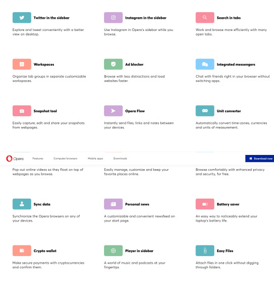
I could go on (and I might!), but my main thing here is that it is so nice to use a product that feels considered from the jump.
The problems that Opera is addressing are very real -- we’ve all seen our fair share of a-billion-tabs-open-at-once nightmares.
To go through this list of features and then use the product feels like you’re using the end result of a team working their butts off to design something really thoughtful and good.
And that’s, well, that’s just swell ain’t it?
1 note
·
View note