
Don't wanna be here? Send us removal request.
Statistics
We looked inside some of the posts by mcr-mitch-blog and here's what we found interesting.
Average Info
Notes Per Post
260
Likes Per Post
207
Reblog Per Post
53
Reply Per Post
0
Time Between Posts
30 days
Number of Posts By Type
Text
5
Photo
11
Link
1
Last Seen Tumblr Blogs


Fun Fact
In 2020, Tumblr had 29.4 million users in the US.
Text
Portfolio Review by Sophie Carey
Sophie Carey is a Manchester based artist who is really breaking the mould. She’s taken time to review my new portfolio pointin out its strongest and weakest points to show what’s working and what needs tweaking
.........................................
After looking at your portfolio, it’s clear that as an artist you’re not afraid to approach different methods and mediums which is great as we can see your different skills throughout each piece.
Firstly, looking at ‘Mount Trumpore’ you have a series of adjacent colours working together with beautiful fluid line work that doesn’t need to be too heavy and bold. You have nailed the portraits of Donald Trump, which allows everything else to work perfectly. As a person that’s into Fine Art over Illustration, I find this piece truly wonderful. It’s clean, structured and I love how the colour dominates most of the work without heavy, brash line work.
In relation to heavy, structured work ‘Temple’ is just that. I think in this piece you’ve shown more skill than aesthetic personally for me. I have no idea how you have created this piece, which maybe is the beauty of it. In comparison to ‘The Capital of Me’ where you’ve let go of that tight, animated style and gave us another way of working in Illustration. I think bringing in primary photography is a cool thing. The whole concept of ‘planting’ yourself in places around Manchester is wonderful. I’ve also read your Zine properly and I think it’s colloquial language and illustration inside is genius.
‘Retro Boy’ is definitely one of your weaker illustrations for me personally, without focusing on the negative you haven’t showed your skills to full potential. Overall it’s a great idea, but seeing your potential on others and seeing your skill set and comparing to this particular piece it doesn’t show as much love and time has been given too it.
But then.. you bounce back with amazing line work again! ‘Putin’, ‘Obama’, and ‘Current Events’ all show your skills which I’ve been waiting for! I can look at all three and know they’ve come from the same artist which is good. I much prefer your work when you let yourself go and the drawings are so well done. It’s clear that when you’re an artist, and you have a brief that is something you love to discuss or want to share with an audience our work becomes a lot more refined and allows us to really show who we are. I think these particular pieces show that. I love the whole mixed media idea with cardboard, newspaper and keeping the simplicity of the line to not over power the background. I’d love to see these even bigger, maybe A2!
My favourite piece is definitely ‘Obama’.
Your composition of this piece is great. You’ve allowed Obama to be central focus yet kept everything else just as important which can be quite a hard task! I personally feel your strength is your line work, and how you create contour through your usage of line is beautiful.
I’d love to see more of these sort of pieces and get some big work done! Overall, I think you’ve really starting to find yourself as an Artist and it’s clear your drawing and line skills are going to take you to where you want to be. Get more work up on Instagram, and get your style out there!
.............................................
It’s always really interesting to get a review from someone who leans more toward fine art than illustration or design. I’m incredibly thankful to her because she has spoken about compositions and the feel of the work and the portfolio. Again, one piece has been picked out as falling short, so I know exactly where to go.
I will go away and focus some of my efforts on tying my portfolio together. I will look at what I have that other artists, designers and illustrators are saying is working and I will work around that. Perhaps I didn’t think too much about certain projects and how they clash with what is actually the really good stuff, and in turn, bringing down the quality of the overall portfolio experience
0 notes
Text
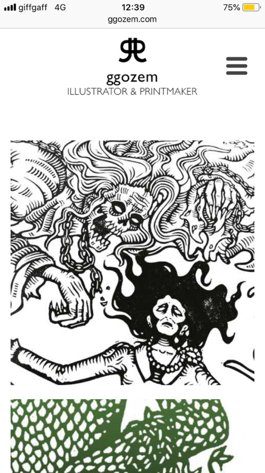
Georgie Gozem Portfolio Review
I approached Georgie Gozam through email after picking up her card at Manchester Buy Sell Art Fair. She gave me the best review of all. She looked at the positives and the negatives in a great way to help it grow and grow
.......................................
You’ve got an interesting selection of work and the beginnings of a really good portfolio. I like the booklet idea too, it’s a nice idea to have a printed sample for people to take away with them, great. The thing that stands out to me is that you’ve got a couple of different styles going on. It’s good to show versatility in your portfolio, but you also want to show off your real strengths and make it clear who you are as an illustrator and what it is that you do.
So, you have the really bold, clean digital work with strong colour palettes like ‘Trumpmore’ and ‘Temple’. These look really striking, especially the Temple ones, and come across as well considered illustrations.Then you have your more hand crafted fine liner drawings of Putin and Obama. The contour lines and the decisions you’ve made about the areas of shading give them character. Great work! The 'Narcos’ illustration is then a combination of these two processes. I think this makes it one of the stronger pieces because it’s confident, bold and forms a link between these different styles. If you can, I’d suggest getting more illustrations like this one in there. Maybe you could create a series of them all surrounding a theme - if you have an interest in politics you could push it in that direction? Or maybe a series of famous drug lords? Why not!
I’d say that the weaker pieces are 'Capital of Me' and 'Retro Boy'. This isn’t to say that they’re bad, but they don’t feature the same kind of line quality as the others. If you put them next to your Temple work for example to draw a direct comparison, they don’t have the same impact. In my opinion, if you were to omit them you’d be left with a far more cohesive looking body of work.
Advice for the future…Hmm… Work really hard. Don’t be afraid to ask questions. Don’t take criticism about your work personally. And also, no one will know you exist unless you tell them, so keep on putting your work out there.
..............................
Georgie noticed the link I was making in the decision to place my digital work and hand crafted work in specific positions in the portfolio. She was also fast to point out what may just be holding that back and it is definitely something I will be making an immediate change to.
I really appreciate her taking time out to review my portfolio. Head over to her site
http://www.ggozem.com/
0 notes
Text
Liam Creely (WeFlySolo) Portfolio Review
In this review, my portfolio was changed from the separate A3 sheets with no true identity, to a binded magazine with a running identity through a new logo and layout. Liam said that the new layout and design are a great success.
I asked for any criticism or advice to take it further -
Liam: i like it cause it’s very simple and easy to view, body of work could maybe of been a bit heavier I.e few more projects you may of done etc and maybe all followed a theme or maybe in some way relate to the previous piece of work. In my opinion the illustrations you’ve done on Ai really catch my eye the most
I got some really useful advice about which direction I should take the display of my work and I’ll be using this to make my portfolio a lot stronger with more linking projects
0 notes
Text
Portfolio review with a Graduate
My second portfolio review came from Liam, a graduate from Stockport. I got a similar feedback to Fig Taylor. Mostly based around the cohesiveness of the content. That is definitely a point that requires more attention. Liam said that perhaps if the name was taken away from the page then you may end up with three different stacks of work if you were trying to figure out who’s work they are as it is slightly too diverse and not consistent enough to really form its own identity. The second point for improvement is to make a publication instead. My portfolio consisted of large separated A3 prints inside a portfolio holder. I can definitely see how changing to something that is binded and fits in the hand like a magazine could be a lot more attractive to clients, easier to transport or send and is much easier to handle turning pages than holding out 6 or 7 A3 sheets

0 notes
Text
Fig Taylor portfolio review
In my first portfolio review I had the pleasure of meeting the great Fig Taylor. She is an expert on what to and what not to do when it comes to illustration and design. Especially when it comes to presenting your work to potential clients.
When looking at my portfolio I was very pleased that nothing was brought up as something that could be completely detrimental to my portfolio. Instead I was told that I have a strong body of work that holds the eye. However, my portfolio was very diverse stylistically and I was advised that that is something to try and change as people want to see a consistent style to really show the strengths rather than saying “I’m good at this, and good at that, and also I can do a bit of this”, rather than saying “this is what I do, this is who I am, remember me”
Following this, Fig gave some amazing advice on what to expect when approaching new clients or agencies, and the do’s and don’ts involved.
I made some notes that really make you think about how much more you can do to show your worth and catch the right people’s eyes.
The nature of illustration is changing
Now you need to use social media profiles and maintain a digital presence
There are more illustrators than jobs
In other countries to U.K. And USA, illustrators are encouraged to have a wide range of styles and skills. Whereas here, we focus on strengthening and honing our individual skills and styles
Employers will expect to open your portfolio and get a really strong sense of who you are
Today, no employers want multiple styles. Some don't mind a hint of flexibility, but a large percentage want one direct style and direction of what they see
Don't include things that you don't believe in or even like doing just because it looks nice
Try to aim for 80% minimum satisfaction with your work and methods in your portfolio
You need to transform your portfolio from the one that got you through uni, to the one that will show how you are suitable for roles in real time jobs
Display the characteristics of a well oiled illustration machine
You must learn to become your own illustrative critic
Maintain the same strength throughout the portfolio. Don't do good start, good end, filler middle
If you don't have the means or apparatus to produce work that you were able to for work in your portfolio. Get rid, or go get the stuff or space with access to what you need
Print portfolio:
A3 A4 industry standard
Never have life drawings, sketchbook work
Sketchbooks can be offered as an extra for clients who do like to see that
There is no set amount of pieces you have to have or max you can have
You can mount your work in any way you want. Just make sure it works for you and compliments your work to its best potential
It must be a body of your best work. Who you are & how people can use you
Digital:
Small body of your own work which is concise and represents you
iPad digital portfolio is a preferred method of showing
With laptops, too many things can go wrong
The website must be professional to the standard you see elsewhere, should also reflect you the way your portfolio does
Carbon made < Website
As an illustrator, your website is your CV
Your blog is like your cover letter. It lets employers know what kind of person you are
Blogging:
Don't include inappropriate content/pics of sad jokes etc
You don't have to write in any certain way
The blog should be more relaxed to a website
It should be told and presented in the way you would to a close friend or family member
You can post personal posts but at the same time don't go wild posting rubbish Most illustrators know their first commissions will come from magazines, editorials
Magazines - low payDesign - mid payAdvertisement- higher pay Going for magazines, you shouldn't stick to just what you know and are familiar with. Enlarge your scape of what you can apply for, everything
4 sorts: Consumer - easy ones WHSmithCustomer - shop magazines etcTrade & Professional - for specific places, commonly ones exclusively for people of an establishment etc
Trade and professional can be a lot freer with what they choose and what you can produce because of the less broader demographic
Do not introduce yourself to new clients through email. Send a letter with a couple of images. One that shows you have done your homework. Send to the image editor of the establishment. Say you have paid attention to what they have used before and send similarly fashioned images while mentioning the link but describe as not being derivative. Also mention that you will call around the same time next week, then make the call the next week, don't forget Create newsletters to send out References: Magforum.comAOiWriters & artists Year book ( +children ver)Carrousel & books for keepsCreative reviewCampaign magazine DO NOT BLANKET BOMB. Basically one message sent to a large number of potential clients
If you're trying to get hold of the art director of a place. Call the switchboard and ask for the number of the art director of the place
PERSONAL
Find people producing similar things. Look who they're working for and networking with and steal it all
0 notes
Photo

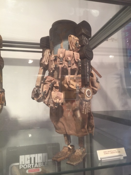
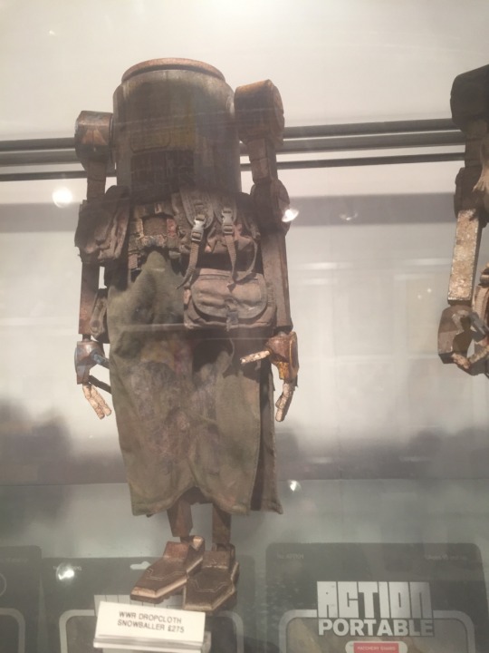
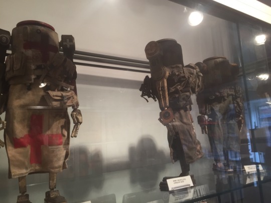
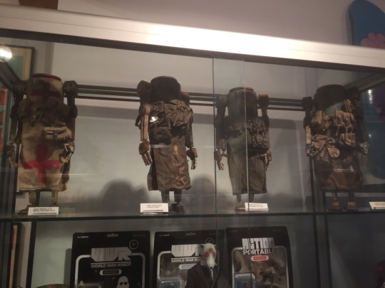
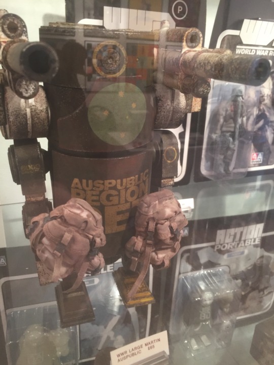
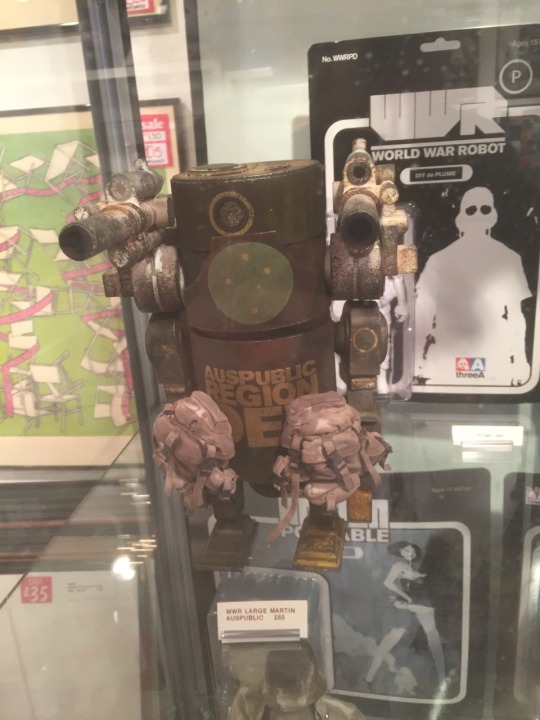
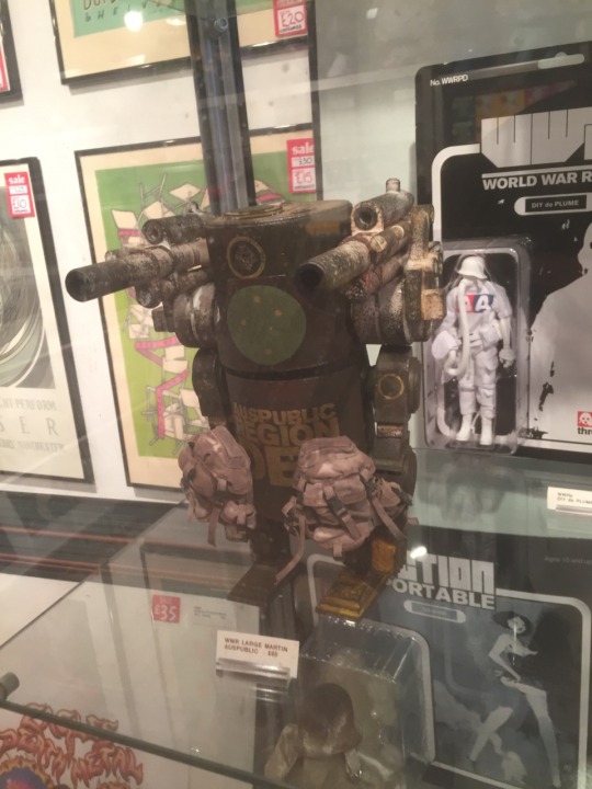
Fantastic models found in the Northern Quarter Manchester. The theme of futuristic A.I paired with the new seen future of a more desolate landscape of empty resources and a war torn world really make these relevant in the way the world is seen today. Rather than imagining shiny tall buildings and flying hover-boards, we tend now to think of a darker world when asked about the future. Just as we see in cinema, gaming, TV and the rest! Fantastically beautiful, relevant and well made models. Not too pricey either
0 notes

Photo
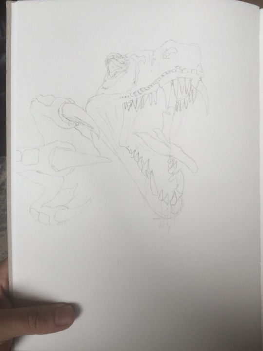
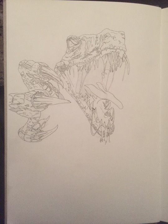
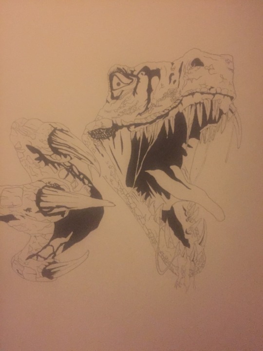
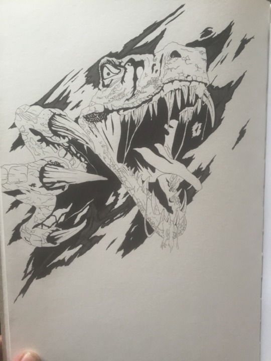
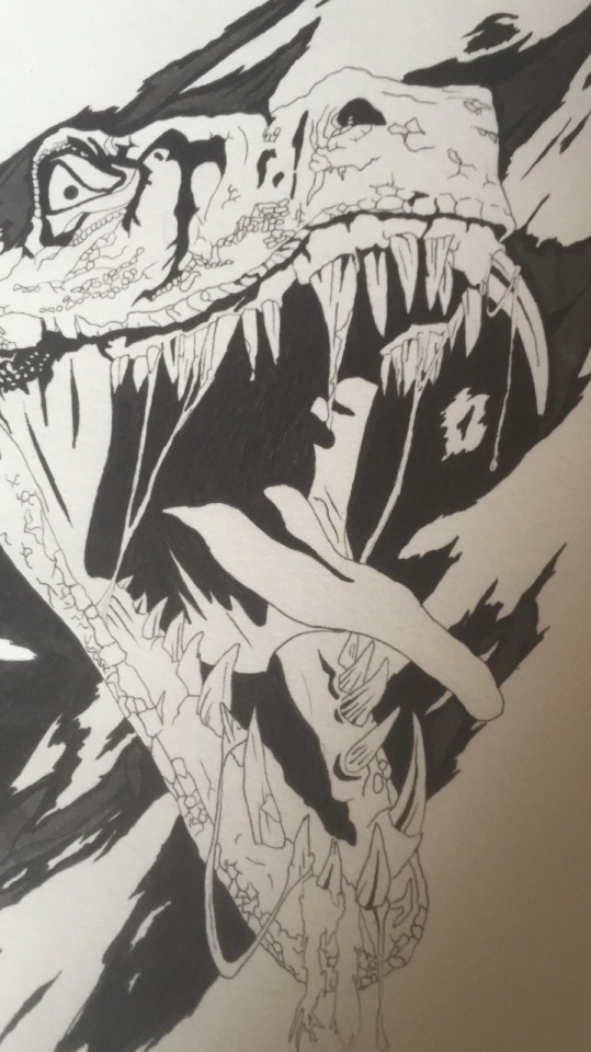
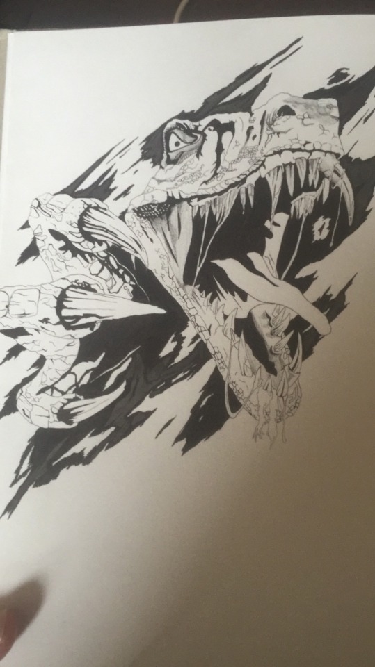
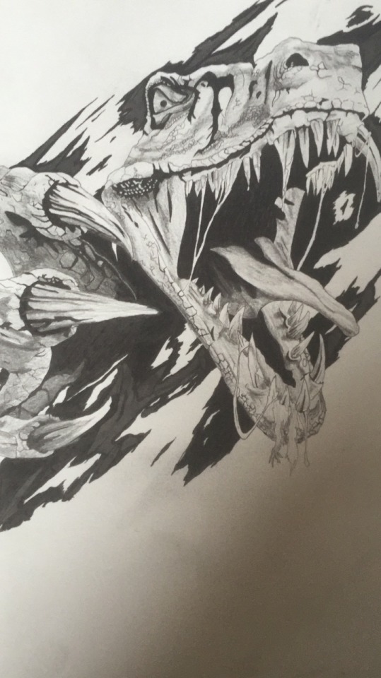

Free hand raptor sketch from beginning to end, torn page effect using pencil, fineliner, ink, coloured pencil
0 notes
Link
I've found a really cool shop through Facebook! Insert Coin is a great place that supplies a whole lot of clothing and merchandise from a wide variety of games! They've even made pop up stores in the U.K. to keep up with demand!
0 notes
Photo
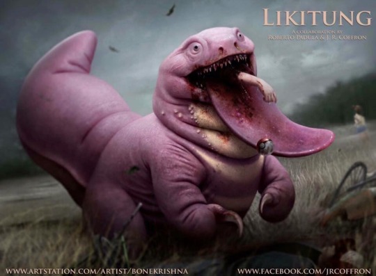
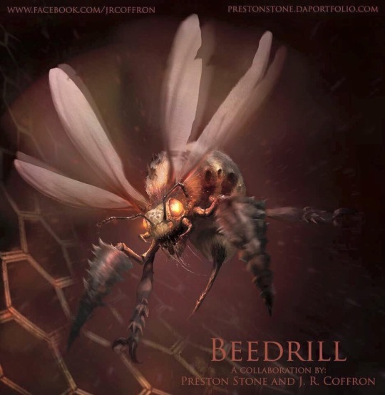
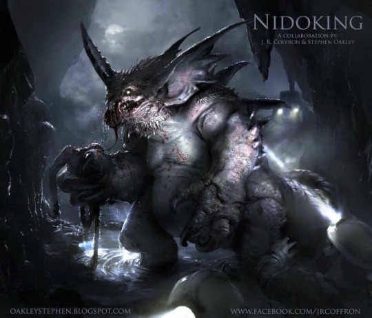
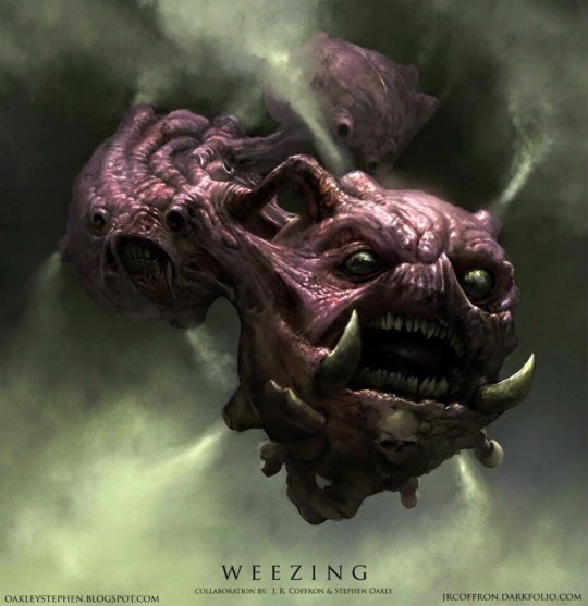

Awesome fan concept art of some famous Pokémon monsters in this collab between Preston Stone and J. R. Coffron
0 notes
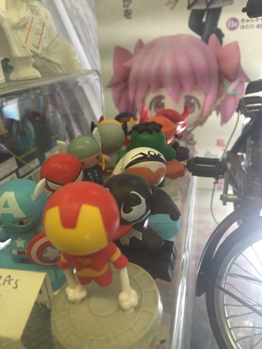
Photo

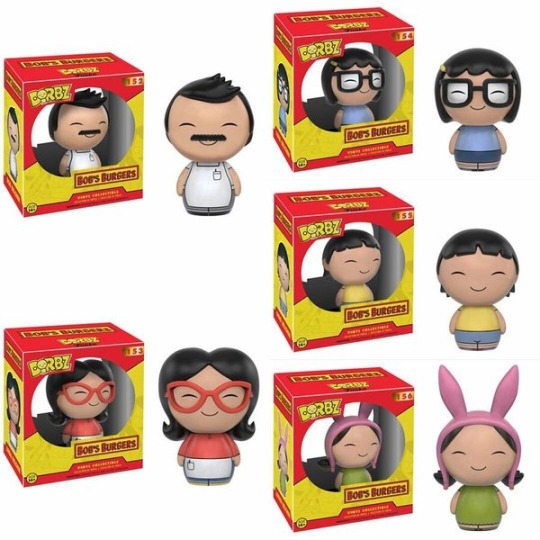
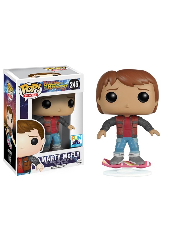
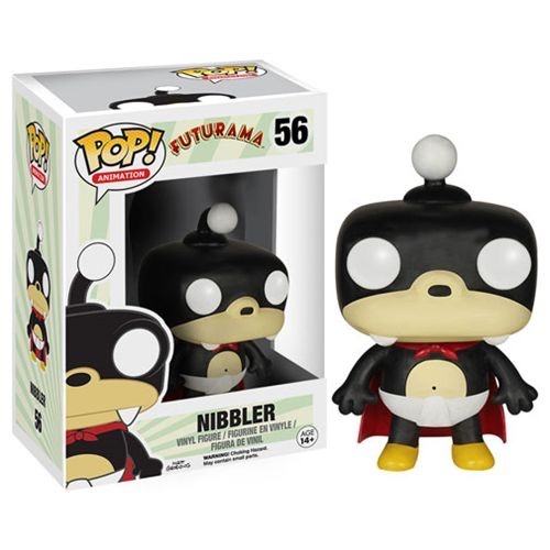
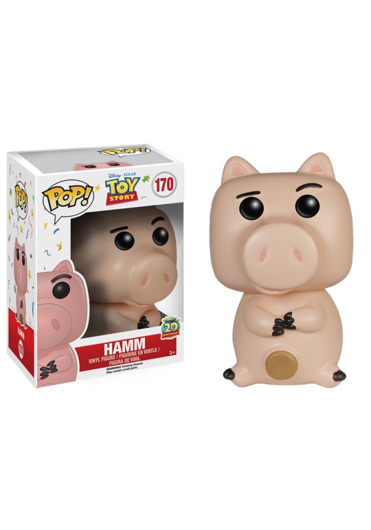
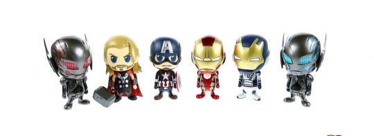
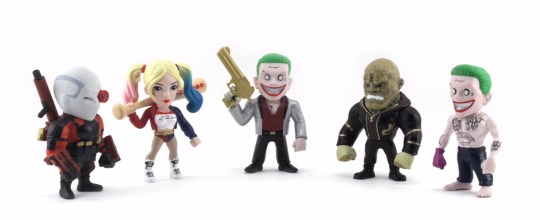
Little 3D figures like these have begun to intrigue me greatly as they have started to be seen as much more regular stock in shops. Mostly seen in game and men's gadget shops they have a massively wide customer base branching through all age groups. As you can find them being the cutest little pig, Batman's Joker or a demonic monster, there is something for everyone. Each brand seems to have a consistent style through each of their figures, linking them to the brand as instantly recognisable to their makers template. The Dorbz figures seem to be the most simplistic of the figures as the body shape is the same on all models. This leaves it to the illustrations on the bodies and the stylisation of the heads to distinguish them individually. Pop! figures are also quite simplistic in nature, however they do hold a little more individuality than the Dorbz. Instead, I see that these figures look more towards the ratio of head to body to limb measurements. Therefore, they can adjust the styles and sizes of figures, matched with any accessories they may have. Cosbaby figures and the Metal Die Cast figures to me, look a very similar style to each other. Still maintaining a general style/layout but also beginning to look a lot more intricate than their counterparts. Perhaps with these figures, each character may take a lot more thought and detailing to achieve a different design for each character. Pop! figures are definitely a favourite for me. They tie in the similar structure with different designs, while still allowing for the customisation of the characteristics of the figure itself without tearing away from the styles embedded within the brand.
0 notes
Photo

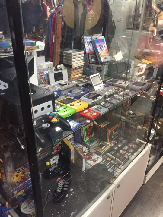
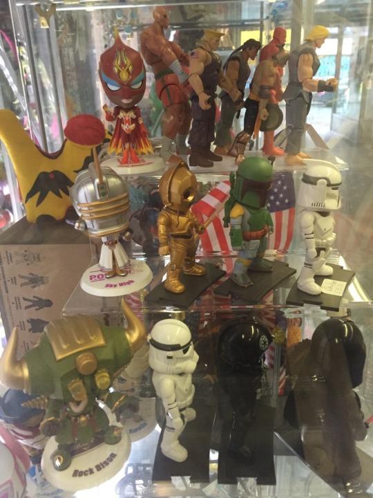
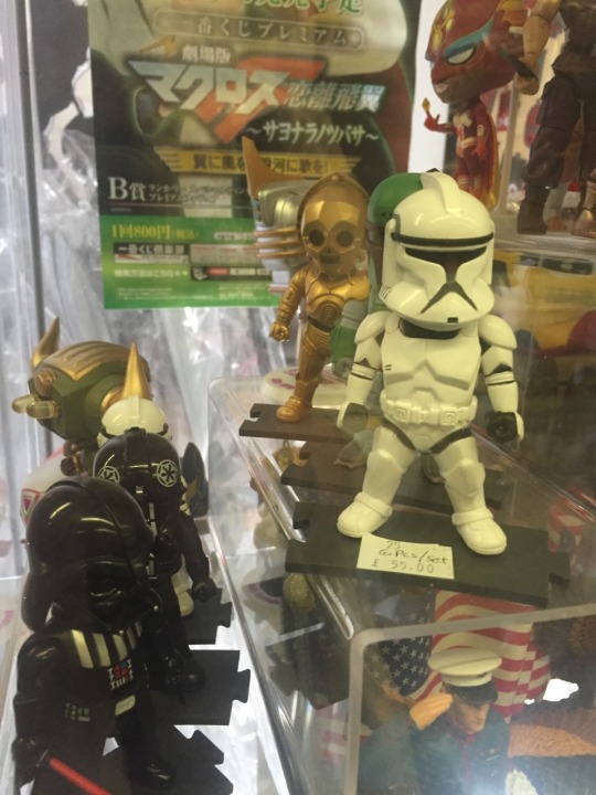
Manchester Northern Quarter - Afflecks Palace Afflecks Palace and the Northern Quarter are such amazing hosts to some of the best, strangest and quirkiest things that Manchester has to offer. From shops like Forbidden Planet and Traveling Man, to the creative corner in Afflecks Palace, there is something for everyone. The biggest thing by far though, is the number of parodied and pastiched figures, toys, models and posters available within the walls of these great establishments. Take a 5 minute walk down the street to your regular high street stores and even here you can see these things emerging onto the shelves everywhere.
0 notes
Photo
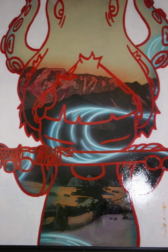
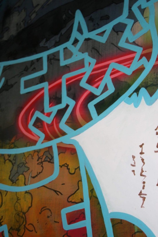
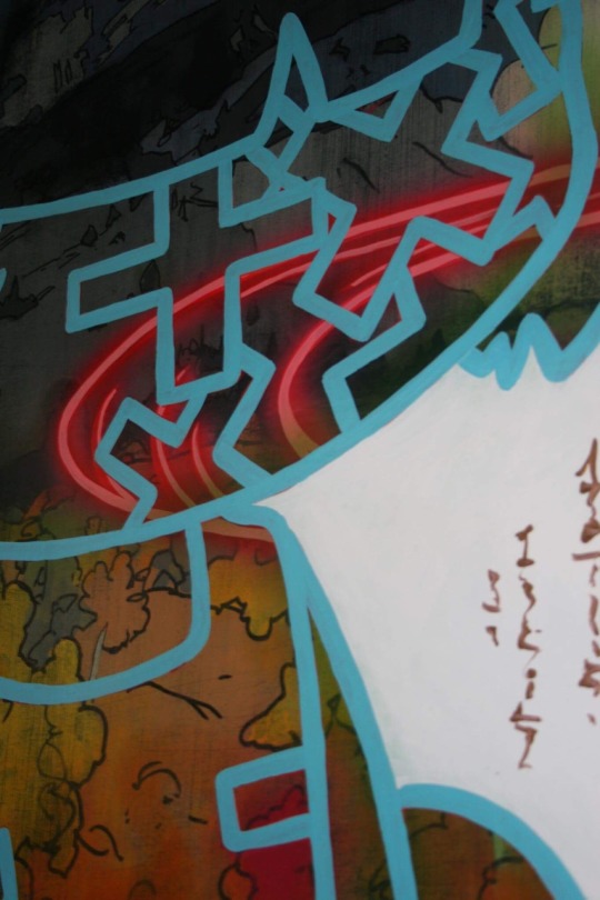
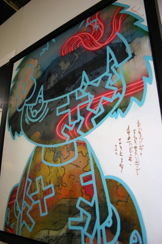
Manchester Buy Art Fair - Tom Lewis Great example of how to get that neon lighting glow by mix media artist Tom Lewis Title - Cloud Float Freely
0 notes