
Don't wanna be here? Send us removal request.
Statistics
We looked inside some of the posts by mimicreativeworld and here's what we found interesting.
Average Info
Notes Per Post
15
Likes Per Post
13
Reblog Per Post
2
Reply Per Post
0
Time Between Posts
6 days
Number of Posts By Type
Photo
10
Text
2
Last Seen Tumblr Blogs


Fun Fact
Tumblr has been banned in Indonesia for providing people with access to pornographic content.
Photo

@smithsonianmag Photo courtesy of Christophe Boisvieux/Corbis
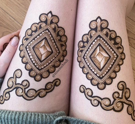
The Art of Henna
Few people know that Henna also has the full name Mehandi Henna which is transliterated from Indian Hindi. This is a form of beauty by using henna to paint on the skin, these drawings are not tattoos, so they only stay on the skin for 5 to 7 days.

@smithsonianmag Photo courtesy of Najlah Feanny/Corbis
Henna is the name of a plant (also known as a nail tree), a plant with flowers that grow in small white clusters, which when old turn red with a pungent aroma. This plant is native to North Africa, West and South Asia and regions with arid climates. The flowers of this plant are taken and incubated with water to form red and pink colors. And now, this plant is the main raw material for making Henna paint.
Drawing henna is a typical Indian makeup. On festive occasions, women (including unmarried girls) draw henna to beautify themselves. When getting married, brides are required to draw henna, because those drawings represent a faithful love and desire for a stable, long-lasting marriage.
Henna is not only beautifying the body, but each of its motifs has a deep spiritual meaning to the Indians. Each drawing is like the good wishes that people give to each other.
This blooming lotus flower symbolizes awakening of the soul, innocence, beauty, creativity, femininity and purity.

@rosemehndi
Square: Magic, apply this shape to protect and fight disease
@rosemehndi
Peacock carries the meaning of beauty

@rosemehndi
Buds and leaves signify fertility, the beginning of a new love and a new life.

@rosemehndi
Flowers: Joy and Happiness

@rosemehndi
Owing to its extensive history, henna as an art form has also got some superstitions attached to it. In India, it is believed that deeper the colour of henna on a bride’s hand, the better would be her relationship with the mother-in-law. In some places, it is also said to signify the strength of love between the bride and groom. Many traditional henna designs are secret symbols of prosperity, love, loyalty, fertility and good luck.
1 note
·
View note
Photo

@benwilsonchewinggumman
The Chewing-Gum Man
Ben Wilson is an artist better known by another name: The Chewing-Gum Man. For more than a decade he has systematically turned over 10,000 trodden-in chewing gums that pepper the streets of London into miniature canvasses. Wilson estimates that he’s created at least 600 paintings on Millennium Bridge alone, using his toolkit of tiny brushes, acrylic paint, and lacquer.

@inspiringcity
No bigger than a cigarette butt or coin, they each are one of kind. Because the urban landscape is cluttered with discarded gum, the unique canvases of Wilson are hard to find. So, keep your eyes open and maybe you’ll see an extraordinary surprise.

@inspiringcity
The gum-paintings ranges from advertising images to creative thoughts he got by interacting with his environment. These paintings reflect his grasp on reality. Wilson is inspired by the diversity in perception. He feels that perception determines our characteristics. It influences the way we think and act as individuals in the society. Wilson's paintings are quite accessible because they depict a familiar yet alternative reality.
By transforming these overlooked and unwanted parts into small masterpieces, Wilson tries to turn the thoughtless action into a thoughtful one.
Take a look at some of this artist's gum work. Source: https://benwilsonchewinggumman.com/home-2/gum-pics/chewing-gum-gallery


0 notes
Photo

@AFP/Behrouz MEHRI
Art under the heels
Nothing speaks to the optimistic spirit and love of beauty of the Japanese people more than the everyday works of art, present on every street, right at the feet of many people passing by every day: Manhole covers.

@AFP/Behrouz MEHRI
The manhole cover decoration project started as a promotional plan for the drainage system in Japan, and has now expanded to apply to many other types of public manholes such as electricity and domestic water supply lines.
Designs on manhole covers are often images typical of the local culture: iconic logos of the town, famous landmarks, important historical events, specialty foods or birds, wild flowers official representations. They are elaborate but close, familiar works of art that any people living in the area can understand.

@courtesy of S.Morita
In most countries, a manhole cover is just an ordinary, utilitarian metal lid that is trampled by thousands of people every day. But in the land of the rising sun, manhole covers have become a symbol of local cultural identity, representing how public art is applied to serve and promote public utilities.

@AFP/Behrouz MEHRI
See more pictures taken by photographer Morita here 👇👇👇
https://www.flickr.com/photos/28074232@N06/sets/72157612036691185/page3/
0 notes
Photo

Do you know Pantone?
Part of the multinational corporation X-Rite, Pantone LLC is a world-renowned color agency. With a history of more than half a century providing products, services and technology in the field of color, Pantone has become a symbol of color standardization for countless designers around the world from the field of color from fashion, interior to graphic, industrial design.
Pantone Matching System
In 1963, Lawrence Herbert, the father of Pantone, created a groundbreaking system that allowed the identification, standardization, and communication of colors to match, exactly, to address misinterpretations in the community. graphic art. Herbert's system paved the way for the first color standard dictionary PANTONE MATCHING SYSTEM.

@pantone
The Pantone Color Matching System (PMS) is essentially a standard color reproduction system. By standardizing colors with names by codes, manufacturers in different locations, different stages can look up the Pantone system and be sure to create a matching color effect for their products without any direct communication.
Pantone – Color of the Year
In 2000, the Pantone color institute created “Color of the year” as a trending concept for the entire creative society. The Pantone Color Institute studies color trends throughout the year to decide on the next Pantone color of the year. They consider all aspects of society: fashion, marketing, social media.
The first color of the year was chosen in 2000, but it was not until 2007 that color trend forecasting began to succeed. Today, when a new color is announced, Pantone offers color lovers an inspiring range of products and a palette of color combinations specially designed with the respective color.
Take a look at “Color of the Year” over the past decade @pantone


0 notes
Photo

@LoaiPlastic
Environmental messages through the lens of Art
In recent years, the story of environmental protection along with the reduction of plastic waste is a topic of interest to many people, especially young people. There have been many practical projects and campaigns organized to arouse the community's consciousness in joining hands to reduce plastic waste.
The most prominent of them is "Loai Plastic (Plastic Species)" - a non-profit project of Vietnamese youth to call for the community's awareness of environmental protection, in which the main audience is young people. It is known that this is a special environmental project that harmoniously combines both online and offline aspects as well as between art and technology. This has helped “Loai Plastic” have a strong influence on the community of young people in modern society.

@LoaiPlastic
At the "Loai Plastic" exhibition, common "species" of plastic waste such as plastic bags, wet towels, plastic cups,... are all recreated with delicate drawings of graphic software, making them from inanimate objects into living individuals. In addition, the most prominent and notable are the "Plastic Monsters" models built in 3D from familiar everyday objects such as straws, cup lids, plastic spoons...


@LoaiPlastic
Some pictures at the exhibition


@LoaiPlastic

@vietnampictorial

@LoaiPlastic

@vietnampictorial
0 notes
Photo

A Love Story – Hand Photography
I started thinking about the idea for this assignment as soon as I received the brief from my lecturer. I like this assignment so much even though I don't have much experience in photography.
I've noticed that, when people are in love, or to be more precise, when they are in a dating relationship, they are going through a lot of complicated emotions. There is anger, there is joy, there are times when they feel peaceful and safe and of course sometimes they will feel danger as well. And human love is always an interesting and endless topic to explore.
I decided the theme for this photo shoot is the emotions that couples experience when they are in a love relationship, and love is the thread that runs through and connects everything.

Danger
My thoughts about the “Danger” in Love are the insecure, involuntary feelings of women's sexuality. A dangerous relationship is one in which either party is coerced and abused physically or mentally. It's like a form of sexual violence.

Safe
The feeling that “Safe” gives is in stark contrast to “Danger” in the previous photo. There is no fear or coercion here. Just two people are enjoying their happiness moment. And they feel “Safe” in this relationship.

Anger
Angry emotions can lead to violent actions, and sometimes it can even lead to emotional silence. When two parties in a relationship stop talking to each other, there is also “Anger’ in love.

Joy
And finally, after experiencing a series of different emotions in love, we have “Joy”. This is also my favorite image. It gives a feeling of peace and warmth every time you look at it. And the “Joy” of healing in love, in my opinion, is the sweetest and most wonderful feeling. It brings a complete conclusion to the series.
0 notes
Photo

@artvision360
Kintsugi - The art of healing the "rifts of life"
Yesterday, I read an article about a technique of Japanese people in order to turn broken pottery to a piece of art. They call this technique is “kintsugi”.
You can see this article here 👇
https://www.forbes.com/sites/yjeanmundelsalle/2020/08/19/the-ancient-craft-of-kintsugi-continues-to-fascinate-contemporary-artists/?sh=533755373afb
Kinstugi is an ancient Japanese technique that uses gold to restore cracked pottery. Items that seem to have to be discarded will be put on a very special new shell after being "healed" by the talented hands of artisans. In Japanese, Kin = gold, tsugi = repair.

@culturewhisper
Stemming from the consciousness of “Wabi Sabi” - accepting the imperfection, ephemeral and impermanence of all things - the Japanese see beauty and truth in the cracks and are determined to mend them. They believe that the item is made more special by the cracks that only it possesses, thereby giving rise to the Kintsugi technique.
While Kintsugi's origins aren't entirely clear, historians believe that it dates back to the late 15th century. According to legend, the craft commenced when Japanese shogun Ashikaga Yoshimasa sent a cracked chawan—or tea bowl—back to China to undergo repairs. Upon its return, Yoshimasa was displeased to find that it had been mended with unsightly metal staples. This motivated contemporary craftsmen to find an alternative, aesthetically pleasing method of repair, and Kintsugi was born.
In an age that respects youth, perfection and the new, Kintsugi art still holds a special philosophy - our life is like a broken tea cup. Caring for and loving broken pieces can teach us how to respect what has been hurt and left scars and imperfections, starting with ourselves and those around us.

Kintsugi Sarkis collection for Bernardaud PHOTO ANASTASIA VOLKOVA. COURTESY OF BERNARDAUD
You can find many beautiful and gorgeous “kintsugi" products from Bernardaud collection.

Kintsugi Sarkis collection for Bernardaud PHOTO LILY ROSE. COURTESY OF BERNARDAUD
5 notes
·
View notes
Text
The Little Secret about Starbucks’s logo that you may did not notice before
Starbucks has been my favorite beverage brand for a long time. And one day as I peered into the beautiful siren's face on my mug, I realized something was wrong here. Well, it's not a perfect symmetry, at least the details on her pretty face. For a graphic designer like me, logo designs built on the principle of golden ratio and thus, perfect symmetry is very important. But why does a global brand like Starbucks have such an “imperfect” design? When you look at her face attentively, you can recognise that Siren's right nose bridge is lower than the left one, and even the curvature and size of the eyes are not the same.

After thinking for a while and looking at the siren, I realized that she has something more real, I mean she feels alive, more "human" than a doll. Perfectly beautiful but soulless.
Then, after searching some information on the Internet, I found that sometimes imperfection is a perfection, in some ways. The logo design team, after observing her closely for a while, also realized that her beauty is not simply beautiful, but also unusually beautiful. See her as a robot or an alien residing in Siren's body. They realized that for Siren to look human, she shouldn't be too proportionate, even though symmetry is the standard of perfect human beauty. So that's why she has to be a little "ugly". And then we see a complete Starbucks logo as it is today, more soulful, more human with a slight asymmetry on the left side of the face. It is shaded a bit more than the rest.

For me, this is a very interesting discovery, giving me a new thought on the definition of “perfection”. Like how enjoying a cup of frapucchino in Dublin's chilly, windy autumn weather is a "perfect" choice.
3 notes
·
View notes
Photo

Music Concert Poster - Assignment 2
Last week, I was introduced to an interesting concert by a friend at Queen’s University Belfast. They used this software called max msp to control a laser projector that makes the laser light move with the sound. For me, it was a spectacular performance and bring me some ideas for my assignment, an Electronic Music Concert Poster.
Following the brief, just only typographic elements can be used, along with basic geometric forms such as shape and line. The goal is to create an appropriate mood and tone for the design that accurately conveys the mood and tone of the music. In EDM or Electronic Dance Music means vibrant music created from electronic devices. This is a musical genre that has its roots in the disco music of the 1970s, often appearing in music festivals and nightclubs. Made up of electronic instruments such as the Synthersizer, electronic drum and MIDI Sequencer, EDM has crept from the dance floors in the US to become the most popular and trendy music genre today. EDM is divided into many genres, most notably House, Trance, Electro, Techno, Dubstep, Moombathon and Trip Hop.

Project: Maxwell - Laser Synth & Abstract Generator | Cycling ‘74
I was fascinated by the colorful laser beams, so I decided to use that image to create my own font. I use Adobe Illustration to draw each letter, with only the Line tool and the Blend Option. It’s a bit difficult at first to control the curvature that makes each letter unique, but it’s a very enjoyable experience to be able to create my own exclusive font.

Next, I placed the letters on Photoshop and used the Gradient and Blending mode to create the laser light effect that shines in the night.


The name Flamingos embodies the fun, vibrant spirit of a weekend music party where everyone can relax to their fullest.

0 notes
Photo


A Memory of Saigon
The brief of this week is Contrast. How Contrast theory is applied in many different ways. That is about Color, Shape, Size, Pattern and Orientation.
And through 4 pictures, I want to tell a story about the city where I was born, Ho Chi Minh City which is also known as its old name “Saigon”.
For me, Saigon not only has two rainy and sunny seasons, not only skyscrapers rising right next to old apartment blocks filled with time. Saigon also has a richer culinary scene than any other city I've been to.
I miss the stalls of noodle soup at night and the shabby old plastic tables and chairs. I remember the early mornings walking the streets, seeing the way of drinking iced coffee in the morning of Saigon people. I also miss the seahorse chess board when family gathering at Tet holiday.


Roadside noodle stalls that you can easily find on any street in this city

Vietnamese black coffee with condensed milk

Seahorse chess is a popular board game in Vietnam
And you know, motorbikes in Saigon are more popular than the way people talk about Guinness in Ireland.
3 notes
·
View notes
Photo


Lets Play With My Triangle
Last week I received a brief from my Visual Communication class on how to combine a certain shape with other elements like point, line, and color to create 4 different pictures using Photoshop. And this is how I "warm up" with this semester. I choose Triangle and my zodiac sign - Scorpio.
In the first picture, the combination of Triangle and Point forms the symbol of the constellation Scorpio with soft curves but a sharp tail.
The image of the constellation Scorpius in the middle of the night sky is reproduced by Line and Triangle shape. This is a large constellation located in the southern sky near the center of the Milky Way.
In the 3rd picture can be seen a playground of Shape and Contrast. Scorpio is represented by the card Death (13) in the Major Arcana of the Tarot deck, representing death and rebirth, and the King of Cups, representing balance and strong emotional control. The Cup also represents the element of Water in the zodiac circle.
After going through a series of abstract pictures, Scorpio emerges as a powerful and somewhat dangerous scorpion with a venomous pointed tail, but more for defense than for attack.
I use images of Tarot cards and the colors of this zodiac sign which are black and dark brown.
Hope everyone enjoys this gentle comeback after a long summer time
#visual communication#photoshop#tarot deck#scorpio#shape and color#visualdiary#digital media#concept art
2 notes
·
View notes
Text
Mona Lisa and the Golden Ratio
hWhat is the golden ratio? First of all, let's talk a little bit about the concept of the Fibonacci sequence. The Fibonacci sequence is an infinite sequence of natural numbers starting with two elements 0 and 1 or 1 and 1, the elements are then set up according to the rule that each element is always equal to the sum of the two preceding it. It is this same law that produces what is known as the "golden ratio", a ratio of beauty. A harmonious unity between science and art. If you have a ratio of two quantities that is approximately 1.6180... then it is called the "golden ratio", precisely because the second number is divided by the previous number in the Fibonacci sequence.

And thats the reason why I think Mona Lisa is so perfect not just because of her smile Painting lovers certainly do not know Leonardo da Vinci - the painting genius of the Renaissance period. In addition to the masterpiece Mona Lisa to the Vitruvian Man, most of Leonardo da Vinci's works are very impressive. However, few people know that Leonardo is not only a painter, he is also a talented scientist, musician, engineer, and mathematician. In fact, many of his studies and theories have a scientific basis and that is why many scientific theories have been found in his paintings.
The compositions in his paintings are always extremely tight. It's a perfect link between rectangles and squares and arcs. These links are created according to the perfect 1/3, 2/3 formula and interlocking.

@craftwhack
In particular, the Mona Lisa painting is a complex series of links between the eyes, the bridge of the nose, the mouth, the forehead, and the distance between the two shoulders. Even more interesting if we make a graph with the starting point of the Mona Lisa's mouth and the end of the hands, we will have a cross-sectional conch shell. In the same way to do the same graph (but the endpoint is the edge of the picture), we will have another cross-sectional shell that is 1/3 of the large shell above.
Perhaps now you are starting to really want to see the picture one more time 😏
1 note
·
View note