
Mimo Agd2 je prostor pro vše, co zajímá studenty Ateliéru Grafického Designu 2 na FaVU v Brně.
Don't wanna be here? Send us removal request.
Statistics
We looked inside some of the posts by mimoagd2-blog and here's what we found interesting.
Average Info
Notes Per Post
58K
Likes Per Post
29K
Reblog Per Post
29K
Reply Per Post
4
Time Between Posts
21 days
Number of Posts By Type
Link
4
Video
5
Photo
5
Text
3
Last Seen Tumblr Blogs


Fun Fact
Average visit duration of Tumblr.com is 10 mins and 25 secs.
Video
youtube
podstata grafického designu
1 note
·
View note
Video
více informací @ facebook [email protected]
interviews with young Gypsies of Uničov 2014&2015 RL
youtube
Projekt rozhovorů s mladými uničovskými Romy 2014 & 2015. Zde první audio ukázka rozhovoru s Týnou, která je původně ze Slovenska.
"Týnu jsem poprvé potkal ve čtvrtek, i když v Uničově žije už několik let. Zeptal jsem se jí kdy a jak zjistila, že existují Romové a Češi a že je Romka. Týněna odpověď byla dost hustá. Zkušenost o které mluví je z doby, kdy ještě žila na Slovensku. V Uničově se jí líbí, přiznává, že ji ale tyto zkušenosti dost ovlivnily." – Radim Lisa
#jakymajisny#aptalijstesejichnekdyjakymajisny#agd2#radim_agd2#agd2favu#mytus a realita#rasismus#racism#romove#gypsies#gypsy#cesko#cigani#cikani#ceska republika
1 note
·
View note

Photo

Paul Morrissey, Andy Warhol, Janis Joplin and Tim Buckley, 1969
4K notes
·
View notes
Photo

H∆ND
Messing around with a first test Cinema4D R16 Motion tracker system. I did a rough test with the worst shaking lo-fi footage and works like a charm haha.
6K notes
·
View notes
Link
It's good to see how style guides are presented, so I collected a few.
http://www.logodesignlove.com/brand-identity-style-guides
0 notes
Text
Helvetica and comic sans walk into a bar and ask for a drink.
The bartender says, "Sorry, we don't serve your type here!"
1 note
·
View note
Text
K jádru grafického designu - NYC studio DEXTER SINISTER's talk about "Identity and the arts" - IMPRINTS, SYMBOLS, MONOGRAMS, LANDMARKS, and LOCKUPS

Later this month, Dexter Sinister will present “Identity,” an exhibition that, in the words of its description, “charts the emergence and proliferation of graphic identity since the turn of the twentieth century, with particular reference to contemporary art institutions — museums, galleries, and so called alternative spaces.”
Initiated by Artists Space, the project has been run by Dexter Sinister in cooperation with a variety of colleagues for over two years. In the fall of 2009, I was asked by Dexter Sinister and Stefan Kalmár of Artists Space to give a talk to an invited group of 20 or so guests. Part of a series of informally titled “How do we look?”, this initial lecture carried an aim that was deeply reflexive, examining the history of the organization’s own visual identity in the context of both arts-related identities and the somewhat woolier world of branding and visual culture. To facilitate the talk, I was given special access to Artists Space’s archive of printed ephemera — my thanks to Amy Owen and Jessica Wilcox at Artists Space for their help and guidance.
The tone was informal, with people asking me to expand upon one point or another, as we sipped some whiskey with conversation. Rather than adhere to a strict chronology of Artists Space’s identity development, I chose to group its marks around a loose taxonomy that included IMPRINTS, SYMBOLS, MONOGRAMS, LANDMARKS, and LOCKUPS so that perhaps a new story could emerge.
The talk was, for me, foundational to many projects and assignments that followed and informed both the structure of my SVA course and our recent identity work for SALT Istanbul at Project Projects.
The writing below is loose and rough, assembled from my notes and fuzzy memory of the evening — but, truth be told, it’s a story better told through visuals, anyway. Even if the below serves as nothing more than a prompt to visit David and Stuart’s smart and inventive show, then I’m glad to have shared it here. — RG

I thought I’d start out tonight with one of Artists Space’s most important early shows, the Pictures exhibition from 1977. And if you look at the booklet of the show here, you’ll see that at the bottom the name Artists Space has been typeset to match the look of the overall booklet. No standalone mark, nothing too systematic — in the early days things changed a lot from one exhibition to another. Reading this, the analogy seems to be that the gallery thought of itself as a kind of publisher. It’s presenting these things, but it’s not imposing its own external identity on anything. It’s initiating creative projects and then allowing its own identity to be mutable, to change with those projects.

And so with that idea in mind the first group of marks I’d like to look at is IMPRINTS. Imprimatur means “to sanction” or “to give formal and explicit approval,” and this is what I was describing before. Rather than a visual identity the emphasis is on the provenance: on where an exhibition came from and who initiated it.

Publishers have long relied on this mutability. Most famously and illustratively, Knopf has a whole broad set of Borzoi dogs that change to compliment a book’s cover design, tone, and setting. There is no single Borzoi. Instead, there are many simultaneous possibilities. It’s almost Platonic: it’s not a specific book with a specific dog but the idea of a book with a dog on it that assigns the book as a Knopf book. It’s more descriptive, really, than symbolic.

This website for White Columns, designed by Project Projects, works in much the same way. When you reload a page the style sheets refresh, and the site goes from serif to sans and back again. So it’s like the Borzoi dog, in that it opens up the possibility that White Columns can take on a variety of formal details but still remain, essentially, itself. The formal “idea” of the site doesn’t change, just its visual expression.

The more you rummage around the archives, the more you see a range of materials in which the Artists Space identity acts in this way. Here is a a flyer for some film programming from the mid-’80s, looking very theatrical indeed. And this strategy wasn’t continuous, either — between the Pictures show and the design of this flyer different, more formalized marks emerged and were then discarded.

Sometimes there was even variance within a given piece. Here’s a great example from 1988 for a show called Telling Tales. There’s literally one “super” logo, which is set in one typeface, and then there’s a smaller “logo-sized” logo in another typeface.

By the late ’80s the impact of design’s postmodern tastes were readily apparent, and the hybridity of a given graphic system set to the max. Even within the artists’ own first and last names there is variance and expressivity. This piece is from 1989.

At other points around this time, zine culture and DIY publishing became more apparent, as in the booklet design for this Robert Gero show from 1990. Here Artists Space acts as the publisher once again, with the form of its name subordinate to the larger aesthetic system of the booklet.

Here, too, in this small photocopied pamphlet from the ’90s, this vibe is apparent. What’s important to understand here is that imprints don’t need to be large or institutional in tone — they can be homemade, grassroots, inventive, and unmonolithic. Quite casual, really.

And in this casualness I’m reminded of Ed Fella’s wonderful posters for the Detroit Focus Gallery, made over a number of years with great inventiveness. Each poster treats the logo differently, and yet the set is coherent and identifiable, offering a kind of aesthetic consistency that supports the range of activities housed at the gallery. Willi Kunz’s ongoing posters for Columbia’s GSAPP program are another example of this kind of identification strategy. Rather than impose a system that can be executed by anyone, they create a highly particular set of responses that can be recognized without being formulaic.
Read More
57 notes
·
View notes
Photo


http://zakgroup.co.uk/practice/view/fridericianum
http://www.zakgroup.co.uk/projects/view/fridericianum
0 notes
Text
Wireless Electricity

http://allthingsd.com/20110602/demo-at-d9-ubeam/
http://ubeam.com/
0 notes
Photo
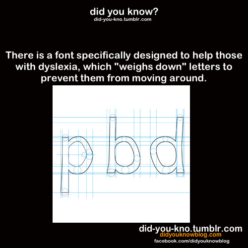
Source
48K notes
·
View notes
Video
tumblr
Jak zakázat pozadí webu Moravské galerie.
0 notes