
Attempting to reverse engineer panels from MS Paint Adventures like Problem Sleuth and Homestuck to better learn how they were made.
Last active 2 hours ago
Don't wanna be here? Send us removal request.
Statistics
We looked inside some of the posts by mspaesthetic and here's what we found interesting.
Average Info
Notes Per Post
2K
Likes Per Post
1K
Reblog Per Post
513
Reply Per Post
19
Time Between Posts
1 month
Number of Posts By Type
Note
12
Photo
1
Text
4
Last Seen Tumblr Blogs


Fun Fact
US Tumblr user growth rate is estimated to slow down to 4.1%.
Note
hey! been a fan of your work for quite a time, now, and was wondering what happened. i was looking foward to that skaia backgrounds tutorial planned.
sorry if its a bother, i know life can get pretty busy sometimes.
hope ur alright! :D
Thanks for the concern. I'm alright, it's just that last year my computer kept getting the BSoD, and then my apartment building burned down, and the backup drives I had were unreadable so I had to salvage what I could from whatever was backed up to the cloud and another dying hard drive.
I'm on a Linux laptop now, and while I could get by with FOSS for these tutorials, I'd like to get back on Windows to use Photoshop for consistency/accuracy's sake. Rent and bills have been buttfucking me sideways though so it's hard to save up for repairs or a new computer.
The Skaia backgrounds tutorial was gonna be about the checker pattern and a couple different ways of adding the prophetic images in the clouds, I believe. The latter is a bit more involved, but the former is dead simple to do so I could explain it here a bit:
On one layer, draw some black and white stripes.
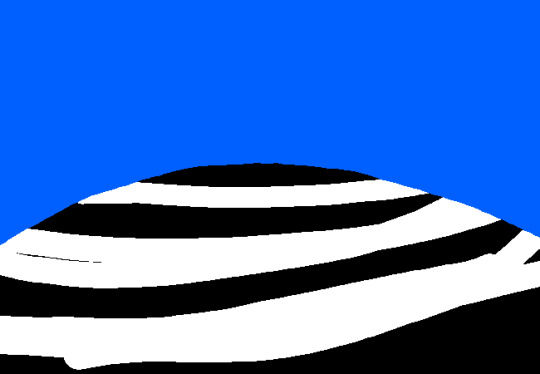
On another layer above it, draw some white stripes.

If you set the topmost layer's blend mode to "Difference", it'll invert the colors beneath it.

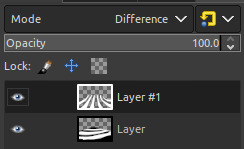
You'll want to clip the top layer to the bottom layer so it doesn't invert anything outside of the contents you intended. I'll leave that up to you as an exercise.
44 notes
·
View notes
Note
kinda weird question, but would you happen to know how many fps some of the flashes in homestuck go?
Not a weird question at all! They're usually 25 fps.
There are some very rare exceptions to this. For example, the walkaround flashes (or really any interactive flash programmed by Gankra). Those are 30-35 FPS, for reasons I can only assume are related to performance/game tick processes.
Then there's "John: Play haunting piano refrain." that is 12 FPS, since it didn't need to be played at a very fast speed.
And funnily enough, the Walt Whitman-attributed quote flash is 24 FPS, which doesn't really make any notable difference from 25 FPS, but it was something I just happened to notice one time while decompiling flashes.
There are probably some couple others I'm forgetting. They are extremely rare however, take my word for it.
Also, because this is something people usually ask as well, the absolute fastest Homestuck's animated GIFs go is 20 FPS (so 50 milliseconds/0.05 seconds per frame).
Interestingly, Problem Sleuth had some panels where the fastest some frames ever went were 0.03 seconds, such as this one:

32 notes
·
View notes
Note
i’m making an mspfa and i want to add in a flash animation, but i dont know where to get urls for the animations i’ve made, have any recommendations?
File Garden is a good free file host. It was made by the same guy who currently runs MSPFA, a good friend of mine, real nice guy. He actually made it in response to all these different file and image hosts like Dropbox and Tinypic changing and breaking URL formats or going out of business and deleting years of old content on MSPFA.
It's gotten real popular as of late, so it might be a bit unstable and go down briefly or bug out, but he is actively working on an overhaul full-time now.
20 notes
·
View notes
Note
what brush did hussie use to draw everything
He used the default hard round brush preset in Photoshop with the Pencil tool. Some newcomers to digital art might hear the word "pencil" and get confused, thinking it refers to a literal pencil texture brush, but it's a distinct tool from the typical Brush tool. In other programs, similar brushes might also be called the Binary brush or Pixel brush.
The Pencil tool is basically the same as the Brush tool, but draws the strokes with pixelated hard edges. The Brush tool on the other hand draws strokes with anti-aliasing, smoothing the outline of the strokes. This is done with semi-transparent pixels, something that the Pencil tool specifically does not use (hence why it could be called a Binary brush, because a pixel is either fully opaque or not).
Something to note is the version of Photoshop Hussie used: CS3. In CS3, if you had pen pressure enabled, the minimum brush size the strokes could go down to was 2px only (if the brush diameter was set to at least 3px). Setting it to 1-2px would not net you any benefits out of having a pressure-sensitive drawing tablet. In other words, brushstrokes can't taper off to 1px thin ends.
(Bear with me since I currently don't have a computer with Photoshop installed so I'm using these kinda shitty old demo gifs that weren't supposed to be used)
Photoshop CS3 brush engine
The brush engine changed slightly in versions after Photoshop CS3, however. Starting from Photoshop CS4, setting the brush size to 2px with pen pressure enabled would make the 2px brush size invert and jump up to 3px as the minimum brush size, while only going back down to 2px if you applied pressure or drew at an angle or something. (I unfortunately don't have any images on hand demonstrating this clearly.) Only setting the diameter to 3px makes the ends 2px, as you can see below.

Photoshop CS4 brush engine
You can still see this shitty behavior in Photoshop CC versions to this day:
Photoshop CC 2024 brush engine
Maybe this doesn't really matter too much if you're normally drawing hero mode panels, but it does produce slightly different results when drawing sprites.
Also if anyone tries to sell you on using a square brush, disregard them. They're an idiot, plain and simple.
87 notes
·
View notes
Note
GIVE THE TUMBLR THEME OVER YOU FUCKER
That isn’t a very nice way of asking for something, now is it… WELL YOU CAN FORGET IT!
Besides, this CSS was very quickly hacked together by me, so things like images and video positions are a little broken on mobile. I’m too lazy to patch things up at the moment.
7 notes
·
View notes
Note
How did Hussie use stroke size in Problem Sleuth and Early Homestuck?
I'm not really too sure what you mean by this.
8 notes
·
View notes
Photo

Trace asked:
Does anyone have any idea if there is an actual poster I can buy of this image?
There isn’t, and the only low-res image available of it would make for a dogshit quality poster. Sorry to be the bearer of bad news.
13 notes
·
View notes
Text
Tidbit: Placronym Pixelation

So you got this fresh placroynm that you don't want engraved with a sophomoric name? Not a problem. You can reject that stupid shit with a pixelize/pixelate filter.
Photoshop
First, you will have to make two more duplicates of your name text layer, so three text layers in total. One for when it's first displayed, one for the first frame of pixelation, and one for the second frame.
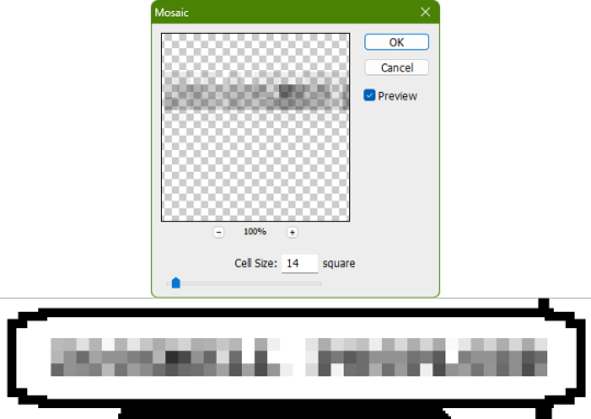
With your first duplicate layer selected, go to Filters>Pixelate>Mosaic..., which is a terrible name for it, but hey, I'm no Photoshop developer. Set the cell size to 11.

For the second duplicate layer, set it to 14.
GIMP
Pretty much the exact same steps as in Photoshop, this time the filter is located under Filters>Blur>Pixelize...


I would suggest right-clicking on the text layer and choosing Composite Space>RGB (perceptual) instead of the default (Auto), or going to the top-right corner of the Layers tab and switching the group of blend modes from Default to Legacy. Basically, doing so will make the semi-transparent pixels as dark as they are in Photoshop, otherwise they will appear too light.


Check out the read-more link below for bonus information on easily animating the name being typed out in Photoshop.
ADDENDUM
Typing animation (Photoshop)
Photoshop's frame animation timeline makes doing this a breeze. First, add a layer mask to your text layer. This will add a white box next to the layer's thumbnail.
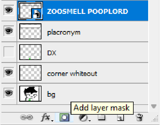
With that layer mask selected (click on it and it will be highlighted in the layers tab), use the marquee tool to make a rectangle selection around the text, then use the paint bucket tool to fill it in with the color black. This will make the text invisible until the layer mask is moved.

Go to Window>Animation if you do not already have the animation timeline open. Click on the little sticky note icon to duplicate the first frame. In newer versions of Photoshop, you will probably first have to click on a button that reads "Create Frame Animation", and the duplicate frames button icon is the "+" in a little square.
Making sure you still have the layer mask selected and not the entire layer, use the move tool and arrow keys to move it all the way to the right, revealing the text on the second frame you've just made. Don't move it too far off now.
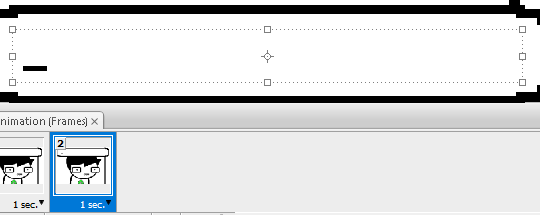
Move the typing cursor layer to the right as well, except you don't have to move it all the way at the end, only where it will be last seen.
Make the typing cursor layer visible on the first frame, and not visible on the second.
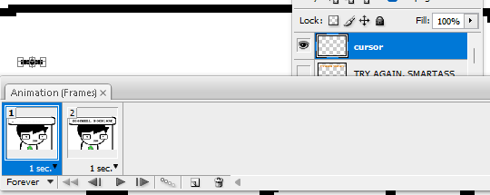
Select the first frame the animation and click on the tween button. This will add all of the frames in between the first and the second one for you. Make sure you only have "Position" checked under "Parameters". For the numbers of frames to add, here's a neat trick for finding the right amount: count the amount of letters in the name. "ZOOSMELL POOPLORD" is 16 letters, so add 16 frames.
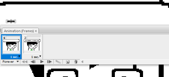
Most of the work is already done, though there might be a couple frames that will need some minor tweaks. Just use the move tool and arrow keys again to finetune the layers' positioning.
This is why it was important to not move the layer mask too far to the right away from the end of the text. Tweening the position spaces it out linearly, evenly, so the farther away the end goal is, the more space each frame will use. Thankfully the font this panel uses is mostly monospaced, and I got a little lucky with my positioning, so I needed to only adjust three or four frames. Way less tedious than having to create each frame of animation myself, at least.

To change the frame delay (the time duration each frame takes up) of the newly created frames, click on the first frame you want to retime, hold down the Shift key, and then click on the last frame. This will make a selection spanning all frames in between. Click on the little dropdown arrow and select 0.1 seconds (100 milliseconds).

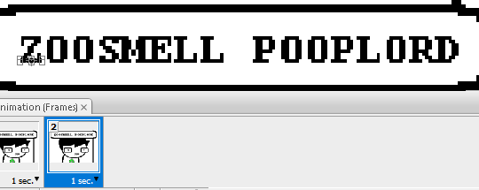
Here's the original panel:
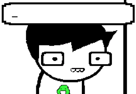
And here's my recreation:
Here's the PSD, too.
82 notes
·
View notes
Note
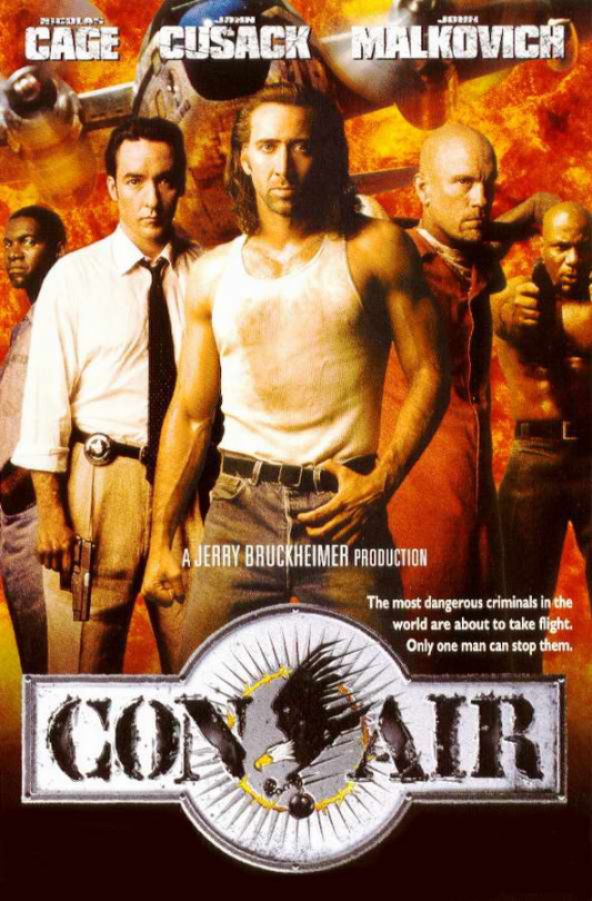
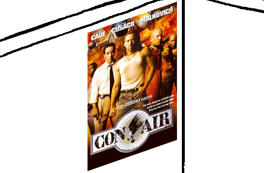
when picking frames from movies to put in a panel, how would you/hussie pick which frames to use, and how would you/hussie process them, if at all?
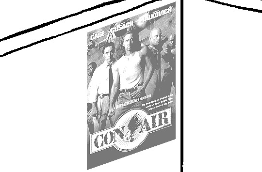
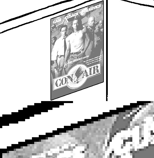
idk. I would categorize this as an artistic decision, so something up to an individual's wants and needs. I can only assume you mean for something like this when John and Jade were watching Con Air:


I really don't know what to tell you. I guess just pick a scene and repeat and skip some frames to make it jittery.
As for processing, I'm not noticing anything here. I would bump up the contrast and/or brightness on them a bit if the clip I was using was a bit too dark and washed out. That's pretty much it.
If someone suggests to posterize the frames, redirect them to this post.
22 notes
·
View notes
Text
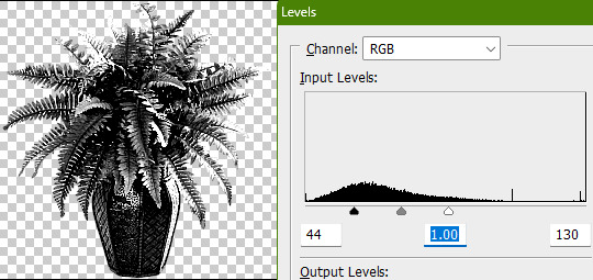
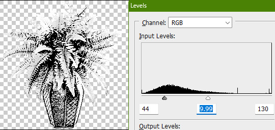
Tidbit: The "Threshold" Effect of Desaturated Objects Due to Increased Contrast
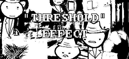
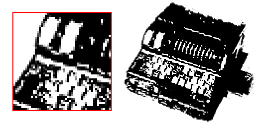
If you've ever asked how to replicate an effect like this...
...it's likely someone told you to apply the threshold filter, which converts any light colors to pure white, and any dark colors to pure black. And it's perfectly fine to do so. It's simple, straightforward, efficient. But I take issue with the assertion that it's definitively the only conceivable way Hussie did it when the evidence points to the contrary. Scrutinize the following examples under a microscope:
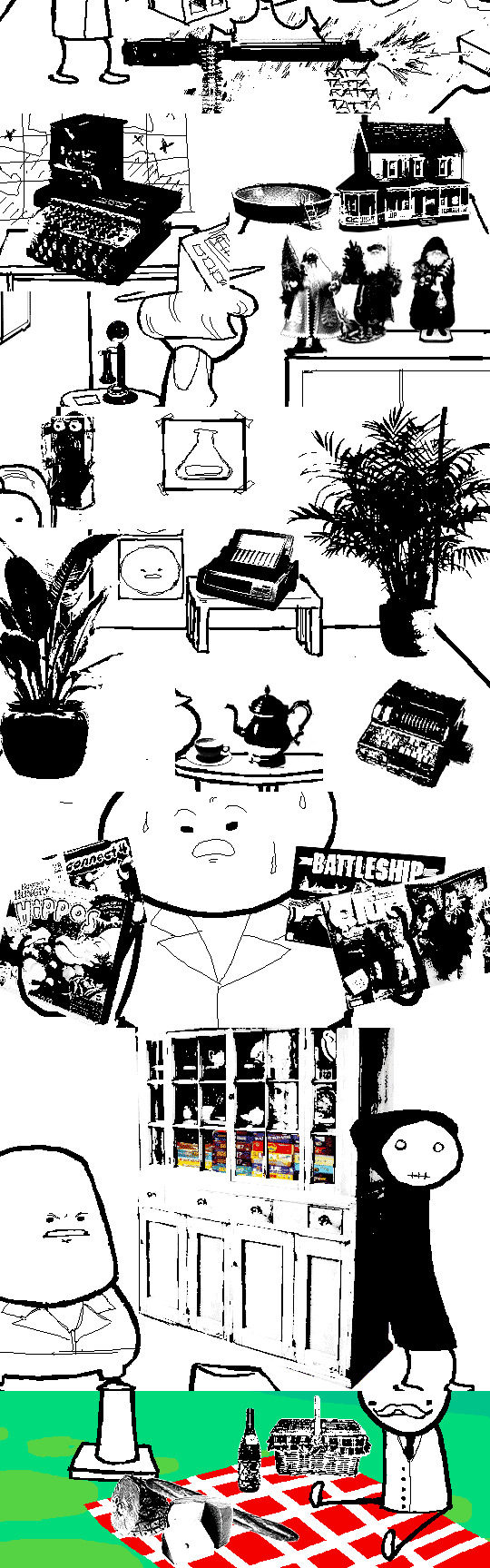
Did you see it? The singular detail that distinguishes these images from ones that have been thresholded? Congratulations if you noticed that these contain not only black and white pixels, but GRAY pixels as well! A threshold filter's conversion is binary; a pixel is either black, or it is white. No in-between. The presence of these gray values rules out its use, then.
One thing is clear, at least: these images are black and white in the traditional sense of the term, i.e. "grayscale", even if it's in drastic form. They've been stripped of any color, hue, chroma. Completely desaturated, in other words.
So from this observation, we can reason that they were converted to be grayscale at some point in the process of editing.
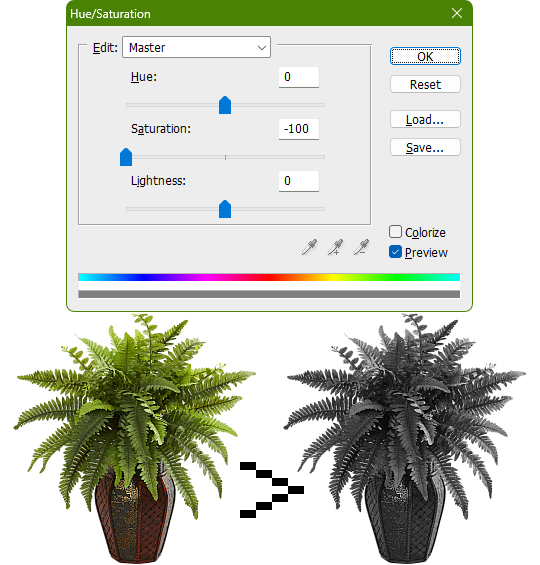
Of course, this is still lacking in the pure black and pure white departments. If only there was a way to adjust the intensity levels and push them both to their extremes... oh wait, THERE IS! Using the Levels adjustment tool!
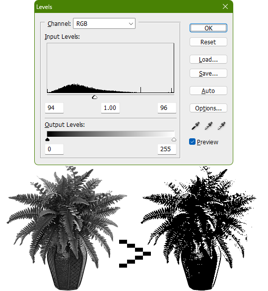
Pushing the black input levels slider to the right makes all dark colors turn darker, and conversely, pushing the white input levels slider to the left makes any light colors turn lighter. This is a great way of increasing the contrast and adjusting the brightness. Speaking of which, the Brightness/Contrast adjustment tool in Photoshop with "Use Legacy" enabled also accomplishes a nearly identical effect.
This timelapse demonstrates how the Brightness/Contrast adjustment is basically equivalent to using the Levels one when used this way
I say nearly identical because raising the contrast all the way to 100% with Brightness/Contrast makes it actually identical with the Threshold adjustment tool. The black and white input levels sliders can't fully join in the middle because of the gray input level slider occupying the space, hence why there are some stray gray pixels even when pushing them to their limits.
Well, there could be several reasons explaining why there could be gray pixels other than the contrast not being high enough to clip them, but I'll spare you another needlessly complicated and overly technical rambling on how I can tell it's most definitely the Levels adjustment tool always.
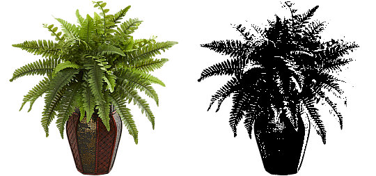
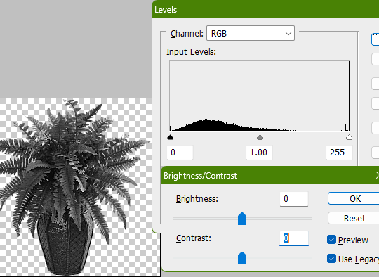
This post is getting a little long, so I'll stop here and elaborate a little more on pertinent things under the read more link, like semi-opaque pixels, scaling down, sharpening, and the gamma slider. Also here's the potted plant PSD if you wanna check it out I guess.
ADDENDUM
Semi-opaque pixels
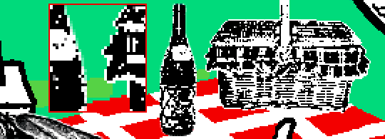
When separating objects from a background, it's usually easiest to do so with a magic wand selection tool, which selects regions of similar colors. There's an option to make the selection anti-aliased, smoothing the edges of whatever you've cropped. Unchecking it will make the pixels hard and jagged. The wine bottle and picnic basket are a good example of each, respectively.
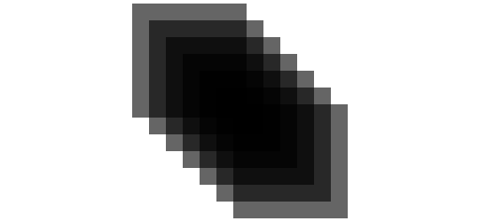
If you've already cropped out something with anti-aliasing enabled, there's still a way to sharpen the edges after the fact. Duplicating the layer multiple times will increase the semi-transparent pixels' opacity. Do it enough times and they'll eventually become completely opaque. An analogy would be stacking multiple panes of tinted glass on top of each other. Stack enough of them and you wouldn't be able to see through anymore.
These semi-opaque black pixels would appear gray on a white background, and so would semi-opaque white pixels on a black one. That's the reason for the gray pixels around the edges on some of these examples.
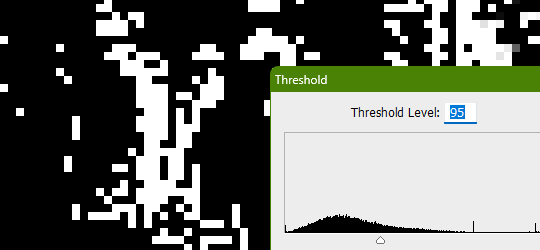
Scaling down/Sharpening
Suppose you've already gone ahead and went through the whole rigamarole of editing the object to be black and white before deciding firmly on the size of it in your composition, and now you think it could be a little smaller. You could always resize it and scale it down, but with the interpolation method set to none/nearest-neighbor, it's going to look kind of shit, and with it set to something else like bilinear or bicubic, the anti-aliasing is going to make it a bit blurry (introducing these gray values). You could increase the contrast again, or you could use the Sharpen filter to do it.
Not to suggest that this particular example was scaled down after editing, it's just the one that looks closest to it since I'm too lazy to make one.

Sharpening repeatedly will bump up the contrast, plus Photoshop's Sharpen filter has the added benefit of hardening any semi-opaque pixels as well, making the edges sharper.
GIMP's Sharpen filter doesn't do that latter part, unfortunately, but if the layer has an opaque white background, it'll do the same.
Gamma slider
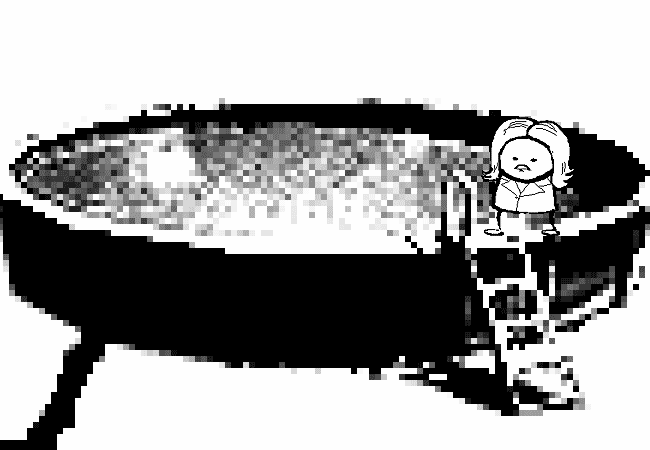
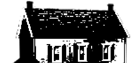
This effect might not be so obvious, but really take a good look at these board games:

Actually, maybe this Problem Sleuth bonus panel shows what I mean better:

The dark values are cranked up very high, and so are the light values a bit, but there's an inordinate amount of midrange values that are on the lighter side than what would be normal. That's because of the midtones input levels slider, the gray slider, the gamma slider, whatever.
I'm toot tired to explain any more than that, so make of that what you will. The end.
481 notes
·
View notes
Note
how do you prospit/derse-ify regular images?
I actually have a big tutorial in the works on this, but since it’s so heavily comprehensive, it may still be a good while until it's completed. I'll briefly go over the main bullet points:
Grab cathedral image off of Google Images, crop out the sky using the magic wand tool.
Decrease the brightness and contrast using the Levels adjustment tool. I like to apply a desaturation filter on top of this to better gauge how muted the colors should be, but this isn’t strictly necessary.
Colorize it a sort of deep purple or dark fudgy orange brown.
Increase the contrast with the Levels adjustment tool.
You can then just hue-shift it like 120 degrees once it’s completed to get the opposing kingdom.
Sorry for the super shitty reductive text post this time.
74 notes
·
View notes
Note
how do u edit an image of an irl guy to look like a troll? yknow, like troll will smith.
Gonna do this one quick and dirty, and with Photoshop in mind.
Step 1) Desaturate the image by adding a Hue/Saturation adjustment layer and dragging the saturation slider all the way down to -100.
Step 2) Add a Levels adjustment layer and darken the skin and hair by dragging the white output levels slider down a bit. This just adds pure black to the colors, so the same effect could be achieved if you paint black on a new layer over the image and decrease its opacity.
Step 3) To make the eyes yellow, add another Hue/Saturation adjustment layer and enable the "Colorize" option. Adjust the hue/saturation/lightness until the color is yellow-orange or whatever. Seems like Hussie painted black over the irises beforehand making them appear flatter, so do that too if you want.
To selectively adjust certain parts of the image using the adjustment layers, you can use the layer masks to do so. White areas are affected by the adjustments, while black areas are not. It's like going from 100% to 0% visible. If the program you're using doesn't have a feature like adjustment layers, then you can create a duplicate of the image and apply adjustments destructively as normal, and still create layer masks on those. If you don't have layer masks either then figure something out.
By default, the layer mask is entirely white, so for the Levels adjustment layer, click on the layer mask and go to Image>Adjustments>Invert. Then take your pencil tool, switch the primary color to white, and draw over the skin. Quickly outline the main parts and then use the bucket tool to fill it in. Faster than just drawing it in entirely by hand, but you do you.
Do the same thing for the Hue/Saturation colorize adjustment layer and draw over the eyes. Essentially, you're done. You can fill in the rest from here.


PSD here.
90 notes
·
View notes
Note
how was Cascades framing animated to become larger https://www.homestuck.com/story/4109
Nothing too crazy, pretty simple stuff. Instead of the stage size being the usual 650x450, it's larger for Cascade, being 950x650. MSPA had a unique website theme for this flash, so instead of the page command being directly on the page, it had to be included in the flash so it could be animated out of the way. Text objects in Flash can be made selectable, helping the illusion that it's part of the webpage. For some reason, Hussie decided to animate an opaque symbol over the text rather than just converting the text into its own symbol and tween it to be transparent, but whatever. I believe it should've been still selectable even in a symbol.
For the actual framing, it was comprised of four instances of the same graphic symbol, so they could be tweened outside of the stage view, making it appear larger. The volume and play/pause buttons were also tweened alongside them until they reached the corners.
Here's the FLA document if you want to poke around with it. Minimum version of Flash Pro required: CS4.
57 notes
·
View notes
Text
Tidbit: Persnickety About Posters
If you want to avoid overly dark or blurry posters in your fan adventures, then follow my lead:
1) Download JPEG off of Google Images.
2) Import, scale down, and skew/shear it. Use an interpolation method such as Bilinear or Bicubic Sharper. Doing both transformations at once is better than repeatedly transforming the image (i.e. resizing it, applying the transform, and then skewing it), as it helps prevent the image and edges from becoming too blurry. This will be important later.
You can hold down Ctrl + Shift to constrain the Move tool along a single axis so it won't go out of alignment as you're skewing it. If you don't see the Transform Controls by default, enable it in the tool options bar at the top, or go to Edit>Free Transform.
3) Desaturate it. Desaturate means to turn color grayer, until it becomes black and white.

4) Adjust the brightness and contrast using the Levels adjustment tool. It's much too dark as it is! In Photoshop, it is located under Image>Adjustments>Levels..., but I recommend creating an adjustment layer from the bottom of the layers tab instead. Doing so will allow you to make edits non-destructively, meaning you can go back and change any parameters until it looks right.

You could use a Brightness/Contrast adjustment with "Use Legacy" enabled instead to achieve a similar effect, but it won't clip the shadows and highlights as easily. You would have to create an additional duplicate adjustment and turn the brightness and contrast way down on the first one to do so. It's somewhat easier to use but less efficient than Levels in this case.
5) Apply a simple sharpen to the image as it is still too blurry for our purposes. In Photoshop, it is located under Filter>Sharpen>Sharpen... Do not use any other filter, such as Unsharp Mask, unless you absolutely have to in lieu of a basic one. If you must, turn down the radius a bit and the threshold all the way to 0.
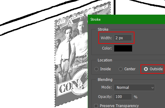
6) Make a selection around the image. Ctrl + left click on the layer's thumbnail to make a selection around it. Doing it this way makes it inherit the level of transparency any pixels have. If you can't, use the Magic Wand tool with "Anti-alias" enabled to select the transparent area outside, then invert it using Shift + Ctrl + I, or go to Select>Inverse.
Create a new layer above the image, then go to Edit>Stroke... and add a black stroke with a width of 2px located Outside. Leave everything else at the default. Doing it this way will create a stroke with anti-aliasing based on the selection you made. This should generally turn out pretty sharp if you follow my advice from Step 2. If you had used the Stroke Effect available from the Blending Options' layer styles, it will always result in a very smooth outline instead. You do not want this.
Voila, and Bob's your uncle, you're done!

The instructions above are Photoshop specific, but it should still be pretty software-agnostic. Here is the recreation PSD, and below the read-more link are additional notes, such as transferring the steps to something like GIMP.
ADDENDUM
You may be questioning why I deliberately made the stroke anti-aliased. "Isn't that an MSPArt cardinal sin??", I hear you clamoring. Well, my dear readers, let me briefly elucidate you on why your ass is wrong. Exhibit A:
The clearly semi-opaque pixels that can be found in every poster outline, which is especially pronounced here in the Little Monsters poster. I can also see that Hussie actually created a stroke on the same layer as the poster and merged it down into the white background like a dumbass. I omitted this in step 6 for the sake of convenience (and also the fact that you can't add a stroke to a smart object in Photoshop without rasterizing it first).
He had to use the magic wand tool in order to extract it from the layer for this panel, and then fill it in with the paint bucket tool. I can even tell he had the color tolerance set up very high on the magic wand to grab all those near-black and very light gray pixels, AND he had anti-alias enabled and the tolerance on the bucket tool set to be at least higher than 0 to tint similar colors. Exhibit B:

I also didn't address exactly how to desaturate something in Photoshop. Honestly it was because I was feeling pretty lazy. I would have had to rewrite step 4 to not include redundant information about adjustment layers. You can add either a Black & White adjustment layer or a Hue/Saturation one and turn the saturation all the way down to 0. The resulting tones will be slightly different from each other but I'll explain why that is in another tutorial.
Speaking of another tutorial, read this one if you believe this post is missing the step of using a posterize filter.
Now onto applying some steps to GIMP.
RE: step 2) In GIMP, there is a dedicated Unified Transform tool separate from the Move tool, unlike in Photoshop where both features are combined into one. This is how you scale and skew (AKA shear in GIMP) both at the same time, among other things such as rotating.
You'll also find that instead of any interpolation methods labeled "Bilinear" or "Bicubic", there are only ones named "Linear", "Cubic", "NoHalo", and "LoHalo". Basically, Linear and Bilinear are the same, so are Cubic and Bicubic, naturally. I guess NoHalo would be similar to Bicubic Smoother and LoHalo would be kind of similar to Bicubic Sharper as well. It's not an exact 1:1, though.
Honestly it doesn't really matter what you use to reduce the size as long as it isn't None/Nearest-Neighbor. You're going to have to sharpen it no matter what. This applies to Photoshop as well.
RE: step 3) Go to Colors>Hue-Saturation... and repeat turning the saturation down to 0, or go to Colors>Desaturate>Desaturate... and select the Lightness (HSL) method.
RE: step 4) Go to Colors>Levels... or Colors>Brightness-Contrast... The Brightness-Contrast adjustment tool already functions almost exactly like in Photoshop with "Use Legacy" enabled.
RE: step 5) In GIMP 2.10, the developers squirreled away the basic Sharpen filter, making it inaccessible from the Filters menu. To use it, hit the forward-slash (/) key or go to Help>Search and Run a Command... to bring up the Search Actions window and type in "sharpen". Select the option that just reads "Sharpen..." and has a description of "Make image sharper (less powerful than Unsharp Mask)". I find that using a sharpness value of around 40 to be similar to Photoshop's sharpen filter.
RE: step 6) Instead of holding down Ctrl, you hold down Alt and click on the layer thumbnail to make a selection around it. Make a layer underneath the image this time since there isn't an option to place the stroke outside the selection rather than the middle. Go to Edit>Stroke Selection... and create a stroke using these settings:

I recommend keeping anti-aliasing disabled however, as GIMP produces lines that are a little too smooth for my taste.

With "Antialiasing" enabled
Without
If you're using a program that doesn't have a stroke feature available, you could draw a straight 1px thick line across the top of your poster, duplicate it, and move it down 1px. Merge them together, duplicate it again, and move it all the way down to the bottom of the poster. Then repeat the exact same process for the sides. I used to do this before I even knew of the stroke feature, haha.
Another reason I had to do it this way was because my dumb ass did the thing I said not to in step 2, scaling down the image with the scale tool, and then shearing it separately with the shear tool. This caused the edges to become too blurry to be used for a stroke automatically. Oh well, live and learn.
148 notes
·
View notes
Note
Exciting news in the asset sourcing nerdosphere, superfans! Thanks to a mystery Redditor, the full-res repainted harlequin posters have been found again, and not only that, but the original paintings by Chris Walling as well! Many accolades to al/nerdenocity and Jade/mspaintadventures on Discord for managing to find these.


The Wayback Machine didn't save a couple of the paintings on the artist's website, but I did find the few that were missing from this Russian Blogger post. Thankfully, they were left unedited.
speaking of flagrant disregard of stock image licenses, how close does homestuck skirt the boundaries of copyright law? was hussie really allowed to just go to google images, take some random image, and control C control V it into a panel?
I'm no counsel, so anything I say should not be taken as factual or legal advice, but from what I understand about U.S. copyright law, determining what constitutes as fair use is done on a case-by-case basis using four major factors:
1) the purpose and character of the use, including whether such use is of a commercial nature or is for nonprofit educational purposes; 2) the nature of the copyrighted work; 3) the amount and substantiality of the portion used in relation to the copyrighted work as a whole; and 4) the effect of the use upon the potential market for or value of the copyrighted work.
Ultimately, it's up to the court to interpret and weigh these factors in their analysis of the new work, so while one case may be declared as fair use, a similar case could be found as infringement. To break down what each of these mean exactly, let's apply them to an example from the comic.

In the hypothetical case of Ornate Victorian Decorative Floral Pattern Artist v. Hussie, 612 U.S. 413 (2011), the plaintiff claimed the defendant infringed upon their work's copyright when the defendant incorporated an unpermitted use of said work into the defendant's own work, Homestuck, an on-line web comic.
The purpose and character was transformative, using the pattern as part of a backdrop in the story, and the more transformational the use is, the less importance is stressed on the other three factors. However, while the comic is made freely available to read on the Internet, Hussie profits off of the comic's ad revenue and sales of related merchandise, such as physical printed books of the comic, making it a technically commercial nature. This doesn't necessarily rule out the use as fair, but it weighs against it somewhat.
The nature of the copyrighted work, the original decorative pattern, has to be determined whether it actually falls under copyright or not. At present, it's impossible to ascertain if the pattern duly belongs to the author, or if it's merely a reproduction of a preexisting Victorian decoration. The concept of an ornamental Victorian era floral style isn't protected by copyright, but a particular rendition of one could be unless it has fallen under the public domain.
The third factor would seem to be counterproductive in defending against the claim, as Hussie markedly used the entire image to produce the repeating pattern, which is where it derives its entire value, at several points throughout the story, but this fact does not bar it to be found as fair use. It just makes it less likely. If the court found it to be sufficiently transformative enough, then this factor would not even weigh in as much.
Hussie's appropriation of the image definitely resulted in the loss of a license sale for the plaintiff (which could have prevented this mutually costly legal battle for both parties in the first place, but that's irrelevant), but the manner of how he used it definitely doesn't act as a substitute for the stock image. Any reasonable person looking to use a stock image of a pattern would likely prefer a higher quality, unmodified, and unwatermarked copy of the original, opting to purchase a license for it that guarantees some clearly defined legal rights. Regardless, the fact that it's licensed could weigh against Hussie's use.
If I was a powdered wig-wearing judge presiding at the trial, I would throw the book at Hussie and his lily white ass in the slammer. Whether this is how it would actually go down in court, I do not know. I'm also not sure of the more dubious inclusions of other copyrighted materials, like the countless movie posters plastering the walls of the characters, or straight up Iron Man and Johnny 5.


I guess the latter's case could fall under parody, since Hussie is at least stating that Johnny 5's sentience is fucking stupid. I still think he doesn't have much solid ground to stand on for everything else, though.
Then there's also the sticky issue of using celebrities' likenesses, as well as the photographer's copyright to those images.


Then you've got using trademarked brands.

In summary, Homestuck in particular is one big potentially misappropriated licensing powder keg waiting to explode (not really).
Oh, before I close out of this topic, there's actually one little curiosity I'd like to cover. On the MS Paint Adventures Wiki, two panels were uploaded on the very same day they were posted in an update that was soon after revised significantly:


It's clear that the changed panels are highly more transformative, the paintings having been flipped horizontally and drawn over. It strikes me as odd that out of all the times Hussie could have been cautious of copyright, the harlequin paintings was where he drew the line. It might not even have been a concern over copyright but a personal matter of aesthetics. If that was the case, it'd be weird to go to such extreme measures for an inconsequential thing. Unless someone can grab a hold of the big man himself and ask, I guess we'll never know the real reason why.
EDIT: I asked an old friend of mine, phantos, who's a veteran member of the MSPA Forums and former acquaintance of Hussie's if they knew anything about this, and they vaguely recall something about an artist not wanting their work to be used in this instance. They also went on to mention that after the incident "it wasn't until he stole the furry porn for Equius' room that [Hussie] even bothered to look for art for 'whimsical room decorations'", which I don't think is quite true since I can think of at least one instance where he did (the witch furry poster in Jade's bedroom), but I felt it was worth noting down.
229 notes
·
View notes
Text
Tidbit: The “Posterization” Effect of Panels Due to the Consequences of GIF Color Quantization (and Increased Contrast (And Also The Tangential Matter of Dithering))
There’s this misconception that the color banding and patterned dithering found in panels is an entirely deliberate, calculated effect Hussie manipulated the image into looking with some specific filter, but this isn’t the case, exactly. It wasn’t so much a conscious decision he took but rather an unavoidable consequence of the medium he partook in: digital art in an age where bandwidth and storage was at a premium.
Not to delve too deeply into the history and technicalities of it, but the long and the short of it is back in the early nineties to late aughts (and even a bit further into the 10s), transferring and storing data over the web was not as fast, plentiful, and affordable as it is now. Filesize was a much more important consideration than the fidelity of an image when displaying it on the web. Especially so when you’re a hobbyist on a budget and paying for your own webhosting, or using a free service with a modest upload limit (even per file!). Besides, what good would it be to post your images online if it takes ages to load them over people's dial-up Internet? Don't even get me STARTED on the meager memory and power the average iGPU had to work with, too.

The original comic strip's resolution was a little more than halved and saved as a GIF rather than a large PNG. That's about an 82.13% reduction in filesize!
So in the early days it was very common for people to take their scans, photographs, and digital drawings and scale them down and publish them as smaller lossily compressed JPEGs or lossless GIFs, the latter of which came at the cost of color range. But it had a wider range of browser support and the feature to be used for animations compared to its successor format, PNG ("PNG's not GIF").
You'd've been hard-pressed to find Hussie use any PNGs himself then. In fact, I think literally the only times he's ever personally employed them and not delegate the artwork to a member of the art team were some of the tiny shrunken down text of a character talking far in the distance and a few select little icons.
PNGs support semi-transparency unlike GIFs, which is why Hussie used them to preserve the anti-aliasing on the text without having to add an opaque background color.
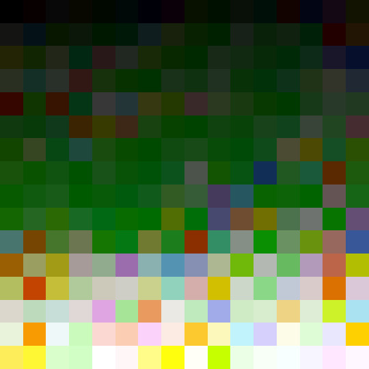
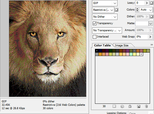
While PNGs can utilize over 16 million colors in a single image, GIFs have a hard limit of 256 colors per frame. For reference, this small image alone has 604 colors:

For those who can't do the math, 256 is a pretty damn small number.
Smaller still were the palettes in a great deal of MSPA's panels early on in its run. Amazingly, a GIF such as this only uses 7 colors (8 if you count the alpha (which it is)).
Not that they were always strictly so low; occasionally some in the later acts of Homestuck had pretty high counts. This panel uses all 256 spots available, in fact.
If he had lowered the number any smaller, the quality would have been god-awful.
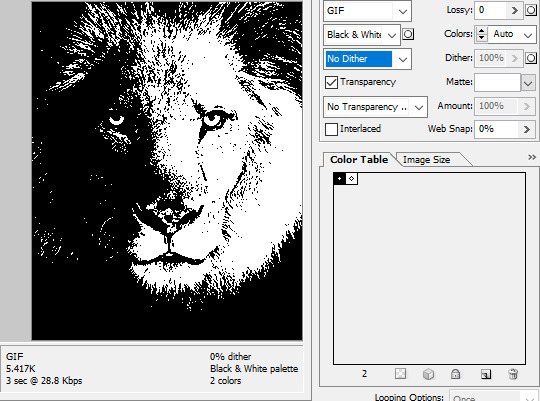
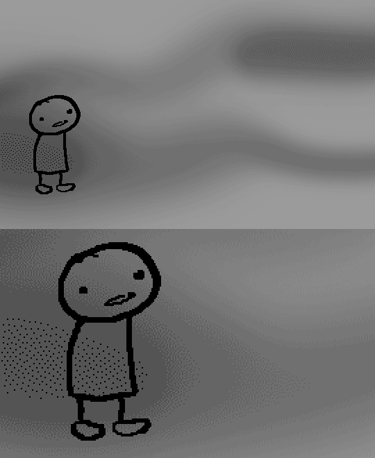
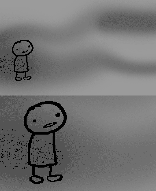
To the untrained eye, these bands of color below may seem to be the result of a posterization filter (an effect that reduces smooth areas of color into fewer harsh solid regions), but it's really because the image was exported as a GIF with no dithering applied.

Dithering, to the uninitiated, is how these colors are arranged together to compensate for the paltry palette, producing illusory additional colors. There are three algorithms in Photoshop for this: Diffusion, Pattern, and Noise.

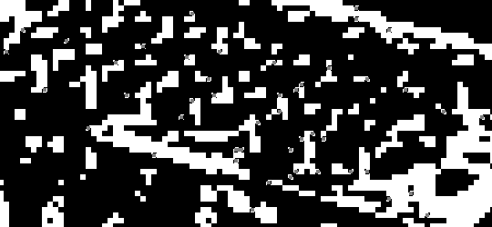
Above is the original image and below is the image reduced to a completely binary 1-bit black and white color palette, to make the effect of each dithering algorithm more obvious.

Diffusion seemingly displaces the pixels around randomly, but it uses error diffusion to calculate what color each pixel should be. In other words, math bullshit. The Floyd-Steinberg algorithm is one such implementation of it, and is usually what this type of error diffusion dithering is called in other software, or some misnomer-ed variation thereof.
The usage of Pattern may hearken back to retro video game graphics for you, as older consoles also suffered from color palette limitations. Sometimes called Ordered dithering because of the orderly patterns it produces. At least, I assumed so. Its etymological roots probably stem from more math bullshit again.
True to its name, Noise is noisy. It’s visually similar to Diffusion dithering, except much more random looking. At least, when binarized like this. Truth be told, I can’t tell the difference between the two at all when using a fuller color table on an image with a lot of detail. It was mainly intended to be used when exporting individual slices of an image that was to be “stitched” back together on a webpage, to mitigate visible seams in the dithering around the edges.
To sate your curiosity, here's how the image looks with no dithering at all:
People easily confuse an undithered gif as being the result of posterization, and you couldn't fault them for thinking so. They look almost entirely the same!
Although I was already aware of this fact when I was much younger, I'm guilty of posterizing myself while editing images back then. Figured I may as well reduce the color count beforehand to help keep the exported GIF looking as intended. I view this as a complete waste of time now, though, and amateurish. Takes away a bit of the authenticity of MSPA art, how the colors and details are so variable between panels. As for WHY they were so variable to begin with, choosing the settings to save the image as requires a judicious examination on a case-by-case basis. In other words, just playing around with the settings until it looks decent.
It's the process of striking a fine balance between an acceptable file size and a "meh, good enough" visual quality that I mentioned earlier. How many colors can you take away until it starts to look shit? Which dithering algorithm helps make it look not as shit while not totally ruining the compression efficacy?
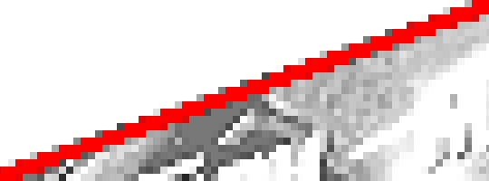
Take, for example, this panel from Problem Sleuth. It has 16 colors, an average amount for the comic, and uses Diffusion dithering. Filesize: 34.5 KB.

Then there's this panel right afterwards. It has 8 colors (again, technically 7 + alpha channel since it's an animated gif), and uses Noise dithering this time. Filesize: 34.0 KB.
The more colors and animation frames there are, and the more complicated dithering there is, the bigger the file size is going to be. Despite the second panel having half the color count of the first, the heavily noisy dithering alone was enough to inflate the file size back up. On top of that, there's extra image information layered in for the animation, leaving only a mere 0.5 kilobyte difference between the two panels.
So why would Hussie pick the algorithm that compresses worse than the other? The answer: diffusion causes the dithering to jitter around between frames of animation. Recall its description from before, how it functions on nerd shit like math calculations. The way it calculates what each pixel's color will be is decided by the pixels' colors surrounding it, to put it simply. Any difference in the placement of pixels will cause these cascading changes in the dithering like the butterfly effect.
Diffusion dithering, 16 colors. Filesize: 25.2 KB
This isn't the case with Noise or Pattern dithering, since their algorithms use either a texture or a definite array of numbers (more boring nerd shit).
Noise dithering, 16 colors. Filesize: 31.9 KB
Pattern dithering, 16 colors. Filesize: 23.1 KB
There's a lot more I'd like to talk about, like the different color reduction algorithms, which dither algorithms generally compress better in what cases, and the upward and downward trends of each one’s use over the course of a comic, but since this isn’t a deep dive on GIF optimization, I might save that for another time. This post is already reaching further past the original scope it was meant to cover, and less than 10 images can be uploaded before hitting the limit, which is NOWHERE near enough for me. I should really reevaluate my definition of the word “tidbit”… Anyway, just know that this post suffers from sample selection bias, so while the panels above came from an early section of Problem Sleuth that generally had static panels with diffusion dithering and animated panels with noise dithering, there certainly were animated panels with diffusion later on despite the dither-jittering.
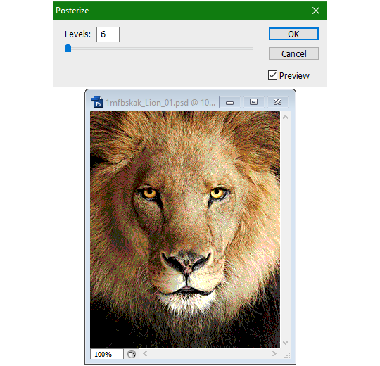
Alright, time to shotgun through the rest of this post, screw segueing. Increasing the contrast almost entirely with “Use Legacy” enabled spreads the tones of the image out evenly, causing the shadows and highlights to clip into pure black and white. The midtones become purely saturated colors. Using the Levels adjustment filter instead, moving both shadow and highlight input level sliders towards the middle also accomplishes the same thing, because, you know, linear readjustment. I'm really resisting the urge to go off on another tangent about color channels and the RGB additive color model.
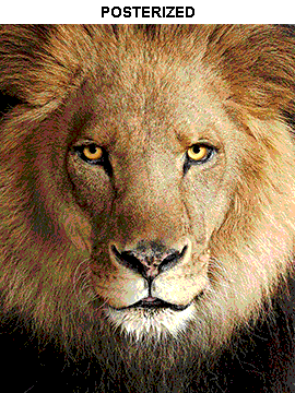
Anyway, there aren't any examples in MSPA that are quite this extreme (at least in color, but I'll save that for a later post), but an image sufficiently high in contrast can be mistaken for being posterized at a glance. Hence the Guy Fieri banner. In preparation for this post, I was attempting to make a pixel-perfect recreation of that panel but hit a wall trying to figure out which and how many filters were used and what each one's settings were, so I sought the wisdom of those in the official Photoshop Discord server. The very first suggestion I got was a posterization filter, by someone who was a supposed senior professional and server moderator, no less. Fucking dipshit, there's too much detail preserved for it to be posterization. Dude totally dissed me and my efforts too, so fuck that moron. I spit on his name and curse his children, and his children's children. The philistines I have to put up with...
In the end, the bloody Guy Fieri recreation proved to be too much for me to get right. I got sort of close at times, but no cigar. These were some of the closest I could manage:

You might be left befuddled after all this, struggling to remember what the point of the blogpost even was. I had meant for it to be a clarification of GIFs and an argument against using the posterization filter, thinking it was never used in MSPA, but while gathering reference images, I found a panel from the Felt intermission that actually WAS posterized! So I’ll eat crow on this one... Whatever, it’s literally the ONE TIME ever.
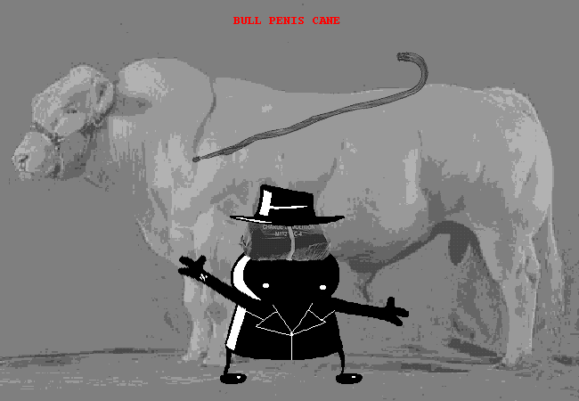
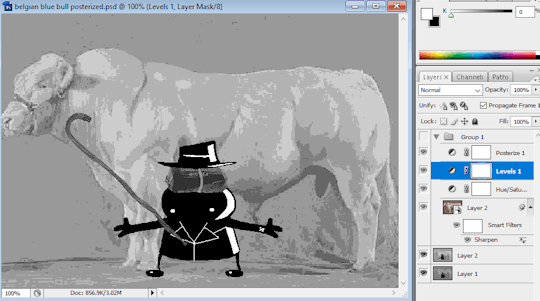
I can tell it's posterization and not gif color quantization because of the pattern dithering and decently preserved details on the bomb and bull penis cane. There would have had to have been no dithering and way fewer colors than the 32, most of which were allotted to the bomb and cane. You can't really selectively choose what gets dithered or more colors like this otherwise.
Thank you for reading if you've gotten this far. That all might have been a lot to take in at once, so if you're still unclear about something, please don't hesitate to leave a question! And as always, here are the PSDs used in this post that are free to peruse.
371 notes
·
View notes
Note
ik its a lot to ask so sorry if no, but can you do a thing for homestuck flash animations and techniques? (thinking specifically [S] Attempt rare and highly dangerous 5x SHOWDOWN COMBO. (page 4085))
Sure, I'd love to cover Flash animation! I intend to put out more technical posts on HTML5 animations specifically at some point in the future, too. Although, there isn't much unique to Homestuck's flashes in terms of techniques that would warrant a whole post. They're 90% just linear classic tweens.
Hussie tweened the legs from right to left and the character portraits from left to right, copy-pasting the keyframes and making the tweens' spans exponentially shorter and shorter to make the movement faster and faster.
Here's the FLA file if you'd like to take a look. Note: It can't be opened in anything older than Flash CS4.
63 notes
·
View notes