Ril, they/them. Mythril Thread Books is a member of Renegade Bookbinding Guild. Amber Family Manufacture is for projects done by my spouse (who is not a part of the Renegade Bookbinding Guild) and me.I firmly believe in the gift economy of fandom, and thus do not sell and never plan on selling my books. I’m also not accepting ficbinding commissions. Find my handbound notebooks here.
Don't wanna be here? Send us removal request.
Statistics
We looked inside some of the posts by mythrilthread and here's what we found interesting.
Average Info
Notes Per Post
317K
Likes Per Post
136K
Reblog Per Post
181K
Reply Per Post
23
Time Between Posts
7 days
Number of Posts By Type
Text
17
Last Seen Tumblr Blogs


Fun Fact
The average Tumblr user visits about 67 pages every month.
Text


Rebinding of The Master and Margarita by Mikhail Bulgakov
🩸 This was my first time working on a book that was published in 1973, so it presented a lot of interesting challenges. I had to clean off old glue from the spine, straighten it, as it was a bit crooked, reinforce it, retrim the edges, then round the spine again. I learned a lot!
🩸 Full leather cover features a hand-foiled design drawn by me. This is part of Margarita’s outfit for the Satan’s Great Ball — her blood-washed skin and a heavy chain with a black poodle medallion.
🩸 The endpapers are a classic illustration by Andrey Kharshak.
🩸 The endbands are very simple, red part marks where the actual novel is in the anthology.
🩸 The edges are painted in Diamine ink Writer’s Blood and polished with a bit of beeswax.
80 notes
·
View notes
Text


the sea makes bones of bodies by @swordsmans
Meanwhile I’m still working my way through my backlog of textblocks.
🌊 This one was a jaw-droppingly gorgeous typeset by the author of a fantastic luzo mermaid!AU.
🌊 I immediately knew I wanted the cover to feature scales in some way, and settled on this black faux leather (the scales are more snake than fish or shark, but they are So Texture).
🌊 The endpapers are printed on the treacherous red watercolor paper (it also has nice texture but does so love to react badly to any amount of moisture in the adhesive) printed with a Japanese wave pattern.
🌊 I painted the inlay on the cover in Procreate and printed it in 3 layers (I’m still experimenting with achieving the transparent and slightly distressed organic look of riso printing on an inkjet printer).
Very happy with the way this turned out (but also have more ideas for a different edition of this fic)!
169 notes
·
View notes
Text


The Threads Of Fate Tangle And Twist by Misthios
🧶 My second embroidered cover. With this one I knew I wanted to do embroidery for it right away, but it still took me a long time to just sit myself down and try it. I ended up using a combination of couching and running stitches in character-inspired colors on black linen, and I'm very happy with the result.
🧶 As for the typeset, I knew what I wanted even before I finished reading. To be honest, the chapter titles idea came to me in a flash as soon as I opened chapter index on AO3 :)
🧶 Knot patterns are used for scene dividers and chapter footers, and nice heart-shaped knots in the inner margins mark the sex scene (for easy of skipping if desired).
🧶 The endpapers also feature a thread-themed pattern. I used a faux-riso tecnique (ran the papers through my inkjet printer four times, priting different shades) to imitate riso's transparent ink effect.
138 notes
·
View notes
Text


This anthology took me a looong time to figure out, first composition-wise, and then the textblock had to wait for some month while I figured out what I wanted to do with the cover. ⚔️👒
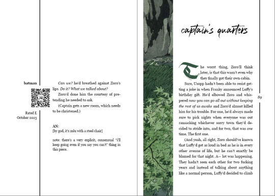
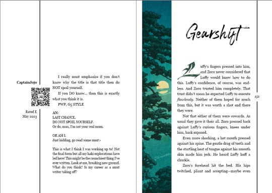
💚 My main idea was GREEN, because I wanted to collect my favorite Zoro/Luffy pieces (about being deeply not normal about each other and also about inappropriate use of Gear 5) and use different Japanese woodcuts for each piece. The fancy linework in the typeset was inspired by @swordsmans's style.
💚 The endbands are a random assortment of greens, and the cover is hand stitched on nice emerald green linen. The feel of the book in my hands is well worth my poor pricked all over fingers (I am very new to any kind of embroidery).
The list of works is as follows:
ouroboros by @swordsmans
without guilt by Augment
the color of want by @okayprairie
the only animal by batman
captain's quarters by batman
bone-breaker ospreys mate for life by @swordsmans
burden of proof by batman
gearshift by @starshipcaptainjojo
306 notes
·
View notes
Text
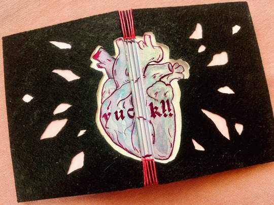


necro elysium (yuck!!) by @mercyisms
A confession: I LOVE fics that use the Disco Elysium format, and The Locked Tomb is just the perfect fit for this type of AUs (and going over the top with book design). And this one is so so so good!
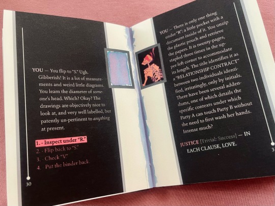
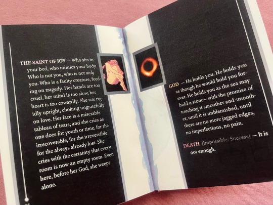
🫀 I knew I wanted to mimic the layout of the text in DE basically as soon as I finished reading and saw the gorgeous illustration by @smapis.
🫀 The cover is inspired by the description of the card, but instead of trying to recreate it exactly (and messing with glitter) I went for the same theme and the kind of DIY arts and crafts style project vibe. Hence my first buttonhole stitch binding, with the heart painted with chromatographic ink (the color is called Unicorn’s Tears) and inked it over in hot pink with a glass dip pen. I also painted the folds of the pages and filled in some of the frames (where the narrator is YOU).
🫀 The rest of the portraits are cropped out of the aforementioned gorgeous illustration, except for Jod’s, which is a photo of a black hole (presented without comment).
🫀 I always want to play with textures for TLT fics, so this time the cover is black felt over a pink gift bag with nice leather-textured pink endpapers, and the textblock paper is a gorgeous 125gsm half-cotton that bravely took everything I threw at it.
I had so much fun working on this 🥰
#mythril thread books#bookbinding#fanbinding#ficbinding#the locked tomb#mercymorn the first#buttonhole stitch binding
599 notes
·
View notes
Text


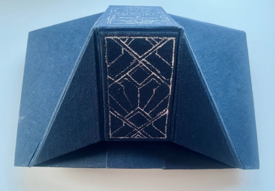


Sansûkh (and Tasâlalkhud) by @determamfidd
I’ve wanted to try my hand at creating a lectern book basically since the moment I saw one, and what fic could fit the bill better than the most epic work in a very much epic fandom?
✨ Sansûkh retells the entire story of the Lord of the Rings and then some, so fitting all of it into a single volume was the kind of fuck around and find out idea that is common among ficbinders.
✨ So, I typeset the text in a two-column style, made it way smaller than what I usually go for (but still very much readable!), added footnotes (as opposed the original endnotes) with translation. It turned out to be 1200 pages, which I printed out twice (remember the fuck around and find out part? Textblocks over 10 cm thick do not fit into the guillotine I have access to, and using 70 gsm paper led to a textblock of just over 10 cm. So I had to scrap those 300 sheets of paper and start again with my trusty 60 gsm Ekko paper).
✨ So then, I painted the edges black, sewn 14 cm of endbands, and took a long hard look at my life and my choices. The lecterb case was only made possible thanks to this fantastic doc by @spockandawe and @lootthecoyote's excellent mathing. I’m honestly amazed it turned out so great on the first try (ok, we did construct a mock-up first, but even it only had one mismeasured part and that 100% on me). I also made an inner cover so no parts of the textblock would show indecently. Also! The case even has inner endpapers (all theoretically visible parts are lined with the same paper I used for the actual endpapers, but taking picture of this whole Object was super awkward.)
✨ Not only did I foil the spine, there’s even a foiled design (matching the one on every spread of the pages) inside the Oxford hollow (that’s the creepy black tunnel between the textblock spine and the spine of the inner cover, you can see it in the first photo).
✨ And the most amazing part: it does the thing! Stands on its own, opens nicely and all that. (Though the pages are a bit too light to want to stay put, and you have to hold it open a bit).
I’m very happy with how this turned out!
#mythril thread books#bookbinding#fanbinding#ficbinding#lotr#lord of the rings#hobbit#sansukh#lectern book
462 notes
·
View notes
Text
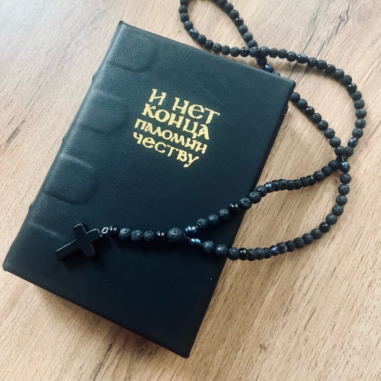


И нет конца паломничеству by An_Owl_Of_A_Witch
My second (and third) K118, and I feel like I’m getting a hang of this binding type.
The story is a Person of Interest Medieval AU, so I went with a manuscript-esque vibe.
🌈 The cover is black bock (? sheep leather) with the title hand foiled in gold. The spine has three faux cords.
🌈 French double core endbands with a rainbow ;) to echo the illustration.
🌈 Fancy title page has a lightly edited public domain frame, for interlude headers I used a vintage monogram plate, and then used my new iPad and the powers of Procreate for good and drew a manicule (the little hand pointing at the author’s notes) and a square frame to match the monogram plate.
🌈 A linocut of a corvid (I needed a rook but settled for a cute jackdaw) marks each blank page (I started each chapter on the right page, so they were a handful of those).
🌈 The author helpfully included a whole reading list with the sources of their historical research, so I checked all the links and made them into a fancy QR-code pattern.
🌈 This edition also features a very special surprise - a poem by @agest inspired by this very story.
P.S.: I also made the rosary used for the photos, it’s a gift for a dear friend.
105 notes
·
View notes
Text


Пищевая цепь by nnalara
I decided to print this 6-parter original story as six A6 volume rather than making a chonky A5.
The story is set in a vampire dominated society, and deals with a lot of heavy topics, so I went with a pretty dramatic aesthetic.
🩸 The insides feature assorted ink splatters printed on red endpapers, a title spread with a bloody and totalitarian vibe, and blood drops on the right margins that get lower from volume to volume.
🩸 The covers are gorgeous red linen with the design printed on via my trusty inkjet printer. This is my second attempt at this technique and I think I’m getting the hang of it. I’m very happy with how the design lines up on the spines!
🩸 Another fun feature are randomly generated endband patterns. Basically, I rolled a d4 every time I changes colors to determine the number of wraps.
🩸 The story/series is called The Food Chain, so I foiled a broken chain on the slipcase. Inside it’s covered with glossy wrapping paper (which I do not recommend using but in this case the patter of rope hearts was just too good to pass up on).
188 notes
·
View notes
Text

Did some traditional Slavic lettering about it 💚
hope is a skill
313K notes
·
View notes
Text


Царевна by Vodolej
Fun fact: this was supposed to be one of my two projects I for sure completed this Binderary, but I caught a really bad flu, so who knows about the second one. But this turned out exactly the way I wanted 💛
The story is a sort of a fairy tale that one of the characters is telling to himself, so I leaned HARD on that vibe. This is an A6 sewn-boards binding.
👑 I think this is like my first bookbinding project where 100% of art was done by me. Front and back covers are inspired by Russian wooden architecture, the half-title page with the summary has my take on a traditional wooden window frame, and the scene divider is Slavic-ish ornament, all of it having something dragonish in them.
👑 I got really into Slavic calligraphy over this past month, so this seemed like the perfect opportunity to practice my vyaz tangling skills (a key feature of the traditional Slavic calligraphy is that every project has a metric fuckton of custom ligatures (hence the name ‘vyaz’, something knit or tied together), that the calligrapher makes up based on some general principles), so the title, front matter, summary, first and last lines are all done by me in Procreate. This particular style is based on Viktor Pushkarev’s ‘tall vyaz’.
👑 The title is additionally embellished with gold ink that looks absolutely stunning in real life despite my rather shaky brushwork.
👑 The ribbon I used for the spine and ended of the cover was a really lucky random find when I was shopping for linen for an unrelated project. I mean look at it! The featured pairing of the story is literally called ‘scales of gold’, how perfect is that?
👑 I really like working on shorter stories because I feel like I can get away with more unhinged design choices in the short form. Which is why I used Cyrillic uncial font as a body font to really hammer in that ancient manuscript feel. This is one of the tamer varieties of that font, but I decided to go for readability over those really pretty archaic letters that I really enjoy.
👑 The paper is 120 gsm Papier Paille made with bast fibre (straw from flax and hemp) rather than wood pulp, and its suggested use is for wedding invitations and the like, so I was cackling maniacally the entire time I was printing this gleefully obscene story on it.
All in all, VERY happy with how this turned out.
187 notes
·
View notes
Text


My Brother's Sister is a novella that was only ever published as a part of an anthology, so I wanted to bind a copy for personal use, because it's a story about a fae changeling from one of my favorite authors.
I really love the way this tiny book feels, it's just the right size to hold in one hand.
I chose owls as a main motif (and there are a lot of them: tiny owls guard every page number and the beginning of every chapter) because that is the protagonist's preferred form. The title is linoprinted and the spine is painted by hand.
(This was actually one of my first books that’s lived in my drafts for two years, and I think it’s time to show it off.)
112 notes
·
View notes
Text


Протокол жизни by SaintOlga
A Major Grom fanfic that deals with a lot of red tape and police work, so I did a sewn-board binding to make it look like a Soviet era personnel file.
🩸 A5 with “bookcloth” that is actually from the Soviet era on the spine and some craft paper on the cover. This time I added a spine lining that does double duty covering edges of the boards, and I think it makes the breakaway spine look great.
🩸 The endpapers are red, with author’s notes and colophon made to look like sticky notes and pasted to them.
🩸 I’m particularly proud of the title page, because it has an actual Saint Petersburd PD seal that I faked all by myself (and a bloody fingerprint, because how else do you sign necro(ro)mantic paperwork?
🩸 Chapter headers all have different broody fingerprints and coffee rings, and another point of pride is the fake personnel file keeping instructions that have the QR-code with the link to the fic “to check the data authenticity”.
It was gifted to the author.
207 notes
·
View notes
Text


The Crystal’s Song by sebastianL
This was a project where nothing prevented me from making this a singe A5 volume. But the story had four part almost identical in length, and that length was perfect for a quarto, so I decided to make it into a set of four A6 books.
💎 The covers are linen, the colors match the colors of Baze and Chirrut’s outfits from the movie (and endbands and endpapers match the covers);
💎 The titles are linoprinted;
💎 The slipcase (it was my first! That was pretty scary, but I’m happy with the result) is meant to evoke the crystal cave with it’s silvery paper in the outside and pretty blue marble paper on the inside;
💎 The cave is also featured on the title spreads and the chapter headers (or, in this case, “siders”, I guess);
💎 My favorite little design easter egg: the QR-codes have three eyes instead of the usual squares because the Crystal Guardian has three eyes;
💎 Each volume has a corresponding number of crystal shards by the page numbers and on the half title pages;
💎 And I also did some fancy typesetting stuff, especially for the prologue and epilogue parts: the repeating mantras form concentric rings of text, and the epilogue, well. I just love how that spread turned out.
125 notes
·
View notes
Text


An A5 bullet journal/planner made as a New Year’s gift for my dearest spouse.
I think it’s my best Secret Belgian binding yet - just tight enough to keep all the signatures perfectly in place and still let the covers flip back easily.
For the covers I used flannel from my old worn out pajama pants.
180 pages feature a leaf for the table of contents, 12 coloring pages with hand lettered month names, 5x12 weekly spreads (with USAsgardian names of the days of the week just for fun), 12 monthly digests (with the header hand lettered as well), 10 pages of trackers and some blank (dot grid) pages.
I hope they have a great time filling it up!
21 notes
·
View notes
Text


The Last Time I Saw You by @scioscribe
I can barely believe this fic has been living in my bookmarks for a decade now.
This AU deals with Rust’s undercover work, so I took Crash’s jacket for my design inspiration.
💊 I recreated the design of the embroidery on the back for the title page (and went for those graphic ribbon banners for chapter headers);
💊 The cover is actual leather (this was my first time working with leather, it was intimidating, but also fun!), and both front and back covers and the flap are backed with paper for extra stability;
💊 It’s an A6 long stitch binding (honestly, an ideal binding type for all your paperback needs), and the closure uses a button from one of my favorite flannels, which is just a cute detail, imo;
💊 Of course it wouldn’t be Crash’s jacket without those bullet holes, though I’m not 100% sure they got there in the AU.
102 notes
·
View notes
Text


Unconditional by @letteredlettered
💚 This is an A6 binding of the lovely typeset that was so generously shared by @pleasantboatpress. This gave me the opportunity to first bind and then read this highly praised fic for the first time, which I since did and which changed my brain chemistry in very fun ways. Cannot recommend this fic enough, it's absolutely fantastic.
❤️ This was my first time using this particular type of tenxtblock paper, and it turned out lovely, if slightly heavier than I expected of a book this size.
💙 The design is pretty minimalist, with full cloth cover in dark blue linen with title and a simple illustration of hands reaching towards each other (because touch is a very important aspect of the story) foiled in gold, with solid color blue endpapers and blue and gold double-core endbands.
213 notes
·
View notes
Text


This tiny (A7) octavo contains a short story written by my friend.
It pays homage to Steven King, so besides the claw marks on the covers that were requested by the author, I added some to the page corners.
A nice little horror story, and a fun project.
Note to self: Clairefontaine vellum is only good for smaller books because literally half the page has huge transparent watermarks. Otherwise very nice paper.
138 notes
·
View notes