
Statistics
We looked inside some of the posts by pinemountainobservations and here's what we found interesting.
Average Info
Notes Per Post
276K
Likes Per Post
76K
Reblog Per Post
199K
Reply Per Post
528
Time Between Posts
12 days
Number of Posts By Type
Text
17
Last Seen Tumblr Blogs


Fun Fact
Kazakhstan’s Minister of Communications and Informatics has blocked the Tumblr site because it contained 60 sites of terrorism, extremism, and pornography in 2015.
Text
Observation: Happy 20 year anniversary to Gary Brolsma’s classic masterwork of the internet age, Numa Numa Dance

#observation#numa numa dance#anniversary#20 year anniversary#life altering#world shattering#powerful
0 notes
Text
Observation:

Happy 10 year anniversary to one of the best rap albums out of the stupid little island of Britain. Proof that Little Simz isn’t the only good British rapper.
0 notes
Text
STOP DON'T SCROL
I am Osama Al-Anqar and my wife's name is Rana Raed Al-Anqar. We have a little girl.

We used to live in our house in the Shuja'iyya neighborhood. We used to live in peace and security and I had a job, but the war came and took everything from me,

first of all my brother Mahmoud, who was martyred in the bombing of the Baptist Hospital. He left behind his children and wife, and my brother Ahmed, whose front leg was amputated in the same bombing. I lost my house, my family's house, and my job. Now we have become homeless, moving from one place to another. We are gripped by fear, terror, and hunger. My daughter suffers from extreme fear and panic, and suffers from lack of food and skin diseases due to the lack of water and cleanliness.

We are in dire need of your help. We call on you to fund this fund to save my family and provide safe shelter, food, drink, and health care. Your donation is no matter what can happen to us in our lives. Thank you from the bottom of my heart. Your support means more.
37K notes
·
View notes
Text
This GoFundMe is verified > #248 on the list of vetted Gaza evacuation fundraisers by @el-shab-hussein @nabulsi
Saving Dr. Farhat's Family Towards Hope: A Call to Action
In the heart of war-torn Gaza, where destruction and loss are a daily reality, lies the deeply moving tale of Dr. Husam Farhat and his family. Amidst the relentless bombardment, Dr. Farhat faced an unthinkable tragedy: the martyrdom of his beloved sisters, Inas and Amal, along with their husbands and children, and his brother Mustafa. This devastating loss shattered not only their dreams but also their hopes for a peaceful future.
As the bombs tore through Gaza, Dr. Farhat's world was further shattered by the destruction of his beautiful home and his office—places that once stood as symbols of stability and success. The home, filled with cherished memories, and the office, where he dedicated countless hours to his work and aspirations, have both been reduced to rubble.
You can witness the extent of this devastation through the video below ⬇⬇ which shows some heartbreaking images of what was once his home and office.
youtube
The Campaign: A Beacon of Hope
We have launched a GoFundMe campaign titled "Saving Dr. Farhat's Family Towards Hope" to raise the necessary funds to provide them with a chance at a safer, brighter future. You can support this cause by visiting and sharing the campaign link:
👉 https://gofund.me/e9f9ce20
youtube
Why Your Support Matters
Your voice is powerful. By sharing this campaign, you help stand up for human dignity and compassion. Every donation and share brings us closer to providing Dr. Farhat's family with the safety they desperately need.
Today, we stand poised to make a difference. Our goal: $29,500 to ensure Dr. Farhat's family's safe evacuation and support as they rebuild their lives in Malaysia. This includes permits, transit fees, living expenses, and housing rent, according to the following details:
Permits and toll fees are $17,500
Travel expenses from Gaza to Egypt, one month’s rent, and other supplies: $1,500
Flight tickets to Malaysia: $1,600
Rent and other expenses for 5 months in Malaysia: $8,044
GoFundMe fee: $855.8
👉 https://gofund.me/e9f9ce20
Join Us in Making a Difference
We urge you to join us in this mission of hope. Let us come together to support Dr. Farhat's family and demonstrate that humanity shines through acts of kindness and solidarity.
Thank you for your compassion, your time, and your commitment to freedom and justice.
With deepest gratitude, Dr. Farhat's Family
51K notes
·
View notes
Text
Emergency: Help Evacuate My Family From GAZA WAR
Dear Humanity,
I'm Haya from Gaza , from a family of 8 people: my parents, two sons, and four daughters (two of them suffer from allergies).

I've witnessed the evidence of the tragedy that has struck our lives in Gaza, where my family and I have survived amidst numerous previous wars. But today, we face the most dangerous and fierce battle in the current war. The urgent need intensifies for us, as we have nothing left and are unable to secure our basic needs such as food, water, and safe shelter.
Here is our story - On October 7th, our lives changed forever, my family and I evacuated from northern Gaza to southern Gaza, hoping to return soon, but it wasn't meant to be. Our home was surrounded, burned, and then completely destroyed, Our home, once a fortress of hope, now lay in ruins, a stark reminder of our shattered dreams.
The night before we left from the north to the south was terrifying. Shelling sounds were everywhere, making a loud noise that felt like it went through our souls. Every explosions shook the ground like earthquakes, sending shockwaves of fear through our trembling bodies. filling us with fear. The air smelled of destruction and blood, making it hard to breathe. When dawn came, we saw the devastation around us, realizing our home was now a symbol of loss and despair.
We ran into the streets and with each step we took into the unknown streets, we felt as if we were plunging deeper into the abyss of our shattered existence, leaving behind everything we own in our home: Clothes, important official documents, the car, and literally it's almost everything - the enormity of our loss weighed heavily upon us.
Our home it was where we found hope, safety, and made precious memories. Losing it felt like losing years of our lives, leaving us adrift amidst the wreckage of our shattered existence.
youtube
A brief video depicting the devastation that struck our home and our entire neighborhood in Gaza.
Desperate Plea: Escaping Gaza's Allergy Nightmare
I, Haya, suffer from severe allergy to penicillin-derived medications, and my sister, Amal, also suffers from severe allergies to medications from my family such as Paracetamol and Ibuprofen.
These allergies create a deep sense of fear and anxiety for us, as we live in a constant state of tension and fear of anything that may require a visit to the hospital. We fear being given inappropriate medications due to the unavailability of suitable treatments in Gaza because of war or lack of awareness and not informing the doctor of our allergies, which could lead to serious consequences threatening our lives.
MY Father Income

Our dreams are heading towards oblivion in the labyrinth of an uncertain future
My story, along with my siblings, represents a united team of four individuals, three of whom are skilled programmers and one graphic designer. We work as freelancers in the world of freelancing.

As for my younger sister, she is a student studying at the College of Architecture. She has always carried a big dream in her heart, a dream of being part of changing Gaza, of making it more beautiful and better. She looked forward to the day when she would receive her degree and start building this dream. But the beginning of the war changed everything. The destruction of infrastructure and universities cast shadows of despair over her dreams.
When I think of my brother in Belgium, I can't help but feel deep sadness. He has been suffering from unbearable anxiety and insomnia since the outbreak of the war. Sleep eludes him at night, and his physical and mental health collapses under the weight of these heavy burdens, negatively affecting his performance at work. Problems and challenges pile up in front of him without the slightest opportunity for rest.
We all feel psychological pressure and extreme anxiety. The war hasn't been limited to external attacks but has deeply infiltrated our daily lives. We search among the rubble for a little safety and the basic resources for survival. Every day comes with a new challenge that we must overcome.
As we sway amidst the rubble of shattered dreams, our souls wrestle and our hearts beat strongly challenging the ravages of war.
Our parents earnestly seek a way to rescue us from this hell, feeling the heavy responsibility for every moment we spend under the shadows of fear and destruction. They dream of a safe place where they can build for us a better future, filled with security and hope, for we deserve life in all its meanings of comfort and peace.
Perhaps this fundraising campaign represents a light in the midst of darkness, it is indeed the only hope we cling to firmly.
I appeal to the world as a whole to hear my cry and the mournful cry of my family in Gaza. We need the helping hand that reaches out to wipe our tears and build a bridge to safety.
Your donation is not just a donation; it's an opportunity to rebuild life and brighten a better tomorrow. Be part of our hopeful story, for we need your hand to start anew.
The purpose of the fundraising campaign
The goal of this fundraising campaign is to rescue my family - my parents, my siblings, and me - through the Rafah Crossing to Egypt, which currently requires $5000 per person. This campaign is our only chance to stay alive, and I humbly request your assistance at this critical time. I will provide you with a comprehensive breakdown of the expenses, committing to transparency and clarity.
All of our important links are here https://linktr.ee/hayanahed
Verified by :
⭐️ operation olive branch, number 26 on their spreadsheet. (On Master list)

⭐️ Project watermelon,line 249 on their spreadsheet. Or you could see it as number 212 here is the photo for more clear proof

Thank you for your kindness and support.
.جزاكم الله خيراً
yours sincerely;
Haya Alshawish.
66K notes
·
View notes
Text
Observation: RYM Top 100 Album Cover Review #18
A Love Supreme by John Coltrane
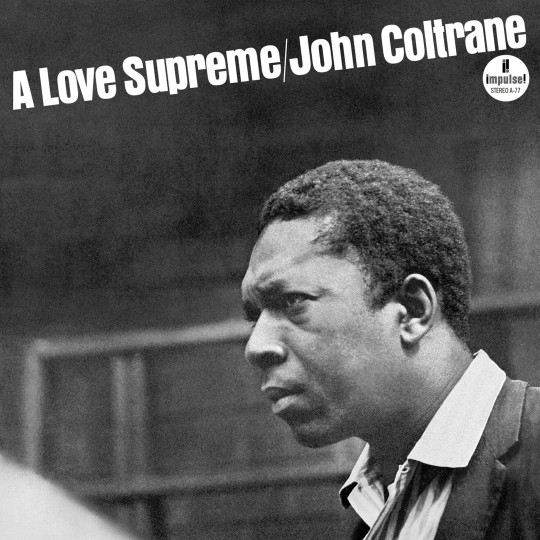
RYM’s next choice for best Jazz album of all time is John Coltrane’s spiritually-inspired masterpiece, A Love Supreme. This record is very important for Trane’s story as well as the development of spiritual and modal jazz. And it’s a personal favorite too!
I’m a big fan of spiritual jazz, I think there’s an added element of personal connection and emotion that purely technical jazz just doesn’t have for me. While I can appreciate the skillful playing in other avant-garde jazz records, it’s players like John Coltrane, Pharaoh Sanders, or Alice Coltrane that can really make me connect to the music. This is a great record, highly recommend to anyone trying to get into avant-garde jazz.
Now, deserved praise for the music aside, what about the cover? I’m not gonna lie, especially out of the context of the great albums lists this cover usually shows up, it’s pretty boring. When I’m looking through a Rolling Stones list or RYM’s top albums of all time, this is an interesting reprieve from the various colors and artistic visions. But on its own, it really does just look like a strangely cropped photo of John Coltrane.
There’s just so little going on. The entire thing is simple black-and-white, the text is nondescript, the division between artist’s name and album name being a “ / “ is odd, the background of the photo is blurry and indescribable, and there’s that weird white slash in the foreground bottom left corner. The only part I appreciate is John Coltrane himself, who has a serious expression and is somewhat interestingly posed, even if basically all of his body is cut off. But even then, he’s not playing the horn or anything, there’s literally nothing to tell something that this is an intentionally created album artwork other than the text. If you removed that, this could just be an oddly cropped photo of a very intense relative that you find on a shelf in your grandparent’s house. The version I have here also has the “impuse!” sticker in the top right, and not every version I could find on the internet had that. For my money this sticker, which I only included because the one on RYM’s chart has it, only makes the cover worse. It feels out of place and sits oddly above Trane’s head.
Overall this isn’t a bad cover, Coltrane himself is fascinating and I think has enough presence to carry the cover into the “fleeting glance and it looks fine” zone. But under scrutiny the whole thing kind of falls apart. Legendary record, very good, but the cover itself is a 3/10.
0 notes
Text
Observation: RYM Top 100 Album Cover Review #17
Revolver by The Beatles
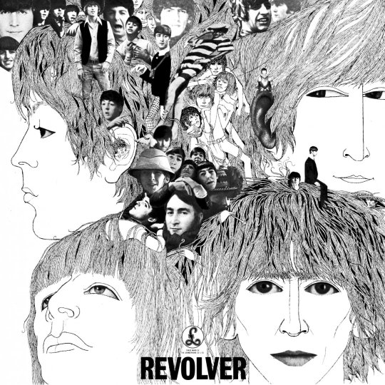
In the time since my Abbey Road review I have, as promised, done a bit of a Beatles deep dive. I definitely have more to explore, but for now I have at least listened to the first couple Beatles records in this list. And out of the ones I have listened to so far, Revolver is definitely my favorite. It’s once again an older record that I just don’t have the full context for, and so will probably never love it the same way so many people do. But it’s definitely good, and I can appreciate that even when The Beatles make a bad song (looking at you, Yellow Submarine), it manages to at least be very interesting.
This album also used to have my favorite cover from The Beatles. I say used to because for a while, I just saw its shrunk-down version on streaming services or websites, and thought it was cool. It was only when I actually pulled up a larger image and looked at it closer that things changed a bit.
I know psychedelia and trippy imagery are The Beatles forté, but this one is kind of a lot for me. I do like it better than the Sgt. Pepper’s cover, the monotone palette makes Revolver leagues better in my opinion. But I’m still not a fan of this type of collage. And don’t get me wrong, I love a good collage. But for me a good collage feels a lot more seamless. That’s just a personal taste thing, I know plenty of people like this style. But I think the drawing parts are just so good and I wish that’s what the whole cover was. The photos just take a lot away from this for me, and even the ones that I kind of like, like the little guys sitting on top of George Harrison’s head, I would like better if they were in the same line art style.
Overall, this is one that I don’t hate, but I definitely don’t like looking at it for a while. It’s fine from a distance, and I think it’s impressive that psychedelic imagery was capturing so well in black-and-white, but I wish it was more consistent. 4/10
1 note
·
View note
Text
Observation: RYM Top 100 Album Cover Review #16
The Velvet Underground & Nico by The Velvet Underground and Nico
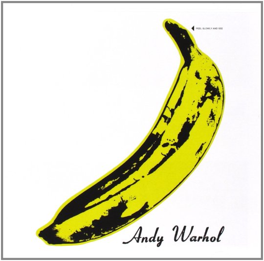
PEEL SLOWLY AND SEE
Andy Warhol is one of my top picks for most overrated creatives of all time. I know the whole point of pop art is to be ironic and criticize consumerist culture, but I really just can’t bring myself to care. His work is broadly uninteresting to me, and I’ve never really been a fan of the brand of criticism that says “what if I criticize something by doing… the exact same thing?!?”. That being said, I think sponsoring The Velvet Underground is one of the best things Warhol ever did. They were genuinely experimental for their time and very influential. Their music isn’t my favorite, but it's hard to deny the impact. Also, Nico was a pretty singular artist for her time, and her contributions to this record shouldn’t be overlooked. That’s about all I have to say on the music side of things, I honestly haven’t looked into the story of this record beyond the pretty basic surface level, so I’m not gonna try to give a half-assed opinion on one of the most-discussed albums of all time.
Instead I’ll be talking about the album cover, created by Mr. Warhol himself. Here he puts his signature style into an interesting space, this artwork feels more similar to the abstract and absurdist movements than it does to pop art. I appreciate that approach a lot, this cover is definitely intriguing. And, in its own way, it is very iconic. In terms of underground music and experimental rock, this album’s legendary status has helped it become very recognizable. It’s nowhere near the levels of iconic as Abbey Road or Dark Side of the Moon, but that’s more due to its somewhat underground (and gatekept) nature. But it has the same qualities as a lot of those famous album covers, it’s a very simple and replicable image that can be put on pretty much anything with a white background.
Honestly, this cover has a lot going for it visually and culturally. My one sticking point is, once again, Andy Warhol. He really just had to put his name smack dab on the cover, huh? Couldn’t be content with a credit on the back of the record, no he had to make this album even more confusing to the uninitiated. I’m of the opinion that any text on the cover of an album that isn’t the artist’s name or the title of the album really needs to have a good stylistic reason to be there, and in this case I don’t see a very good reason other than Andy Warhol’s ego. The other text though, “PEEL SLOWLY AND SEE” is great, it once again adds to the absurdist feeling of the art. The whole thing reminds me a lot of René Magritte’s “The Treachery of Images”.
Overall, this is a pretty great cover. Solid artwork, iconic status in the music nerd scene, and a decent usage of text. Andy Warhol’s dumb ass brings this one down a bit, but I’d still call this a 7.5/10
#observation#rym album cover reviews#the velvet underground and nico#the velvet underground#nico#7.5/10
0 notes

Text
Observation: RYM Top 100 Album Cover Review #15
Illmatic by Nas
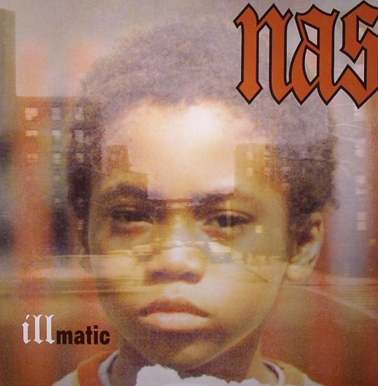
Part of the reason I’m really enjoying doing this series so far is that I get to really evaluate classic album covers as more than just images attached to music. Ilmatic is a great example of a cover that I think gets overlooked because the music gets so much praise. Actually I think that’s the case for a lot of rap album cover arts, Drake and Kanye are some of the only artists I can think of that really get a lot of attention for what they put on the covers of their albums. Otherwise, I don’t see a lot of critical analysis of hip-hop visual art, which I think is kind of interesting.
Anyways, here I feel like I may get into my first straight up negative review of an album. Not of the music of course, 90s hip-hop may not be my thing, but it’s hard to deny this as one of the best-written rap albums ever made. But that cover art though...
Like realistically, what is going on here? This is Nas’ origin story, so he’s got the picture of himself as a kid, and the album is very much centered in his hometown of New York, so he has the urban landscape in the background. And there’s his name, and the name of the album. Everything important is here. But when all of those pieces are put together, I don’t know. I think I like this cover less the more I look at it.
I said it yesterday with the Mingus album, but part of my problem is always going to be that I have a modern sense of design. I can’t look at older design choices and not compare them to what current artists and designers are doing. And so I’ll just say straight up, I really don’t like a lot of older hip-hop imagery. If you do like, and there’s plenty of people that do, that’s totally fine and all power to you. I think there’s absolutely a huge market for it and it can be very meaningful to people. I’m not gonna come in here and tell people that this is objectively bad design, cause that’s just not true and I don’t have any place saying it. What I will say instead is that, in my opinion, I just don’t like the over-the-top, maximalist, goofy style of like 90s-2000s rap mixtape and album artwork. It’s too much for me, and while I might find it kind of funny sometimes, I don’t enjoy it for much else beyond that.
And Illmatic is not the worst offender in my eyes by any means. It’s definitely trying to be a lot more serious than say We Got It 4 Cheap Vol. 2 by Clipse. It’s got a raw, dusty color palette (probably the best thing about it, and something I actually really like), it’s got a somewhat unsettling photo of a 7-year-old Nas, it’s got a dramatic flair to the font. It’s trying to create a mood, and I think it mostly succeeds. But to my eyes there are a couple of huge flops that really bring this cover down.
I’ll start with the text, which I think is definitely the worst part of this cover. The placement is alright, I’ve got a bad photo here that for some reason crops Nas’ name right up next to the border and I don’t think that’s normally how it looks. So I’m not bothered about that. What is an issue to me is the font, or rather fonts, that are used here. Why are there three of them? I had this same problem with The Black Saint and the Sinner Lady, but it’s even worse here because not only are there three fonts that are each only used for between three and five letters, but all three are different colors and different sizes. And the fonts for “ill” and “nas” are similar enough that I don’t understand why a different one was used. “nas” has a black border around it because it was made a color that is very similar to the photo collage in the background, which bugs me because like, just make it black or white like the other text, then it would all fit together a bit more, right? I don’t know, the text really bothers me the more I look at it, I think it really takes away from what otherwise would be a decently striking superimposed collage. But put all together it just is not it.
The superimposed photos themselves are alright. I think the one of Nas is actually very good, it's really interesting and the most memorable part of the art (alongside the color palette) by far. But the background, the city street, it’s just very mediocre to me. Especially for how important the city is to the story of this album, it feels like more than half the photo is just the sky above and an empty street below. You get a glimpse of some nondescript buildings and cars in the middle section, but nothing about this is interesting. It doesn’t even look like New York to me, if I knew nothing about Nas this photo could be of any random city anywhere.
Also, while the placement of Nas’ portrait is definitely interesting, and I like the way the space in the middle of the street lines up with his forehead, I still feel like if a better urban landscape photo was chosen there could have been a much better and more interesting collage that could be made.
This album is a classic, one of the greatest rap albums ever made, but that doesn’t mean I have to like its art. In this case, I give Illmatic by Nas a 3/10
1 note
·
View note
Text
Observation: RYM Top 100 Album Cover Review #14
The Black Saint and the Sinner Lady by Charles Mingus
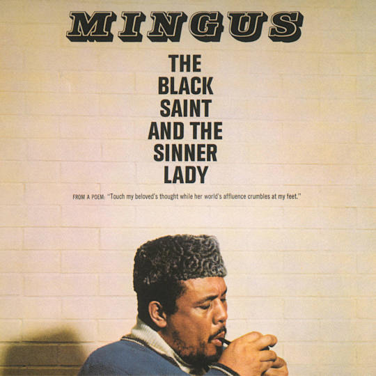
Out of Rate Your Music’s top albums so far, this is the first one that doesn’t fit into any subgenre within Rock or Hip-Hop. I think there’s probably some very interesting criticism that someone smarter than me could level about how RYM is dominated by mostly male users and their opinions on music. Rock and Hip-Hop are the most popular genres among men on average, so it makes sense that the “greatest albums of all time” according to RYM fall mostly within those genres, even if they are experimental or alternative versions.
Anyways, I don’t really want to write a whole essay dissecting the various flaws of a stupid music rating website, so let’s talk about RYM’s favorite jazz record of all time, The Black Saint and the Sinner Lady, arranged by Charles Mingus.
This record is great. Of course it is, it's this high for a reason. It’s got a different feel than some of the other jazz albums that I’ll talk about later, Mingus was working with a much larger group than most of his contemporaries and the music ends up exploring many more spaces and feeling a lot larger and grander because of it. Personally, I think I appreciate the spiritual jazz of Pharaoh Sanders and John Coltrane a bit more, but I’m also not a huge jazz-head, and definitely don’t appreciate all the subtleties. I’m okay with that though, I’m sure I’ll get better at it as I listen to more great jazz, and for now I’m fine just sticking to album cover reviews.
So what about that cover? This one is pretty simple, it’s a photograph that almost looks like a painting, with a bit of text and a very plain background. Like a lot of older records, including ones I’ve already reviewed like Abbey Road and Ziggy Stardust, I think my current expectations for design and aesthetic are definitely getting in the way of appreciating this cover for what it was when it was made. But at the same time, I’m only here to give my opinion, so I can only really judge it by my standards. And my standards tell that this album, while it does fall into the “picture of the artist with text” genre of cover, it’s at least a nice and somewhat interesting version of that. The portrait is really cool, Mingus looks very smooth, relaxed but powerful, and it’s a great way to introduce him as the orchestrator of the music that’s to come. The text is alright, I like the font and placement of his name, but the name of the album is in a different, very boring font and I feel like a slightly different placement would make it more readable. The smaller text underneath is in another version of the title text’s font, so we’ve got three different fonts in three different type sizes sitting all right below each other, which is a strange choice. The color choices are nice though, and it's overall not a bad cover. Just kind of boring and with weird text choices. I personally think a more maximalist cover might convey the feeling of the music better, if I hadn’t listened to this I would have guessed that this is just one cool dude playing the saxophone (I know Mingus was a bassist, but that also isn’t conveyed by the cover at all). Bonus points for being a really good portrait and an example of nice photography, but it’s still not my favorite cover.
For the first jazz album in RYM’s top 100, I’m starting off pretty low with a 5/10
0 notes
Text
Observation: RYM Top 100 Album Cover Review #13
The Rise and Fall of Ziggy Stardust and the Spiders From Mars by David Bowie

Ziggy ziggy ziggy.
Here we have the first album on this list that I own a vinyl copy of, and another one of my all-time favorite from the years before I was born. This is the birth of one of Glam Rock’s all time great characters, Ziggy Stardust, otherwise known as David Bowie.
David Bowie’s body of work is pretty unmatched in music in my opinion, he’s both one of the most prolific solo artists in any genre and one of the most consistent. This is his first of three perfect albums in my opinion, and while it's not his first studio release overall, it does feel like the moment he really entered his own and became one of the greats. His preceding record Hunky Dory is also pretty good, but nothing else from the Glam Rock era really comes close to Ziggy Stardust for me.
Before I listened to the vinyl that came with my record player, my experience with this album was pretty much limited to its hits. And while “Starman”, “Suffragette City”, and especially “Moonage Daydream” all have very special places in my heart, this album as a whole listen is really special. Bowie here just hits that perfect mark between almost being too corny and over the top, and the instrumentation is just so rocking and experimental and beautiful that he completely blows past goofiness and enters real greatness. I love this album a lot, it can often feel like a cheat code for making me happy, and owning a physical copy is always special.
But again, I’m trying not to talk about the music too much, especially for albums that I’ve listened to a lot and love a lot. So what about that cover?
Well, this is kind of a tough one. As I’ve said, I love this music a lot. But when I think of a visual, this cover doesn’t necessarily come to mind. The color palette definitely does, brown and gold with just a few splashes of vibrant blue and green feel like a perfect fit for the music. But the actual image? I don’t know, it just feels a bit plain for how crazy and conceptual some of these songs are. David himself is definitely the most interesting thing about this cover, his Ziggy Stardust persona makes for a wild and very glam contrast against the moody, grimy backdrop. And I definitely do like that contrast, it just again doesn’t fit amazingly well to the music for me. David Bowie has album covers that I like a bit more, but ultimately I think he as an artist and the music he makes has always been more interesting to me than the visuals that come along with his projects. He’s certainly more interesting than your average solo artist with pictures of themselves on their album covers, and he’s often tries new things with his covers, but they never really hit that peak for me. This one doesn’t feel like it would stand alone as a great piece of art, and it doesn’t fit the music well enough for me to love it. For me, this cover is a solid 6/10, good but never great.
#observation#rym album cover reviews#the rise and fall of ziggy stardust and the spiders from mars#david bowie
0 notes
Text
Observation: Does it still count as a perfect game of TFT if the only damage I took was from the giant Scuttle Crab on round 5 (from the Crab Rave portal)?
#observation#tft#teamfight tactics#that giant crab not only was the only fight I lost it was the last fight my opponents lost#that thing is deadly it literally won the game for me
0 notes
Text
Observation: RYM Top 100 Album Cover Review #12
Remain in Light by Talking Heads

“Take a look at these hands!"
Presenting Talking Heads and their 1980 masterpiece, Remain in Light. I’ll be the first to admit that older music often goes over my head. I just don’t have the context for it, and I can really only compare it to modern iterations that have built on what was made in the past. That’s why I don’t love Pink Floyd or The Beatles or The Velvet Underground the way many music nerds do. They just don’t hit me the same way those who were influenced by them do.
However...
Sometimes there’s just something that gets made and never gets replicated. When I want to listen to prog, I’m more likely to go to black midi than Pink Floyd. For psychedelic pop, Weyes Blood always hits me harder than the Beatles. But the spaces explored by Talking Heads are incredibly unique, at least to me. And this album really takes it to another level. This is the Loveless of New Wave and Post-Punk to me, a true pioneer that is rarely if ever topped within its respective lane. I have a lot of love for this record, and I have to say, the album cover plays a not-insignificant role in that.
Especially when I compare this cover to Talking Heads’ other work, it is something special. The combination of photography, text, and of course the incredibly unique glitchy tears sits in a very interesting place that for my money, fits the music perfectly. Talking Heads have an amazing mix of unserious goofiness and chillingly cold commentary, and the choice to rip their own pictures apart this way helps create a visual motif that slides right along in the same groove as their music. The color choices also work great, I especially love the various shades of blue. The whole thing feels whimsical and sinister at the same time, and depending on how deeply you pay attention to David Byrne’s lyrics, you can get both those vibes out of the music. For me, as a consummate lyric ignorer most of the time, I like the element that the cover adds, it makes me remember that Talking Heads aren’t just a goofy nerd rock band singing about weird shit. They have something to say, and I credit Remain in Light for helping me realize that.
One of my favorite pre-2000 albums of all time, truly a unique and amazing body of work. I give this cover a 9/10
1 note
·
View note
Text
Observation: RYM Top 100 Album Cover Review #11
Abbey Road by The Beatles

Well, here we go.
Abbey Road is one of the most iconic albums of all time. Considered by many to be the best album from arguably the best (and definitely most famous and influential) band of all time, there’s no way this album and its cover couldn’t be in talks for the best of all-time. This is another one that is so talked-about that I really can’t add too much to the conversation. I’m also very much not a Beatles superfan. I don’t dislike them or consider them overrated like some, but I’m also definitely too young to care a lot about them. They’re so far past my time that the people they influence are some of my favorite artist’s influences. My experience with their catalogue is very limited, and while I have plans to change that at some point soon (I’m working my way through a lot of contemporary psychedelic music right now, but I’m eventually going to get to them), I haven’t begun that journey yet.
With all that in mind, I may come back to revise this cover review later. I certainly will have to do that with Revolver and Sergeant Pepper’s, albums I’ve spent even less time with. But in this case I do feel like I have a decent amount to say, given how normal this cover is in comparison to some of the British Invader’s other works.
This is a case similar to Dark Side of the Moon, albeit in a different way. This cover is on many a shirt, I’m sure. However it doesn’t really have that iconographic quality that DSotM or similar covers have. Instead this cover is made iconic by its association with The Beatles and status as their last real record. It’s definitely the last one that gets praised a lot, and obvious it gets enough acclaim to land just outside RYM’s top ten. And for this album, I very much think this is a case of those outside factor’s carrying the iconic quality of the cover far beyond the artistic quality of the cover itself.
Not to say that it’s a bad cover by any means. Especially for the time, this is pretty quality, and it hits in the same way that albums like Weezer (the blue album) would hit later on. The meme-ability is off the charts here and I think that’s given it lasting staying power for modern audiences. But let’s be honest here for a second: If this was some random album in the middle of a random band’s discography, would it be good? I think in a vacuum, this is just a fine album cover. Because its The Beatles, they get away with just having a photo of them crossing the street. But without that influence, this cover doesn’t have a lot special going for it. The outfits and stances are a little bit heightened, this obviously isn’t a candid photo, it was set up and shot intentionally. But its also not heightened enough to really feel super special. The guys aren’t positioned perfectly evenly like the Weezer cover, the background isn’t particularly interesting like other photographic covers I’ve talked about (thinking of TPAB here) and the color palette really doesn’t speak to any specific vibe or emotion that this record might be touching on.
All that being said, this cover does not exist in a vacuum. It very much is one of the most iconic and memorable album covers of all time, and even if that is mostly due to the music and the men behind it, that fact remains. I give Abbey Road a 5/10.
0 notes
Text
Observation: RYM Top 100 Album Cover Review #10
The Dark Side of the Moon by Pink Floyd

And here we are! Almost out of the top ten. And rounding out the end of that illustrious list, we have Pink Floyd’s game-changing album (and album cover) Dark Side of the Moon.
As I’ve said already, I haven’t listened to much Floyd, and the stuff I have spent time with hasn’t stuck with me til now. So expect a redux opinion of this, Wish You Were Here, and the other like twenty Pink Floyd albums in RYM’s top 100, once I get around to listening to them.
That being said, this album cover is certainly one that has an impact beyond being an album cover. This artwork is absolutely legendary, and it's the first one on this list I’m very confident 99% of people will have seen before. In the same vein as Unknown Pleasures and the Nirvana logo, this is a piece of music history that can and has been separated into a completely visual aspect. This is something you can wear on a t-shirt and have zero clue it's related to music (at least until a sweaty Pink Floyd superfan comes up to knowledge check you). This album cover started a wave, and there’s simply no way I can cover all of its impact in one tiny post, or separate that cultural impact from my assessment of the art.
All that in mind, how is this as a cover? I will first of all say, it makes sense that this became as massively popular as it did. Like Unknown Pleasures, this is just a cool science-based image. It’s incredibly simple, has an obvious source but can be extrapolated out into many different meanings if you like, and most importantly, can be worn on a black t-shirt. It’s very effective as a logo, less so as a piece of art, if that makes sense.
I think this cover is fine. It’s never going to live up as art to the cultural impact it has had, but it's not bad exactly. It's just very very okay, perfectly in the middle. Which is why I give a solid 5/10.
1 note
·
View note