
Statistics
We looked inside some of the posts by reverie-studies and here's what we found interesting.
Average Info
Notes Per Post
695K
Likes Per Post
441K
Reblog Per Post
254K
Reply Per Post
236
Time Between Posts
1 month
Number of Posts By Type
Photo
7
Text
6
Note
3
Video
1
Last Seen Tumblr Blogs


Fun Fact
Post activity is at the highest at 4:00 pm EDT; notes peak at 10:00 pm EDT.
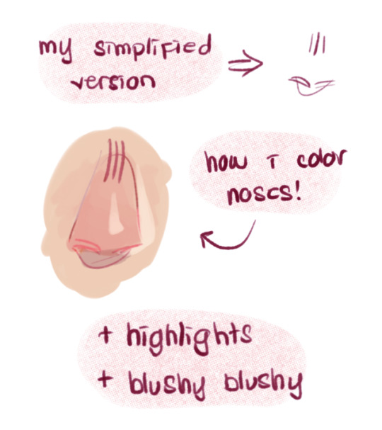
Photo
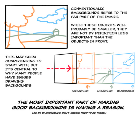
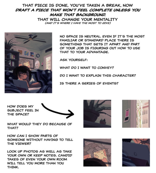
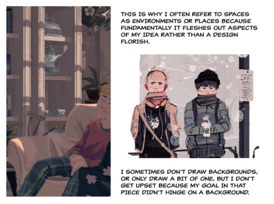
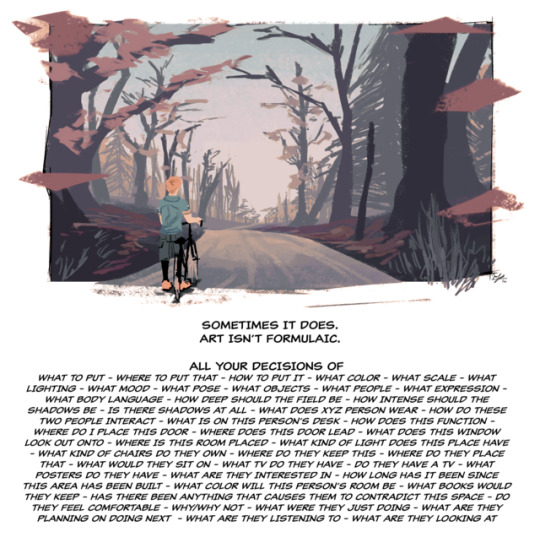
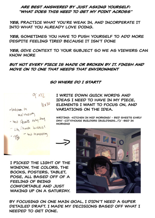

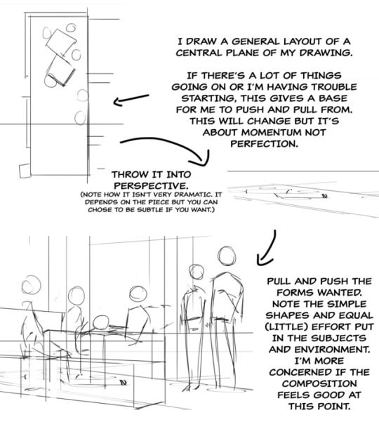
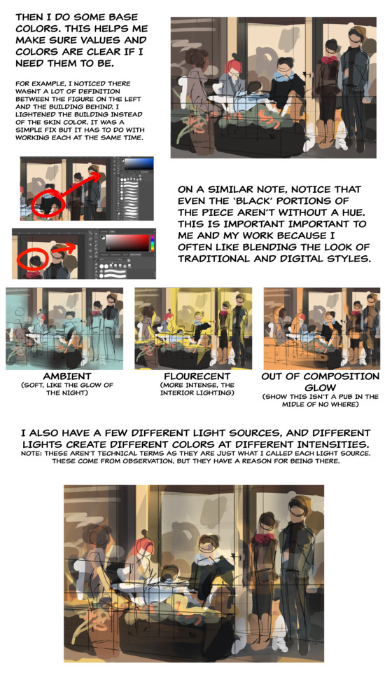
friday night tutorial time
this post is massive but i tried to cover both the conceptual and technical side, hopefully it’s somewhat coherent
continued under cut
Keep reading
50K notes
·
View notes
Text
The lip sync tutorial they DON’T give you
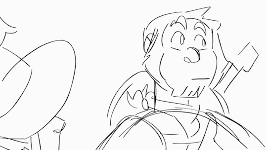
I mentioned on twitter that I wanted to do a lip sync tutorial and immediately got some people who were interested so I put one together real quick!
I’m going to use a bit of unfinished lip sync from my taz animated part as reference. They’re just gifs so no sound, but you should still be able to tell that he’s saying “I’d say a solid B… Solid B minus.”
Anyone who’s looked up how to do lip sync has seen phoneme charts. Phonemes are just the shape your mouth makes when you make certain sounds.
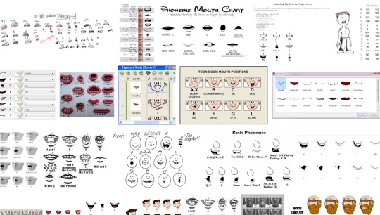
When you do lip sync, you want some kind of reference to make sure it’s right
What’s easiest is to say it yourself and pay attention to the shapes your mouth is making. Since you’re going frame by frame, your audio is slow enough that you can make each shape slowly and distinctly and you can get each individual phoneme down in the animation.

Don’t do this.^
An easy way to tell if you’re animating lip sync wrong is if you run out of frames to make each shape. You don’t need them! Making each shape is unnatural. People talk quickly and the mouth doesn’t have the time to get into each shape. They blend together, sometimes to the point where the shape doesn’t change at all!
Not only does the 2nd gif take less frames and energy to make, it’s more relaxed, it looks less distracting, and his lips are much easier to read!
These are reference charts to show the differences more clearly
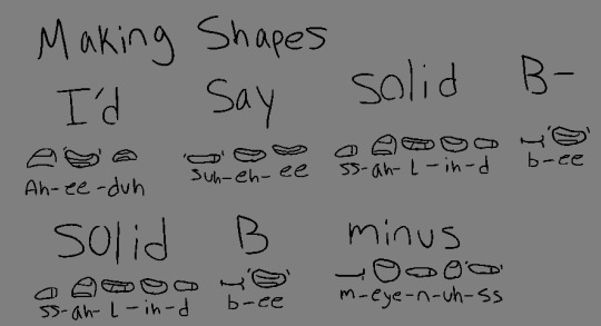
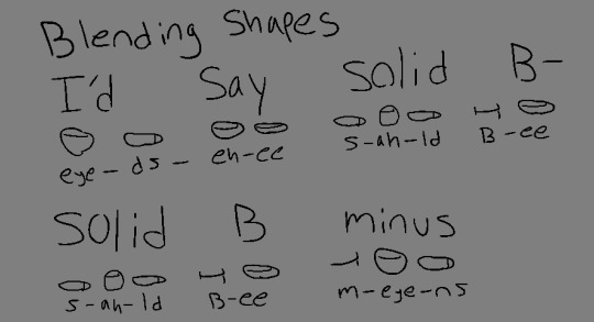
This is the difference between getting swallowed up in every last detail and paying attention to reality.
What matters more than hitting every syllable is making it look natural and flow with the acting. That’s why anime mouth flaps can work so well. A strong pose through the whole body matters more than one mouth shape.
42K notes
·
View notes
Note
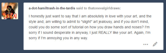
Oh almighty napkin arm with googly eyes, I humble peregrin dare come forth with a request... could you make some character design breakdowns for some more realistic characters? Like your power ranger fanart? I tried to break them down on my own, but I'm not sure I did it that well... it's incredibly useful and interesting... Keep being awesome, and thanks for how you already helped me anyway!
Thanks for the patience, had to mull this one over. The more complex a design gets, the more difficult it is to break down. Basic character design tips may not be enough…so let’s delve into:
Character Design Tips Part 2!
Before we start, it’ll help to read my last character design post, where I laid out four concepts: shapes, silhouettes, colors, and inspiration. In this post, I aim to build on and rephrase these in a way that hopefully makes it easier to apply them. I’ll be drawing examples from my Power Rangers (2017) fanart to illustrate my points.
(Disclaimers:)
(Ideally, you should already be comfortable with drawing people. If not, look into figure drawing, gesture drawing, etc.)
(Whereas my previous tips were more tried and true, the tips here are more my own thoughts, so they may be half-formed.)
(Again, these are not rules. They’re just tips to add to your toolbox; the more tools you have, the more versatile you’ll become.)
Without further ado, let’s start!
Based off what we know about shapes, silhouettes, colors and inspiration, I want to cover: lines and angles, external and internal silhouettes, values, and references.
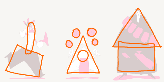
1. Shapes => Lines and Angles
Last time, I laid out three basic shapes:round, box, and triangle.
Problem: limiting yourself to these 3 shapes can be useful and fun for simpler designs, but they may be too simple or look out of place on more complex designs.
Solution: let’s go to the next level! Instead of shapes, shift your thinking to lines and angles!
Lines can be curved, straight, or diagonal.Angles can range from obtuse to acute angles.Follow your intuition: what feeling do you get from each line or angle?If I follow my own intuition, I see that:
curved lines = natural, soft
straight lines = balanced, grounded
diagonal lines = off-balance, in motion
obtuse angles = broad, relaxed
right angles = rigid, unnatural
acute angles = slim, dynamic
If this sounds familiar, you’re right! It’s just the shapes all over again:
curved lines make round shapes
straight lines with obtuse/right angles make boxy shapes
diagonal lines with acute angles make triangular shapes
But lo! Since we broke the shapes into their smaller components, it’s much more flexible! Now we can use lines and angles for more complex designs:

2. Silhouette => External and Internal Silhouettes
Last time, I explained the silhouette test: if you black out the figure, it should still be readable.
Problem: blacking out the figure only tests the outline of the design, i.e. the external silhouette. But what about the inside of the design?
Solution: block in the figure and test for the internal silhouette!
If you want not just an interesting outline, but an interesting costume, block in the major components of your design to see if it has a readable internal silhouette. This test can help you avoid boring or cluttered costumes and makes your design stand out. If your internal silhouette is too empty, try adding props or designs. If it’s too busy, simplify it.

3. Colors => Values
Last time, I talked about the 60-30-10 and 70-30 rules for color.
Problem: those rules work on the assumption that you’re only using 2 to 3 colors. But what if I want to use more colors?
Solution: good news! The same idea applies if you split your palette into 3 major values: shadows, midtones, and highlights.
Balance your palette by converting your colors to grayscale and applying the 60-30-10 rule to the values. This is related to the idea of silhouettes; if you get a nice internal silhouette, you’ll probably end up with a nicely balanced set of palette values, and vice versa.

(Fun fact! You can split your palette in different ways. In a watercolor tutorial, Miyazaki splits the palette into bright, dark, black, green 1, green 2, blue 1, and blue 2.)
4. Inspiration => References
“Good artists copy, great artists steal!” -Picasso
Problem: Coming up with something 100% original is tedious and doesn’t always give great results. It saps the inspiration right out of you!
Solution: It’s a lot easier to steal ideas from references!
Note: don’t just copy, steal! Cherry-pick/massage the aspects of the reference you find the most appealing and work them into your design. Ditch anything that you don’t care about. Make it your own! Make it something you can put your own name on! Below is the reference image I used for my designs:

And below is my fanart:


That’s it for now! Thanks for reading! If you guys want to see any other topics, feel free to ask and I can try my hand at it.
If you want to see my previous character design tips, click here.If you want to see the full-size Power Rangers fanart lineup, click here.If you want to see other character designs I’ve done, click here.
9K notes
·
View notes
Text
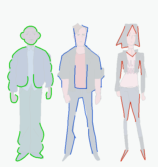
Character Design Tips
Some people have asked how I went about drawing the Overwatch cast, so I threw together a list of things I think about when designing characters: shapes, silhouettes, colors, and inspiration.
1. Shapes
There are three basic shapes in my toolbox: round, box, and triangle. If I follow my intuition, each shape conveys a personality. For example:
Round = charismatic, harmless, endearing
Box = reliable, uniform, traditional
Triangle = cunning, dynamic, competent (downward pointing more aggressive)

Shapes can also be combined for more complex characters
2. Silhouettes
Block in the character. If I can still recognize who it is, then it has a strong, readable silhouette.
3. Color
Sometimes less is more. Limit the palette for unity and impact. When working with three colors, keep the 60-30-10 rule in mind. Pick one color to make up about 60% of the character, a second color to make up about 30%, and the last color is about 10%.
When working with just two colors, use the 70-30 rule. One color is about 70%, the second is about 30%.

4. Inspiration
Designs come to mind easier when I’m listening to music, or when I have a mental image of something in mind. For example, I was listening to Klezmer music when drawing Reaper, and I was thinking of a chicken when I was drawing Lucio. It can take a while to warm up, so a good source of inspiration is important to stay motivated.
Beyond that, it’s up to you!
[If you want to see the specific artists I drew influence from, click here to see my influence map.]
19K notes
·
View notes
Video
youtube
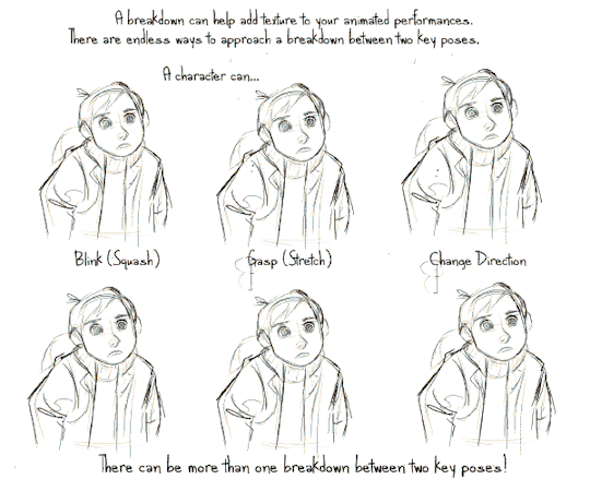
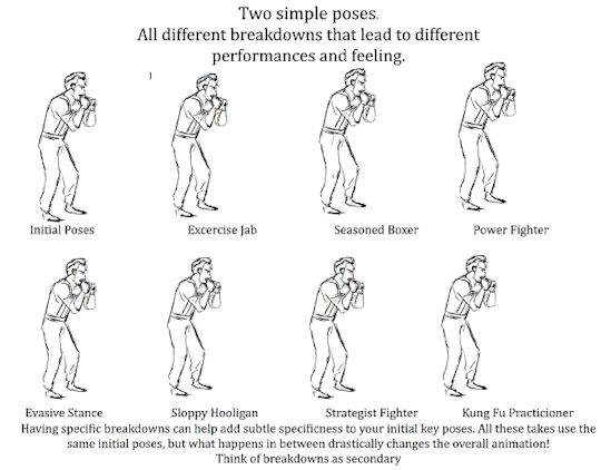
Today’s episode on the Powow Workshop (Formerly Stringbing Workshop), I introduce the animation breakdown, what it is, and how it can be used.
Please check out my patreon page and give it a support: https://www.patreon.com/StringBing
Gumroad (Buy exclusive tutorial material): https://gumroad.com/stringbing
Music: Boom de Boom - Aaron Lieberman FunkDown - MK2 Happy Mandolin - Media Right Productions

39K notes
·
View notes
Photo
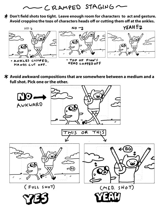
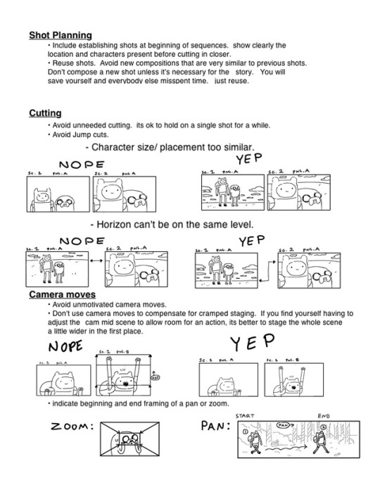
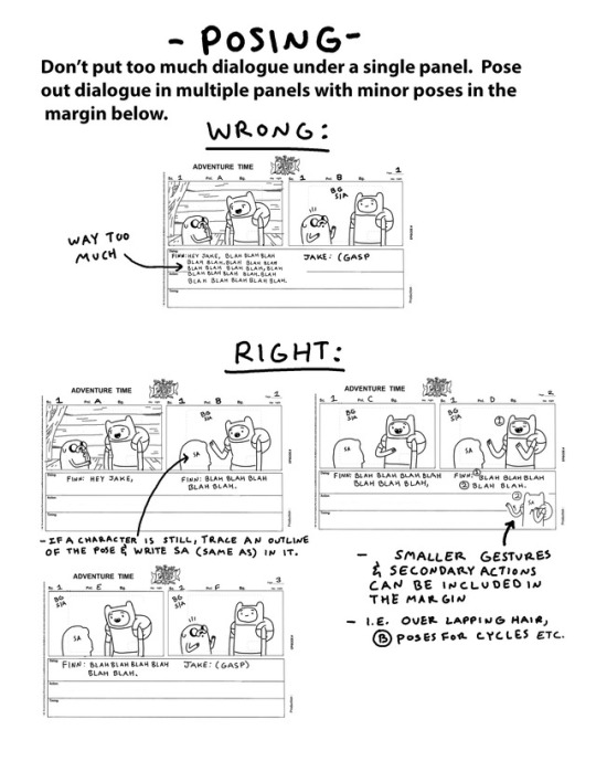

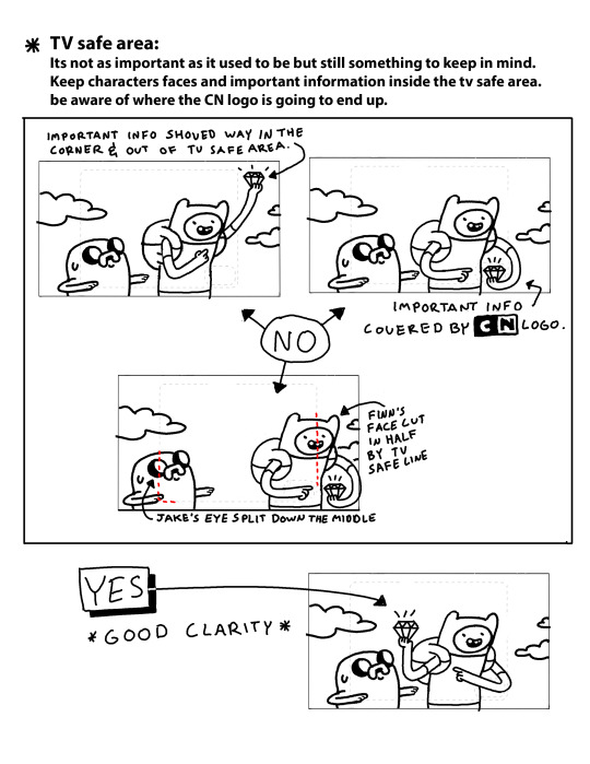

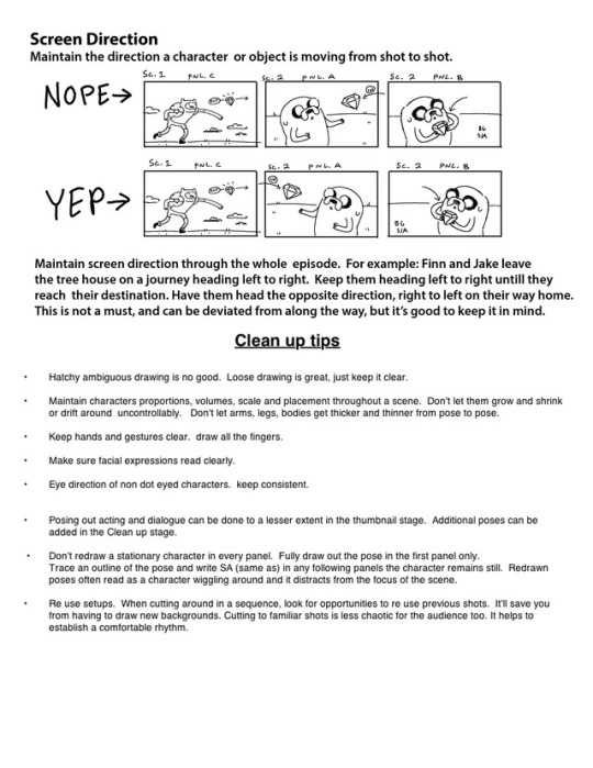
by storyboard supervisor Erik Fountain
A few years ago, Erik put together these updated AT storyboard guidelines for new board artists and revisionists.
134K notes
·
View notes
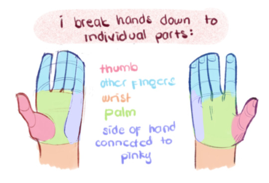
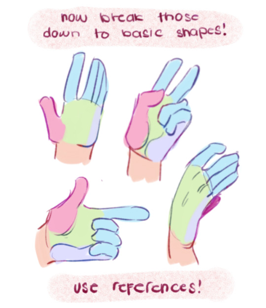
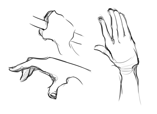
Photo


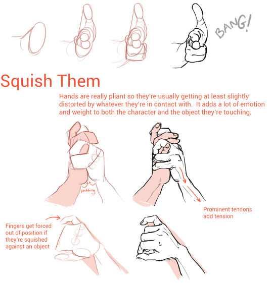
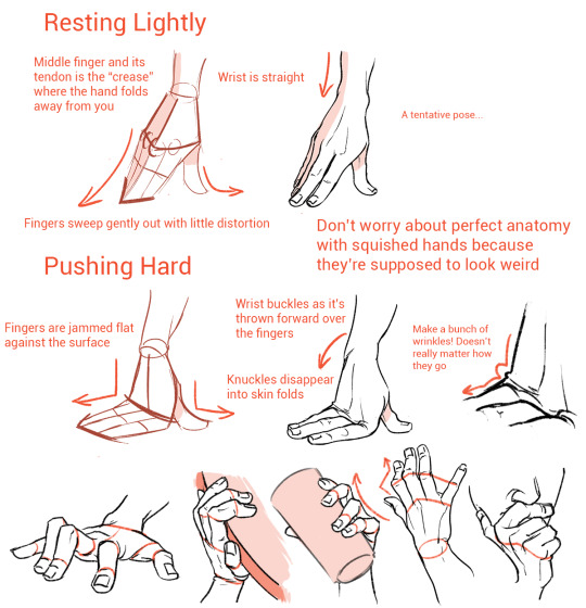
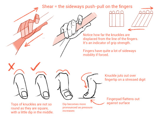
I’m not an expert but I like hands a lot so hopefully some of this was helpful!
224K notes
·
View notes
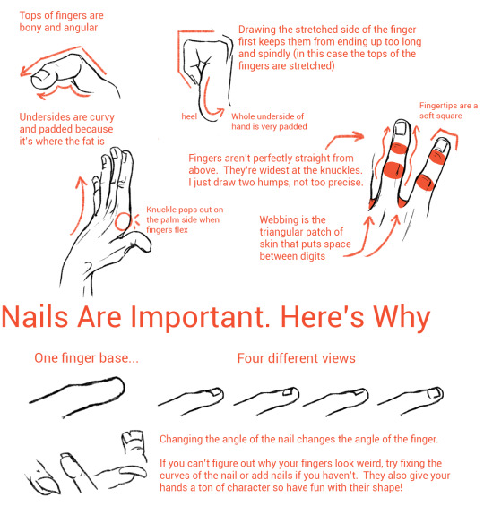
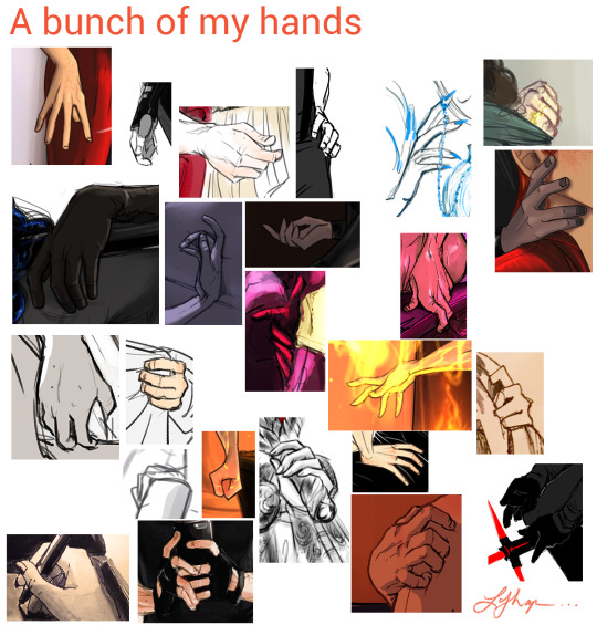
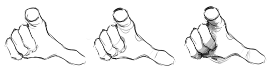
Photo

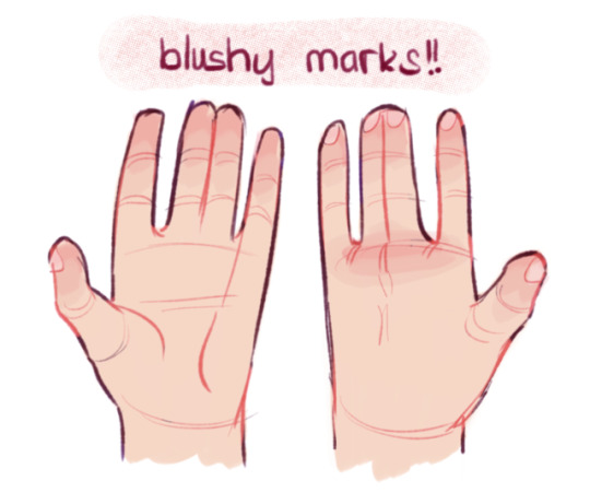
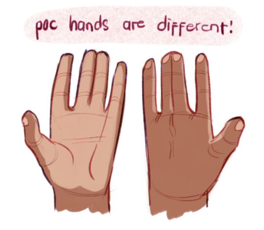


@a-dot-hamiltrash-in-the-tardis here u go!! i hope this helps aaaa ;;
the last time i did this was pretty long ago now and i’ve learned a lot, so i also did this to update on that :’))
(also btw!! an extra note on hands: diversify it! other people have longer hands, other people have fatter, more sausage-y hands,, add lil traits that make it unique too, like scars or calluses, etc etc)
2K notes
·
View notes
Note
Hey, i'm an animation student too! I've actually been doing more storyboard/animatics now and i adore how you have your storyboards set up. Whats your basic idea when you're setting them up? Especially the shading. Its fantastic!
Hi thanks for the ask!
For my storyboards I tend to work in a 2.35:1 aspect ratio if that was your question? The shading is just gradients and four or so gray scale colors under the line work layers that I do as I’m going. I find its helpful to put a “palette” of grayscale in the top of your file so you don’t have to spend all your time color picking like so

Hope that helps!
-SV
287 notes
·
View notes
Text
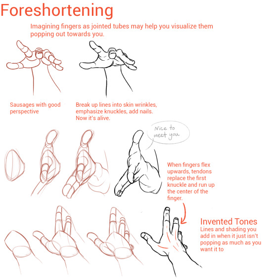
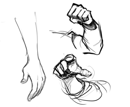
Hands
As I do with most things, I draw hands from a series of gesture strokes that insinuate the pose and shape I want. Something I personally find very appealing about hands are all the joints, bends, and crooked bits so I start with those and build the rounder, meaty bits from there.
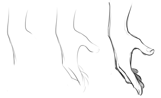
In the first two steps here if you just look at the individual strokes I’ve drawn, you can see they’re just some curves, really, that sketch out the shape of the hand, and I’m focusing on the joints and knuckles. (The fingertips in the second one are actually rly unnecessary and ugly to me haha – that’s usually the kind of thing I’d just throw down in step 3.)
And again below, just starting w/ some curves and squigglies to show the joints and knuckles:
These hands are by no means realistic or fully proportional but drawing’s supposed to be fun and these are really fun! I’m like, really not about that whole “draw a box and then the little tubes and those are the fingers” thing. It’s too technical and so much life gets lost when you sketch that way. Maybe it’s helpful for a pose you’re uncertain about but then just look at a photo or your own hand to see how things work, y’know?
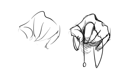
Something else I’m really about is using shading and line to emphasize the bends and stuff even after I’ve got the hand down:
The first image here you can tell the fingers are bent, but they also look lumpy imo. To stylize further, I add some thin lines for the joints and fingernails, and then shade for some extra depth + to pronounce the foreshortening etc. (Fingers are so ugly from this angle! But we gotta draw them like this sometimes…)
Some examples where these extra lines assist in conveying the shape:
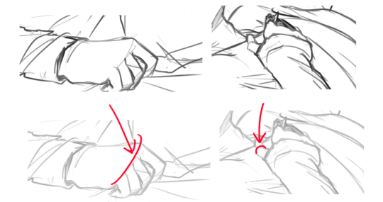
And shading:
(Bottom right is the same pose as a previous example which I didn’t realize till now sorry haha)
Some general tips:
- Use asymmetry!!! When the joints don’t line up exactly right, or you’ve drawn two hands doing the same thing but idk one’s curled a little bit more or the right pinky sticks out but the left doesn’t – these little touches make the drawing more dynamic, even if the general pose/concept is flat.
- Thumbs are really cool? They’re like trapezoidal. The same tapering thing kinda happens where the hand meets the wrist. A hand is like a big thumb
- Two things that a lot of beginner artists get wrong: which side the thumb is on (…always double-check…I still double-check sometimes too), and drawing the fingers straight instead of slightly bent when trying to draw a relaxed hand. Relaxed fingers curl! And this is much easier to draw imo than perfectly tense fingers
- Study your own hands and think about their shape. Part of developing a style + comfort with drawing a particular thing is how you choose to simplify the form thru line. I explained above that I focus on the joints and knuckles and seek to simplify those with curves and squiggles but maybe you’re more interested in a different aspect. (Like, you can see I don’t draw palms v much…that’s cuz I like knuckles haha)
Hope this is helpful/feel free to ask followup questions!
8K notes
·
View notes
Text
Just a thought.
I always see posts on tumblr offering beautiful commission work for a flat rate per picture and it’s often like $30 or $45 for a whole drawing and I wonder like do they aim to get it done in 2-3 hours’ time? Because of the detail of the art, it would often seem to me that it would take much more time…
I know that if you’re a kid and you’re just doing things as a hobby that any money for any amount of work sounds lovely, but also consider how that undercuts actual freelancers, and your future!
Also as a buyer, especially If you support the $15/hour minimum wage movement, please think about how much you’re paying someone by the hour to make for and deliver something to you. Consider proactively asking them how long they estimate it will take them, and if you have the means, adjusting how much you pay them to make sure they’re receiving a reasonable wage!
145 notes
·
View notes
Photo

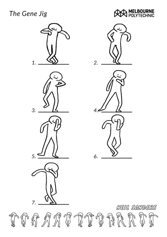
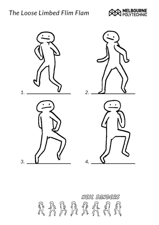


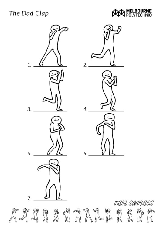

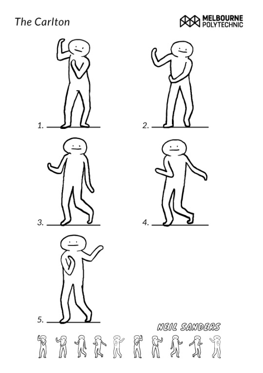
I’m running an Introductory Animation Workshop with creative arts students this Saturday (August 20, 2016) for The School of Creative Arts Open Day at Melbourne Polytechnic’s Prahran Campus. I’ve rotoscoped and broken down some of the greatest dance gifs to their basic poses and we’re going to collaboratively design characters then MAKE THEM DANCE!!
Come down, check out the campus and say HI!
I can’t wait to see the weird animated goofs that result from this workshop, I’ll post them in a couple of days so we can all be in awe of their hilarious spontaneity!
58K notes
·
View notes
Photo


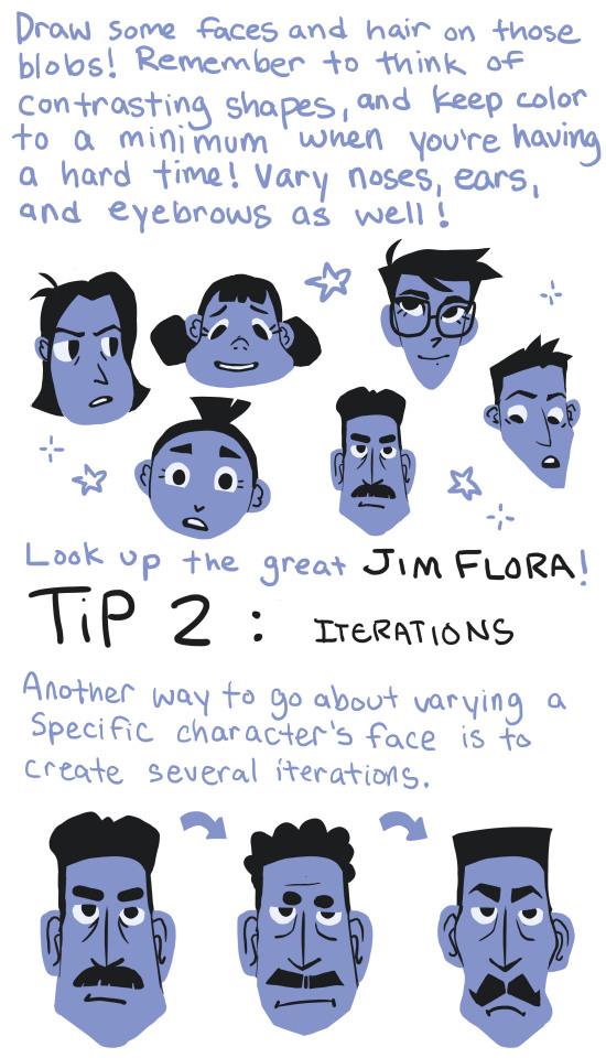

This is something I need to work on as well, so it was good practice for me! I hope this helps some of you that also struggle with same-face-syndrome!
TLDR: Just look at Jim Flora’s artwork and study from that ;)
43K notes
·
View notes
Text
ANIMATION INDUSTRY MAIN SOFTWARE

Someone asked what is the industry mainstream regarding software, this is our mental map, to arrive to OZ, follow the yellow sidewalk! :)
Please take this with a grain of salt. This is just valid for 2015, and this is a set of recommended choices if you want a pro life, not if you are an occasional artist.
I made the post because we both faced a choice once, and we chose Max instead of Maya.. Director instead of Flash.. UGH.
39K notes
·
View notes
Text
Thursday’s tips. How long it takes to learn animation industry software
.
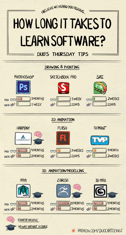
Most artists will face the choice of software more than once in their lives, and that is the reason we made a guide of the most used programs in the animation industry a while ago.
http://duocartoonist.tumblr.com/post/130356034210/animation-industry-main-software
But maybe need is pressing you to get something done “NOW” and you need to learn a new skill, like.. PRONTO!! which tool to use then? can you estimate the time of completing such feat?
We personally consulted an animation college teacher and he agreed that an average person can learn the basics of any given software in 4 hours of fiddling with it intensely. Yet we believe that dealing with a beast that takes 10 months to master is not the same than one that takes only 3 days.
Here is a guide that we put together so you will know what you are getting into. next week: How to choose your first Cintiq
6K notes
·
View notes
Photo


Hi, everyone!! I’ve had a studyblr for about a week now and have already met so many kind, supportive people. I couldn’t be more thankful. That said, I really wanted to give back to such an amazing community! So here’s my first printable for you!
It includes:
a 5AM-10PM schedule (for my early hustlers)
‘Top 3 Priorities’ + ‘Can Wait’ categories
a ‘To-Do’ list
Daily Goals, Notes, Doodles
a water tracker (stay hydrated, friends!)
10 Good Things (reflect back on your day and jot down the little things that made you happy even if your day wasn’t the greatest)
They’re available for download in PDF and PNG formats + in pink, blue, yellow, and white! I’ve also made a grid and grid-less version!
Grid
Blue: pdf / png Pink: pdf / png White: pdf / png Yellow: pdf / png
No Grid
Blue: pdf / png Pink: pdf / png White: pdf / png Yellow: pdf / png
And here’s a link to the entire folder on my DropBox!
Please tag me with #arystudies or mention me if you use these!! I’d love to see them in action. :’) I’m also really curious to see what you all think of them, so please let me know!!
Happy studying!
20K notes
·
View notes
Note
Do you have any advice or tips for solo animators (students, hobbyists, freelancers, etc.)? Especially when it comes to workflow and how to get things done in a timely manner when you don't have a whole team to help you animate?
Hey there! Sorry I haven’t been able to get this sooner - I’ve been very occupied in my work lately.
I totally understand where you’re coming from though. Its hard to get a lot of work done in a timely manner by yourself when you’re pretty much your own boss. I suffer from this still, and from my experience - I do have thoughts to share. I’m going to talk about both freelance work, and doing personal work.So here are my top advices on being professionally independent!


1. Set yourself a deadline, use special events as reference Set a day on when you want/need to finish a certain project. A lot of my friends use events, conventions, and exhibitions as deadline placeholders for their own work. My former mentor and teacher uses things like CTNx to showcase a 2D project he’s been working on so that he can garner thoughts, reviews, and get people interested to help fund future projects. Trust me, when its set on a special day, there’s more reason to finish the work you set yourself to.

2. Organize yourself workbook with a calender, a check list and notes Now that I think about it, I would not have been able to complete my previous shorts without setting myself a calender. You can make yourself a physical book (or an online excel) with a calender, and a checklist of things needed to finish during that day/week/month. Start crossing out the days that go by, and see if you are able to manage your goals. If you don’t make the quota, then its probably time to start thinking of ways to limit the work put into the next shots. That leads to my next point.

3. Understand your limitations, prioritize important parts In a lot of my animated work, there are shots that have high production value, and some that looked like it was clearly rushed. If your client gives you a sequence to animate, start thinking about shots that scream high quality, and then place the shots that don’t seem too important later on the list. For example, you might want to give yourself more time for a shot you feel will be highly difficult, and then less time for shots that can easily be done by you. If you’re still unsure about how to organize this, talk to your client and ask what parts of the animation do they want to have the best quality, so you can start thinking about prioritizing certain shots.

4. Do a pipeline test. Record notes and assess future problems and difficulties.
Depending on what your client asks for, you still need to do a pipeline test to see all the necessary steps you’ll be tackling in the future. Some clients will ask you to do from roughts to the final colors, or some will ask for rough animation only. The reason why pipeline tests exist is to see what future problems you’ll encounter. You should also record how long each step takes; how long it takes you to do certain footage of animation, so when you do plan your quota for the following days - you have a better idea in how to set it up.

5. Constantly check in with your client
If you’re lucky, you might get a client who is very hands on and is constantly checking up on you. This is good because its a good motivator to actually get work done! You’ll have more things work in progresses to show, and they can give feedback. It gives them a clear idea of the overall progress, so they have a better understanding on how long the work usually takes. You guys could also form some suggestions for future obstacles in the work.
6. Gather peers you trust and set up a frequent meet-up to show and share work

This mostly helps if you are doing your own personal work, but when its a project that is entirely under your control: its easy just to chill out and relax (I am highly guilty of this.) Some people can work on their own projects - and not show it to the world; whereas I constantly need to show work to my peers to keep me motivated. I’m the type of person who needs to get feedback and encouragement on continuing a project, so I’ve been showing people I really trust some things I’ve been doing on the side. This also helps keep you working on the project time to time.

7. If all still fails, hire yourself a production manager/personal producer/agent
The top advice I get when thinking about running a production is to hire a production assistant/personal producer/agent. A production assistant should be able to understand the overall process of the animation workflow, and should help you set up a schedule for it. They’ll also be able to organize meetings between your client and/or a team if you do decide to hire that extra work force - because hey; artists dealing with things like organizing conferences, time tables and budget handling is just too much. This can be highly time efficient for you, since you can just focus on the production side of things, while someone else handles the more “business” side of things.
4K notes
·
View notes