
Statistics
We looked inside some of the posts by savofficial and here's what we found interesting.
Average Info
Notes Per Post
1
Likes Per Post
1
Reblog Per Post
0
Reply Per Post
0
Time Between Posts
15 days
Number of Posts By Type
Text
6
Last Seen Tumblr Blogs


Fun Fact
Hackers stole 65M passwords from Tumblr in 2013.
Text
Module 6
Identifying graphic design in daily life.
1. Data Visualization
Apologies for the water stains.


Recently I was travelling to Miami to celebrate my 21st birthday! Along the journey I had a layover in the Atlanta airport which had many opportunities to purchase kitschy or excessive items. This isn’t uncommon for many airports throughout the world but, this business stood out in particular to me. There was a sales attendent passing out free CBD samples and informational pamphlets as seen above.
The tactic of drawing in travelers with promises of free items is very effective and casts a wider net to a new potential market. However, after receiving various samples there was little to no explanation about the effects that could be experienced from taking the available products. Sure I was told it’d be a calming sensation but, what would that entail? How much should a person take? How long does it take to be effective? How exactly does it work? Questions like these are typical to an uninformed consumer and is glossed over by both the saleswoman and informational pamphlet.
Instead vague wording like “empower modern wellness” is used as catchall that promotes healthiness. Although the claims in their pamphlets are not outright “lies” the emphasis on selling, franchising, sampling, and consuming leads me to believe that their agenda is not solely to promote wellness but rather to sell in any way possible. Although their experts in store are likely more knowledgeable on their products and outcomes this could be communicated in a better way in their print promotion.
2. Larger Identity System

Target brands are interesting and completely different than other grocery store brand names. For example, where Walmart has Great Value and Whole Foods uses 365, Target uses three unique brands found exclusively in their stores Up&Up, Wild Fable, and Favorite Day.
As mentioned in the D2L module Up&Up offers alternatives to typical daily used products like toilet paper, medicine, cleaning supplies, and more. This is no different than any other grocery store and is pretty typical. Wild Fable specifically creates trendy decently priced clothing that can only be found at Target. Lastly, the identity system I am focusing on in this post is, Favorite Day which specifically offers food item alternatives.
Considering the type of store Target is produce is not a staple for a majority of shoppers. Unlike other grocery stores Target has faced controversy in the past regarding their fresh food products. Therefore, the success of Favorite Day is remarkable as they created a brand particularly focused on fun food items and activities in four main areas (1) baked goods, (2) candy, (3) snacks, and (4) ice cream/frozen desserts.
These items are packaged in fun, cute, and colorful material with their signature logo in a cursive loopy font. Compared to other goods surrounding Favorite Day items on shelves they stand out for being more interesting or unique. For example, when buying something simple like a loaf of bread as a consumer you could pick up the typical white bread loaf or a fancy looking baguette for a similar price. Or in another instance, you could grab a regular can of whipped cream or a unique more sweeter can of marshmallow whipped cream for a similar price point. After visiting Target enough customers should begin noticing the signature look and tastes Favorite Day uses with its consistent logo usage, funky packaging, whimsical appearance, and association with slightly better quality for decent prices.
0 notes
Text
GD Module 5
1 & 2) Find a design and describe its denotative and connotative meaning.

The following picture is of a sparkly lotion made by Bath and Body Works. In the light when the lotion is applied it slightly bronzes the skin and leaves a sun kissed glow. From the name of the product alone, “Honolulu Sun”, and the use of flowers and palm leaves one could denote that the product is synonymous with Hawaii. Additionally, the outside of the bottle itself is colored in a rose gold metallic coating that mimics the bronzed look some will achieve with the product. Outside of the apparent appearance and denotative meaning for this product one could connotate that mentions of Honolulu, Hawaii evokes a summer feeling or island life feel. The product is meant to be shown off so it would make sense for the user to wear less clothing (i.e., shorts over pants) making it ideal for warmer weather use. Also, the glow that the wearer receives mimics a tanned appearance which is most common in warmer climates or seasons.
3) Find a design and describe its iconic function.

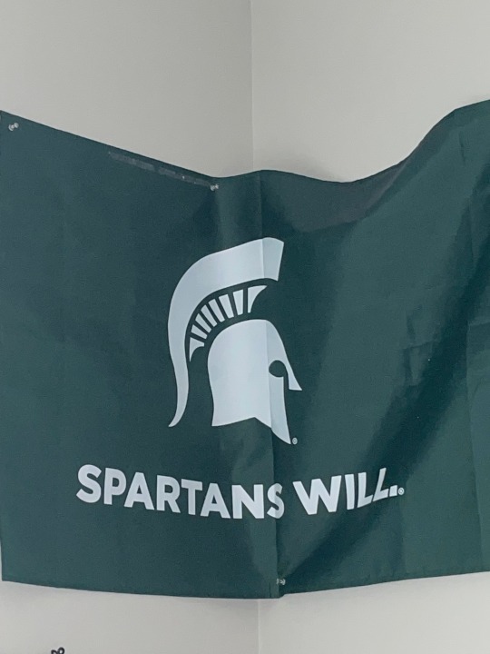
To the average viewer the statue in this poster may not mean much but, to Spartans everywhere we know its cultural significance. This is a photo of the famous Spartan statue on Michigan State University’s campus. It depicts an older more formal version of our school’s mascot, Sparty. Although he has been through multiple design changes throughout his history, many can identify his most popular looks including gruff Sparty, modern Sparty, and his other forms like this statue. Although this example is only iconic for MSU alum, student, staff, or fans, Sparty’s significance is still great making his design iconic.
4) Find a design and describe its indexical function.

The following picture is from my brother’s graduation in Kalamazoo from Western Michigan University. In the image you can see the commencement host handing the degree to my brother in an action shot. Like the example from lecture with the car causing a person’s hair to move, this photo captures the moment my brother officially received his degree. As a result of him completing courses successfully, the university handed him his diploma which illustrates their causal relationship. Without passing his classes and completing the necessary requirements, there would be no cause for an exchange of a diploma nor an invitation to the very event resulting in no picture. Therefore, I believe the following illustrates an indexical design.
5) Find a design and describe its symbolic function.

Popcorn and movies go hand in hand. Theatres internationally recognize the pairing of the two making it a “classic” as the packaging describes. Although there is no particular affinity or reason for popcorn in particular gaining popularity among movie-goers as a go-to snack, it has always been a big part of the viewing experience. Therefore popcorn has become an iconic symbol associated with film, theaters, and movies.
6) Find a design that references a past “style” and say what the design is trying to signify by its reference to that style.

The following design is from Burt’s Bees line of dog shampoo. In the design the illustrations featured uses old-school geometric line art giving the product a retro feel. Pair this artwork with the captioning underneath the founder’s image and its clear that the designers are trying to establish a long-standing trustworthy reputation. By showing how committed even the founder is to consumer’s and their dogs people may build a sense of trust in the brand from the presentation of the product alone.
0 notes
Text
GD Module 4
Identifying graphic design in the world around me.
1. Example of rhythm in a publication design
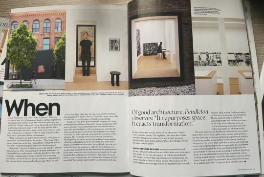
Bauhaus design was a popular style in the early 1900s that was considered avant-garde. By using unique placement and typefaces with typography rhythm is introduced in the design. This is evident in the following publication from an architecture magazine.
2. Example of typographic hierarchy to establish the order of importance on a page
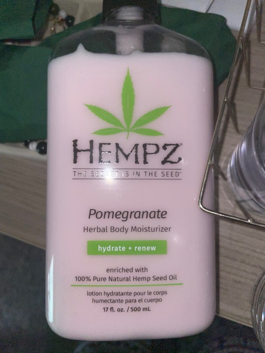
On this bottle the brand is placed most prominently into the viewer’s sight with a large appearance and unique font. Directly underneath is the company’s mission showing the connection between the two elements. Then followed below are more hierarchies in varying colors and faces (italicized or standard). Each of these elements help to enforce the idea that the text purposefully guides the viewers eyes into certain parts of the product.
3. A letter with an ascender
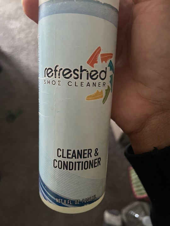
Ascenders are defined as font that reaches above the average comparative height. In the above example the word “refreshed” has three prominent ascenders including the “f”, “h”, and “d” who’s tails reach above the “r, “e”, and “s”.
4. A letter with a descender
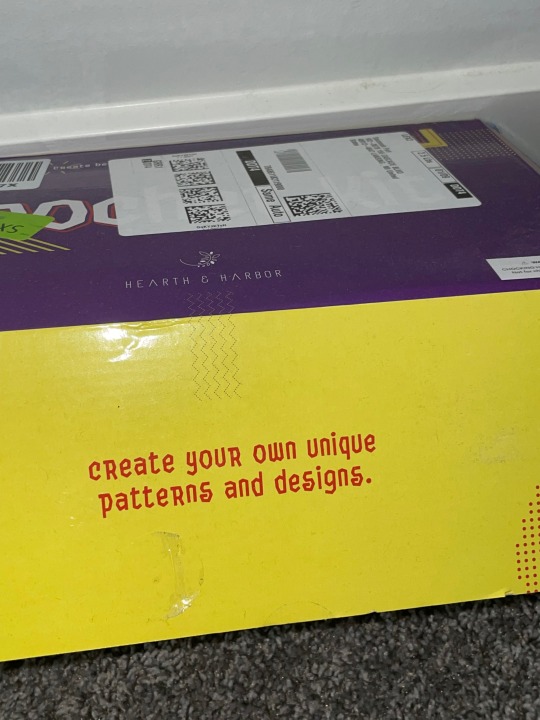
Descenders are defined as font that reaches below the average comparative height. In this example the saying on the above crochet box has multiple descenders including “y”, ”q”, ”p”, and ”g”. Their structure causes the hooked vertical pieces of the text stand out as descenders.
5. A letter with a counter
Counters are the negative spaces in between different text. Above you can see that the “A”, “O”, and “R” all have negative space. This is hard to explain in words but I put a transparent red highlight for example purposes.
6. A letter with a crossbar
Crossbars are horizontal lines through the middle of text. This can be seen in a capital “A” or lower case “t”. In the above example I used the latter as you can see in the words “Little” there are two lower case “t”s.
7. A font that has a large x-height (short ascenders)
Compared with the example in number three this design has small ascenders. The “l”, “t”, & “g” all have higher horizontal reach compared to the other letters but don’t tower over the other letters. In comparison those ascenders are much smaller and shorter than other examples.
8. A font with a small x-height (large ascenders)
Compared with the other letters the “q” and “p” stick out most because of their long vertical reach. When viewing the other letters the difference in height is prominent and has become apart of the brands image and identity.
9. A piece of design that appears to be “Modernist”
Modernist typography adapts the beliefs of Warde and other minimalist designers. Create something unique and captivating but don’t distract from the content its meant to portray. I think this is excellently done with this piece of Spartan swag. The font used is serious and simple but is used in a unique way with capitalization, bolded typeface, and use of a period. Not only is the typography great the message is powerful for viewers too.
10. An example of a font being used that is trying to connote something more than just the text typed in that font
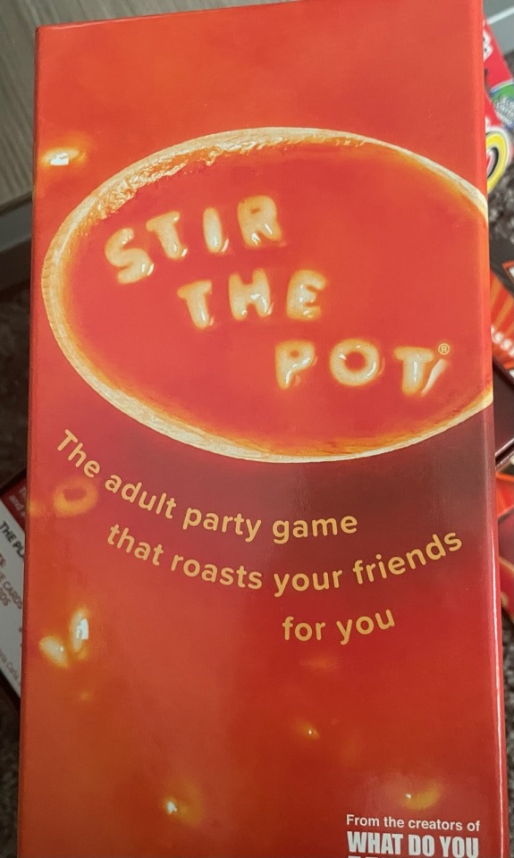
The game below called Stir the Pot prompts players to gossip about one another. In other words it helps stir the pot among friends and livens up a social gathering through drama. As the popular phrase “stirring the pot” creates drama the designers took the meaning literally by using alphabet soup as a clever way to display the name of the game.
0 notes
Text
GD 260
Identifying graphic design in daily life.
Complementary colors: Potter Park Zoo rhino magnet

Complementary colors are defined as colors opposite from one another on the color wheel. In this design orange is used as the background with a blue rhino in the middle which are complementary of one another.
Analogous colors: Boba box

Analogous colors, on the other hand, are defined as colors next to one another on the color wheel. Although the main brown color of the drink is prominent in this design, the text and detail elements are analogous to one another. The text used for the titles, subtitles, and instructions are in yellow and red analogous colors.
Cool colors: Deodorant stick

Cool colors are known to be calming and cooling. When considering color psychology companies use deep blues and purples to convey relaxation and luxury. I found an example of color color usage in this deodorant's design with whites, blues, and purples.
Warm colors: Potter Park Zoo tiger magnet

Warm colors reflect energy and happiness. I saw an example of this in real life on this magnet by using orange, yellow, and red shades from the background and tiger’s coloring.
Contrasting colors: Cascade

(I apologize for the poor quality of this photo here is a professional picture of the same packaging.)
When selling products it’s important to draw would be customers’ attention and color is a great way to do so. The design is overall cool with dark shades of green, blue, and purple used in the packaging. However the title of the product “Cascade” stands out most in red. This bold contrast makes it stand out most from the otherwise cool colored palette.
Gestalt Principles of Grouping (continuity): Birthday cake

For my roommate's birthday she bought a Taylor Swift inspired cake. If you look closely on both tiers of the cake, the hand written frosting has lyrics to a popular song. The eye naturally follows the text around the circumference of the cake! Gestalt Principle of Continuity is known to draw the eye in certain directions which this frosting does!
Active figure-ground relationship: Potter Park Zoo map

Active figure-ground relationships are created when the eye perceives negative space as a new design layer. In this example, if you look in the top left of the map, you can see a cartoon bubble showcasing “the Ice Safari”. The bubble is white blending into the background of the rest of the sign while cutting into the map to trick the eye into perceiving the bubble.
Historical looking: Obama family portrait

Designs that are historic often follow a similar pattern. They are presented formally, stray away from overediting, and highlight important people or things. Here we can see a family portrait on a magnet. The use of the U.S. flag in the background, formal attire, and famous people make this design appear historic.
0 notes
Text
GD 260
Identifying contrast in graphic design in everyday life. Below you can find a collection of photos from my life.
Image 1: Granola

At first glance, this packaging seems mundane but, after searching for contrasting design elements I noticed intentionally contrasting design choices throughout. One of the most noticeable to my eye is the variety of different font types and sizes. For example, the word "Protein" is bolded in a sans serif font printed with a white patchy/textured appearance. This draws customers' attention to that label most compared to the other smaller less emphasized words on the packaging like the nutritional information in the bottom left corner.
Image 2: Pillow

Dry brushing is a popular technique used in painting to create interesting textures. This technique can be imitated outside of the canvas and in other designs which I noticed on one of my pillows in my bedroom. There are "imperfections" in the design on the pillow because of the scattered random lines and dots. However, these elements all combine together to make something pleasing to the eye to view. Dry brushing pushes the boundaries of rhythm and balance to create an interesting contrast.
Image 3: Plinko
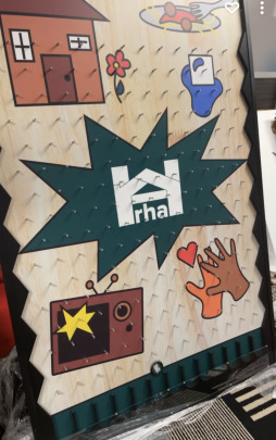
Another example of how much scale can change a design can be seen below. At tabling events for my job we have a plinko prize board. Our graphic designer created the artwork along the backing of the board and it has many contrasting elements. Other than the contrasting colors in multiple elements players can see images all with different sizes, rhythm, and shapes (i.e., square TV + house VS rounded plate + hands). Each work together to draw passerbys attention and entice would-be-players eye to stop by our table!
Image 4: Wolves

My roommate bought this shirt from FiveBelow and something about it, other than its hilarity, stood out to me. Both the scale and texture of the design are interesting and varied. There are some trees and wolves that are larger than others drawing attention to them. Additionally, the blur into the background color of the shirt provides the viewer with an interesting textural contrast. Moreover the random number of wolves and trees in the design also speaks to the "imbalance" of the design disrupting a natural rythm in the design.
Image 5: Dishtowel

Even in the very ordinary, there are ways designs utilize simple changes to introduce contrast. For example, on this dish towel, there are multiple sizes of paw print in the pattern. Other than their color this provides an excellent contrast to repeating the shape multiple times without the design turning out plain. By using scale the design is able to contrast.
0 notes
Text
GD 260
Identifying graphic design in everyday life. Here are a few photos taken around campus in between class and work.
Image 1: Sparty’s Cafe sign

The Sparty's Cafe sign serves two purposes: it informs customers that the seating area is for them, and it promotes food sales to passersby. Its clean design and legible sans-serif typography paired with bold wall colors attracts the average viewer to look at the entire cafe area.
Image 2: The Writing Center logo

Another example of wall signage in daily life is the MSU Writing Center decal. The logo features a legible sans-serif font, with a touch of personalized handcrafted typography. The sign also displays their website, further promoting their services to passersby.
Image 3: Arrow wall decals

In many of the newly renovated halls there are huge wall decals and murals spread throughout. MSU opted for a more bold interior design when upgrading our halls. For instance, see the wall decal arrows pointing left below. They are eye-catching with their bright colors and word map design ft. sans-serif typography.
Image 4: RHA employment advertisement

There’s a running theme of graphic design on-campus involving wall signage. This poster from my office has many design elements that conveys information about open job positions. It creatively includes bold typography, logo usage, and appropriate advertising information.
Image 5: Impact bulletin board

Lastly is a bulletin board for our college’s radio station. The contrasting colors, sans-serif typography, logo usage, and mascot make the board stand apart on the plain beige wall.
1 note
·
View note