sithexiles
166 posts
Just a girl and her girlblog against the world
Don't wanna be here? Send us removal request.
Statistics
We looked inside some of the posts by sithexiles and here's what we found interesting.
Average Info
Notes Per Post
62K
Likes Per Post
42K
Reblog Per Post
19K
Reply Per Post
71
Time Between Posts
25 days
Number of Posts By Type
Text
13
Note
1
Photo
3
Last Seen Tumblr Blogs


Fun Fact
The Tumblr app for Google Glass was released on May 16, 2013.
Text
I like both dynamics and I've seen a lot of different opinions on this but I can't decide.
15 notes
·
View notes
Text


he's a nepobaby
122 notes
·
View notes
Text
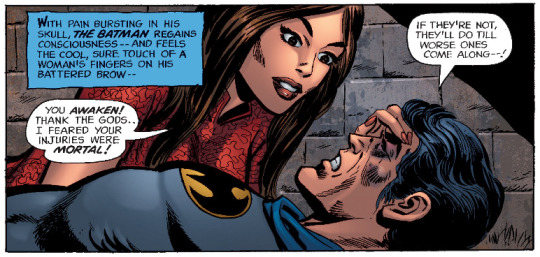
First meetings, first love, and all that fun stuff
Detective Comics (1937-) #411
35 notes
·
View notes
Text

happy autumn leaves falling down like pieces into place season to all those who celebrate
4K notes
·
View notes
Text

asking myself why his mama isn't here
8 notes
·
View notes
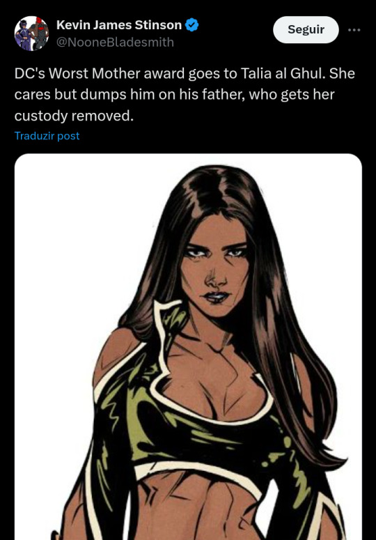
Text

it's always "Talia taught Damian that love is useless and his white dad taught him that love is fantastic" like c'mon did you know his momma calls his daddy BELOVED?!??? she isn't the monster you and grant morrison think she is!
92 notes
·
View notes
Text
what a loser
33 notes
·
View notes
Note
Hii you're so talented!! i wonder if you could explain how you did this gif effect with the squares? and do you have any tips on colouring because yours is always top notch <3333
heyy thank you so much 🥹 and of course! i've never really done a tutorial before but i'll try my best to explain it in a way that makes sense 😅
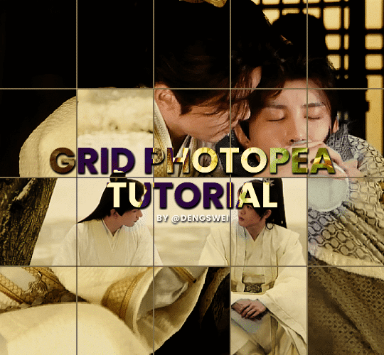
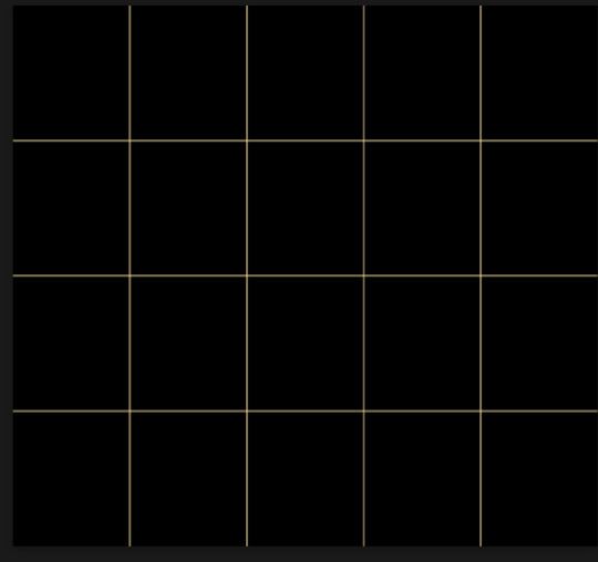
so i start off with making my two gifs seperatly and colouring them as i normally would, once i've done that i load both gifs into the same project and once i've done all that i started on the grid part:
now go to view -> add guides and this window should pop up:
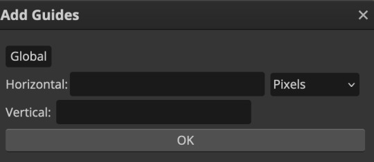
(it's was so daunting at first when i saw this i was like ????? and started putting in random numbers and was like oh that's how this works 🤣)
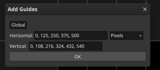
here's the settings i used for my gif which is 540px x 500px in size with 5 squares x 4 squares: (if you want more or less you just have to play around with it)
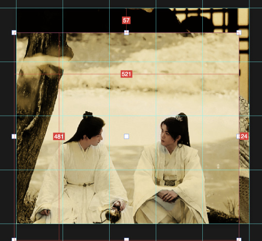
once you've done that it should look something like this:

now the next part is really up to preference again: add a vector mask onto the gif that's above the other one like this: (ignore the name of my folder that is irrelevant 🤣)

and then i used the rectangle select tool (this is because the rectangle select should lock onto the grid squares making it easier to erase certain sections) + a black brush tool to erase the squares to show the other gif that's underneath (you can reposition both gifs to your liking which is what i did)
before & after:

so my vector mask looks like this afterwards
(you don't have to do the squares so close together like i did it was just how i liked it & because of the scenes i had chosen that mine turned out this way)
now onto the grid lines: i used the line tool with these settings

just like with the rectangle select tool the line tool should lock onto the grid line you want to redraw, do this for every line that you want/have for your grid & once you're done go to view -> clear guides and it should look something like this: (added a version with just a black background so it can be seen a little easier)

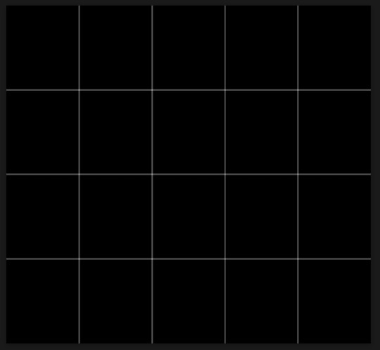
(i'm ngl idk why my lines ended up kinda faded and not white 🤣 i think it might be because i used a white fill instead of white stroke but it doesn't really matter to me because i got my ideal outcome anyway 🤣)
bonus step: you can stop here if you'd like but i wanted my lines to match my colouring & my intended typography so i put all my line layers into a folder and set the mode to difference & added a yellow fill layer with a clipping mask, like this:
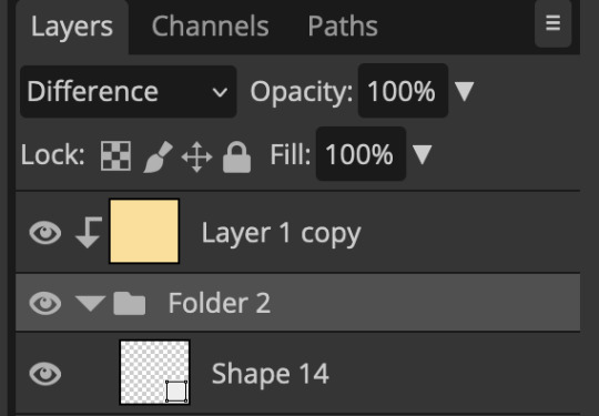
and it should look like this:
you can also play around with the opacity of the lines too which is what i tried out but i prefered for my set the lines being at 100% opacity but it's really up to you with what you want to play around with
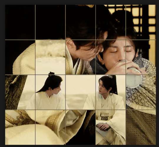
now once you're happy with everything merge those layers together (make sure they have the same amount of frames first before merging them) and either save as it is or add some typography like i did and you should end up with this:
for tips when it comes to colouring it really depends on what you're colouring, if you want to manipulate the colours as much as i do i recommend choosing a colour within the scene so you're not having to change too much, or finding scenes that have colours that can be manipulated more easy (any colour that aren't skin tones, unless you're working with red or yellow like i did here, i chose yellow because one of the outfits in the gif was yellow toned and it looked better with the gifset being yellow than my original colour which was blue), also looking for scenes were the people in it don't move as much also is a big help!
i hope this helps :) feel free to ask more questions if you didn't understand or want some more tips i honestly don't mind!
212 notes
·
View notes
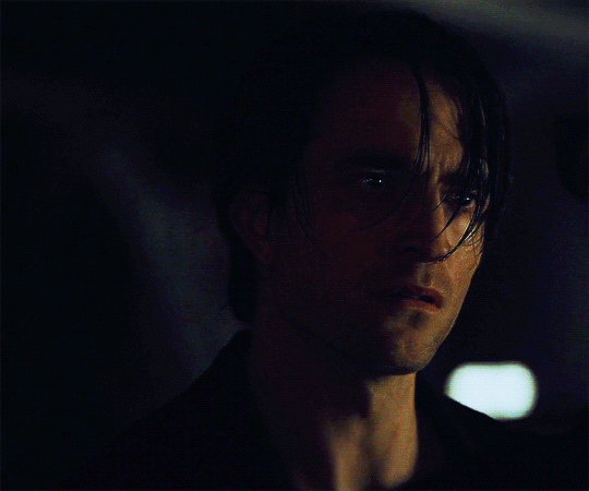
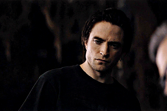
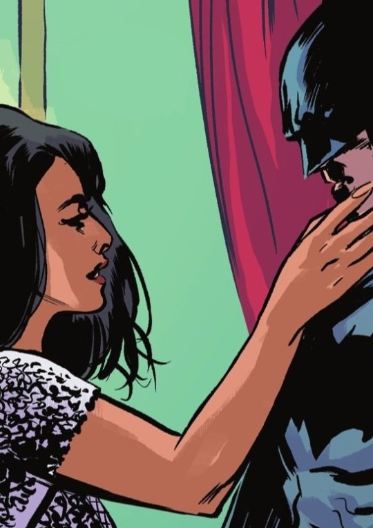
Photo
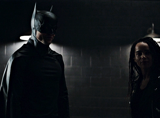

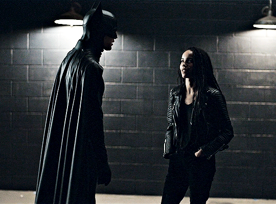


✧ Robert Pattinson and Zoë Kravitz THE BATMAN (2022) ━ Chemistry Read & B.T.S. dir. Matt Reeves
4K notes
·
View notes


Text

breathe in, breathe through, breathe deep, breathe out.
953 notes
·
View notes
Text
8 notes
·
View notes
Text
let's face it, Obi-Wan is only a stickler for the rules in comparison to Anakin. this guy thought lightsaber nunchucks were cool as a teenager and jumping out of politicians windows was cool as an adult. he regularly sasses the chancellor of the republic. he saw Anakin and Padmé being super obvious and decided it was none of his business. he sits pussy facing the world in important meetings. hes's a lonely single in your area. he won one (1) fight against a sith lord and decided they were his speciality despite getting his ass handed to him by Dooku multiple times. he's annoying on purpose as a battle strategy. every man he meets desires him carnally and he doesn't notice. he puts one foot on Han Solos ship and is like "damn bitch you live like this" despite having spent 20 years in a desert hole. he gets himself killed to one-up Vader one last time. he's winning the idgaf war
21K notes
·
View notes
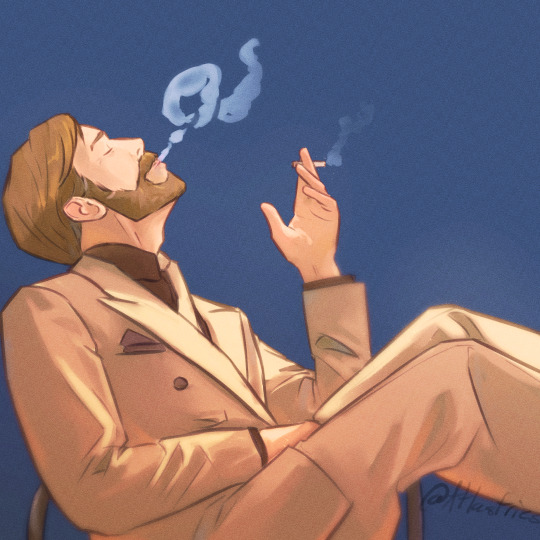
Photo
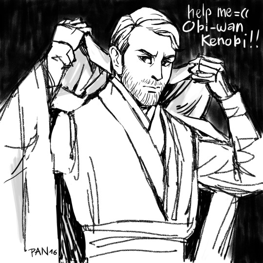
Trying digital art for the first time. Help me Obi-Wan Kenobi, I “Ctrl + Z” alot ;__;
1K notes
·
View notes