hi i'm charisse & this is where i reblog resources so i don't have 10k likes.
Don't wanna be here? Send us removal request.
Statistics
We looked inside some of the posts by steinfelds and here's what we found interesting.
Average Info
Notes Per Post
14K
Likes Per Post
9K
Reblog Per Post
5K
Reply Per Post
8
Time Between Posts
3 months
Number of Posts By Type
Photo
7
Note
5
Text
4
Video
1
Last Seen Tumblr Blogs


Fun Fact
Mobile US users spent an average of 115.8 minutes on Tumblr app monthly.
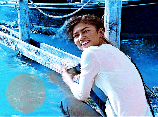
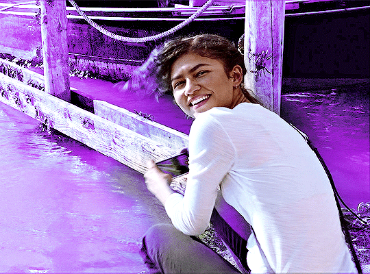
Photo
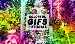
COMPLETERESOURCES — Colorful GIFs
“@crazybollywood ; can make a tutorial how to make these gifs by @ehco?”
These gifs are super fun, you can use a bunch of colors or a few to match a specific scheme. There’s also a few different ways you can achieve this. *Note: If you don’t like grainy-ish gifs, this tutorial isn’t for you!
Keep reading
464 notes
·
View notes
Note
hi! i was wondering if you could share the overlay and/or explain how you made the first gif in the last set you posted? thank you very much in advance <3
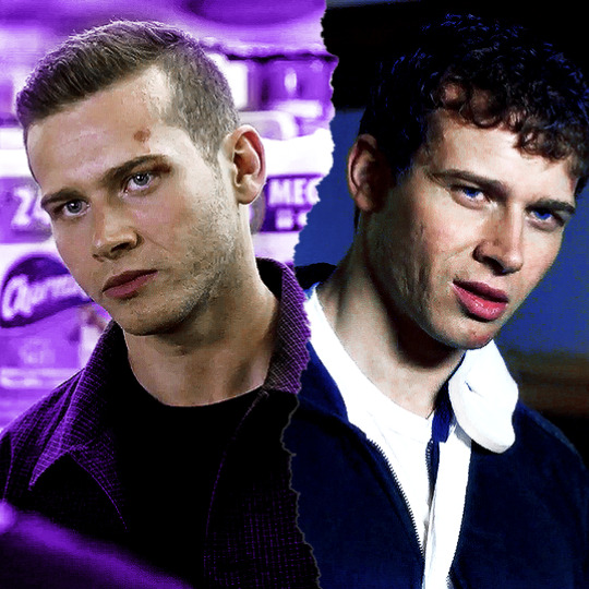
Hi anon! I'd be happy to share how I created the ripped paper effect in this gifset !

You’ll need a basic knowledge of gifmaking and photoshop, and I’ll put the rest of this under the cut.
1) Creating your gifs
So to start off you're going to create your gifs in separate canvases. I work in timeline mode and I add my sharpening and colouring, and I put both gifs in groups (explained here).
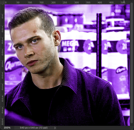
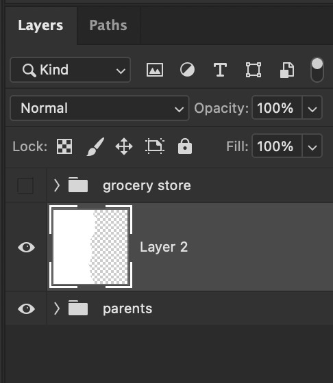
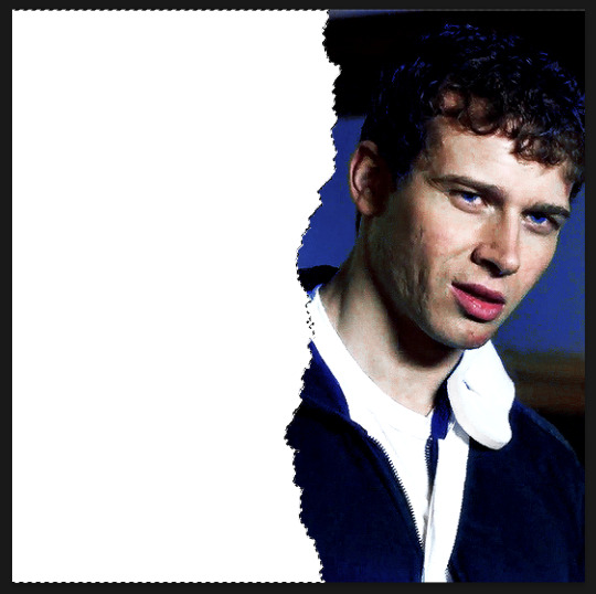
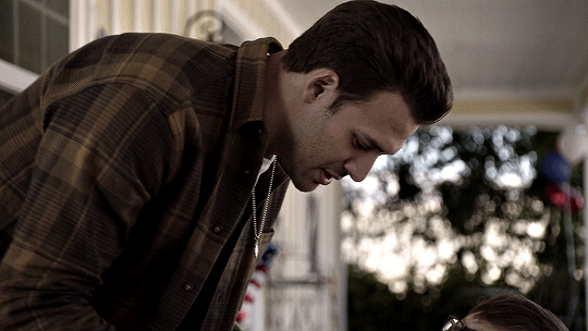
Here are my gifs on separate canvases. For reference, I've called the one on the left "grocery store" and the one on the right "parents".

You'll then want to copy and paste your gif groups onto the same canvas. This is what my canvas and layers panel looks like once that's done. From here, you're ready to start the ripped paper effect.

2) Ripped paper overlay
For this step, you want to obtain your ripped paper overlay. You can find various ripped paper textures/overlays using google, but I used these overlays by @peytonsawyers !
You open up the overlay you want to use, and either copy and paste or just drag it onto your gif canvas. You can then resize and rotate the texture and orient it where you want.
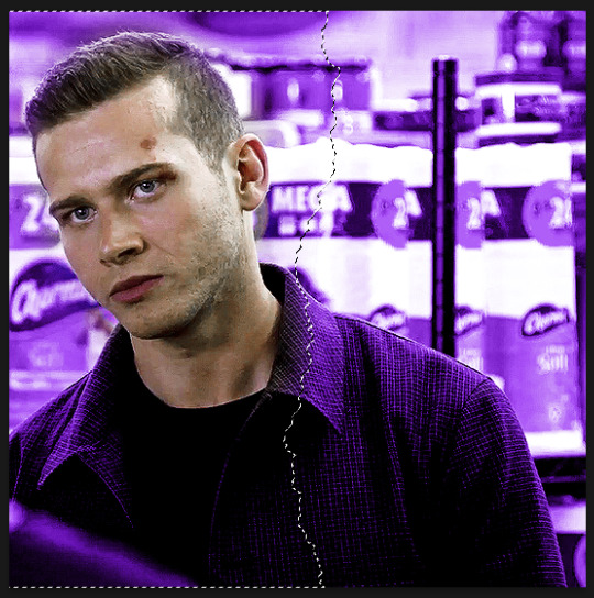
I then drag the ripped paper layer so that it's placed between my two gif groups. I also hid the top group just so that I can see the overlay, but this is only temporary. Your canvas and layers panel should now look like this:


2.5) Filling in the overlay
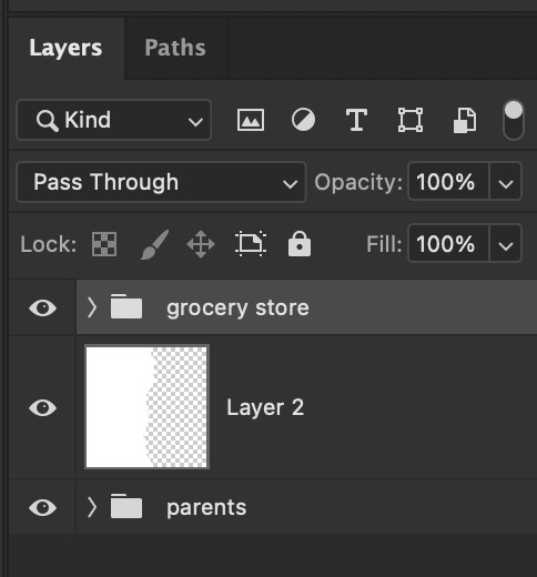
So as you can see we have an issue because the ripped paper doesn't cover the entire area where we want our top gif to show. To fix this, I just use a white brush at 100% hardness and paint in the area that needs to be covered, making sure the ripped paper layer is selected (this doesn't have to be perfect, just make sure that the entire area is filled.
Now this is what it should look like:

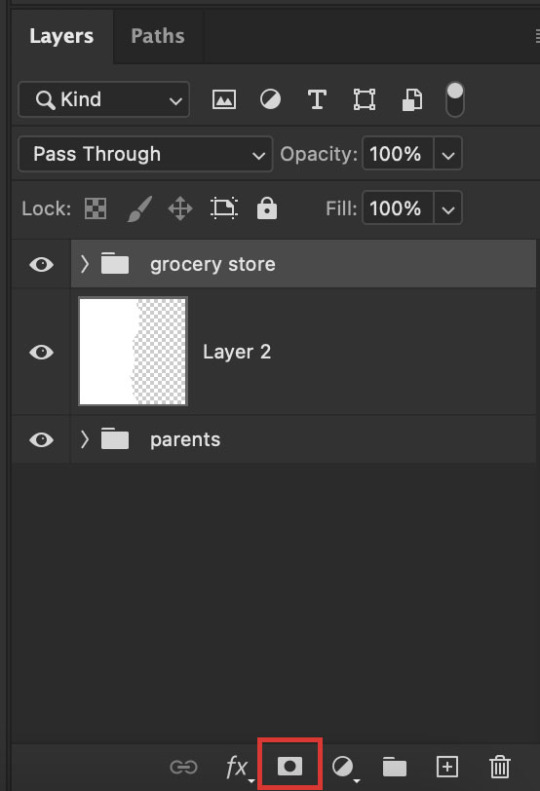
3) Masking the top gif
Use the command (or ctrl) key and click on the thumbnail in the layers panel for your ripped paper layer (the square highlighted in white in that last screenshot). You should get a marching ants selection around the ripped paper like so:
Now reveal your top gif group (by clicking on the eye icon), and make sure you have the group selected in the layers panel. You should still see the selection around where your ripped paper is, like so:
Now go to the bottom of your layers panel and click on the little mask icon:
And now you should get a mask on your top group in the shape of the ripped paper, and you should be able to see both gifs simultaneously on the canvas:

If the black and white areas on your layer mask are flipped after you click on the mask icon, just click on the layer mask and use the command + i (ctrl + i) keys to switch it back so that you can see both your gifs.
4) Final touches
Now if you're happy with the result so far, you can absolutely stop here. However, I wanted to show the uneven rip (like how when you rip a piece of paper you can see some white bits on the edges).
To do this, select your move tool (shortcut: click the v key on your keyboard) and making sure your ripped paper layer (NOT the mask) is selected, use your arrow keys to move it slightly until it shows between the two gifs.


It currently looks a little too clean for my liking, so I like to move it slightly up/down as well so that it looks more uneven and natural. If your overlay is too small, just use the transform function (command + t or ctrl + t) to resize it so that it fills the canvas. This is what mine looks like after I mess around with it:

And you're done! If you want to adjust any colouring, just go into the gif group and you can edit the layers from there.
Hope this helps anon! Let me know if you have any questions!
301 notes
·
View notes
Note
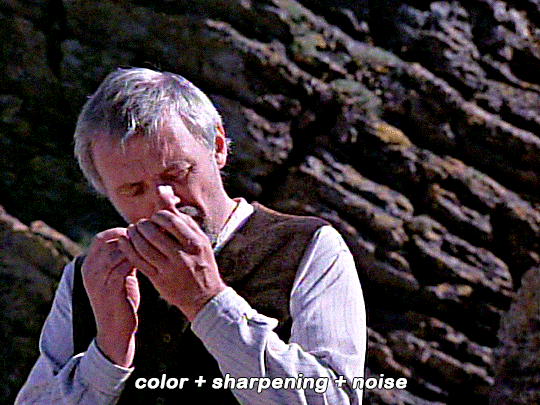
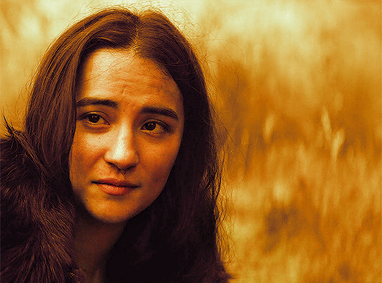
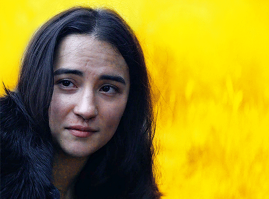
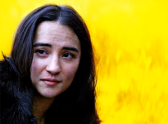
Hi! I was wondering if you had any tips on how to color the flashbacks in the begins episodes, because they have that weird green tint that's so hard to get rid of? Would really appreciate any advice you had! Love all your gifs :)
hellooo! that is really nice of you to say, thank you <3
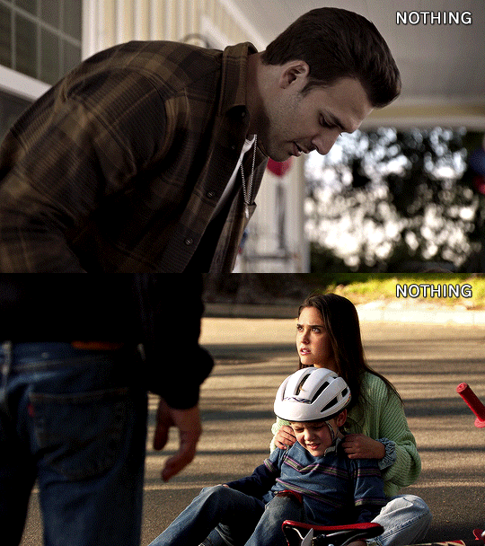
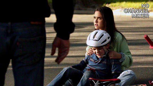
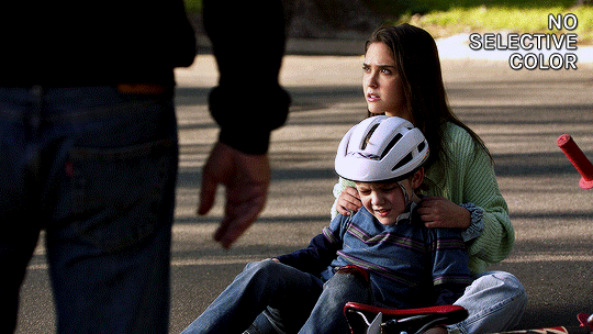
yeah flashback scenes in 911 can be tricky to color. i don't know why they made the el paso flashbacks look so drab, or the hershey flashbacks so glowy and green lol. anyway, i have two flashback examples on how to go from this:

to this


steps under the cut (:
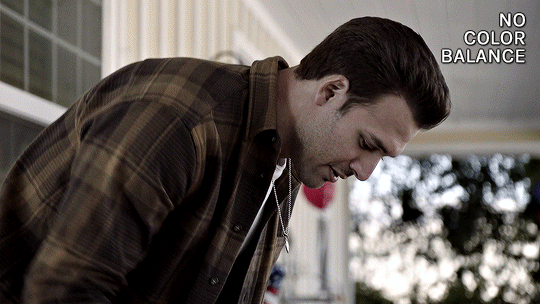
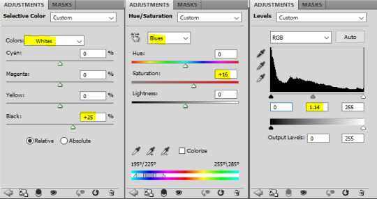
CURVES
the first thing i always do is usually use a curves layer to white balance the colors automatically. it can be quite handy, but it's usually not enough. it can be a great place to start though. on the top right you can click the 3 lines menu and choose "auto options..."


then you can play around with the different settings in the algorithms section, and the snap neutral midtones. there's usually one that's better, so i just toggle between them and choose which one looks best.

if the auto settings don't work well for your shot, you can always do this manually with the black and white droppers with a curves or levels layer. becca/@yenvengerberg did a great tutorial on it here (in the step one: curves section)
both gifs with curves auto color correction:
as you can see it brings the colors in a more neutral zone and less saturated, but the coloring still needs more editing.
COLOR BALANCE
i used a color balance layer to bring back some warmth into the eddie gif. i started by giving it a bit of red in the shadows, then with midtones and highlights, i simply played with the sliders until i got something i liked (knowing i'll grade the colors more specifically later).

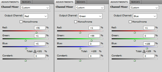
CHANNEL MIXER
for the maddie & buck gif, i wanted to reduce the yellow/green tint. i needed to add some blue to counter the yellow and channel mixer worked better than color balance for this one. this channel mixer tutorial by kate/@aubrey-plaza goes into so much depth, much better than i ever could, but here's how i did it:
SELECTIVE COLOR
my favorite and most used layer! i use it all the time. for the eddie gif, i wanted to make it warmer and less drab. i always start with deepening the blacks, then i want to make sure the skintones are good with the reds and yellows.

then the rest is mostly small adjustments to my liking, especially with cyans, blues, neutrals. this particular gif doesn't have a lot of blue tones so it doesn't change a lot tho haha

selective color results for eddie:

then for the maddie & buck gif, i went pretty much in the same order: blacks, skintones (reds and yellows)
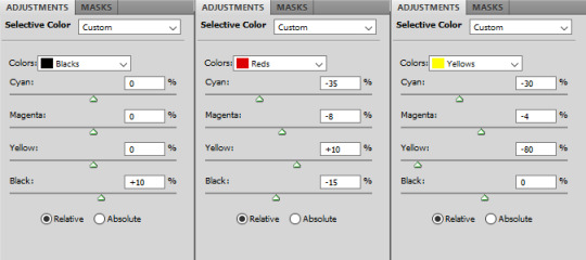
then blues, cyans, neutrals:

maddie & buck selective color results:
FINAL TOUCHES
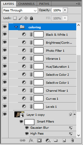
now that the gifs are color graded, what's left is to add final touches, aka more vibrance, contrast, exposure, etc etc.
for the eddie gif i added these layers
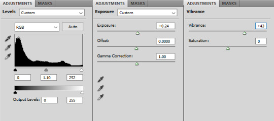
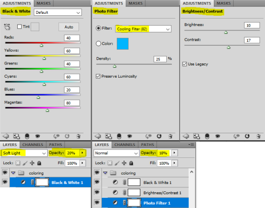
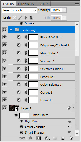
here's the layer order and final result:

for the maddie & buck gif, these are the layers i added:

and the layers order and final result for that one:

that's it, i hope that helps a little!
there's also this great tutorial by ace/@ajusnice on how to color yellow tinted shots, it's a great reference.
147 notes
·
View notes
Photo
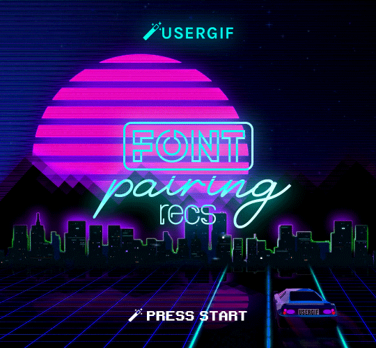
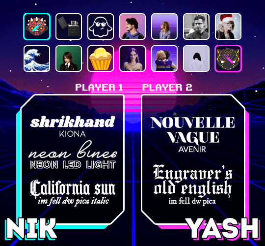
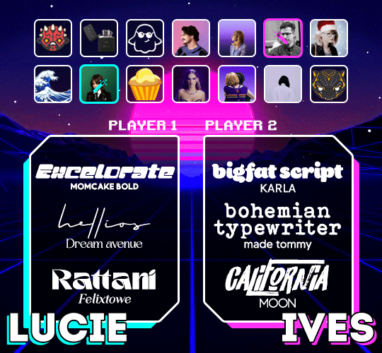
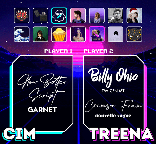

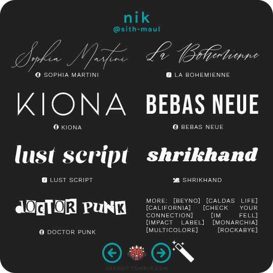
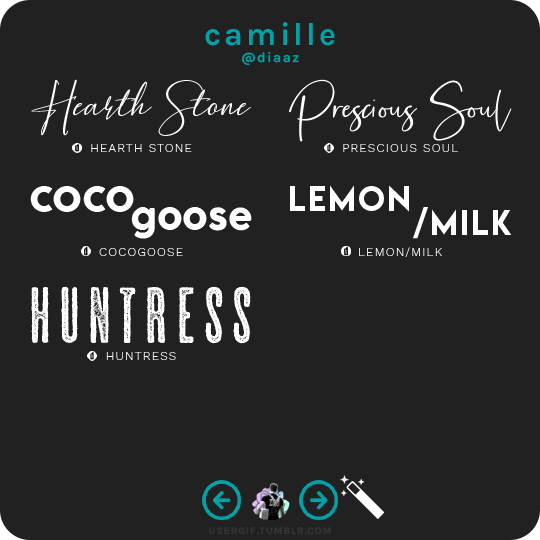
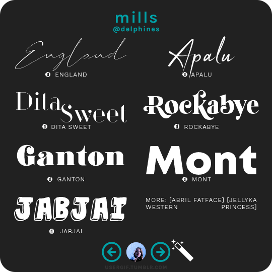
anonymous asked 💬 hi! i know you guys already made a font rec but can i request a font combination rec?
USERGIF FONT PAIRING RECS 🪄 PER MEMBER Here are some of our members’ favorite font pairings! Check out our previous FONT RECS and our #typography or #fonts tags for more inspo! TIP: On mobile, slide your finger over the gif to slowly scrub through frames.
CREDITS: — retro video game backgrounds: [one] [two] — all fonts & links listed below the cut
Keep reading
1K notes
·
View notes
Note
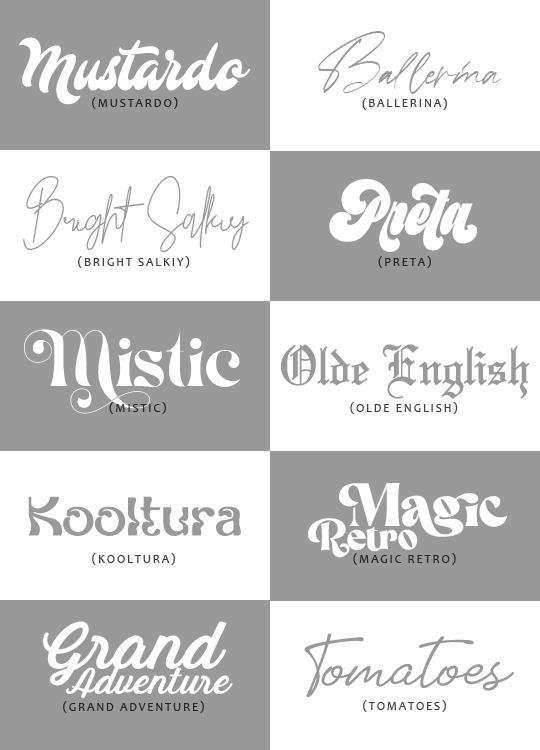
hi! i love your gifs and i was wondering if you could list some of the fonts you use? i really love them and would love to know which ones you like
heyyy thank you so much!!
i try to be varried in the fonts i use but sometimes i tend to gravitate to the same ones anyway haha. here are 20 fonts that i've used and loved these past couple of months (oh and the small font is candara, which i use literally all the time 🙈):

928 notes
·
View notes
Photo
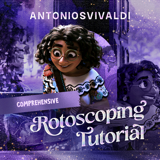

Rotoscoping Tutorial by @antoniosvivaldi
Hi everyone! I’m excited to announce my long-delayed Rotoscoping Tutorial - requested by a number of people over the past calendar year.
In this tutorial, I will show you how to create the cutout gifs like this (and seen in most of my gifsets under this tag) with Rotoscoping on After Effects. I’ll also provide additional examples and a number of things that I do to optimise my giffing / Rotoscoping workflow (e.g. useful shortcuts & other things to be aware of).
This is the structure of the tutorial:
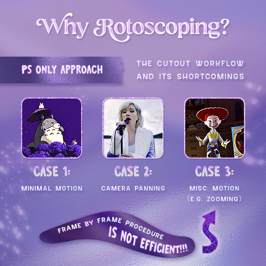
Why Rotoscoping? Photoshop video timeline’s limitations
Photoshop workflow pt 1: Preparing your gif
After Effects workflow: Interface, shortcuts, and Rotoscoping tools
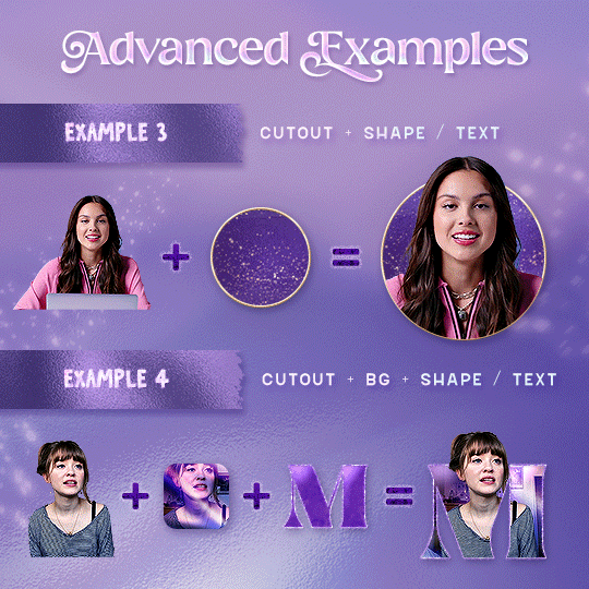
Photoshop workflow pt 2: Assembling your gif; with multiple examples
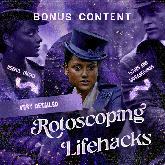
Bonus content: Rotoscoping tips* & workarounds to common issues
For quick reference, here are example gifsets (and where Rotoscoping is used in the posts) that I will mention in the tutorial:
Example 1: Cutout gif effect | panels 2 + 4
Example 2: Changing a gif’s background colour | all panels
Example 3: Cutout gif effect in a shape | all panels
Example 4: Putting it all together | panels 1, 3, & 5
What you need & need to know:
Software: Photoshop & After Effects (After Effects 2021 or later for Rotobrush 2.0)*
Hardware: 16GB RAM required to run later versions of AE*
Difficulty: Advanced; Knowledge in making gifs, applying layer masks, and using video timeline interface assumed
Key concepts: Rotoscoping (AE) / Video Timeline (AE+ PS) / Layer Masks & Groups (PS)
Supplementary files: tutorial resources
*I’m currently running the latest version of PS & AE on an M2 Mac, but I’ve also used older versions (CC 2015 & 2020) on Intel-based Macs. I’ll outline some known compatibility & performance issues, and workarounds later in this tutorial that could help streamline your giffing workflow.
Tutorial under the cut. Like / Reblog this post if you find this tutorial helpful. Linking this post / the example gifsets in your post caption, will be greatly appreciated if you read this to create effects seen in Examples 3 + 4.
Keep reading
2K notes
·
View notes
Note
hi! would you ever do a tutorial on your sharpning settings? your gifs always look so nice!
hi! thank you! <3 yeah of course, i posted one a couple weeks ago or so but i can't find it now so i'll go through it again.
and i'm sure there are better less awkward ways to do this but i've messed about with these settings a bunch and i'm finally kinda happy with them.
first i use smart sharpen with these settings:

then i duplicate the layer
on the duplicated layer i add gaussian blur & noise with these settings


then i set the opacity for the duplicated layer to somewhere between 20-50% (this depends on the quality of clips i'm using for newer real hd shows i go with 20-25% and for older shows where the quality isn't as good i go higher)
on the original layer - which only has the smart sharpen - i add smart sharpen again with these settings:

i do that second smart sharpen at least twice but sometimes 3 times - depending on how it looks after the 2nd time.
and that's it!, i do that for pretty much all shows i make gifs for, the only real difference is the opacity of the duplicated layer (and that only really applies to greek & older degrassi gifs atm)
if you do want it to look much sharper than it does in the end you can remove the duplicated layer and it will look good, i just like the little bit of softness it gives to the edges.
this is what the layers look like when finished:

18 notes
·
View notes
Text

sorry this took me a little bit, had a busy week. but i’ve included a tutorial on how i did those two gifs from this gifset below.
included under the cut:
adding multiple gifs to a layout – multiple gifs inside one gif
overlaying gifs using clipping mask
Keep reading
23 notes
·
View notes
Photo


hello friends! an anon asked us how i did the text effects on this kate x yelena gifset right here and in the examples above, so here is my best attempt to show it was done. all you need is photoshop and basic knowledge in giffing + usage of timeline!
Keep reading
480 notes
·
View notes
Photo
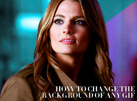
HOW TO CHANGE THE BACKGROUND OF ANY GIF BY USERGIF
An anon asked us to make a tutorial on how to use gradients to change the background on scenes with lots of movement so under the cut I’ll explain two ways of doing it: keyframes and frame by frame.
Keep reading
1K notes
·
View notes
Text
low quality video -> "HD" gifs tutorial! (utilizing the add noise tool)
for the lovely @tomdestry and anybody else wanting to learn this trick (;
this works on movies/videos in 720p and lower
must have basic gif making knowledge
I'm using photoshop cc 22.3.1 (2021)
TUTORIAL UNDER THE CUT ⤵️
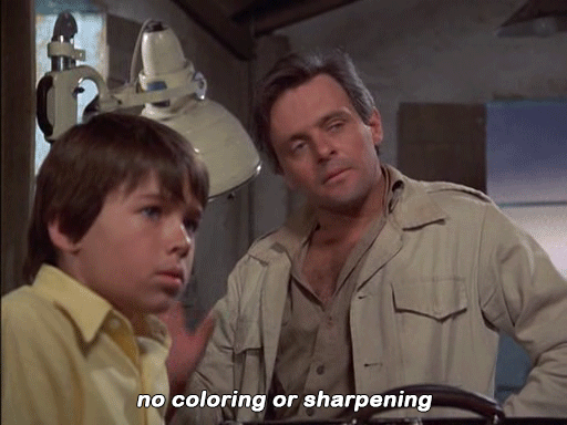
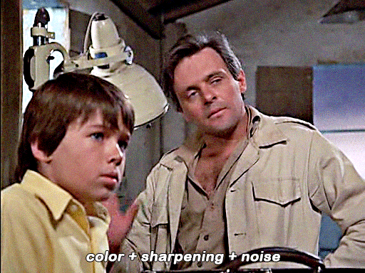
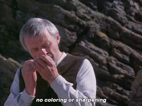
In this tutorial I'm gonna show u how to create an illusion of high quality and film grain in your gifs just by using smart filters, coloring, and noise! This works on 720p, 480p, 360p, and 144p resolutions
1. So to start make the gif base
I am using a scene from qb vii in (a terrible) 360p
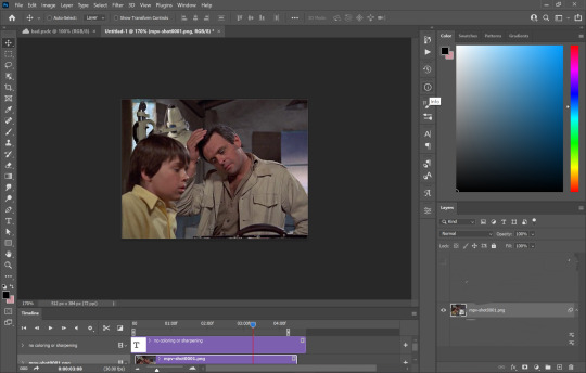
(I use the timeline version of making gifs sorry 😅)
2. Add 'unsharp mask' filter
filter -> sharpen -> unsharp mask...

Amount: between 50-110% (no higher than 110)
Radius: between 1.0-2.0 pixels
Threshold: 2 levels
3. Add 'smart sharpen' filters
filter -> sharpen -> smart sharpen...
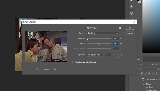
I like to add 2 layers of smart sharpen with these settings. So overall you will have 3 layers of sharpening; unsharp mask, smart sharpen, smart sharpen 2. THIS IS OPTIONAL. Sometimes you won't need the second layer of smart sharpening but that's up to u (:
4. Add the 'add noise' filter
filter -> noise -> add noise...
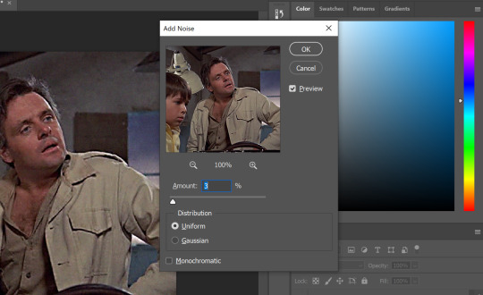
the add noise filter helps soften out the hard pixels of the video and creates a film grain effect. play around with the amount to see what works best for you but I wouldn't go higher than 4%. AND GO BY DECIMALS! don't just use 1, 2, 3, 4. try out like 2.5% or 3.6%, etc. In the end i used 3.4% of noise for this gif
5. Color your gif
edit it and use any coloring u like! try to push the shadows and add more black in your 'selective color' adjustment layer just to give your gif more contrast (for an even sharper look)
6. Save!
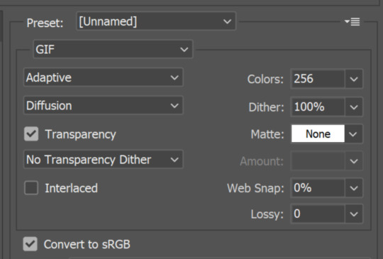
once you're satisfied with how your gif looks, save for web and you're done! here are my save for web settings
My results!
360p video:
480p video w 3% noise:
(put too much contrast on these gifs but oh well u get the idea 😂)
End notes/tips!
obviously this trick won't work on every low quality movie
play around with the sharpening, noise, and color settings to find the best version for u!
the higher the quality (720p, 1080p dvd) the less noise you will need to add (1 to 2.5%)
gifs look even better if they are put into 2 column posts instead of a single column (268x instead of 540x)
the noise filter does mute the fine/sharp details of the gif so take it easy on the noise. only add in small increments!
and lastly - this is fake HD, it won't turn your 480p video into a crisp blu-ray 1080p quality. it just gives an illusion of higher quality (:
Any questions or suggestions, pls feel free to dm me or send me an ask. I am more than happy to help my fellow content creators! 💙
753 notes
·
View notes
Text
Rotating text animation - an easy peasy tutorial
hi! Robin @madeline-kahn mentioned she’d like to know how i made the rotating animations for this edit i made for @jatpsource

and i was bored so here we are haha! the process is super simple and it makes a cute edit so like win-win situation here :D
what do you need:
Photoshop CS6 or higher (i was sad to find out this particular kind of animation didn’t work on my beloved CS5) It has to have the timeline option, otherwise this won’t work for you.
okay let’s do this! i’ll put it under a cut bc it has lots of screnshots and it makes the post too long
Keep reading
525 notes
·
View notes
Photo

anonymous asked 💬 what are your personal font recs?
USERGIF FONT RECS 🪄 PER MEMBER Here are some of our members’ favorite fonts! Fonts without a source icon are default fonts on Photoshop. Fonts with the source listed as “other” may require a deeper Google search or are only available to purchase, but most fonts are free! TIP: On mobile, slide your finger over the gif to slowly scrub through frames.
MORE RESOURCES FROM USERGIF MEMBERS: — fade-animated text tutorial by nik [@sith-maul] — font compilation by kate [@selinakyle] — font compilation by sole [@fionagallaqher] — font packs + downloads by jennifer [@antoniosvivaldi] — glitching text tutorial by nik [@sith-maul] — moving text tutorial by drea [@sashafierce] — quick text styles tutorial by kate [@selinakyle] — warp text tutorial by drea [@sashafierce] — (all fonts listed below the cut)
Keep reading
4K notes
·
View notes
Note
Hi! In your latest (I think) Marvel set with 3 Peter Parkers did you make this effect of the shot closing in on Ned?? I don't remember how it was in the movie and this is so funny 😂 If you did, do you mind telling how did you do it?
hi! sjdfshkjfsh im glad it made u laugh. and i don’t mind at all! 💛
so with ur gif in timeline, click the arrow pointing down next to layer one. these options should now pop up.

click the little clock next to transform. a yellow diamond should appear! now move the slider to the point of the gif where you want the zoom to occur.

now at this point, you’re gonna want to use the transform tool (ctrl+t) to zoom into whatever or whoever you want to zoom in. here is my process:


and this is what ur timeline should look like now!

this is my finished product:

hope this helped u out!
here’s another method that u can try out!
93 notes
·
View notes
Text
elio’s colouring tutorial! <3
i've been getting a lot of asks about my colouring process and requests for colouring tutorials, so i finally decided to make one! using a few gifs as examples, i'll show you how i turn backgrounds into a vibrant colour. this tutorial assumes that you already know how to gif; we're jumping right into the colouring!

(disclaimer: just keep in mind that this is what works for me, experimenting is the best way to learn what works for you ahshdgjg anyways, here we go, under the cut!)
four things i keep in mind when i want to make a colourful gif:
scenes should have backgrounds that aren't complicated or full of other objects (especially if they're dark)
scenes should have backgrounds with colours that are easy to manipulate. i.e. a simple blue background will be much easier to change than a background that has a mixture of green, red, and brown.
scenes shouldn't have a lot of movement. scenes with limited movement will save you from a migraine.
avoid dark scenes!!! it's really hard to colour a dark scene, and most of the time, it doesn't turn out looking as vibrant as other scenes.
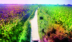
this alina scene from shadow and bone isn't the best because the lighting is on the darker side, but the relatively solid blue/green background made it doable. that being said, it would have been much less time-consuming if it was brighter.
step one: brightness.
the first thing i always do is click on "brightness/contrast." leave the toggles at 0, but change the blending mode to screen. this generally gives you a decent brightness without overdoing it.
now, if this was a regular gifset, i would move on to "curves." for a vibrant colouring set, i leave that for last. the results turn out much better if your curves layers are on top of your colouring layers; order layer matters!
step 2: hue/saturation.
generally, you won't want to touch this too much because it changes the overall appearance of your gif and can affect things like skin tone. however, you do want to move it subtly either to the left or right depending on what colour you want your final gif to be! think of it this way: the point of hue/saturation is to get your gif (especially your background) to a colour that's easy to manipulate so that your "selective colour" layers work better!
this alina starkov scene has a relatively blue background with mild splotches of green. the blue is easier to manipulate than green since there's more of it, so i'll move the hue/saturation to the right (+8) to make the gif a little bluer.
step 3: colour balance.
colour balance works the same way — use it to change the colour of your gif so that your selective colour layers are stronger.
play around with midtones, shadows, and highlights. don't overuse these, or it'll be a pain to fix other parts of your gif later (i.e. a person's face). again, i made the gif look more blue and less green with this colour balance layer. this is how my gif looks now, with a before and after included so you see what i meant about going from green -> blue:

*i also added two subtle selective colour layers (set on "relative") after the colour balance to make alina's face less grey.
step 4: selective colour
alright, this is where the real colouring comes in!!! selective colour layers are your best friend when you want vibrant colours in your gif. now that we've made the scene take on a bluer tone than green, click on "selective colour." you’ll see two options when you click on it: absolute and relative.
i recommend beginning with absolute, not relative. absolute is stronger than relative, and will therefore give you more vibrant results. you can use relative to "touch up" later.
the key to selective colour layers is to alternate between absolute and relative. think of the absolute layers as a way to set the foundation for a new colour, and the relative layers as a way to subtly fix little things afterwards. the number of selective colour layers will differ per scene and gif. sometimes, i'll have 5 absolute + 10 relative, and other times i'll have 10 absolute + 2 relative.
there's no right answer for how you play around with the toggles in selective colouring, because again, it will differ per scene.
for this gif, the first thing i did was go to the cyans (absolute) and dragged the toggle for "cyan" all the way to the left (-100), magenta (+8), and yellow (+38). this got rid of the cyan tones, but that's alright, because the point of establishing this blue tone is so that the colour of the entire gif is easier to manipulate.
for blues (absolute), i did the following: cyan (-48), magenta (-27), yellow (+100). this gets rid of the blues almost entirely, leaving us with a light grey and neutral tone.
since we now have this neutral tone, i went to neutrals (absolute), and moved the toggles: cyan (-25), magenta (+10), yellow (+100). i also did black (-5) to make the scene a little brighter. now, after all of this, our background is orangey-yellow. the only problem is that it's also affected alina's face, so our gif looks like this:
definitely not the look we want the final gif to have. but this is alright! don't be afraid to make your scene look intense, because your layer mask will help you!
click on your layer mask — the white box next to the selective colour layer. make sure you click on the layer mask of the selective colour layer that's affected the person's face. so, mine would be the "neutrals" selective colour layer. then, grab the brush tool, set the colour to black, and colour over the face/other necessary areas. anywhere you paint black on your gif, the selective colour layer's effect will be erased. if you make a mistake, change your brush tool colour to white and paint the layer back.
my gif looks much better now, and alina's face is no longer orange. but i want the background to look yellow — this is orange. now that we've established a vibrant colour background, it'll be much easier to work with — getting here was the hardest part!
i made another selective colour (absolute) layer. i usually like to have at least two absolute layers before moving on to relative layers.
now that our background is orangey-yellow, we can dive right into the yellows of our selective colour layer. i moved the toggles like so: cyan (-100), magenta (-9), and yellow (+100). this gives me a light yellow colour, but there are still darker splotches in my gifs. this isn't an issue; i just moved black to -40 and fixed most of it.
now that we have a vibrant colour that's similar to the shade we want, it's time for our relative selective colour layers. my gif looks good, but i want it to take on an even more vibrant shade.
make a new selective colour layer and click relative. the changes you make with relative will be subtler than absolute, but because we've established such a vibrant colour already, relative will be perfect! i moved the toggles like so: cyan (-100), magenta (-33), yellow (+16), black (-6). now my gif looks like this:

this gif turned out pretty good without a lot of trouble, but sometimes, i'll have to go ahead and add another absolute layer, then another relative layer, etc. again, like i said earlier: alternate between absolute and relative selective colour layers!!!!
step 5: new layer + brush tool
i could leave this gif as is, but i still think that the darker splotches ruin the overall look. to fix this issue, i made a new layer, used the eydropper tool to find the right colour, and used the brush tool to colour over these areas. again, i usually have multiple layers where i manually colour over certain areas. for this gif, i have 5 layers.
i tend to set the blending mode to soft light because it gives the best results. colour works too, but i find that it tends to make the colours look a bit flatter.
near the top of alina's head are whiter splotches. those bothered me as well, so again, i made a new layer and used the brush tool to cover them. i didn't change the blending mode though. i kept it on normal but lowered the opacity (for this gif, to 63%). this works because there isn't a lot of movement in the gif, so it doesn't look messy. darken will colour in your white spots too, but that doesn't work too well sometimes — in my opinion, keeping it on normal and messing around with the opacity looks most natural.
this is how my gif looks now:
step 6: curves
now that our colouring is done, it's time for curves!
if you click on the curves layer, you'll see that there are three little droppers on the left. i use the first and the third.
click on the first dropper, then click on the darkest point of your gif. then use the third dropper to click on the whitest part of your gif. this will help balance out the brightness and contrast. if your curves are too extreme, lower the opacity.
if your gif doesn't look good with the curves layers, just scrap them. you can fix most of the brightness with a new selective colour layer. for this gif, i used curves and a new selective colour layer to make alina's hair look darker and less blue. this also helped balance out the overall brightness of the gif, as well as her skin tone.
step 7: vibrance
slap on a vibrance layer, but leave the saturation alone. for this gif, i did vibrance +37.
andddd that's it!
this is what my final gif looks like:
*the area around her neck is a bit too pixelated, but it was fine because this gif was originally used in a 268 px gifset, so it wasn't noticeable.
but this is an issue that can happen with vibrant colouring! so, what if the gif turns out too pixelated after a lot of colour manipulation?
this is an easy fix if your gifset doesn't have a lot of movement (and in some cases, even works with some movement!) here's an example.
this gif was given a vibrant purple colour by doing the steps listed above. i've included a before and after so you can see the colouring.
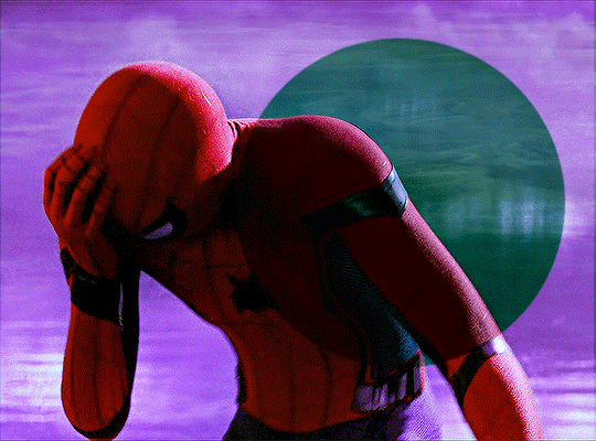
but if you look near the top, it's very pixelated and messy because of how much brightness/colour manipulation has happened. we can fix this by making a new layer, using the eyedropper tool to find a similar shade of purple to the background, then colouring over those pixelated spots.
keep the blending mode on normal but lower the opacity so that it blends seamlessly. for this gif, 48% opacity worked.
my gif now looks like this:

it's not perfect. if you look closely, you can see that some of the purple is painted over spider-man's head at one point since there's a lot of movement happening here. you can sometimes fix this by using the eraser tool with a significantly lowered opacity (i.e. 15-30%). but the main point is, the pixelated areas look much better and less messy, and overall, the gif has a more cohesive look.
AGAIN, the key idea of vibrant colouring:
the key idea of vibrant colouring is, in my opinion, this: manipulate the overall colour of the gif with other layers so you can use selective colour to achieve your vibrant colours.
one method that i sometimes use (but didn't for the previous examples) is to take your gif, do all of the steps, but focus especially on new layers + brush tool to help you colour your gif. here's what i mean.
this admittedly awkwardly coloured gif of MJ was originally blue. this vibrant blue was achieved by making a new layer and manually colouring in the background after doing all the other steps. it was blue before, but it certainly wasn't this vibrant without the multiple manually-coloured layers. you can see what i mean in the before and after:
since we have this vibrant blue colouring, adding a selective layer on top of this will give us fantastic results. since your gif is blue, go to cyans and blues on a selective colour layer.
with the help of three selective colour layers that alternate between absolute and relative, my final gif looks like this:
if i hadn't used new layer + brush tool to manually colour this gif's background, it wouldn't have ended up so vibrant — or if it had, it would've taken me much longer.
so, again: focus on manipulating the entire background so you can take full advantage of selective colour layers!!! with practice, it gets easier.
that's it from me! i hope this overly long tutorial was helpful! give it a like or reblog if you found it helpful, and feel free to reach out to me if something's unclear!!! happy giffing <3
798 notes
·
View notes
Photo
I’ve gotten some requests to make a tutorial for the effects I’ve used in these sets here and here. Hopefully this all makes sense and is actually helpful! This tutorial is made assuming you already know how to make gifs and will be done using photoshop on a mac. If you have any questions or any other requests for tutorials please send me an ask! I used this tutorial here myself to learn, but I wanted to make a more step by step tutorial for those who are more visual learners like myself.
tutorial under the cut, please help me out by reblogging ♡
Keep reading
2K notes
·
View notes
Video
youtube
NEW VIDEO TUTORIAL: a tutorial on how to make multiple gifs in one canvas (as requested)
this is what I’ll be teaching you this time:

What you’ll need for this:
Basic understanding on how to make gifs. (Check out my other giffing + coloring tutorial for reference.)
Photoshop CC.
Patience <3
If you have any remaining questions about anything, my DM is always open! Either here or on @lizzies, just let me know what I can help you with and I’ll try my best!
~
as some of you may know, all of my resources and content are made for free, and i work with commissions. but if you feel like supporting a content creator, this is my ko-fi. all of my income comes from supporters so this is always extremely helpful. <3 let me know if this tutorial helped you, and if there’s any specific video tutorial you’d like to get from me, just let me know and i’ll try my best to deliver!
222 notes
·
View notes