
Don't wanna be here? Send us removal request.
Statistics
We looked inside some of the posts by supertaterblogs and here's what we found interesting.
Average Info
Notes Per Post
4
Likes Per Post
4
Reblog Per Post
0
Reply Per Post
0
Time Between Posts
1 day
Number of Posts By Type
Photo
13
Text
4
Last Seen Tumblr Blogs


Fun Fact
Average visit duration of Tumblr.com is 10 mins and 25 secs.
Photo


The first one is a picture of a sunset on top of my grandma’s hill that I found was really pink and orange instead of a usual yellow and orange color. This sunset was really amazing to look at especially the line of smoke from an airplane to bring out a different perspective in the sky.
The second one is a flower pot that looks a little different than the last time I saw it. The pot has more colorful flowers and some of them grew bigger in over a month.
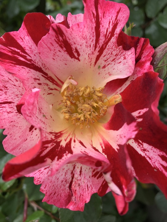
The last one is a beautiful pink rose on my backyard fence that I just now noticed to be in full bloom at this time of year. That is why April is one of my favorite months.
0 notes
Photo

Here is my final studio project for this semester. I had Katharina Grosse as my artist and I tried my best to create a colorful background like Katharina does with a sketch of my cat.
1 note
·
View note
Photo

Here is my encouraging banner for me personally to think about through these hard times. It’s also a quote or reference from the movie “Zombieland.” I really appreciate this rule.
1 note
·
View note
Photo

Bridget Riley “Crest” 1964, emulsion on board, 65 1/4″ x 65 1/4″.
In this image, Riley creates an organization of multiple twisted lines that creates a sense of visual movement on a static and flat canvas. These works eventually became known as the “op art” movement, but Riley thought this perspective put limitations on her work. She then creates more works of art that involve wrestling with the potential and problems of pure abstraction and says that “Painting is a wonderful discipline and a great art form.” She was very interested in color, but couldn’t find any way to begin to understand basic color relationships. Instead of using just a simple black color, Riley uses a mixture of color harmonies and color contrasts to create powerful effects. https://www.a-n.co.uk/news/a-qa-with-bridget-riley-painter/

Odilon Redon “The Eye like a Strange Balloon, Mounts toward Infinity”, 1882, lithograph, 10 5/16″ x 7 11/16″.
Redon’s works are meant to be coherent and look upon this idea that “the head as the origin of the imagination and the spirit lodged in matter, not based on surrealism.” The work evokes a sense of mystery within a dream world. Redon’s main objective is to create realistic visions by “approaching the unlikely and giving visual logic to the imaginary elements...” Redon is more of a modernist than a symbolist because he was also interested in scientific materialism. “His work was mainly based on his own private world expressed in personal symbols and allowed the viewer to understand what hidden realities lay within the forms.” https://www.theartstory.org/movement/symbolism/artworks/
0 notes
Text
The Artist’s Role
The artist is the one who creates things from their own experience, knowledge, creativity, imagination, and learning. Their role is to make something that they love, appreciate, admire, inspiring, mind-blowing, heart-warming, etc. Artists are the ones who share their creativity with other people to inspire them, make them happy, make them sad, angry, or make them skeptical. The artist has a big role that can’t be taken lightly or taken for granted because being an artist is hard work. Even being a critic is hard work, being a parent, teacher, anything is hard work. For artists, their role is to be creative and make something that they feel is something that will have an important effect on themselves or on other people or even to make something just for fun. Being an artist can also be fun because you get to learn all these new things about art and use it with your own imagination and creativity.
0 notes
Photo


The first one is my birthday cake that I decorated myself. I just turned 19 on April 16th, so I used some black and red frosting to make my chocolate cake look like a walking dead theme cake. I think it looks bad lol.
The second one is my adorable calico cat that I found chilling on the stairs and thought it would be a perfect time to get a picture of her since she is camera shy. I also love her fur color, how the orange, black, and white all separate each other to make a distinction.
The last one is my Nintendo switch controller that I thought had some interesting blue, yellow, and gold colors. I love how the colors of Zelda create a joyful, peaceful kind of mood.
0 notes
Photo
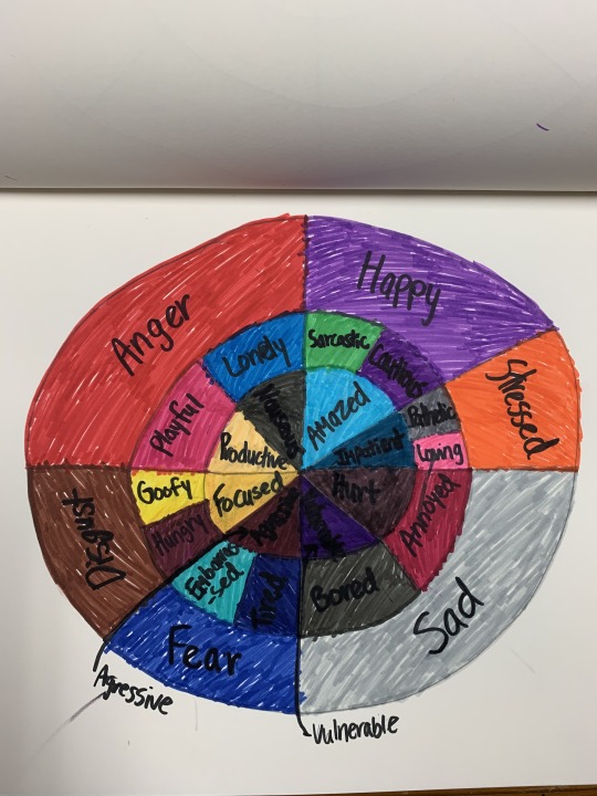
Here is my emotion chart for this week.
1 note
·
View note
Photo

Gerhard Richter “Bomber”, 1963, oil on canvas, 51 1/4″ x 70 3/4″, Wolfsburg, Germany.
The “Bomber” is derived from a photograph of a World War 2 air raid that Richter could have experienced as a young boy. The color grey carries an expression away from personal experience to an expressionless impassivity. Richter notes that the color grey is “the ideal color for indifference, fence-sitting, keeping quiet, and despair” or “for states of being and situations that affect one, and for which one would like to find a visual expression.” Richter basically created non-figurative and monochromatic grey paintings that removed imagery completely and carried his idea of the color grey with a better focus.
0 notes
Text
Working With Restrictions and Rules
Art may have many restrictions and rules to follow or work with, but there are several advantages or ways to work with them. Some restrictions might affect someone’s project negatively or positively, but those who have negative affects will need to work with them either way. I think artists need to be aware of every rule for each project and follow them, easy right? Probably not, but one thing to remember is to focus on what you want to create and then figure out how you can apply the rules to your project. If there is a certain rule that you don’t know how to work with, ask for help from a professor or art expert or the internet. Then make sure to follow through every rule, but also have fun with the project; it doesn’t have to be all about the rules.
Restrictions and rules can help an artist because they might have several ideas or inspirations to use with their own creativity and not even think about what the world would want to see. It would be unorganized and frustrating to go through all the different ideas that each separate person has. So rules are made to keep the creativity at a certain vantage point or level for everyone to be still be able to use their own ideas and creativity, but with a certain theme and ways to present them in an orderly fashion.
0 notes
Photo


The top picture stood out to me for color because I loved how the gray clouds turn lighter when it touches the sun and how the clouds would turn darker when they are away from the sun.
The second picture was just a silly idea that I thought made sense for color because it showed me how dipping something red into a white object or thing would turn into a bright pink or a brighter red color.
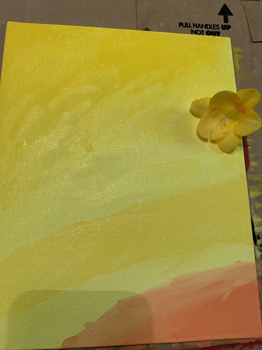
The last picture was a mix of my paints I used with the yellows and some orange colors that makes the water look like a nice, refreshing drink.
0 notes
Photo
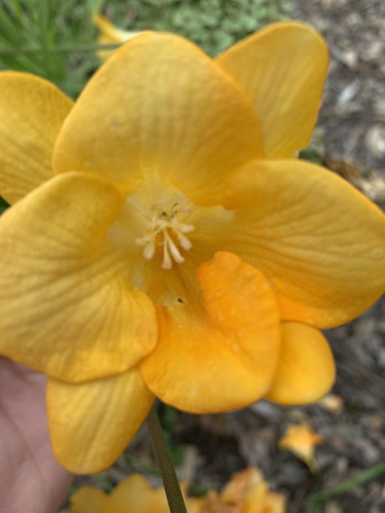
Here is the color research for this week, I tried to get a clear color selection of each flower and I think I did an ok job.
1 note
·
View note
Text
Color Theory History
This text was mainly about all the different people who created different methods and inspirations back in the nineteenth century. It first started with Greek philosophers, including Aristotle, and with Leonardo da Vinci, then ends off with Ostwald. The text goes through all the accomplishments that each artist made and what inspirations are still known to this day that are main concepts of color. All of these artists made special contributions to figure out how color works with shadows, tints, contrasts, and lighting.
One main concept that interested me was why Leonardo da Vinci used a yellow flesh tone for the main subject in his painting “Virgin and Child with St. Anne.” It says in the text that he used this tone because he wanted to intensify the reds and blues of the subject’s clothing and create a distance between the mountains in the background and figures in the front. A certain website says that Leonardo arranged the figures as a pyramid and set in a landscape to symbolize something important. This symbol is the baby lamb in Jesus’ grasp that shows innocence and Jesus’ sacrifice for humanity. Maybe Leonardo wanted to intensify the colors to show symbolism of the figures, but to also create a hazy and dynamic background.
https://www.leonardodavinci.net/the-virgin-and-child-with-saint-anne.jsp
0 notes
Text
Distinguishing Visual Art, Design, and Craft
Visual art is distinguished from design and craft because visual art is all about focusing on the environment and everything you see. Design and craft are types of art that you create and make a change to show off your perspectives. Visual art is where you don’t make a change or create something, but find something that interests you and think about how you want to perceive or understand what you see. Visual art can also be distinguished from design and craft by the concept of what essentials or methods you use to get the result of each art project. Visual art might use a camera or just your own imagination and thoughts to find a subject that interests you while design and craft use paints, paper, etc to create something from whatever you visualize. Design and craft is basically a type of art you create from making a visual on something and making it either more interesting or effective.
0 notes
Photo

Clothing Color Coordination from white to black and from light to dark.
0 notes
Photo

My favorite colors are in the right circles and my least favorite are in the left circles.
0 notes
Photo


The first picture is a mix of some kind of light pink and cool colors that ended up looking like a smoothie.
The other two pictures are my cat and dog that I thought was interesting to look at their fur color. My cat has like an orange, black, and brown mix of color and my dog has white, black, and light brown mixes. These colors compliment their features and it is interesting to look at this in different ways.
0 notes
Photo

Jasper Johns “White Flag”, 1955, encaustic, oil, newsprint and charcoal on canvas. The “White Flag” was his first major monochromatic painting that demonstrated that even in this white form of color, the American flag is still recognizable. He focuses the viewer’s attention not on what is depicted on the canvas, and how it is made because the flag isn’t just a painting, but a canvas with layers of newspapers, fabric, paper, and unbleached beeswax. This artwork on the American flag allowed him to explore a two-dimensional object and find its symbolic meaning. He also anticipates aspects of pop art, minimal art, and conceptual art. He made this artwork to further explore what he is interested in, which is abstract art.
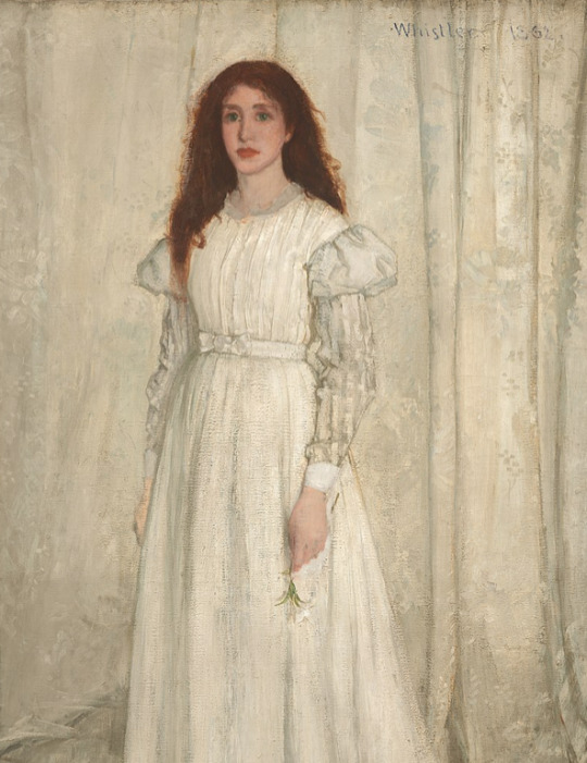
James Abbott McNeil Whistler “Symphony in White No.1: The White Girl”, 1862, oil on canvas. This artwork was made by the limits of using a palette, skewing the perspective, and minimizing tonal contrast to create an interesting spatial and formal relationship. The White Girl demonstrates James’ talents to the world, but many viewers were uncomfortable with the looks or the incompleteness of this white girl, so he renamed it with Symphony No.1 to focus attention on what he viewed as the painting’s true subject: his handling on the white paints, its textures, and subtle tonal contrasts. He made this artwork to show others what he thinks on certain aspects of how a painting should look like, according to his eyes.
0 notes