#(IT'S A FIGURE DRAWING CLASS NOT A LINEAR PERSPECTIVE CLASS)
Text
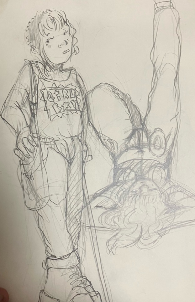
drawing just eats up my fucking time man
#eats up my time and my charcoal pencils#i don't even like charcoal pencils. i love charcoal i'm meh on graphite. charcoal pencils... in some ways they're the worst of both worlds#tales from diana#i spent five fucking hours doing my drawing homework and it came out w Several Fucking Foundational Flaws#at least in composition for what the assignment was supposed to be#and i was so unsatisfied w it bc in the end the figure i ended up doing was so small#bc i was focusing on adding a lot of detail to the room i was sitting in#and im soooo fucking anal-retentive about drawing rooms. long story short i should've just. zoomed in like 3.5x and not#done all that much. i nearly burnt myself out before i even started drawing ME (THE POINT OF THE ASSIGNMENT)#(IT'S A FIGURE DRAWING CLASS NOT A LINEAR PERSPECTIVE CLASS)#the figure i drew is kinda cute actually but so squished it doesn't look... much like me at all#maybe it's also my hair being tied back but the facial features are so small they dont look like anyone in particular#and as small as they are they don't really resemble me much either#so i was so unhappy w it that i drew a very VERY zoomed in one that was just. well mainly my face.#it was on a smaller piece of paper#(normally we do them on 18'' x 24'')#i drew the ceiling and walls in the background but it's like. very much not the focus.#there's a bit of shoulder and arm too but my hair is covering up a lot bc i let it down#it's not very much fitting the assignment either but i thought it made up for the whole... lack of PERSON that i didnt have in my first one#and counting the breaks i had to take to let my brain melt that all took like... six and a half hours#but i couldn't NOT do all of that. i just. ugh. i wish drawing were fucking easy for me it absolutely is not.#there are so many things i should do instead of what i naturally think to do. and im also very slow and detail-oriented#detail-oriented but my details don't even turn out really good.#what i draw in two hours other people could draw in less than half that time#what i draw in six hours other people could draw in two#and that doesn't make me want to give it up. i'm glad i work hard. i think it's worth it for the joy i get out of learning it.#but damn. i'm just a slow-fuckin-poke.
0 notes
Note
how did you get so good at crowded perspective pieces?
hey lol. forgive me for the wait, i tried to answer this (twice) on the day u sent this and both times my app crashed after me typing out a whole thing so i just needed to. take a breath before trying again. im on vacation rn so i dont have all of my files/sketches so im gonna try and make do with what i have.
the real answer is that i only really started doing it recently! i really made the resolution to make my work more involved and resolved instead of just doodling a character on a random background.. i’m very inspired by cartoonists and comicmaking and so i want my illustrations to be fully resolved scenes that tell stories and communicate ideas. right now im focusing a lot on trans bodies in close proximity, small spaces and domestic t4t relationships. I started off with a few studies. I did sketches of some artists who drew enviroments i enjoyed and tried my best to grasp an understanding of spatial relationships. taking some life drawing classes also really helped ^_^
im gonna talk about my house party series bc its relevant but i used different methods to sketch each one!
i used the csp perspective tool to create a linear grid to work off of, it’s very helpful, i knew i wanted a more centered composition for this one so i drew my center character first and figured out how to layer others around them from there!


this one was a little more complex. i made a photo collage (i wish i had used my own refs but. we all make mistakes) and then went over it with a lasso tool blocking out chunks of color. then i turned off the collage layer and drew over the chunks until i was happy with my layout! for this composition, i wanted your eye to travel pretty nonstop around the peice so i chose to make it cluttered and vertical to overwhelm the viewer!

this one was actually not sketched digitally!! i drew the characters in my sketchbook since i knew i wanted to go for a more layered and abstracted vibe, then used my lightboard to trace them on top of eachother.
I think creating crowd scenes is a lot about juggling space, figuring out how to make things look cramped but not have things blend into one blob. it’s difficult, but with patience you can learn to balance the elements effectivly.
9 notes
·
View notes
Text
FIGURE DRAWING ART 1330C PORTFOLIO
GESTURE (SECOND DAY OF CLASS)

CONTOUR (2ND DAY CLASS)

BLIND CONTOUR/POSE
5MIN POSE

EGGS

BLIND CONTOUR HANDS

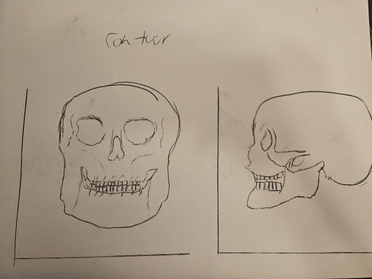
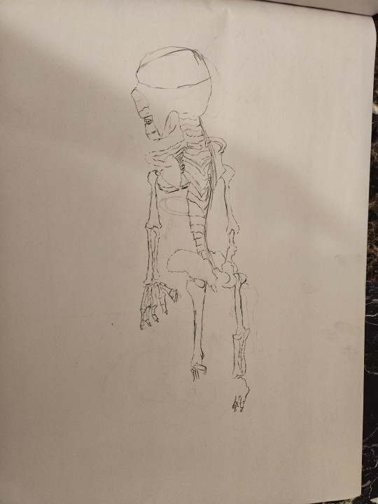
SKULL STUDIES


SPINE/RIBCAGE STUDY

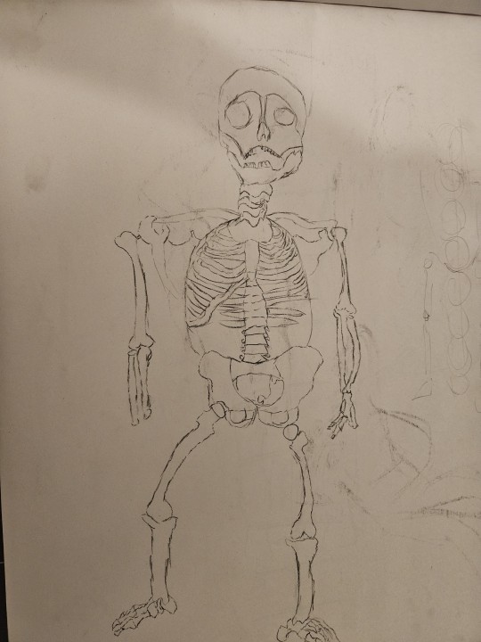
SKELETON STUDIES


PEER PORTRAIT

3 VIEWS SELF PORTRAIT

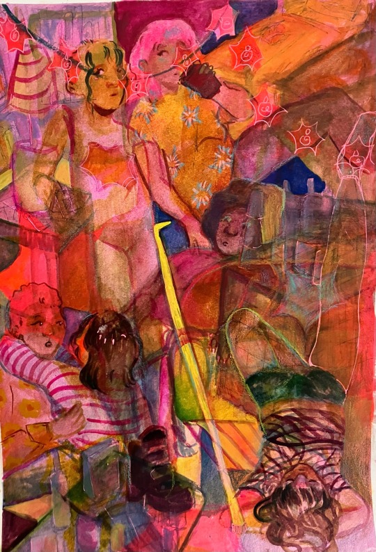
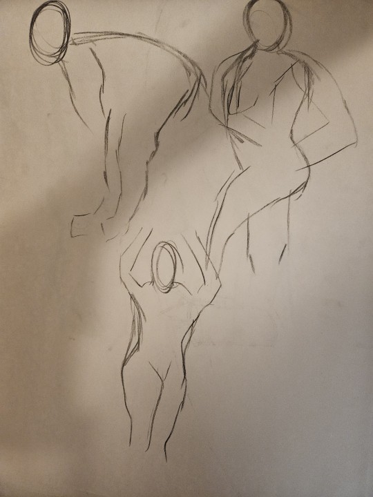
PERSPECTIVE STUDIES/COLOR (3 FIGURES)

MIDTERM AND ARTIST STATEMENT
MIDTERM TITLE: "The Birds Sing Eyes"
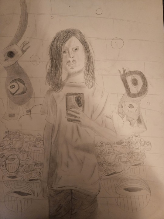
ARTIST STATEMENT:
The approach for this midterm was to create a piece that showcased me in some sort of dream world. Initially this panned out in a way that didn't make much sense, so I was prompted to make it like a mural. Upon researching Wynwood art murals, I came across murals of some birds and murals of some eyes. This gave me the idea to intertwine my South American culture and my roots with some aspects of my mental workings. The eyes are meant to represent the constant expectations that are placed on me and the anxieties that come from that. The clouds represent my tendency to daydream, and the birds my desire to fly while simultaneously reflecting my South American roots. One initial challenge I faced was getting the background in on time. I ran out of time when it came to the background so when I was prompted extra time to correct these issues I was able to overcome that obstacle. I am overall very satisfied with the figure and found myself to still admire how I did that to this day as it is not something to my skill level, not at the time I began the midterm anyways.
MUSEUM INSPIRED

FINAL AND ARTIST STATEMENT:
FINAL TITLE: "Sands in the Red"

ARTIST STATEMENT:
The approach for this final assignment was to comment on the post pandemic struggle. To this end, this painting has figures outlined in blue to represent a shield, a sort of aura or distance from the other figures. They are also painted in red with distorted faces to represent turmoil post pandemic and the challenges that's faced for the economy, for jobs, and for life in society. The distorted faces simultaneously represent the fact we are more distant than ever post pandemic. We don't go outside as much, we don't interact as much, and instead, we rely on technology. I chose the sand as a landscape and framed it the color of the sand to represent almost a dream-like world, a cyberspace to further hone in the theme of technology and our desire to go outside. One challenge I faced was simply that I ran out of time. At first, this piece was highly abstract and it didn't make away with the whites of the canvas and looked extremely unfinished unpolished and not like painting. I overcame this by redoing the painting and instead going for a more linear approach to depict the same abstract figures in a more defined, perspective driven way.
OVERALL STATEMENT:
Figure Drawing as a learning experience tended to be even tougher than Drawing at times. I've never worked with anatomy and being consistent with proportions was an especially gruesome task for me. However, Figure Drawing produced what I believe was the best artwork from me out of the two classes, which surprised me. My goals and expectations post-semester and into my future endeavors is that I will be able to produce figures even more proficiently in this space, and that I will become more consistent as a figure artist if I ever tackle this type of art ever again. I saw myself sprout into an artist of my own in this class, something which I cannot echo when it comes to the Drawing class. My favorite materials in this class was paint. This is because it allowed me to create highly abstract yet grounded figures that conveyed emotions through the muddied combinations of color I chose at given moments. It allowed me to express more emotion than I ever would've been able to with any of the other materials in this class. My favorite assignment in this class was actually the midterm, however. This is because it was one of my most expressive works and it allowed my figure drawing skills to shine through, a skill I didn't think I would have when I began doing this midterm. A challenge I faced in this class was my inexperience with drawing figures. At first, even drawing skulls or a head shape was challenging. But as I kept doing assignments in this class, I overcame this with practice and built experience that allowed the processes of figure drawing to become engraved in my art.
0 notes
Link
0 notes
Text
Perspective/Space

Name: “Paris Street, Rainy Day” (1877)
Artist: Gustave Caillebotte (1848-1894)
Medium: Oil painting on canvas
Movement : Impressionism
Location: Art Institute of Chicago
Analysis
In the foreground, we see a middle-class couple with an umbrella. She wears a fur lined coat, a long skirt, a hat with half veil and diamond earrings. He wears a mustache, a top hat, a frock coat and a bow tie. In the middle ground, we see a couple of pedestrians walking down the street and a green lamppost. if you include its reflection on the ground, the lamppost spans the entire height of the painting. In the background, we see the buildings and some tiny working-class figures. there is a maid in a doorway, and a man carrying a ladder. This painting is also a great example of two-point perspective, which contains two vanishing points on the horizon line. This is often used to show something like the corner of a building on a street.
Glossary
Space is an area, expanse, territory, distance or range. Variable spaces expand or contract as our stories unfold. A closeup has a short range. A wide shot covers a lot of territory.
Atmospheric Perspective Value contrast and color saturation decrease with distance. Brightness increases as objects fade further into the background. In addition, objects such as mountains may appear more blue.
Diagonal Shapes Diagonal shapes pull the eye in a direction to create the illusion of depth. If the diagonal is going back like a railroad track or fence-line the eye will follow it into the perceived distance.
Elliptical Perspective An ellipse is an oval shape. Elliptical perspective provides visual clues to the location of curved surfaces in space. Look straight down on a glass of water. The rim of the glass is a circle. Move the glass to the side, the rim now appears as an ellipse. Line up the rim at your exact eye level, the ellipse now appears as a straight line.
Foreground, Middle ground, & Background The 3 treatments of objects in space support design to achieve depth. This template for placing and sizing objects in the picture plane shows variations on the foreground, middle ground, background configurations.
Foreshortening Foreshortening is when an object’s dimensions appear shorter when angled toward the viewer. At the same time the part coming toward the viewer is enlarged.
Linear Perspective Linear Perspective is a system used by artists in which the relative size, shape, and position of objects are determined by drawn or imagined lines converging at a point on the horizon.
Overlapping Overlap is when part of one object is obscured by another object. The obscuring object appears to be in front.
S-Curve or Winding Path In an image of a landscape, S-curve or winding path will draw the eye of the viewer into a perceived distance. Size relationships Objects appear smaller as their distance from the observer increases.
Transparency or Opacity Transparency or opacity is when we feel like we can see objects through a glassy, gauzy, smoky, or dusty layer. The transparent/opacity adjustment affects the saturation and color of objects to give a feel of depth.
Vertical Position Vertical position places objects higher up in the composition to appear further away.
Volume Volume is the amount, expanse, extent, magnitude, size, aggregate, bulk, dimensions, or mass of an object. The volume variable indicates the amount of territory needed for each object in a scene.
1 note
·
View note
Text
This is the linear perspective assignment in my figure drawing class back in 2016. At first I was trying to use the ruler to make a perspective background that was used during the Renaissance like Brunelleschi when he did the Florence cathedral in Florence Italy and Leonardo da Vinci when he did the famous painting called Mona Lisa. Next I use the vanishing point to make sure it's all correct which is based on velocity according to fphysics that requires a lot of algebra which is one of the hardest math classes I took it seriously. I created three figures which were based on black form rectangles and squares which is very simple to do which look like artificial maniquins rather than natural skeletons and muscles of the human body. First of all I really liked the finalized version of the drawing which was improved a lot and I was influenced by my professors advice in order to be successful as an artist in the future.

0 notes
Text
Shape

Shape in UI Design
Shape is an important factor in the UI design of games. In this screenshot of the Battlefield 1 loadout screen, the progress bars for the player’s achievements are shown in neatly arranged rectilinear boxes on the left, and the player’s top weapons, class, and vehicles are also in rectilinear boxes on the right. The weapon and vehicle icons are depicted through white silhouettes. The bottom left box on the right of the screen depicts the Assault class, which is represented by a grenade exploding. This makes sense because the Assault class gets extra grenades in game, unlike the other classes. The rectilinear arrangement makes it easy for the player to track their progress and achievements, and the silhouettes of the weapons and vehicles give a minimal but also easily identifiable image of the player’s best weapons and vehicles.
Glossary
Shape is the external form or appearance characteristic of someone or something; the outline of an area or figure. As a verb, to shape is to give a particular form. As artists, we shape our characters outward appearance by using shapes.
Abstract Shapes and Abstraction (see Non-objective Shapes) means no recognizable objects. Abstraction is a sliding scale from realism to completely non representational. Abstract shapes can be used in backgrounds and textures. The background pattern in this Minecraft image is abstract. The character is still recognizable as a human, but the doctor’s human form is abstracted in the game of Minecraft to conform to the blocks of the game world.
Biomorphic is a free-form pattern or design with a shape suggestive of a living organism, especially an amoeba or protozoan.
Curvilinear shapes are s-curves. Curvilinear shapes inform Jessica Rabbit’s character design and can represent a winding river vanishing into the distance.
Distortion is exaggeration, contortion, reform, slant, twist, or warp in ways that depart from reality. Look at the Minecraft Human body example. The figure of the Minecraft doctor is distorted by the shape of the blocks.
Idealism asserts that the physical world is less important than the mind or the spirit which shapes and animates it. Idealists choose the soul, the mind, or the psyche over the body, the material, and the historical. When ideals (of appearance, or proportion for example) regulate the way an artist represents the world, her work can be described as Idealistic. The leading artists of the High Renaissance - Leonardo, Raphael and Michelangelo - are all associated with varying forms of Idealism, as were ancient Greek sculptors. How do you think idealism affects avatar customization?
Non-objective shapes have no object as a reference and no recognizable subject matter. Non-objective shapes are often used to simplify design shapes. Geometric shapes such as a triangle, square, and circle are abstract until you put them together to represent a house or a smiley face. One Minecraft block, away from the game, is anon-objective shape. Inside the game that same block, depending on it’s color and texture could represent a part of a landscape, sheep, or sword. The block as part of a character or environment inside the game would no longer be abstract.
Positive space is the subject, focal point, or areas of high interest in any composition. Negative space is the area around the areas of interest. All compositions balance positive and negative space. Yes, stuff in the negative space can point to the focal point to make it most obvious. Positive and negative create a whole. Every composition is a combination of positive and negative space. Wield the positive and negative spaces with control and story-telling magic to become a design master.
Realism, or naturalism, attempts to represent subject matter truthfully, without artificiality or exotic or supernatural elements. In the visual arts, illusionistic realism strives for the accurate depiction of lifeforms, perspective, and the details of light and colour.
Rectilinear is a boxy shape made with straight lines. For example, the screen you are looking at is a rectilinear shape filled with little square pixels, and pixels are also rectilinear. A storyboard is a series of drawings in a linear set of rectilinear frames.
Representational means objects that players can name. The object represents something from the real world, or something that has the verisimilitude of realism. A cartoon bunny can represent a rabbit without being realistic. Representational is a sliding scale from realism to almost abstract. 2 dots and a curve can be arranged into an abstract pattern or they can be arranged into an emoji that represents a smiley face.
Silhouette is a profile or shape that is easy to identify.
Squash and stretch are shapes profiles that emphasize motion. The stretched position shows the form in an extended condition. When you do a sit up your belly squashes and your back stretches.
0 notes
Text
How can you improve your art by working on your perspective?
Improving at drawing isn't simple. Nonetheless, there are imperative fundamentals and activities that may help. Understanding perspective is basic when drawing backgrounds. In the world of art, perspective is about your viewpoint. At the point when you figure out how to improve drawing skills you have the perspective as a beginner, you should get familiar with its significance.
If you are thinking "okay! This is all good but how can I figure out how to draw perspective and how to improve drawing skills?"
(And In Medium Put the YouTube video by Embedding it)
(Take a Good snip from Perspective tutorials YouTube Video of Pencil Perceptions)
Linear Perspective Terms
Linear perspective is the most notable kind of perspective. Draw objects smaller as they become further away until they vanish at a specific "vanishing point." Linear perspective has vanishing points, and all that else depends on the lines prompting those vanishing points. With linear perspective, profundity is accomplished through lines and the size and arrangement of structures.
One-Point Perspective:- Linear perspective with only one vanishing point is one point of view. The vanishing point will commonly show up in the middle part of the scene.
Two-Point Perspective:- The linear perspective that utilizes two vanishing points is called a two-point perspective. Scenes in a two-point perspective ordinarily have the vanishing points set at the extreme left and extreme right.
Multi-Point Perspective:- Linear perspective doesn't need to be restricted to a couple of vanishing points. A scene could have different vanishing points relying upon the complexity of the subject. For instance, a three-point perspective is like a two-point perspective; it has left and right vanishing points on the horizon. Also, there is a third vanishing point either underneath or over the horizon.
Atmospheric Perspective:-
Atmospheric perspective, additionally called aeronautical perspective, passes on profundity through varieties of values (lights and darks), shadings and lucidity of components. Atmospheric perspective happens when particles noticeable all around, for example, water vapours and smog affect what is seen.
A Beginner's Guide to Perspective: Exercises
How about we put our new information under test on how to draw and understand perspective using simple boxes. Work on drawing these to improve your understanding of the perspective in real life.
1. Draw a draft
To start with, draw a draft.
2. Decide your vanishing point
Draw a rough draft of a box and it's the vanishing point, horizon, and draw lines from the vanishing point. Broaden the edge of the box. The vanishing point is where the all-encompassing line meets the horizon. Decide two vanishing points and a horizon that is corresponding to the screen. Try to keep a separation between the two vanishing points!
3. Draw a line
Draw a line from the highest point of the case to the vanishing point. When utilizing a two-point perspective, draw your vertical lines opposite to the horizon. Utilize a ruler for straight lines.
4. Done!
Erase every unnecessary line, and you're finished! In the event that you can draw a box, you can apply a similar strategy to draw structures. You can even utilize it to make a rough sketch for characters with different perspectives.
Hope this article will help you understand the drawing perspective. If so, you can also join our online art classes if you want to learn to draw.
0 notes
Text
Secession from the Academies- Thursday 21st November
Within this lecture we learn about the secession from the Academies of art. I think recover today included: when artist began to secede from academies Army academic style of art; the new exhibiting organisations and artists groups that begun to settle; interestingly decorative leading to the aesthetic movement; interest in colour, colour harmonies, music, light, climatic atmosphere and foreign cultures for inspiration; Ruskin/Whitler trial seen as the site of debate about the future of art; development of Impressionism, Paulist – Impressionism and art nouveau; as well as a greater social awareness by artists for example the consciousness of the poor.
The first painting we learn about in this lecture was called ‘the golden stairs’ made by Edward Burne-Jones in 1880. This painting had a linear feature prominent throughout, through the inclusion of the stairway which is circle throughout the painting giving a clear direction for the audience. Burne-Jones spent a lot of time in Paris and really admired the impressionist artists who had moved away from academic traditions. Is that a learning through the academic System he was taught by Resetti one of the Pre-Raphaelite brothers, which meant that he had already had training in art styles that were of the avant-garde and didn’t follow the traditional. This painting was exhibited in the Grosvenor Gallery in London which was a new art space in London which was use an alternative to the Royal Academy in London, which had just opened up in the 1870s – so was fairly new during this exhibition time. If you look closely in this painting you can see that all the women are similar in the fact that they are the Pre-Raphaelite femme fatale, as well as their gowns all creating a repeated pattern through the linear designs present. He wanted to achieve his main goal of creating something beautiful, and therefore beauty as a concept was extremely important to him throughout his whole time an artist. Burne-Jones wanted to create “a beautiful romantic dream was and will never be”, which explores his one to reject the contemporary world and his lack of fear towards painting things which did not exist in order to create desire I’m true beauty- which was also seen in his painting ‘In Praise of Venus’.
In 1855 Edward Burne-Jones and his teacher William Morris established the brotherhood, the order of Sir Galahad, which was meant to draw attention to the ancient and decorative world and express decadence.
The artist Whistler was, himself, very important in disseminating the Impressionist movement. The New English art club founded in 1886 allowed Whistler to exhibit his new art, typically frenched styled work. Art with very fluid brush strokes and movements full of unexpected viewpoints and perspectives- particularly seen in the painting by Philip Wilson Steer, ‘Mrs Cyprian Williams and her two little children’ rom 1861. The lines flowing neatly throughout the painting shows an interest within the art nouveau movement – seen commonly on the Paris Metro signs- so there were many influences from many different movements not just the impressionists.
Steer was a great impressionist painter. We looked at his painting ‘a summer’s evening’ made in 1887 to 1888. This painting is impressionist as although you can see multiple figures you cannot make out distinguishable features due to their similarity to the actual backgrounding colour. There is also a great juxtaposition between the red on and the beach and the blue of the ocean which creates a sense of warmth. This is very similar to the painting by Walter Sickert ‘Minnie Cunningham at the old Bedford’ made in 1889. Much like the juxtaposition between the blue and the red in the previous painting by steer, there was a jarring effect created by the complimentary colours of red and green. We also cannot see or make out any features on the face, which is influenced by steers work once again.
Stanhope Forbes painting ‘A street in Brittany’ made in 1881 was a representation of the everyday life of the working-class people. Artists began to create artistic colonies in Cornwall due to Gogan’s colony in Brittany. Artists all moved to Cornwall due to the interest in a new landscape and the new lighting. In the Brittany colony, the artists would look at the local people as “primitive” and “strange” which the found to be interesting to paint due to the new and different. It gave them lots of new textures and objects to paint; due to the foreignness of the landscape.
0 notes
Text
Designing Adobe’s Brand Illustration Style

The process of building an overarching graphic illustration style for Adobe products
Context
Illustrations are emerging as a vital part of the user experience, as they help express the brand directly into a product. At Adobe, we’ve had a lot of important discussions around the need for a unified brand illustration style. As our products evolve, we want to make sure we’re building better brand recognition with our users, and build deeper connections between user and product.
As you may have gathered from past articles by my teammates (such as Sonja Hernandez’s brand system article and Anny Chen’s filetype icon case study), there are a lot of considerations to take into account for a product landscape as big as ours. Adobe’s offering includes over 100 products, services, and communities, from creative tools to communication and marketing tools. How do we provide a creative and playful illustration style which can scale to a company and product lineup like Adobe’s?
A brief history of illustrations in Adobe products
Before we started exploring color illustration in our products, our Icon team had already established a more linear illustration style in 2016, which is still widely used in our products. These linear illustrations are typically used for informative contexts, in areas like empty states and user onboarding flows.

Welcome to CC assets by Marco Mueller
Initially, we wanted to integrate this linear style created by icon designer, Marco Mueller, with our new brand illustration system to make the transition between these two areas as seamless as possible. I tried adding figures interacting with the linear elements to create stories. The style of these original figures was actually inspired by the illustration used on the Acrobat 5.0 packaging way back in 2001.

Early illustration style experiment (L) Adobe Acrobat 5.0 Package Illustration (R)

Adobe Capture on-boarding illustration

CC library illustration
We had several internal discussions about this style after its first release — Khoi Vinh, principle designer at Adobe, raised some concerns regarding the visual identity. Regardless of its interesting historical origin, this approach used a combination of vector shapes and human figure, which has been widely used in the tech industry. So our team decided to revisit this project and explore other directions.
“But it is worth taking a step back to examine the way our products use illustration and trying to understand why we’ve all settled on this particular approach.” — Two Very Different Kinds of Illustration, Khoi Vinh
I was honored to collaborate with a remarkable illustrator and artist at Adobe, Kyle Webster, for this project. This time around, we set out with a few goals for the illustration style: We wanted to demonstrate Adobe’s commitment to world-class illustration through creativity and playfulness. The illustrative language needed to allow for variety within the style, so that it may be expanded over time across the system of products and messaging, and allow for additional illustrators to contribute. We also wanted it to feel unique to Adobe, and not “owned” by another company.
First, Kyle tried to see if we could add more visual elements to help enhance the existing illustration style. As you can see, he added more personality to the figures by including skin color, details in clothing style, and shadows to bring more depth to the characters.

“While it was fun to see how far I could push the style away from the original source material, while retaining a more traditional human form in the drawings, it became apparent that this direction would not be as flexible as we wanted, nor would it give us room to really play and experiment. I’m glad we changed direction and Emma did a wonderful, thorough exploration that set us on the right path to develop a unique and adaptable visual vocabulary.” — Kyle Webster
As Kyle stated, this initial exploration was still pretty close to the original style, and after a few more brainstorming sessions, we decided to move even further away from the standard human figure to explore a more abstract visual vocabulary.
It’s time to ditch the trend…
Adobe Spectrum Inclusive Design Mobile Banner
We exist in a software landscape where illustrations are becoming more uniformed and — for the lack of a better word — generic. Often, illustrators are removing personal, creative characteristics of people in their illustrations in order to capture a wide diversity of people. They focus a lot on figures, and don’t experiment a lot on how to express their ideas more abstractly.
In Meg Robichaud’s inspiring article, You Can’t Just Draw Purple People and Call it Diversity, she discusses the inclusive issues of in-product illustrations. I wanted to shift the focus away from trying to represent human diversity in every single illustration, and in doing so open up different possibilities for expressing the same user concepts through abstract shapes instead.
Establishing principles and exploration
Illustration is an intuitive and subjective art form, which can make it challenging to translate into a systematic language that works across multiple platforms and products.
In order to experiment and define a new style, I restrained my explorations with four tenants:
Human forms and perspective
Texture
Shapes
Color
I’ll spend some time here talking about each, and guiding you through some examples.
Human forms and perspective
Including human forms can build an immediate connection with users, but to what level can we abstract those forms and still connect? Do we always need to have fully concrete figures involved? Do we need to include perspective details, such as shadow and dimension?
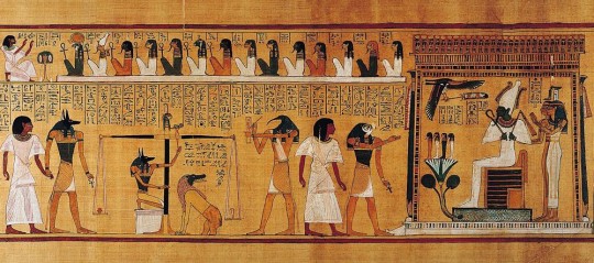
The Weighing of the Heart: In Spell 125, Anubis weighs the heart of Hunefer. This spell is first known from the reign of Hatshepsut and Tuthmose III, c. 1475 BC. Image from Beyond Hieroglyphs: The Art and Architecture of Ancient Egypt
Side profile explorations
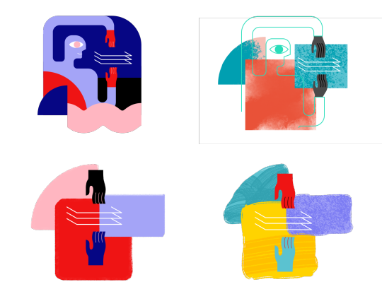
Inspired by the style of Ancient Egyptian art , where the heads are painted in profile with little to no shading, I tried a series of side profiles and arm/hand combinations that could be assembled in different ways to tell stories.
Texture

Kyle’s explorations of textures
Texture is another great way to bring these shapes to life and give them a human touch that adds personality and a distinct style. Kyle curated a series of brushes that could generate a subtle but intriguing texture in the illustrations. We played with a range of texture styles and compositions outlined in the above study. Ultimately, we preferred the openness and airy look of Option A in terms of composition, but also liked the brush stroke effects in Option E and how it was integrated with the forms. From there, we decided to combine the two styles and keep exploring.
Shapes

Alexander Rodchenko and Varvara Stepanova’s famous Books! poster (1924) employs a stark grammar of simple geometry and flat color to promote a campaign for worker education, the image is from The easy guide to design movements: Constructivism
Shapes play a huge role in our design principles, and they also help connect this new style with the more informative illustrations that were developed earlier. Coming from a background in graphic design, I wanted to experiment with mixing geometric elements into our style to create a minimal and contemporary look. I’ve always been inspired by Suprematism and Constructivism, two significant art movements and philosophies in graphic design. Both art movements focus heavily on using basic geometric forms and the importance of composition to create an impactful visual design.

Shapes I used in the illustrations
Colors

Colors can strengthen the connection between illustrations and a product, so we generated color palettes that were based off of the product’s brand color theme and then included additional colors that would complement the main colors. We wanted to allow for more flexibility in color combinations, and so the additional colors are open to the designer to pick and choose what makes the most sense for each illustration. The only other guideline we provide around color is how they are layered, so the darkest color is only ever used for line work and figures. The medium and light colors are for solid shapes and background.
Defining the visual language
Storytelling and Abstraction Level
To find the right visual language for telling a story, I tried to assemble the elements I talked above. Below are some examples from the early exploration.
The idea was simple: use the least amount of elements to express the most out of a story.
I tried to reduce the number of figures in the illustration. The idea was simple: use the least amount of elements to express the most out of a story. The two illustrations at the bottom can clearly convey this concept while distilling the form down to its essence.
Textures and lines
At this stage, I was trying find the sweet spot of line, texture, and shape combination in each illustration that would be visually interesting enough and still feel balanced to the eye:
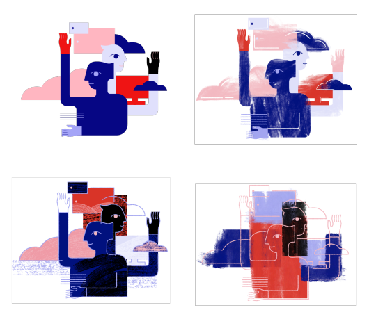
The goal was to have a clear definition between foreground and background, layers and dimension, and to create unexpected and interestingly arranged interactions between lines and shapes that would reinforce the messages.
Linear shape explorations
Showcase
Here are some illustrations that I created based on this new system. You may notice them in the most recent release of Document Cloud (Acrobat) and this week’s Creative Cloud release. Keep an eye out for these and more in upcoming releases of your favorite Adobe apps!

Acrobat DC On-boarding card


Creative Cloud Mobile on-boarding cards

Creative Cloud Mobile on-boarding cards

Adobe I/O Console XD Plugins Webpage

Adobe Illustrator CC 2019 on-boarding banner
0 notes
Text
A few wooden buildings

Places have memories. This is not to propose the pathetic fallacy that they have feelings, consciousness, thoughts or intentions, but that in the same manner that a certain synaptic pattern preserves a trace of experience in the brain, features of landscape and cityscape preserve traces of biography. Of course subjective experience can only be imaginatively resurrected from biographical details, or from buildings and artifacts, but it is entirely possible that this is also what occurs when we retrieve memories from our brain tissue. The act of recollection on the basis not of long-term potentiation of the synapses, but of topographic and documentary residues, is central to the literary genre of psychogeography, but also to historical fiction in general. When David Mitchell stumbled across a small neighbourhood of seventeenth- and eighteenth-century Dutch architecture in Nagasaki, the memory of a particular series of historical events, he felt moved to begin such a process of imaginative recollection.
He had found Dejima, once an island at the edge of the Bay of Nagasaki, but now absorbed into the city by a process of land reclamation, which housed a Dutch trading enclave from 1641, when they replaced the Portuguese, until 1854, when the Convention of Kanagawa rendered it obsolete. During this period Japan was legally secluded, with trade and contact with the outside world strictly controlled; for Europeans it took place exclusively through the offices of the Dutch East India Company at Dejima. Around twenty Dutchmen lived on this small patch of ground, around one-hundred and twenty metres by seventy-five, visited by no more than two ships a year. If that isn’t a fascinating scenario, a readymade setting for dramatic fiction, I don’t know what is.
Mitchell is known for innovative and experimental approaches to narrative, but The Thousand Autumns of Jacob de Zoet is a straight genre novel, a historical thriller with a linear plot. It is a technically exemplary work of historical fiction, characterised by plausible world-building (its accuracy is entirely moot, as I know little about the time and place in which it is set), and convincing spoken language, ‘Bygonese’ as Mitchell calls it, which nods to the turns of pre-industrial English phraseology without falling into tweeness. Most importantly, as with all good speculative fiction (and I make no apology for including historical fiction in that category), every aspect of difference between the world inhabited by the characters and that in which the reader can be assumed to reside, is shown, not told. The plotting is taut, effective, gripping, and has a sense of urgency that is abetted by the use of the present tense throughout. Repeated cliffhangers turn on a change of point-of-view character, leaving the reader desperate to tear into the next section and find out what happened.
One such shift is also into the first person. The shocking immediacy this brings to the narrative is deployed in a shift from the perspectives of other characters who are of more or less high status, to one who is a slave. It’s a very effective strategy, forcing the reader to confront the subjective experience of slavery from their own subject position; Mitchell takes the opportunity to explore exactly what that loss of liberty might feel like, and how it might be endured. This switch, and sudden immersion, is one of the most powerful moments in the book. Up until this point even the most socially engaged reader will have taken Dejima’s hierarchies more or less for granted as they follow a narrative focussed on the desires, successes, and setbacks of certain characters who for all the contingent restrictions on their freedom of action, are not chattels. Sadly, this brilliantly written passage is no more than an interlude, and its first-person narrator a minor character. When we return after a single chapter to the narrative’s established points-of-view, there is a jar – or at least there was for me. For a brief moment, this character was the most important in the book, the subjectivity to which all the others had led, the most marginal and unrecorded of experiences resurrected by the magic of fiction from a historical record in which it figures mainly as a trade commodity. But, it turns out, Mitchell invoked it to serve no more than a decorative function.
Perhaps he was too in love with his own brushwork not to include this portrait, even when it had become clear it had no real place in the book. Perhaps this is really the best representation the life of a slave could have, to be treated within the fictional domain as instrumentally as within the primary world of the historical record, but that is not a representation that reflects very well on Mitchell. Towards the end of the book there is another comparable example of a writer too in love with their own materials to resist including what does not really belong, when a long descriptive passage acquires rhyme and regular meter, although it remains justified on the page as prose. Again, it is extremely well-written, but again it draws attention to itself as a clever formal device, in the midst of a book whose beautifully constructed, lucid prose, is characterised by both consistency and transparency. In a novel as accomplished as this one, such unwonted departures advertise themselves as faults.
Also striking a dissonant note against the predominantly cosmopolitan, multi-cultural perspective of the book, is the rather bizarre fantasy that provides the plot with its propulsive mystery. Accusations of Orientalism could be levelled at a writer who decides to include fantasy, not of the magic and dragons type, but of the conspiracy-theorist, Da Vinci Code variety, in a novel that otherwise belongs to the historical fiction genre, and to make it a fantasy of Japanese depravity, contrasted in the book to prosaic forms of European dishonesty and corruption. The precise details of said depravity do not need to be rehearsed here, and I don’t propose to make a detailed analysis of the novel’s representation of cultural and ethnic identities, but it’s worth noting that this was a questionable choice on Mitchell’s part. To me, it felt like a cheap shot.
Although some characters are not on stage for long enough to appear as anything more than villains, for the most part every individual is portrayed sympathetically. Real honesty in a context of widespread corruption is shown as a plausible possibility, albeit one with significant costs; but other than the end-of-level boss around whom the central plot revolves, every character that we spend a reasonable amount of time with, has motivations for their behaviour that are plausible, that are reasonable responses to their context, and that evince a nuanced understanding of the moral and ethical ecology of Mitchell’s very particular revenant society. He has an empathy or compassion for his characters (you choose) which is probably a prerequisite for writing anything that feels like a description of a real person.
The memory of Dejima that Mitchell invokes is not populated by characters whose names appear in the historical record, with a few exceptions, while the few specific historical events that he deploys have been transformed in time and detail to fit the exigencies of his narrative. This does not invalidate in any way the novel’s status as an act of remembrance. A novel adhering literally to the available record, or a non-fictional account attempting to reconstruct the lives once lived on Dejima, could not, at this distance, make any claim to more effectively preserve those long-vanished subjectivities. What is most important, what is genuinely vital to the health of our global culture, is to remember that real people lived in such times and places, and experienced lives that were utterly particular to them. The Thousand Autumns of Jacob de Zoet is several things: it is a ‘literary’ historical fiction, a commodity which will enable middle-class readers to accumulate and reinvest yet more cultural capital; it is an entertaining and exciting thriller, which will enable readers of all stripes to lose themselves for a while in a milieu they will probably thank their preferred deity that they do not have to inhabit; and it is a vivid reading-out from the historical record of a memory, embodied in a few wooden buildings in Nagasaki.
0 notes
Link
0 notes
Photo


Juan Sánchez Cotán (Spanish 1560-1627). Quince, Cabbage, Melon, and Cucumber 1602. Oil on canvas, 27 x 33 1/2 inches. San Diego Museum of Art, San Diego, California. Source.
William Bailey (American b. 1930). Turning 2003. Oil on linen, 70 x 55 inches. Source.
As I started putting this week’s slideshow together, I remembered a conversation we had about the handling of edges in representational still life painting. That conversation got me thinking about two things: painted edges as they appear in both representational and abstract painting, and the possible relationship between certain kinds of still life painting and the sort of geometric abstraction we looked at last week. Cotán is an artist I learned about in a college painting class, and this particular example is often cited to demonstrate the use of geometry in representational composition. The placement of objects, some of which are suspended with string, serves no apparent narrative function but simply delineates a particular curve.
William Bailey studied at Yale under Josef Albers, whose work we will consider shortly. Turning shows an arrangement of vessels and eggs on a round tabletop; to my eye, the light and space depicted here is palpable and accurate, despite the fact that he does not rely on tricks such as atmospheric perspective (blurred edges would be an example) or the “correct” use of linear perspective when drawing his ellipses. What’s particularly fascinating about Bailey’s still life paintings is the fact that they are entirely invented by the artist and not painted from an actual arrangement of objects. Here is how the artist describes this aspect of his work: “The paintings I do are not from life—they’re made up, but they’re made up from real situations. Real objects. You can see some objects over there on the other side of the room. I don’t paint from those things, but they’re actors in my repertory company.” (Source.) He goes on to say that he treats both the figure and landscape the same way.
0 notes
Text
Virtual Assignment 2
1. JOURNALING -
- Unity: when there is consistent similarity that provides uniformity. Ex: I see this every day in the logos around town. Logo’s are made with unity to provide a sense of comfort and consistency to their meaning.
- Variety: is the collection and expectance of diversity. Ex: I think variety is seen in almost every aspect of life, whether forced or embraced. But the best form of variety that I can think of is that of a soda machine. Just think about all of the different art on the different bottles trying to sell you the almost exact same thing.
- Balance: the formation of space or object to create and equal existence the opposing influences; this can be achieved through asymmetrical or symmetrical formations. Ex: I think balance is best seen is the simplest of things, an example of that is a Chich-fa-la cup, the red logo is placed on the white background of the cup and then is balanced by the red straw.
- Emphasis: is a technique that and artist to to draw the viewers attention to a specific area or object in their art. Ex: I think that emphasis is best seen on a movie cover which usually depicts the main character in an important scene.
- Subordination: is a technique used by artist through the tool of color value, clarity, and size to diminish areas of lesser importance in an art piece. Ex: I think that a good example of subordination is seen in modern photography when the artist blurs out the background of photo so that what is being emphasized is not being over taken by the rest of the photo.
- Directional Forces: Embedded pathways created my artist to guide the viewers eyes through and artwork. Ex: The best way take directional force is used in modern art is in comic books where the artist uses direction to navigate the reader through the comics.
- Repetition And Rhythm: repetition is the use of a visual element multiple times over, and rhythm is the repetition of various visual elements in a related design. Ex: This design principle is used everywhere, but my favorite example of it is in clothing. I have a hoodie that has a repetition of three different patterns of abstract shapes.
- Scale And Proportion: scale is the diffraction of sizes from of one thing to another while proportion is the diffraction of size of one thing to the entirety of the whole piece. Ex: My favorite example of this is a still-life painting that I have hanging in my room. The painting consist of three cubes differing is size, while one cube is much larger than the others all three are proportionately small the the entirety on the painting.
2. WRITING AND LOOKING

Henri Matisse, LE BONHEUR DE VIVRE (THE JOY OF LIFE) 1905-6 (pg. 394)- Media: Oil on canvas. 69
- This painting is created through the use of hard lined figures arranged in the fore, mid, and background in an impressionistic manor, loose brushstrokes, mellow values of pastel hues that seem to cause emotion. The artists uses linear perspective companied by directional force to guide the viewer from the foreground to the background. Abstract shape and undefined line are used to created the surrounding nature and backdrop. Emphasis, subordination, variety, rhythm, scale, and proportion are used to focus the viewer on the main subjects.
3. CONNECTING TO ART.I think that color has a different effect on me than most people, I feel that color can get in the way of art a lot of the time. I think that some of the most influential and emotional art that I have seen are the monochrome photographs from the depression. The lack of color saturation allows the white and black values, in my opinion, great a deeper more surreal experience for the viewer. When I look at the photographs of that time period I can see the dirt and grit of the emotionally deprived people, the lack of color allows the imagination of the mind to fill the void and incorporate empathy for the hardship of the ones depicted. But if I had to choose a color scheme for my life it wouldn’t only be white and black, I think that i would also put the primary colors of red, yellow, and blue but only in a meek hue.
4. ART PROJECT

- This is a 12″ by 23″ acrylic painting that I did of a pack of Winston cigarettes. I choose to show you a painting because it has become a resent and fun passion for me. I have always only drawn or drafted in the past but when I entered art school and started taking painting classes I fell in Love with the personal obstacle. This painting is important to me because my grandfather died from lung cancer when I was at a very young age. And some of my most vivid memories are of him smoking Winstons and telling us kids not to tell my grandmother. So whenever I look at this painting I get to laugh and remember my grandfather.
5. PHOTO/DESIGN.
- Apple, American Eagle, Fender, La Croix, D Drum, Zildjan, Toyota, Nike, Vans, Tervis Tumbler, Chevy, Ford, SCF, USF, NFL, Jersey Mikes, Publix, Starbucks, Buddy Brew, Cornerstone Of Lakewood Ranch, American Spirits, Miller Lite, H & M, PacSun, Tesla, Guitar Center, and of course Coco-cola and Pepsi.
How do you know about these logos?
I know about these logos from observation and use. I see these logos and use the product marked by these logos of a daily or weekly bases. It’s crazy to think about how a simple logo can create a craving or draw a memory from the past. I think thats why people remember and recognize logos, they’re apart of them, it’s who we are.
How do you understand the value of logos?
As I touched in the last answer, logo’s have an emotional / psychical effect on people whether the know it or not. I understand the value of logos because I have and do experience the impact on me and others every day. Logos provide a connection made through the product or company that they represent, which allows people to connect and make good and bad memories and emotional attachments.
0 notes
Link
Drawing the Figure: Figure Drawing - Charcoal to Comic Book ##100%FREEUdemyDiscountCoupons ##FreeOnlineTraining #Book #Charcoal #Comic #drawing #Figure Drawing the Figure: Figure Drawing - Charcoal to Comic Book Students learn to use value in conjunction with line to achieve a synthesis of form, space, composition, and content, moving from the fundamentals of linear description to the integration of tone. Finally the student will be able to achieve a dynamic pose to create a story with comic slides. How to Develop Your Own Style With a Few Tools Includes a 30 Day Money Back Guarantee. Includes exercises from Art classes taught in NYC Quickly develop a perspective to turn your hobby into a career Learn to find a style of drawing that is suitable for your project of choice. Follow along with the tutorials and choose what you find to be the most fitting. Materials Used: 1.White Chalk 2.Compression Charcoal 3.Charcoal Pencil Soft/ 4B 4.And MORE! 👉 Activate Udemy Coupon 👈 Free Tutorials Udemy Review Real Discount Udemy Free Courses Udemy Coupon Udemy Francais Coupon Udemy gratuit Coursera and Edx ELearningFree Course Free Online Training Udemy Udemy Free Coupons Udemy Free Discount Coupons Udemy Online Course Udemy Online Training 100% FREE Udemy Discount Coupons https://www.couponudemy.com/blog/drawing-the-figure-figure-drawing-charcoal-to-comic-book/
0 notes
Text
"HOMEWORK TASK FOR ROWAN’S TUTORIAL"
Visiting the galleries was exciting as we saw new works and artists. We visited the Nolan Oswald Dennis 2019 exhibition titled: Option at the Goodman Gallery which discussed the idea of mapping from colonial times to the present day. Many of his artworks are textured drawings,diagrams and mapping.These drawings have what appear to be tentacles,or worms traversing the page in all directs. Essentially these works are maps of various spaces, such as political, psychological and economic spaces.The Goodman gallery space I found welcoming light and easy, an excellent showcase for the work. However negotiating the entire building took time as it is really big,I found this spatially disorienting.
In the tutorial we discussed the the symbolism in the exhibition for example the long till slip which represents a political court case. The letters B and F which were typed repeatedly on the till slip stands for Steve Biko and Franz Fanon(Figures of Black Consciousness).
A further example is the work where synonyms of words forming a large spiral on one of the gallery walls that gives a non linear perspective of history. Another effective symbol of European colonial thinking is the blacked Globe(European view).It could represent the world colonialism. There was two exhibitions in the Goodman Gallery but I only focused on one of them.
Nolan Oswald Dennis, Prop10 [prou(k)n], 2018, Graphite,washi tape and , Goodman Gallery.

Simphiwe Ndzube’s UNCHARTED LANDS AND TRACKLESS SEAS is an exhibition which I have seen and I enjoyed it again. Simphiwe uses Magical Realism, which is a fictional reality, to create a different world full of mysticism and history. Where he criticises the artworld and the wider society and yet have the creative freedom to play. His works a mix ture of texture(fabric) and bright paint colours. In his paintings there are figures with no faces or with colourful tentacles. The mounds of soils extracted from the earth which are placed on the gallery floor are symbols of mining and grave digging.
There are recurring motifs such as the gloves which represent labour. The umbrella could mean protection or objects by the colonial powers. His work has a confrontational quality as some of the figures stare at the viewer. The tendrils(cattle whips) suggest cattle herding.
The pictures look out as if they are either trying to escape their frames or go inside(escapism). There are fingerprints which look like their trying to go into the narrative.
The gloves could be used for protection or for surgical reasons.The gloves which are either painted on or stuck on are thick, mainly used to washing up gloves or for garden work. It represents the working class.
The figures are wearing work outfits or festive clothing for special occasions which very colourful and bold prints. It could also refer to the working class,
The sculptures look life like yet they are proportionally smaller and therefore disconcerting for the viewers.The faces are covered as if there identity has been removed or some have a mask like quality with no eyes or mouth.
Ndzube refers to his work as Afrofuturist as he created his own words and languages for his exhibition.
Afrofuturist:’Seekers of Light’(2018) from Simphiwe Ndube’s solo exhibition.

The first gallery that we visited was BlankProjects where we saw Bronwyn Katz’s ‘/ // ! ǂ’ audience installation which was a simple exhibition with a deep meaning. She discussed the four clicks which she interpreted in her own language and style. Using metal structures which created a metallic sound which were hard to interpret although they were connected to the exhibition title. The themes of forced removals was also discussed because of industrialisation. .Her exhibition talked about the four languages, Zulu, Khosa,Sutho, KhoiKhoi which has almost disappeared because of colonialism. How most of our understand of the language is first translated into English.
Although we had a short time to visit and explore the three galleries it was enough time to realise the themes that the artists were trying to convey. We discussed it in more details in Rowans Tutorial where we discussed the similarities between the exhibitions of decolonial history,sculptural elements and two dimensional elements, which was a thematic similarities in all three exhibitions. All three exhibitions consisted of both two dimensional and three dimensional works. While also allowing the viewers to have their own interpretations of their works.
,
0 notes
Last Seen Blogs

gillfosters
Who better than me to get inside the world of gangster rap?

contentoutfit
contentoutfit

rishika26a-blog
Untitled

breakingthedisneyspell
Decolonising the Mouse

emiliakicks
Emilia Hicks