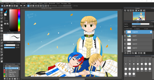
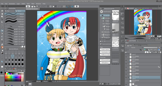
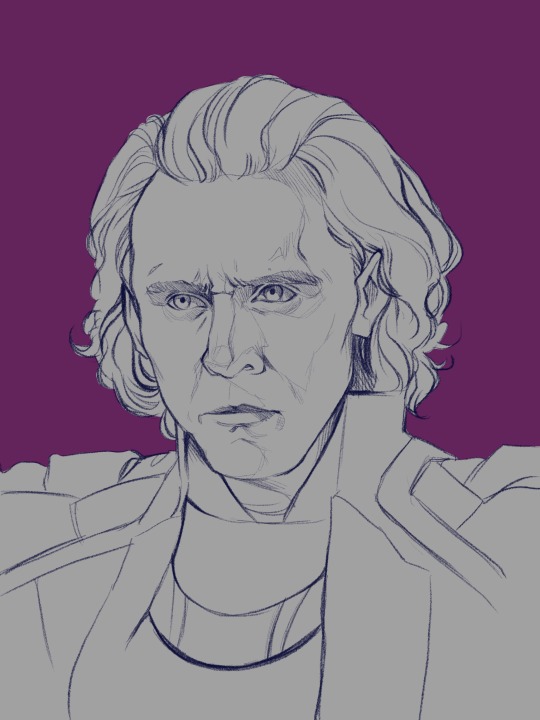
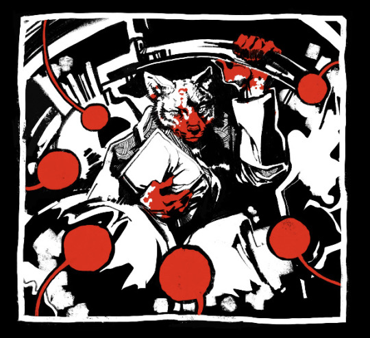
#(base drawing in procreate painting in krita....i was on the go)
Text

happy three years, bd2
#bravely default 2#bravely default#seth#gloria neu musa#elvis lesley#adelle ein#mine#myart#procreate#krita#(base drawing in procreate painting in krita....i was on the go)#group: heroes of light#bravely default ii#bd2#bdart#wasn't able to muster the strength to do anything fancy#but a lil something
36 notes
·
View notes
Note
would you consider doing a painting process explanation post? im really in love with the colors in your ‘better’ animatic and am considering using the same sort of method in a grayscale scenario for some of my own work- not sure how it would translate from krita to procreate, but im curious about how you color/draw to lay things out! start to finish!!! :)
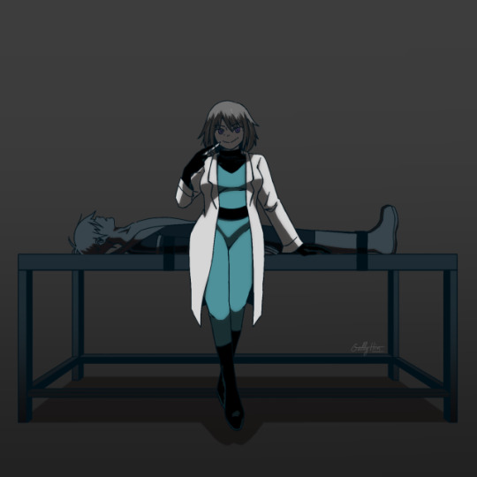
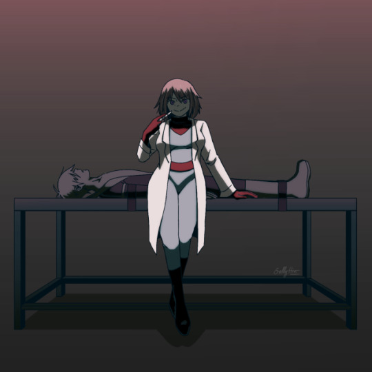
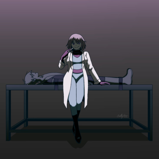
hiii dont know how interesting my coloring process is but here it is anyway


i start with a base color that matches the whole vibe of the piece (i dont use a fully opaque brush most of the time, so some of it bleeds into the final colors), then slowly work from element to element (usually dark-light) i also use a fuzzy brush for that 'dreamy effect' then go back in to add some sharp edges for clarity

also to note when using fuzzy brushes to make sure ur light colors are bleeding into the dark ones and not vice versa!! you can tell one looks very dreamy and the other just looks muddy
45 notes
·
View notes
Note
Hey uh, what drawing apps do you use/recommend?
I mostly use photoshop and sometimes krita
As far as recomendations go, I don't really like recomending programs since it really does depend on what you are going to use (pc, laptop, android tablet, ipad, you name it) and how you feel about it
But just to list some programs I know about/ have used at some point:
Clip Studio Paint, Infinite Painter, Autodesk, Fire Alpaca, Paint tool Sai (I dont know if this keeps existing) and Aggie/Magma I guess
(i dont have an ipad and I only know of Procreate for it)
I'm gonna go in a bit of a ramble so I'm gonna leave that under the cut
Like I said I dont really like recomending programs because what works for some people might not work for others
For example Clip Studio Paint is an amazing program with a lot of tools that'll make your life easier, it works for pc, for android tablets, and I think for ipad too. it has an animation feature, the tools it has for comics/manga are amazing, and theres a whole asset store for brushes and whatnot with free stuff you can get! A lot of friends have move from photoshop to csp, most of my supervisors use that, and it called me like a siren call. but I cant use it. idk what is it, but i just cant get used to it, I've tried it in 3 different times for a couple of months and it never clicked with my brain. so I don't use it
I have an android tablet that I bought so I could draw digitally without being chained to my desk but I rarely draw there because I dont like the way it feels, but I use Infinite Painter and is a very compleate program there are tools under a paywall but is very cheap to buy
Autodesk, Fire Alpaca and Sai were some of the programs I used when I started digitally, I used to jump from one to the other to see what felt better (I ended up using photoshop) Autodesk and Fire Alpaca are free (as far as I know/remember) and Sai you do have to buy it but is a one purchase for life kind of thing (as far as I know)
Aggie/Magma is a browser based program, I don't really like it lmao, it lags a lot for me and my pc fans go like crazy whenever I open it, but I know people who use it as their default and I've seen people do very cool things in a shared canvas.
Same way, many people find photoshop very daunting or confusing or restricting while is my favorite thing and I feel like fish in water there. So it depends on your preferences!
My best recomendation is to jump from one place to the other, use those free programs and use up the free trails of the paid ones (and pirate photoshop) see what feels right to you!
And remember this very important bit of information:
Programs are just a tool. The tool does not make the artist.
Sure the wrong tool can mess you up, but that's why is important to experiment and find what works for you. But using fancy or pricy programs are not gonna make you a better artist, after all, there's people who do realistic portraits on ms paint
36 notes
·
View notes
Note
Hello!! How are ya?
I decided on starting my own webtoon and I was wondering if you have some tips on making one?
I work in Krita so its definetly harder bc i dont have page assistiant like procreate does so if you work in a similar program what canvas size do you use?
Thank you and have a great day/night!
Hii! And congrats (or condolences?) on being a fresh webtoon creator!
Now I'm sorry to say that I'm the last person you should get webtoon advice from haha. I draw my webcomic as actual comic pages first, so I can post them on Tumblr. That's how this comic started and that's how I will end it (...one day). After that, I cut out the panels and create the webtoon version with those. I recommend this way to literally no one because it limits you greatly.
All my pages so far have been made in Paint Tool SAI though, I've only been (rarely) using Procreate for half a year now, and didn't even know page assist was a thing until you just told me haha. So I think you should be more than fine in Krita.
My canvas size for Webtoon is 800x1280 pixels, which is the max that Webtoon themselves recommend. Don't go over that or else your dimensions will be screwed. Everything smaller than that is fine, though. And with that canvas size I only place 1 or 2 panels on one canvas (depends on the size of the panels). There's no real science behind that, I just like that amount of 'pause' between panels when you scroll through it. It's pure feeling based.
If you have any other specific questions, feel free to ask!
#pica's asks#YES I KNOW IT'S BEEN MONTHS SINCE THE LAST PAGE#I'm just so busy I'm sorryyyyyyyy djklshfh
10 notes
·
View notes
Note
What drawing program do you use? I wanted to get procreate again for my boi but I was wondering if there was a cool alternative :D
Currently i'm using procreate on my ipad and..... yeah its kind of the industry standard app for a reason, its just so good! And a ONE TIME PURCHASE which is, unheard of these days. If you're looking for something on the pc, i've tried:
Krita - free, which is good, but a bit of a learning curve to it. doesn't handle like how photoshop does, which ultimately worked against me as i've been using PS for like. almost 3 decades LMAO
PaintTool SAI - free (tho i believe thats just the trial and then you're supposed to buy it, and tbh it would be worth it lol), more heavy on the painting side of things (hence the name) but a VERY solid program. actually what i started drawing LQ in back in the day?? out of all the online options i would go with this for drawing
OpenCanvas - free. does this exist anymore lol
Photopea - free, web-based clone of sorts of photoshop. works in a pinch but a little tricky - not sure if i would use this for drawing as it being inside a browser is a little risky (nightmare flashbacks of oekaki boards crashing..... hooo).
Photoshop - extremely not free anymore (unless you know where to look) and tbh not necessary for askblogs, and adobe's new pricing structure + sucking the dick of AI reeeeally turns me off from it.
for what its worth my current process w/ lq in 2024 is to draw + color in Procreate on my ipad, literally send the image to my honey via discord so i dont have to email it lmao, and then i fry the image in an entirely legal copy of Photoshop CS2 that i somehow still have
#lqlounge#big reason why the first few images in his return looked a little odd#was that i couldnt get that shitty gif compression just right#gotta have that lossy 88 gif with like 50-100 colors
3 notes
·
View notes
Note
That Vritra drawing looks really good tbh!! I just wanna tell you that (oh I love women...)
Also, I'm curious as well about how you would do greyscale painting. Do you have any tips/advises about it? As I'm thinking I want to practice painting with that method, too
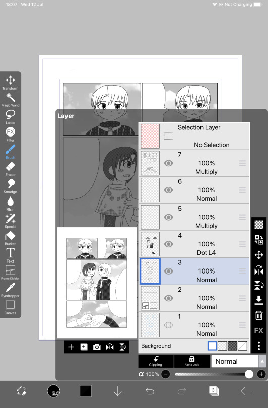
so idk if im the BEST person to ask given this is the first time i've used greyscale in like...idk 5 years? but basically the gist of it is to paint the image in monochrome black and white so your values stay clear. the program i used is krita so i'll explain how to do it there but theres actually more guides for procreate, clip studio, photo shop etc
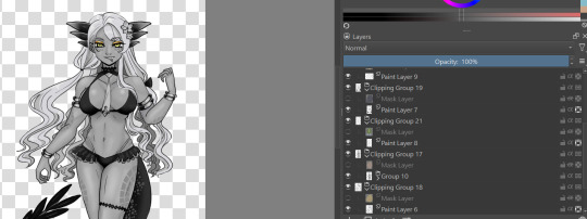
for this, in order to make sure coloring later was easier, i made each color group (skin, hair, tail+bra, tie and underskirt, gold) a different layer. i dont usually label mine because i hate myself but you may fine doing so more useful. once you've colored each layer in the correct grey value just shade it normally.
i also wanted to make sure i got the values for her skin right so i tried this trick i saw the other day on a reference image i have of her, which is to make a second layer, alpha lock it and switch the layer setting to color instead of normal. this sets the image to monochrome with very little fuss so you can easily color pick values without much issue (although you'll notice i actually lightened her hair a bit bc og vritra's is pretty close in value to her skin)
once you've colored in the values you're bascially done. just make a clipping group and set the clipping layer to 'color' and it will fill in the layer to the color you picked. you may need to adjust the layer below a bit-i ended up having to darken the tie because the green wasnt coming out the right color. the other thing is that i actually set the gold to color dodge on a dark brown because i felt that made a better gold color. realistically, you would also further tweak the image but it was pretty late last night so i called it a day
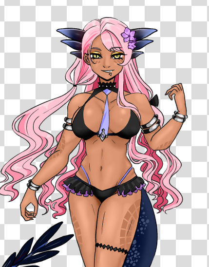
this also gives you the ability to play with the color palettes a bit although you wont be able to go beyond the base values- like in this case, i cant really make her hair or skin darker than how i already set it, so keep that in mind unless you're good with other filter settings
7 notes
·
View notes
Text
My personal views on art software as a hobby artist
So lol the next art post is text based.
But considering this is my art account and art related I figured that this post should go on this art blog.
But aware these are my own views and other artist views may vary.
Ok I swear I'll try to upload some art on this blog soon!
So what I look for in a art program (free or paid) when I draw stuff
For colored illustrations
Be able to draw straight into the program or process lineart from tranditional media well
To be able to fill color with the bucket tool on different layers with ease
To be easily blend/render coloring
For manga/comic panels
Make panels easily
Apply tone easily
Have a lot of free use/references/assets (ie backgrounds) to be able to be used
Have a good text insert tool
General
Be able to transfer illustrations back and forth easily (ie from ipad to laptop)
Have a good basis of tools, ie brushes, line tool.
Bonus points if they have a good intergrated soical media platform.
So I was going to go through some art software (free and paid) that I currently use for my illustrations, go through some postives and negatives.
Before that..
Software I am not mentioning
Photoshop (because I think it's too difficult to render plus I mostly use it to alter image sizes)
Gimp (never used)
Krita (Never used)
Sketchbook (hardly used)
Many other programs I don't mention
Medibang Paint (Mobile + Desktop, Free + paid)
I feel like this program does'nt really get a lot of attention. It's free and always requires so many "updates" but it's a program I use a lot currently. Mostly on ipad I use this program.
Positives
Really easy to draw on and simple to color on
Bucket tool is the best in this program works on every layer
The text tool IS AMAZING to use (I use it currently for my fancomics)
My artwork looks really bright and colorful when I finish coloring on this app
Negatives
The uploading on to their soical media platfrom is bad
Cloud upload is a little slow/glitchy
Text tool needs online/internet to work
The desktop version is not as good as ipad version
Not good for drawing manga/comics
When online, ads are really annoying
Color blending/rendering is not really good apart from using the watercolor brush
Even though there's so many things I don't like about this software. I USE THIS PROGRAM A LOT. I think it's been 3-5 years snice I've used this program up to this day. Still very under-rated this program is.
IbisPaint X (mostly mobile but there is desktop, free + paid)
The "alternative" to procreate for android users. I don't see many users talk about this program neither.
Positives
AMAZING for manga/comic drawing. It's my current default program to draw my fancomics right now
Screentone layer is amazing
Really good bucket tool, works on different layers
Good resources/assets for manga/comic creation
Negatives
A pain to transfer files back and fourth, snice this program is mobile exculsive (unless you pay for desktop)
It's not really good to do colored illustrations on (no good blending tools, no dual colors can be used)
Text tool is not good.
A new program I came across and I honestly was SO IMPRESSED with the manga tools that I bought the ad free version. I honestly recommend this program for manga/comic creation over clip studio paint.
Procreate (paid and on ipad only)
Speaking about Procreate I have it! I also don't use it as much as Medibang + Ibispaint lol. I honestly think procreate is over-rated.
Positives
Animation is the most simple and easy to use (I did my own test animations on them)
Good customisation with brushes
Good blending tool
I like the timelaspe function
Amazing color palette creation
Negative
THE AUTOFILL/BUCKET SUCKS BAD (the main reason I hate drawing on this app, every drawing I do I have to color in manually like a 5 year old and it takes me ages to finish a drawing on this app)
For some reason every drawing I do on this app my colors are dull and washed out compared to medibang
Transfering files back and forth is a pain as well
I mostly don't use procreate because for me the bucket tool NEVER works on my lineart (even setting reference on the layer) which results on me keeping the drawing simple because I have to manually color every section myself. I don't understand why it's so popular. I rather use medibang than procreate for my drawings.
In my view apart from it's animation features it's not really worth the price. Considering I bought it and hardly use it.
Paper by WeTransfer (Free + paid, on ipad only)
I BARELY see any artists use this app, I think I might be the only person who uses this app lol. It's got good/bad features and I still use this app for rough ideas/doodles
Positives
AMAZING organisation of art (can make unlimited journals with pages to add to them)
Can hold unlimited art pieces, don't have to name files.
Good color mixing/color picking
Takes little space on your device so I hold all of my doodles in here
Negatives
Barely/never updates
Outdated/limited tools
BAD AT MAKING FINISHED COLOR PIECES OR EVEN COMICS
NO LAYERS
Color palette is REALLY BAD
washed out/dull look when doodles are finished
So because I DRAW A LOT, I use this app to draw rough doodles/ideas. I mostly use it as a art reference for my OC designs or dumb doodles like the one above. But yeah I understand why it's not popular, no layers is like art mode HARD. But I enjoy drawing on it.
Clip studio paint (mobile and desktop ,paid + limited free?)
I recently got this program because I heard so much about it from soical media. So..I acutally think this program is over-rated lol!
Positives
AMAZING for colour illustrations, bucket tool is great, color picker good, great blender/render
MASSIVE online/asset resources the most I've seen so far
My finished drawings look bright and colorful and just as good as medibang
Negatives
You have to pay monthly for ipad version/ newer version (which I don't have)
I don't think this program is good for manga/comic drawing (restricted screentone layer, limited material layer, bad text tool)
I am disapointed with the manga creator, I think it's BAD! I can't FIGURE how to add panel or even draw on a manga page, I had an headache trying to figure out the way screentone works. I personally think Ibispaint is WAY more simple and better program to create manga than CSP.
But I understand why it's good and worth paying for. The blending tools are amazing as well as resources/assets. I have yet to test the animation feature.
Programs I don't use much/anymore
Paint Tool Sai (paid, desktop only)
A program that existed before procreate or clip studio got popular
Positives
Working Bucket tool
Good blending tools
Amazing color palette creation
Negatives
limited assets/resources
only good for colored illustrations
I honestly did use paint tool sai for a number of years before moving on to medibang. I think this program is good, but it felt outdated as I moved on to other art software.
Overall
I just wanted to say this is my own view and so please don't get angry lol. I mean every artist is different and have their own program they like to use. This is from my own view.
I am not saying to use medibang more and use procreate less. It's just in my view sometimes I don't see why certain programs are more popular than others.
Don't take this as advice on what art program to use either. I don't know just use the one you like.
#artviews#clip studio paint#procreate#medibang paint#ibispaintx#this is not really advice on what art program to use I just wanted to share my views ok lol#paint tool sai#paper wetransfer#art software
1 note
·
View note
Text
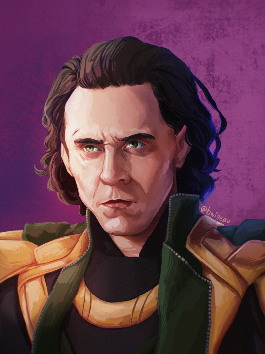
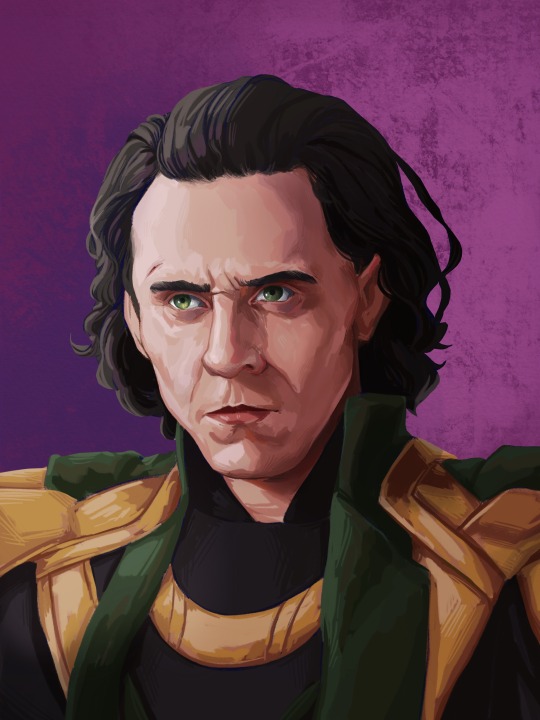
Painting Tutorial!
Hello and welcome to a kind-of tutorial for my colouring technique! I’d like to preface this by admitting that my art style is a mess of actual things I learned in art school mixed with ‘things that look good but idk why lol’ and some lazy shortcuts thrown in for good measure. If something doesn’t make sense it’s probably because it was never meant to, and I’m just winging most of this with no coherent plan. Cool? Cool.
Program used: Procreate (I use the same techniques in Photoshop, so they should work in programs like CSP, Krita and Sai)
Brushes:
-Derwent for sketching (Procreate default) or your favourite sketching brush
-GvW Elder 2. 0 1 for shading (from Georg’s free ink set)
-Basic round brush
-Basic airbrush
Step 1: The sketch (Derwent Brush)
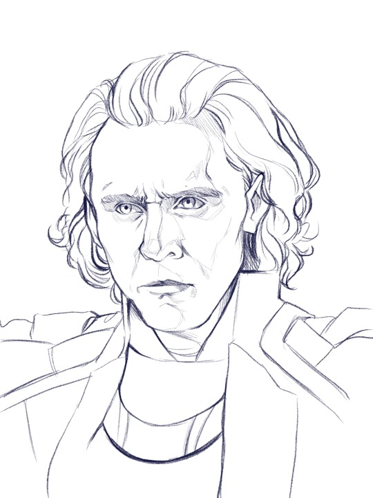
Today we’re painting my favourite murder boy, Loki! I won’t go into much detail about the sketch, because this is about colouring, not sketching. Make sure you have a solid sketch before starting on your colours. I know it gets frustrating to work on a sketch for so long, but anything you fix in this stage won’t need to be fixed later.
Use references for anything you’re not 100% sure about, and flip your canvas often to make sure nothing’s wonky. Your brain gets used to staring at the drawing, so flipping it lets you see mistakes you might otherwise miss.
I like sketching in colour because black just feels daunting to me. We’re gonna change the colour later anyway, so just pick any favourite!
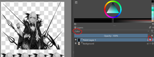
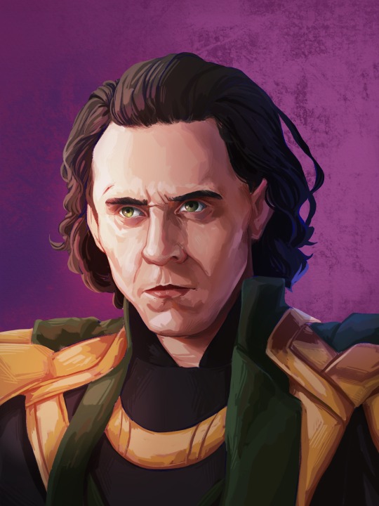
Step 2: Clipping Layer
This is one of the most important stages. All your colour layers for the character will be clipped to this one so you don’t have to worry about going outside the sketch. I usually have a single clipping layer for organic portraits, but my lined pieces will have a layer for each section. We’ll be painting over the sketch eventually, so go ahead and clip the sketch to the base layer as well. It’s also time to pick your base background colour. I decided to go in a completely different direction than the reference image, so I’ll mostly be making the colours up.
Step 3: Base Shading (Elder Brush)
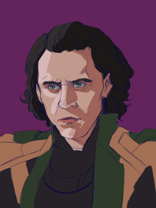
I know this looks like a big jump, but bear with me! All I’ve done is add basic shadows to the form. I’ve picked a midtone for each section of colour, and added a basic shadow and light.
Go ahead and start by locking your sketch layer and changing its colour. I’ve used dark reddish tones in the face, and left the rest blue. I like how the blue pops up here and there when I get to painting over the sketch.
To pick your light and shadow tones, look at the colours you’re using in the background. Something useful to remember is that warm lighting will cast cool shadows, and cool lighting will cast warm shadows. In this case, since the background has a cool tone, the shadows in the face will be warmer in comparison.
Always remember that your character and your background exist in the same environment; the colour of the background will influence the character. Here, the light source has a pinkish tinge to reflect the character’s environment.
Look at your reference to see where light hits, and squint your eyes to determine the big geometric shapes of the light and shadows. At this stage, stick to three tones maximum: a base, a shadow, and a light.
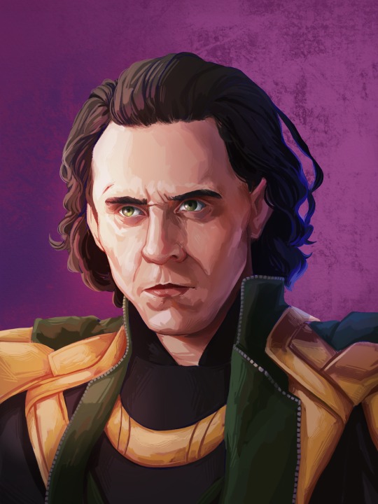
Step 4: The Shit Stage
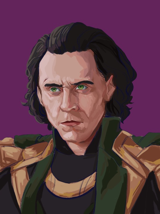
This is when the feeling of ‘oh no this looks like garbage and I hate myself’ will hit. Don’t let it fool you! Paintings look like trash before they get better. In the early stages, you’re just laying in the foundation for the details that will come in later. Just push through!
Here, I’ve started adding tones in-between the light and shadows to make the shapes blend into each other and look rounded and softer. This is all done on a layer over the sketch, still clipped to the base layer.
I pick my midtones by zooming in and colour-picking at the border between two shades I’ve already laid down. It’s a little tricky since the brush I use doesn’t have an opacity setting, but I like the sharp chunky look it gives my pieces.
Remember: Skin is not one uniform colour, and light will peek through in some places. This is called sub-surface scattering, and it’s the key to beautiful, alive-looking skin. Light will scatter under the surface of the skin, and certain parts neighbouring the shadows will look more saturated because the blood vessels under the skin are illuminated. This piece doesn’t use bright sunlight, so it’s more subtle but still visible.
Notice the strip of warm saturation right before the shadow? It’s going to look orange under sunlight, but for Loki I’ve gone with a pink since the light is cool.
Step 5: Slightly Less Chunky
I like the chunky look in my paintings, but if everything is equally as sharp, nothing really stands out. A wise tip from one of my painting professors is to smooth out the shadows, but keep the lights sharp.
Use a mixture of more colour-picking and the blending tool to round out shapes. You can also use the airbrush if you’re more familiar with it.
Be careful of overblending! Blending too much is a common mistake in digital art, and can make a face look flat and off-putting. Blend some areas, and colour-pick them before going back over them in with your solid brush. This will make your shadows look softer, but not too soft.
Texture is extremely important and often forgotten. It gives your eye something to look at, even in a seemingly smooth space. Remember: Unlike in traditional art, digital media has no surface texture.
A smooth gradient on a cotton canvas is never completely smooth, it will always have the canvas texture underneath it that keeps it from looking too unnatural. In digital, you’re working from nothing. When working digitally, any texture you want, you need to create yourself. This is why depending too much on the blending tool will make skin look unnatural; you need to compensate for the lack of interesting surface underneath.
Step 6: Lighting
Interesting lighting can go a long way to make your painting spectacular. Note that the light source was chosen in the third step; this step simply enhances what you’ve already done.
In this piece, I’ve picked a primary light source (where the majority of the light is coming from) and a secondary light source to keep things interesting. Since the background is cool-toned, I picked a warm orange for the main light source to contrast it. The secondary light source is a cool blue, so it doesn’t quite have as much contrast. I want the secondary light source to be noticeable, but I don’t want it to be fighting for dominance with the main light source.
I clip a colour dodge layer on top of the colour layers, and put another unclipped colour dodge layer over it.
The clipped layer is the secondary light source, because I don’t want it to bleed into the background. Leaving the primary light source unclipped will give a glowy effect to the lighting, since the area around the character will also be affected. I use a large airbrush for this step.
If there are areas that need more contrast, you can deepen the shadows with a clipped multiply layer underneath both colour dodge layers.
Step 7: Details
This is the time to add little things like a more refined eye shine or little flyaway hairs. The eyes also looked a bit wonky to me, so I fixed them up. Not much else to say about this stage, just add little things that will tie the piece together.
Since the face is the focal point, it’s painted in more detail than the armour. If the piece was equally detailed everywhere, the viewer’s eye wouldn’t know where to look! You don’t have to slave away over details in areas where they won’t be noticed or would be distracting.
Step 8: Finishing Touches
This is the final step! Once the painting itself is done, I like to merge all my layers and apply a bit of noise to the whole image. I find it adds a bit of grain and texture that makes the piece even more cohesive. Don’t add too much though, or it will grey out your colours.
In certain pieces, I also add a slight chromatic aberration. I don’t add it to all my pieces, and I use it differently every time. Be careful though, it can become an eyesore if you overdo it! Keep it away from the focal point of the image (in this case, Loki’s eyes) or it can actually make the painting off-putting and difficult to look at.
Since my drawing program has a dark background, I like to export the image as a test and see if it still looks good in my photo gallery with a white interface. Sometimes things look really bright against a dark interface, but will look dull and too dark when put against white. If your piece needs adjusting, use the curves tool to adjust the contrast.
All that’s left to do is sign your artwork on a separate layer (so it can be moved or removed if need be), and voilà! A lovely portrait!
—
I hope you found this tutorial helpful! If you have any questions or comments, feel free to leave them in the notes or message me! If you’d like to chat about art, (or anything really) my ask box and messages are always open to new friends!
128 notes
·
View notes
Note
my friend may i ask what brushes you use 👁
sure! i use procreate and most of my brushes are super customized but i can describe them enough to recreate in any program (hopefully). this is gonna be a little bit long because i'm bored and i love talking about this stuff soooo
the brush i use most often is a medium hard airbrush. with lots of size pressure but very little opacity pressure. it's super versatile and i usually use it to sketch digitally (which i only do sometimes, most of the time i just scan in pencil drawings or go straight to paint)
my main brush for painting is a rectangle brush with a stamp hue jitter and a bit of texture on the sides. i love square brushes for blocking out shapes and it's good for making a base you can put more detail on top of, but it works on it own as well. the main thing with square brushes is i never turn on pressure settings for anything, i find they get in the way when working on the base of a painting so i keep the brush a consistent size and full opacity. the stranger painting only uses the hard airbrush and this square brush:
i also like using it to fill in space in more line-art heavy drawings
for lineart i sometimes use a very hard pencil brush with heavy line weight and no opacity settings. i'm not exactly sure how to make them but pencil brushes are really easy to find online for csp/photoshop/krita/etc. just grab any one and turn on a little bit of smudging and mess with the settings until it feels right. i use it to give my lineart a bit of texture, especially when there's not much else in the artwork for fill that role. here's an example where i used this pencil brush for most of the lineart, particularly on the figure:
the rest of it was either filled in with the lasso selection tool or a version of the square brush i mentioned earlier, you can see it pretty clearly on the border and around the speech bubbles.
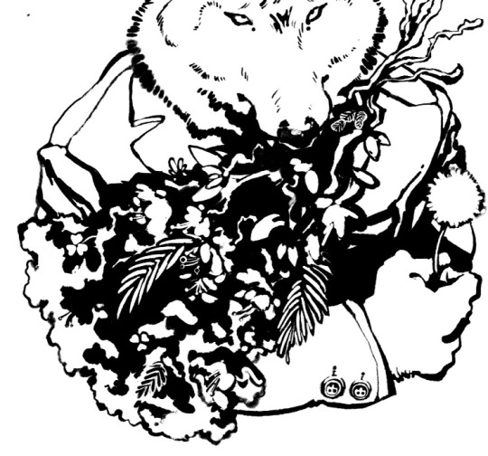
this isn't really about a brush in particular but more about how i use them (i always got frustrated with brush packs that couldn't replicate what the artist did and i couldn't figure out why so i'm including this aside to try and avoid that because younger me would kill me if i didn't). i approach lineart more like painting: i first lay down a base layer which is usually overdone and then carve out my lines using an eraser with the same texture as my line brush. i've found when you do that it makes it easier to experiment and allows you to use textures in a more interesting way, as well as mess around with textures that might not be feasible with one-pass-lineart. nothing against it ofc but once i started doing this digital art fully clicked for me. the best example i can think of is this bouquet from my werewolf kiss drawing where i first went in with the black silhouette and then drew in some detail with white, then again went and refined the form with black
speaking of i have another lineart brush i used in the drawing above. it's called mercury on procreate and i don't really know how exactly it works but it's like a very hard airbrush with a lot of texture on the edge and i turned the size pressure settings to the max. it's a little similar to a watercolor brush with no opacity settings. i use it for drawings where i want a more rounded form on the lines and for details in my paintings sometimes
anyway the only other brush i use is just called "oil paint" on procreate. it's a little hard to describe but i'm fairly sure most art programs have a version of it. it's a heavily textured brush with a ton of smudge on it but very little opacity settings. in my paintings i like to lay down a base using an airbrush, build up texture and color using my square brush, and then finish everything off with the oil paint brush. here's a speedpaint that shows it
11 notes
·
View notes
Text
Tutorial/Step-by-step/Tips
I’m not a pro nor my art is perfect
But if you are interested or just curious by my coloring process and way to think
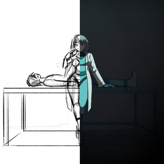
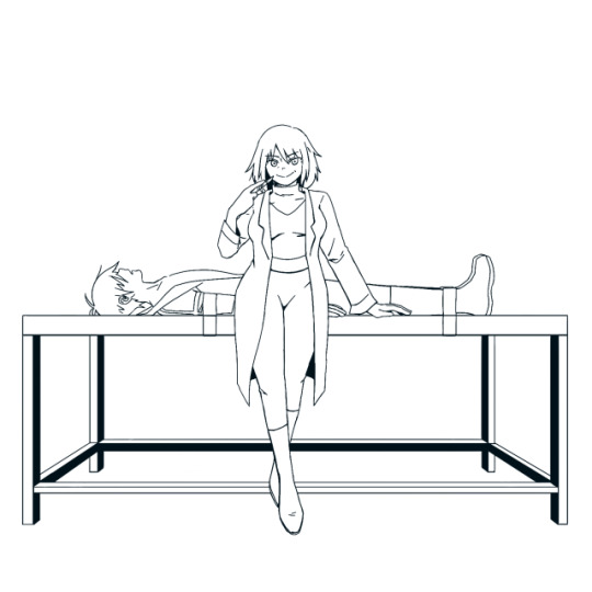
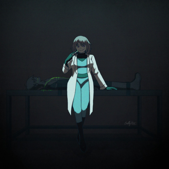
Step-By-Step and several tips bellow with my last “Maddie & Danny motherly love” drawing :)
(warning: bad English because i’m not a native)
(warning 2: i’m an art nerd so when I begin don’t know when to shut my big mouth, so very very long post and quite messy)
xxx
I use Procreate, but this could work with most software like Photoshop/Paint tool Sai/Clip Studio maybe Krita too
Some tips could also be use in traditional arts
Basic knowledge needed: color theory (warm|cold, saturated|desaturated), one digital software
Step 1: Sketch
Tips: Don’t be shy to try different compositions first and choose the best idea, at first I wanted to draw Danny viewed from above and Maddie looking at the sky hiding the gory parts but it’s didn’t work well, sometimes simplicity is more efficient
Tips: Maddie is here right in the middle, looking at the spectator, this composition in general is bad/uninteresting because the dynamic is weak, and the feeling it’s strange and unsetting
But it’s very efficient in horror and spooky stuffs where this feeling is wanted (like in the famous “Shinning” ‘s scene with the twins sisters), it’s uncanny
I could have draw Maddie very straight and symmetrical to really insist on this unsetting feeling (something way too perfect to be true), but I wanted her to be sultry (like in the song), not looking "death inside"
The square format help to insist on this strange feeling too

Tips: Composition is all about contrast, here Maddie is standing up and is build with curvy line of actions, in contrary of Danny who is lying down, and their bodies joined in a cross shape
I planned to draw her very cleaned and mocking while a gory scene is behind, I abandoned the « guts out » idea because it was too just distracting, we should see Maddie first and not what on the table
Tips: A quick way to check big anatomy problems is to flip your canvas with horizontal/mirror flip, on traditional medium you could flip your paper on a sunny window or a lightbox

Step 2: Lineart
Tips: I planned to do a very dark ambiance with little lights, so with my lineart I added heavy/dark shadow on Maddie’s hair, clothes, and the table
I don’t recommend it for light or pastel scene
Tips: Often in art, people talk about line weight, but something effective I find is to use thicker (green) line where the shadow will be, and thinner (red) where the light will be

Tips: Avoid joints and interference
We tend to do that naturally, but better be conscious of it
If your lines are crossing more that 2 times (here on Maddie’s sleeves) or barely touching (Danny’s shoes) the line could be odd and heavy, try to do this as little as possible

Step 3: Base colors
Tips: I already have a Maddie’s palette, but here I really want to give this drawing a cold feeling, so I desaturated her hair and her skin which were warm colors, for her jumpsuit and eyes to really pop out
Danny is hidden in the back and is a “furniture” so his colors are very dark, almost blending with the table


Tips: The lineart is painted in dark blue and parts hidden by the black part of her jumpsuit are painted in turquoise
Step 4: Shadows
Tips: I use a new layer for the shadows often on multiply but not always (play with your layers modes to find your wanted effect), please try to not use black because nothing in real life is pure black
Here I used a dark green shadow, for a cold feeling, if your drawing is warmer use a warmer tone like red or orange
You could add a secondary more saturated shadows inside the main shadow, but hey I'm lazy
Dark red shadow
Dark green shadow

Light pink shadow (pastel vibes...)

Step 5: Light
Tips: Similar to the shadow try to not use pure white and play with the modes, here I use a cold turquoise light
A warm light like yellow/orange/red will give a total different feeling
My tips for really making light pop is select shadow layer>invert>fill with light color>mask or clipping mask to set it on the subject>change the layer mode
Red light
Turquoise Light

Pink Light
Step 6: Additional contrast
Tips: The most important in a drawing are eyes/faces/hands/gestures/light
People are naturally attracted to eyes and face, and light
It’s one of the reason why I didn’t draw Danny’s eyes (even closed)
Gesture and hands give life to a drawing, hands are like a second face so don’t neglect its
Tips: I just add a dark layer between Maddie and Danny to make her pop even more, the viewer should see her eyes first and Danny after, like a bad surprise

Step 7: Additional effects
Tips: I just play here with layers modes, hue, and general shadows until I have what I wanted
Tips: It’s always interesting to give your drawing some texture, a paper-like texture is very common
To give is a shaking effect I use here a noise layer (black layer>noise max>overlay mode>blur if necessary
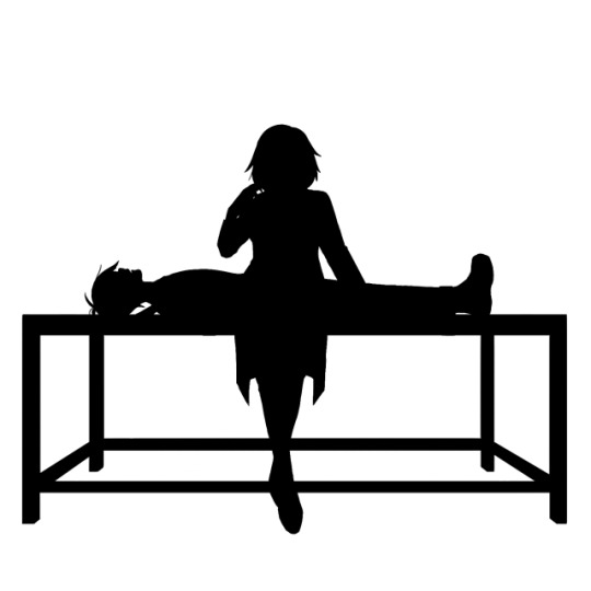
Step ?: Composition - Silhouette
Tips: To create strong characters in character design with unique body shape and body languages, professionals fill all the characters in black
If a composition is strong, being all black should be enough to understand who this character is, and the story you want to tell
Illustrations don’t go as far as characters design art where we really try to make one single character to shine, but this could be useful to check if every elements/characters is interesting enough
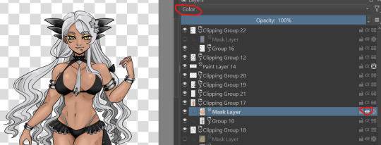
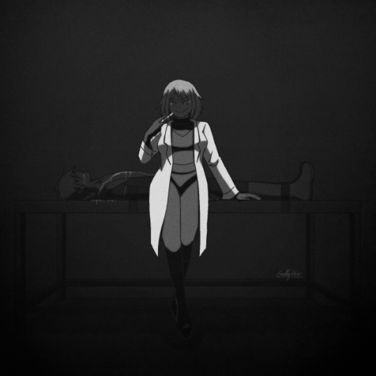
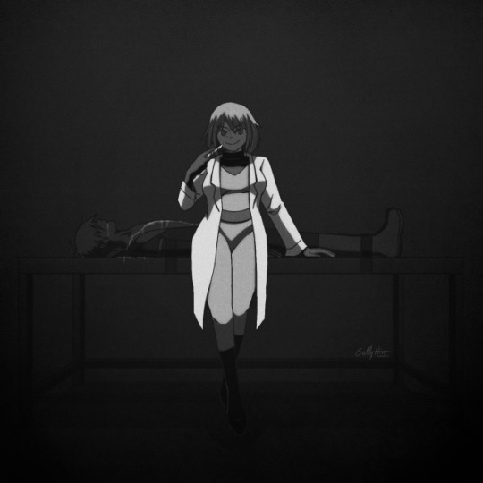
Step ?: Lights - Black and white desaturation
Tips: Colors are a combination hue, saturation and light
To check the lights, I use a black layer set on hue mode on top of my drawing to desaturated it all, and hide/open this layer regularly
This way I could check if the lights are right, if not I adjust the layers (colors, shadows or lights layers)
The lights are good when the drawing is self explanatory in B&W, when the parts aren’t blending together in weird way, and when the drawing converts the same feelings as it’s were in colors
Bad, her face and Hair are blending together, and her jumpsuit and her belt too
Better
Step ?: Let it’s matured
Tips: I always let my drawing several days before posting it on socials medias
This way if I’m too tired after finish it, the days after with cleaned eyes I could spot errors easier and corrected its before it’s too late
Furthermore you always make progress unconsciously each day by simply living and observing
For example I let this drawing 3 days before posting it, but maybe I should have wait 1 week...
Final words: As I said, I’m not a pro, it’s just some useful tips I learned in my art journey and from experience, none of this is « rules » and I don’t use all of these each times (sometimes I forget some tips, sometimes I’m just lazy and don’t want to put too much though on it)
Try, experiment, breaks rules, and be curious
Sorry for the big post, like I said I’m an art nerd and I never know when to shut my mouth
Hope it could help and have fun \( ^ ▽ ^ )/
Bonus: Step-by-Step gif

9 notes
·
View notes
Note
do you have an idea of a checklist for learning how to create digital art? like i know practice is essential, but i don't really know where to start or where to go from there. thanks so much xox
I think I can toss some stuff out here that might be of use. Assuming an artist learning digital art starts from the beginning–owning a tablet & drawing program but not knowing how to use them–here’s an inconveniently long list of stuff that could help them.
TL;DR: 1, mess around till you’re used to drawing digitally. 2, study and create ad infinitum. 3, a bunch of tips that are pretty hard to TLDR so you should probably just go over em. Step 2 is basically what you asked me NOT to tell you (“practice”!), but unfortunately it’s all I know how to do :,(
1) If you own a tablet that you plug into your computer (i.e., you don’t draw directly on the screen), feel free to spend a few weeks or even a month+ just getting used to it. When you first start out, it’s really freaky drawing in one place and seeing things appear somewhere else, but trust me in that you won’t even notice the disconnect after a few months of consistent digital drawing. I’ve been painting digitally for about 2 years now, and it’s actually slightly easier for me to draw digitally than traditionally. [If you have a cintiq, or you use an iPad with Procreate, or something similar, then you probably don’t have to spend as much time in step 1.]
Keep in mind that it doesn’t matter how good you were with traditional drawing when you start digital; the mental disconnect you have will make it very difficult to think about proportions, values, edges, colors, etc. You’ll probably notice yourself making mistakes that you wouldn’t normally make on paper. Don’t worry about them, just keep drawing as you usually would. Digital you will catch up to traditional you in time.
For now, get used to blending colors, drawing somewhat steady lines that go in the correct direction, and fooling around with brushes and brush settings. If you come across a brush that you like (easy to work with + pleasing results), it may help to stick with it as you continue to learn. Digital doodles and sketches are good for this stage; though try to keep doing traditional work so your base art skills don’t atrophy.
If you’re just starting out with Photoshop or Sai or Krita or whatever software you’re using, you’re gonna be intimidated by all the funky buttons and settings that you first see. If it makes you feel any better, I use maybe 0.1% of the tools that Photoshop offers me. When you start, all you need to worry about is the brush tool and control-z, maybe the eraser too.
2) Do studies as well as pieces from imagination. You can move into step 2 as early as you please; you don’t have to wait until you think you’ve become “skillful” at digital drawing (in fact, this step is what will probably help you become the most comfortable with digital). It’s alright if your colors are icky looking and your values are off (tip, occasionally turn the saturation of your drawing to 0 to check the values), because as long as you keep studying reality and appealing art & continually learn from your mistakes, you’ll get better.
Always remember to study or at least appreciate the qualities of art you enjoy. It’s the same thing that people always tell writers–you have to read a lot to write well. You probably shouldn’t shield yourself from the influence of other artists; while you may think that this action would help you develop artistically in the manner most true to yourself, in reality the vast majority of the process of learning art will be honing in on what you find visually pleasant so that you may, in turn, express your artistic taste in your work. If you look at other people’s art, you can pick out tiny aspects of it that you like and incorporate that into your style. It’s a bit trickier to build a style without the “help” of other artists, though you can always turn to nature for help. On that note, I also recommend referencing nature as much as you can, because we as human beings are sort of wired to find natural designs, colors, and structures beautiful. Look at nature for the universally beautiful, and look at art for the subjectively beautiful (i.e., enjoyed uniquely by you).
If you find yourself getting burnt out pretty quickly, then just paint/draw simple and small things for period of half an hour to 1 ½ hours a day (and switch back to traditional). You can spend this time mapping out proportions, creating thumbnails of values/colors, drawing linework, or whatever. Add complexity to your pieces as the months go by, and if you already have a decent foundation in drawing aim to create somewhat finished pieces after maybe four months to a year. Please note that the second part of that sentence was something I completely made up out of my head, because I’m trying to quantify pretty unquantifiable concepts such as a “decent foundation in drawing” and a “somewhat finished” piece of art. If you find it unrealistic, or just too easy of a goal, disregard it entirely. It can take you half a decade to learn to make finished digital art, or you can get it down in a couple months.
3) Fun fact, there’s not really a step 3 as you stay in 2 forever, always studying and creating. But there’s a few other things about digital art that you ought to know, so here they are:
• If your computer doesn’t make a fuss about it, I’d recommend working on a decently large canvas (at least 3000 by 3000; I personally prefer 6000 by 6000). You’ll get less defined edges and colors if you go below 1000 by 1000, from my experience.
• If you have a tablet with pressure sensitivity (you probably should otherwise digital painting is kinda hellish), go to your brush settings and set ‘transfer’ to ‘pen pressure.’ This is what makes it possible to blend.
• If you’re having trouble matching colors while studying, you can always color pick the ref (in photoshop: bring the pic into PS and use the eye dropper tool) and compare its colors to your colors. Some people add too much red to their skin tones, some people draw their highlights with overly desaturated colors, some people make trees and grass in their landscapes too green; whatever the case, take note of and correct errors that you consistently make.
• Get used to using the transform/warp/liquify tools (liquify is technically a filter but you get what I mean). They’re lifesavers for fixing proportion mistakes that you’ve only noticed 8 hours into a piece.
• Give layers a shot. I only work on one layer, but I’ve heard from people who divide their piece up into multiple layers that they’re damn useful (until you draw on the wrong one).
• Flip your canvas horizontally every once in a while to make sure stuff hasn’t gone awry.
• Screw around with color modes; they can do some really fancy things that are difficult to duplicate with normal digital painting, let alone traditional. On the topic of colors, don’t be afraid to use somewhat desaturated colors (near the center of the color picker square in PS). There are some very aesthetically pleasing color combinations that you can make out of somewhat dulled colors.
• If you’re using PS, bind ‘step backward’ to control Z, not ‘undo.’ This is under keyboard shortcuts. Set up a bunch of shortcuts that are the most convenient for you–personally, I only keep my left hand near the lower left region of my keyboard (my right hand is away from the keyboard and off to the right, drawing on the tablet), so I have all of my necessary shortcuts in that area.
This was a bit longer than I expected, but I figure that someone out there can get something out of it. Cheers to you, if you do.

#asks#digital art#art tips#art help#aesthetic#black and white#illustration#beauty#how to#artists on tumblr
9K notes
·
View notes
Last Seen Blogs

medium-voyant-nassam
MARABOUT NASSAM SPECIALISE DANS LE DOMAINE DE RETOUR D'AFFECTION

smokeinsilence
smoke in silence.

meditation-pulse-of-life
Untitled


lovely-girls-1
Pretty Girls