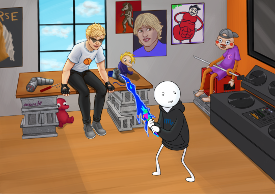
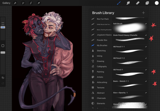
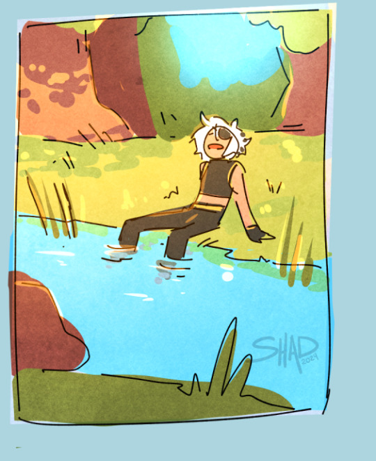
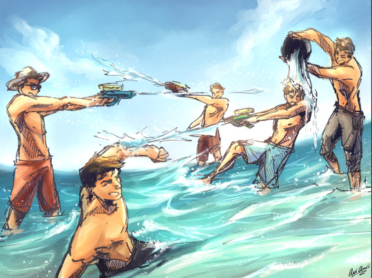
#(but everything is painted on the same layer as its lineart! so it was a fun challenge i've never done before)
Text
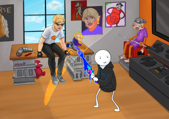
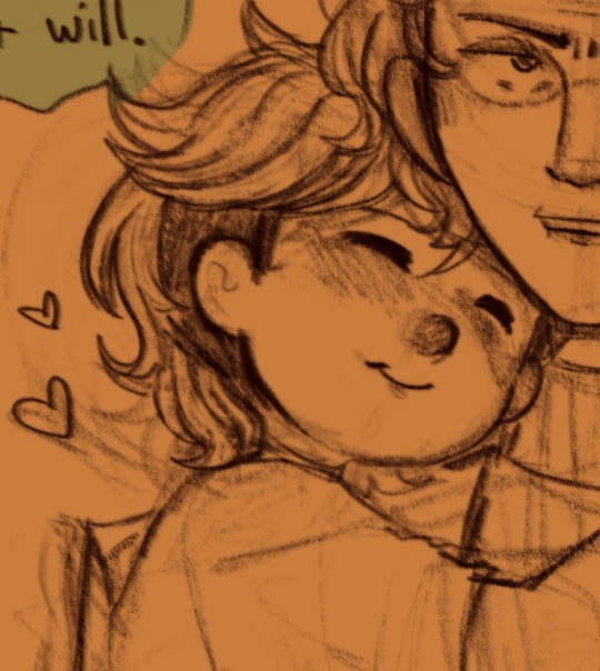
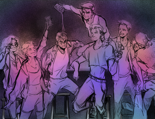
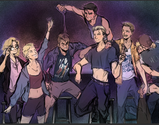
DIRK: Absolutely god damn incredible.
He’s leaning forward, laughing, dimples carved into his freckled cheeks. There’s a small twist in your heart about it, and you can’t place why.
it's been four years and i still get so emotional about pesterquest
(non edited version + closeups under the cut)
#hi back down the dirk strider pit#and since this was a big piece it's another of me testing out some new art stuff - in this case painting on a single layer#(it didn't end up being exactly one layer bc shadows/background foreground layering/etc)#(but everything is painted on the same layer as its lineart! so it was a fun challenge i've never done before)#in other news the audio engineer in me getting so hung up on making the tiny details on the sound board believable#she totally misses that's not how cinderblocks go#shhhh its fine#my art#homestuck#dirk strider#pesterquest#mspa reader
21 notes
·
View notes
Note
Do you have a coloring tutorial or recommended digital brushes? I love the way you render! It feels polished while maintaining the roughness and charm of a sketch!
I’m an artist who can get linework down pretty easily but when it comes to rendering that’s where I struggle. Any wisdom helps! ❤️
Hello!! Thank you so much! <3
I did a simple tutorial awhile ago but It's not the best
Rendering is also my weak point but I can outline a few things I do!
But overall my Process is:
- rough sketch
- clean sketch/lineart
- flat colors
- shadows
- highlights
- merge layers and use adjustment filters to get the look i want before I start rendering ( Color balance/hue + saturation/gradient maps/adjustment layers)
!! This is generally where I stop if i am not doing a painting and keeping it as a lined drawing !!
- I will add finishing details like eye shine etc.~
DONE
if I am doing a painting styled piece i keep going.
- I will start just painting on top of everything
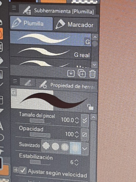
- I generally just stick with the same brushes I sketch with because I'm comfortable with them and I find switching brushes to be kind of tedious. So its the HB Pencil and Basic Sketch a lot of times.
- Use the eyedropper tool to pick colors to blend and using adjustment layers like multiply to deepen shadows then merge down again.
- Using to many layers makes me frustrated.
- Render render render
- When I'm happy or just don't feel like I want to work more on it I add some noise and chromatic aberration and Viola!

I use almost all of the adjustment tools but the big 3 for me are:
Color balance (this helps me adjust my color choices and unify the vibe of the piece in going for)
Noise! adds some nice grain to the art and makes it a bit more tactile.
Chromatic aberration just adds such a cool look and depth.

as for brushes I have a page on my Caard that lists my most used ones
I have a tag on my page with tutorials as well
I hope some of this helps!
#redundantz speaks#ask#redundantz ask#brushes#tutorial#art reference#art tutorial#art tips#im sorry this probably isnt what you were looking for im pretty shit at explaining how i do things#long post
67 notes
·
View notes
Text
the fettuccine art process, because someone asked
ok so like i'm really dogshit at explaining things but i will TRY !! using victim in a silly outfit as my example
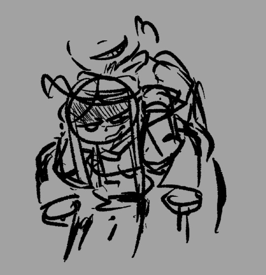
i tend to start things off with this sorta thing? trying to confirm the general silhouette and posing. i don't have a defined sketch or lining phase, they are the same thing

and then i.. i do my sketch. same layer. i'm not too fond of doing lineart unless its a very important piece, so i simply clean my sketch and use it directly.

okay usually it's not this clean but i want this to be coherent for ya so. i block out my colors here, and apply some vague coloration to my linework using alpha lock. alpha lock is like a clipping layer but just for your current brush, so it requires no adding of layers (but it cannot be disabled, as it is painted directly over your work.) alpha lock/clipping allows for you to draw only over existing lines. i love u alpha lock <3

i then merge everything together!!!!! this is because too many layers makes me NERVOUS lmao. i like to be able to directly paint over everything!
i abuse the hell out of krita's brush blending modes (like a layer blending mode such as multiply, but just applied to your current brushstrokes and not a whole layer) i use lighten (only draws over colors it is lighter than) and darken (only draws over colors it is darker than) to color things in, multiply if i need to darken something overall and overlay if i need to crank up the saturation.
and so i just fuckin. i just. i just render man. i just Go.

i just do it i guess. all painted over this single layer. it seems scary but trust me it's SO much easier !!
i tend to slap on my texturing and then also sometimes do some post processing in the form of curve editing to ensure i have proper contrast!
if you want elaboration on any specific part of the process such as sheer clothing or reflectiveness or hair or whatever do say so, i'm not sure exactly what to point out lol
25 notes
·
View notes
Note
i really love the way you paint your art esp with the 4 portraits of the turtle bois! do you have any tips with how you shade and blend the lineart with the coloring? ive been analyzing your art for while and i couldnt wrap my head on how you do that style where theres a lineart but at the same time on some places its lineless i hope im making sense
Oh yeah I totally get it! So what I do (for my full renders anyway) is digital painting. It's when after I have my sketch and all the main colors I want, I merge all the layers together and start painting and blending over everything. Basically my line art, base colors, shadows, and highlights are all in one layer and I start working everything in together.
I'll put a gif of my process down below to visualize what im talking abt, but essentially the idea is to get this soft painted look I like, while also knowing that I'm not married to whatever line art I made. You can even see during the process that I changed the shape of donnie's face and his hand, and that's because I just picked the "line art" and "background" color and drew over thoes places again and again until I liked it. The reason that some places look lineless is because I painted over them, and I just kinda like how that looks and don't bother to go over it with the line art color again XD
TL;DR: The reason that the line art looks blended in with the colors is because I merge everything down into one layer when I have all the general colors I want, and then I start painting and blending over everything. Over time, with all the blending, the line art and colors naturally star to look blended in together <3
#aha I really really like playing art teacher and talking abt my process a lot#idk why but it just makes me happy#if there are any other questions abt that plz ask away !! im always happy to answer are questions <33#ask#art tut
232 notes
·
View notes
Note
Okay I just dropped an ask but this is more of a art question.
I recently started using Clip Studio Paint more than my usual Procreate and kind of want to know in your opinion what are some tips to share? Like what color works best in line art, the blend tool, and just anything that can make this so much easier for more future works
Sure!! I might not be the best at tips but I can try!
When it comes to lineart, I actually found a little neat trick myself while messing around

I have two different layers of the same lineart, one is set on overlay and the other on multiply. Overlay basically colors in your lineart by its own by using whatever the color bases are under it and it both colors it in while also saturating the colors as well. And multiply just darkens the color of the lineart to balance it out more, I usually color in the lineart in the overlay layer a bright (pink, blue, whatever color you want) and also use that same color, but darken it a bit more for the multiply layer. (You can then mess with the opacity of the layers together, like if you dont want your multiply layer to darken your lineart too much to the point its just black you can lower it down as much as you like)
For the blend tool, I personally use this one by namelessarchivist

Unfortunately it costs "clippies", which is the currency clip studio uses in the "clip studio assets" shop. But thankfully the assets shop has plenty of other brushes and blending tools by others (and majority of them are free!! So you could probably find a similar or better blending tool there, also find alot of neat brushes there too, the options are unlimited)
Also will remind you there is also a color mixing window in clipstudio and it looks like this!! If it isn't there for you try clicking on the top buttons where it says "Window" and then click on "color mixing"

THE CLOSE AND FILL TOOL IS YOUR BEST FRIEND WHEN ADDING COLORS, it's like the bucket tool but better because it leaves no gaps between the lineart and color

I also recommend finding the "lasso fill" tool (which is already by default in clipstudio), it can also help by adding colors, I've been using it more often recently and it's actually pretty fun!! (if you can't find it, press "u", it's the shortcut for the tool so it'd immediately lead you to it)

Uh that's all for now at least everything I can remember, you can ask more specific questions if needed and I'll do my best to answer them!!
8 notes
·
View notes
Text
The timelapse! I forgot to turn it on at first and only later realised its not a screen recording lol so I'll explain a little more here.
I used clip studio paint and the brush pack is Thick coating Brush Set (厚塗りブラシセット) & it took me 3hr since I had a clear ref and mental illness.
When practicing faces with a ref you can mark the edges of the ref or things like pupils to help with proportions and connect like?? Focus points to find the shapes. Connecting those dots, rotoscoping or drawing triangles and edges will help with learning.
Zooming out a lot, not erasing and instead blurring or going over it will also help with keeping focus on shapes ♡

If you paint base lines like I do you don't have to worry about lineart just base shapes. Set time limit to learn not to get stuck, it really doest matter if you end up painting over it, depends on style. Too tired to English rn but let me know if you have questions bye ♡
Oh I forgot, for some shading I used a multiply layer, rhe glowy thing is the add glow layer option (in sai I use luminosity) and I merge layers constantly bc I like how it blends when everything is on one layer BUT I save copies of the merged layers for backup.
When I use sai most is the same but I play around with the grit of the textures (bg more texture, important focus parts like the face = less grit), since sai brushes are so easy to customize
#speedpaint#art process#digital art#rendering faces is fun if you like doing makeup#im tagging this as#wip#so it shows up when you search on my page for my art process#i wasnt trying to make a tutorial or anything i just like talking
15 notes
·
View notes
Note
I’m a new digital artist do you have any tips for starting?
ALRIGHT SO. it took some days to answer this sorry.
Do everything. Like just go FOR it. In how u wanna draw. Not everyone has like... a similar way to go about digital drawing. (Some people paint, I do mostly cartoonish and cel...shading??) So whatever feels best for you. Sometimes you learn a new thing its okay to evolve in your art thats normal! Style is... a hard consistency bruh.
Stabilization... is your friend if you really want a nice smooth line. (I use it sometimes if something not going great, esp if you want to really follow that sketch!)
Lining IS an option. Dont be held back by lining. You can use the sketch, just duplicate the layer and erase some of those lines and boom! lineart. You can adjust as necessary.
LAYERS ARE YOUR FRIEND. I draw on a computer so layers are quite unlimited. I know apps that restrain you to few tho which is Dumb but like i guess its a mobile art program. But dont be afraid to use them. Or one. You can get away with one layer, thats how i started before i learned about layers. (Art programs came a long way since then.)
SAVE. FREQUENTLY. Also please PLEASE back that up somewhere that ISNT the app itself. If you lose the app or the login... good bye to all that. I have the luxury of usbs and an external hard drive. Just find a way to back that up. Art is a lot of memory and storage just expect that. And yes keep them because then you have something to look back on and go 'dang. ive learned'
The clipping layer is also very useful. u want your lines colored but theyre a different color?? You dont have to redraw that! You can clip a layer over it and color over the lines and boom. Colored lines. Same with coloring layers too btw. Very useful art thing to use. yes even in painting.
Also this does help once a while but you dont always have to draw on white, u can change the bg color to something different (depends on the program u can default it to something else so u dont have like.. open the previous file to get the color again.) Like i will change it to greys blues or something lighter cause it turns out. things look very different on different colors. (color theory hello... i cannot teach u that.)
There is always a free option somewhere. Do not worry.
Um thats basically what i got for ya. Some programs have different perks for you that others wont tho.
Such as csp and its delightful vector layers (Sai has this too but i CANT change the pen type. vs csp where u can use any pen. BUT CSP DOESNT HAVE MY WATERCOLOR BRUSH... that i adore.)
Animating is a different proceedure. but What it is that i used for a while UHM... Pencil2d. Then i moved to opentoonz. (they are... very different... but opentoonz does infact make some things easier)
#UH BASICALLY JUST EXPERIMENT TILL IT WORKS#like it did take me... actually forever to realize stabilization and vector layers on sai#ive had the program for years....#its a constantly learning process with art
14 notes
·
View notes
Note
Hey there hi!
Sorry to bother, but I'm so glad I found your art because I love it in a million different ways and it's really inspiring me to go back to doing stuff with MS Paint but there's a slight problem... I have no idea how to do stuff properly anymore! I'm pleading for your assistance because I haven't got a clue how do you do half of the things you do in your art and I want to get better. The blurred colors, multi-colored lines, gradients, etc... I love how you do the things you do. Would it be terrible of me to ask for a small tutorial of how you operate MSP? I've seen the general tutorial for coloring, which is great, but I'm more interested in the functionalities of the program that you use.
Bless your art and your critters. Thanks for sharing them all!
first of all, thank you so much!!!
as for msp: i used it solely for the lineart and sketching and such, (or marker-tool paintings) there aren't really in-program features for true airbrushes or gradients :(
ive been pasting the complete lineart into a different program like sai, and to extract it i would (1.) put it on a binary layer mode to "get rid" of the sketch as long as its lighter than the lines. merge it with an empty layer too to fully apply that effect. and (2.) sai has this function: layer -> convert luminance to opacity, which turns everything white transparent. not sure if other programs have the same thing but itd be nice if they had some equivalent
i don't think thats much help but regardless good luck and sorry for the late response!!
16 notes
·
View notes
Note
woah your colors are very good- is there a process to them? they look so nice
Wah, thank you!!
For coloring, I generally think it's a little bit of having an eye for color -- i look at a lot of other artists' pieces and try to remember things they do that i like with color! And some of it is going to school for animation, where im trying to make things simple and cohesive.
My go-to is
pick colors for whatever I'm doing. This is sort of just...based on intuition. But two things i make sure to do(or try to) is if its a character, I try to limit them to 2 "main" colors and an accent, if needed. I try not to exceed that, personally, because with my art it tends to get too busy looking? But its not a hard rule for sure -- This little guy is blue and gold. The hair is a really light blue, and then the dark blue clothes, and some gold accenting to break things up.
Backgrounds i tend to just pick what feels right. But this background has blue, so I make sure its the same type of blue that is on the character.
Then, I have a set of layers that I overlay ontop. I have this saved as a material template in Clip paint and I just drag-drop. This is where all my color correcting happens, tbh.

adjust the brightness and contrast, if needed.
adjust the hue and saturation. I tend to make the picture a little warmer hue, and boost the saturation
I have two textures i overlay, and adjust he opacity per image. One is a paper texture, and the other one despite being named paper still, is jus a static noise texture.
a gradient i adjust colors on per image, but warmbright-to-cooldark is generally my rule of thumb
Then I'll add some glow from the lightsource as a glow or overlay layer, too. this is normally just a gradient and erasing bits
here that is with just it popped on, and then with my adjustments
Next I'll normally add a gradient map, and adjust the color balance to make sure everything looks kind of unified. Sometimes i do this and then delete both of them because i liked it before LOL. But this really helps give a mood, too.
I also change the lineart color. If I'm being lazy, I just make it all one dark, saturated color (in this case a dark saturated red) Now it looks like its hot a summery! Vs how cool coded the original picture colors were!

Thats my like....quick and dirty. Theres a lot of good tutorials on how to actually colorpick initially and everything, but tbh I dont really think about it a ton and I think a lot of it comes from having a large mental color library 😅
16 notes
·
View notes
Note
Sorry this is so random but what brushes do you use to do your lines and colour?
NO WORRIES!!! I'm sorry I don't know how to share the brush links and that sort of thing but I hope the names with examples are enough, I use Clip Studio Paint
OKAY I just use three brushes for everything. For lines I use this one, I started using it bc I thought the name was funny😭 and it's my favorite.


I don't do lineart, I just use the sketch for everything, that's why it's a bit messy but I like it that way! You dont have to change the settings at all, I just apply less pressure with the first sketch and then I go over it with extra pressure, all in the same layer.
Then for flat colors just this default marker. Boring ik😭 but its for setting flat colors you dont need nothing fancy

Flat colors look like this for me. I add some blush with the airbrush! But nothing else.
And then for rendered-ish stuff I use this one, the english name is gouache its just témpera in spanish

Looks kind of like this, I did the details in eyes and hair with the brush I use for lines!
Hope this helps!
60 notes
·
View notes
Note
for the art questions thing: what’s your process for shading? how do you come up with drawing / animation ideas? how do you sketch / how does a sketch differ from a complete piece for you?
Oh boy thank u for the questions! Uhh i ended up writing a lot w these so I'll throw this under a cut. I added pictures too. We'll call this a first draft for whatever I end up doing for my class assignment.
My process for shading changes pretty dramatically between if I'm doing my easy cel shading or my fancy soft shading. Lately, if I'm doing cel shading, I'll just come up with colors straight off the color wheel (colorpick and move it darker, more saturated, cooler/warmer depending on the material). OR, one trick I like, I'll draw where I want the shadows all on their own layer, THEN copy my color layer, mask n merge it on top the shading, and multiply that onto the actual layer. So it's the same colors for each exact section multiplied on top of itself? If that makes sense? Does nothing for the Atmosphere but it is Darker, and if I'm drawing them in a void anyways, it works fine. Sometimes I like to just slap a random tilted rectangle on it like its a garfield background.
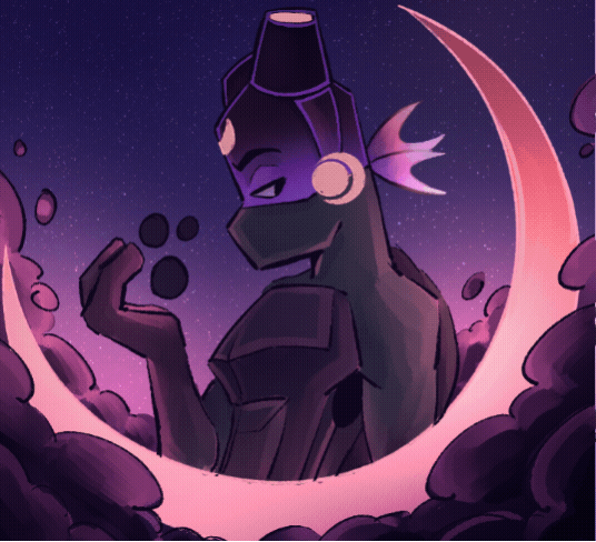
My soft shading is much more trial and error; for those fancy Xiph pin-ups I've been doing, I'll have like 30 different layers going, all doing different shit. Multiply mostly for shading, then for highlights I'll just try overlay/screen/soft light/hard light until something Works. A fun thing I do on these too: To get that "painted" look without adding a bunch of random texture, I use my default lining pen sized WAY up with the opacity WAY down and just go ham. Close up of robot ass for reference.
For ideas: I'd say the majority of the art I put out is "inspired" from something else, like memes or songs or tiktok audios. Honestly, I'd say every piece of information I receive has to pass through a "could this be about my ocs" filter in my brain, and if the answer is even kind of yes, I Will Make It So. Everything is ocs to me <3 and sometimes I inflict those oc thoughts on everyone else :3
For actual Original stuff though? Most of my ideas come about as a natural result of trying to figure something out with my characters. How would they respond to this, how would they do that, how does that work? The whole reason I started doing art is cause I have such a hard time with words, and sometimes drawing it out is just the only way I can communicate a thought. Expressions, camera angles, visual gags, subtle details, timing, those are things I could never figure out in writing. So I make comics and animations!
Sketching, what can I say about sketching. My sketches are very messy because I try for a Zero Erasing method like I do in real life (<- enjoys drawing in pen). If I sit there overthinking every line of a sketch, I get too caught up in the details before I've figured out the full picture. Sketching is for blocking/framing/posing ONLY, clean up is for lineart. I do sketch in only black/grays if that's a thing people care about, but that's because I have very strong thoughts on color, again it's too distracting.
The main difference to me (that im sure no one else notices) is I let my sketches get fuzzy from resizing. I'm very particular about my art having NO anti-aliasing/transparent pixels. Crisp and clean, and VERY easy to color.
Sketches I have on hand for example. Lil preview of smthin im working on :3c

Actually, sometimes I don't do sketches at all ? Like I go straight to clean lines. Only for certain characters, like LEDD and the lab rats, and if it's not a crazy angle or something. I can just draw them on command at this point. Very handy.
Thank you again for questions ^^ I am. slowly figuring this assignment out.
#chayos speaks#im not gonna tag this oc talk cause Technically thats for Lore. I did mention ocs tho :]#ask#tumblr keeps wanting to move my read more. keep it where i put it Please
4 notes
·
View notes
Note
I would just like to say… that your use of colour in your work is absolutely insane!! Every time I look at your drawings and I see your colour-use my mind starts to go into overdrive. As someone who struggles with colour and colour palettes I’m so jealous in like the best way possible
Do you plan your colour palettes before hand (if so how do you go about doing that) or does it just sorta happen?
Anyway, I just wanted to tell you that I love ur art! <33
omg thank you so much for this ask, I absolutely love talking about the more technical side of art!
Believe it or not I actually really struggle with color too, it kinda feels like I have to wrestle the piece into looking cohesive while also having interesting and fun colors. I don't typically plan out a color palette before I start coloring since it feels too restrictive to me so I'll just have a rough idea of what the lighting and background is going to be and then I'll choose a base color that I paint everything on top of. I'll use these two [1] [2] as an example
My process for adding color is more or less just adding the base layer that I build everything else on top of, adding solid colors and shading with multiply and then throwing on some glow dodge and then adding on some details.

and these set the undertones and lighting for everything else that goes on top. it's a bit like painting in gouache if you've ever done that before. whatever is beneath everything doesn't just act as a background but will show through to the layers on top
Then its just blocking out the simple colors using a brush at half opacity. I don't think I ever actually choose their clothes beforehand and I kinda just go with whatever I think is gonna look the best or makes the most sense. So like with Ice and Goose in the second one, I wanted them to have contrast with each other so they would be easier to see who's who, and ended up with Ice in blue and Goose in warmer bright colors.
From there it's just a matter of using a mix of purple and blue to shade and adding in reds and oranges to make skin look less lifeless and then adding details and using different blending modes like glow dodge to add effects


But sometimes even after the 500 adjustment layers there's still some things that I still feel like messing with like making sure the lineart blends into the piece and environmental lighting such as the lighter blue reflections in the shadows here because of the water

but yeah this process isn't the same for everyone and it's just what feels right for me. I'd recommend taking something simple and figuring out what you like the most! My process changes from drawing to drawing, especially if it's more focused on the background like that one of Mav and Rooster arguing in the forest. and I tend to draw a lot of warm lighting like sunsets or blues and purples just because I like them but I rarely have a solid idea of what the final colored version will look like and instead I just start out with a general feeling I want the final to give off
#omg sorry this ended up being so long lol#if you guys want me to break down my other drawings I'd be so down!#I'm not even sure I answered your question in the end lol#but hopefully it made sense#art breakdown#answered asks#anii talks art
12 notes
·
View notes
Note
this might be something with pretty obvious answers, but i wanted to start doing digital art
any tips? thank you
hello anon and congrats on being my 2nd ever ask!!
I'm the absolute worst person to ask about this, but I'll try my best.
Disclaimer: Actually blending and painting digitally is a whole other topic. If you wanted me to talk about painting: I'm sorry!! But, I can make a post about that specifically if you want. For this post though I'll be talking about more easy basic stuffs since you said you were just starting out (I still do mention shading tho).
This post ended up being lengthier than I thought, so I'll leave my thoughts under the cut.
In terms of getting started hardware wise, I've only ever had one drawing tablet (its a huion, but I can't recall what specific model) so I'm not sure I can make any good recommendations but I know there are many ppl on yt who have more experience with various tablets than I do if you don't have one yet!
However, in terms of software, I currently use medibang paint simply because it's free and suits my (very) simple needs. That being said I think it's pretty decent and is definitely more than enough for just starting out. There's also firealpaca, which is essentially the same program but with a focus on animation and comics at the cost of less brushes. Both can be used for basic illustration and have pretty much the same basic brushes and functionality, so either are good starting programs imo.
Besides all that, I'm guessing you're asking more about the actual art side. I don't know if you're transferring to digital from traditional art or just starting to draw in general, but hopefully I can help regardless. There's a lot of beginner digital art tip videos by people way more qualified than me out there so I'm gonna try to give tips I feel like aren't talked about as much.
1. Canvas size is important
When setting up your canvas size, it should definitely be at least 1920x1080 pixels (standard HD size). my canvas is usually 3000x3000 or just a large square. This is mostly because I'm indecisive, draw small, and don't know exactly how I want my canvas oriented until I start drawing; however, I find it to be a good starting point in general as it's big enough to be cropped and preserve quality. Basically, just don't accidentally make your art too small (which sounds obvious but it is something I have done before and haven't really seen artists talk about for beginners. It's a really easy thing to overlook).
2. Save ALL of the time
This isn't really an art tip as much as it is a PSA to prevent disaster. I don't think I've seen an artist that HASN'T lost drawings or parts of drawings from their software crashing or forgetting to save. A lot of if not all art programs do have an autosave feature but it's definitely not meant to be relied on. Especially when you're starting out and are likely spending a LOT of time learning and experimenting with your drawings, just make sure to hit CTRL+S often and make it a habit.
And as a side note, save your art in dated folders of each year/month. It makes the process of backing up your art or uploading it to a drive a lot easier. Safe art is good :]
3. Take advantage of EVERYTHING
Okay, moving on from that sort of off topic PSA, If you're used to traditional art, or just not familiar with your art program, it's easy to forget how many tools you actually have at your disposal to make the drawing process easier and/or faster. So I have compiled a list of essential tools that are in every art program that you might want to experiment and become familiar with before just diving into the deep end and making a drawing (which is fine too, but it can be a little overwhelming).
Layers and clipping
Generally, you want a layer for each unique element of the drawing, such as:
Sketch
Lineart
Color
Shadows
Lighting
I typically divide the color layer into a layer for each color so I can shade them individually (not doing so makes your colors susceptible to getting in each other's way and is just kind of a pain). For example, I'd probably split the color layer of a portrait of a person into a skin, hair, and eye layer. I know when it comes to painting specifically having 39178319 layers is usually criticized, but I think it provides good organization and a bit of a safety net, especially if you're new to digital art and will likely be indecisive in the beginning about things like color.
Speaking of being indecisive about color, one of the most important features of an art program is clipping.
Essentially, whatever you draw on a clipping layer will only show up within the layer that's below it (which as I'm typing this I've realized makes way more sense when you see it than through words). There's usually a checkbox to enable clipping on a layer in the layer window, and its usually called just clipping or clipping mask across software I've seen.

(Clipping off)

(Clipping on)
One of the main things you can use this for is quickly changing the color of a layer without having to be decisive about it and permanently change it. You can have multiple clipping layers over one layer and simply hide the ones you aren't using.
The more prominent thing clipping is used for, however, is shading. Basically, you add a clipping layer to your base color and color in your shadows without having to worry about "going outside the lines". I really wouldn't recommend doing shading any other way unless you're just freehand painting. Clipping is definitely the easiest approach.
Blend modes
I don't really know how to define what a blend mode exactly is, but I can tell you what the two most useful ones are. There's a lot of them depending on what program you use, but the most important (imo) and universal ones are called multiply and add.
What multiply does is intensifies the darks and completely gets rid of the lights on whatever layer you apply it to. In simpler terms, it casts itself as a shadow on the layer below it, hence it is used most often for basic shading.
Because of the nature of the blend mode it is common to choose colors like dark purple or dark red as the tone for the shadows. I honestly really love purple/cool shading, but you can experiment with various tones of shadows and find which fits the vibe of your piece. A general rule of thumb is to not just use a darker version of the color you are shading (unless that's the look you're going for), but also shift the hue on the color wheel a bit to add more v i b e s. For example, shading red with maroon/purple-toned red or green with a slightly blue-green.
Add is the opposite of multiply. It intensifies the lights and completely gets rid of the darks on whatever layer you apply it to. It casts a glowy looking highlight on whatever is below it, and is used for intense lighting or making stuff look cool and glowy (my favorite thing).
As somewhat of a side note, each layer also has an opacity (how opaque/transparent the layer is) setting. Lowering the opacity from 100% will make the layer more transparent (very useful for adjusting the intensity of the shadow or highlight layer, and to draw over your sketch).
Conclusion
There is a LOT more I can talk about regarding this but I think most of it has already been said by much more qualified artists. Also this post is hellishly long and I think any more advice would be overwhelming (if it wasn't already). Hopefully everything I mentioned above can help you start your digital art journey. I'm down to make a part 2 of more obscure tips if I can think of enough.
Best of luck anon and sorry for making you read all of this!
8 notes
·
View notes
Note
hello goodmorning kia i hpoe you;re having a great day ^^
also i just wanted to ask, how do you colour / paint hair? the way you do hair in your art just makes me go,, :point_right: :point_left:,, /pos
i'll be real, hair is the HARDEST to color for me HAHAHA so im not entirely too sure!
the way i color is very similar to how i color and paint everything

(oops edit: i fucked up the text for a sec)
i don't actually like the way this painting looks LOL
this is the general way of how i do it!! it also works the same for literally every other part of the painting
the main focus in this is step 5, which is just overpainting or thick painting (i dont actually know the name. its like the thing you do where you paint in one layer and adjust by picking colors over and over)
it's good for clean-up and also forming any mistakes you made with the sketch/lineart (in this case, my sketch is my lineart which i do in all of my work)
of course, the most important part about this is understanding color theory, which is honest to god the hardest concept of art to understand LOL
i still dont get it fully myself but the most you understand color theory, the less you'll need to really look for technical skills and tutorials and the easier it'll be to figure out yourself :]
#painting without relying on layers and relying on colors you choose yourself#(not color picking from references)#are the best ways to start studying color theory from the very barest bones#bc it helps you learn to not rely on colors handed to you! you mix and guess colors yourself#bc when you paint irl or traditionally#you cant exactly use layers or use an eye drop to grab the color from your reference or from the image in your head#tutorial#beevian-buzzes#hope this helps somewhat!
147 notes
·
View notes
Note
hello Virgil when you have the time you should explain your coloring and lining process
they way i do both lines and ESPECIALLY color changes basically every time i draw but yeah sure! im also p bad at explaining myself so idk if this is gonna make sense to anyone but me!
(first off dont draw on pure white canvases!! itll psyche you out and intimidate you because of the blank canvas, also its fucking eye bleeding!! i like going with a medium/light grey but ive seen people use a beige or light brown too just anything but pure white. also helps to just get SOMETHING onto the page if your having trouble w/ artblock, doesnt matter if its good it just has to be something u can work with. trust the process 100% and if it doesnt turn out good theres no shame in restarting from scratch, at least the idea is out of your head and easier to work through what was wrong)
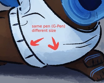
my sketches are usually super messy and i go through like two to four different layers of refining it before starting lineart, and with lineart i usually use either a simple hard round brush or a sketchier one if im doing painting? my go-to ones are the default G-Pen in clip studio edited a bit to fit how i like pen pressure and 1834113 and 1761353 in the asset store but i like messing w/ whatever i can find on there and whatever feels fun at the time lmao so its not very consistent
i try and keep my lines pretty thin on the inside and thicker on the outer edge? as well as adding bits of cross-hatching and hatching both in the lines and when i go in with shading!
i keep my lineart brushes pretty minimal with the pen pressure as im not the best with my pen control and just change the size of pen as i go lmao. More prevalent when i'm doing super clean lines for comics and not sketchy ones like this for painting but its generally the same, i'm not the neatest person when it comes to lines
I draw a lot of the individual parts (head, facial features, hair, clothes, hands, etc.) on separate layers so if something looks wrong i can either wipe the layer entirely or go in with the transform tool and not mess with the rest of the lineart in the process lol
(also i saw someone keep the eyes and facial features visible under the hair but erase where they meet the lines for the hair? and just yoinked it for myself because it looks super nice lmao.)
starting colors is almost always the same, where i just go in and block in the base color for each part (skin, hair, clothes, etc.) on a separate layer to make going back and editing colors a lot easier. with painting like here i also go in and add basic shading, mostly around the skin! usually i add a darker & warmer color around the cheeks, nose, eyes, fingertips and joints as well as in places where theres shading like under the head and under the nose.

also in the darkest parts of the shading like under the head/neck and under the nose i like to add a light bluish/purpleish color very lightly as a bounce light! it doesnt always fit with the piece but it does look very nice when i can make it fit so i try to remember to do that lol.
(I dont take many progress shots or timelapses so i apologize for not having the best reference images lmao)
if im doing painting, after finishing the base colors & light shading i put everything ive done into one folder and make a clipping mask over top of it and paint over it!


i usually add more detailed shading + heavier highlights on places like the nose and edges of the skin showing to make it look nice and shiny lol
(i dont have any recent drawings i can show progress pics of but just trust me on this) if im doing cell shading though i do the same thing with putting the lineart and colors into a layer, but add a multiply layer on top of it and pick a pretty saturated color to go in with the shading. if i have a background i try and keep in mind what colors are in the background and what the lighting situation is to make sure the characters blend into the background more realistically. also airbrush tool and the add glow layer is your best friend in this situation

usually after that i go back and color the line art! I pick the darkest color in a part of the drawing like the clothes or hair, make it warmer and darker and go in on the innermost parts of the lineart with it and keep a lot of the outer lines black for contrast
then i just go completely fucking ham with overlay layers and gradient maps lmao, they ARE the fucking best and are usually what i use to finish off a drawing lol.
usually i use a combination of just fucking with the default "sky" graidents in clip studio or one set i got from the asset store (1814319) on a soft light layer at like, 10-30 opacity because it gives it a REALLY nice look. again just keep in mind the lighting situation (darker night? daylight? funky bright colors?) and just go until it looks good lol.
that's basically it? though tbh i tend to just grab onto whatever technique or tip i saw on tiktok or someone on youtube do and use that, as well as changing how i color hair/skin depending on what i think looks nice at the time. none of my shit is consistent what so ever so i just kinda change things or try new brushes/coloring styles on the fly if i think it looks nice lmao. pure essence of fuck around and find out every time i open clip studio
really hope this makes sense to anyone but me and hope this was helpful!
#virgil arts#virgil asks#long post#(?)#honestly best tip is just browse the clip studio asset shop and try as many brushes as u can#and just watch every coloring tutorial u can find on yt or tiktok or wherever#just try shit!#eventually youll find stuff you really like and wanna go with#my entire style is a mish mash of my favorite shows or comics or artists styles that ive yoinked and blended together#(((((specifically stole the way abd illustrates draws faces if u want to know how i draw faces just binge his yt channel)))))))#((((also i go tt the way i draw hair 100% from ikimaru and the general homestuck fandom back in the day))))#also one of the best bits of advice ive gotten is to not worry about finding a style#eventually if u just start adding cool shit u see other artists do itll just come naturally to u#pure trial and error motherfucker!#tho tbf i learn mostly via the 'trial by fire' method#where i just throw myself into something im not remotely qualified to make and figure it out as i go#because eventually if i do that enough i do in fact get really good at the thing im trying to learn!#thats how i learned background stuff!#(also. if u dont have clip studio. u can do most of this shit sans gradient maps in any program)#(ALSO CLIP STUDIO IS BABY EASY TO PIRATE BUT YOU DIDNT HEAR THAT FROM ME)#(I FOR SURE OWN A COMPLETELY LEGAL COPY OF CSP)
7 notes
·
View notes
Note
Hey Sylenth! I've been following you for a long time and practically look up to you as an artist role model🤗 the way you draw traditionally and enhance it practically shows to me that its possible to create art as visually appealing as yours. Anyways I came here to ask a question that I cant really figure out on my own. I saw you show the different ink washes and I know you use them in your pieces, it's been something I've always wanted to try and just dont know how to do it. If it's not to much to ask, could you share how you do it and what supplies you use? Itd be greatly appreciated but I understand if you dont want to. Thanks in advance!🥰
Aah, thank you, I'm so flattered! 😳💙✨
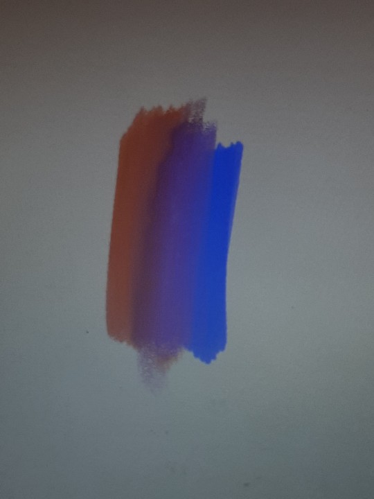
I prefer to work with ink in a "slow, but safe" way: I start coloring from the lightest shade, gradually building up the tone with layering. I think this video with Shin pretty much covers it. I'm just more careful when it comes to bigger pieces, but overall process is the same. The only exception is when I want to use wet on wet technique for some cool chromatography effects like these:
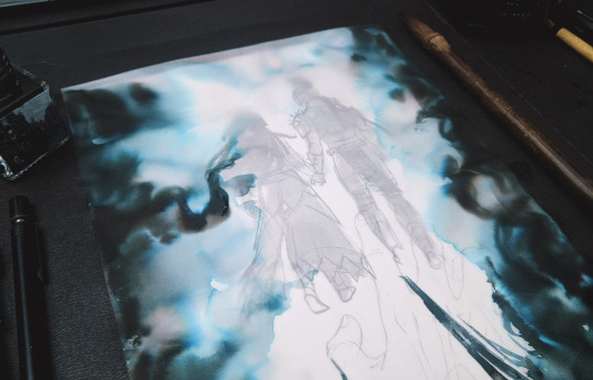
In that case I fill in those places first, so that these water pools don't disturb already shaded areas AND so I can throw away redraw the piece right away if something goes wrong.
💠 As for art materials - I prefer using inks that are safe for fountain pens, so I mostly use Diamine inks for drawing. They're affordable, mix really well and have a lot of gorgeous colors available. I also have several bottles of Sailor inks and recently I've discovered some really cool chinese manufacturers like Carpink and Penbbs (the ink on the photo above is Carpink's Foggy City, for example). The thing I like the most about inks is the chromatography some of them have - I'm in love with how all those dyes separate and become visible when applied to wet surfaces. If you never tried it before, I think I can recommend to start with Diamine Earl Grey - it's a purplish grey color which dissolves beautifully into pink and blue. This ink is pretty easy to buy and fun to play around with.
💠 I've written about the paper I use in detail here, so you can check this post, if you're interested. Basically if the paper is good for watercolor, it'll be good for inks too (if we're talking about ink washes specifically ofc). Oh, and since then I've also started to draw on a transparent tracing paper sometimes! I drew Ada and half of (N)O14 on it. I like how it makes ink transitions look very soft and a little blurry; it's kinda hard to work on compared to a normal paper though.
💠 My favorite brushes to use are Art Secret sable travel brushes, I use them all the time for everything. You can see it in the video with Shin and pretty much on every Inktober 2019 photo since I bought them. I try some other brushes from time to time, but these are still the best for me.
💠 And finally, for lineart I mostly use gel pens, dip pen and a small brush. If I'm doing lineart with inks, I either use the waterproof ones (like Higgins Black Magic or Sailor Kiwaguro) or do the lineart after finishing the ink wash.
💠 Oh and one more thing! I highly recommend to get a ceramic or a porcelain palette, or even to use a plain white dinner plate (yeah, I'm serious, I bought all my smaller "palettes" in a houseware store). It's SO much easier to work with than a plastic one! The paint doesn't shrink into tiny drops, you can always see what color you're using, it stays moist longer and the surface doesn't stain at all, you can wipe it with a tissue and it's as good as new.
Hope it was useful for you! 💙
45 notes
·
View notes
Last Seen Blogs
daimon-michiko
Because She Never Fails
julie-xxx
Julie.

lincolnheliix
3UCLYD1A.


linadolphin
Lina Doll