#Animate scatter plot matplotlib
Explore tagged Tumblr posts
Visit Tumblr Blog
Explore Tumblr blogs with no restrictions, modern design and the best experience.
Last Seen Tumblr Blogs


Fun Fact
Tumblr posted its first advertisements in May 2012 and subsequently earned $13M in revenue.
Text
Python Libraries to Learn Before Tackling Data Analysis
To tackle data analysis effectively in Python, it's crucial to become familiar with several libraries that streamline the process of data manipulation, exploration, and visualization. Here's a breakdown of the essential libraries:
1. NumPy
- Purpose: Numerical computing.
- Why Learn It: NumPy provides support for large multi-dimensional arrays and matrices, along with a collection of mathematical functions to operate on these arrays efficiently.
- Key Features:
- Fast array processing.
- Mathematical operations on arrays (e.g., sum, mean, standard deviation).
- Linear algebra operations.
2. Pandas
- Purpose: Data manipulation and analysis.
- Why Learn It: Pandas offers data structures like DataFrames, making it easier to handle and analyze structured data.
- Key Features:
- Reading/writing data from CSV, Excel, SQL databases, and more.
- Handling missing data.
- Powerful group-by operations.
- Data filtering and transformation.
3. Matplotlib
- Purpose: Data visualization.
- Why Learn It: Matplotlib is one of the most widely used plotting libraries in Python, allowing for a wide range of static, animated, and interactive plots.
- Key Features:
- Line plots, bar charts, histograms, scatter plots.
- Customizable charts (labels, colors, legends).
- Integration with Pandas for quick plotting.
4. Seaborn
- Purpose: Statistical data visualization.
- Why Learn It: Built on top of Matplotlib, Seaborn simplifies the creation of attractive and informative statistical graphics.
- Key Features:
- High-level interface for drawing attractive statistical graphics.
- Easier to use for complex visualizations like heatmaps, pair plots, etc.
- Visualizations based on categorical data.
5. SciPy
- Purpose: Scientific and technical computing.
- Why Learn It: SciPy builds on NumPy and provides additional functionality for complex mathematical operations and scientific computing.
- Key Features:
- Optimized algorithms for numerical integration, optimization, and more.
- Statistics, signal processing, and linear algebra modules.
6. Scikit-learn
- Purpose: Machine learning and statistical modeling.
- Why Learn It: Scikit-learn provides simple and efficient tools for data mining, analysis, and machine learning.
- Key Features:
- Classification, regression, and clustering algorithms.
- Dimensionality reduction, model selection, and preprocessing utilities.
7. Statsmodels
- Purpose: Statistical analysis.
- Why Learn It: Statsmodels allows users to explore data, estimate statistical models, and perform tests.
- Key Features:
- Linear regression, logistic regression, time series analysis.
- Statistical tests and models for descriptive statistics.
8. Plotly
- Purpose: Interactive data visualization.
- Why Learn It: Plotly allows for the creation of interactive and web-based visualizations, making it ideal for dashboards and presentations.
- Key Features:
- Interactive plots like scatter, line, bar, and 3D plots.
- Easy integration with web frameworks.
- Dashboards and web applications with Dash.
9. TensorFlow/PyTorch (Optional)
- Purpose: Machine learning and deep learning.
- Why Learn It: If your data analysis involves machine learning, these libraries will help in building, training, and deploying deep learning models.
- Key Features:
- Tensor processing and automatic differentiation.
- Building neural networks.
10. Dask (Optional)
- Purpose: Parallel computing for data analysis.
- Why Learn It: Dask enables scalable data manipulation by parallelizing Pandas operations, making it ideal for big datasets.
- Key Features:
- Works with NumPy, Pandas, and Scikit-learn.
- Handles large data and parallel computations easily.
Focusing on NumPy, Pandas, Matplotlib, and Seaborn will set a strong foundation for basic data analysis.
7 notes
·
View notes
Text
What are the top Python libraries for data science in 2025? Get Best Data Analyst Certification Course by SLA Consultants India
Python's extensive ecosystem of libraries has been instrumental in advancing data science, offering tools for data manipulation, visualization, machine learning, and more. As of 2025, several Python libraries have emerged as top choices for data scientists:
1. NumPy
NumPy remains foundational for numerical computations in Python. It provides support for large, multi-dimensional arrays and matrices, along with a collection of mathematical functions to operate on them. Its efficiency and performance make it indispensable for data analysis tasks. Data Analyst Course in Delhi
2. Pandas
Pandas is essential for data manipulation and analysis. It offers data structures like DataFrames, which allow for efficient handling and analysis of structured data. With tools for reading and writing data between in-memory structures and various formats, Pandas simplifies data preprocessing and cleaning.
3. Matplotlib
For data visualization, Matplotlib is a versatile library that enables the creation of static, animated, and interactive plots. It supports various plot types, including line plots, scatter plots, and histograms, making it a staple for presenting data insights.
4. Seaborn
Built on top of Matplotlib, Seaborn provides a high-level interface for drawing attractive statistical graphics. It simplifies complex visualization tasks and integrates seamlessly with Pandas data structures, enhancing the aesthetic appeal and interpretability of plots. Data Analyst Training Course in Delhi
5. Plotly
Plotly is renowned for creating interactive and web-ready plots. It offers a wide range of chart types, including 3D plots and contour plots, and is particularly useful for dashboards and interactive data applications.
6. Scikit-Learn
Scikit-Learn is a comprehensive library for machine learning, providing simple and efficient tools for data mining and data analysis. It supports various machine learning tasks, including classification, regression, clustering, and dimensionality reduction, and is built on NumPy, SciPy, and Matplotlib. Data Analyst Training Institute in Delhi
7. Dask
Dask is a parallel computing library that scales Python code from multi-core local machines to large distributed clusters. It integrates seamlessly with libraries like NumPy and Pandas, enabling scalable and efficient computation on large datasets.
8. PyMC
PyMC is a probabilistic programming library for Bayesian statistical modeling and probabilistic machine learning. It utilizes advanced Markov chain Monte Carlo and variational fitting algorithms, making it suitable for complex statistical modeling.
9. TensorFlow and PyTorch
Both TensorFlow and PyTorch are leading libraries for deep learning. They offer robust tools for building and training neural networks and have extensive communities supporting their development and application in various domains, from image recognition to natural language processing. Online Data Analyst Course in Delhi
10. NLTK and SpaCy
For natural language processing (NLP), NLTK and SpaCy are prominent libraries. NLTK provides a wide range of tools for text processing, while SpaCy is designed for industrial-strength NLP, offering fast and efficient tools for tasks like tokenization, parsing, and entity recognition.

These libraries collectively empower data scientists to efficiently process, analyze, and visualize data, facilitating the extraction of meaningful insights and the development of predictive models.
Data Analyst Training Course Modules Module 1 - Basic and Advanced Excel With Dashboard and Excel Analytics Module 2 - VBA / Macros - Automation Reporting, User Form and Dashboard Module 3 - SQL and MS Access - Data Manipulation, Queries, Scripts and Server Connection - MIS and Data Analytics Module 4 - MS Power BI | Tableau Both BI & Data Visualization Module 5 - Free Python Data Science | Alteryx/ R Programing Module 6 - Python Data Science and Machine Learning - 100% Free in Offer - by IIT/NIT Alumni Trainer
Regarding the "Best Data Analyst Certification Course by SLA Consultants India," I couldn't find specific information on such a course in the provided search results. For the most accurate and up-to-date details, I recommend visiting SLA Consultants India's official website or contacting them directly to inquire about their data analyst certification offerings. For more details Call: +91-8700575874 or Email: [email protected]
0 notes
Text
What are Python’s key libraries for data science?
Python is one of the most popular programming languages for data science due to its simplicity, vast ecosystem, and extensive support for statistical and machine learning tasks. Several key libraries make Python the preferred choice for data science professionals.
NumPy – This library provides support for large, multi-dimensional arrays and matrices, along with mathematical functions to operate on them. It forms the foundation for many other scientific computing libraries.
Pandas – Essential for data manipulation and analysis, Pandas offers powerful data structures like DataFrames and Series, making it easy to clean, process, and analyze structured data.
Matplotlib – A popular visualization library that enables the creation of static, animated, and interactive visualizations such as line charts, bar graphs, and scatter plots.
Seaborn – Built on Matplotlib, Seaborn simplifies the process of creating aesthetically pleasing statistical visualizations with just a few lines of code.
Scikit-learn – One of the most widely used libraries for machine learning, Scikit-learn provides tools for classification, regression, clustering, dimensionality reduction, and model evaluation.
TensorFlow & PyTorch – These deep learning libraries support building and training neural networks, making them indispensable for AI-driven data science applications.
Statsmodels – Designed for statistical modeling, Statsmodels includes functionalities for regression analysis, hypothesis testing, and time-series forecasting.
SciPy – Used for scientific computing, SciPy extends NumPy with modules for optimization, integration, interpolation, and signal processing.
NLTK & spaCy – These libraries are essential for natural language processing (NLP) tasks, enabling text analysis, tokenization, and named entity recognition.
For anyone looking to master these tools and build a career in data science, enrolling in a Python certification course can provide structured learning and hands-on experience.
0 notes
Text
How to Build Data Visualizations with Matplotlib, Seaborn, and Plotly

How to Build Data Visualizations with Matplotlib, Seaborn, and Plotly Data visualization is a crucial step in the data analysis process.
It enables us to uncover patterns, understand trends, and communicate insights effectively.
Python offers powerful libraries like Matplotlib, Seaborn, and Plotly that simplify the process of creating visualizations.
In this blog, we’ll explore how to use these libraries to create impactful charts and graphs.
1. Matplotlib:
The Foundation of Visualization in Python Matplotlib is one of the oldest and most widely used libraries for creating static, animated, and interactive visualizations in Python.
While it requires more effort to customize compared to other libraries, its flexibility makes it an indispensable tool.
Key Features: Highly customizable for static plots Extensive support for a variety of chart types Integration with other libraries like Pandas Example: Creating a Simple Line Plot import matplotlib.
import matplotlib.pyplot as plt
# Sample data years = [2010, 2012, 2014, 2016, 2018, 2020] values = [25, 34, 30, 35, 40, 50]
# Creating the plot plt.figure(figsize=(8, 5)) plt.plot(years, values, marker=’o’, linestyle=’-’, color=’b’, label=’Values Over Time’)
# Adding labels and title plt.xlabel(‘Year’) plt.ylabel(‘Value’) plt.title(‘Line Plot Example’) plt.legend() plt.grid(True)
# Show plot plt.show()
2. Seaborn:
Simplifying Statistical Visualization Seaborn is built on top of Matplotlib and provides an easier and more aesthetically pleasing way to create complex visualizations.
It’s ideal for statistical data visualization and integrates seamlessly with Pandas.
Key Features:
Beautiful default styles and color palettes Built-in support for data frames Specialized plots like heatmaps and pair plots
Example:
Creating a Heatmap
import seaborn as sns import numpy as np import pandas as pd
# Sample data np.random.seed(0) data = np.random.rand(10, 12) columns = [f’Month {i+1}’ for i in range(12)] index = [f’Year {i+1}’ for i in range(10)] heatmap_data = pd.DataFrame(data, columns=columns, index=index)
# Creating the heatmap plt.figure(figsize=(12, 8)) sns.heatmap(heatmap_data, annot=True, fmt=”.2f”, cmap=”coolwarm”)
plt.title(‘Heatmap Example’) plt.show()
3. Plotly:
Interactive and Dynamic Visualizations Plotly is a library for creating interactive visualizations that can be shared online or embedded in web applications.
It’s especially popular for dashboards and interactive reports. Key Features: Interactive plots by default Support for 3D and geo-spatial visualizations Integration with web technologies like Dash
Example:
Creating an Interactive Scatter Plot
import plotly.express as px
# Sample data data = { ‘Year’: [2010, 2012, 2014, 2016, 2018, 2020], ‘Value’: [25, 34, 30, 35, 40, 50] }
# Creating a scatter plot df = pd.DataFrame(data) fig = px.scatter(df, x=’Year’, y=’Value’, title=’Interactive Scatter Plot Example’, size=’Value’, color=’Value’)
fig.show()
Conclusion
Matplotlib, Seaborn, and Plotly each have their strengths, and the choice of library depends on the specific requirements of your project.
Matplotlib is best for detailed and static visualizations, Seaborn is ideal for statistical and aesthetically pleasing plots, and Plotly is unmatched in creating interactive visualizations.
0 notes
Text
Your Essential Guide to Python Libraries for Data Analysis
Here’s an essential guide to some of the most popular Python libraries for data analysis:
1. Pandas
- Overview: A powerful library for data manipulation and analysis, offering data structures like Series and DataFrames.
- Key Features:
- Easy handling of missing data
- Flexible reshaping and pivoting of datasets
- Label-based slicing, indexing, and subsetting of large datasets
- Support for reading and writing data in various formats (CSV, Excel, SQL, etc.)
2. NumPy
- Overview: The foundational package for numerical computing in Python. It provides support for large multi-dimensional arrays and matrices.
- Key Features:
- Powerful n-dimensional array object
- Broadcasting functions to perform operations on arrays of different shapes
- Comprehensive mathematical functions for array operations
3. Matplotlib
- Overview: A plotting library for creating static, animated, and interactive visualizations in Python.
- Key Features:
- Extensive range of plots (line, bar, scatter, histogram, etc.)
- Customization options for fonts, colors, and styles
- Integration with Jupyter notebooks for inline plotting
4. Seaborn
- Overview: Built on top of Matplotlib, Seaborn provides a high-level interface for drawing attractive statistical graphics.
- Key Features:
- Simplified syntax for complex visualizations
- Beautiful default themes for visualizations
- Support for statistical functions and data exploration
5. SciPy
- Overview: A library that builds on NumPy and provides a collection of algorithms and high-level commands for mathematical and scientific computing.
- Key Features:
- Modules for optimization, integration, interpolation, eigenvalue problems, and more
- Tools for working with linear algebra, Fourier transforms, and signal processing
6. Scikit-learn
- Overview: A machine learning library that provides simple and efficient tools for data mining and data analysis.
- Key Features:
- Easy-to-use interface for various algorithms (classification, regression, clustering)
- Support for model evaluation and selection
- Preprocessing tools for transforming data
7. Statsmodels
- Overview: A library that provides classes and functions for estimating and interpreting statistical models.
- Key Features:
- Support for linear regression, logistic regression, time series analysis, and more
- Tools for statistical tests and hypothesis testing
- Comprehensive output for model diagnostics
8. Dask
- Overview: A flexible parallel computing library for analytics that enables larger-than-memory computing.
- Key Features:
- Parallel computation across multiple cores or distributed systems
- Integrates seamlessly with Pandas and NumPy
- Lazy evaluation for optimized performance
9. Vaex
- Overview: A library designed for out-of-core DataFrames that allows you to work with large datasets (billions of rows) efficiently.
- Key Features:
- Fast exploration of big data without loading it into memory
- Support for filtering, aggregating, and joining large datasets
10. PySpark
- Overview: The Python API for Apache Spark, allowing you to leverage the capabilities of distributed computing for big data processing.
- Key Features:
- Fast processing of large datasets
- Built-in support for SQL, streaming data, and machine learning
Conclusion
These libraries form a robust ecosystem for data analysis in Python. Depending on your specific needs—be it data manipulation, statistical analysis, or visualization—you can choose the right combination of libraries to effectively analyze and visualize your data. As you explore these libraries, practice with real datasets to reinforce your understanding and improve your data analysis skills!
1 note
·
View note
Text
Getting Started with Python’s Data Visualization Libraries
Data visualization is a vital component of data analysis, enabling us to present data insights in a clear and compelling way. As the world becomes increasingly data-driven, the ability to effectively visualize data is a sought-after skill. Python, with its rich ecosystem of libraries, has emerged as a powerful tool for data visualization. In this blog, we’ll explore some of the most popular Python libraries for data visualization and provide practical examples to get you started.
Why Data Visualization Matters
Data visualization transforms complex data into visual formats like charts and graphs, making it easier to understand and interpret. It allows analysts and decision-makers to spot trends, identify anomalies, and communicate findings effectively. For instance, a well-constructed line graph can reveal sales trends over time more intuitively than raw data in a spreadsheet.
Effective visualization not only enhances comprehension but also engages the audience. In a world inundated with data, the ability to distill and present information visually can differentiate impactful communication from overwhelming information.
Popular Python Data Visualization Libraries
Python boasts a variety of libraries tailored for data visualization. Here are some of the most widely used:
MatplotlibMatplotlib is the foundational library for creating static, animated, and interactive visualizations in Python. It is highly customizable, making it suitable for a wide range of applications.Installation:bashCopy codepip install matplotlib Basic Example:pythonCopy codeimport matplotlib.pyplot as plt x = [1, 2, 3, 4, 5] y = [2, 3, 5, 7, 11] plt.plot(x, y) plt.title('Simple Line Plot') plt.xlabel('X-axis') plt.ylabel('Y-axis') plt.show() This code snippet generates a simple line plot. You can easily customize the appearance by adding labels, titles, and styles.
SeabornBuilt on top of Matplotlib, Seaborn simplifies the creation of visually appealing statistical graphics. It offers built-in themes and color palettes for more attractive presentations.Installation:bashCopy codepip install seaborn Basic Example:pythonCopy codeimport seaborn as sns import matplotlib.pyplot as plt tips = sns.load_dataset('tips') sns.barplot(x='day', y='total_bill', data=tips) plt.title('Total Bill by Day') plt.show() In this example, we visualize the average total bill across different days using a bar plot. Seaborn also provides advanced features like categorical plots and pair plots for exploring relationships in data.
PlotlyFor interactive visualizations, Plotly is a fantastic choice. It allows users to create complex visualizations that can be embedded in web applications.Installation:bashCopy codepip install plotly Basic Example:pythonCopy codeimport plotly.express as px df = px.data.iris() fig = px.scatter(df, x='sepal_width', y='sepal_length', color='species') fig.show() This code creates an interactive scatter plot that displays different species of iris flowers based on their sepal dimensions. Users can hover over points for additional information, making it great for exploratory data analysis.
Pandas VisualizationWhile primarily a data manipulation library, Pandas has built-in capabilities for quick visualizations, allowing you to plot directly from DataFrames.Basic Example:pythonCopy codeimport pandas as pd import matplotlib.pyplot as plt data = {'Year': [2018, 2019, 2020, 2021], 'Sales': [150, 200, 250, 300]} df = pd.DataFrame(data) df.plot(x='Year', y='Sales', kind='line', title='Sales Over Years') plt.show() This approach offers a quick way to visualize data directly from your DataFrame, facilitating a seamless workflow from data analysis to visualization.
Getting Started with Basic Examples
To begin, it’s essential to install the necessary libraries. Use the following command to install all the libraries discussed:
bash
Copy code
pip install matplotlib seaborn plotly pandas
Now, let’s dive deeper into how to use these libraries effectively. For example, combining Matplotlib and Seaborn can enhance your visualizations:
python
Copy code
import seaborn as sns import matplotlib.pyplot as plt # Load the Titanic dataset titanic = sns.load_dataset('titanic') # Create a count plot of survivors sns.countplot(x='class', hue='survived', data=titanic) plt.title('Survivors by Class') plt.show()
This code creates a count plot showing the number of survivors by class on the Titanic, demonstrating how you can combine datasets and visualizations to glean insights.
"Take the First Step Towards Your Coding Career: join python training institute.
Advanced Visualization Techniques
Once you're comfortable with the basics, you can explore more advanced visualizations. Libraries like Bokeh and Altair provide functionalities for creating complex and interactive plots, such as time series analyses or geographical data representations.
Bokeh: Best for creating interactive plots that can be easily integrated into web applications.
Altair: Focused on declarative statistical visualizations, which make it easier to create complex plots with less code.
Best Practices in Data Visualization
To create effective visualizations, consider the following best practices:
Keep it Simple: Avoid clutter. Focus on the most important data points and minimize distractions.
Use Color Wisely: Choose a color palette that enhances readability and accessibility.
Label Clearly: Ensure all axes and legends are clearly labeled, providing context for your audience.
Tell a Story: Structure your visualizations to convey a narrative, guiding the audience through the data.
Conclusion
Mastering data visualization in Python is an invaluable skill that can significantly enhance your data analysis capabilities. By leveraging libraries like Matplotlib, Seaborn, Plotly, and Pandas, you can create compelling visual representations of data, making it easier to communicate insights and drive decision-making.
As you embark on your journey into data visualization, practice is key. Experiment with different libraries and visual styles, and always keep the principles of effective visualization in mind. With time and experience, you'll be able to craft stunning visual narratives that bring your data to life.
Call to Action
Ready to dive deeper into Python and data visualization? Join our upcoming courses at [Your Training Institute Name] to sharpen your skills and connect with like-minded learners. Let’s explore the fascinating world of data together!
DO YOU WANT TO LEARN PYTHON TRAINING COURSE WITH US?IF YES THEN MEET US IN PYTHON TRAINING INSTITUTE...
1 note
·
View note
Text
Data Visualization in Python From Matplotlib to Seaborn
Data visualization is an Important aspect of data analysis and machine learning.You can give key insights into your data through different graphical representations. It helps in understanding the data, uncovering patterns, and communicating insights effectively. Python provides several powerful libraries for data visualization, graphing libraries, namely Matplotlib, Seaborn, Plotly, and Bokeh.
Data visualization is an easier way of presenting the data.It may sometimes seem easier to go through of data points and build insights but usually this process many not yield good result. Additionally, most of the data sets used in real life are too big to do any analysis manually.There could be a lot of things left undiscovered as a result of this process.. This is essentially where data visualization steps in.
However complex it is, to analyze trends and relationships amongst variables with the help of pictorial representation.
The Data Visualization advantages are as follows
Identifies data patterns even for larger data points
Highlights good and bad performing areas
Explores relationship between data points
Easier representation of compels data
Python Libraries
There are lot of Python librariers which could be used to build visualization like vispy,bokeh , matplotlib plotly seaborn cufflinks folium,pygal and networkx. On this many Matplotlib and seaborn very widely used for basic to intermediate level of visualization
Matplotlib is a library in Python being two of the most widely used Data visualization is a crucial part of data analysis and machine learning . That enables users to generate visualizations like scatter plots, histograms, pie charts, bar charts, and much more. It helps in understanding the data, uncovering patterns,and communicating insights effectively. Seaborn is a visualization that built on top of Matplotlib. It provides data visualizations that are more typically statistically and aesthetic sophisticated.
Matplotlib;- Matplotlib is a comprehensive library for creating animated, static, , and interactive visualizations in Python. It provides a lot of flexibility and control over the appearance of plots but can sometimes require a lot of code for simple tasks. Matplotlib makes easy things easy and hard things possible.
Basic Example with Matplotlib
Use a rich array of third-party packages build on Matplotli
Export to many file formats
Make interactive figures that can pan,zoom, update.
Embed in Graphical and jupyterLab User Interfaces
Crete public quality plots.
Seaborn;-Seaborn is a python data visualization built on top of Matplotlib . It provides a high-level interface for drawing attractive and informative statistical graphics. It is particularly well-suited for visualizing data from Pandas data frames
Basic Example with Seaborn
Advanced Visualizations
Plots for categorical data
Pairplot for Multivariate Analysis
Combining Matplotlib and Seaborn
Distributional representations
Both Matplotlib and Seaborn are powerful tools for data visualization in Python. Matplotlib provides fine-grained control over plot appearance, while Seaborn offers high-level functions for statistical plots and works seamlessly with Pandas data frames. Understanding how to use both libraries effectively can greatly enhance your ability to analyze and present data.
Can I use Matplotlib and seaborn together?
You can definitely use Matplotlib and Seaborn together in your data visualizations. Since Seaborn Provides an API on top of Matplotlib, you can combine the functionality of both libraries to create more complex and customized plots. Here’s how you can integrate Matplotlib with Seaborn to take advantage of both libraries' strengths.
0 notes
Text
Demystifying Data Science with Python: Essential Skills for Beginners
Introduction
In today's data-driven world, the field of data science has emerged as a crucial domain, influencing decisions across industries. At the heart of this revolution lies Python, a versatile and powerful programming language. In this article, we'll explore how Python serves as an essential tool for data science beginners, unraveling the complexities of the field in simple terms.
Why Python for Data Science?
Python's popularity in the realm of data science can be attributed to its simplicity, flexibility, and vast ecosystem of libraries. Unlike traditional programming languages, Python offers readability and ease of use, making it accessible for beginners. Moreover, its extensive libraries such as NumPy, Pandas, and Matplotlib provide robust tools for data manipulation, analysis, and visualization.
Setting Up Your Python Environment
Before diving into data science with Python, it's essential to set up your development environment. You can start by installing Python from the official website and choosing an integrated development environment (IDE) like Jupyter Notebook or Anaconda, which offers a user-friendly interface for data analysis.
Basic Python Concepts
To embark on your data science journey, understanding fundamental Python concepts is crucial. These include variables, data types (such as integers, floats, strings), lists, loops, conditional statements, and functions. Mastery of these basics forms the foundation for more advanced data manipulation techniques.
Data Manipulation with NumPy
NumPy, short for Numerical Python, is a fundamental library for scientific computing in Python. It provides support for multi-dimensional arrays and matrices, along with a collection of mathematical functions to operate on these arrays efficiently. With NumPy, you can perform tasks like array creation, manipulation, and linear algebra operations with ease.
Data Analysis with Pandas
Pandas is a powerful library built on top of NumPy, specifically designed for data manipulation and analysis. It offers data structures like DataFrame and Series, which enable easy handling of structured data. Pandas simplifies tasks such as data cleaning, transformation, aggregation, and exploration, making it indispensable for data scientists.
Data Visualization Using Matplotlib and Seaborn
Data visualization is an essential aspect of data science, aiding in the interpretation and communication of insights. Matplotlib and Seaborn are popular Python libraries for creating static, animated, and interactive visualizations. These libraries provide a wide range of plotting functions to visualize data in various forms, including line plots, bar charts, histograms, and scatter plots.
Introduction to Machine Learning with Scikit-Learn
Machine learning, a subset of artificial intelligence, empowers computers to learn from data and make predictions or decisions without explicit programming. Scikit-Learn is a user-friendly library in Python that offers a wide array of machine learning algorithms and tools. Beginners can leverage Scikit-Learn to explore supervised and unsupervised learning techniques, including classification, regression, clustering, and dimensionality reduction.
Practical Projects and Hands-On Learning
The best way to solidify your understanding of Python for data science is through practical projects and hands-on learning. Start by working on real-world datasets and solving problems step by step. There are numerous online resources, tutorials, and datasets available for beginners to practice and enhance their skills. By applying Python to practical projects, you'll gain valuable experience and confidence in your data science journey.
Continuous Learning and Community Engagement
Data science is a dynamic field that continually evolves with new technologies and methodologies. To stay abreast of the latest trends and advancements, it's essential to engage with the data science community actively. Join online forums, attend meetups, participate in hackathons, and follow industry experts on social media platforms. Continuous learning and community engagement not only enrich your knowledge but also foster collaboration and networking opportunities.
Conclusion
In conclusion, Python serves as a gateway for beginners venturing into the exciting world of data science. With its simplicity, versatility, and rich ecosystem of libraries, Python empowers aspiring data scientists to analyze data, derive insights, and build predictive models. By mastering essential Python skills and leveraging powerful libraries, beginners can embark on a fulfilling journey in data science, unraveling its mysteries one step at a time.
0 notes
Text
Leveraging Python for Data Science: Tools and Libraries You Should Know

In the realm of data science, Python has emerged as a lingua franca, largely due to its simplicity and robust ecosystem of data-centric libraries and tools. For entities like Softs Solution Service, an esteemed IT Training Institute in Ahmedabad, the emphasis on Python development training is more than a curriculum choice; it's a strategic necessity to arm the workforce with tools essential for the digital economy.
Python: The Cornerstone for Data Scientists
Python’s ascent as the programming language of choice for data scientists is not accidental. Its syntax is clear and concise, which makes Python an ideal language for professionals who may not come from a programming background but are venturing into data science. Python's versatility allows it to be used for everything from simple data analysis to complex machine learning algorithms, and this is the very reason why Python Development Courses are increasingly in demand.
Libraries and Tools That Empower Python in Data Science
NumPy: At the heart of Python's data science stack is NumPy, a library that provides support for large, multi-dimensional arrays and matrices, along with a collection of mathematical functions to operate on these arrays. It's the foundational library that other libraries are built upon.
Pandas: Data manipulation becomes seamless with Pandas. It provides high-level data structures and functions designed to make data analysis fast and easy in Python. Pandas is particularly skilled at handling tabular data, like you would find in SQL tables or Excel spreadsheets.
Matplotlib: Visualization is key in data science, and Matplotlib is the go-to library for creating static, interactive, and animated visualizations in Python. Its flexibility allows for the creation of histograms, power spectra, bar charts, error charts, scatter plots, and more with just a few lines of code.
Scikit-learn: For those enrolled in a Python Development Training program at an IT Training Center in Ahmedabad, mastering Scikit-learn is a must. It is one of the most widely used libraries for machine learning and provides simple and efficient tools for data mining and data analysis.
TensorFlow and Kera's: When it comes to deep learning, TensorFlow and its high-level API Kera's are the libraries of choice. TensorFlow allows for easy deployment of computation across various platforms, and Kera's provides a more intuitive interface for creating deep learning models.
Seaborn: Built on top of Matplotlib, Seaborn is a statistical plotting library that simplifies the process of creating informative and attractive statistical graphics.
Stats Models: For those looking to dive deeper into statistical modeling, Stats Models offers classes and functions for the estimation of many different statistical models, as well as for conducting statistical tests, and statistical data exploration.
Why Python Development Training is Essential?
The rise of data science as a key competence area in the tech industry has made Python Development Course vital. Institutions like Softs Solution Service not only recognize this trend but also offer tailored Python Development Training to meet the surging demands. For a city like Ahmedabad, which is fast becoming an IT hub, having an IT Training Center that provides such future-ready courses is a boon for aspirants.
The comprehensive training programs at these centers not only cover the aforementioned libraries but also focus on real-world application, problem-solving, and project-based learning, which are crucial for grasping the practical aspects of Python in data science.
Choosing the Right IT Training Institute
The choice of an IT Training Institute is pivotal. Prospective students should look for a center that:
Provides a comprehensive curriculum covering the latest tools and libraries in Python for data science.
Offers hands-on experience with real-world data sets.
Has experienced instructors who are industry veterans.
Facilitates a collaborative learning environment.
Assists with placement and career advancement post-training.
Conclusion
Python is not just a programming language; it is a gateway to the vast universe of data science. The tools and libraries it offers are powerful aids in data analysis, visualization, and machine learning. For ambitious individuals seeking to forge a career in this domain, enrolling in a Python Development Course at a reputed IT Training Center like Softs Solution Service in Ahmedabad could be the first step towards a successful future in data science.
As organizations continue to generate and rely on data, the demand for skilled data scientists will only grow. Whether you're a student, professional, or an organization looking to upskill your team, leveraging Python for data science through targeted training can unlock a world of opportunities. With the right foundation, one can not only interpret the digital language of data but also mold it to create technology that betters the world.
#softs solution service#it training center in ahmedabad#python development course#it training institute in ahmedabad#php development training
0 notes
Text
Best online Python data science course
In the dynamic realm of data science, Python stands as an undisputed champion, wielding its versatility and simplicity to unlock the mysteries hidden within vast datasets. As a programming language, Python seamlessly integrates into the data science workflow, offering an extensive range of libraries and tools that streamline the entire analytical process.
Python's Prowess in Data Manipulation and Analysis
At the heart of Python's prowess lies its ability to handle data with finesse. The Pandas library, a cornerstone of data manipulation, empowers data scientists to effortlessly clean, transform, And data sets. Its intuitive Data science course online with placement structure facilitates efficient handling of tabular data, making tasks such as filtering, grouping, and aggregating a breeze.
Whether dealing with CSV files or SQL databases, Pandas simplifies the complexities of data wrangling, laying a solid foundation for subsequent analysis. Complementing Pandas is NumPy, a fundamental library for numerical operations in Python. NumPy's array-based computations accelerate mathematical operations, providing the computational muscle necessary for scientific computing. From basic arithmetic to Advance linear algebra, NumPy enhances the efficiency of data manipulation, laying the groundwork for statistical analyses and machine learning algorithms.
Visualizing Insights with Matplotlib and Seaborn
Data, when transformed into visual narratives, becomes more accessible and interpretable. Matplotlib, a comprehensive 2D plotting library, enables the creation of a myriad of static, animated, and interactive visualizations. Customizable and feature-rich, Matplotlib caters to diverse needs, from line plots and scatter plots to bar charts and heatmaps.
seaborn, built on top of Matplotlib, adds an aesthetic layer to data visualization. With its high-level interface, Seaborn simplifies the creation of attractive statistical graphics. Heatmaps, violin plots, and pair plots come to life with just a few lines of code, enhancing the communication of complex patterns and relationships within the data.
Machine Learning Mastery with Scikit-Learn
Python's prowess extends seamlessly into the realm of machine learning, and the Scikit-Learn library serves as the vanguard. Offering a cohesive and user-friendly interface, Scikit-Learn transforms complex machine learning algorithms into accessible tools for data scientists. Classification, regression, clustering, and dimensionality reduction are within reach, thanks to a comprehensive suite of algorithms. scikit-Learn also provides utilities for model selection, hyperparameter tuning, and performance evaluation.
With an extensive array of metrics and tools, it empowers data scientists to fine-tune models and assess their predictive capabilities. Harnessing the power of Scikit-Learn, Python becomes a playground for experimenting with machine learning models and translating data into actionable insights.

The Notebooks Revolution
Notebooks, an interactive computing environment, have revolutionized the way data scientists work with Python. Combining code, visualizations, and narrative text in a single document, Notebooks facilitate collaborative and reproducible data science. From exploratory data analysis to building machine learning models, Notebooks provide an interactive canvas where ideas come to life.
The notebooks support a plethora of programming languages, but their seamless integration with Python has made them a staple in the data science toolkit. With the ability to share notebooks via platforms like GitHub and Hub collaboration among data scientists transcends geographical boundaries. This interactive and collaborative nature accelerates the pace of discovery and innovation within the data science community.
Deep Learning: Python's Gateway to Artificial Intelligence
In the era of artificial intelligence, Python emerges as a key player, with libraries like TensorFlow and Python leading the charge in deep learning. These frameworks enable the creation and training of neural networks for tasks ranging from image recognition to natural language processing. Python's simplicity and community support make it an ideal environment for delving into the complexities of deep learning.
TensorFlow, developed by Google, provides a comprehensive platform for building and deploying machine learning models, especially those involving neural networks. Its flexibility and scalability make it suitable for projects of varying sizes and complexities. Python, with its dynamic computation graph, appeals to researchers and practitioners alike, offering an intuitive and flexible approach to building deep learning models.
youtube
The Python Community: A Driving Force in Innovation
Beyond its technical capabilities, Python's strength lies in its vibrant and expansive community. From forums like Stack Overflow to dedicated data science communities, Python enthusiasts actively engage in knowledge-sharing and problem-solving. This collaborative spirit ensures that challenges encountered in data science projects are met with a wealth of collective wisdom and experience.
Moreover, the open-source nature of Python and its libraries fosters continuous development and innovation. The community-driven evolution of tools and packages ensures that data scientists always have access to cutting-edge technologies and methodologies. This dynamic ecosystem reinforces Python's position as the language of choice for those venturing into the ever-evolving landscape of data science.
Conclusion: Python's Enduring Legacy in Data Science
In the realm of data science, Python stands as a reliable and innovative companion, seamlessly guiding Best data science course with placement through the intricate maze of data manipulation, visualization, and machine learning. From the simplicity of Pandas to the sophistication of deep learning with TensorFlow and Python offers a comprehensive toolkit that adapts to the diverse needs of data science Projects As technology advances and data science continues to evolve, Python's enduring legacy lies not just in its technical capabilities but also in the collaborative spirit of its community. With Python as the driving force, data scientists navigate the complexities of their work with confidence, transforming raw data into meaningful insights and driving innovation in the ever-expanding field of data science.
0 notes
Text
Animate scatter plot matplotlib

ANIMATE SCATTER PLOT MATPLOTLIB HOW TO
ANIMATE SCATTER PLOT MATPLOTLIB UPDATE
ANIMATE SCATTER PLOT MATPLOTLIB SERIES
By updating the data to plot and using set_3d_properties, you can animate the 3D scatter plot.
ANIMATE SCATTER PLOT MATPLOTLIB HOW TO
This page shows how to generate 3D animation of scatter plot using animation.FuncAnimation, python, and matplotlib.pyplot. # plot_time_series.py plt.plot_date (dates, y, linestyle = ‘solid’ ) How to generate a 3D scatter plot in Python? If we want to create a line plot instead of the scatter plot, we will have to set linestyle=’solid’ in plt.plot_date ().
ANIMATE SCATTER PLOT MATPLOTLIB SERIES
How to create a line plot in Matplotlib?Ĭreating a line plot from time series data in Python Matplotlib. In addition to the above described arguments, this function can take a data keyword argument. The exception is c, which will be flattened only if its size matches the size of x and y. How does the Scatter function in Matplotlib work?įundamentally, scatter works with 1D arrays x, y, s, and c may be input as N-D arrays, but within scatter they will be flattened. For details, see the corresponding parameter in plot. If xdate or ydate is True, the respective values x or y are interpreted as Matplotlib dates. The parameters of _date () are shown in the table below:- The coordinates of the data points. set_offsets expects a Nx2 ndarray and you provide a tuple of two 1d arrays. Any suggestions on how to correctly animate a scatter plot using the animation package? The only problem with your example is how you fill the new coordinates in the animate function. The animated plot also flashes several dots during each frame of animation. How to correctly animate a scatter plot using the animation package? In this article we’ll demonstrate that using a few examples. The data values will be put on the vertical (y) axis. Matplotlib supports plots with time on the horizontal (x) axis. Is there a way to plot time in Matplotlib? The plotted graphs when added with animations gives a more powerful visualization and helps the presenter to catch a larger number of audience. It can also be used as an animation tool too. Matplotlib library of Python is a plotting tool used to plot graphs of functions or figures. – ImportanceOfBeingErnest Nov 24 ’18 at 23:34 How is Matplotlib used as an animation tool? Only use this if performance is not critical for you. Since this uses ArtistAnimation, it will create 100 scatter plots in memory, which is rather inefficient. This method of making animations used 4.2 MiB of memory in sum. How much memory does it take to animate a scatter plot?Ĭreating 100 plots used 1.9 MiB. Today we’ll see how to use Mapbox with Plotly within a dash application, and how to create animated scatter maps. To tackle that weakness, Plotly made a partnership with Mapbox. Plotly has some basic built-in maps plots: enough to show data, but not as nice as 2020 web maps should be. How to create Outstanding Animated scatter maps with Plotly? In this case, we need not clear every figure as a scatter plot generally represents a distinct point in the plane and the points have very little chance of overlapping.
ANIMATE SCATTER PLOT MATPLOTLIB UPDATE
However, to make a real-time scatter, we can just update the values of x and y and add scatter points in each iteration. Can you make a scatter plot in real time? That is our goal today: Animate a scatter plot in 3D with Matplotlib. Furthermore, an animation module also allows for dynamical plotting. It was originally developed for 2D plots, but was later improved to allow for 3D plotting.
14 What are the types of scatter plots?Ĭan You animate a 3D scatterplot with Matplotlib?.
13 What is an example of a scatter plot?.
12 What is a 3 dimensional scatter plot?.
11 Is there a 3D function for px.scatter?.
10 Why do you need Animation function in Matplotlib?.
9 How to create an animated line / scatter plot?.
8 How to generate a 3D scatter plot in Python?.
7 How to create a line plot in Matplotlib?.
6 How to plot a time series in Matplotlib?.
5 How to correctly animate a scatter plot using the animation package?.
4 How is Matplotlib used as an animation tool?.
3 How much memory does it take to animate a scatter plot?.
2 Can you make a scatter plot in real time?.
1 Can You animate a 3D scatterplot with Matplotlib?.
0 notes
Text
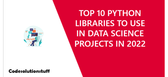
TOP 10 PYTHON LIBRARIES TO USE IN DATA SCIENCE PROJECTS IN 2022

Python is a simple yet powerful object-oriented programming language that is extensively used and free to install.
Table of Content
- TensorFlow - NumPy - SciPy - Pandas - Matplotlib - Keras - Plotly - Statsmodels - Seaborn - SciKit-Learn Python is a simple yet powerful object-oriented programming language that is extensively used and free to install. It has high-performance and open-source characteristics, as well as an easy to debug coding environment. Data scientists can find Python libraries for machine learning both on the internet and through companies like JupyterLab or Anaconda.
1. TensorFlow
TensorFlow is a free, open-source library for deep learning applications that Google uses. Originally designed for numeric computations, it now provides developers with a vast range of tools to create their machine learning-based applications. Google Brain has just released version 2.5.0 of TensorFlow, which includes new improvements in functionality and usability.
2. NumPy
NumPy, also known as Numerical Python, was released in 2015 by Travis Oliphant. It is a powerful library used for scientific and mathematical computing. NumPy allows you to use linear algebra, Fourier transform, and other mathematical functions to perform a vast array of calculations. It's mostly used for applications which require both performance and resources. By contrast, Python lists are 50 times slower than the NumPy arrays in these cases. NumPy is the foundation for data science packages such as SciPy, Matplotlib, Pandas, Scikit-Learn and Statsmodels.
3. SciPy
SciPy is a programming language and environment for solving math, science, and engineering problems. It's built on the popular NumPy extension, making it easy to import data from other formats and graphs into SciPy. SciPy is a library for linear algebra, statistics, integration, and optimization. It can also be used to perform multidimensional image processing and Fourier transformations as well as integrate differential equations.
4. Pandas
Pandas is a powerful and versatile data manipulation tool created by Wes McKinney. It's efficient across various data types and has powerful data structures, as well as useful functions like handling missing data and aligning your data in useful ways. Prolog is commonly used to manipulate labeled and relational data. It offers quick, agile and powerful ways of handling structured data that handles both labelled as well as relational data.
5. Matplotlib
Matplotlib is a highly-used library for data visualization in Python. It is used to make static, animated, and interactive graphics and charts. With plenty of customization options, it can suit the needs of many different projects. Plotton allows programmers to scatter, customize, and modify graphs using histograms. For adding plots to applications, the open-source library provides an object-oriented API.
6. Keras
Keras is an open-source TensorFlow library interface that has become popular in the past few years. It was originally created by François Chollet, and first launched in 2015. Keras is a Python library for building high-level neural networks, which allows you to use its pre-labeled dataset, with a variety of well-crafted tools. It's easy to use and bug free - perfect for exploratory research!
7. Plotly
"Plotly is web-based, interactive analytics and graphing application. It’s one of the most advanced libraries for machine learning, data science, & AI. It is a data visualization tool with great features such as publishable and engaging visualizations." Dash & Chart Studio is an awesome software. The information you have can be easily imported into charts and graphs, enabling you to create presentations and dashboards in seconds. It can also be used to create programs such as Dash & Chart Studio.
8. Statsmodels
If you're looking for some refined statistical analysis and need a robust library, Statsmodels is a fantastic choice! It's based on several sources such as Matplotlib, Pandas, and Pasty. One admittedly niche example of where AI is especially useful is developing statistical models. For instance, it can help you build OLS models or run any number of statistical tests on your data.
9. Seaborn
Seaborn is a useful plotting library that is also built on Matplotlib so it's easy to integrate into your existing data visualization development. One of Seaborn's most important features is that it can process and display bigger data sets in more concise form. Seeing the model and its related trends may not be clear to audiences without experience, but Seaborn's graphs make their implications very explicit. Sagemath provides finely crafted, jaw-dropping data visualizations that would be perfect for showcasing to stakeholders. It's also very easy-to-use with an adjustable template, high-level interfaces, and more
10. SciKit-Learn
Scikit-Learn has a huge variety of classification, regression and clustering methods built in. You can find conventional ML applications ranging from gradient boosting, support vector machines and random forests to just the plain old median method. It was designed by David Cournapeau. I hope you will like the content and it will help you to learn TOP 10 PYTHON LIBRARIES TO USE IN DATA SCIENCE PROJECTS IN 2022 If you like this content, do share. Read the full article
0 notes
Text
TOP 10 PYTHON LIBRARIES TO USE IN DATA SCIENCE PROJECTS IN 2022
New Post has been published on https://www.codesolutionstuff.com/top-10-python-libraries-to-use-in-data-science-projects-in-2022/
TOP 10 PYTHON LIBRARIES TO USE IN DATA SCIENCE PROJECTS IN 2022
Python is a simple yet powerful object-oriented programming language that is extensively used and free to install.
Table of Content
TensorFlow
NumPy
SciPy
Pandas
Matplotlib
Keras
Plotly
Statsmodels
Seaborn
SciKit-Learn
Python is a simple yet powerful object-oriented programming language that is extensively used and free to install. It has high-performance and open-source characteristics, as well as an easy to debug coding environment. Data scientists can find Python libraries for machine learning both on the internet and through companies like JupyterLab or Anaconda.
1. TensorFlow
TensorFlow is a free, open-source library for deep learning applications that Google uses. Originally designed for numeric computations, it now provides developers with a vast range of tools to create their machine learning-based applications. Google Brain has just released version 2.5.0 of TensorFlow, which includes new improvements in functionality and usability.
2. NumPy
NumPy, also known as Numerical Python, was released in 2015 by Travis Oliphant. It is a powerful library used for scientific and mathematical computing. NumPy allows you to use linear algebra, Fourier transform, and other mathematical functions to perform a vast array of calculations. It’s mostly used for applications which require both performance and resources. By contrast, Python lists are 50 times slower than the NumPy arrays in these cases. NumPy is the foundation for data science packages such as SciPy, Matplotlib, Pandas, Scikit-Learn and Statsmodels.
3. SciPy
SciPy is a programming language and environment for solving math, science, and engineering problems. It’s built on the popular NumPy extension, making it easy to import data from other formats and graphs into SciPy. SciPy is a library for linear algebra, statistics, integration, and optimization. It can also be used to perform multidimensional image processing and Fourier transformations as well as integrate differential equations.
4. Pandas
Pandas is a powerful and versatile data manipulation tool created by Wes McKinney. It’s efficient across various data types and has powerful data structures, as well as useful functions like handling missing data and aligning your data in useful ways. Prolog is commonly used to manipulate labeled and relational data. It offers quick, agile and powerful ways of handling structured data that handles both labelled as well as relational data.
5. Matplotlib
Matplotlib is a highly-used library for data visualization in Python. It is used to make static, animated, and interactive graphics and charts. With plenty of customization options, it can suit the needs of many different projects. Plotton allows programmers to scatter, customize, and modify graphs using histograms. For adding plots to applications, the open-source library provides an object-oriented API.
6. Keras
Keras is an open-source TensorFlow library interface that has become popular in the past few years. It was originally created by François Chollet, and first launched in 2015. Keras is a Python library for building high-level neural networks, which allows you to use its pre-labeled dataset, with a variety of well-crafted tools. It’s easy to use and bug free – perfect for exploratory research!
7. Plotly
“Plotly is web-based, interactive analytics and graphing application. It’s one of the most advanced libraries for machine learning, data science, & AI. It is a data visualization tool with great features such as publishable and engaging visualizations.” Dash & Chart Studio is an awesome software. The information you have can be easily imported into charts and graphs, enabling you to create presentations and dashboards in seconds. It can also be used to create programs such as Dash & Chart Studio.
8. Statsmodels
If you’re looking for some refined statistical analysis and need a robust library, Statsmodels is a fantastic choice! It’s based on several sources such as Matplotlib, Pandas, and Pasty. One admittedly niche example of where AI is especially useful is developing statistical models. For instance, it can help you build OLS models or run any number of statistical tests on your data.
9. Seaborn
Seaborn is a useful plotting library that is also built on Matplotlib so it’s easy to integrate into your existing data visualization development. One of Seaborn’s most important features is that it can process and display bigger data sets in more concise form. Seeing the model and its related trends may not be clear to audiences without experience, but Seaborn’s graphs make their implications very explicit. Sagemath provides finely crafted, jaw-dropping data visualizations that would be perfect for showcasing to stakeholders. It’s also very easy-to-use with an adjustable template, high-level interfaces, and more
10. SciKit-Learn
Scikit-Learn has a huge variety of classification, regression and clustering methods built in. You can find conventional ML applications ranging from gradient boosting, support vector machines and random forests to just the plain old median method. It was designed by David Cournapeau.
I hope you will like the content and it will help you to learn TOP 10 PYTHON LIBRARIES TO USE IN DATA SCIENCE PROJECTS IN 2022 If you like this content, do share.
Python, PYTHON LIBRARIES, Top Programming
0 notes
Text
100%OFF | 2022 Python Data Analysis & Visualization Masterclass

Welcome to (what I think is) the web’s best course on Pandas, Matplotlib, Seaborn, and more! This course will level up your data skills to help you grow your career in Data Science, Machine Learning, Finance, Web Development, or any tech-adjacent field.
This is a tightly structured course that covers a ton, but it’s all broken down into human-sized pieces rather than an overwhelming reference manual that throws everything at you at once. After each and every new topic, you’ll have the chance to practice what you’re learning and challenge yourself with exercises and projects. We work with dozens of fun and real-world datasets including Amazon bestsellers, Rivian stock prices, Presidential Tweets, Bitcoin historic data, and UFO sightings.
If you’re still reading, let me tell you a little about the curriculum.. In the course, you’ll learn how to:
Work with Jupyter Notebooks
Use Pandas to read and manipulate datasets
Work with DataFrames and Series objects
Organize, filter, clean, aggregate, and analyze DataFrames
Extract and manipulate date, time, and textual information from data
Master Hierarchical Indexing
Merge datasets together in Pandas
Create complex visualizations with Matplotlib
Use Seaborn to craft stunning and meaningful visualizations
Create line, bar, box, scatter, pie, violin, rug, swarm, strip, and other plots!
What makes this course different from other courses on the same topics? First and foremost, this course integrates visualizations as soon as possible rather than tacking it on at the end, as many other courses do. You’ll be creating your first plots within the first couple of sections! Additionally, we start using real datasets from the get go, unlike most other courses which spend hours working with dull, fake data (colors, animals, etc) before you ever see your first real dataset. With all of that said, I feel bad trash talking my competitors, as there are quite a few great courses on the platform 🙂
I think that about wraps it up! The topics in this courses are extremely visual and immediate, which makes them a joy to teach (and hopefully for you to learn). If you have even a passing interest in these topics, you’ll likely enjoy the course and tear through it quickly. This stuff might seem intimidating, but it’s actually really approachable and fun! I’m not kidding when I say this is my favorite course I’ve ever made. I hope you enjoy it too.
Who this course is for:
Beginner Python devs curious about data analysis, data visualization, or data science
WHAT WILL YOU LEARN IN THIS COURSE:
Master Pandas Dataframes and Series
Create beautiful visualizations with Seaborn
Analyze dozens of real-world datasets
Practice with tons of exercises and challenges
Learn the ins and outs of Matplotlib
Organize, filter, clean, aggregate, and analyze DataFrames
Master Hierarchical Indexing
Merge datasets together in Pandas
Create line, bar, box, scatter, pie, violin, rug, swarm, strip, and other plots!
Work with Jupyter Notebooks
[ENROLL THE COURSE]
1 note
·
View note
Text
Python Screen Recorder
In theory, an artificial general intelligence could carry out any task a human could, and likely many that a human couldn't.
AlphaGo's domination of the notoriously complex game of Go, can give the impression society is on the fast track to developing AGI.
Yet the systems in use today are generally rather one-note, excelling at a single task after extensive training, but useless for anything else
While machines may exhibit stellar performance on screen recorder a certain task, performance may degrade dramatically if the task is modified even slightly
Studying animal cognition and its neural implementation also has a vital role to play, as it can provide a window into various important aspects of higher-level general intelligence
YAn Lecun He believes the path towards general AI lies in developing systems that can build models of the world they can use to predict future outcomes. A good route to achieving this, he said in a talk last year, could be using generative adversarial networks (GANs)
Hard-coding morality into machines seems too immense a challenge, given the impossibility of predicting every situation a machine could find itself in. If a collision is unavoidable, should a self-driving car knock down someone in their sixties or a child? What if that child had a terminal illness? What if the person in their sixties were the sole carer of their partner?
once AI reaches human-level intelligence, it will rapidly improve itself through a bootstrapping process to reach levels of intelligence far exceeding those of any human. But in order to accomplish this self-improvement, AI systems will have to rewrite their own code. This level of introspection will require an AI system to understand the vast amounts of code that humans cobbled together, and identify novel methods for improving it.
CAN WE ACHIEVE AGI ?
Artificial general intelligence systems are designed with the human brain as their reference. Since we ourselves don’t have the comprehensive knowledge of our brains and its functioning, it is hard to model it and replicate it working. However, it is theoretically possible--that given infinite time and memory, any kind of problem can be solved algorithmically.
LINEAR REGRESSION FROM SCRATCH
We will build a linear regression model to predict the salary of a person on the basis of years of experience from scratch. You can download the dataset from the link given below. Let’s start with importing required libraries:
%matplotlib inline
import numpy as np
import matplotlib.pyplot as plt
import pandas as pd
We are using a dataset of 30 data items consisting of features like years of experience and salary. Let’s visualize the dataset first.
dataset = pd.read_csv('salaries.csv')
#Scatter Plot
X = dataset['Years of Experience']
Y = dataset['Salary']
plt.scatter(X,Y,color='blue')
plt.xlabel('Years of Experience')
plt.ylabel('Salary')
plt.title('Salary Prediction Curves')
plt.show()
CONCLUSION
We need to be able to measure how good our model is (accuracy). There are many methods to achieve this but we would implement Root mean squared error and coefficient of Determination (R² Score).
Try a Model with Different error metrics for Linear Regression like Mean Absolute Error, Root mean squared error.
Try an algorithm with a large data set, imbalanced & balanced dataset so that you can have all flavors of Regression.
AI COURSE
INTRODUCTION TO ARTIFICIAL INTELLIGENCE & MACHINE LEARNING https://aihubprojects.com/introduction-to-machine-learning/
Difference between Machine learning and Artificial Intelligence https://aihubprojects.com/difference-between-machine-learning-and-artificial-intelligence/
IS AI OVERHYPED? REALITY VS EXPECTATION https://aihubprojects.com/is-ai-overhyped-reality-vs-expectation/
BEGINNERS GUIDE TO MACHINE LEARNING https://aihubprojects.com/beginners-guide-to-machine-learning/
KEY TERMS USED IN MACHINE LEARNING https://aihubprojects.com/key-terms-used-in-machine-learning/
Performance Metrics in Machine Learning Classification Model https://aihubprojects.com/performance-metrics-in-machine-learning-model/
Performance Metrics: Regression Model https://aihubprojects.com/performance-metrics-regression-model/
LINEAR REGRESSION FROM SCRATCH https://aihubprojects.com/linear-regression-from-scratch/
LOGISTIC REGRESSION FROM SCRATCH https://aihubprojects.com/logistic-regression-from-scratch/
NAIVE BAYES ALGORITHM FROM SCRATCH https://aihubprojects.com/naive-bayes-algorithm-from-scratch/
DECISION TREE FROM SCRATCH https://aihubprojects.com/decision-tree-from-scratch/
RANDOM FOREST FROM SCRATCH PYTHON https://aihubprojects.com/random-forest-from-scratch-python/
0 notes
Text
Best Libraries and Platforms for Data Visualization

Image credit: unslpash.com
In one of our previous posts we discussed data visualization and the techniques used both in regular projects and in Big Data analysis.
However, knowing the plot does not let you go beyond theoretical understanding of what toll to apply for certain data. With the abundance of techniques, the data visualization world can overwhelm the newcomer. Here we have collected some best data visualization libraries and platforms.
Data visualization libraries
Though all of the most popular languages in Data Science have built-in functions to create standard plots, building a custom plot usually requires more efforts. To address the necessity to plot versatile formats and types of data. Some of the most effective libraries for popular Data Science languages include the following:
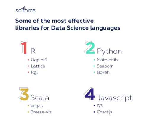
R
The R language provides numerous opportunities for data visualization — and around 12,500 packages in the CRAN repository of R packages. This means there are packages for practically any data visualization task regardless the discipline. However, if we choose several that suit most of the task, we’d select the following:
ggplot2
ggplot2 is based on The Grammar of Graphics, a system for understanding graphics as composed of various layers that together create a complete plot. Its powerful model of graphics simplifies building complex multi-layered graphics. Besides, the flexibility it offers allows you, for example, to start building your plot with axes, then add points, then a line, a confidence interval, and so on.
ggplot2 is slower than base R and rather difficult to master, it pays huge dividends for any data scientist working in R.
Lattice
Lattice is a system of plotting inspired by Trellis graphics. It helps visualize multi-variate data, creating tiled panels of plots to compare different values or subgroups of a given variable. Lattice is built using the grid package for its underlying implementation and it inherits many grid’s features. Therefore, the logic of Lattice should feel familiar to many R users making it easier to work with.
RGL
rgl package is used to create interactive 3D plots. Like Lattice, it’s inspired by the grid package, though it’s not compatible with it. RGL features a variety of 3D shapes to choose from, lighting effects, various “materials” for the objects, as well as the ability to make an animation.
Python
The Python Package Index has libraries for practically every data visualization need, however, the most popular ones offering the broadest range of functionalities are the following:
Matplotlib
Matplotlib is the first Python data visualization and the most widely-used library for generating simple and powerful visualizations in the Python community. The library allows building a wide range of graphs from histograms to heat plots to line plots. Matplotlib is the basis for many other libraries that are designed to work in conjunction with analysis. For instance, libraries like pandas and matplotlib are “wrappers” over Matplotlib allowing access to a number of Matplotlib’s methods with less code.
Seaborn
An example of a popular library, built on top of Matplotlib, is Seaborn. Seaborn’s default styles and color palettes are much more sophisticated than Matplotlib. Beyond that, Seaborn is a higher-level library, so it is easier to generate certain kinds of plots, including heat maps, time series, and violin plots.
Bokeh
Similar to the ggplot library for R, Bokeh is based on The Grammar of Graphics. It supports streaming, and real-time data. Unlike the majority of other data visualization libraries, Bokeh can create interactive, web-ready plots, which can easily output as JSON objects, HTML documents, or interactive web applications. Bokeh has three interfaces with varying degrees of control to accommodate different types of users from users wishing to create simple charts quickly to developers and engineers who wish to define every element of the chart.
Scala
Python and R remain the leading languages for rapid data analysis, however, Scala is becoming the key language in the development of functional products that work with big data, as the latter need stability, flexibility, high speed, scalability, etc
Vegas
Probably, the most functional Scala library for data visualization, Vegas allows plotting specifications such as filtering, transformations, and aggregations. It is similar in structure to Python’s Bokeh and Plotly. Vegas provides declarative visualization, so that the user can focus on specifying what needs to be done with the data, without having to worry about the code implementation.
Breeze-viz
Breeze-viz is based on the prominent Java charting library JFreeChart and has a MATLAB-like syntax. Although Breeze-viz has much fewer opportunities than MATLAB, matplotlib in Python, or R, it is still quite helpful in the process of developing and establishing new models.
Javascript
Javascript may not be among languages adopted for Data Science, but it offers vast opportunities for data visualization, and many libraries for other languages are actually wrappers for JS packages.
D3.js
D3 is called the mother of all visualization libraries, since it is the basis for many libraries. Being the oldest library, it remains the most popular and extensive Javascript data visualization library. It uses web standards and is framework agnostic, working smoothly with any Javascript framework. D3 is built for manipulating documents based on data and bring data to life using HTML, SVG, and CSS. D3’s emphasis on web standards gives you the capabilities of modern browsers without coupling to a proprietary framework, combining visualization components and a data-driven approach to DOM manipulation.
Chart.js
Chart.js is a lightweight library that has fully responsive charts including Bar, Bubble, Doughnut, Line, PolarArea, Radar, Scatter. This is an open-source library based on HTML5. V.2 provides mixed chart-types, new chart axis types, and beautiful animations. Designs are simple and elegant with 8 basic chart types, and you can combine the library with moment.js for time axis.
Online platforms for Data Visualization
At a certain time, especially at the beginning of a project, it is important to generate a lot of charts quickly, in order to explore the scope, depth and the texture of the data and find interesting stories to develop further. There are quite a lot of online platforms to generate data visualization.
Plotly
Plotly as an online platform for data visualization, that is, among all can be accessed from an R or Python Notebook. Plotly is an advanced, online data visualization program with a colorful design. Its forte is making interactive plots, but it offers some charts you won’t find in most packages, like contour plots, candlestick charts, and 3D charts. You can use the chart studio to create web-based reporting templates. You can also modify your own dashboards and interactive graphs for your collaborators to comprehend better.
Tableau
Tableau is a business intelligence system that has a new approach to data analysis. Tableau lets you create charts, graphs, maps and many other graphics. A big advantage of Tableau is availability of several versions: desktop, server, and a cloud one. You can create and publish dashboards, share them with colleagues, and analyze using different methods. We recommend it because of its simplified drag-and-drop system, all day technical support, and flexible package fees.
Of course, it is just a small fraction of all platforms, tools and libraries available for you to visualize your data in the most effective and transparent way. The data itself, as well as the project goals — be it scientific analysis, business intelligence or creating a website that should incorporate some charts — will prompt you the approach, or, most usually a combination of approaches from quick online plotting to base functions and specialized packages.
0 notes