#BoxShadow
Explore tagged Tumblr posts
Visit Tumblr Blog
Explore Tumblr blogs with no restrictions, modern design and the best experience.
Last Seen Tumblr Blogs


Fun Fact
The average Tumblr user visits about 67 pages every month.
Text
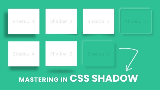
Shadow Play: Mastering Box Shadow in CSS

Introduction
Welcome to the world of shadows in web design! In this blog post, we'll delve into the fascinating realm of box shadows in CSS and how mastering them can elevate your design game. Box shadows add depth, dimension, and a touch of magic to your web elements, making them visually appealing and modern. Whether you're a beginner looking to grasp the basics or an experienced developer seeking advanced techniques, this guide will walk you through the ins and outs of box shadows. Get ready to unlock the full potential of this powerful CSS feature and add a captivating layer to your web projects.
Understanding Box Shadow
Box shadow is a versatile CSS property that allows you to add visual depth and dimension to elements on your webpage. It creates the illusion of elements lifting off or casting shadows, contributing to a more immersive and engaging user experience. Let's break down the key components of the box shadow property: - Color: The color of the shadow, specified in a variety of ways, such as named colors, hex codes, or RGB values. - Blur: The blur radius determines how blurry or sharp the shadow appears. A higher value results in a softer, more diffused shadow. - Spread: This property controls the size of the shadow. A positive value increases the size, while a negative value decreases it. - Inset: An optional keyword that creates an inner shadow, giving the appearance that the element is pressed into the page. Here's an example of a basic box shadow declaration: CSS.box { box-shadow: 10px 10px 20px #888888; }
Creating Basic Shadows
Now that we've laid the groundwork for understanding box shadows, let's dive into creating some basic shadows to enhance the visual appeal of your web elements. Creating a basic shadow involves specifying the color, blur, and spread properties to achieve the desired effect. Here's a step-by-step guide to creating a basic box shadow: - Choose the Element: Select the HTML element to which you want to apply the box shadow. This could be anything from buttons to cards or images. - Define the Shadow: Use the box-shadow property in your CSS to define the shadow. For example: - CSS.basic-shadow { box-shadow: 5px 5px 10px #333333; } CSS.radial-shadow { box-shadow: radial-gradient(circle, #4CAF50 0%, transparent 100%) 10px 10px 20px; }
Optimizing for Performance
See the Pen CSS Box Shadow Examples by vavik (@vavik96) on CodePen. While box shadows can enhance the visual appeal of your website, it's crucial to consider performance optimization to ensure a smooth and efficient user experience. Implementing box shadows irresponsibly can lead to increased page load times and negatively impact overall performance. Here's a guide on how to optimize box shadows for better performance: - Limit the Use of Shadows: Avoid applying box shadows to a large number of elements on a page. Excessive shadows can contribute to increased rendering times and slower performance. Reserve shadows for key elements that genuinely benefit from the visual enhancement. - Use Conservative Shadow Values: Opt for smaller blur radii and spread values, especially for shadows that don't require a pronounced effect. Smaller values contribute to faster rendering times while still providing a subtle visual lift. - Avoid Animating Shadows: Animating box shadows can be resource-intensive. If possible, limit or avoid shadow animations, particularly on elements that are frequently interacted with or visible on the screen. - Consider CSS Hardware Acceleration: Leverage hardware acceleration for smoother rendering. This can be achieved by applying shadows to elements that have their own GPU layers, such as elements with the CSS property transform: translateZ(0);. Additionally, here's a quick reference table summarizing key optimization tips: Optimization TipDescriptionLimit the Use of ShadowsAvoid excessive application of box shadows to maintain optimal performance.Use Conservative Shadow ValuesOpt for smaller blur radii and spread values for faster rendering.Avoid Animating ShadowsMinimize or avoid animations on box shadows for improved performance.CSS Hardware AccelerationApply shadows to elements with GPU layers for smoother rendering. By following these optimization techniques, you can strike a balance between visual enhancement and website performance. Remember, thoughtful and judicious use of box shadows contributes to a polished design without compromising speed and responsiveness.
Practical Applications
Now that you've honed your skills in mastering box shadows, it's time to explore practical applications where these subtle yet powerful design elements can make a significant impact on your website. Let's delve into real-world examples of how box shadows can enhance various elements and contribute to a visually appealing user interface. - Card Components: Implement box shadows on card components to create a sense of elevation and separation from the background. A subtle shadow can make cards appear as if they are floating, adding a modern touch to your layout. - Buttons: Apply box shadows to buttons to make them visually stand out and convey a sense of interactivity. Experiment with shadow intensity to find the right balance between a subtle lift and a more pronounced 3D effect. - Images and Thumbnails: Enhance the presentation of images and thumbnails by adding shadows. This technique provides a subtle border and makes the images pop on the page, especially when placed on a light background. - Navigation Menus: Use box shadows to distinguish navigation menus from the rest of the content. Shadows can help create a layered effect, making it clear that the navigation is a separate and interactive element. Here's a quick reference table summarizing practical applications of box shadows: ElementPractical ApplicationCard ComponentsCreate elevation and separation with subtle box shadows.ButtonsEnhance interactivity by applying shadows to buttons.Images and ThumbnailsAdd a subtle border and make images stand out with shadows.Navigation MenusDistinguish menus with layered effects using box shadows. As you integrate box shadows into these elements, remember to maintain a consistent design language throughout your website. Striking the right balance between visual enhancement and coherence contributes to a seamless and aesthetically pleasing user experience.
Common Mistakes to Avoid
While mastering box shadows can significantly enhance your web design, it's essential to be aware of common pitfalls that can lead to unintended and undesirable outcomes. Steering clear of these mistakes ensures that your use of box shadows contributes positively to the overall aesthetics and user experience of your website. Let's explore some common mistakes and how to avoid them: - Excessive Use: Avoid the temptation to apply box shadows excessively throughout your site. Overusing shadows can clutter the visual hierarchy and negatively impact performance. Instead, selectively apply shadows to key elements that benefit from the enhancement. - Contrast and Readability: Be mindful of the contrast between the shadow color and the background. If the contrast is too high, it can affect text readability or create a distracting visual effect. Opt for subtle shadows that complement the overall design without overpowering the content. - Uniform Shadow Values: Using the same shadow values for every element may result in a monotonous design. Vary the shadow properties based on the context and size of the element to achieve a more dynamic and visually interesting layout. - Ignoring Performance: Failing to optimize box shadows for performance can lead to slow page load times. Limit the number of elements with box shadows, use conservative shadow values, and avoid unnecessary shadow animations to ensure a smooth user experience. Here's a quick reference table summarizing common mistakes and their solutions: MistakeSolutionExcessive UseApply shadows selectively to key elements for a clutter-free design.Contrast and ReadabilityEnsure a balanced contrast between shadow color and background for optimal readability.Uniform Shadow ValuesVary shadow properties based on element size and context for a dynamic layout.Ignoring PerformanceOptimize shadows for performance by limiting elements, using conservative values, and avoiding unnecessary animations. By steering clear of these common mistakes, you can leverage box shadows effectively, enhancing the visual appeal of your website while maintaining a seamless and performant user experience.
FAQ
Explore answers to frequently asked questions about mastering box shadows in CSS. Whether you're troubleshooting common issues or seeking clarification on specific aspects, this FAQ section is designed to provide helpful insights and solutions. Q: Can I apply box shadows to any HTML element? A: Yes, box shadows can be applied to most HTML elements, including divs, buttons, images, and more. However, consider the purpose and visual impact before adding shadows to ensure a cohesive design. Q: How do I create a box shadow with a transparent color? A: To achieve a box shadow with a transparent color, use RGBA or HSLA values for the color property, adjusting the alpha channel to control transparency. For example: box-shadow: 5px 5px 10px rgba(0, 0, 0, 0.5); Q: What is the impact of box shadows on website performance? A: Excessive or unoptimized use of box shadows can impact performance by increasing page load times. It's recommended to limit the number of elements with shadows, use conservative shadow values, and avoid unnecessary animations for optimal performance. Q: Can I animate box shadows for dynamic effects? A: While it's possible to animate box shadows, it's important to consider the potential impact on performance. Avoid excessive shadow animations, especially on frequently interacted elements, to maintain a smooth user experience. Q: Are there alternative techniques for creating depth without box shadows? A: Yes, alternative techniques include using borders, gradients, and pseudo-elements to create depth and visual interest. Experiment with different approaches to find the method that best suits your design goals. Feel free to refer to this FAQ section as you navigate the nuances of working with box shadows, addressing common queries and optimizing your approach for a seamless and visually pleasing web design.
Conclusion
Congratulations on completing this journey into the art of mastering box shadows in CSS! Throughout this guide, you've learned the fundamentals of box shadows, explored advanced techniques, and discovered practical applications that can elevate your web design skills. As you continue to integrate box shadows into your projects, keep in mind the importance of balance. Strive for a harmonious design where shadows enhance the user experience without overwhelming the visual landscape. Experiment with different values, apply shadows selectively, and consider the unique context of each element to achieve optimal results. Remember to prioritize performance by avoiding common mistakes, such as excessive use of shadows and neglecting optimization. By following best practices, you can ensure that your web pages load quickly and provide a seamless experience for your visitors. Whether you're creating subtle shadows for a clean and modern look or experimenting with advanced techniques for a bold and dynamic design, box shadows offer a versatile tool to express your creativity in web development. Thank you for exploring the world of box shadows with us. May your future designs be visually captivating, user-friendly, and optimized for top-notch performance. Happy coding! Read the full article
0 notes
Photo
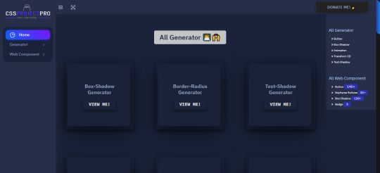
Hi I'm Abhishek Kumar Khantwal . Recently I created a website which contains web component and generator.. you will see 200+ amazing buttons ,120+ box shadows and many generators. This website will help you to become even more creative website developer....
#css#htmlcssjavascript#button#buttongenerator#webiste#CSSanimation#cssproject#boxshadow#animation#hoverbutton#transform#keyframe
0 notes
Text
Best Box Shadow Effect for Card UI

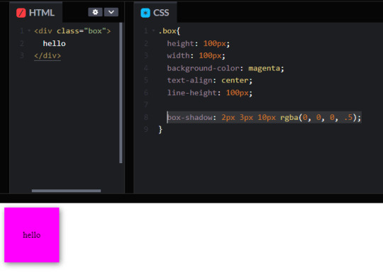
Check out this simple but effective CSS snippet of using 2 box-shadow, the second one with a bigger blur and opacity. Works well on card UI elements. See the Pen…
0 notes
Text
Exploring Neumorphism in Flutter App Design: A Guide to Creating Modern Interfaces

Introduction
In the world of Flutter app design, Neumorphism has gained popularity for its unique approach to blending realism and simplicity. This design trend creates visually appealing user interfaces by using soft shadows and subtle gradients to mimic physical objects on the screen. In this comprehensive guide, we will explore Neumorphism in Flutter app design and learn how to implement it to create modern and visually appealing interfaces. Get ready to bring a touch of elegance to your Flutter apps!
1. Understanding Neumorphism
Neumorphism, also known as "Soft UI," is a design style that takes inspiration from skeuomorphism and flat design. It combines realistic elements, such as shadows and highlights, with minimalistic aesthetics. The goal is to create interfaces that resemble physical objects, giving them depth and a tactile feel.
2. Applying Neumorphism in Flutter
To create a Neumorphic design in Flutter, we'll focus on two key aspects: shadows and gradients. 2.1. Shadows Shadows play a crucial role in Neumorphism by adding depth to UI elements. In Flutter, we can achieve this by using the BoxShadow class. Adjust the color, blurRadius, and spreadRadius properties to create the desired shadow effect. 2.2. Gradients Gradients are another important aspect of Neumorphism that help create a realistic appearance. Flutter provides the LinearGradient and RadialGradient classes to define gradients. Experiment with different colors, stops, and directions to achieve the desired effect.
3. Simplistic Elements
One of the defining features of Neumorphism is its simplicity. To create a Neumorphic look, avoid complex shapes and stick to clean, minimalist designs. Utilize basic Flutter widgets such as Container, Card, or Button and focus on subtle shadow and gradient effects.
4. Consistency and Balance
Maintaining consistency and finding the right balance are crucial in Neumorphism. Keep a consistent color palette, shadow intensity, and gradient style throughout your app to create a cohesive user experience. Be mindful of the contrast between foreground and background elements to ensure readability.
Sample Code
Output

Exploring Neumorphism in Flutter App Design A Guide to Creating Modern Interfaces
Conclusion
Neumorphism offers a modern and visually appealing approach to Flutter app design. By leveraging shadows, gradients, and simplistic elements, you can create interfaces that blend realism and simplicity seamlessly. We've explored the key techniques, including shadow creation and gradient usage. Remember to maintain consistency and find the right balance to achieve the desired Neumorphic look in your Flutter apps. Now, it's time to unleash your creativity and design stunning user interfaces! Read the full article
0 notes
Text
How to Add Drop Shadow Effect In Flutter?

During app development, specific modules are necessary to add to fix or insert additional features or optimize some functions. In Flutter app development, one common action that project leaders require is adding a shadow effect. For this, the DropShadow plugin of Flutter is a useful component that one can apply to pictures and widgets.
You can hire Flutter developer to handle the process of implementing the demo program for drop shadow in Flutter projects and properly apply this plugin. Flutter development company have experience with handling the drop shadow packages within Flutter apps. But first, knowing what it means is important. Here, you will read about all the necessary details on this Effect.
Short Overview of Drop Shadow Effect The Drop Shadow is an effect that can apply to widgets or any image during the development process. Flutter programmers use the drop_shadow package to apply this coding in Flutter-made apps and optimize the UI quality. With this, a shadow effect is noticeable in different types of elements, like asset images, networking images, text widgets, and container widgets.
Example of Drop Shadow Types Here are some examples of different types of coding that go into specific types of drop shadow implementation.
Solution 1: Box.Decoration.boxShadow This type of code would help prepare a type of amber box using the drop shadow. The benefit of using the BoxDecoration.boxShadow is that one can monitor and control multiple shadow characteristics carefully. Here are some of these characteristics:
BlurRadius- This sets the shadow radius. color- Specifically for the shadow color. Offset- Sets the shadow offset. blurStyle- This sets the blurring style and holds the default value of BlurStyle.normal. spreadRadius- Before applying blur, the box should inflate for a specific limit. This is that amount. The code: Scaffold( appBar: AppBar(title: const Text(‘Dropshadow'),), body: Center( child: Container( width: 300, height: 300, decoration: BoxDecoration( color: Colors.amber.shade300, borderRadius: BorderRadius.circular(5), // implement shadow effect boxShadow: const [ BoxShadow( color: Colors.black54, // shadow color blurRadius: 20, // shadow radius offset: Offset(5, 10), // shadow offset spreadRadius: 0.1, // The amount the box should be inflated prior to applying the blur blurStyle: BlurStyle.normal // set blur style ), ], ), ), )); Output: solution 1 dropshadow Solution 2: Material Widget Developers can create the drop shadow effect with the help of a Material widget.
The code: Scaffold( appBar: AppBar(title: const Text('Dropshadow')), body: Center( child: Material( elevation: 20, shadowColor: Colors.black, color: Colors.pink, shape: RoundedRectangleBorder(borderRadius: BorderRadius.circular(150)), child: const SizedBox( width: 300, height: 300, ), ))); Output: solution 2 dropshadow Solution 3: Card Widget Developers can add drop shadow by using a Card widget to wrap the primary widget. This is one of the quickest and simplest solutions to try, and one can customize this drop shadow type further. The elements for that include:
shadowColor- This signifies the shadow color. elevation- This customization helps control shadow size behind the Card widget. The code: Scaffold( appBar: AppBar(title: const Text('Dropshadow')), body: const Center( child: Card( elevation: 16, // the size of the shadow shadowColor: Colors.black, // shadow color color: Colors.lightGreen, child: SizedBox( width: 320, height: 240, ), ), )); Output: solution 3 dropshadow Solution 4: PhysicalModel Widget It is possible to use the PhysicalModel widget for implementing the drop shadow effect in Flutter apps.
The code: Scaffold( appBar: AppBar(title: const Text(‘Dropshadow')), body: const Center( child: PhysicalModel( color: Colors.blueAccent, elevation: 10, shadowColor: Colors.blue, child: SizedBox( width: 320, height: 280, ), ), )); Output: solution 4 dropshadow Solution 5: Drop Shadows for Text You can use the simple_shadow plugin type to insert a drop shadow effect within text components.
The code: Widget build(BuildContext context) { return Scaffold( appBar: AppBar( title: const Text('Dropshadow'), ), body: Center( child: Text( 'flutteragency', style: TextStyle(fontSize: 60, fontWeight: FontWeight.bold, shadows: [ Shadow( color: Colors.black.withOpacity(0.3), offset: const Offset(15, 15), blurRadius: 15), ]), ), ), ); } Output: solution 5 dropshadow Constructor Notably, it is important to call for the constructor element underneath to utilize the DropShadow plugin properly.
The code for this is as follows: const DropShadow({ Key? key, required this.child, this.blurRadius = 10.0, this.borderRadius = 0.0, this.offset = const Offset(0.0, 8.0), this.opacity = 1.0, this.spread = 1.0, }) Make sure the required fields must not be empty when the constructor called.
Implementation of DropShadow The sequence is explained hereafter for implementing the DropShadow effect accurately. It is important to understand and follow the steps accurately to avoid coding errors.
Step 1: Insert the dependencies In the pubspec-yaml file, add the available dependencies. e.g., dependencies: flutter: sdk: Flutter drop_shadow: ^0.0.1+4
Step 2: Include the assets Following the dependencies, add the available assets to the file. assets: – assets/
Step 3: Handling the importing steps Run the following sequence: import ‘package:drop_shadow/drop_shadow.dart’;
Step 4: Run package Finally, you can run the Flutter packages within the app’s root directory.
Sample Code: class HomePage extends StatelessWidget { const HomePage({Key? key}) : super(key: key); @override Widget build(BuildContext context) { return Scaffold( body: Center( child: SingleChildScrollView( child: Column( mainAxisSize: MainAxisSize.min, children: [ DropShadow( child: Image.network( 'https://images.pexels.com/photos/1191639/pexels-photo-1191639.jpeg', width: 250, ), ), const SizedBox(height: 35), DropShadow( child: Container( height: 150, width: 250, decoration: BoxDecoration( borderRadius: BorderRadius.circular(20), gradient: const LinearGradient( colors: [Color(0xFF3366FF), Color(0xFF00CCFF)], ), ), ), ), const SizedBox(height: 35), const DropShadow( child: Text( 'Sample Text', style: TextStyle(fontSize: 35, color: Colors.orange), ), ), ], ), ), ), ); } } Output: constructor dropshadow Wrapping up: Ultimately, this approach will prove beneficial if you carry out the steps properly.
Frequently Asked Questions (FAQs) 1. What is a material widget in Flutter? The material widget is liable for Clipping if clip behavior is not Clip. none, then the material clips its widgets sub-tree to the shape already defined by shape, type, and borderRadius.
2. How many types of widgets are in Flutter development? There are usually two types of widgets in Flutter: The stateful widget and the Stateless widget.
3. Why is a widget used in a Flutter application? Flutter widgets are used to create a modern framework that has taken inspiration from React. The main idea is to develop the UI out of the widgets. It describes what their view will look like with the current configuration and state.
Content Source: https://flutteragency.com/add-drop-shadow-effect-in-flutter/
0 notes
Text
【 Flutter 】Flutter を 基礎 から 学習 ( ウィジェット編 ) part26 Single-child layout widgets
【 Flutter 】Flutter を 基礎 から 学習 ( ウィジェット編 ) part26 Single-child layout widgets
「基礎 から 学ぶ Flutter 」という書籍で 学習 したことを ブログでアウトプットしていこうと思います。今回は ウィジェット編 ( part26 )です。 前回 【 Flutter 】Flutter を 基礎 から 学習 ( ウィジェット編 ) part25 Single-child layout widgets 引き続き、Single-child layout widgetsについて学びます。 Single-child layout widgets BoxDecorationクラス boxShadowプロパティ boxShadowプロパティはウィジェットに影を付けることができます。 import 'package:flutter/cupertino.dart'; import 'package:flutter/material.dart'; void main()…

View On WordPress
0 notes
Text
vecka 3
Måndag:
Feedback på loading screen - insiktsfulla tips. A gillade min tanke med cirklarna, men att de skulle vara lite mindre. Även att de körde med boxshadows istället. Övergripande kändes den lite stor, men annars var designen bra. Tänk på: Kolla smådetaljer, dubbelkolla storlek.
Fortsätt på min hemsida: Varit mer nogrann men storleken och att de hamnar på en bra plats så det inte blir jobbigt för ögat. Har lite tankar angående top-ratings, behövs det? kan man ha något annat där?
Uppgift: var klar med start + en landningsida på alla storlekar för att gå igenom på onsdag.
tisdag:
hemsida
Torsdag:
gå igenom design, feedback: mer liv, kändes som default
redigera bilder till Sony
Fredag
fortsätta på hemsida
0 notes
Video
youtube
@chewup #chewup #visualeffects #transitions #textEffects #videoEffects #hashtags #concept #art #design #especialEffects #BoxShadows
#chewup#visualeffects#transitions#textEffects#videoEffects#hashtags#concept#art#design#especialEffects#BoxShadows
0 notes
Text
Adobe Muse Widget Bundle 2 (Muse Widgets)
Adobe Muse Widget Bundle 2
Adobe Muse Widget Bundle 2 is a widget Bundle for Adobe Muse CC, It contains 7 brand new essensial bundle special for you. If you are muse developer or designer you must have this Bundle.
Main Feature:
100% Responsive
100% Webpage Suitable
100% Webpage Modification
Package content:
[TA] – 3DTextonHover [Widget]
[TA] – Background Music [Widget]
[TA] – BoxShadow [Widget]
[TA] – GIFonClick [Widget]
[TA] – Scroll2Top [Widget]
[TA] – TextOutline [Widget]
[TA] – TextShadow [Widget]
Documentation
assets
index.html
[TA] – Widget Bundle.zip
3DTextonHover:
Using this you can make 3d text. Text change on the mouse move. amazing thing you must have to see this.
Background Music:
Relax with music. play inside your website thats attracts your user.
GIFonClick:
Onclick you still image start making motion like facebook. Please use in your website that attract more than your creativity.
Scroll2Top:
Its basic but mendatory. now you can put anything over scrolling box.
Installation:
Browse to the location where you downloaded the widget file.
Extract the contents of the file.
Double-click the MULIB file to import it into the Library. This will launch Muse if it’s not already open.
After extracting the files, click the Import Muse Library icon at the bottom of the Library Panel in Muse.
Browse to the location you where you extracted the widget files. Select the MULIB file.
Note: The help file is included in the main package.
from CodeCanyon new items http://ift.tt/2rakV5q via IFTTT https://goo.gl/zxKHwc
0 notes
Text
Removing Box Shadows with CSS: Step-by-Step Tutorial
Introduction
Welcome to our step-by-step tutorial on "Removing Box Shadows with CSS." Box shadows are a popular design element in web development, often used to add depth and dimension to various elements on a webpage. However, there are situations where you might want to remove these box shadows. This tutorial will guide you through the process of identifying, accessing, and modifying the CSS to effectively remove box shadows from specific elements on your website.
Why Remove Box Shadows?
Box shadows are a versatile and widely used CSS property that can enhance the visual appeal of your website. They create a sense of depth, making elements stand out by adding shadows behind them. However, there are several compelling reasons to remove box shadows in certain scenarios: - Design Customization: Sometimes, you may have a specific design or branding requirement that doesn't align with the default box shadow styles provided by your CSS framework or theme. Removing box shadows allows you to achieve a unique look and feel for your website. - Accessibility: Web accessibility is a critical consideration in modern web development. High contrast and strong box shadows can make it difficult for users with visual impairments to read and navigate the content. Removing or reducing box shadows can improve accessibility by making content more readable. - Print-Friendly Pages: When users want to print content from your website, heavy box shadows can consume excessive ink and make the printed page less attractive. Removing box shadows for print-friendly pages ensures a more efficient use of resources. - Performance Optimization: In some cases, an excessive use of box shadows can negatively impact the performance of your website. Too many box shadows can lead to slower page load times. Removing unnecessary shadows can help improve page speed. It's essential to remember that while there are valid reasons to remove box shadows, they can also contribute positively to the user experience when used appropriately. For example, subtle box shadows can create a sense of hierarchy and guide users' attention to specific elements on the page. Before proceeding with the removal of box shadows, it's crucial to carefully evaluate your website's design requirements and user needs. By understanding the reasons behind removing box shadows, you can make informed decisions and implement changes that best suit your project's goals.
Step 1: Identify the Target Element

Before you can begin removing a box shadow, it's crucial to identify the specific HTML element to which the shadow is applied. This element is the target of your modification. Here's how to go about it: - Inspect the Web Page: Open your web browser and navigate to the page where the box shadow is located. Right-click on the element with the shadow, and select "Inspect" or "Inspect Element" from the context menu. This will open the browser's developer tools. - Element Selection: In the developer tools, you'll see the HTML structure of the webpage. Hover over different elements in the HTML panel, and the corresponding parts of the page will be highlighted. This helps you visually identify the target element with the box shadow. - Examine the Styles: In the "Styles" or "Computed" panel of the developer tools, you can see the CSS properties applied to the selected element. Look for the property responsible for the box shadow. It is typically called "box-shadow." The values of this property will give you insight into the shadow's appearance and dimensions. Additionally, you may need to consider the element's position in the HTML structure and its class or ID attributes. These identifiers can help you pinpoint the element more precisely if there are multiple elements with similar styles on the page. For complex websites, it might take some trial and error to identify the target element accurately. Once you've successfully identified it, you're ready to move on to the next step – accessing the CSS for the element and modifying it to remove the box shadow. Remember, a careful and accurate identification of the target element is essential to ensure that you only remove the box shadow from the desired element without affecting other parts of your web page.
Step 2: Access the CSS
After successfully identifying the target element with the box shadow, the next crucial step is to access the CSS responsible for styling that element. Here's how to access the CSS code: - Browser Developer Tools: In most modern web browsers, including Chrome, Firefox, and Edge, you can access the CSS styles applied to an element using the built-in developer tools. Right-click on the element with the shadow, and select "Inspect" or "Inspect Element" to open the developer tools. In the developer tools panel, navigate to the "Styles" or "Computed" tab. Here, you can see all the CSS rules that apply to the selected element. - Identify Relevant Styles: To find the CSS rule responsible for the box shadow, look through the list of styles in the developer tools. Search for properties like "box-shadow," which define the appearance of the shadow. You may need to expand the styles to see the specific CSS rules affecting the element. - Explore Linked Stylesheets: If the CSS for your website is linked from an external stylesheet (common in larger websites), you may find that the box shadow styling is not directly visible in the developer tools. In such cases, click on the link to the external stylesheet within the developer tools to access and modify the CSS code directly. Once you've located the relevant CSS rule, you can proceed to make the necessary modifications to remove the box shadow. If the CSS code is embedded in a style tag within the HTML document, you can modify it directly in the developer tools. If it's part of an external stylesheet, you may need to access and edit the source file using a code editor or the website's content management system (CMS). It's important to exercise caution when editing CSS code, as unintentional changes can affect the appearance and functionality of your website. To ensure a smooth process, make a backup of the CSS file or section you intend to modify and document your changes for future reference. By successfully accessing the relevant CSS, you're one step closer to removing the box shadow from your target element and achieving the desired design or functionality for your webpage.
Step 3: Modify the CSS
Once you've identified the target element and accessed the relevant CSS, you're ready to proceed with modifying the CSS to remove the box shadow. This step involves careful changes to achieve the desired result without compromising the integrity of your website's design. Here's how to do it: Locate the Box Shadow Rule: In the CSS code, find the rule that defines the box shadow for the target element. The rule will typically include the "box-shadow" property with its values. It might look something like this: CSS.your-element { box-shadow: 4px 4px 10px rgba(0, 0, 0, 0.2); } Modify or Remove the Rule: To remove the box shadow, you can simply delete or comment out the entire "box-shadow" rule. If you want to keep the CSS rule but remove the shadow effect, change the values to "box-shadow: none;" or set the shadow's dimensions to zeros, e.g. "box-shadow: 0 0 0 0 rgba(0, 0, 0, 0);". This will effectively eliminate the shadow effect. Test Your Changes: After making the modifications, it's essential to test your webpage to ensure that the box shadow has been successfully removed. Refresh the page and examine the target element to confirm the absence of the shadow. If the shadow is still visible, double-check your changes and save the CSS file if necessary. Remember to save your modified CSS file or update the code within your content management system (CMS) to ensure that your changes persist across page loads. Additionally, document the changes you've made for reference in case you need to revert them or make further adjustments in the future. Keep in mind that removing the box shadow is just one option. You can also modify the shadow's properties, such as color, spread, blur, or offset, to customize its appearance to better suit your design preferences. By successfully modifying the CSS, you'll have achieved your goal of removing the box shadow and can enjoy a cleaner and more personalized visual presentation for your webpage.
Common Pitfalls
While removing box shadows from your web elements can enhance your website's design and performance, there are common pitfalls and challenges to be aware of during this process. Understanding these pitfalls can help you avoid potential issues: PitfallDescriptionOverlooking Multiple ShadowsSome elements may have multiple box shadows applied through layered CSS rules. Make sure to identify and modify or remove all relevant shadow rules to achieve the desired effect.Accidental CSS ChangesWhen editing your CSS to remove shadows, be cautious not to accidentally alter other CSS properties, as this can lead to unintended changes in your website's appearance.Browser CompatibilityWhile modern web browsers support CSS box shadows, older browsers may not. Ensure that your design remains functional and visually appealing across different browser versions.Accessibility ImpactRemoving box shadows can affect web accessibility. Make sure to test your changes with accessibility tools to ensure that the content remains usable for everyone, including individuals with visual impairments.Print StylesWhen removing shadows for print-friendly pages, be aware of how the lack of shadows might affect the readability and aesthetics of printed content. Adjust your print styles accordingly. Additionally, it's essential to maintain consistency in your design and ensure that the removal of box shadows aligns with your overall visual strategy. Make sure that the changes don't compromise the user experience or make your website appear less professional. Another potential pitfall is forgetting to update your documentation and style guides to reflect the changes you've made to the design. Keeping your team informed and maintaining clear documentation helps avoid confusion in the future. By being mindful of these common pitfalls and challenges, you can navigate the process of removing box shadows with confidence and ensure that your website remains visually appealing, functional, and accessible to all users.
FAQ
Here are some frequently asked questions related to removing box shadows with CSS: 1. Why would I want to remove box shadows from my website? Box shadows can be removed for various reasons, including design customization, accessibility, print-friendliness, and performance optimization. It depends on your specific design requirements and user needs. 2. How can I identify the target element with a box shadow? You can use your browser's developer tools to inspect the element and look for the "box-shadow" property in the CSS. It's crucial to accurately identify the element you want to modify. 3. What if there are multiple box shadows on the same element? If an element has multiple box shadows applied through different CSS rules, you need to modify or remove all relevant shadow rules to achieve the desired effect. 4. Can removing box shadows affect my website's accessibility? Yes, removing box shadows can impact web accessibility, as some users rely on them for visual cues. It's essential to test your changes with accessibility tools to ensure content remains usable for everyone. 5. How do I ensure my changes are compatible with different web browsers? To ensure compatibility, you should test your website in various browsers, including older versions. Using CSS features supported by most modern browsers can help maintain consistency in design. 6. Can I customize the appearance of the box shadow instead of removing it? Absolutely. Instead of removing box shadows, you can modify their properties, such as color, spread, blur, or offset, to tailor them to your design preferences. These frequently asked questions provide insights into the considerations and best practices when dealing with box shadows in CSS. If you have more specific questions or encounter challenges, feel free to reach out for further guidance.
Conclusion
In conclusion, the process of removing box shadows with CSS can greatly impact the visual presentation, accessibility, and performance of your website. This step-by-step tutorial has guided you through the essential stages of achieving this, from identifying the target element to accessing and modifying the CSS code effectively. By understanding the reasons for removing box shadows, you can make informed decisions that align with your design goals and user needs. Whether it's for customization, accessibility improvements, or print-friendliness, the ability to control box shadows empowers you to create a web experience that best suits your project. However, it's important to be aware of common pitfalls and challenges that may arise during the process, such as issues with browser compatibility and accessibility. These considerations should not be overlooked when making design changes. Remember that the removal of box shadows is just one option. You can also customize the appearance of shadows to enhance your website's aesthetics while maintaining a clean and user-friendly design. As you apply the knowledge gained from this tutorial, make sure to test and document your changes, ensuring that your website remains consistent and accessible across different browsers and devices. Keep an eye on the overall user experience, and be open to further refinements as needed. We hope this tutorial has been a valuable resource in your journey to remove box shadows with CSS. If you have any more questions or require assistance with your web design projects, please don't hesitate to reach out. Your ability to control design elements like box shadows empowers you to create a unique and user-friendly online presence for your audience. Read the full article
0 notes
Text
How to Hire a Search Optimization Expert in Phoenix
No matter the service you provide, all businesses can benefit from having more customers, which begins with free traffic from Google.
Our Search Optimization Service is your unfair advantage in the Phoenix Arizona area.
youtube
As a local business owner in Phoenix Arizona we know that you are seeking every advantage possible over your competition in the city. Never before has there been more competition for the merchandise or services that you sell. Watch this video to learn what search engine optimization can do to increase your online presence in the local market you serve.
youtube
When considering how to drive more traffic to a business website, a common assumption is that paid advertising is the easiest. However, it turns out the return on investment from search engine optimization is much stronger than PPC. This video explains SEO versus pay per click.
youtube
Google’s study uncovered that buyer preference is nearly always for customized ads based on Phoenix Arizona. 67% of mobile users revealed a strong preference for SERPs presented by City like Phoenix, State such as Arizona, and ZIP code.
We used this very approach to customize this page using the geography of the search area for a search engine optimization expert. Now think about this, how many seo firms can rank in hundreds of markets in the United States? Many cannot even demonstrate rankings in their own home town. SEO Ranker Agency is an expert SEO in Phoenix AZ. Visit seorankeragency.com to learn how we can impact your business with more leads and customers.
Google’s online search engine utilizes a wide range of techniques to figure out which pages are presented on the first page of the outcomes. Their specific algorithm is a carefully kept secret. Still, there are a few basics to boost your online presence in the major search platforms such as Yahoo!, Bing, and Google search result pages. The term for this is search engine optimization, or SEO; other references to this service type is also online search optimization.
If you think about the role of search engines, it is vitally important that their results are lacking any black hat techniques. This is why there are no guarantees as well as no fast systems for your site to rank. If an agency promises you a prime outcome, it’s most likely a fraud, or that they will apply optimization approaches that could lead to your website negatively hit by Google, and your hard work lost. Grab your free search engine optimization analysis to see what is needed for your site to beat the competition in your city and market.
Get found now to explode your business with more leads and customers! /* Toogle */ .icp_form-4-1 { /* Background Color */ background-color:#ecf0f1; /*background-color: #2980b9;*/ /*background-color:#e74c3c;*/ /*background-color:#f1c40f;*/ /*#2980b9,*/ /* Font Style */ font-family: 'Titillium Web', sans-serif, Arial; line-height: 1.5px !important; /*font-family: 'Maven Pro', sans-serif;*/ /*font-family: 'Roboto Condensed', sans-serif;*/ /*font-family:'Bitter', serif;*/ } .icp_form-4-1 img { max-width:100%; box-shadow:none; display: inline-block; } /* =================================================== */ /* Form 4 */ .icp_form-4-1 { /* Size and position */ width: 88%; margin: 0 auto 0px; padding: 4%; position: relative; /* Font styles */ /*color: #2c3e50;*/ vertical-align: top; text-align: center; font-family: 'Titillium Web', sans-serif, Arial !important; } .icp_form-4-1 .top4 { background: #2C3E50; margin-bottom:0px; width:110%; z-index:2; margin-left: -5%; padding: 8px 0% 5px 0%; } .icp_form-4-1 p { margin: 1% 0 1% !important; font-size: 14px !important; line-height: 1.0em !important; color: #141414 !important; text-align: center; font-family: 'Titillium Web', sans-serif, Arial !important; } .icp_form-4-1 h1 { font-size: 24px; padding-bottom: 0px; margin: 0 0 2% !important; line-height: 1em !important; font-weight: 700 !important; color: #141414 !important; font-family: 'Titillium Web', sans-serif, Arial !important; } .icp_form-4-1 h1:before { content: none; } .icp_form-4-1 h2 { font-size: 18px; padding-bottom: 10px; font-weight: 400; line-height: 1em; } .icp_form-4-1 input[type=text] { /* Size and position */ width: 80% !important; max-width: 80% !important; height: 37px !important; max-height: 37px !important; padding: 8px 3% 8px 3% !important; margin: 4% 0 0; margin-bottom: 15px; display: inline-block; /* Styles */ border: 0px solid #2C3E50; /* Fallback */ border: 0px solid rgba(78,48,67, 0.8); background: rgba(255,255,255,1); border-radius: 2px; box-shadow: 0 1px 0 rgba(255,255,255,0.2), inset 0 1px 1px rgba(0,0,0,0.1); -webkit-transition: all 0.3s ease-out; -moz-transition: all 0.3s ease-out; -ms-transition: all 0.3s ease-out; -o-transition: all 0.3s ease-out; transition: all 0.3s ease-out; /* Font styles */ color: #2C3E50; font-size: 13px; font-family: 'Titillium Web', sans-serif, Arial !important; } .icp_form-4-1 .icp_url { /* Size and position */ width: 80% !important; max-width: 80% !important; height: 37px !important; max-height: 37px !important; padding: 8px 3% 8px 3% !important; margin: 4% 0 0; margin-bottom: 15px; display: inline-block; /* Styles */ border: 0px solid #2C3E50; /* Fallback */ border: 0px solid rgba(78,48,67, 0.8); background: rgba(255,255,255,1); border-radius: 2px; box-shadow: 0 1px 0 rgba(255,255,255,0.2), inset 0 1px 1px rgba(0,0,0,0.1); -webkit-transition: all 0.3s ease-out; -moz-transition: all 0.3s ease-out; -ms-transition: all 0.3s ease-out; -o-transition: all 0.3s ease-out; transition: all 0.3s ease-out; /* Font styles */ color: #2C3E50; font-size: 13px; font-family: 'Titillium Web', sans-serif, Arial !important; } /* input[placeholder], [placeholder], *[placeholder] { color: white !important; } */ .icp_form-4-1 input::-webkit-input-placeholder { color: rgba(37,21,26,0.5); text-shadow: 0 1px 0 rgba(255,255,255,0.15); } /* WebKit and Blink (Safari, Google Chrome, Opera 15+) */ .icp_form-4-1 input:-moz-placeholder { color: rgba(37,21,26,0.5); text-shadow: 0 1px 0 rgba(255,255,255,0.15); } /* Mozilla Firefox 4 to 18 */ .icp_form-4-1 input:-ms-input-placeholder { color: rgba(37,21,26,0.5); text-shadow: 0 1px 0 rgba(255,255,255,0.15); } /* Internet Explorer 10 */ .icp_form-4-1 input[type=text]:hover { border-color: #2C3E50; } .icp_form-4-1 input[type=text]:focus, .icp_form-4-1 input[type=submit]:focus { box-shadow: 0 1px 0 rgba(255,255,255,0.2), inset 0 100px 1px rgba(0,0,0,0.1), 0 0 0 3px rgba(255,255,255,0.15); outline: none; } /* Fallback */ .no-boxshadow .icp_form-4-1 input[type=text]:focus { outline: 1px solid white; } .icp_form-4-1 input[type=submit] { /* Size and position */ width: 80% !important; max-width: 80% !important; height: 37px !important; max-height: 37px !important; padding: 8px 0% 8px 0% !important; /* Styles */ background: #1e73be !important; border-radius: 2px; border: 1px solid #a5a5a5 !important; cursor: pointer; -webkit-transition: all 0.3s ease-out; -moz-transition: all 0.3s ease-out; -ms-transition: all 0.3s ease-out; -o-transition: all 0.3s ease-out; transition: all 0.3s ease-out; /* Font styles */ color: #ffffff !important; line-height: 1em !important; font-weight: 700 !important; font-family: 'Titillium Web', sans-serif, Arial !important; } .icp_form-4-1 input[type=submit]:hover { /*background: #2c3e50;*/ box-shadow: inset 0 1px rgba(255,255,255,0.5), inset 0 20px 30px rgba(99,64,86,0.4); } /* Fallback */ .icp_form-4-1 label { display: none; padding: 0 0 5px 2px; cursor: pointer; line-height: 1.2em; } .icp_form-4-1 label:hover ~ input { border-color: #333; } /* =================================================== */
Enter your website URL to get a free SEO audit report.
sdn_custom = sdn_getParameterByName('sdn_c'); if(sdn_custom != '') document.getElementById('sdn_custom_val-1').value = sdn_custom;
Know your End Game for Hiring an SEO firm in Phoenix Arizona
Small business owners like to work with best rated Phoenix SEO Ranker Agency because we follow through on our promises. If you don’t have a good knowledge of the ultimate business benefit that obtaining more traffic will bring, success will be challenging. We do not work with every company who contacts us, an unusual fact that surprises many business executives. If we do not think that we can bring sufficient value, we’ll definitely refer the business to the best firm who is best situated to meet the requirements. Learn more about Phoenix local seo and things to consider when hiring a premier search optimization firm for small businesses.
Not All Search Engine Optimization Consultants are Equal
Surely you have competitors big and small. The value (ROI) of search engine optimization can vary. Factors like ASP and even the amount of prospects your business can handle can have an impact. Just as you specialize in your business, a expert Phoenix Online Optimization company will help your businesses presence on the search engines.
Our company understands that search optimization is not universal. Phoenix SEO builds marketing strategies intended for the companies we work with, and we one-size-fits all approaches.
Be careful: With the availability of cheap labor outside the US; search engine optimization can be easily “fronted” by a US agency while the work is performed in India. The downfall is not with having some duties completed by other vendors. But the issue is when you thought the person optimizing on your site are the same you bought the service from. With offshore business structures, the people you began with will not be the group who works on your web site. We are proud to be a Phoenix SEO company. When you call us, you will speak to a principal.
Search Engine Domination Requires Keyword Analysis
Users are expecting Google to comprehend natural communications and language. The days of typing in unusually structured search queries are behind us. This fact both simplifies and complicates the process. Our seo agency is a top 10 website ranking firm. An important first task that we complete) with all new clients is to audit content on all pages and optimize the key phrases that are thought to convert, suggesting alternatives, to boost search engine rankings. This is referenced as on page optimization.
To show ROI, we give our clients with a report showing how the proper keywords can drive your website traffic. When we begin working together, we will supply regular reporting on how the ranking of your personally chosen search terms are progressing. Don’t leave your businesses success to happenstance, with correctly positioned keywords your site traffic will sky rocket.
Effective Link Building for Google, Yahoo!, and Bing SEO Ranking
Showing up on page one for specific keywords is the primary objective of SEO, or, search engine optimization. Meaning you must have a purposeful linking strategy. Your SEO company should supply links with the most important parameters used by search engines including Google. SEO Ranker Agency will complete an extensive analysis of the linking structure to and from your website, and we will show you precisely how to build upon them.
Take Action Now, Do Not Delay
Every day that goes by without you ranking at the top of Google is a day that your competitor is stealing your customer. Don’t wait to get started, simply complete our DISCOVERY FORM and we’ll get back with you to discuss how we can help you achieve your goals.
The post How to Hire a Search Optimization Expert in Phoenix appeared first on Get your website on the first page of Google with SEO.
0 notes
Text
3D Transforms & More CSS3 Goodies Arrive in GSAP JS
3D Transforms & More CSS3 Goodies Arrive in GSAP JS
GSAP’s CSSPlugin is now super-charged to handle some slick new CSS3 properties like 3D transforms, boxShadow, textShadow, borderRadius and clip. Plus you don’t need to worry about a litany of vendor prefixes. GSAP makes it easy to create next-generation effects today. [Note: the animation below is NOT a video – it’s regular DOM elements being animated with GSAP. And yes, the scrubber works!]
View On WordPress
0 notes
Text
A change of project
So, after what happened with my app and animations in Sketch I’ve decided to go back and finish off the takahe project to take my mind off it.
I’m adding the finishing touches right now with the final styling of the blockquotes and some other little touches

I moved the blockquote out of the section and into it’s own to act as a divider, otherwise it was just getting lost in the rest of the text.
I’ve also added a boxshadow to some elements to help them stick out from the rest of the page.

I really like boxshadows when they’re done right, they add a sense of 3 dimensionality to the page and help draw certain elements to the users eye.
I’ve also added a little scroll down icon to the header, just because it’s good practise to do so with fullscreen headers:

The site’s pretty much done now, just some final content tidying and I’m good to go!
0 notes
Text
Adobe Muse Widget Bundle 2 (Muse Widgets)
Adobe Muse Widget Bundle 2 (Muse Widgets)
Adobe Muse Widget Bundle 2
Adobe Muse Widget Bundle 2 is a widget Bundle for Adobe Muse CC, It contains 7 brand new essensial bundle special for you. If you are muse developer or designer you must have this Bundle.
Main Feature:
100% Responsive
100% Webpage Suitable
100% Webpage Modification
Package content:
[TA] – 3DTextonHover [Widget]
[TA] – Background Music [Widget]
[TA] – BoxShadow…
View On WordPress
#custom WordPress development#Prevaj#WordPress development and Support company#WordPress development services#WordPress experts#WordPress plugin development#WordPress Support and Maintenance
0 notes
Text
JS/CSS navigateur déterminant Script Développeur
New Post has been published on http://www.developpeur.ovh/612/
JS/CSS navigateur déterminant
il ’ léger s ( gzippé 2KO ou 3, 8Ko minimisé) détecteur de navigateur JavaScript qui peut être utilisé dans tous vos projets web. Il ’ s créé pour vous aider à écrire du code CSS ou JavaScript pour n’importe quel navigateur spécifique, la version du navigateur ou autres joyeusetés d’une manière très facile. Détecter le moteur d’affichage, OS, prise en charge des fonctionnalités CSS et plus encore.
c’est une solution indispensable pour la construction de sites web inter-navigateur et inter-plateformes et applications web.
Comment ça marche ? Très simple. Il génère une liste des classes avec des informations détaillées sur le navigateur, appareil moteur, système d’exploitation, mise en page et puis l’attache à la balise .
Contrairement à la célèbre Modernizr, le déterminant de navigateur CSS/JS est principalement axé sur le navigateur et l’appareil lui-même, mais pas sur les fonctionnalités du navigateur. Mais elle détermine également la prise en charge des fonctionnalités courantes de CSS.
détection de navigateur avec CSS
.opera élément color : red / / toutes les versions d’Opera .ie8 élément color : red / / MSIE 8 .ie7_5 élément color : red / / MSIE 7,5 .ie8-élément color : red / / Internet Explorer 8 ou moins .chrome24-élément color : red / / Chrome 24 ou moins (version 25 est la valeur maximale disponible) .webkit élément color : red / / navigateurs tels que Chrome à base de Webkit , Safari, IOS, Android etc... gecko18 élément color : red / / navigateurs qui basé sur Gecko v18 .macos élément color : red / / Mac OS .windows seul élément color : red / / n’importe quelle version de Windows .win7 élément color : red / / Windows 7 .pc seul élément color : red / / de n’importe quel ordinateur non mobiles, y compris Mac OS .mobile élément color : red / / n’importe quel appareil mobile .desktop élément color : red / / fenêtre largeur 980px ou plus .iphone élément couleur : rouge / / iPhone. ipad.landscape élément color : red / / iPad en paysage orientation .android élément color : red / / appareil avec Android OS. android.crmo élément color : red / / Chrome Mobile sous Android OS. mobile.tablet élément color : red / / Only appareil mobile avec la largeur courante de la fenêtre de 768px pour 979px .boxsizing élément color : red / / navigateur prenant en charge le CSS3 box-sizing propriété .no-gradient élément color : red / / navigateur qui ne prend en charge CSS3 gradients .cookie élément couleur : red / / Cookies activés .no-éclair élément color : red / / Flash n’est pas installé... et tellement plus !
détection de navigateur avec JavaScript
si (browser.ie && browser.version < = 8) / / Code pour MSIE 8 ou moins si (browser.is_mobile) / / Code pour les appareils mobiles si (browser.is_old) / / Code pour les anciens navigateurs tels que : / / Internet Explorer 9 ou moins / / Firefox 3.6 ou moins / / Safari 3.0 ou moins / / Opera 10.1 ou moins si (browser.supports("border-radius")) / / Code pour les navigateurs prenant en charge la propriété border-radius CSS3 si (browser.is_desktop) / / largeur de la fenêtre est égale ou supérieure à 980px
et beaucoup-beaucoup plus.
sélecteurs CSS tous
navigateurs- chrome safari firefox c’est à dire konqueror opéra operamobi operamini crmo inconnu
version de navigateur comme : firefox18 firefox18-firefox18_0 (mais pas firefox18_0- ou firefox18_0_1234 ou firefox18_0a1)
moteurs de présentation : webkit gecko trident presto khtml
version mise en page comme : gecko18 gecko18_0 (mais pas gecko18- ou gecko18_0_1 ou gecko18_0a1)
les appareils mobiles : iphone ipod ipad , kindle de blackberry
systèmes d’exploitation : windows win8 win7 vista xp win2003 cros unix linux ios android unknown_os
propriétés CSS3 base : opacité dégradé , borderradius borderimage animation transition transformation textshadow boxsizing boxshadow . Ou non-gradient etc. no-borderimage …
d’autres :
pc mobile (n’importe quel ordinateur ou appareil mobile)
Bureau tablette téléphone (selon la largeur de la fenêtre)
paysage portrait (orientation de la fenêtre, selon la hauteur et la largeur de la fenêtre)
rétine , écran tactile (ou non-rétine no-touchscreen)
cookie flash java (ou non-cookie sans flash no-java)
JavaScript API
browser.is_modern — retourne true si il ’ s un navigateur modern. Dépend de la question de savoir si le navigateur prend en charge la propriété de transition CSS3
browser.is_old — contraire de browser.is_modern
browser.is_mobile — retourne true si il ’ s un appareil mobile
browser.is_pc — n’importe quel ordinateur non mobiles, y compris Mac OS
browser.is_desktop — 980px de largeur de fenêtre et plus
browser.is_tablet — fenêtre largeur 768px à 979px
browser.is_phone — largeur de la fenêtre est 767px ou moins
browser.is_retina — retourne true si il ’ s écran Retina
browser.is_touchscreen — — retourne true si elle ’ appareil à écran tactile s
browser.name — le nom du navigateur
browser.NAME — comme browser.ie, browser.firefox etc.. Retourne true ou indéfini
browser.nameFull — retourne le nom complet du navigateur comme “ Firefox ”, “ Internet Explorer ” etc.
browser.version — la version du navigateur
browser.layout — le nom du moteur de présentation, comme “ webkit ”, “ gecko ”, “ trident ”, “ presto ”, “ khtml ” ou “ inconnu ”
navigateur. LAYOUT_NAME — comme browser.webkit, browser.gecko etc.. Retourne true ou indéfini
browser.layoutFull — nom du moteur de présentation, complet comme “ WebKit ”, “ Gecko ”, “ Trident ”, “ Presto ”, “ KHTML ” ou “ inconnu ”
browser.layoutVersion — comme la version du moteur de présentation, “ 533,1 ” pour WebKit/533,1, “ 18,0 ” pour Gecko/18,0, “ 18.0a1pre ” pour Gecko 18,0 Alpha 1 pré etc.
browser.os — retourne le nom abrégé de la système d’exploitation, comme “ windows ”, “ macos ”, “ CRO ”, “ unix ”, “ linux ”, “ ios ”, “ android ” ou “ inconnu ”
browser.osFull — retourne le nom complet du système d’exploitation, comme “ Windows ”, “ Mac OS X ”, “ CRO ”, “ Unix ”, “ Linux ”, “ iOS ” , “ android ” ou “ inconnu ”
browser.osVersion — retourne la chaîne de version d’OS, comme “ 7 ” pour Windows 7, “ 4.2 ” pour Android 4.2 etc.
browser.device — retourne le nom court de l’appareil mobile, comme “ iphone ”, “ ipad ”, “ ipod ”, “ blackberry ” ou “ kindle ”
browser.deviceFull — retourne le nom complet de l’appareil mobile , comme “ iPhone ”, “ iPad ”, “ iPod ”, “ BlackBerry ” ou “ Kindle ”
browser.supports.CSS_PROP — comme browser.supports.opacity, browser.supports.gradient etc.. Seules les propriétés prédéfinies sont acceptés ( “ propriétés CSS commun ” liste ). Veuillez noter que le second mot doit être capitalisé comme textShadow, borderRadius, boxSizing etc.
browser.mode — retourne “ Bureau ”, “ tablet ” ou “ téléphone ” selon la largeur courante de la fenêtre
browser.orientation — comme orientation de fenêtre de navigateur “ paysage ” ou “ portrait ”
browser.cookieEnabled — retourne true si les cookies sont activés dans le navigateur
browser.flashEnabled — retourne true si Flash Player est installé et activé dans le navigateur
browser.javaEnabled — retourne true si JAVA est installé et activé dans le navigateur
browser.width() — retourne la largeur du navigateur
browser.height() — retourne la hauteur de la [navigateur
browser.supports("css-prop") — déterminer si le navigateur prend en charge la propriété CSS.
responsive utilitaires
CSS/JS navigateur déterminant est aussi supports base utilitaires réactif plus rapide mobile de l’environnement de développement. Vous pouvez utiliser des sélecteurs CSS pour déterminer la plate-forme de bureau, tablette ou téléphone. Il peut être utile si vous avez besoin d’un appui sensible dans Internet Explorer 8 (ou moins), qui ne prend en charge CSS3 Media Queries.
Live démo et une documentation complète
de Changelog Version 2.3 | 6 février 2014 - Minor corrections
Version 2.2 | 15 décembre 2013 - fixe flash detection - autres corrections de bugs
Version 2.1 | 15 octobre 2013 - détection fixe de Opera 15 +, IE 11 - rallumé à “ ie ” propriété de “ msie ” dans l’API JavaScript (alors maintenant il ’ s browser.ie)
Version 2.0.3 | 29 mai 2013 - l’orientation (paysage, portrait) mises à jour automatiques pour CSS
Version 2.0.2 | 24 mai 2013 - fixes de détection de périphériques mobiles
Version 2.0.1 | 11 mai 2013 - opéra se déplace à WebKit bientôt, alors maintenant nous prêts pour cela ! - Correction d’un lien vers la documentation (déplacé vers un nouveau domaine)
Version 2.0 | 23 janvier 2013 - Total almoust remaniement du sol vers le haut - encore plus puissant. Ajout du support des nouveaux navigateurs, OS, moteurs de présentation, dispositifs et autres fonctionnalités - nouvel algorithme de détection - maintenant, vous pouvez détecter des démos de la version du moteur OS et mise en page avec CSS et JavaScript - mise à jour - nouveau outil ajouté (Voir l’aperçu en direct) de test - nom du navigateur Firefox remplacé de ” .mozilla ” à ” .firefox ” - remplacé “ c’est à dire ” à la propriété “ msie ” dans l’API JavaScript (alors maintenant il ’ s browser.msie) - Mac remplacé OS de ” .mac ” à ” .macos ” - le même 4 Ko (minimisé) !
version 1.0.5 | 1er janvier 2013 - fixes de détection de largeur de fenêtre
Version 1.0.4 | 28 décembre 2012 - ajouté OS : win8, win7, vista, xp - rétine ajouté affiche detection
Version 1.0.3 | 27 décembre 2012 - ajout du support de détection iOS - Correction d’un bug critique avec les navigateurs Safari - autres modifications et corrections de bugs
Voir sur Codecanyon
JS/CSS navigateur déterminant
0 notes
Text
DecoratedBoxTransition Widget – Definition, Properties & How to Use It?
DecoratedBox Widget in Material Design paints a decoration onto another box like a Container Widget that is a child of DecoratedBox. Just like a DecoratedBox Widget Flutter has a new widget called DecoratedBoxTransition Widget that is used for animating different properties of its Decoration.
What is DecoratedBoxTransition Widget?
DecoratedBoxTransition Widget is an animated version of a DecoratedBox that animates the different properties of its Decoration.
Default Constructor for it will have a below code snippet.
const DecoratedBoxTransition({Key? key,required Animation decoration,DecorationPosition position = DecorationPosition.background,required Widget child})
In the above Constructor, all fields marked with required must not be empty, so decoration and position must not be null in our constructor. To implement the above widget or looking to build an outstanding mobile business application, consult and hire best Flutter developers from Flutter Agency.
Properties:
Key: It controls how one widget replaces another widget in the tree. A key is an identifier for Flutter Widgets, Elements, and SemanticsNodes. A new widget will only be used to update an existing element if its key is the same as the key of the current widget associated with the element.
Animation<Decoration> Decoration: This attribute is used to Animation of the decoration to paint. It can be created using a DecorationTween interpolating typically between two BoxDecoration.
DecorationPosition Position: This attribute is used to define whether to paint the box decoration behind or in front of the child.
Widget Child: The widget below this widget in the tree. It will have only a one-child widget. To allocate multiple children users are requested to use Row Widget or Column Widget and Wrap all the children into Row Widget or Column Widget.
How to use DecoratedBoxTransition Widget?
The following code snippet tells us how to implement DecoratedBoxTransition Widget in Flutter.
import 'package:flutter/material.dart'; class DecoratedBoxTransitionWidget extends StatefulWidget { @override _DecoratedBoxTransitionWidgetState createState() => _DecoratedBoxTransitionWidgetState(); } class _DecoratedBoxTransitionWidgetState extends State with TickerProviderStateMixin {
late AnimationController _controller; bool _first = true; final DecorationTween decorationTween = DecorationTween( begin: BoxDecoration( color: const Color(0xFFFFFFFF), border: Border.all( color: const Color(0xFF000000), style: BorderStyle.solid, width: 4.0, ), borderRadius: BorderRadius.zero, shape: BoxShape.rectangle, boxShadow: const [ BoxShadow( color: Color(0x66000000), blurRadius: 10.0, spreadRadius: 4.0, ) ], ), end: BoxDecoration( color: const Color(0xFF000000), border: Border.all( color: const Color(0xFF202020), style: BorderStyle.solid, width: 1.0, ), borderRadius: BorderRadius.circular(10.0), shape: BoxShape.rectangle, // No shadow. ), );
@override initState() { _controller = AnimationController( vsync: this, duration: const Duration(seconds: 1), ); super.initState(); }
@override Widget build(BuildContext context) { return Scaffold( appBar: AppBar( title: const Text("DecoratedBoxTransition Examole"), ), body: Center( child: Column( mainAxisSize: MainAxisSize.min, children: [ DecoratedBoxTransition( position: DecorationPosition.background, decoration: decorationTween.animate(_controller), child: Container( width: 200, height: 200, padding: const EdgeInsets.all(20), child: const FlutterLogo(), ), ), const SizedBox( height: 20, ), ElevatedButton( onPressed: () { if (_first) { _controller.forward(); } else { _controller.reverse(); } _first = !_first; }, child: const Text( "Click Me!", ), ) ], ), ), ); } }
Output Result

Conclusion
In this article, we have been through What is DecoratedBoxTransition Widget in Flutter along with how to implement it in a Flutter.
FlutterAgency.com is our portal Platform dedicated to Flutter Technology and Flutter Developers. The portal is full of cool resources from Flutter like Flutter Widget Guide, Flutter Projects, Code libs and etc. Thanks for being with Us!!!
Source: https://flutteragency.com/decoratedboxtransition-widget/
0 notes