#Brick-style elevation design
Explore tagged Tumblr posts
Visit Tumblr Blog
Explore Tumblr blogs with no restrictions, modern design and the best experience.
Last Seen Tumblr Blogs


Fun Fact
130K people were victims of a chain letter scam that affected Tumblr in May 2011.
Text
#Normal house front elevation designs#House front elevation 2025#Trending house elevation designs#Simple front elevation designs#Low-cost house elevation designs#Small house front elevation designs#Modern house front elevation 2025#Single-floor house front elevation#Double-floor front elevation design#Front elevation design ideas#Compact house elevation#Budget-friendly front elevation#Front house elevation styles#Brick-style elevation design#House front compound wall elevation#Color combinations for house elevation#3D front elevation designs for houses#Ground+1 elevation designs#20x25 house front elevation#500 sq ft front elevation design#Contemporary house elevation#Indian house front elevation designs#House façade design 2025#Minimalist front elevation ideas#House exterior design trends 2025#Affordable house elevation ideas#Traditional front elevation design#Modern small home elevation#Simple ground floor elevation designs#Elevation design for compact homes
0 notes
Note


I’m building TCE in minecraft and am working on the ground floor. I’ve got the cool patterned carpet and the very striking central elevator chosen, along with a cool ceiling design (with gold accents and lighting). But I’m kind of stuck on what type of pillar I want to use to break up the space. Do you or your followers have a preference out of these four?
- the quartz and gold will supplement the elevator and ceiling
- the big tiles will be a nice break against the tiny detailing of the floor and ceiling
- the brick will match the internal brick walls
- and the obsidian is there because the purple undertone is cool and my dumb husband is the only other opinion I’ve asked so far and it’s his favourite (im not sold on it).
First, HOLY SHIT??
If I had to make a layout for TCE, I'd get like one of those home design programs. Or, at the very least, do it in The Sims 3 or 4. Minecraft?? Kudos to the insane dedication there. 👀 Most of my "builds" in Minecraft are just fortresses, many of them either on water or underground simply because I have a tendency to load my world with the most hostile mob mods I can find and beauty is a second thought.
I think, and naturally this is just my opinion, that the quartz and the obsidian aren't really right. It's between the brick and large tiles one for me. I'd lean towards the one with the larger tiles, but I don't know if the difference will end up being too visually cluttered compared to the other patterns? I guess that boils down to preference.
If you end up doing several floors (mercy on your soul), there could be pillars in different styles or shapes.
36 notes
·
View notes
Text
Do You Need Planning for a Patio?
So, you're thinking about adding a patio? Maybe you've been eyeing that open backyard space, imagining a cozy seating area for morning coffee or a full-blown outdoor entertainment hub. Sounds great—but do you need planning for it?
The short answer: it depends. The long answer? Well, that’s what we’re getting into.
What Kind of Patio Are You Thinking About?
First things first—what does "patio" mean to you?
A simple slab of concrete with a few chairs?
A screened-in outdoor space with bug protection?
A fully covered, weatherproof area with fans, heaters, and maybe even a built-in grill?
Each of these setups comes with different considerations, and that’s where planning (or permits) may come into play.
Do You Need a Permit for Your Patio?
South Bend has zoning laws and building codes that determine whether you need a permit for your project. Generally, here’s how it breaks down:
No permit needed: If you're installing a ground-level patio made of pavers, bricks, or concrete (as long as it doesn’t affect drainage).
Permit might be required: If your patio includes permanent structures, like a roof, walls, or electrical work.
Definitely need a permit: If you're building a patio that’s attached to your house, significantly elevated, or includes plumbing and electrical installations.
Why Does This Matter?
If you skip the permitting process when it’s required, you could run into problems down the road. Unpermitted work might affect your home’s resale value or create headaches if a city inspector gets involved.
Not sure what applies to your situation? It’s always a good idea to check with your local building department.
What Do You Want From Your Patio?
Now, let’s talk function. A patio isn't just about laying down some stone and calling it a day. It should fit your lifestyle. So ask yourself:
How do you plan to use it? Will it be a quiet space for relaxation, a gathering spot for family, or something else?
Do you want it enclosed? A screened-in patio keeps bugs away, but it’s more of an investment.
What’s the weather like in South Bend? A shaded or covered patio can make a big difference in comfort, especially in summer.
How much maintenance do you want? Pavers and wood decks need more upkeep than stamped concrete or composite materials.
Are you planning to live in your home long-term, or are you thinking about resale value? A well-designed patio can boost property appeal, especially for homebuyers looking for extra living space.
Choosing the Right Materials
The materials you pick determine not just the look but also the longevity of your patio. Here’s a quick rundown:
Concrete: Affordable, durable, and can be stamped for a decorative finish.
Pavers: Flexible, aesthetically pleasing, and easy to repair, but installation can be pricey.
Natural stone: Elegant and timeless, but one of the most expensive choices.
Brick: Classic look with good durability, but it requires occasional maintenance.
Wood or composite decking: More common for decks than patios, but a great choice if you want a raised look.
No matter what you choose, make sure it complements your home’s style.
What About a Screened-In Patio?
A screened-in patio is like an outdoor room—a game changer for people who love fresh air but hate mosquitoes. It also extends the usability of your space, letting you enjoy it even when the weather isn’t perfect.
But here’s the thing: if you’re adding screens, a roof, or enclosing your patio, you’ll probably need a permit.
Bonus Perks of a Screened Patio
Keeps out bugs and debris
Adds privacy
Protects furniture from the elements
Can be customized with fans, lighting, and even heating for year-round comfort
For families with kids or pets, a screened-in space is especially handy. No more chasing the dog down the street when it bolts after a squirrel!
DIY vs. Hiring a Pro: What’s the Right Move?
If you're a DIY enthusiast, you might be tempted to build your patio yourself. And for basic ground-level patios, that’s totally doable. But when it comes to more complex builds—especially those requiring permits, electrical work, or roofing—it’s usually best to bring in a pro.
Why?
Time-saving: A professional team can complete the project faster and more efficiently.
Quality: Proper grading, drainage, and installation ensure your patio lasts.
Code compliance: No worries about whether your project meets local regulations.
Final Thoughts
At the end of the day, planning your patio isn’t just about paperwork—it’s about making sure you end up with a space you’ll actually use and enjoy. A little thought up front can save you from headaches later.
So whether you’re dreaming of a simple backyard hangout spot or a fully enclosed sunroom, take a step back and ask yourself:
Do I need a permit? Check with your local building department.
What will I use the patio for? Plan with your lifestyle in mind.
What materials work best? Choose for durability and aesthetics.
Should I DIY or hire a pro? Be realistic about your skills and time.
And if you’re considering a screened-in patio, reach out to Screenmobile of South Bend—they’ll help you design a space that fits your home, style, and budget.
Because let’s be honest—who doesn’t want an outdoor space that’s both beautiful and functional?
7 notes
·
View notes
Text
Winter Anime 2024: Payday
Metallic Rouge

Metallic Rouge hasn't ended yet, but I am quite certain that at this point it's unsalvageable. I can give it one thing: it's going for a specific ~vibe~, and nails it. Why anyone would want to evoke the ~vibe~ of "deservedly forgotten 2000s sci-fi seasonal" is beyond me (I won't provide an example, because if I could remember it it wasn't forgettable enough), but there you go. Truly, Bones have outdone themselves with this celebration of their 25 year legacy.
It's hard to even start, but the one thing everyone is certain about is as good as any: The plotting and structure of this show is a complete mess. Some consider this "ambitious", but I don't think an ambition of "let's throw in every half baked thing we can think of and try to glue it together with proper nouns" is worth celebrating. We've got insipid and illogical worldbuilding that ultimately goes nowhere, brave political statements on the level of "slavery sure is bad but don't be rude about it", metaphor bombshells like a character who schemes behind the scenes and styles themselves the "puppetmaster" and constant plot twists that explain things long after I've given up on even trying to make sense of anything. That's where the ~vibe~ comes from: everything that has ever vaguely annoyed you in a mid anime is somehow in this one all at once.
This wouldn't be so bad if it had characters that are entertaining on their own, but here we meet the most bizarre creative decision: the one thing it has going for it is the Diet Dirty Pair banter between Rouge and Naomi, which elevates a few episodes to "decent", but of course they spend half the show seperated. And by themselves, Rouge likes chocolate and is as dumb as a brick with charisma to match, while Naomi is sassy and mysterious and that's it. The rest of the characters (and naturally, there are far too many of them) are either irritating or at best just bland.
So if this is Bones pulling out all the stops, at least you should expect the production values to be high, but even that is a mixed bag. Metallic Rouge looks quite mediocre for the most part until it's time for a dedicated Sakuga Cut™, which might be a fight or alternatively just a random one of the dozens of boring hallway conversations (that Crunchyroll of all things is treating this as a joke really says it all). And even the fights aren't all that great, because this show somehow manages to have bad sound mixing and music beds that I'd call interesting in theory but don't work well as a score. At least it has a stellar OP, but even that seemed a lot better before the show actually came out.
I might bump up the score a point if it ends exceptionally well (which it won't), but even in that case... it's still bad. Please go back to sourcing your deep plots from Weekly Shounen Jump, Bones. ~3/10
Bucchigiri...

Bucchigiri..., on the other hand, has the exact opposite problem: While Metallic Rouge is a convoluted tangle of inconsequential plot, this show is just happy to phone it in. It almost feels like a rerun of fall 2021, where Metallic Rouge is the new Fena and Bucchigiri... is the new Takt:Op. It leaves an agreeable first impression, with a bold, colorful look, unusual setting, expressive direction and kinetic animation – but everything not entirely superficial is an excuse, and a "dog ate my homework" level of excuse at that. If all you want is bromantic burly brettyboys going through the motions, get your fanfic pen ready, but don't expect the show itself to provide significantly more than character designs. It doesn't help that the main character is particularly bad, with his gimmick being "annoying disinterested horndog". These non-characters keep going in circles slapping each other's asses and being not very funny for two thirds of the show, until a very generic "sensitive best friend is tempted by evil" drama plot appears because even yaoi shippers realize that eventually something has to happen, which boils down to Matakara going around slapping everyone's asses again, but now it's supposed to be sad. And then that doesn't work at all, because for character drama you need characters. Who knew.
Of course the funny bit is that this is pretty much what I asked for. I gave SKOO shit for only being good at the wacky parts while the heartfelt drama and more fleshed out characters fell flat. Well, now the director's followup work is just the wacky bits and feels completely hollow for it, and then the exaggerated drama lacks anything to back it up. Maybe just do better, I suppose. Oh yeah, and this also hasn't ended yet but with how completely predictable it is I feel like I've already seen the final episode. ~4/10
Undead Unluck

You can take the Shounen out of the Jump but you can't take the Jump out of the Shounen. I don't usually touch the Weekly Shounen Jump brand for good reasons, but Undead Unluck definitely had one of the strongest first impressions for one in a long time, if only because it has leads that aren't Goku and Vegeta again. But it also had a flashy, devil-may-care attitude with absurd nonsense happening left and right, a bonkers setting that is actually interesting in its own right and production value to back it up. In short, it was Fire Force with arguably better characters. When it's firing on all cylinders, Undead Unluck is a very fun time.
The problem is that Undead Unluck is firing on all cylinders about as often as a Cadillac V8-6-4 with a flaky ignition distributor. Primarily it has a massive padding problem: The amount of recapping and flashbacks to things that just happened is patently ridiculous and I say that as someone who has watched two seasons of My Hero Academia. If you include things like OP and ED, I feel like calling roughly a third of this show's runtime literally repeated content is not a wild exaggeration. And that's only literally repeated content – since this is Weekly Shounen Jump, there is also a lot of restating of facts and tedious explanations. I can't even blame this just on Jump Editorial, because a lot of the time it seems to be in service of hitting the right cliffhangers – but if both source and adaptation have severe pacing issues, it all compounds to the worst pacing in any show I've seen a considerable amount of.
And then, even in the coinflip of time when it's actually doing anything, it's obviously not always at its best either. This is honestly acceptable from a show that goes wild – with these you have to take the bad with the good. I didn't care much for the lazily metafictional final arc for example, but it would be perfectly fine if it didn't (quite expectedly at this point) do its core statement twice in as many episodes in a row, only with more screaming the second time. It's good when it's good, sure, but it would have to be outstandingly brilliant to make the whole thing worth it – which it isn't, so it's not. 5/10
Mahou Shoujo ni Akogarete (Gushing over Magical Girls)

My standard line regarding any extra spicy fanservice anime show has always been "you know you can find real porn on the internet easily, right". Gushing over Magical Girls (which is, aint gonna lie, a genius title translation) is a pretty good example why: Even though it is pretty damn explicit, it still isn't on the level of actual porn, and then the extended moaning and wriggling sequences just take up so much of the time that it gets tedious pretty fast. And a lot of the "other" content of the show is just blatantly an excuse to make the porn happen. There's some edgy comedy too, but I think characters like Kiwi are more annoying than anything, so that didn't do much for me either. Then the middle section of the show is an excursion where our protagonist villains go sex up a couple of more villainous villains, which feels like it's missing the point even by its own standards. Also, be aware that with hentai content come hentai production values, and this one is definitely below average. None of this is particularly unusual.
However, I kept watching this one, and the reason is pretty simple: I don't actually object to spiciness in principle, and in the beginning the show did a pretty good job of portraying Utena's awakening to a bunch of fetishes. That she then started an awkward on-and-off anonymous BDSM relationship with an actual magical girl was even better. I honestly have to say that this is a brilliant concept, even if it wasn't executed to a level where I was certain it was intentional. Also, while it's arguably the "main plot", it's a fairly small part of the show and when it didn't show up much in the middle I was sure the show had lost me. I do have to admit though that against all odds, Gushing does stick the landing, with a final episode that really pays off that plotline in the best way you could reasonably (see above) expect. It's a bit of a rough ride, but this show delivers.
So I'm two minds about Gushing over Magical Girls. If you just consider it a hentai OVA that somehow escaped to television (which is not an unreasonable standpoint), it feels surprisingly ambitious and well thought out. But as a regular TV show, it just has too many weaknesses to ignore. Still, even though I can't call it good, I still think it's a more interesting curio than the score might make it sound. 5/10
Hime-sama "Goumon" no Jikan desu ('Tis Time For "Torture", Princess)

Oh no, this has "torture" in the title, what could it mean? Yeah, I think at this point everyone knows that it's a joke (one might even say... The Joke) and let's leave it at that. It feels like every season there's some fluffy and cute comedy that I quite enjoy for no profound reason. The Alleged Torture here simply doesn't do anything wrong, manages to find just about enough angles to its one joke to not get boring, and features nice designs and enough production value to deliver a smooth ride all the way to the end. It occasionally does something beyond its one joke, and that tends to turn out cute and chill as well, like Tortura's modest OL home life. Really the only thing I don't like about this is the manzai reaction antics of the sword – explaining the joke is always questionable, but it's especially so when there is exactly one punchline that never changes. In any case, this one is hardly essential and there are many others like it, but sometimes you just want something sweet and inoffensive that still puts the effort in. And this is definitely one of those. 6/10
Kusuriya no Hitorigoto (Apothecary Diaries)

I feel like I should like this show a lot more than I actually do. This is because it is made of great ingredients: Very nice looks, a setting with tons of potential, mostly interesting characters and in particular an amazing main character. Maomao is just great, she has tons of personality and a funny oddball charm that is tempered by a smart and stoic attitude. The beginning of the show, where Maomao plays the streetwise intruder into the stilted world of court intrigue and manages to cut through the bullshit like nobody else could, is pretty excellent.
However, as the show went on, it became clear that I just don't agree with the direction the plot takes. Of course it turns out that Maomao is actually deeply involved into the court drama in half a dozen ways (without ever telling the audience about it, which smells of retcon). Of course the focus shifts to other characters like Jinshi or later on Lakan, who are far less interesting. Of course there is a romance with Jinshi on the horizon. I don't want to be that guy that is mad that a show doesn't turn out to be what they had wished it to be, but it's still a letdown.
And that's not mentioning that the daily business of the show, various levels of detective work, is hardly solid gold either. It's just bad at mystery writing – most "cases" turn out to be massively contrived and then Maomao walks in and just guesses the solution out of nowhere. The large-scale mystery (who is Jinshi, really?) is not much of a mystery at all but Maomao can't figure it out because apparently she has to solve these complicated and tiny problems before she can realize the simple and obvious large one. And then there's the drama, which is effective enough in the moment but seems to be mostly built on a foundation of allegedly smart people acting much more stupid than they should.
So overall, I think this is still a good show simply because Maomao is fun to watch no matter what, but I just don't think the writing can quite hold up its part of the bargain, and that is kind of a bummer. 7/10
Yuuki Bakuhatsu Bang Bravern

Bang Bravern arrived with a simple, but quite amusing thesis statement: What if you had a tacticool, Armored Core-like mecha setting but then everything changed when a super robot show invaded. That's pretty funny. It also just so happens that Masami Oobari knows that the likes of Top Gun tend to have a certain undertone, and also made Bang Bravern explicitly homoerotic. That's even funnier. Add to this the fact that the epic super robot action genre is inherently hilariously over the top, and you have the makings of a very amusing show. Now, I could just leave it at that, because that's what Bravern is. An over the top and self-aware love letter to the super robot shows of old, with a couple of additional comedic angles.
In other words, it's like all super robot shows that have been made in the last two decades. Yeah, Bravern is undeniably quite entertaining, but I also don't think it's anywhere as unique as people seem to think it is. The "super in a world of reals" joke in particular doesn't really come into play that often, apart from when that side of the show keeps introducing dozens of characters that then proceed to not do anything apart from standing on the sidelines. The gay love affair does matter more often, but seems to run into diminishing returns because once you've done "come inside me" (which it does in like episode 3), you really have nowhere to go. And besides those two, well... it's charmingly exuberant and features all the goofy tropes, but it lacks the absurd hugeness of a TTGL or the meaningful subtext of a Gridman – and that's only shows that I have actually seen as a non-fan of the genre. I suppose fans will gladly take it anyway, because the genre is somewhat rare nowadays, but Bravern doesn't exactly blow me away. Still, you can't deny the fun. 7/10
Sousou no Frieren (Frieren: Beyond Journey's End)

So here we come to the big dog. The show that's pulling Doraemon numbers on Japanese TV, has been riding a comfortable #1 spot on MAL for months, and has inspired an unfathomable amount of porn. And the real surprising thing is that it's the first show in a very long time that I think comes even close to deserving that level of hype, especially early in its run when it absolutely isn't the kind of show you'd expect to do this – apart from the production values being about as good as TV anime gets, naturally.
Frieren starts out as an uniquely focused narrative that explores as many angles as it can out of a complicated mess of legacy, memory and regret through the lens of a pretty simple and generic RPG trope. It achieves this almost entirely through one of the best casts I've seen in a long time – Frieren may not be quite as charming a protagonist as Maomao, but she has much more depth and more importantly, every character that matters in her show is almost as good, and their relationships are even better. In its first-cours adventure mode, when we're just wandering around having more or less episodic encounters and plot points that drift in and out of focus with a wistful tone but splashes of goofy comedy, Frieren is quite excellent and would have been my show of last year if I had considered it eligible.
But then it slams in a new gear with the elegance of a tractor driver who thinks clutches are for pussies. Suddenly we're doing a proper Shounen Exam Arc and we're getting a lot less of this and a lot more of this. Now to be fair, this is a long running manga and it probably could not have kept doing flashbacks to Frieren being too dense to realize that Himmel was hitting on her 80 years ago forever. But still, the mage examination arc just really isn't Frieren at its best. It's not even that the content is particularly bad (maybe apart from the really quite rough beginning), and I do understand the long-term benefits of introducing a bigger cast of characters for future use, especially when they turn out to be quite good eventually... but it all just takes way too long. There's still great moments here, but that's usually a small segment of the established good stuff or, failing that, Frieren dropping a sick ass spell. Yeah, I won't even blame this on the action, because said action is incredibly well done and still quite brief, but you really didn't need a full season of theorycrafting and skill discussions to get those explosions. In short. Frieren temporarily turns into Full Metal Alchemist with better leads, and while this would be high praise for almost any shounen manga, it isn't for the one that has demonstrated it can do far better.
There is one real upside to this distraction arc though: Unlike, say, the plot problems of Apothecary Diaries that are here to stay, none of this irreversible, which Frieren immediately makes clear by snapping back to its best behaviour the second they leave the designated raid zones. The ending is as good as any part of the show, with the skillful writing and great tone we have come to wish for. Frieren may not be as consistently excellent as it first appeared, but it is still pretty damn good – and not on a purely superficial level either, because it obviously can have outstanding writing when it wants to and the fundamentals are rock solid too. 8/10
Yubisaki to Renren (A Sign of Affection)

And the top spot of the season goes to... a show that may not be the most ambitious, but does absolutely nothing wrong. Yubisaki to Renren is a fluffy romance where a very cute girl meets a very nice boy, and then no drama happens because not everyone in the world is a fucking idiot. I think my delight with this says more about the absolute state of romance anime than it does about the show itself, but I also have to say that while the plot of this show might be simplistic, it takes great care to set everything up in such a way to get away with said simplistic plot.
Obviously the core of the setup is that Yuki is deaf. But, quite smartly, the author doesn't make the story about Yuki's problems with not being able to hear, but rather about how her world is just... limited. And Itsuomi is a dude with an uncommonly wide worldview and experience. Opposites attract, and there you go. The show basically gets all the grounding it needs from that simple setup for free, then throws in a bit of complicated history among the larger cast. Then just make Yuki incredbly cute and Itsuomi an uncommonly levelheaded adult who will take measures to prevent any pointless drama before it gets out of hand, and you have a show that's just 100% a good time all the way through. So the leads (i.e., the thing that matters way above all else in a romance) are great, and the rest of the cast is more than fine too, even those who would instigate such drama – it can't get annoying, because they never succeed.
Really if I had to say something negative about this show it would be that it's still superficial compared to a show at its skill level that does go hard. I mean, it's about two nice people falling in love and nothing goes wrong, which isn't exactly a lot. There is maybe also the idea that Itsuomi may be a bit too perfect, but I'm just more than happy to see a male lead in a shoujo romance that is neither an abusive jerk nor a bland cardboard cutout. In a perfect world, something like Yubisaki to Renren should feel a bit bland and generic, but in the real one, there just isn't much like it. 9/10
#anime#review#winter2024#metallic rouge#bucchigiri?!#gushing over magical girls#undead unluck#hime sama goumon no jikan desu#kusuriya no hitorigoto#yuuki bakuhatsu bang bravern#sousou no frieren#yubisaki to renren
20 notes
·
View notes
Text


Brocket Hall
Nueva
Hace un instante
Hi guys!!
I'm sharing Brocket Hall. This is the 22nd building for my English Collection!
I decorated some of the house ground floor, for reference.
History of the house:
Brocket Hall is a neo-classical country house set in a large park at the western side of the urban area of Welwyn Garden City in Hertfordshire, England.
On the parkland site were two predecessors: the first of these was built in 1239 as Watership or Durantshide Manor, and was early held variously of Hatfield Manor and the Bishop of Ely. A second predecesor was built about 1430: whereas in 1413 John Mortimer had held Waterships, it is known that in 1477 Thomas Brockett held both manors. The house was acquired by John Brocket in the early 1550s, and passed to his son Sir John Brocket (captain of the personal guard of Queen Elizabeth) on his death in 1558.
The building and park owe much of their appearance today to Sir Matthew Lamb, 1st Baronet, who purchased the estate in 1746 and commissioned Brocket Hall to the designs of the architect Sir James Paine in around 1760.
The next owner was William Lamb, 2nd Viscount Melbourne, who was Queen Victoria's first Prime Minister (1835–41). She often visited during this period. His wife, Lady Caroline Lamb, infamously had an affair with Lord Byron, causing Lord Melbourne much embarrassment. For one of his birthdays she held a state banquet in the Saloon, at which she had herself served from a large silver dish, naked.
On Lamb's death, the house passed to his sister Emily, whose second husband was another Prime Minister, Lord Palmerston. Palmerson died at Brocket Hall in 1865, the last UK prime minister to die in office.
On Emily's death, the hall then passed to Emily's grandson by her first marriage, Francis Cowper, 7th Earl Cowper, though it was his younger brother, Henry (d.1887), who lived at Brocket Hall.
In 1893, George Stephen, 1st Baron Mount Stephen, President of the Bank of Montreal and the first Canadian to be elevated to the Peerage of the United Kingdom, leased Brocket Hall from the 7th Earl for the remainder of his lifetime. Over the next three years, guests included the Queen's children: The Prince and Princess of Wales, The Duke and Duchess of Connaught and the Princess Mary, Duchess of Teck. In 1897, one year after his first wife died in 1896, Lord Mount Stephen married Georgina Mary (known as Gian) Tufnell, a Lady-in-Waiting to Princess Mary Adelaide, Duchess of Teck, who encouraged the match. Gian was a lifelong friend and confidante of the Duchess's daughter, Mary of Teck, the wife of King George V, and the Mount Stephenses regularly entertained the royal couple. Gian preferred life at Brocket Hall to the social life that surrounded their London residence at Carlton House Terrace. Lady Mount Stephen was a close friend of Georgina Gascoyne-Cecil, Marchioness of Salisbury, who lived on the neighbouring estate, Hatfield House.
After the death of the 7th Earl Cowper (1905), the underlying future reversion was left to his niece, but she died only a year after him (1906) and the estate passed to her husband, Admiral Lord Walter Kerr, who lived at Melbourne Hall. When the life tenant Lord Mount Stephen died in 1921, Kerr put the estate up for sale, and in 1923 it was purchased by Sir Charles Nall-Cain, who co-ran the brewing company Walker Cain Ltd; he was created Baron Brocket in 1933. His son, Ronald Nall-Cain, 2nd Baron Brocket, was a Nazi sympathiser; he was interned during the Second World War, and his property was sequestrated and put to use as a maternity hospital.
More history: https://en.wikipedia.org/wiki/Brocket_Hall
------------------------------------------------------------------------------
House file:
Location: Hatfield, England
Material: red brick
Style: Neo-classical
Date: 1760
This house fits a 50x40 lot.
I only decorated some of the important rooms. All the rest of the house is up to your taste to decor.
Hope you like it.
You will need the usual CC I use:
all Felixandre cc
all The Jim
SYB
Anachrosims
Regal Sims
King Falcon railing
The Golden Sanctuary
Cliffou
Dndr recolors
Harrie cc
Tuds
Lili's palace cc
Please enjoy, comment if you like the house and share pictures of your game!
Follow me on IG: https://www.instagram.com/sims4palaces/
@sims4palaces
Access only for memebers (free for all)
DOWNLOAD: https://www.patreon.com/user?u=75230453
#sims 4 architecture#sims 4 build#sims4#sims 4 screenshots#sims 4 historical#sims4building#sims4play#sims4palace#sims 4 royalty#ts4#ts4 download#ts4 simblr#ts4 gameplay#ts4 screenshots#the sims4#sims 4#sims 4 aesthetic#sims4 build#sims 4 gameplay#thesims4#the sims 4
18 notes
·
View notes
Text
DIY Floating Shelves: A Stylish & Functional Addition to Any Room
Looking to upgrade your space with a practical yet stylish solution? DIY floating shelves are the perfect way to enhance any room—whether it’s your living room, kitchen, or bathroom. These minimalist shelves not only add extra storage, but they also elevate your home’s aesthetic with a modern touch.

Here’s everything you need to know about creating your own floating shelves!
Why Choose Floating Shelves?
Floating shelves are a sleek and contemporary storage solution that gives any room an instant upgrade. Their no-visible-brackets design makes them appear as if they’re floating on the wall, creating a clean, clutter-free look. Plus, they are versatile, making them suitable for any room in your home!
Living Room: Showcase books, plants, or decorative pieces.
Kitchen: Store spices, utensils, or coffee mugs.
Bathroom: Perfect for towels, toiletries, or candles.
What You’ll Need for This DIY Project
Wood Boards: Choose a wood type that matches your room’s style (oak, pine, or reclaimed wood are great options).
Brackets or Floating Shelf Hardware: These keep your shelf secure without visible support.
Screws & Wall Anchors: Make sure to match these with the type of wall (drywall, plaster, or brick).
Power Drill & Level: To ensure the shelves are securely mounted and level.
Paint or Stain (optional): To add a custom finish to match your décor.
Step-by-Step Guide to Building Your Floating Shelves
Step 1: Measure and Mark
Start by deciding where you want your shelves. Measure the length of the wall and mark where you want the shelves to be placed. Use a level to ensure everything is aligned.
Step 2: Cut the Wood to Size
Cut your wood boards to the desired length (most shelves are around 3-4 feet long). Sand the edges smooth for a clean finish.
Step 3: Attach Floating Shelf Hardware
Install the floating shelf brackets or shelf mounting system onto the wood. Follow the instructions that come with your hardware to ensure a secure fit.
Step 4: Mount the Shelves on the Wall
Drill holes in the wall where you’ve marked and insert the wall anchors. Then, mount the shelves onto the brackets, ensuring they are secure. Double-check with the level to make sure everything is even!
Step 5: Final Touches
If you’re using paint or stain, give your shelves a coat of finish that suits your room’s vibe. Let them dry before adding items to them.

Styling Your Floating Shelves
Once your floating shelves are up, it's time to style them! Here are some fun and creative ways to make your shelves pop:
Layering Books: Stack books vertically and horizontally for an artful look.
Greenery: Add small plants like succulents or trailing vines for a touch of nature.
Personal Touches: Display family photos, art prints, or unique collectibles.
Lighting: Consider adding small LED lights to illuminate your shelves and create a cozy ambiance.
The Bottom Line
DIY floating shelves are the perfect blend of form and function, offering a clean, modern look while maximizing your space. Whether you’re looking to organize or display your favorite items, these shelves will elevate any room in your home with a personalized touch. Ready to get started? Grab your tools, and create your own floating shelves today!
Pro Tip: Don't forget to share your finished floating shelves with your followers and inspire them with your creativity! ✨
#DIY Home Decor#furniture#decor#home & lifestyle#home decor#homerenovation#home improvement services#Minimalist Design#Storage Solutions
3 notes
·
View notes
Text
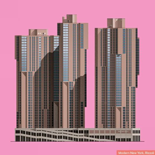


Blade Runner in the Bronx! Excerpt from Modern New York: (..) Harlem River Park Towers (now River Park Residences) stole title of the tallest building in the Bronx from Tracey Towers after only 3 years. They were built on an isolated site in Morris Heights bounded by Harlem River from the west and a train line and the Major Deegan Expressway from the east. Two bridges connected the towers with the rest of the Bronx, but residents didn't necessarily need to leave the area as a school, shops, and community facilities were built on-site. The best way to appreciate the size of the project is to see it from the Harlem River Greenway across the water. The scale is colossal: Two slabs (each a merger of a pair of towers) rise thirty-eight and forty-two stories and contain 1,654 apartments. With so many residents, elevators were a major problem. There are not enough even when they are all in service (which is not often). The project’s architects, Davis, Brody & Associates, designed oversize square “super bricks” that became their trademark. Thanks to the size, workers could build a larger area of a wall per day than with smaller bricks. The towers would grow wider toward the top, offering great views of the city. The architects had used the same style and materials on Waterside Plaza on East River, which had opened the year before.
53 notes
·
View notes
Text
A 40x60 Duplex Modern Villa Design in Bangalore with Art Deco Touch & Rental Homes by Design Thoughts Architects

Proposed exterior render for Pavan residence
At Design Thoughts Architects, we initially jot down the client’s ideas to design their dream homes. One client who approached us was Mr Pavan. He wanted a modern villa with a touch of Art Deco style for his family of five. Our task was to design two rental homes on the first floor and a duplex-style house on the first floor for the couple and the kids.
Project Details:
Type: Residence / Style: Modern style
Project Architects:
Year of start: 2024
Project Stage: Under construction
Project site area: 40’ x 60’
Site orientation: South facing
Project Location: Anajanapura, Bangalore
Proposing the exterior elevation

Proposed corner elevation exterior render for Pavan residence
According to the client’s requirement, we implemented a modern style with contrasting white brick cladding and red bricks in the elevation. The windows in the elevation are embossed with bold black Georgian grills and glass. The use of rounded corners for the massing exhibits traits of Art Deco and modern style. We executed this along the walls. A unique feature proposed in this project is the curved bay window on the third floor.
This proposed exterior perfectly balances design, texture and material asymmetry.
Understanding the planning proposal of the rentals
As we proceed to the rental homes from the parking through the lobby, we are greeted with chic and modern interiors set in a pastel colour palette. Along the adjacent walls of the Pooja room, we propose a grey-gold wallpaper and a full gold wallpaper for the Pooja with a traditional motif. The lighting fixtures in this area are a mix of contemporary and classical.
We proposed an exterior balcony along the dining spaces in both rental homes to create a visual connection. The kitchen-dining coherently connects the living room and pooja area. The kitchen interiors are made of gloss finish dark metal with notable details like rounded brass handles for the cabinets. All the furniture pieces chosen blend with the colour theme of the space and are modern in appeal.
According to Vastu, this 2-BHK rental plan is ergonomic and is currently being executed. In the interiors of the main bedroom, we bestow luxury villa interior design with a statement wardrobe piece finished with a mirror slider door. The design of both rentals is something to look forward to.
Proceeding with the planning of the duplex
Our client, Mr Pavan, wanted to design a duplex for his family on the second and third floors. This duplex is an intermix of luxury, art deco interiors, spacious layouts, and apt interior-exterior connections. The second floor accommodates family spaces, a library, a kid’s bedroom, a kitchen and dining. The third floor is more private and easily integrates with the exterior landscape.
Deck and library

The deck and library space in the duplex
Common areas and transitional spaces
Kitchen-dining and internal staircase
Bed Space design

Curved bay window design in the main bedroom
Exterior design
Exterior sit-out space with Brick jalli acting as light/heat filter
End note
The spatial planning of each project is updated according to client preference and is monitored regularly until the date of handover to the client. Mr Pavan’s residence is one such ongoing project that we are excited about. Stay tuned for site updates, client feedback and our team’s experience while working on this project.
Feel free to connect and drop your comments.
Join the Conversation: We value your ideas and are open to new design challenges. Reach us at [email protected], visit our website and follow us on Instagram at Design Thoughts Architects.
Thank you for being a part of our design journey; we look forward to hearing your thoughts and ideas. Cheers to many more creative interactions ahead!
Writer,
Design Thoughts Architects
#construction#architects in bangalore#bangalore architects#house design ideas#bengaluru architects#residential architects#dream home#house architecture#home design ideas#modern house design#contemporary architecture#art deco#art deco design#rental house#rental home#rental housing#modern home plans#home plans
2 notes
·
View notes
Text

Day 58 — The Bendi
The Bendigo Hotel, affectionately known as The Bendi, has stood as a cornerstone of Collingwood’s history and culture for over 150 years. Originally opened in 1871 as The Collingwood Arms, the hotel has seen countless transformations, yet it remains a gathering spot for locals, travellers, and music enthusiasts.
Carlton Brewery purchased the pub in 1887 to elevate its standards and solidify its place in the community. In 1911, the building was completely rebuilt and renamed The Bendigo Hotel. Designed by the renowned hotel architects Sydney Smith and Ogg, the new structure was a striking expression of Edwardian Queen Anne style.
With its brick facade, Art Nouveau details, and iconic oriel corner towers, the design was both sophisticated and welcoming. Much of that 1911 architecture still stands today, making The Bendi a rare and important example of the era’s hotel design.
Photo: 2025
2 notes
·
View notes
Text
Elden Ring DLC Build -- Democracy!
Non-Fromsoft people encouraged to vote. I want to be able to blame as many people as possible.
Considerations for each option:
Dexterity: Lean hard into parries. Do four-digit criticals with the Miséricorde. Ruin people's evenings by being smarter than them in PvP. Probably has the most options of the new weapon types in the DLC (notably the goofiest ones). A lot of people will be playing DEX, so I'm not gonna get hipster points...but I can make up for it by not using katanas. Biggest downside is that
Strength: Dunk with overwhelming force. Scare the shit out of people on elevators. The DLC adds throwing weapons, and one of them is a great hammer that you swing around Super Mario 64 style to throw. Doesn't look like it'll have as many new toys, unfortunately. Might be wrong.
Faith/Intelligence: Notably undercooked archetype in the base game, looking to actually be fleshed out in the DLC. Makes use of most magic systems in the game, but excels at evil stuff (skeletons, evil, curses, etc) and -- paradoxically -- high-utility and holy damage miracles. Kinda' ass in PvP, but that won't mean too much until about a month in; most of the people who play this game panic when they're invaded. The closest I'll willingly go to a mage build, and it's on thin ice -- casting spells is boring, especially considering the new weapon archetypes they're going to drop.
DEX/STR: Allows me to dip my toes in both weapon archetypes and find out what I like the most for my 2nd playthrough. Will probably be great for light greatswords, a new archetype that makes your character move like a warrior princess. Not very exciting, but there's a chance it's the best build for the new martial arts weapon type. In which case it's super exciting!
Dragon Cleric: Ultimate glass cannon build that can nevertheless ruin people's evenings by one-shotting them. Has a suite of offensive options, ranging from "biting really hard" to "vaping in the enemy's face to give them tuberculosis." Has something for basically every situation. Kind of a one-trick pony, though -- it relies on a lot of buffs, and if you don't kill something in like two hits you are basically forced to scoop up your own balls and run.
Arcane Scum: Utilize various status effects to irritate people and boost my damage. Or go bleed and just win. I don't see them nerfing statuses in the DLC, but I really hope they do. It's not even fun using bleed to burst down people and bosses anymore. Can be combined with STR or DEX to make some interesting builds, but they're both scummy in their own ways. Bloody Helice is probably the only honorable weapon to use.
Faith: Faith alone is actually kind of boring, only a few steps up from 😪Mage😪. However, mixing it with DEX or STR is dope. DEX/FAI opens up a lot of lightning options, inluding the absolutely wonderful Bolt of Gransax. DEX/STR offers fire, and has an entire class of incantations designed around it. Faith is flexible, which is great since a lot of enemies have immunity to faith-based damage types (fire, holy, lightning, tax evasion, etc). There are always different options when you make a faith build...and this DLC will offer even more. Really, there are a few too many options, and unfortunately a lack of focus can make Elden Ring exhausting. Since I want to relax and enjoy the DLC, I'd need to pick a few solid weapons and stick with them. Ironically, this is kind of limiting.
#elden ring#fromsoft#elden ring spoilers#shadow of the erdtree#soulsborne#fromsoftware#reallygreatposts#poll
7 notes
·
View notes
Text
Buy Pearl Jewellery Online: The Best Place to Find Exquisite Pieces at L'Amour Pearls
Pearls have been revered for centuries for their timeless elegance and sophisticated beauty. They are often seen as a symbol of purity, wisdom, and grace, making them a sought-after choice for jewellery lovers around the world. If you're looking to buy pearl jewellery online, L'Amour Pearls is the ultimate destination for high-quality, luxurious pearl jewellery that will elevate your style.

Whether you're searching for a statement piece to complement your outfit or a thoughtful gift for a loved one, L'Amour Pearls offers an impressive collection of pearl jewellery that is both elegant and affordable. In this blog post, we will guide you through the benefits of buying pearls online, highlight some of our top products, and explain why L'Amour Pearls is the best Canadian pearl store for all your pearl jewellery needs.
Why Buy Pearl Jewellery Online?
In today's digital age, online shopping has become more convenient than ever. When it comes to purchasing pearl jewellery online, there are several benefits that make it an attractive option for jewellery enthusiasts:
Wide Selection: Shopping online gives you access to a much broader selection of pearl jewellery compared to physical stores. At L'Amour Pearls, we offer a variety of designs and styles, from classic pearl necklaces to contemporary pearl accessories, ensuring that you'll find the perfect piece to suit your taste.
Convenience: One of the biggest advantages of online shopping is convenience. You can browse our collection of pearl jewellery from the comfort of your home, at any time of day or night. There's no need to worry about store hours or travel time – simply visit our website, explore our range, and place your order with just a few clicks.
Competitive Pricing: Online stores often offer more competitive prices than brick-and-mortar shops. This is because online retailers, like L'Amour Pearls, can cut down on overhead costs, allowing us to pass on the savings to our customers. Plus, you can take advantage of special deals and promotions that are exclusive to online shoppers.
Detailed Product Information: When you buy pearl jewellery online, you have access to detailed product descriptions, high-quality images, and customer reviews. This allows you to make an informed decision before making a purchase. At L'Amour Pearls, we provide all the information you need to ensure that you're choosing the right piece of jewellery for your collection.
Secure Payment and Delivery: Online shopping platforms are equipped with secure payment systems, ensuring that your transaction is safe and protected. Additionally, once you've made your purchase, we offer reliable shipping options, so you can receive your pearl jewellery right at your doorstep.
L'Amour Pearls: The Best Canadian Pearl Store
When it comes to pearl jewellery in Canada, L'Amour Pearls is the go-to destination for high-quality, authentic pearls. As a leading pearl jewellery store in Canada, we take pride in offering a wide selection of stunning pearl jewellery pieces, crafted with the finest materials and attention to detail.
Our collection includes everything from elegant real pearl necklaces in Canada to sophisticated pearl jewellery sets in Canada. Whether you're looking for a classic design or something more modern, L'Amour Pearls has something to suit every taste and occasion.
At L'Amour Pearls, we believe that pearls are not just a luxury – they are a timeless investment. That's why we source only the highest-quality pearls, ensuring that each piece in our collection is a true work of art. Our jewellery is crafted to last, so you can enjoy your pearls for years to come.
Top Pearl Jewellery Pieces to Buy Online
If you're ready to buy pearls online, here are some of our top-selling pieces that are sure to make a statement:
1. Real Pearl Necklace in Canada: A real pearl necklace is a classic piece of jewellery that never goes out of style. Whether you're dressing up for a special occasion or adding a touch of elegance to your everyday look, a pearl necklace is the perfect accessory. At L'Amour Pearls, we offer a variety of real pearl necklaces in Canada, each crafted with care and attention to detail. From single-strand necklaces to more elaborate designs, you'll find the perfect pearl necklace to suit your style.
2. Pearl Jewelry Sets in Canada: If you're looking for a complete set of pearl jewellery, our pearl jewelry sets in Canada are the perfect choice. These sets typically include a necklace, earrings, and a bracelet, all made with high-quality pearls. Whether you're attending a wedding, a formal event, or just want to treat yourself, our pearl jewellery sets are designed to complement any outfit and add a touch of sophistication.
3. Pearl Earrings: Pearl earrings are a versatile and timeless addition to any jewellery collection. Whether you prefer studs, drops, or hoops, we have a wide selection of pearl earrings to choose from. Our earrings are crafted with care, ensuring that each pair is as beautiful as it is durable. Whether you're looking for something simple and elegant or bold and dramatic, L'Amour Pearls has the perfect pair of earrings for you.
4. Pearl Bracelets: A modern pearl bracelet is a chic and stylish accessory that can be worn alone or stacked with other bracelets for a more personalized look. Our pearl bracelets come in a variety of styles, from delicate chains to bold cuffs, so you're sure to find the perfect piece to add to your collection.
5. Pearl Accessories: At L'Amour Pearls, we offer a range of pearl accessories that can elevate any outfit. From hairpins and brooches to rings and watches, our collection of pearl accessories is designed to add a touch of elegance and sophistication to your look. These accessories make the perfect gift for a loved one or a special treat for yourself.
Why Choose L'Amour Pearls for Your Pearl Jewellery Needs?
There are many reasons why L'Amour Pearls stands out as the best Canadian pearl store for buying pearl jewellery online. Here are just a few:
Quality and Craftsmanship: We source only the finest pearls, ensuring that each piece of jewellery is crafted to the highest standards. Our skilled artisans pay close attention to every detail, from the selection of pearls to the design and finishing touches, ensuring that you receive a piece of jewellery that is both beautiful and durable.
Wide Selection: Our collection includes a wide variety of pearl jewellery to suit every taste and occasion. Whether you're looking for a classic pearl necklace, a set of pearl earrings, or something more unique, we have something for everyone.
Customer Satisfaction: At L'Amour Pearls, we are committed to providing excellent customer service. We want you to be completely satisfied with your purchase, and we are always here to assist you with any questions or concerns you may have.
Affordable Prices: We believe that luxury should be accessible to everyone. That's why we offer competitive prices on all of our pearl jewellery without compromising on quality. When you shop with us, you can rest assured that you're getting the best value for your money.
Secure Online Shopping: Our website is designed to provide a seamless and secure shopping experience. With easy navigation, detailed product descriptions, and a safe payment system, shopping for pearl jewellery online has never been easier.
Conclusion
If you're ready to buy pearl jewellery online, L'Amour Pearls is the perfect destination for all your pearl jewellery needs. Our collection of high-quality, elegant pieces is designed to suit every style and occasion. Whether you're looking for a real pearl necklace in Canada, a complete pearl jewelry set in Canada, or a stunning pair of pearl earrings, we have something for everyone.
As the best Canadian pearl store, we are committed to offering our customers the finest pearls and the best shopping experience. Explore our collection today and discover why L'Amour Pearls is the ultimate destination for pearl jewellery online shopping in Canada. Follow for more us on Pinterest, Instagram, Facebook, Youtube and Linkedin.
#buy pearl jewellery online#buy pearls online#best canadian pearl store#pearl jewelry sets in Canada#real pearl necklace in Canada#Pearl Jewelry Canada#Pearl Jewelry Toronto#pearl jewellery online shopping#pearl accessories
3 notes
·
View notes
Text


Turn your kitchen into a masterpiece with these wall design ideas. From vibrant backsplashes to rustic exposed brick, get ready to elevate the heart of your home with style and creativity. 🍽️🎨
20 notes
·
View notes
Text
August 6 - Sicao Green Tunnel, Anping Tree House, Tainan Confucius Temple, and Hayashi Department Store


We were told to meet today at 1pm, so I had the morning to myself. I decided to go try an Asian massage. I just got a foot massage, and the masseuse told me that she can tell I’m not sleeping well based on rubbing my feet. It was cool experiencing Eastern medicine. Then, we were off on the bus for our tour of Tainan, which is the oldest city in Taiwan. Our first stop was at the Sicao Green Tunnel, which is a river with mangrove canopies hanging over both sides. We got on the boat tour, and we could see a great temple from the river. They gave us life jackets and hats. The boat took us down and back this beautiful river. Then, we went straight to the Anping Tree House, which consists of trees growing on top of the ruins of a house. It all looked so interesting. The roots of the trees growing down the brick walls of this old house. There was another building on the premises with a gift shop and more educational exhibits, including Chinese calligraphy practice paper. After that, we went to Tainan Confucius Temple, which was similar to the one I went to on my own. It had a surrounding wall with multiple rooms and then a central building. Our last stop was at Hayashi Department Store, which is a super historic building in Tainan. It has this old-style elevator that I got to ride up to the top floor in. On the roof, I saw a traditional Japanese gate. We also went shopping there. Later on, I walked to a famous beef noodle restaurant in Tainan because Peter said Tainan is known for its fresh beef.
Academic Reflection:
Peter told us at the Sicao Green Tunnel that the mangroves can’t get as much oxygen from the saltwater, so part of their roots are above the water line. At Anping Tree House, I learned more about banyan trees, which are the trees that are growing on the ruins of this house. I also learned about the underground military shelter right next to the house.
At the Confucius temple, Peter taught us how to tell north and south Chinese architecture apart. The northern style architecture has a straight roof, while the southern one is curved. This temple had a curved roof, so we knew it came from a southern Chinese design. At the department store, Peter taught us about the elevator, and he said that the Japanese-style gate is similar to the one we saw across the street from the Confucius temple. He also said that the current president of Taiwan used to be the mayor of Tainan, and he led the charge to reopen this department store.
2 notes
·
View notes
Text
Transform Your Outdoor Space with Sebastian Pavers in Vero Beach
Transform Your Outdoor Space with Sebastian Pavers in Vero Beach
Vero Beach, a picturesque coastal city in Florida, is known for its beautiful beaches, lush landscapes, and vibrant outdoor living culture. For homeowners looking to enhance their outdoor spaces, Sebastian Pavers offers a perfect solution to create stylish, durable, and functional areas. Whether you want to revamp your driveway, patio, walkway, or pool deck, Sebastian Pavers from Vero Outdoor Living can transform your vision into reality. This comprehensive guide explores everything you need to know about Sebastian Pavers, including their benefits, installation process, design ideas, and how they can elevate your outdoor living experience in Vero Beach.

What Are Sebastian Pavers?
Sebastian Pavers are high-quality interlocking paving stones designed to provide both beauty and durability for various outdoor applications. Manufactured with advanced technology and premium materials, these pavers are ideal for creating stunning driveways, patios, walkways, and pool decks that can withstand the test of time and the elements.
Benefits of Sebastian Pavers
Exceptional Durability: Made from high-density concrete or stone, Sebastian Pavers are built to endure heavy traffic, extreme weather conditions, and daily wear and tear. Their robust construction prevents cracking, chipping, and fading, ensuring a long-lasting appearance.
Versatile Design Options: With a wide range of colors, shapes, and sizes, Sebastian Pavers offer immense design flexibility. You can choose from classic brick patterns, contemporary styles, or natural stone looks to match your home’s aesthetic and personal preferences.
Low Maintenance: Unlike traditional concrete or asphalt, Sebastian Pavers require minimal upkeep. Routine cleaning with a mild detergent and occasional sealing are usually enough to keep them looking pristine.
Eco-Friendly: Many Sebastian Pavers are designed with environmental sustainability in mind. Their permeable nature allows rainwater to drain through, reducing runoff and promoting groundwater recharge.
Enhanced Property Value: Investing in high-quality pavers can significantly increase the curb appeal and value of your property. A well-designed outdoor space creates a welcoming atmosphere and can make your home stand out in the real estate market.
Why Choose Sebastian Pavers for Your Vero Beach Home?
Vero Beach’s unique climate and coastal charm make Sebastian Pavers an ideal choice for enhancing outdoor spaces. Here’s why these pavers are particularly well-suited for this region:
Climate Resilience
Vero Beach experiences a subtropical climate with high humidity, frequent rain, and intense sun exposure. Sebastian Pavers are designed to withstand these conditions, maintaining their appearance and structural integrity despite the harsh weather. Their resistance to moisture and temperature fluctuations ensures a long-lasting and reliable surface for your outdoor areas.
Coastal Aesthetic
The natural beauty of Vero Beach’s coastal environment calls for materials that complement its charm. Sebastian Pavers come in various textures and colors that can mimic natural stone or enhance seaside themes. Whether you prefer a classic look or a modern design, there’s a paver style to match the coastal elegance of your property.
Professional Installation
Local expertise in installing Sebastian Pavers ensures that your project is completed to the highest standards. Vero Beach professionals understand the specific soil conditions, drainage requirements, and design preferences unique to the area. Their knowledge ensures a flawless installation that enhances the performance and appearance of your pavers.
Choosing the Right Sebastian Pavers for Your Project
Selecting the perfect Sebastian Pavers for your outdoor project involves considering various factors to ensure you achieve the best results. Here’s a detailed guide to help you make an informed decision:
1. Purpose and Function
Determine the primary use of the area you’re paving. Different applications require specific considerations for durability, slip resistance, and aesthetic appeal:
Driveways: Choose thicker, more robust pavers that can handle the weight of vehicles and daily traffic.
Patios: Opt for pavers that balance style and durability, suitable for foot traffic and outdoor elements.
Walkways: Select pavers with slip-resistant surfaces to ensure safety.
Pool Decks: Consider pavers with textured surfaces to prevent slipping and heat absorption.
2. Design and Style
Consider the overall look you want to achieve. Sebastian Pavers offer a range of styles, including traditional brick, modern concrete, and rustic stone. Think about how the pavers will complement your home’s architecture and landscaping.
Traditional: Classic brick or cobblestone patterns create a timeless appeal.
Modern: Sleek, clean lines and geometric shapes provide a contemporary look.
Rustic: Natural stone or weathered finishes evoke an earthy, organic feel.
3. Color and Texture
The color and texture of the pavers should harmonize with your existing outdoor elements. Light colors can brighten up smaller areas, while darker hues add depth. Textured pavers enhance visual interest and provide practical benefits, such as improved traction.
4. Budget
Establish a realistic budget for your project. While Sebastian Pavers offer excellent value, costs can vary based on the type, size, and complexity of the design. Include additional expenses such as installation, base materials, and maintenance in your budget.
The Installation Process
Proper installation is crucial for the performance and longevity of your Sebastian Pavers. Here’s a step-by-step overview of the typical installation process:
1. Planning and Design
Site Assessment: Evaluate the area where the pavers will be installed. Consider factors such as drainage, grading, and soil type.
Design Layout: Create a detailed design plan, including the pattern, color scheme, and border options. Professional designers can help you make the best choices based on your preferences and site conditions.
2. Preparation
Excavation: Remove existing surface materials and excavate to the required depth. This ensures a stable base for the pavers.
Base Installation: Lay a compacted base layer of gravel or crushed stone. This provides drainage and stability for the pavers.
Edge Restraints: Install edge restraints to keep the pavers in place and prevent shifting.
3. Paver Installation
Laying Pavers: Begin laying the pavers according to the design plan. Use a string line or laser level to ensure straight rows and proper alignment.
Cutting and Fitting: Cut pavers as needed to fit around edges and corners, ensuring a seamless appearance.
4. Finishing Touches
Joint Sand: Fill the joints between the pavers with sand to lock them in place and prevent weed growth.
Compaction: Use a plate compactor to press the pavers into the base and settle the joint sand.
Sealing: Apply a sealant to protect the pavers from stains, moisture, and UV damage.
Design Ideas for Sebastian Pavers
Sebastian Pavers offer endless design possibilities. Here are some creative ideas to inspire your next outdoor project:
1. Elegant Driveways
Create a grand entrance with a stylish paver driveway. Consider using a combination of colors and patterns to add visual interest and enhance the curb appeal of your home.
2. Charming Patios
Design a cozy outdoor living space with a paver patio. Add comfortable seating, outdoor lighting, and landscaping to create a perfect spot for entertaining and relaxation.
3. Inviting Walkways
Enhance the beauty of your garden or yard with a charming paver walkway. Use curves and borders to create a visually appealing path that guides visitors through your outdoor space.
4. Sophisticated Pool Decks
Transform your pool area with elegant paver decking. Choose slip-resistant pavers in light colors to keep the surface cool and safe for swimmers.
5. Unique Fire Pits
Incorporate a custom paver fire pit into your patio or garden design. This focal point provides warmth and ambiance for outdoor gatherings and adds a touch of sophistication.
Maintenance and Care
To keep your Sebastian Pavers looking their best, regular maintenance is essential. Follow these tips for optimal care:
1. Cleaning
Routine Cleaning: Sweep the surface regularly to remove debris and prevent staining.
Deep Cleaning: Use a mild detergent and a pressure washer to clean stubborn stains and dirt. Avoid harsh chemicals that could damage the pavers.
2. Sealing
Periodic Sealing: Apply a sealant every 1-3 years to protect the pavers from stains and weathering. Follow the manufacturer’s recommendations for application.
3. Repairs
Repairing Cracks: Replace any damaged or cracked pavers promptly to prevent further issues. Remove the damaged paver, replace the base if necessary, and install a new paver.
4. Weed Control
Preventing Weeds: Use a weed barrier fabric under the base layer to reduce weed growth. Regularly remove any weeds that appear between the pavers.
Vero Outdoor Living: The Best Resource for Sebastian Pavers in Vero Beach
For homeowners in Vero Beach, Vero Outdoor Living is the premier resource for Sebastian Pavers and other outdoor living solutions. Here’s why Vero Outdoor Living stands out:
Expertise and Experience
Vero Outdoor Living specializes in transforming outdoor spaces with high-quality pavers and expert installation. Their team of professionals has extensive experience working with Sebastian Pavers and understands the specific needs of Vero Beach homeowners.

Customized Solutions
Vero Outdoor Living offers personalized design solutions to match your vision and lifestyle. From selecting the perfect pavers to creating detailed design plans, their team works closely with
#patiosflorida#pergolasflorida#outdoorkitchen#pooldecksflorida#turfflorida#walkways#pathways#super mario#pooldecks#patio
3 notes
·
View notes
Text
All Pro Painting Co.: Top-Rated House Painting Services in Suffolk County

Enhance Your Dwelling with Expert House Painting Services in Suffolk
Your abode mirrors your unique personality and style, and what better method to augment its allure than with a fresh layer of paint? If you're a delighted homeowner residing in the picturesque Suffolk region, you're in for a treat! All Pro Painting Co. offers premium house painting services that will breathe new vitality into your living spaces. With our team of adept professionals committed to excellence and precision, we're here to metamorphose your house into a breathtaking masterpiece that you'll take pride in calling home
The Craft of House Painting: Uplift Your Suffolk Home
Your dwelling transcends mere brick and mortar; it's an empty canvas yearning for adornment. Our house painting services in Suffolk are customized to elevate the aesthetic allure of your residence. Boasting an extensive palette of colors, finishes, and techniques, we collaborate closely with you to grasp your vision and convert your house into a work of art.
Revealing the Enchantment: House Painting Services in the Heart of Suffolk
Nestled in the heart of Suffolk, All Pro Painting Co. stands as a paragon of quality and craftsmanship. Our house painting services are devised to emphasize your home's intrinsic charm, all while providing a shield from the elements. Whether your objective is to revitalize the exterior or inject a burst of vibrancy into your interior spaces, our team guarantees a seamless application that leaves an enduring impression.
The All Pro Painting Co. Distinction: Excellence in Every Brushstroke
What distinguishes All Pro Painting Co. is our steadfast commitment to perfection. Our house painters are not merely skilled laborers; they are artists driven by an unyielding aspiration for flawlessness. From meticulous surface groundwork to the deft handling of brushes, we invest our unwavering dedication into every brushstroke, delivering outcomes that outstrip your anticipations.
Revamp Your Abode: From Dreary to Dazzling with All Pro Painting Co.
Is your Suffolk domicile yearning for a revamp? Search no further than our house painting services to morph your home from lackluster to lustrous. Our adept painters grasp the subtleties of color psychology and design aesthetics, ensuring that your house transforms into a harmonious and inviting haven for you and your cherished ones.

Trusted Expertise: Leading House Painting Services in Suffolk
In the realm of house painting, experience reigns supreme. All Pro Painting Co. boasts a well-established legacy of serving the Suffolk community with pride. Our many years of proficiency have equipped us with the dexterity to address an array of painting conundrums, rendering us the first choice for homeowners seeking reliable and top-notch house painting services.
In Conclusion
Your abode is your sanctum, and All Pro Painting Co. is here to elevate its allure and grace. Fueled by a fervor for imagination and an unwavering commitment to excellence, our house painting services in Suffolk are tailored to exceed your anticipations. Bid adieu to humdrum walls and usher in a realm of vibrant hues and sophistication. Connect with us today at https://www.allpropaintingco.com/ to inaugurate a transformative expedition with All Pro Painting Co.

📍 : 575 Hempstead Turnpike, West Hempstead, NY 11552
📞 : (516) 481-2787
#House Painting Services Suffolk#House Painting Services hempstead#Professional Painters Suffolk County#Exterior Painting Company Suffolk County
2 notes
·
View notes
Text
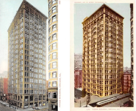
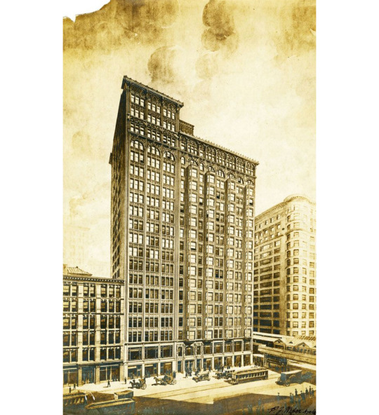
Fisher Building, Chicago
343 South Dearborn Street
Completed 1896; addition 1907
Charles Atwood, D.H. Burnham & Co. architects
1907 addition, Peter J. Weber, architect
2001 restoration and adaptive reuse, Pappageorge Haymes, supervising architects
by Roger Jones, August 2023
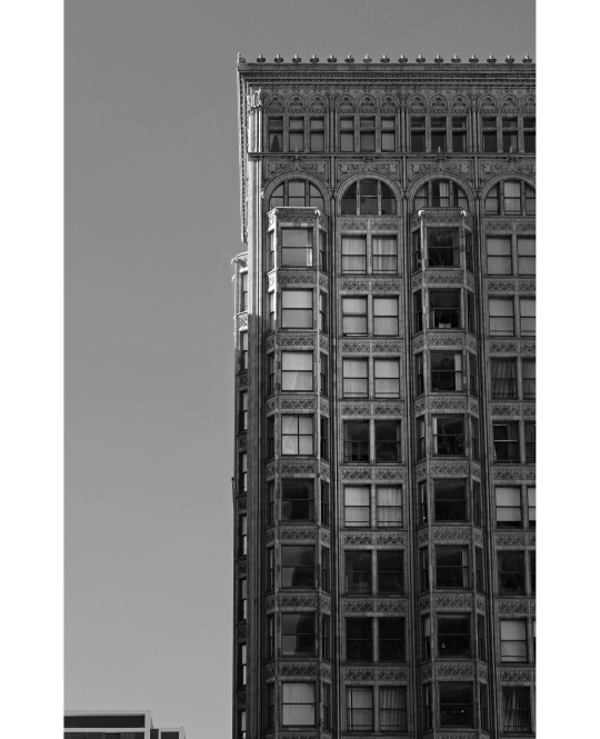
Fisher Building, photo by Roger Jones

Lucius Fisher (1843-1916). He was a Chicago, Illinois paper company magnate and architect. In 1895, he commissioned Daniel Burnham and Company to build the 20 story, 275 foot tall Fisher Building in the Chicago Loop.
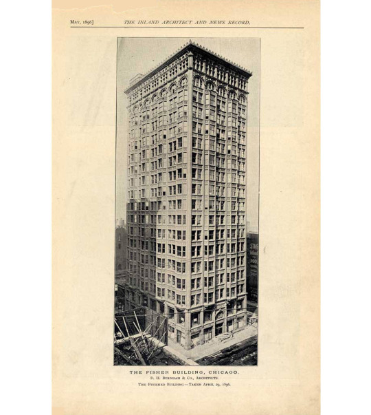
Fisher Building, Chicago, taken April 29, 1896. From The Inland Architect and News Record, May 1896. [Link to full article PDF here]
The writer of the 1896 article described the building thus:
But here, for what we believe to be the first time in human experience, one of the highest commercial buildings in the world has been erected almost without any bricks. It fronts on three streets, and on the remaining side adjoins other property. The fronts are covered with cellular terra cotta on the outside, not in imitation of a wall, but following upward the steel supporting members, and closing in the transoms between the windows, leaving two-thirds of the exterior to be enclosed by glass… Only two bricklayers were employed at any time in this part of the work.

(Left) Daniel H. Burnham (1846-1912)
(Right) Charles B. Atwood (1849-1895)
The Fisher Building, 343 South Dearborn Street in the Chicago Loop, was commissioned by paper magnate Lucius Fisher. The original 18-story building was completed in 1896 by D.H. Burnham & Company; the architect was Charles B. Atwood, who died before the building's completion. An addition was later added in 1907.
Some facts about the building, from the Emporis site:
The original wing was only the second building in Chicago to reach 18 stories (after the Masonic Temple), and is the oldest still standing at that height.
Because of the building's great height for its time, the usual spread foundations were supplemented with piles underneath them to support the added weight.
The second floor was originally a banking room, and has especially large windows compared to the floors above it.
To enhance the facade's vertical emphasis, most of the ornamentation is placed on its horizontal members, reducing the banding effect that would occur if they were blank.
The Gothic ornament is in the 15th century style of Bruges and Rouen.
Declaring the structure a Chicago Landmark in 1978, the Landmarks Division noted:
Cladding this early skyscraper with Gothic-inspired, terra-cotta tracery was not a casual stylistic choice. Its designers looked for inspiration to the early Gothic cathedrals of Europe, which shared common characteristics of tallness and often having more glass than masonry. Cut glass door panel Eagles and mythical beasts decorate the upper stories, and aquatic creatures and seashells--a visual pun on the name of the building's original owner, Lucius G. Fisher--are found at the base. A later addition to the north is largely a repetition of the original design, except for the absence of bay windows.
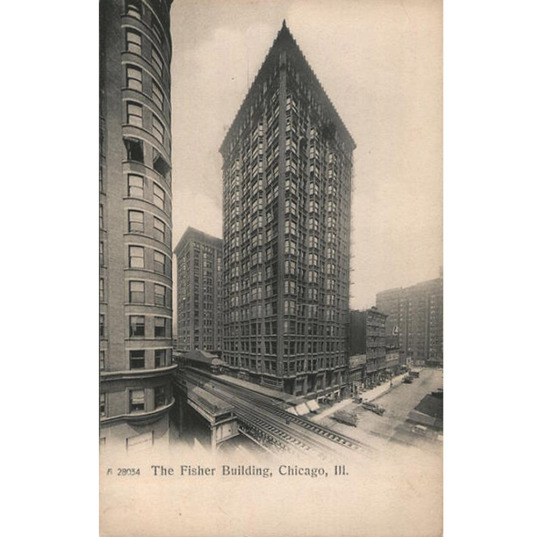
Early postcard views of the building
Archival photos
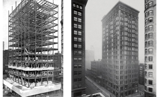
Fisher Building under construction (left) and on completion (right)
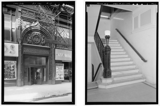
Van Buren (main) entrance; Lobby stairs

Entrance hall
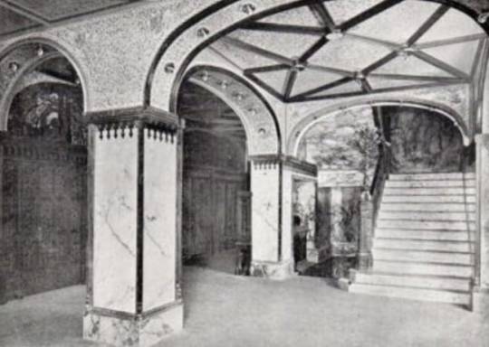
First story entrance corridor in 1896

Original elevator cage
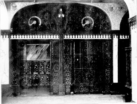
Original elevators
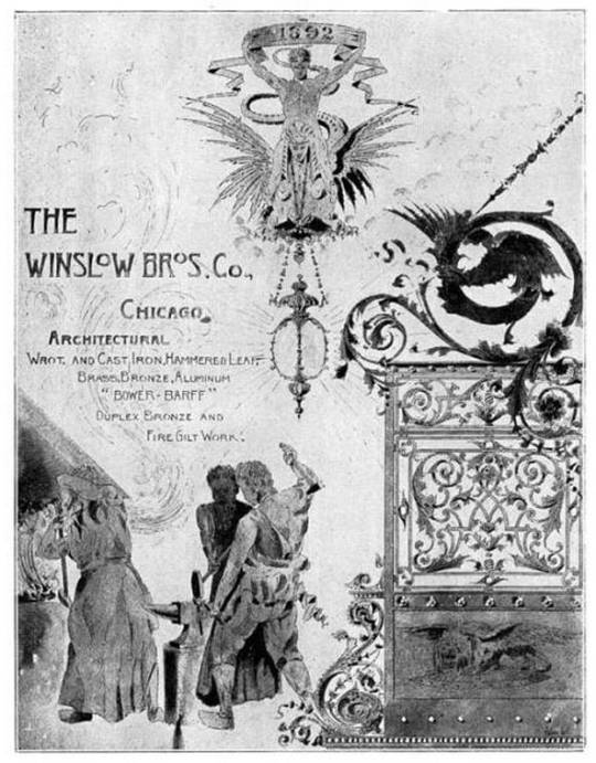
Advertisement for Winslow Brothers, who executed the metalwork for the Fisher Building
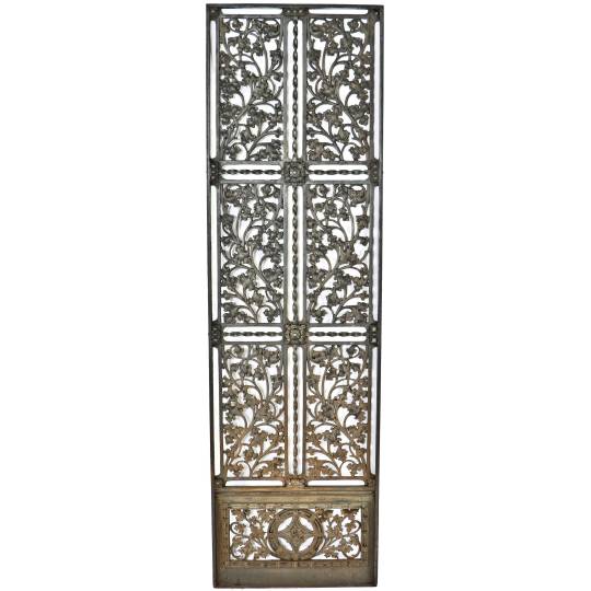
Late 19th Century Cast Iron Elevator Lobby Door from The Fisher Building, listed for sale on 1stdibs.com. Compare to original elevators photo above.
Rendering of the 1907 addition, Peter J. Weber, architect
Other illustrations
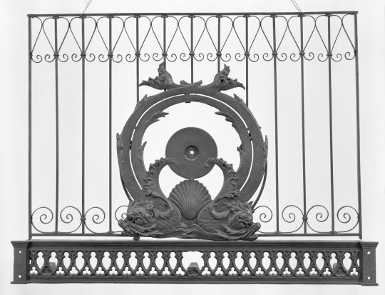
Upper elevator grille. Art Institute of Chicago

Elevator frieze panel. Urban Remains, Chicago.
Architectural Description from the 1965 Historic American Buildings Survey Report [Link to PDF of report here]
PART 11 ARCHITECTURAL INFORMATION A. General Statement: I. Architectural character: The Fisher Building is a large office 'building designed by the firm of D. H. Burnham Co. in 1895. It has been cited by the Chicago Landmarks Commission and it is indicative of the level of achievement in skyscraper design attained by the architects of the Chicago School. The steel cage structure is sheathed in a curtain wall of decorative terra cotta and glass, providing ample space and light for the occupants and making it possible for the building to be erected relatively quickly and economically. B. Description of Exterior: 1. Over-all dimensions: Rectangular 70'-6" (five-bay south front) x 150' 0" (eleven-bay west front), including addition. Eighteen stories. 2. Wall construction, finish and color: The original block of the building had tripartite projecting bays alternating with planed surfaces. Bays end at sill of 17th story. Arches of varying width span the window openings of the 17th floor. The original salmon terra cotta finish is now coated with a black patina from the soot and dirt of the city. 3. Openings: a. Doorways and doors: The arched entrance on VanBuren Street, originally the principal entrance, is intact; that at 343 South Dearborn Street has received a 20th century I 'modernization"--a polished granite portal with plate glass and aluminum doors. The original doors from the vestibule inside are decorated with an ornamental fish cut in the glass panels. b.. Windows: Mostly one-over-one light, double-hung windows; those of the original building are grouped three to a bay window, two between; in the north addition, the windows are placed in a plane in groups of three. At the 17th floor the lights are gathered under wide arches; at the 18th they are again in threes with transoms above. The first floor display windows have been disfigured by a variety of signs, aluminum panels, and other attempts at commercial modernization. ...General setting and orientation: The buiIding occupies the southern portion of a narrow block at the south end of the Loop. Its neighbors are the Old Colony Building (HABS No. ILL-1053) to the south and the Monadnock BuiIding (HABS NO. ILL-1027) to the west. The buiIding fronts the sidewalk line on three sides and is adjacent to the elevated on VanBuren Street. Prepared by Larry J. Homolka, Historian and Assistant Supervisor National Park Service August, 1965.
My Photos:


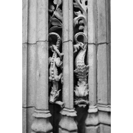


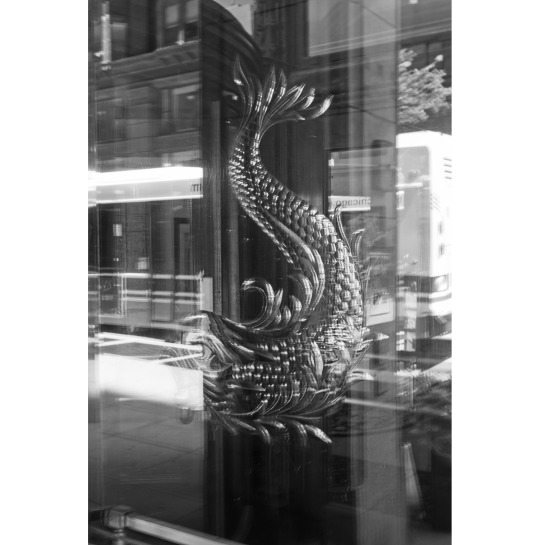
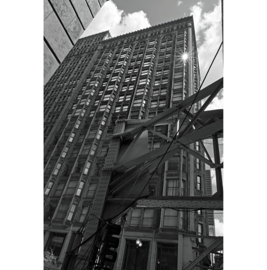
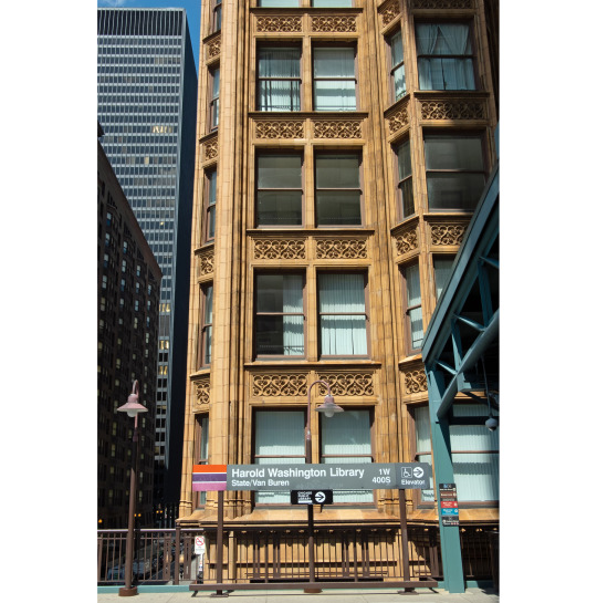
Links / Sources:
Architecturefarm - old chicago skyscraper of the week–Fisher Building
Chicagology
chicago.designslinger
Emporis Buildings on the Wayback Machine – Fisher Building Chicago
HABS Report 1965
Historic Structures
cityclubapartments.com - Daniel H. Burnham's Fisher Building interior lobby original elevator doors executed by Winslow Brothers
Chicago Landmarks - Fisher Building
Researchgate
Urban Remains - Fisher Building
Urban Remains - Fisher artifacts
Wikimedia commons
#Fisher#Fisher Building#architecture#Chicago#DH Burnham#Charles B. Atwood#skyscraper#terra cotta#landmark#Peter J. Weber
5 notes
·
View notes