#Caran d'Ache products
Text

Original sheep sketch | Limited edition fine art print from an original drawing.
My sketches start life as hand-drawn graphite images made on cartridge paper. I often work on these with charcoal, oil pastel or Caran d'Ache to create the look I'm after. The artwork is then scanned and finessed digitally ready for fine art printing. This process often referred to as Giclée printing uses the highest standard of printing methods to give gallery quality results that maintain all the details of the original sketch.
The graphite pencils I use are Faber-Castel, the oil pastels are Sennelier and the china-graph is Caran d’Ache. The inks are pigment based archive quality (100years+). The heavyweight specialist papers I use are of the best professional quality having a wonderful surface designed specifically for fine art drawings and illustrations.
Very limited editions with only ten per size printed.
All artwork is signed and includes a certificate of authenticity.
The A5 are 5.8" x 8.25" (14.8cm x 21cm)
The A4 are 8.25" x 11.7" (21cm x 29.8cm)
The A3 are 11.7" x 16.5" (29.8 cm x 42cm)
The A2 are 16.5" x 23.4" (42 cm x 59.4cm)
Originals are A3 11.7" x 16.5" (29.8 cm x 42cm)
Frames not included in price.
Free shipping on artwork to all destinations.
https://www.seanbriggs.co.uk/product/sheep-2/?feed_id=3912&_unique_id=66542900c9f43
8 notes
·
View notes
Text
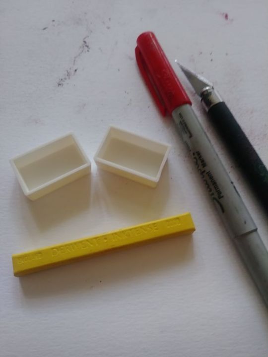
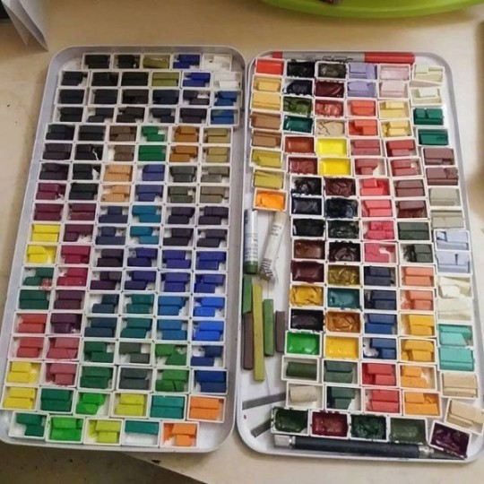
Fill Watercolour Pans
I initially wrote this years ago, but the whole thing was a mess and a bit outdated, so I've tidied it up a wee bit.
If you choose to use paint or pigment sticks as solid paint with a brush rather than sticks to draw with, here's some notes on cutting them down to put into watercolour pans. Given the size of the sticks, you might even be able to create multiple pan sets from one set of sticks, so that you could have one for home and one for travel. Or a set for you and one for a friend.
Notes:
Please note that all of the instructions are based on using full pans, not half pans - but the instructions can be tailored for the use of half-pans as well.
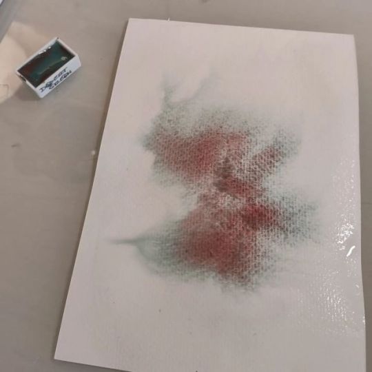
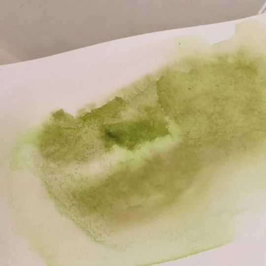
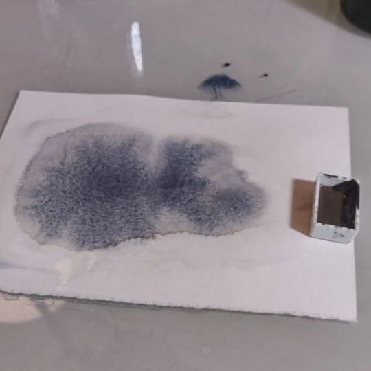
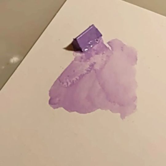
I filled pans with Derwent Inktense Blocks, Derwent ArtBars (discontinued), Watercolour tube paint, Daniel Smith Watercolour Sticks, and gouache. You can also do it with Caran d'Ache Neocolor IIs or other water-soluble crayons or pastels.
You will need:
empty watercolour pans, full - get opaque pans, as the clear ones are much harder to read text on
a measuring tape - preferably one you won't care about getting damaged or dirtied with pigment
a Sharpie, or other permanent marker/pen
an X-Acto, or other fine cutting knife
paper towels, or other foldable paper/thin surface to cut on - a smooth surface is best, because it'll be easier to knock the smaller pieces onto a palette for later use. No sense in wasting!
shallow containers to put your filled pans in - I used document holders and an old Derwent Inktense tin
double-sided tape, sticky dots, Velcro dots, thin magnets to affix your pants into the above
toothpicks - for stirring wet media
Now, to work:
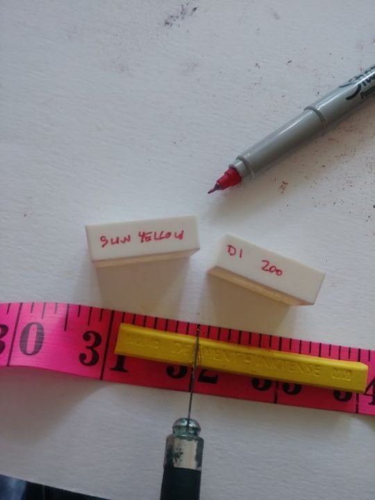
Label the pans clearly using the Sharpie prior to filling them. This goes for all media types. Labelling on the sides seems to work out best. I put the colour name/number on one side, and the set name on the other.
Filling the pans with blocks or sticks:
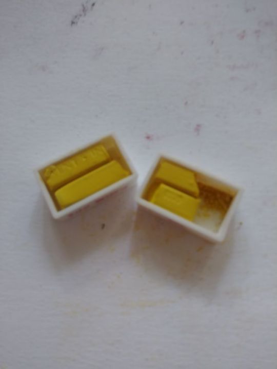
You can cut the blocks into any length you want, but if you're using full pans with your Inktense Blocks, you can cut them in four equal quarters.
To make life easy, label the pan with the name of the colour, its number if applicable, and the name of the brand/product line. Since pans are small, I used short forms for brands to make life easier: DI - Derwent Inktense, DS - Daniel Smith, DA - Derwent ArtBars, VG - Van Gogh. Etc.
Note that across brands, names might be the same but the colours not. This makes adding the brand essential so you know which to refill with later when you empty your pan.
Make sure to do the cutting over a piece of paper, paper towel, or other movable surface, so that you can knock any shavings excess from the block cuttings into the applicable pans.
When it comes to the Derwent Inktense blocks, you can put two big chunks in each pan.
You can choose to only cut off enough to fill one pan at a time, and just replenish from your leftovers when you run out of the pan contents. If you do it this way, make sure you leave till last the end of the stick that has the colour number on it so you can keep track of what colour it is.
I did it two pans at a time just to get the messy parts out of the way all at once, and it does also allow me to create two sets: one for home and one to carry with me or to gift.
As Derwent ArtBars (discontinued) are longer than Inktense blocks, you can fill just one pan at a time, cutting off two chunks from the ArtBar to fill a pan, and leaving the rest in its wrapper - leaving the end of the label with the colour name/number - to replenish from later. You can fill about three full pans with one ArtBar.
You can use the tip of your cutting knife to lift the edge of the labels off the ArtBars and other wrapped sticks, as it's not the easiest thing to get the labels off with a fingernail without ending up with paint under your nails. I suggest peeling the whole bar before you cut it, so you only have to do the peeling once instead of multiple times. The ArtBars can get very sticky, and that makes it hard to get the wrappers off.
Make sure to clean your knife, hands, and cutting surface (if necessary) after each colour cut to avoid mixing colours together in the pans.
If you do mix two colours together by accident, mix them together well and label the pan appropriately. You've just created a new colour! This is especially important to think about when mixing tube watercolour paint. I stirred a yellow with a toothpick that had a little green on it because I'm daft, and ended up with a paint I hadn't intended. It was a nice ochre though!
Filling the pans with watercolour/gouache:
If you're filling your pans with watercolour/gouache tube paints, fill the pan to almost the top then stir gently with a toothpick for a bit to ensure the pigment and binder (which sometimes separate in the tube) are re-mixed. Stirring also helps make sure that the paint spreads out to utilise the entire inside of the pan and no gaps are left around the edges. Let this paint dry and, if necessary, repeat the process until the pans are filled to a level that you're satisfied with.
Remember not to do this with acrylics or oils, because once those dry they can't be re-wet. Do this only with watercolour or gouache tube paints.
Make sure you cover your pans until the paints have dried fully to make sure no dust or other items end up in the paint. Watercolour paints, for example, can take a few days to dry - or, in the case of some honey-based paints, never fully dry at all. I put my pans into a closable plastic container that still allows some airflow but does cover them well and keeps them protected from contaminants while they dry. Covering them with a bowl on a countertop also works.
Pastels/Pencils:
You could fill pans with shavings from water-soluble pencils as well. So be mindful where you sharpen so that you can save up the shavings. You could also deliberately shave up entire pencils just to do this, but that's a lot of time and expense. Might be an interesting consideration when doing certain kinds of collage or texture work though.
There's some videos on YouTube that give you tips on how to make your own PanPastel style pastels out of regular soft pastels (like the Gallery ones by Mungyo) and rubbing alcohol. Watercolour pans would work a treat for the storage of such.
Storage:
As far as containers go for permanent paint storage, you can use either plastic or metal. Some of the things I've used are a cookie sheet with a lid, an old Inktense 72 tin, and a document holder. While some like airtight, I prefer not because of the potential for mould. You can fit 106 full pans into the original Derwent Inktense Blocks 72 set tin.
You can use traditional watercolour field palettes as well, but the largest I've seen so far allows only up to 48 half pans or 24 full pans unless you remove the metal part that holds the pans. If you do, you can fit a much larger number of pans into the palette.
If you have the colours to warrant it, and the money, you could separate the colour groups each into their own field palette. This is what I've done with watercolours. My pigment sticks are in an old Inktense tin and document holder.
In any of these cases, it's easy to create a swatch sheet that you can tape into the lid of the container. This way, you can swatch the paints in the same order you've put them in the pan.
Using two-sided glue dots to secure the pans to the cookie sheet can be hit and miss, and not terribly secure. However, they are good enough to keep the pans in place when moving them from storage to use. I would not suggest waving your pans in the air like you just don't care. That way lies a disaster. The more you touch/dirty them, the less clingy they are.
The pluses of using the document holders are space-saving, easy cleaning, allows for airflow when drying pans by propping the lid open with the locking clips, and when fully the closed the lid is plenty far from the top of the pans so anything wet shouldn't stick to the closed lid. These document holders can take up to 112 full pans.
Notes:
I used full pans because it's easier to load a long bristle brush with paint. With half pans you can only load a small portion of the bristles.
You can remove the permanent marker from the pans easily using a cloth and some rubbing alcohol. Make sure to do this in a well-ventilated area.
Jack Richeson gouache in pots separates like a mad bastard, and the balance of binder to pigment was not consistent across all colours. The pots were so poorly balanced that some were like stirring through water and others were like trying to stir through chunky pudding. It was not even possible, with some of the pots, to stir them to a consistent viscosity. I might have had a bad batch and all, but I will not be purchasing these again.
There may be some reference in here to Derwent ArtBars. They are a discontinued product. They were a softer pigment stick that were a bit gummy and not the easiest to use. It'd be great if they brought back the colours in another format though. Maybe a legacy-type set of Inktense blocks.
The process in pictures:
From left to right: Derwent ArtBar, Derwent Inktense Block, Rembrandt Watercolour (tube), and Daniel Smith Watercolor Stick.
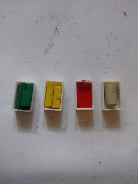
On the right are gouache, watercolours, and watercolour sticks. On the left are ArtBars, Inktense blocks, Inktense paint pans. These images are from 2018/2019.
0 notes
Text
Art Supplies and Materials Market Projected to Show Strong Growth
Advance Market Analytics added research publication document on Worldwide Art Supplies and Materials Market breaking major business segments and highlighting wider level geographies to get deep dive analysis on market data. The study is a perfect balance bridging both qualitative and quantitative information of Worldwide Art Supplies and Materials market. The study provides valuable market size data for historical (Volume** & Value) from 2018 to 2022 which is estimated and forecasted till 2028*. Some are the key & emerging players that are part of coverage and have being profiled are Da Vinci (United States), Windsor & Newton (United Kingdom), Marie's (Belgium), Schmincke Germany), Faber-Castell (Germany), Sakura (United States), Caran d'Ache (Switzerland), Mont Marte (Australia), Canson (France).
Get free access to Sample Report in PDF Version along with Graphs and Figures @ https://www.advancemarketanalytics.com/sample-report/11475-2012-market-2023-global-art-supplies-and-materials
Art Supplies and Materials market is expected to mark significant growth over forecasted period owing to increasing consumers spending on auction and arts shows, providing traction for art supplies in schools and residences and technological advancement. The major companies are adding more proven technologies systematically and strategically in Asia-Pacific countries as these countries are focused on fastest-growing verticals that focus towards art & crafts as a significant extra-curricular activity is another aspect which is driving the demand for art supplies.
Keep yourself up-to-date with latest market trends and changing dynamics due to COVID Impact and Economic Slowdown globally. Maintain a competitive edge by sizing up with available business opportunity in Art Supplies and Materials Market various segments and emerging territory.
Influencing Market Trend
Market Drivers
Increase Number of Popularity of Auctions Boost the Art Supplies and Materials Market.
Rapid Demand of Exhibitions and Art Shows Fuelled Up the Market.
Opportunities:
Increasing Demand of Number of Independent Art Professional Leads to Grow the Art and Supplies Market.
Prevalence of Recreational Arts Sector has influenced the Demand of Art Supplies Market.
Challenges:
Limitation on the Maintenance of Materials Anticipated the Challenge The Market.
Have Any Questions Regarding Global Art Supplies and Materials Market Report, Ask Our Experts@ https://www.advancemarketanalytics.com/enquiry-before-buy/11475-2012-market-2023-global-art-supplies-and-materials
Analysis by Type (Drawing Pen, Paints and Stains, Craft Tools), Application (Home use, Commercial use, Educational use)
Competitive landscape highlighting important parameters that players are gaining along with the Market Development/evolution
• % Market Share, Segment Revenue, Swot Analysis for each profiled company [Da Vinci (United States), Windsor & Newton (United Kingdom), Marie's (Belgium), Schmincke Germany), Faber-Castell (Germany), Sakura (United States), Caran d'Ache (Switzerland), Mont Marte (Australia), Canson (France),]
• Business overview and Product/Service classification
• Product/Service Matrix [Players by Product/Service comparative analysis]
• Recent Developments (Technology advancement, Product Launch or Expansion plan, Manufacturing and R&D etc)
• Consumption, Capacity & Production by Players
The regional analysis of Global Art Supplies and Materials Market is considered for the key regions such as Asia Pacific, North America, Europe, Latin America and Rest of the World. North America is the leading region across the world. Whereas, owing to rising no. of research activities in countries such as China, India, and Japan, Asia Pacific region is also expected to exhibit higher growth rate the forecast period 2023-2028.
“According to Labeling of Hazardous Art Materials Art (LHAMA) and Federal hazardous Substances Act (FHSA), its provide all art materials offered for sale to consumers of all ages in the United States undergo a toxicological review of the complete formulation of each product to determine the product’s potential for producing adverse chronic health effects and that the art materials be properly labeled for acute and chronic hazards.â€
Blick acquired Utrecht Art Supplies . This acquisition is beneficial in providing healthy network of 39 outlets across different region. It also provide tremendous and well established geographical network.
Table of Content
Chapter One: Industry Overview
Chapter Two: Major Segmentation (Classification, Application and etc.) Analysis
Chapter Three: Production Market Analysis
Chapter Four: Sales Market Analysis
Chapter Five: Consumption Market Analysis
Chapter Six: Production, Sales and Consumption Market Comparison Analysis
Chapter Seven: Major Manufacturers Production and Sales Market Comparison Analysis
Chapter Eight: Competition Analysis by Players
Chapter Nine: Marketing Channel Analysis
Chapter Ten: New Project Investment Feasibility Analysis
Chapter Eleven: Manufacturing Cost Analysis
Chapter Twelve: Industrial Chain, Sourcing Strategy and Downstream Buyers
Read Executive Summary and Detailed Index of full Research Study @ https://www.advancemarketanalytics.com/reports/11475-2012-market-2023-global-art-supplies-and-materials
Highlights of the Report
• The future prospects of the global Art Supplies and Materials market during the forecast period 2023-2028 are given in the report.
• The major developmental strategies integrated by the leading players to sustain a competitive market position in the market are included in the report.
• The emerging technologies that are driving the growth of the market are highlighted in the report.
• The market value of the segments that are leading the market and the sub-segments are mentioned in the report.
• The report studies the leading manufacturers and other players entering the global Art Supplies and Materials market. Thanks for reading this article; you can also get individual chapter wise section or region wise report version like North America, Middle East, Africa, Europe or LATAM, Southeast Asia.
Contact US :
Craig Francis (PR & Marketing Manager)
AMA Research & Media LLP
Unit No. 429, Parsonage Road Edison, NJ
New Jersey USA – 08837
Phone: +1 201 565 3262, +44 161 818 8166
[email protected]
#Global Art Supplies and Materials Market#Art Supplies and Materials Market Demand#Art Supplies and Materials Market Trends#Art Supplies and Materials Market Analysis#Art Supplies and Materials Market Growth#Art Supplies and Materials Market Share#Art Supplies and Materials Market Forecast#Art Supplies and Materials Market Challenges
0 notes
Text

849 Caran d’Ache + Nespresso Special Edition now available!
Only $49.60
A new icon with a monochrome, metallic look, is born of the success of Caran d'Ache's previous collaborations with Nespresso. This 6th edition is driven by a shared vision of a world in which design, sustainability and color come together to create unique, responsible products.
Made from the aluminum of recycled Nespresso capsules, the 849 Caran d’Ache + Nespresso ballpoint pen draws inspiration from the world of the Kazaar capsule. The midnight blue of the pen’s body, clip and button highlights Caran d’Ache’s color expertise. This universal color transcends generations and preferences, becoming an essential reference point. The body of the pen, made of recycled aluminum, is engraved with the phrase "A recycling story is in your hands" – a reminder that every action matters and that everyone can write their own story.
This 849 Caran d’Ache + Nespresso Special Edition is so much more than a simple writing instrument; it is the very story of recycling. An exceptional collaboration between two Swiss companies, once again bearing witness to their commitment to eco-design and sustainable development. By adopting this instrument, become a part of this commitment.
Environmentally-friendly packaging made from 100% recycled and recyclable cardboard.
Includes one Goliath ballpoint refill installed in the pen.
Then search on NESPRESSO
0 notes
Text
HEY. Are you an artist?
Do you do traditional watercolor (physical media as opposed to digital)? Do you use water brushes? (the kind that have water in the handle) Do you use them with aquarelle pencils? (water color pencils or water soluble colored pencils such as Caran d'Ache Museum Aquarelle, Albrecht Dürer Artists' Watercolor Pencils, or Derwent Inktense) ?
Tell me, what water brushes do you use and love? Which ones have you tried and hated?
I had some in some unknown brand (or I just forget the brand) and they were just ok. The brush head was rather stiff acrylic white bristles, not too unlike a toothbrush, and they were too stiff. The cheap ones my mom got from a dropshipper are almost the opposite. Way too soft, like cheap doll hair. They don't hold water and paint very well, it just floods the paper immediately.
I'm looking for some that are not real animal hair, but feel more like a traditional brush. Any idea?
Blarbly ramble under the cut about watercolor pencils
Watercolor pencils have always intrigued me, but the cheap ones I kept buying were really not satisfying, because the paint would never fully dissolve. There was always lines still visible, and the colors were blah and muddy. I gave up on them, thinking they were just not a great medium.
I tried some Derwent Inktense about idk 6 or 7 years ago, and they were much better, but still not quite what I wanted out of something like a watercolor pencil.
Fast forward to about a year ago, when I ordered a mystery box of art supplies and in it was a Caran d'Ache Museum aquarelle pencil. OH. This was a whole other world. I was hooked. They're so smooth and the colors are stunning. But sadly they are kind of spendy.
So for Christmas I had put some on my list, (both Supracolor and Museum) among a bunch of other things, not expecting all of it, just trying to provide a wide variety to make it easier. (Wound up getting most of it, which while I'm appreciative of, it was unnecessary lol)
The result is that I am currently test driving the Caran d'Ache Museum Aquarelle and their SUPRACOLOR line as well. So far I like both of them more than the Derwent Inktense, though admittedly they are somewhat different products (Inktense are unsurprisingly slightly more opaque and ink like, sort of like an india ink, hence the name)
I also ordered one of their Keith Haring sets on my own, because they're Keith Haring, I mean come on how could I resist?
I was thinking they would just be Supracolor in a fun tin, but I don't think they are. They feel harder than Supracolor, because they don't lay down as much color and I have to press a bit more to get the same saturation. I still love the tin though so not a total loss. I'm sure they will have some use somewhere and I'll be glad to have them on hand.
The Supracolor are lovely to use, with smooth application and bright colors, and while not what I would consider inexpensive, they are lower priced than the Museum line. Better than student grade, but still not top of the heap.
Which brings me to the Museum Aquarelles. My gods. They are like butter! Silky smooth and they lay down so much saturated color it's like a dream. They're not smooshy soft like Faber Castell Gelatos which are pretty much lip balm textured watercolor paint sticks, but that's the closest I can think of in terms of being enjoyable to work with as far as texture and smoothness goes.
So I'm basically in a love affair with these, now that the good stuff has been discovered.
I love the fact that you can easily transport them and not worry about paint squishing out everywhere, and they're way lighter weight than pan paints. They're also great for painting in bed! This is specifically why I am asking about the water brushes. I was feeling like yuck because an ice storm forced the closure of local businesses, and I was unable to pick up my prescriptions for a week. I was going bonkers without anti-anxiety meds *and* basically having to stay indoors to avoid risk of a busted tailbone due to ice. So I took to painting in bed. I could have done it at a table, or my desk, but staying in bed for a day or two just felt right. Anyway, trying to balance a tiny lidded cup of water in bed was sort of a pain, but it seems my water brushes have all vanished. :|
Cons are the risk of breaking them while traveling, and the lack of flexibility in mixing color like you can with pan or tube paints. But there are workarounds like scrabbling the colors on some scrap paper in solid slabs, (sorta like those paint sheet books) and then picking up paint from each with a soaked brush and then mixing them on a palette. It's a tad wasteful, but works better than the other method of layering the colors on your paper like you would with standard colored pencils, and hoping you get the ratio right.
Hm. Didn't mean for this to become a rambly review of my experience with them, but there you go.
1 note
·
View note
Note
thats what i mean wnd its like with every new interest id have in something i dont want to fully commit bc its just going to make me want to spend spend spend on it be it kpop, some random clothing brand or idfk a bag or some other accesories. heck even tarot has become ridiculous in that there is an overconsumption of card productions bc apparently ppl cant just make do with a small amount and even if someone new was going to get into tarot they wouldnt know which card deck to buy bc theres simply, too many. i find that even with youtube as societies main form of entertainment, its almost too much to watch to browse i dont know what videos i want to watch half the time its just junky videos that people use other people for money and baiting people into buying more junky items :(
for exampke i used to watch a really lovely guy who did nice drawings of his explroring slowly he became less about drawings and more about promoting his art haul supplies most of which he was sent for free and he was always saying to his followers oh but look such and such an item is so so great buy it bc he said so (not in those words but thats what they imply). them the same hypocrite uploaded a nother video titled something like maybe he has too many art supplies and it was like draws full of unused unopened supplies some of it very expensive like caran d'ache expensive, then when i commented that i bought the travel palette that ppl were raving about i realise it was just a trick of the algorithim telling folk to need it in thier lives cause the items the youtubers have wouldnt make no difference to their drawings and it didnt even try to improve mine so i stopped watching his channel and many others who have sadly turned into the consumerism route. its not just america thats lost its plot, its every country sadly.
Exactly. Everyone’s just losing it, tbh. Everyone’s just hyper fixating on shit and for the people who have a lick of success that becomes money and power and fame, and frankly they stop caring about the people on the bottom of the ladder who’re contributing to it. And this is coming from someone with major hyperfixations who pours my heart and soul into shit only to either get burnt out or find something else and shifting all my attention to it and then the cycle continues. But at least my hyperfixations don’t directly harm or even really impact others like most of those youtuber’s are. Honestly, it’s just getting sad ATP. It feels like we were making so much progress then everything just went downhill again. Even with things such as laws that give people more freedom and rights being overturned. Like it’s just sad atp.
0 notes
Photo


Day 33 of 100 days of productivity 25.05.2018 Still feeling quite ill. But I decided to go to the British Library, where I could feel the buzz of other students revising. Unfortunately I couldn’t use the Reading Rooms because I left my pass at home. I managed to get a lot of work done. During my break I went to the Harry Potter shop at King’s Cross. I just wanted to buy everything. 🔮 Hope you all have a pleasant weekend!
#100daysofproductivity#100 days of productivity#studyspo#studyblr#chemblr#british library#London#Harry Potter#platform 9¾#king’s cross#studysthetics#productivity#revision#a level chemistry#exams#caran d'ache#muji#MacBook Air#MacBook#studyspiration#studysesh#library#books#study motivation#studyinspo#studystudystudy
8 notes
·
View notes
Photo

Le 31 films de la collection Phylactère sont disponibles gratuitement sur notre chaîne You Tube. N'hésitez pas à découvrir des univers graphiques surprenants d'hier et d'aujourd'hui. Bon visionnage ! https://www.youtube.com/channel/UCxARWUZE-uj5mrJtmpPNZmQ/videos?view_as=subscriber Voici les différents thèmes et oeuvres abordés : "LES ÉCRITURES DU MOI" : - Dominique Goblet avec « Faire semblant c'est mentir » - Fabrice Neaud avec « Journal I, II, III et IV » - Jean-Christophe Menu avec « Livret de Phamille » et « Munographie » "LA PARODIE" : - René Pétillon avec « Bienvenue aux terriens » - Goossens avec « Georges et Louis racontent » et « Panique au bout du fil » - Sikoryak avec « Masterpiece comics » "LA BD AU RENDEZ-VOUS DE L'HISTOIRE" : - Keiji Nakasawa avec « Gen d’Hiroshima » - Marjane Satrapi avec "Persépolis" - Jean-Philippe Stassen avec "Déogratias" - Calvo avec "La bête est morte" - Alberto Breccia avec "Perramus" "L'UCHRONIE" : - Vincent Brugeas et Ronan Tulhoat avec "Block 109" - Jean-Pierre Pécau, Fred Duval, Fred Blanchard et Gess avec « Vive l’empereur» - Kris et Duhamel avec « Les brigades du temps» - Kaiji Kawaguchi avec « Zipang» - Mari Yamazaki avec « Thermae Romae» "DUR D'ÊTRE UNE FILLE ! " : - Alison Bechdel avec "Fun Home" - Ulli Lust avec "Trop n'est pas assez" - Debbie Dreschler avec "Daddy's girl" - Judith Vanistendael avec "La jeune fille est le nègre" - Florence Cestac avec "Les démons du soir" - Claire Bretécher avec "Agrippine" "LES HÉROS DE L'ENFANCE" : - Zep avec "Titeuf" - Julien Neel avec "Lou" - Emmanuel Guibert et Marc Boutavant avec "Ariol" - Pierre Bailly et Céline Fraipont avec "Petit Poilu" - Carla et Wilhelm Hansen avec "Petzi "LES PIONNIERS DE LA BD" : - Gustave Doré avec "Histoire pittoresque, dramatique et caricaturale de la Sainte Russie" et "Des-agréments d'un voyage d'agrément" - Wilhelm Bush avec "Max et Moritz" - Arthur Burdett Frost avec "L'anthologie" - Caran d'Ache avec "Maestro" Novanima Productions Girelle production et multimédia Merci à nos partenaires : Bip-TV (officiel) TV Tours-Val de Loire CNC - Centre national du cinéma et de l'image animée Région Nouvelle-Aquitaine Ciclic Centre inte https://www.instagram.com/p/B-RVst5gB1Q/?igshid=vm9dgouv031j
1 note
·
View note
Text

Sheep and lamb sketch | Limited edition fine art print from an original drawing.
My sketches start life as hand-drawn graphite images made on cartridge paper. I often work on these with charcoal, oil pastel or Caran d'Ache to create the look I'm after. The artwork is then scanned and finessed digitally ready for fine art printing. This process often referred to as Giclée printing uses the highest standard of printing methods to give gallery quality results that maintain all the details of the original sketch.
The graphite pencils I use are Faber-Castel, the oil pastels are Sennelier and the china-graph is Caran d’Ache. The inks are pigment based archive quality (100years+). The heavyweight specialist papers I use are of the best professional quality having a wonderful surface designed specifically for fine art drawings and illustrations.
Very limited editions with only ten per size printed.
All artwork is signed and includes a certificate of authenticity.
The A5 are 5.8" x 8.25" (14.8cm x 21cm)
The A4 are 8.25" x 11.7" (21cm x 29.8cm)
The A3 are 11.7" x 16.5" (29.8 cm x 42cm)
The A2 are 16.5" x 23.4" (42 cm x 59.4cm)
Originals are A3 11.7" x 16.5" (29.8 cm x 42cm)
Frames not included in price.
Free shipping on artwork to all destinations.
https://www.seanbriggs.co.uk/product/sheep-and-lamb/?feed_id=3908&_unique_id=6652d7bc193fb
8 notes
·
View notes
Text
World Watercolour Month 2022 - Day 16 to 31
Day 16
Derwent Metallic Paint Pans. Ooh. Shiny.
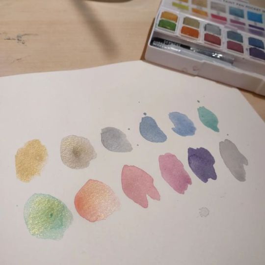
Day 17
Schmincke Aquadrops - Sepia
I forgot just how heavily pigmented liquid watercolour can be. This stuffs a real mover too, especially if you encourage it with a brush even a little.

Day 18
Caran d'Ache Neocolor II water-soluble wax crayons - Lemon Yellow, Lilac
Crayon into wet, dry, dry and manipulated with a wet brush, mixed dry then blended with a wet brush.

Day 19
Marabu Aqua Ink - Pyrrole Re, Sunshine Yellow, Quinacridone Gold
The Sunshine Yellow is definitely the movingest. I have not yet investigated how lightfast these are.

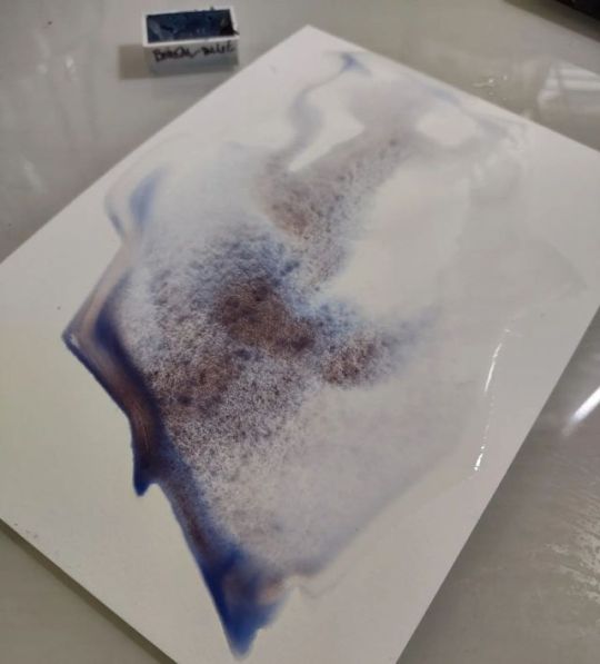
Day 20
Boreal Blue - PB29, Pearlescent - Isaro
Day 21
Desert Green - PR108, PG26 - Schmincke
Day 22
Serpentine Genuine - Daniel Smith
Made from Australian Stichtite, it granulates to a burnt scarlet. You can see the red if you look closely at this. It does some funky things with gauze texture.
Day 23
Payne’s Grey - Winsor Newton
I like this colour so much I bought the big tube.

Day 24
Coliro (top/round) makers of Finetec-branded (bottom/square) paints.
C: Apple Green, Moss Green, Mermaid, Peacock Blue, Blackberry, Red Brown
F: Blue Silver, Mystic Colour, Caribbean Green, High Chroma Blue, Orange Copper, Tangelo
They both use the same round peg on the bottom of the pans, so can both be stored in the proprietary palettes.

Day 25
Haze Indigo - PB29, PG26, PBR33 - Schmincke
Day 26
Haze Brown - PBR7, PBK11 - Schmincke

Day 27
Lilac - Derwent Artbar
A discontinued product. These were a triangle-shaped waxy crayon that was watersoluble.
Day 28
Derivan Liquid Pencil - Comes in two forms: permanent and rewettable.
L to R - Grey 9, Grey 3, Blue, Yellow, Sepia, Red

Day 29
Peacock Blue - Derwent Inktense
Theses come in a block form and a pencil form. They are a solidified ink that is watersoluble, does not reactivate after it dries, and can be used on cloth as well as paper.

Day 30
Media from another mother - my collection of gouache. Should I get more?
Day 31
A very kind soul, knowing my finances are problematic, offered to buy me some paints earlier this year. I declined, because while I would love more art supplies, I sure don’t need them. When I had money, not having a mortgage or children, I buy art supplies.
As many wise souls have said, buying art supplies and using them are two different hobbies.
This is by no means an exhaustive portrait.

1 note
·
View note
Photo

Goodmorning lovely people 💕 I finished this portrait of these two kitties today (finally!) I try to keep business & my personal life separate but dang, life has been kicking my butt lately! I just spent more than a week of being super sick and have been so fatigued from that. I'm finally starting better and being more productive again! 🐾💙 the holiday commissions are in full swing so expect a post almost every day! 😉 . . . . Now accepting commissions for 2020! If interested, please DM me or visit my website!! 🖱Facebook.com/MelissaDraws 📷Instagram.com/MelissaConleyArtist 🌐MelissaConley.com 📧[email protected] . . . . Made with: Derwent Drawing & Lightfast pencils, Prismacolor pencils, Caran d'Ache Luminance, and the Faber-Castell Polychromos colored pencils on 11"x14" bristol vellum paper from Strathmore. . . . . Tags: #cat #catart #catportrait #catdrawing #petart #kitten #catsofinsta #drawing #coloredpencil #realism #blackcat #artist #fineart #photorealism #fabercastell #carandache #derwent #strathmore #tombow #animals #animalart #coloredpencilmagazine #wip #fcd_artists (at Williamstown, New Jersey) https://www.instagram.com/p/B5p173EBoAH/?igshid=1mwknv17kysb6
#cat#catart#catportrait#catdrawing#petart#kitten#catsofinsta#drawing#coloredpencil#realism#blackcat#artist#fineart#photorealism#fabercastell#carandache#derwent#strathmore#tombow#animals#animalart#coloredpencilmagazine#wip#fcd_artists
1 note
·
View note
Text

849 Caran d’Ache + Nespresso Special Edition now available!
Only $49.60
A new icon with a monochrome, metallic look, is born of the success of Caran d'Ache's previous collaborations with Nespresso. This 6th edition is driven by a shared vision of a world in which design, sustainability and color come together to create unique, responsible products.
Made from the aluminum of recycled Nespresso capsules, the 849 Caran d’Ache + Nespresso ballpoint pen draws inspiration from the world of the Kazaar capsule. The midnight blue of the pen’s body, clip and button highlights Caran d’Ache’s color expertise. This universal color transcends generations and preferences, becoming an essential reference point. The body of the pen, made of recycled aluminum, is engraved with the phrase "A recycling story is in your hands" – a reminder that every action matters and that everyone can write their own story.
This 849 Caran d’Ache + Nespresso Special Edition is so much more than a simple writing instrument; it is the very story of recycling. An exceptional collaboration between two Swiss companies, once again bearing witness to their commitment to eco-design and sustainable development. By adopting this instrument, become a part of this commitment.
Environmentally-friendly packaging made from 100% recycled and recyclable cardboard.
Includes one Goliath ballpoint refill installed in the pen.
Then search on NESPRESSO
0 notes
Text
Caran d'Ache Workshop Book
Caran d'Ache Workshop Book
Just over a year ago, perhaps a bit longer, Caran d’Ache published a book, the book is called the “Caran d’Ache Workshop Book”. I was first alerted to it when a good friend of mine, Vinnie Gracanin from Australia who used to be a representative for Caran d’Ache, told me about it.
I took a look at the Caran d’Ache website, trying to find out a few more details; I knew from Vinnie that the book contained a lot of art work from various artists using Caran d’Ache products, but I didn’t know too much more.
(adsbygoogle = window.adsbygoogle || []).push({});
I took a look around YouTube and other art related blogs, just to see if there was other reviews or write ups about the book and I couldn’t find anything at all, other than a video of someone unboxing the book. So I took the plunge and purchased to book for myself and I was so happy that I did. However, I didn’t want people to go through the same issues I experienced before purchasing the book and having to blindly by it, and so completed this review. I know watching or reading reviews of books is not the most exciting thing in the world, especially as actually reviewing books can be very tricky. I can’t show too much of the book, to the extent people know everything there is in the book and don’t need to buy it, but I have to show just enough to help you see what the benefits of the book are.
Caran d’Ache Workshop Book Languages
Before getting into the contents of the book and why I love it so much, it is important to let you know just who can purchase this book. Of course anyone can buy the book, but what I mean is who can purchase it and read it in their own language. Luckily, Caran d’Ache haven’t just published a wonderful book and done so in English, the Caran d’Ache Workshop Book comes in many different languages.
Obviously English, which serves a good portion of the speaking world, Swiss, French, German, Italian, Japanese, Dutch and Austrian. On the Caran d’Ache website they also have an option for Belgium, however the main language spoke in Belgium, or one of the languages spoke there is Dutch, there is also French speaking and Brabantian. So as you can see, the book is available to most of the speaking world.
Caran d’Ache Workshop Book Status
The format of the Caran d’Ache Workshop Book is what I would call a “Coffee Table Book”, the type of book that you would have out on display in your living room our lounge for anyone, artist or not, to pick up and browse through. For those of you who may not be old enough to remember, before the internet and Google, if you wanted to learn something new or research a topic, you had to pick up a book with pages, not an e-book, and read it. No question a much more laborious task than that of the methods we use today, non the less, this book is not only full of incredibly interesting information, this is also an visually stunning, page turning master piece in its own right.
There are 192 pages, protected in a sturdy hard backed binder, the spine of the book is a little different to other books you may have read, I am not quite sure how to explain it to you, other than show you some images of it. With the binding of the pages in such a format, it allows you to open the book out with worry of splitting or cracking the other spine.
Caran d’Ache Workshop Book Contents
When you first open the book, the inside of the hardback cover have the image of a swatch on them, which I thought was quite funny given that when us colored pencil artist buy a new set of colored pencils the first thing we all do is create a swatch.
The book is split into manageable and easy to follow sections and within each section are sub sections, I wouldn’t really call them chapters, but I guess if you would prefer to call them chapters, that would be fine.
The first section in the book is called “Background”, and I personally think this is such an interesting section that it grips you and pulls you into the book and company right from the beginning. Here they discuss the materials Caran d’Ache use and their commitment to the environment. For a lot of artists, this is such an important subject and one I am happy to report, many art supply companies are really taking seriously.
The next section is called “Practice”, this section talks about possible tips and techniques for using Caran d’Ache products such as Graphite, Gouache, Watercolor, Coloured Pencils, Fibre Pens, Pastels, Acrylic and Modelling Clay.
The next section is called “Know-How” and this is quite a comprehensive section with lots of topics covered. Topics such as the Colour Wheel according to Wilhelm Ostwald, Paper, Colour Theory, Techniques, which has so many subsections in itself.
The next section is called “In The Caran d’Ache Workshop” which I am sure you can guess what is covered here? Subjects such as mixing techniques, tonal drawing techniques, modelling clay techniques and so much more.
The next section is called “Passe-partout” which is a French phrase and according to the Collins English dictionary means
“A mounting for a picture in which strips of strong gummed paper are used to bind together the glass, picture and backing”
This section discuss framing, the different types of framing processes and frame types that can be used, storing your finished work and presenting it. This information is of course incredibly useful to artists wishing to sell their work and present it in the best possible way.
(adsbygoogle = window.adsbygoogle || []).push({});
The final two sections are pretty self explanatory, “The Gallery” and “Caran d’Ache History. I know from previous reviews I have completed that a lot of people are not interested in the history of a company, however, I personally find to understand a companies current situation and future aspirations, it is important to understand the history.
the Gallery is full of wonderful images from artists all over the world using various products from Caran d’Ache, no matter what your favourite Caran d’Ache product is, be it the Museum Aquarelle, the pigment bursting Neocolour II, the Royalty quality Luminance, the precision of the Pablo or the enormous color selection of the Supracolor Soft, there is an art piece to represent your favourite product.
However, you don’t just have to flick to the back of the book to see images of artwork, the entirety of the book is littered with beautiful and detailed images of Caran d’Ache products. For those of you who follow The Art Gear Guide reviews and like the style that I have tried to incorporate into the reviews with extreme, Hi-Def, close ups images of the products and enjoy this format, then you will love the Caran d’Ache Workshop Book.
The images throughout the book are amazing and so incredibly inspirational. We all find inspiration in different things and ways. For me, there are a few YouTubers who I watch all the time, re-watching videos they have created over and over again and I find inspiration in this. Caran d’Ache actually have a YouTube Channel were they show case and demonstrate their products, watching these videos help ignite inspiration and now the Caran d’Ache Workshop Book helps stimulate my inspiration,
Caran d’Ache Workshop Book Price
the price for the Caran d’Ache Workshop Book is very much a universal price just with the different exchanges at play. Buying the actual book is difficult to get hold of via the likes of Amazon or Ebay regardless of the country. I looked on these platforms for months and just couldn’t find one. So the best place to go is directly to the companies website. From here you will have no problems whatsoever getting hold of a copy and you can select which language you want the book in.
The price of the book is £41 and as I mentioned, because the only place selling the book is the Caran d’Ache website, it is the same price regardless of the country you reside in. I personally think for a book of this type, a wealth of important information, a gallery of beautiful art work created by amazing artists from all over the world and a detailed catalog of the companies most desired and favoured products.
Caran d’Ache Workshop Book Conclusion
I am sure most of you who know me, know just how much I love the Caran d’Ache products I have used and reviewed thus far, so when I learnt of a book published that detailed the products, demonstrated techniques about the products and spoke of the company’s history among many other things, I really had to get a copy. Before getting the book, as it was an online purchase, as opposed to walking into a book store and flicking through it, I would have liked to know a bit more information on the book, in the form of a review, prior to buying it.
So I hope for anyone who is interested in the Caran d’Ache Workshop Book or, perhaps a bit like myself, has been interested and just wanted to know a bit more about the book before buying it, I hope this review will be of some help to you. I know some people may think that £41 is a bit too much for a book, however if you take a look around Amazon and other book stores, books in this particular genre and size, mostly cost in and around this price point.
For any colored pencil enthusiast, be that watercolor pencils, pastel pencils, colored pencils, graphite pencils or even supplies such as modelling clay, acrylic paint and felt tip pens, I really think this book will be a source of knowledge, inspiration and visual stimulation. I have also completed a youtube video showcasing the book as much as I can without damaging sales for the company, follow the link to watch if you are interested.
(adsbygoogle = window.adsbygoogle || []).push({ google_ad_client: "ca-pub-0244044993544446", enable_page_level_ads: true });
#Caran d'Ache Workshop Book#Caran d'Ache#Caran d'Ache Workbook#Caran d'Ache Work book#Work book by Caran d'Ache#Caran d'Ache products
0 notes
Video
Art journaling moments from the recent Art Bar Art Fair 2019 at SM Megamall Atrium. I had the opportunity to share my love for art journaling, and shared some insights and techniques how to use some Caran d'Ache products. Thanks so much @artbarph for having me. #RavenFox13 #ArtbarPh #CarandAche #Journaling #ArtDemo #ArtJournal #ArtJournaling #Sketch #watercolor #Watercolour (at SM Megamall) https://www.instagram.com/p/B1BDbrnH0i0/?igshid=138k7mcq8alu5
#ravenfox13#artbarph#carandache#journaling#artdemo#artjournal#artjournaling#sketch#watercolor#watercolour
1 note
·
View note
Photo
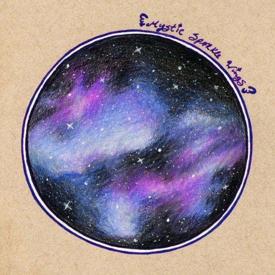
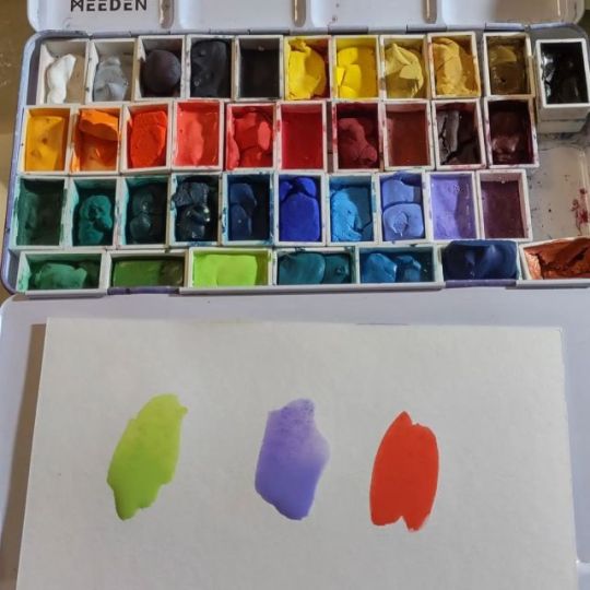
Arteza Expert Colored Pencils Review
Hu-boy, have I got a story for you guys!
So I've been seeing Arteza's Expert colored pencils floating around in both ads and as freebies to Art Youtubers for a while now, and finally, it was too much and I threw up my hands and said to myself OKAY LET'S TRY THEM. (even though I very sincerely don't need any more colored pencils...)
Previously, I've tried their Woodless Watercolor Pencils and liked them, and I've specifically heard good things about these pencils. So I went in with measured, but positive expectations.
The full 72 set goes for about $30 either on Amazon or Arteza's own website, which is the same price point as the Schpirerr Farben colored pencils currently on Amazon. So they aren't the super-duper cheapest, but the price is pretty fair compared to companies like Derwent, Faber Castell, or Caran D'ache.
So, some tea first, and then I'll talk about how the pencils handle (tea in small text in case you don't care):
My set came in the mail and I immediately opened them and went to swatching, as I do.
It was when I was writing out the color names (I write the names out first, then go back and put the color down) that I noticed I had two "Charcoal A120" pencils, and likewise discovered I was missing "Peacock Blue A008." And suddenly I was filled with dread; oh no something's wrong I'm going to have to contact customer service ohnononoohno.
So I contacted their customer service through the Guarantee address ([email protected]) on the back of the tin, hoping to get the issue resolved as quickly as possible and wanting/expecting nothing more than the one pencil I didn't have.
About two hours later, they got back to me and through a bit of back-and-forth, I provided pictures (which I expected them to ask for), then a screenshot of the Amazon Order Details and my shipping address (also expected). It was just after 4:00, last I heard from them on a Friday, so I figured either that was that and I should be on the lookout in the mail, or they had closed up shop for the weekend and I'd heard from them again on Monday.
I woke up Saturday morning with an order confirmation email that confused me, and another reply informing me they couldn't just send the one pencil, so they'd be sending me a whole new set, and I didn't have to return the original set; I was welcome to keep or donate it. This made the confirmation email make sense, as it was for the shipment of the new set.
This naturally was a nice surprise. (And I must also add the reply email had a timestamp of 4 in the morning so I have to applaud the magical soul that was coherently responding to customer service emails at such an hour as I would be loathed to do the same.)
With that issue at least temporarily dealt with (as I wanted to wait and see the new set before "officially" closing my mental books on it), I moved on to producing the test image you see above and otherwise evaluating the pencil. However, I decided to wait and not fill out a Colored Pencil Testing Workshop for these until after the new set arrived, just in case.
And I'm glad I did. The replacement set came in on Wednesday, and I was practically bursting at the seams to get it open and see what was what.
All 72 different colors were present and accounted for.
However, the "Emerald A094" pencil's tip was broken/missing. I did sharpen it back up, and it appears completely fine. Probably what happened is it was broken during sharpening or something at the factory. Not a big deal, but noteworthy when combined with my previous experience and considering that there are other signs of minor quality control issues. For example, the company/color names and information printed on the pencils are not aligned consistently, and if you go on Amazon and start looking at the negative reviews you'll find a lot more than just these relatively small things.
My point in including all this: As I'll talk about in a second, the pencils themselves work just fine and I don't think Artexa is maliciously producing defective sets of colored pencils and just trying to make a quick buck. Quite the contrary. I think they are dedicated to making the best products they can while still keeping them affordable compared to their competition. It's just that they have some issues here and there like every company in existence does, and part of that, in my theory, is likely because they have less in the budget for certain quality control measures when compared to the more expensive brands. This isn't a dealbreaker by any means, but I do think it's important to keep in mind.
So all of that out of the way, how do these pencils actually work in the field?
They're not as soft as Prismacolor, but I went in expecting that from what I'd already heard. They're not as hard/rigid as the Faber Castell Polychromos, so they land somewhere in the middle. They layer pretty well; they don't seem to build up wax quite as quickly as Prismacolor, but they aren't nearly limitless with layers like the Polychromos. Blending was better than I expected and overall pretty good.
The white surprised me a little. The Prismacolor white is still the best I've used, but this one did better than I expected. It also worked well with blending other colors.
Speaking of; Color selection is interesting. In the plastic trays, they seem to be arranged from in color order...but in three separate "sets," rather than in typical "all the yellows are together, and the pinks are together," etc. color order. This bothers me a little since I'm used to the other way, but that's just me. The colors themselves though seem to sit somewhere between typical color choices and also trying to be different, which is. (Also a lot of them have really fun color names, which I really appreciate personally.) (And while we're here, I will say the tin and trays are nice/pretty standard, but the trays are pretty snug in there so I have a little trouble moving things around, but it's not so much of a deal-breaker that I feel I need a separate case for them.)
They seem to generate a lot of dust/crumbs, but the weird thing was that when I went to wipe it away, it didn't smear specks of color on the paper. Good, but odd.
Honestly, they measure up about the same as the Schpirerr Farben pencils in terms of falling somewhere between Prismacolor and Polychromos in terms of performance, and that makes a lot of sense considering both sets are at the same price point. (Though the Schpirerr Farben pencils do still behave and feel different, most likely because they're oil-based to the Arteza's wax-base.) They aren't my new favorite, but they are pretty decent and if Prismacolor is just too expensive for you, I'd say they're not a bad second choice.
I did notice something exceedingly peculiar during my testing though: These pencils have basically no water resistance. They melt down almost like watercolor pencils, or at least like the Derwent Inktense (which dissolve pretty well but compared to typical watercolor pencils they do take a little more water and working to melt down entirely).
Typically, regular colored pencils do move when hit with a lot of water, but not to this extent, and it usually takes a lot to really pull a noticeable amount of pigment out.
The thing about this is that Arteza sells a set of regular watercolor pencils, and as best I can tell from the pictures (as I have yet to procure a set for myself) the only differences between that set and this one are the colors on the front of the tins, and the Expert pencils are round/circular, while the watercolor pencils are hexagon shaped. Other than that, there aren't any visible differences between the two. Granted, this isn't really fair, as the main differences would normally be in how they perform on paper and you can't really tell that from stock photos.
And yet, and I can't help but wonder if there's something fishy going on there. Could they be the exact same cores, just packaged differently...?
I am very tempted to order a set of their watercolor pencils just to compare...But until then, I am planning on trying a watercolor piece with these just to see what happens. Maybe I'll try and they won't turn out that well and my theory will be busted, or maybe I'll have to order the other set and find out for sure that way...
____
Artwork © me, MysticSparkleWings
____
Where to find me & my artwork:
My Website | Commission Info + Prices | Ko-Fi | dA Print Shop | RedBubble | Twitter | Tumblr | Instagram
2 notes
·
View notes
Photo

Hoppy last Friday of Inktober! We drew this rabbit using water-soluble Caran d'Ache Technalo Graphite Pencils. ⠀⠀⠀⠀⠀⠀ Shop the products here: https://to.jetpens.com/2Q1kPtL ⠀⠀⠀⠀⠀⠀ Clickable link in Instagram profile! ⠀⠀⠀⠀⠀⠀ #jetpens #instajetpens #jetpensinktober #inktober #inktober2018 #carandache #graphitepencil #pencil #artpencil #watersolublepencil #watersolublegraphite #technalo #quattro #globalart #waterbrush https://www.instagram.com/p/BpiPkfPgQ_X/?utm_source=ig_tumblr_share&igshid=apqe4yoapgti
#jetpens#instajetpens#jetpensinktober#inktober#inktober2018#carandache#graphitepencil#pencil#artpencil#watersolublepencil#watersolublegraphite#technalo#quattro#globalart#waterbrush
12 notes
·
View notes
Last Seen Blogs

hithisisleon
Where's everyone going, bingo ?

centralpark1981
love, or the lack of it

relishonhotdog
RelishOnHotDog

ekzsound-blog
Без названия

fictive-phonebook
Helping Fictives Connect With Each Other