#Chromat
Text

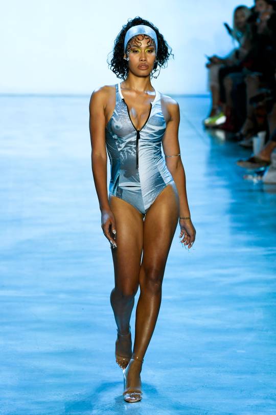
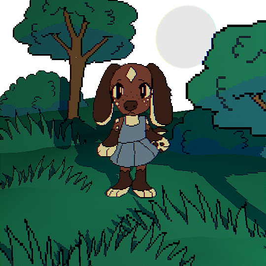
Outfit for Kiwi
Chromat Fall 2019
3 notes
·
View notes
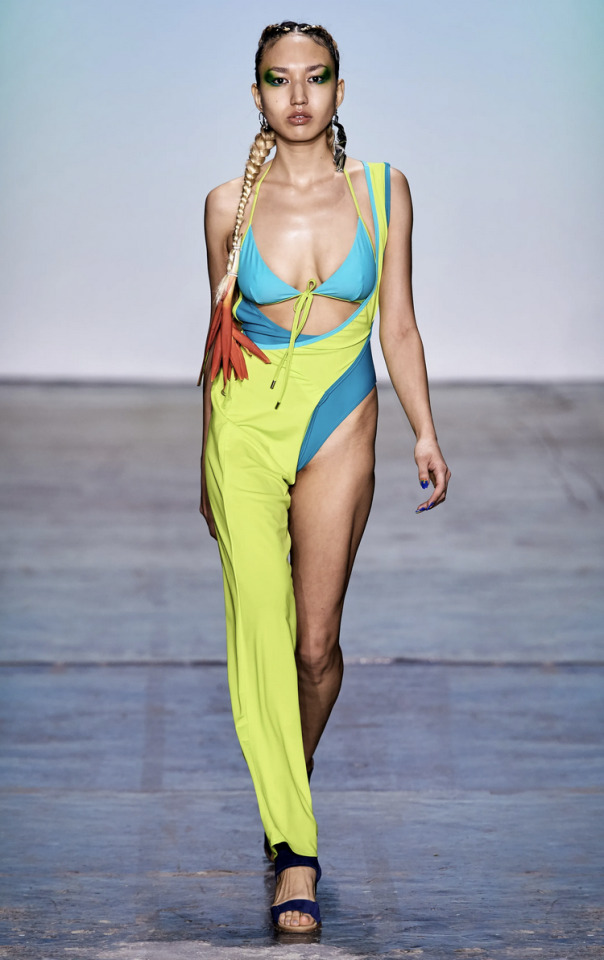
Photo

Jasmine Guzman at Chromat, Spring 2022
16 notes
·
View notes
Photo
Outfit for Dolphin
Chromat Spring/Summer 2019
13 notes
·
View notes
Text
"Get infected!"
what if its some sort of video game?
session 7: virus / bug
#secret life smp#smajor1995#zombiecleo#grian#secret life spoilers#bdoubleo100#impulsesv#pearlescentmoon#goodtimeswithscar#ethoslab#skizzleman#smallishbeans#bigbst4tz2#tangotek#geminitay#joifeepixel#joifeeart#chromatic aberration#gif#pixel gif#eyestrain#glitch effect#glitch#trafficblr
8K notes
·
View notes
Text
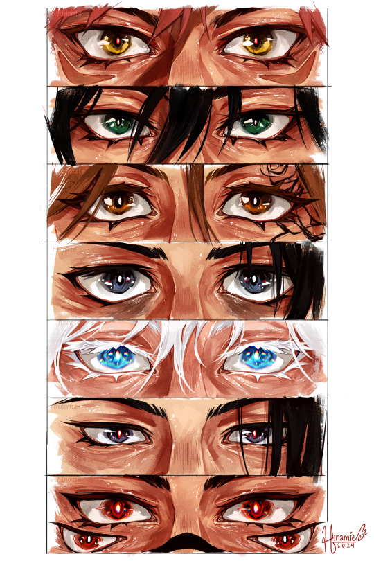
some quick jjk eye paintings
#my art#jujutsu kaisen#jjk#megumi fushiguro#yuji itadori#nobara kugisaki#yuta okkotsu#gojo satoru#geto suguru#ryoumen sukuna#fanart#jjk fanart#tagging everyone feels like it took longer than the actual painting my god#i believe ive gone on record waxing poetic about how i love lower eyelids and how i could paint them fr hours#so i put my money where my mouth is and thats what i did today . self care :)#i had a cool idea fr gojo where i wanted to do like an abberated effect to show 2 extra sets of eyes#but god it looked cluttered and awful no matter what layer mode i put it on sdgdgjsdg#settled fr chromatic abberation on th irises :')#quickish painting but i am ! happy !#very proud also of the different eye shapes i ws able to achieve while keeping them consistently sized#was worried abt geto there fr a sec#but tbh he turned out to be one of my favs ????? surprised myself#anyway this is my love letter to eye skin <3 i love u lower eyelid folds mwah <3
5K notes
·
View notes
Photo

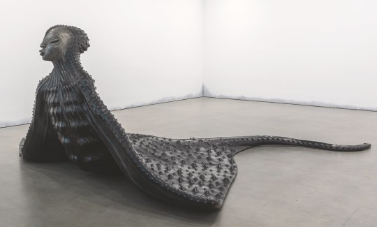
- Wangechi Mutu, “Water Woman” (2017) & “Mamaray” (2020)
28K notes
·
View notes
Text

Drift for @lemonomelette ‘s DTIYS!! The colours were so nice in the Drift piece but boy was that difficult ;O
2K notes
·
View notes
Text
liver in the woods
#shes named after her favourite food. liver //#gif#flashing images#scopophobia#blender#chromatic aberration#oc:liver#transparent gif
2K notes
·
View notes
Text
Realizing I never posted this animation i did of Casper on tumblr at all
3K notes
·
View notes
Text

Outfits for Mozu
Chromat Fall 2019
#mozu one piece#franky family#water 7#one piece#one piece fashion#chromat#green#okay so apparently kiwi is the one who wears pink and mozu is the one that wears green. oops
3 notes
·
View notes
Photo
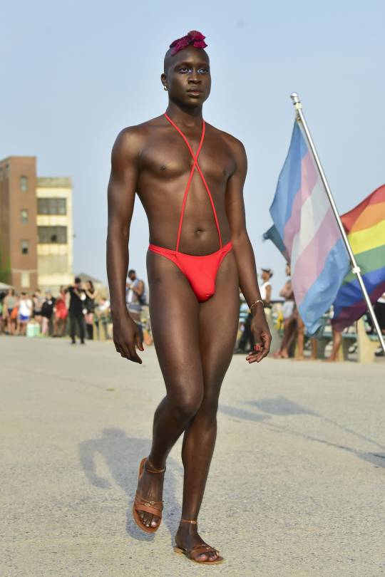
Basit Shittu at Chromat, Spring 2022
9 notes
·
View notes
Text
I think 90% of my gripes with how modern anime looks comes down to flat color design/palettes.
Non-cohesive, washed-out color palettes can destroy lineart quality. I see this all the time when comparing an anime's lineart/layout to its colored/post-processed final product and it's heartbreaking. Compare this pre-color vs. final frame from Dungeon Meshi's OP.


So much sharpness and detail and weight gets washed out and flattened by 'meh' color design. I LOVE the flow and thickness and shadows in the fabrics on the left. The white against pastel really brings it out. Check out all the detail in their hair, the highlights in Rin's, the different hues to denote hair color, the blue tint in the clothes' shadows, and how all of that just gets... lost. It works, but it's not particularly good and does a disservice to the line-artist.
I'm using Dungeon Meshi as an example not because it's bad, I'm just especially disappointed because this is Studio Trigger we're talking about. The character animation is fantastic, but the color design is usually much more exciting. We're not seeing Trigger at their full potential, so I'm focusing on them.
Here's a very quick and messy color correct. Not meant to be taken seriously, just to provide comparison to see why colors can feel "washed out." Top is edit, bottom is original.
You can really see how desaturated and "white fluorescent lighting" the original color palettes are.
[Remember: the easiest way to make your colors more lively is to choose a warm or cool tint. From there, you can play around with bringing out complementary colors for a cohesive palette (I warmed Marcille's skintone and hair but made sure to bring out her deep blue clothes). Avoid using too many blend mode layers; hand-picking colors will really help you build your innate color sense and find a color style. Try using saturated colors in unexpected places! If you're coloring a night scene, try using deep blues or greens or magentas. You see these deep colors used all the time in older anime because they couldn't rely on a lightness scale to make colors darker, they had to use darker paints with specific hues. Don't overthink it, simpler is better!]
#not art#dungeon meshi#rant#i'm someone who can get obsessive over colors in my own art#will stare at the screen adjusting hues/saturation for hours#luckily i've gotten faster at color picking#but yeah modern anime's color design is saddening to me. the general trend leans towards white/grey desaturated palettes#simply because they're easier to pick digitally#this is not the colorists fault mind you. the anime industry's problems are also labor problems. artists are severely underpaid#and overworked. colorists literally aren't paid enough to do their best#there isn't a “creative drought” in the anime industry. this trend is widespread across studios purely BECAUSE it's not up to individuals#until work conditions improve anime will unfortunately continue to miss its fullest potential visually#don't even GET ME STARTED ON THE USE OF POST-PROCESSING FILTERS AND LIGHTING IN ANIME THOUGH#SOMEONE HOLD ME BACK. I HATE LENS FLARES I HATE GRADIENT SHADING I HATE CHROMATIC ABBERATION AND BLUR
2K notes
·
View notes
Text
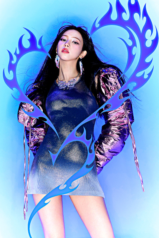
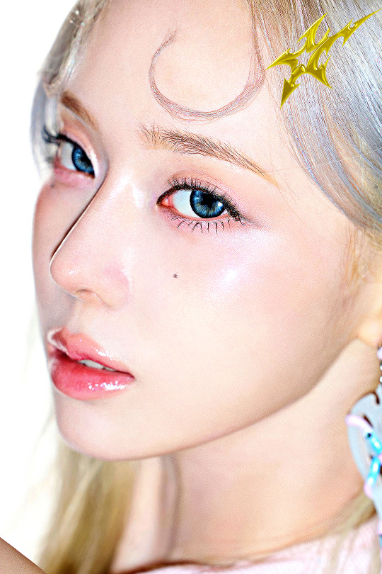
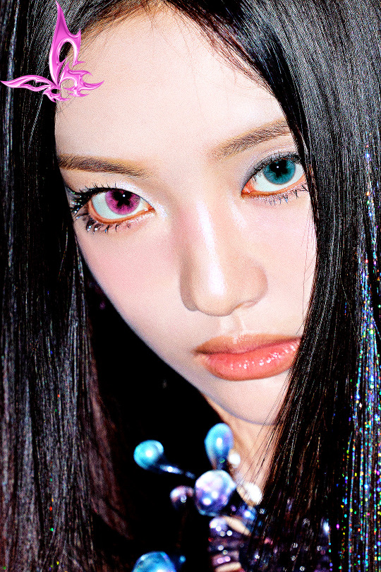
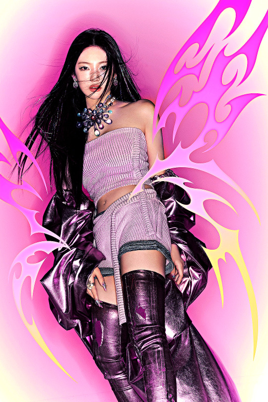
aespa ♡ ☾ ☆ ཐིཋྀ
'Armageddon' Superbeing, 2024
#aespa#aespainc#femaleidolsedit#femaleidol#femadolsedit#aespaedit#kgoddesses#ggnet#karina#giselle#winter#ningning#99#09#edits#gfx#*#felt inspired and changed the colors and added the chromatic icons <3<3<3
815 notes
·
View notes
Text
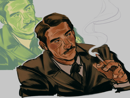
is he. y’know. House
#fallout#fallout new vegas#fnv#mr house#robert house#i always forget about chromatic noise my beloved
888 notes
·
View notes
Text
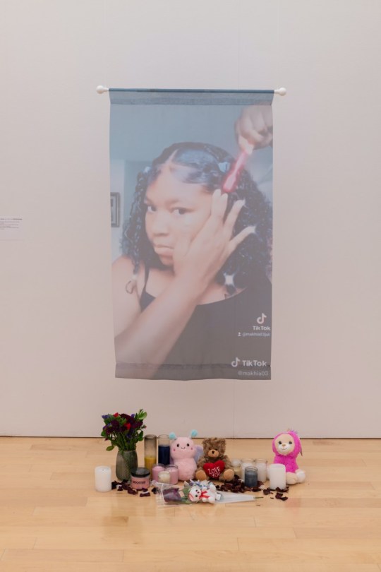
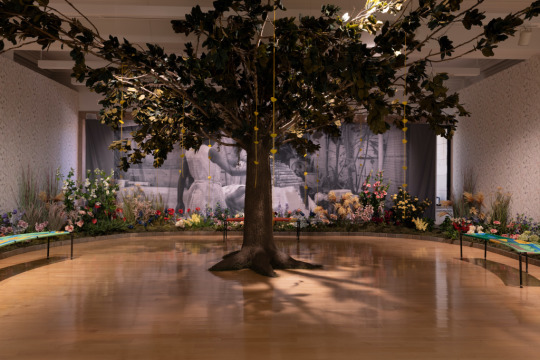
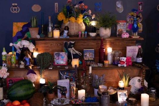
Installation view of Freedom Square: The Black Girlhood Altar at the Chicago Cultural Center
The exhibition at the Chicago Cultural Center opens with the installation “Homegoing.” The work is a suspended image depicting a screenshot from Ma’Khia Bryant’s personal TikTok. In the photo she’s laying her edges, her jet-black hair shining, her baby face clean and free of makeup. Below the printed photo is a collection of candles, stuffed animals, and a bouquet. On April 20, 2021, Ma’Khia was killed by an Ohio police officer in what was later determined a justifiable homicide. She was 16 years old.
In the gallery titled Rest and Recess: The Courtyard, the exhibition transports the viewer to the Caribbean where Black girls play together unburdened and hopeful. A tree, sculpted by Robert Narciso and made from branches from Rekia Boyd’s family home, sits in the center of the room casting a protective shadow over everything. From its branches hang yellow paper hearts scribed with the hopes and dreams of little Black girls. The sound of their joyful cacophony activates the space.
[ x ]
#chromatic voice#ma'khia bryant#rekia boyd#a long walk home#scheherazade tillet#robert narciso#we all make art#usermarmalade#police brutality#missing and murdered black women#say her name#black lives matter
3K notes
·
View notes
Text
if joker Jr Tim has no fans I am dead
#i hope this is an improvement from my last drawing#you can pry glitch effects and chromatic abberation from my cold dead hands#Joker Jr.#dc fanart#tim drake#tim drake fanart#timothy drake#joker junior#joker Jr Tim drake#the wee baby#im thinking about him so now you must too#batman beyond#one day I'll do him justice
931 notes
·
View notes
Last Seen Blogs

divo74
Untitled
surechord
on top of the world
ptrklos-art
Illustrator & 3D Artist

bigdaddycuzz
Untitled
forever3344
Thoughts that spin the webs of actions