#Color Contrast
Explore tagged Tumblr posts
Visit Tumblr Blog
Explore Tumblr blogs with no restrictions, modern design and the best experience.
Last Seen Tumblr Blogs


Fun Fact
Total funding amounts to $125.3M.
Text

Somewhere in space
#digital art#abstract art#abstract#digital illustration#art#original character#illustration#cute art#character design#furry#neoncore#neon colors#color contrast#creepincrawl
195 notes
·
View notes
Text
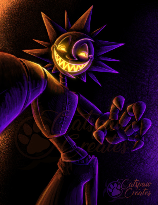
Eclipse - Color Experiment #3
Less glowy version under the cut.
I’m not sure how I’m going to top this, but I thoroughly enjoyed the process. Colors inspired by my friend Grifty’s Eclipse variant (only colors, not design 👍)
Moon next. Debating on others like Jack O Moon…
I’ve learned a thing or two making these. Already big improvements from the first one.
#catspaw art#spicy dorito bot#wickedly delightful#daycare attendant#daycare attendent#dca fandom#dca fanart#eclipse fnaf#fnaf eclipse#color contrast#art experiment#orange#purple#heliotrope#digital art
207 notes
·
View notes
Photo

Le Quernec's Blue Corridor ⬣ Where stark geometry meets calculated color shock
#red#color contrast#electric blue#blue#contemporary#21st century#minimalism#paul le quernec#architecture
167 notes
·
View notes
Text

Neons
#new york#backlight#street photography#contrast#architecture#manhattan#skyscraper#skyscape#city photography#cityscape#city life#newyork#manhatten#color contrast#office#wall street#financial#downtown#building#buildings#publicsector#neon aesthetic#neon lights#neon#neon colors#neon art#green#abstract
64 notes
·
View notes
Text

Vitraux et Volets (Stained Glass and Shutters)
📍Le Marais (3e), Paris, France
Wandering the streets of Le Marais after nightfall, I caught this façade with windows glowing like jeweled cathedral glass tucked into a mundane wall. That contradiction had to be caught—unexpected beauty framed by the everyday.
The composition is built on contradiction. The stained glass belongs in a sacred place, but here it sits in a quiet residential building, above shuttered windows and aging stone. Then there’s the color contrast in the light: the warmth of tungsten bleeding down the wall like candlelight, set against the cool cyan spilling out of the stairwell window. One feels antique and lived-in; the other sterile, almost ghostly.
I shot handheld (thank you, shake reduction), wide open at 18mm on the kit lens. That 1/13s exposure was a bit of a gamble, but ISO 3200 gave me just enough breathing room. The tungsten spill from the wall lamp on the right gave the upper half of the frame this warm, gaslight patina, with the cyan from the upstairs and cool blue/green of the stained glass cutting through it. Mixed lighting mess? Maybe. But here I think it works.
I let the symmetry of the windows anchor the shot, and positioned the glowing top-left room just off-center—rule of thirds doing its quiet work again. Those shutters, some open, some closed, add a lived-in rhythm, while the iron railings and stained glass gridlines keep the whole frame in a soft sort of prison.
It’s moody, a bit theatrical, and I had to capture it.
Processed with Affinity Photo v2 and Topaz Photo AI.
Camera: Pentax K3
Lens: smc Pentax DA 18-135mm ED AL [IF] DC WR
18mm | ƒ/3.5 | 1/13s | ISO 3200
Taken: March 03, 2025
#photographer on tumblr#original photographers#original photography#street photography#urban photography#architecture#building#stained glass#window#moody#color contrast#low light#paris#france#vacation#winter#March#2025#pentax#pentaxian#pentax k3#Affinity Photo#Topaz Photo AI#balcony
13 notes
·
View notes
Text

The tumbling blocks quilt pattern, also known as cubework, creates a 3D optical illusion using geometric shapes and contrasting colors, potentially with a history rooted in ancient mosaic floor designs and possibly even signaling routes on the Underground Railroad.
Piecing tumbling blocks quilts remains among quilters' favorite challenges, arranging the colors to form the elusive blocks and sewing the sharp-toothed diamonds together. The Tumbling Blocks quilt is one of the earliest quilt patterns, featuring geometric forms of light and dark that tumble across the quilt.
What it is:
Optical Illusion: The pattern uses a repeating arrangement of fabric pieces to create the illusion of three-dimensional cubes or blocks.
Geometric Shapes: It typically involves triangles and diamonds sewn together to form the blocks.
Color Contrast: The use of contrasting light and dark fabrics is key to achieving the 3D effect.
Variations: Common variations include Cubework, Disappearing Blocks, Golden Cubes, and Stair Steps.
#crafts#gifts#decor#sewing#quilting#briar rose quilts#bedding#shopping#quilters of tumblr#holiday#optical illusion#geometric shapes#color contrast#blocks#cubes#art quilt#quilting as art#quiltblr#quilt pattern#quilt tutorial#textile art#fabric art#embroidery#patchwork#quilts#quilt#tumbliing blocks#tumbling blocks quilt
11 notes
·
View notes
Text

A panel from a wip comic I'm working on.
#artists on tumblr#color contrast#rabbit#wild hare#animal bones#surreal#illustration#folk gothic#wildlife gothic#my art#digital ilustration
217 notes
·
View notes
Photo

Decay's Artistry in Blue A close-up of a weathered wall displaying vibrant blues, rusty browns, and creamy tones of peeling paint. The layers reveal a story of time, evoking nostalgia and beauty in decay.
#Urban Exploration#Texture#Street Art#Visual Storytelling#Nostalgia#Art in Nature#Rugged Beauty#Decay#Color Contrast#Travel Photography#Creative Expression#Artistic Soul#Photography Lovers#Urban Decay#Nature Meets Art#Photo of the Day#Inspiring Places#City Life#Insta Good
14 notes
·
View notes
Text

Mexican color game
#mexico#red and blue#blue and red#red & blue#colors#color contrast#complementary colors#photographers on tumblr#photography#fujifilm#travel#curators on tumblr#street#fujixt2#stairs#window#orange roof
100 notes
·
View notes
Text

AI + the LAX airport
#hallway#blue walls#tiled floor#light blue#interior design#architecture#home decor#modern design#clean lines#minimalist#bright lights#long hallway#floor tiles#color contrast#space#design inspiration#home interior#aesthetic#interior photography#hallway decor#light and shadow#geometric design#contemporary#stylish#home style#interior spaces#hallway design#modern home#architectural photography#design details
3 notes
·
View notes
Text

The Watcher
#Rain World#Slugcat#the watcher#rw fanart#rw slugcat#rain world the watcher#y2k#illustration#abstract art#character art#purple#blue#indigo#color contrast#art#furry#anthro#digital art#y2k inspired
361 notes
·
View notes
Text

Color Experiment #2
Using my 2nd favorite brush, just playing with contrast and color pairs.
Really enjoying making these. They remind me of old velvet paintings.
If I get brave enough I’ll post the full version for Kill Code when I’m done with the 4 I want to do. Probably Eclipse next…
#color experiment#practice practice practice#catspaw art#the daycare attendant#daycare attendent#dca fandom#dca fanart#fnaf sun#sundrop#sundropfnaf#sundrop fnaf#sun fnaf#color contrast#digital art#yellow#green
187 notes
·
View notes
Photo


"It's the Devil I Love" by Line Hachem ⚯ Sweet scenes laced with threat
#digital art#color contrast#surrealism#emotional duality#illustration#line hachem#contemporary#purple#blue
130 notes
·
View notes
Text

A Memory
#new york#street photography#sky#architecture#manhattan#sunset#dusk#manhatten#dream#surreal#lines#street lights#cityscape#restaurant#abstract#warm#cool#cold#colors#color contrast#lucid dreaming#memories#upper west side
43 notes
·
View notes
Text


my dilemma, basically
color theory can eat my ass
#character design is my passion#oc#color theory#color contrast#color palette#wip#art#im planning to redo the pants n shoes cause the color heirarchy is all outta wack#weezart
7 notes
·
View notes
