#Combine Concaves
Text
Case IH Combine Parts: An In-Depth Look
Case IH combines are renowned for their advanced agricultural technology, designed to maximize efficiency and productivity during the harvesting process. These machines are essential for large-scale farming operations, combining cutting-edge engineering with robust construction.
0 notes
Text
Case IH Concaves: Revolutionizing Modern Harvesting
Case IH concaves are an integral part of the harvesting technology used in modern agricultural machinery, specifically designed to optimize the efficiency and quality of crop harvesting. Case IH concaves represent a significant advancement in harvesting technology, offering numerous benefits that enhance both the efficiency and quality of the harvesting process. From eliminating rotor loss and increasing capacity to ensuring cleaner grain samples and reducing fuel consumption, these concaves are designed to meet the diverse needs of modern agriculture.
0 notes
Text
My Dragon ~ Aemond x wife!Reader
warnings: mentions of Aemond's eye injury, some angst & fluff
word count: 1.0k
note: pure fluffy dad!Aemond goodness! was stuck on this idea for a while, hope you enjoy this little piece!
masterlist
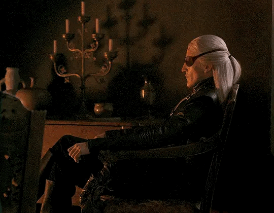
You returned to your chambers after a long day, desperate for nothing more than a long, hot bath and the soft furs of the bed you shared with your husband. You had spent the day with your good sister Helaena. Though once only sisters through friendship, you were truly sisters now after the marriage to her younger brother.
As you opened the doors to your chambers, it was unusually quiet. You closed the door behind you, listening to the crackling of the hearth. You spot the back of Aemond’s head, seated on the settee facing the dancing flames. His head is angled downwards; no doubt he has stayed up late with his nose in a book as you often find him.
Though he never admits it after the fact, you’d caught him on more than one occasion fast asleep on the settee or in his chair, a book open-faced in his lap.
You smile softly as you approach, careful not to startle him.
“My love…” you call softly, to which Aemond turns his head.
He purses his lips slightly, bringing a hand to his mouth shushing you. Your eyebrows concave together in confusion, which ebbs as you walk closer. Aemond has forgotten his usual book this evening; instead, your sleeping daughter rests her head on his lap, fast asleep, her small chest rising and falling with each breath.
Her silver curls are splayed every which way, her nose whistling with every breath she exhales.
“It is late my love,” you playfully tease, keeping your voice a low whisper so as not to wake her.
“I know,” Aemond says, his voice just as soft, “We lost track of time.”
You smile, walking behind him to place your hands on his shoulders. Though only in her fourth year of life, your little dragon has the Targaryen prince wrapped around her little finger. Aemond brings a hand to rest on top of yours, pulling it from his shoulder and pressing a gentle kiss on the back of your hand.
“Did you have a nice time?” he murmurs against the back of your hand, his breath causing gooseflesh to appear.
You hum in response. “I did. You know how I enjoy spending time with Helaena. Though I must admit, my legs do ache.”
You had spent most of the day walking through the gardens with the princess, helping her add to her collection of curious creatures and oddities. You loved Helaena’s hobbies and were more than happy to indulge her. But the day was long under the hot summer sun, and it left you eager for bed.
“Shall I call for someone to draw you a bath?” Aemond asks as you lean to rest your chin on his shoulder.
“It tis alright,” you assure him, “Do not trouble yourself.”
“It is no trouble, you know this,” he insists, glancing at you sideways. You made sure to rest upon the shoulder where he can see you with his functioning eye.
You remove your hand from him, caressing the leather eyepatch he wears.
“You must be uncomfortable,” you tell him softly, stroking the worn leather. It begins to irritate him on days such as this one when the heat causes the leather to chafe the skin of his cheek.
The weather is strange these days, getting so hot during the day and then dropping significantly during the night. Aemond’s violet eye flickers down at your sleeping child. How perfect she looks, the perfect combination of both of you. A miracle made of your love. You sense his hesitation.
“She shall not be afraid, my love,” you assure him.
“How can you know?” he says, looking down away from your comforting gaze.
Aemond had always been fearful of how others reacted to his injury. You remembered in your youth before he had begun courting you, how you’d learned of why he wore the patch. It was Helaena who informed you that Aemond wished to not frighten the ladies of the court.
“Prince Aemond should not wish for a weak stomached woman anyhow,” you had snapped, as other ladies had snickered at his injury. “Women say they wish to marry a warrior, then faint at the scars from battle. How distasteful.”
Helaena had told Aemond how you’d come to his defense. You’d been the apple of the Prince’s eye ever since. Well, until the birth of your little one. Two women now completely owned the dragon prince’s heart.
“A mother’s intuition,” you assure him, moving to remove the patch. Aemond freezes for a moment but relaxes into your touch as you place the eyepatch on the table, revealing his magnificent sapphire.
You stroke your finger along the scar, admiring how the sapphire reflects the light from the hearth.
“My dragon,” you murmur, cupping his sharp chin in your hand, and pressing a gentle kiss to the scarred tissue.
Aemond sighs, his chest rumbling. You can see a flicker of desire in his violet eye at your praise. Your daughter stirs then, perfect face scrunching as her pale lashes flutter open. She looks up at you with wide violet eyes before throwing her small arms around your neck.
“Muña!” she says sleepily, arms heavy around your neck.
“Hello my love,” you softly croon, pulling her completely into your arms, “How was your day?”
She buries her face into the crook of your neck and you inhale the lilac scent of her hair. How you enjoy the moments with your companions, but oh how you miss your daughter by the end.
“We went exploring all day! And we went flying on Vhagar,” she chatters away, “Sunfyre even joined us! Kepus flew right next to us!”
“Did he now?” you ask with a chuckle. Aegon was a surprisingly delightful uncle.
Aemond stands then, still facing slightly away. You reach for his hand, pulling him closer. Your daughter looks at him, the smile never leaving her face. Aemond turns his head slowly, revealing the scarred tissue and brilliant sapphire. You hold your breath, waiting for your little girl’s reaction.
She stares, unblinking, before reaching out to touch his face.
“Blue is my favorite color,” she informs, turning back to you, “Did you know Sunfyre likes to sing? I don’t think Vhagar enjoys singing, her songs are rather deep. It shakes the windows of the Keep! Muñāzma was quite cross with her!”
You glance at your husband, watching his cheeks turn red. You smile so brightly that your cheeks begin to ache. There was never anything for him to fear. She adores him all the same.
As do you.
#aemond targaryen x female reader#aemond targaryen imagine#aemond targaryen#aemond targaryen x fem!reader#aemond fluff#aemond x reader#aemond x you#aemond x y/n#aemond targaryen x you#aemond targaryen x reader#aemond one eye#prince aemond#house of the dragon aemond#dad!aemond#dad!aemond targaryen#aemond fic#aemond x fem!reader#aemond fanfiction#aemond stannies#aemond the kinslayer
3K notes
·
View notes
Text

Corn is a common crop grown everywhere in the world. The edible part of the crop is to be separated from the inedible one. The chaff apart from the stalks is required to be separated. The farmers are required to perform several laborious operations to harvest this particular crop. Thankfully, the modern corn combine harvester is capable of performing the entire job automatically. The first corn harvesting machine was developed in the year 1930. The reason this particular equipment is known as combine is that it is performing several jobs in one.
0 notes
Text
being woken up for a kiss.
엔하이픈 ・ female reader + word count 700 genre fluff established relationship non-idol au warnings not proof-read kissing skinship — more
a/n. blank

heeseung would, admittedly, be pretty confused; it’d be the break of dawn, and he’d have to turn on his phone to confirm his assumptions of the time. would probably think that something’s gravely wrong, and might start panicking a little, albeit he’s still rubbing his eyes in a post-sleep state. “what’s wrong, babe? you okay?” would have a soft smile plastered on his face as he hears your murmurs for a kiss; “ah, you’re so cute, love”, he’d say, planting a sweet kiss on your lips, and wrapping an arm around you…
jay would be confused, times a hundred; would probably lie there for a minute or two, mind still processing his surroundings. might think that it’s thundering, considering the fact that it’s not an easy feat to wake him up from his deep slumbers; would probably check in on you without further hesitation, not bothering to verify the (obviously missing) signs of a storm. would give into your whispered request, peppering your face with kisses— “there, now go to sleep, love.” would likely disregard his sleepiness for a moment, staying up until he’s sure that you’re sound asleep…
jake would wake up so easily, a soft “hmm” being elicited in the wake of consciousness. legs would still be entangled with yours, arm draped over your side; “morning, baby,” he’d mumble, eyes still closed shut. would stay in that position until he hears your pretty voice— attentively listens to your hushed question, and leans in to instantly fulfil your wish, lips meeting yours in a short moment; “eh, it isn’t morning yet?” he would then snuggle closer to your embrace, lips dotting pecks all around your face— “better, angel? … let’s go to sleep, yeah?” holds you close to him for the rest of the night…
sunghoon would wake up pretty quickly too; his senses would gradually stir from slumber just a few minutes after the soft taps on his shoulder. would blink really slowly, mind still a bit hazy from the long sleep. brows would furrow lightly upon seeing your gaze, one that’s filled with soft adoration and slight bashfulness. a small smile would tug at his lips after hearing your small request; would stretch slightly and draw you into his arms, lips lightly pressing on your cheek. “not enough?” he’d murmur, before giving you a lingering kiss…
sunoo would probably be a little flustered; his eyelashes would flutter slightly, a soft sigh falling from his lips. would probably reach over to engulf you in a hug, eyes barely able to stay open in the essence of sleepiness. would mumble a soft “mhm” upon hearing your question, and would stay silent for a moment, wondering if he’d heard it right; “you woke me up for a kiss?” there’d be no resistance as he shifts closer to you, lips meeting yours. “are you able to sleep now, love?” he’d whisper; would lightly kiss your face, fingers caressing your arm with such delicate touches…
jungwon would react so softly to you; would blink away the remnants of sleep, gaze focused on your face— eyes would be twinkling with such affection. listens to you with a small smile; a soft laugh would escape his lips afterwards. doesn’t wait a second longer to cup your cheek, his thumb lightly brushing against your skin before he pulls you in for a kiss; “better?” he’d ask, the concave of his dimples visible despite the dimness of the room, his voice a velvety combination of sleep and love…
riki would be really taken aback; stirs a bunch as he rouses from his dreams. would adjust to the soft brightness of his surroundings relatively quickly— might realise your intentions, given the closed distance between you both, and the tint of blush across your face; would tease you, face painted with feigned grumpiness, a large contrast to the warmth glimmering in his gaze. facade would soften, and he’d reach out to tuck a loose strand of hair behind your ear, leaving a short kiss in the process. “you’re cute, you know?” he’d say, smile flourishing radiantly on his lips. would scoot a tinge closer to you, head now leaning on your pillow, arm wrapped around you…
taglist open! @halcyoni-ki @wondipity @yjjungwon @shysakuno @niktwazny303 @crxzs @g4m3girl @minhosify @haechansbbg @yeomha @stepout-09-15 @chansburgah @sona-verse01 networks! @kflixnet @enhanet @k-labels
#૮ ྀི ◞ ◟ ა ?#kflixnet#enhanet#k labels#enhypen fluff#enhypen scenarios#enhypen imagines#enhypen drabbles#enhypen reactions#enhypen headcanons#enhypen soft hours#enhypen soft thoughts#enha fluff#enha scenarios#enha imagines#enha drabble#enha reactions#enha headcanons#enha soft thoughts#enha soft hours#heeseung fluff#jay fluff#jongseong fluff#jake fluff#jaeyun fluff#sunghoon fluff#sunoo fluff#jungwon fluff#niki fluff#riki fluff
1K notes
·
View notes
Text
Minoan Kilt
The large, structural skirt worn by Minoan women in art is instantly recognizable, and when I made my own I combined current best guesses with my own personal tastes.

My kilt shape follows the hypothesis laid out by Bernice Jones in her book Ariadne's Threads: The Construction and Significance of Clothes in the Aegean Bronze Age. She describes the shape of that of a labrys, a double-headed axe with apparent ceremonial significance in Ancient Minoan culture. This garment may be depicted in Linear-B logogram *166 + we, we-being the backwards-s-shaped squiggle in the center which identifies the piece as a garment.

See pages 336 and 341 in Marie-Louise B. Nosch, The Textile Logograms in the Linear B Tablets
Actual details on construction and materials below the cut:
Construction:
The top and bottom edges of the kilt are concave, so the sides are longer than the middle. This gives the chevron-shape seen on layered kilts in art. In addition, the curved top half makes the skirt flare out, accommodating the hips and giving more freedom of movement to the legs. My kilt measured from my waist to my anklebone at the longest point, and about 1.5 times around my waist.
I chose to make a flounced kilt, with smaller strips of fabric and trim applied to a large base piece, rather than a tiered kilt, in which multiple kilt shapes of varying length are layered one on top of the other, so you end up wrangling 3 layers of fabric around the waist. The flounced kilt saves fabric and gives you a lot more freedom with whatever trim you might want. Jones' diagram for a flounced kilt is seen below:

Unlike the version in the diagram above, I chose not to attach ties to the garment itself both because the linen I used was very heavy and I was concerned about weight, and also because folding the skirt and securing it with a separate tie worked just fine for my tastes. In total I had four flounces: 2 alternating rows each of fabric and fringe.
The vertical edges of most kilts are left plain, probably representing either the selvage or an edge otherwise finished off to prevent fraying. For my kilt, however, I ended up with a couple inches of self-fringe on either side as I adjusted the fabric to the correct width. At least three examples of kilts with fringed vertical edges are known, all three from the so-called "House of the Ladies" in Akrotiri
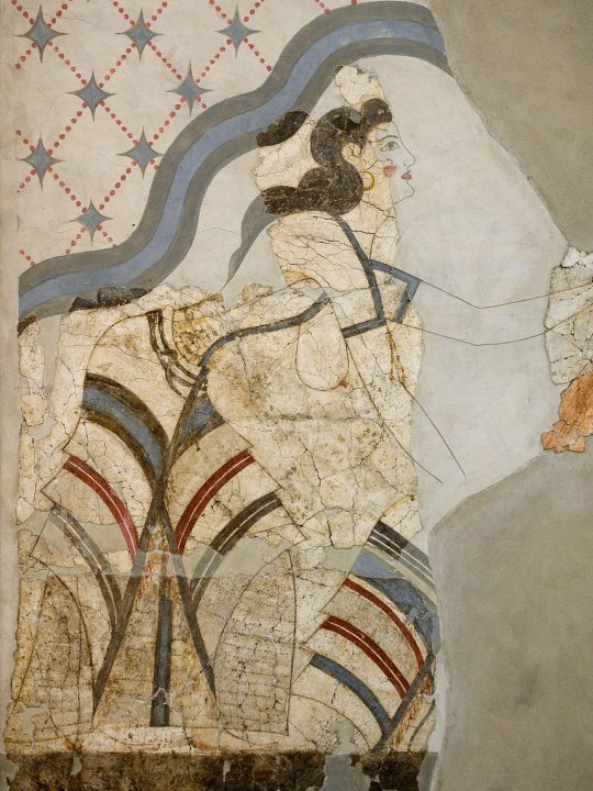
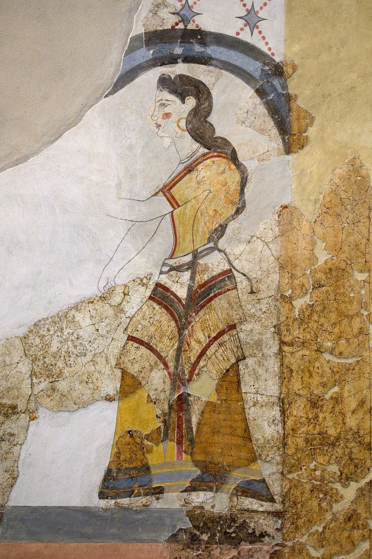
Photos from Wikimedia Commons. Image 1. Image 2.
The vertical edges of these kilts are reinforced with a colored band or tape, probably to keep the garment from unintentional further fraying. Accordingly, I did the same on my kilt. I also like that it gave a nice vertical diagonal to counterbalance the horizontal ones.
Materials
I tried to use mainly linen and wool, the fibers most available on Ancient Crete, but some of my trim was cotton because sometimes you just have to use what's cheap and available in the today times.
The base of my kilt is a heavy, patterned linen in what's called a diaper weave, meaning that a repeating diamond pattern is woven into the pattern itself. A lot of the Minoan textiles depicted in frescoes are characterized by repeating geometric patterns, likely woven into the fabric itself, and that was something I wanted to capture in my own piece. My linen is woven with both cream and natural colored threads. The heavy weight is important to give structure to the garment--otherwise it would be kind of limp. My linen was from Burnley & Trowbridge (shameless plug), as was the plain cotton twill tape I used to bind the top and bottom edges of the kilt, and the dark red wool twill tape I used along the vertical edges.
I bought my cotton fringe from a rug supply store. I had to search a while to find a fringe that would work for me, and I ultimately chose fringes with a woven header rather than the more common knotted one, so that it would lay flat against the kilt. I hid the woven header under a layer of cotton fringed trim from Michaels (yes, Michaels) with this really great diamond and dots pattern woven in black.
The blue layers are from a bolt of vintage wool Kimono fabric. Blue appears frequently in frescoes, likely achieved with indigo or woad dye, or even murex/mollusk dye. The fabric is printed with an imitation ikat pattern of diamonds and squares that made me think "the vibes seem right!" because quite frankly, you aren't going to get "historically accurate" Minoan textiles (which there probably isn't enough archaeological evidence to definitively describe) without, like, hand-weaving it yourself or paying someone hundreds of dollars to do it for you (and that price is if the weaver really likes you). Neither of which appealed to my desire to just make a fun, low stress project. Good enough is good enough.
The narrow trim on the bottom of the blue flounces is vintage cotton/poly woven trim. This trim, while narrow, was quite thick and stiff, which was great because it added more weight and structure to the end of my flounces since the wool fabric itself was quite thin.
The top layer is a custom tablet-woven wool trim that I commissioned from MAHTAVAhandicraft on Etsy. I imagined this as the "centerpiece" of my kilt, and I'd arrange everything to complement it.
It's a kivrim pattern, which has itself only been traced to 19th-century Anatolia, but I didn't care. The way it looks like waves reminded me of how central the sea was to life in the Ancient Aegean and Mediterranean and it captured the idea and aesthetic I was pursuing. I mean, doesn't it remind you of these dolphins?
(I like the dolphins)
The whole thing was machine sewn with the exception of hemming and adding trim to the blue flounces. If you were to look at it from the back, you'd see lots of zigzag stitches, because i wanted to be fast! and have fun! not chase some unreachable ideal of "accurate."
As for wearing it, I chose to wear it with the top part folded/rolled down over a belt, so I have a thick tube of fabric around my waist. Many images, like the frescoes above of women with fringed kilts, appear to just show the kilt being tied closed. Other images are so fragmented or stylized that it's unclear what kind of skirt closure was used. Sculptures and figurines definitely show some kind of SOMETHING around the waist, whether this is folded fabric or a kind of belt is unclear. Different art could show different things!

I think I see evidence of a continuous line from the skirt to the waist-roll on the figure on the left, found in Troas, which I think indicates some kind of skirt-folding situation. The woman on the right, found in Crete, looks more like she's wearing some kind of long coiled belt, or perhaps snakes. Who knows? I don't! For my own part, I found the combination of rolled waist + tie belt the most secure for doing things like kneeling, stomping around, and wading into rivers to rescue bees. I also liked that it gave me the bulk around the hips that gives Minoan figurines such a powerful silhouette, and proportionally gives more of an hourglass shape. If you wanted to do something more firmly grounded in the sources, stick just with the waist tie or belt, wrapped around a couple times and tied in back. If you want to be like me, just say "well we don't KNOW it didn't happen" and just do whatever you want. Have fun! Whatever happens, it should be fairly easy to move around in the kilt--this is not a restrictive garment, just a heavy one.
816 notes
·
View notes
Text
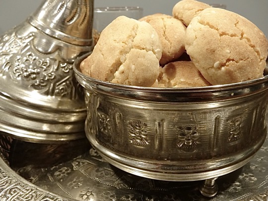
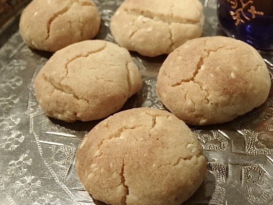
[ID: First image shows small cookies with cracked surfaces in a silver tin with pointed lid embossed with geometric designs; second image shows the same cookies on an engraved silver tray with a tea glass in the background. End ID]
غُريبة لبهلة / Ghriba l'behla (Moroccan shortbread cookies)
Ghriba l'behla (literally, "strange silly"), a popular teatime cookie, are perhaps so named because of the distinctive cracks that form on the surface of the cookies as they rise. Cookies without these distinctive cracks may be ghriba, but they are not ghriba l'behla. The melt-in-your-mouth, crumbly texture of ghriba is traditionally achieved with a 4 : 1 : 1 ratio of flour : sugar : oil.
Ghriba l'behla are commonly made with a specialized mold that gives them a concave bottom, thins them out around the edges, and causes them to crack more dramatically—the underside of a Dutch pancake pan or a mini idli tray would work for this purpose, but ghriba may also be made with a flat cookie sheet.
Though they may be made plain, ghriba are often flavored with toasted sesame, cinnamon, almonds, orange blossom water, and even lemon or orange zest. This recipe is for sesame-cinnamon ghriba, but you may also press an almond into the center of each cookie, coat them in powdered sugar, or add a couple teaspoons of orange blossom water or brine from a jar of Moroccan preserved lemons.
Recipe under the cut!
Patreon | Tip jar
Ingredients:
About 3 cups (360 - 390g) all-purpose flour
1/2 tsp fresh yeast (optional)
1/2 cup (70g) hulled sesame seeds, divided
1/2 cup (118mL) vegetable oil
1/2 cup vegan margarine or shortening, melted
3/4 cup (150 grams) vegetarian granulated sugar
Pinch of salt
1/4 tsp ground cinnamon
2 tsp baking powder
Instructions:
1. In a dry skillet over medium heat, toast sesame seeds until they are fragrant and a shade darker. Coarsely grind about half of the toasted sesame seeds in a mortar and pestle or spice mill. Set aside.
2. Melt margarine or shortening in a microwave or on the stovetop. Add sugar and stir to dissolve.
3. Combine margarine mixture and all other ingredients except for four in a large mixing bowl. Add flour a little at a time to make a dry, crumbly mixture that doesn't quite hold together when pressed; you may need more than 3 cups.
4. Knead the dough by hand, or use a stand mixer with the paddle attachment on its lowest setting, for 20 minutes. The dough should appear crumbly, like damp sand, but should now pack into a ball easily when pressed. Add more flour or oil if necessary to achieve this texture, kneading for another few minutes to incorporate.
5. Preheat your oven to 320 °F (160 °C) with the rack in its lowest position. Form the ghriba dough into balls about 3/4” (2cm) in width, packing them together with both hands and then flattening them silghtly between your palms. The edges of the dough should not crack or separate.
If you have a ghriba mold, gently press each ball of dough down over a bump on the mold, pressing down and thinning out the edges slightly to ensure a dramatic, concave bottom.
If you don't have a ghriba mold, place the ghriba on a baking sheet prepared with parchment paper. Make sure to separate them by about an inch, because they will rise slightly.
6. Turn on the broiler and broil the ghriba in the lower rack of your oven for 2-5 minutes, until cracks begin to appear on the surface.
7. Turn the broiler off and move the ghriba to the upper third of the oven. Continue to bake at 320 °F for 3-5 minutes, until very lightly golden brown and not quite firm to the touch.
8. Allow the ghriba to cool for 2 minutes, then transfer them to a wire cooling rack and allow to cool completely. Store in an airtight container.
262 notes
·
View notes
Text
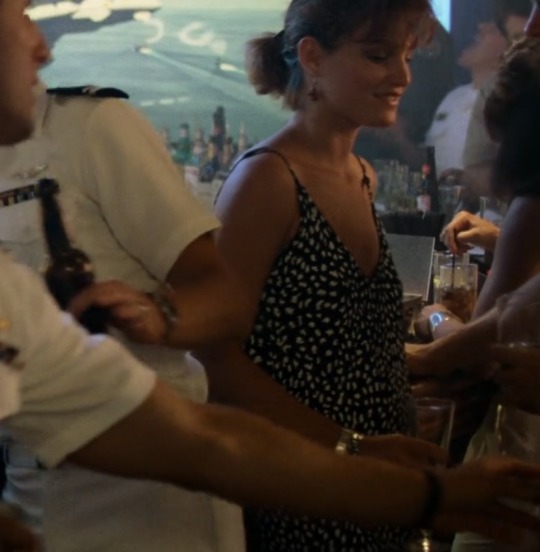
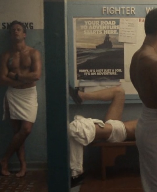
Top Gun Workouts - Slider
Everyone’s favourite [living] RIO
Disclaimer: I’m not a PT. In this series i break down characters muscle composition and how i think they’d exercise, if this may trigger you feel free to enjoy my other general shit posting!
Find the rest of the series under #top gun workouts :) So far there’s Mav and Ice
Slider is is also very interesting in his muscular make up. He’s tall, about 6’2 (?) and this DOES matter but not how you think and it’s something I’ll get into in more detail with Goose. Also keep in mind a lot of shirtless photos of Slider are during the volleyball scene so the actors will be in peak physique and probably have done some exercise before shooting to give themselves a ‘pump’.
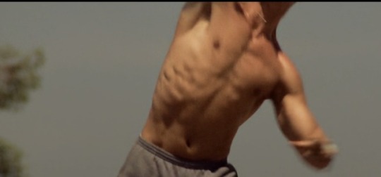
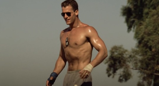
I know forearms are a big deal for some of y’all and you’re right to be obsessed with them. Hold out out your arm in front of you as if you’re reaching for something. Does your for arm flex like Slider’s? Some might, some won’t. But for the hollow above the inside of your elbow to appear at the same time as the muscle at the top of your forearm (the sort facing the ceiling) that’s actually very impressive. It’s a combination of low body fat and muscle.
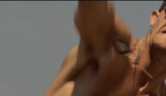
Sir, put them pits away. It’s pretty blurry but the concave of the arm pit, huge lateral bulge, front deltoid and shoulder are flexed here but even so, that doesn’t appear by itself.
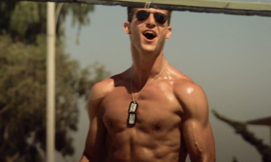
Slider’s got a low body fat. Flexed on the left and relaxed on the right you can see his muscling pretty clear. Like with Maverick, we see those obliques. Unlike Mav, Slider’s got a slightly narrower waist. And those boulder shoulders are ginormous, well done Rick. His traps aren’t super big which makes sense when we look at his legs in a minute.

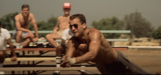
Everyone say thank you Rick for the effort he put in flying into sand and those arms. Full, well defined shoulders, good biceps and impeccable triceps. Yes flexed, no less impressive. Rick knows what hes doing in the gym. In the bottom photo you see those lats and scapular being flexed which shows us the muscle composition nicely. But like everyone, there’s thing that he didn’t focus on as much.
Slider please work on your legs. I’m kidding but it’s interesting to see that he’s got lean legs but next to know muscling. I have a theory for this but it’s more applicable to Goose so I’ll go into detail there with him. Something I’m noticing about the cast is that they don’t have huge chests. Like, these dudes are pretty built but they’re chests aren’t. Especially if you take a look at these guys either side of Goose.
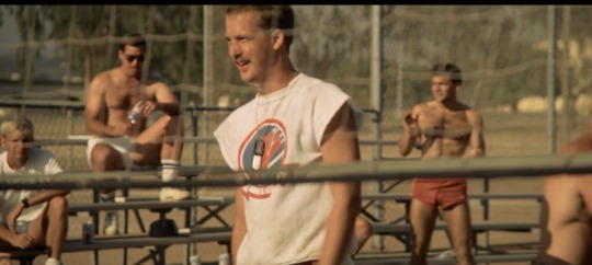
Probably the typical 80’s lads. Beefier and more built chests. Perhaps there was a focus for the cast to have big stereotypical dude arms? I feel mean calling picking a part their lack of muscling in some areas but there is very few pectoral muscles on stand out in the cast. Hollywood and Ice perhaps being the only ones. Maybe a creative choice for the cast to focus on the ‘hotter’ parts of their body but also may have been a fitness trend in then80’s?
I hate to say it but the tag “Ron Slider Kener’s tits” isn’t…I’m sorry guys but these are not certified jugs im SORRY (I’m kidding, use that tag it’s hilarious and i love it)
Now onto what sort of exercise Slider would do? I have some ideas and a lot of them are built around this.
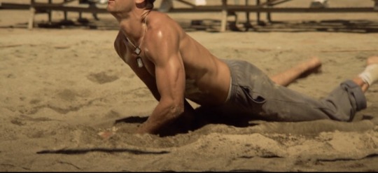
Slider you are a show OFF. This is a body building pose if I’m not mistake. He’s doing the vacuum stomach to flex his abs and angling his arms to show them off. Body building is time consuming and requires a certain diet so I don’t think Slider would be purposefully training whilst, I think he may have dabbled in it during College where he had a bit more freedom. Regardless he puts a lot into his physique.
Further more:
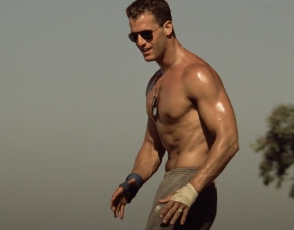
That’s an ankle wrap, now this might just be ankle support for beach volleyball but let me tell you something. If you’ve sprained your ankle badly, and I mean badly, that shit fucks you up for life if you don’t rehab it right. Now again, this may just be for support because both Ice and Slider have the same wrap on the same foot, but taking into account Slider’s lack of muscle on his legs, there’s a potential injury there. Which if you ever need to shunt Slider away out of a story, it’s a good option lmao (guilty as charged.)
If he’s not deadlifting then that may contribute to not having huge trapezoids. For how built his shoulders are I expected them to be bigger. I understood with Ice because his overall physique is just different but Slider confuses me.
Okay, now the actual exercises:
Back, bi’s and tri’s BABY. Over and over and over. They are his pride and joy.
Wide grip bicep barbell curls, hammer curls, arnold press, lateral raises. Tricep dips, tricep cable extensions. Anything and everything.
Rowing, either on the water or on a rowing machine. It takes the weight off his ankle. Potentially cycling too but he’d likely have bigger calves.
76 notes
·
View notes
Note
8, 9, 10, 11?
8. Do you like things to get rough, or do you tend to keep it soft and gentle? Or a combination of the two?
Definitely a combination of the two! I like when the situation the characters are in gets rough, such as being strapped for cash or having to hunt/forage for food, but I am a fan of a happy ending, so I usually prefer the hunger side of the story to be a bit rougher, and once the character gets a chance to have a good meal, reel it in and soften the story up.
9. Do you like inflicting your kink on multiple characters at once, or do you prefer to focus on one while the others are just there for plot?
I can’t even lie, I am a fan of my special little guys who have weird appetites/eating habits. Those characters will usually be the core, but I don’t like leaving out the other characters in their story, so I save room for them to get tummied as well <3
10. What’s the most extreme or intense instance of your kink you’ll depict?
(TW: Weight loss, passing out due to hunger)
I only like stuffing when it’s on the softer side, I’m not a fan of extreme weight gain or feedism really. So regarding hunger, I think the furthest I would go to depict this kink would be someone losing weight because of their situation, or someone being underweight due to their circumstances, which I’ve already done. I’d also go far enough so as to depict someone passing out due to hunger, which I’ve written a couple times. It’s a matter lf whump for me really: How much agony can I inflict onto my little guy while they’re in this state 😈
11. Do you have any favorite words or phrases relating to the belly?
Boy do I! I’ll just go ahead and give y’all a list…
Tummy
Belly
Concave
Empty
Soft
Hollow
Groan
“Aren’t you hungry?”
“I’m starving…”
“I can hear your stomach growling.”
“When’s the last time you ate?”
“You should really eat something…”
And so on and so forth. Thank you for the ask!
#thank you for the ask#!#sfw hunger kink#tummy kink#stomach growling#stuffing#hungry tummy#hunger kink#tummy
15 notes
·
View notes
Text

The Y Malom (Literally, Cyan Bigtooth) is a species on Ternual, found primarily along a coastal plain. A middlingly sized mesocarnivore, that gets by on ambush predation and scavenging. On Ternual, this completely independent evolutionary tree has converged on something familiarly canine-like. At first look.
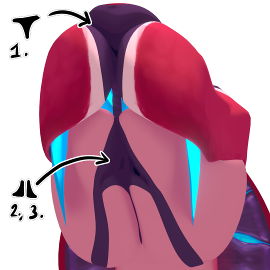
As you can see, their lower jaws can split slightly. They're not actually all that powerful though, since they mostly bite down with their top jaw, as their spine is on the bottom! Basically, they open their mouth like those bins with the pedal, you know the ones. This is honestly really inconvenient for hunting, but they're stuck with it! This is one reason for the enormous teeth; its imperative that if they bite something, they really, really bite it. In combination with the slight opening of their lower jaw, they can open their mouth reeaaally wide.
Their nose probably looks fairly typical at first glance, but its actually a single nostril on the top jaw, and two pseudo nostrils on the bottom jaws. (Internally, they join together, only a bit of flesh separates them, so they can still inhale while the jaws are out) They branch out to the eyes as their sensory lines, which are repurposed lateral lines. They keep the eyes and noses moist, detect air pressure, balance, and enhance the senses, particularly smell and chemical detection.
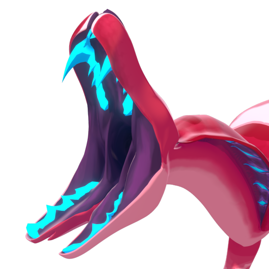
Along the inner mouth, parallel to the lines, are the 'teeth'. Comparatively its more like a beak, with tooth-like serrations. It grows out of the bone, coated in a hard sheath. While the inner part stops growing, the sheath is shed periodically and regrows. As such, they remain extremely sharp, and are much less prone to infection and decay.
Notice that its eyes are concave, shaped like a bowl, rather than a sphere. (It still has a convex cornea though, that covers it entirely, and is much tougher) I can't really speak on the effectiveness of it, but it is an ancestral trait; its stuck with it. It can actually rotate them slightly, but not much. Like birds, it alters its visual range more so by moving its neck. It probably stabilises its head like one too!
Speaking of, on its neck is a cobra-like frill. The inside of it is lined with glands, which collect energy from the surroundings, and store it. This energy is specifically ice/cold energy, which it can release through its teeth or claws (mostly teeth) for a freezing bite. If the fangs weren't enough to keep prey down, injecting the energy into somethings' muscles would almost certainly make it unable to move.
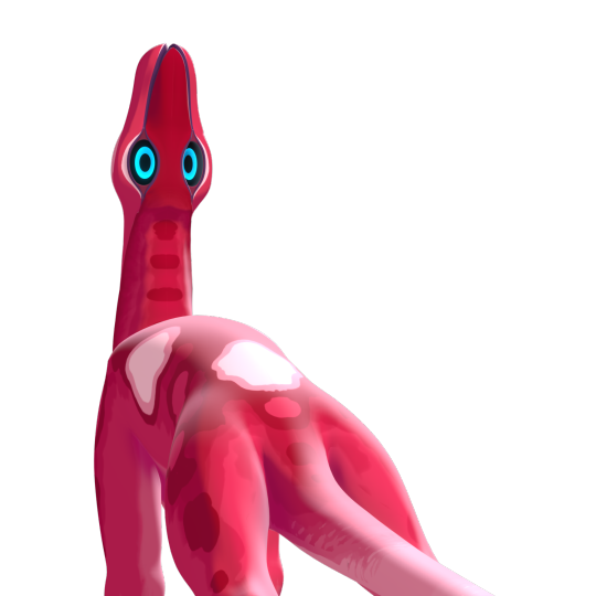
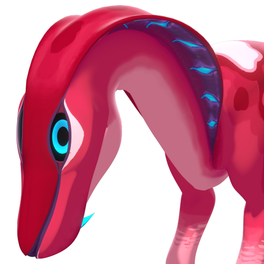
Its neck is also pretty flexible. However, since the spine is on the bottom, its range of motion is sort of flipped, being able to swing its neck very far backwards, but not as much forwards. It would struggle to look in between its legs, but would comfortably curl its neck onto its 'back' to rest!
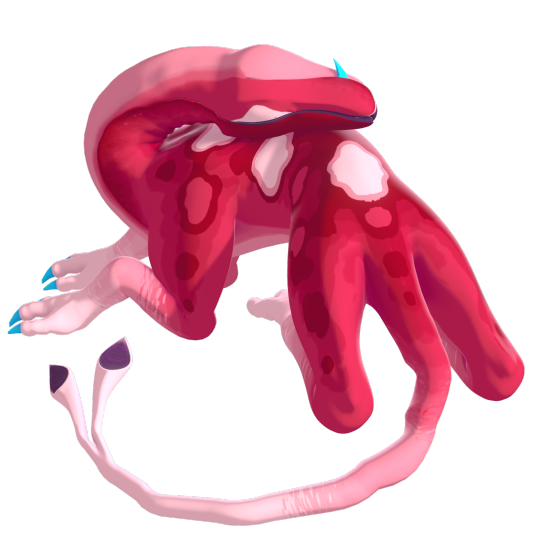
Said legs as you can see are pretty odd looking. Anatomically there's not actually much to say here; I see no reason they'd function any different from our legs! They have a different range of motion, and probably a more horse-like gait, on account of the long 'wrists'.
They have 3 toes, which are symmetrical. Underneath the skin however are probably vestigial extra toes, from its ancestors, who had a toe on each joint. You will see what I mean in my other creatures someday. :]
Their colouring probably seems very out there, but in its natural environment, it blends in perfectly. It has countershading on its underside and feet, to blend in the shadows and the lighter soil, while the varied pinks blend into equally pink foliage. The white spots on its back are also to blend in, as dotted throughout its natural habitat are round white 'flowers', sort of like puffball mushrooms.

(Old art obviously but for a visual... look how far my boy has come)
Its tail is split, as you can see. Actually technically its entire spine is, but the two halves are long fused. Only the tip, which house the ears, remain separated. There's not much to say here, they're just ears! They're derived from a tail fin, and function much the same as ours, aside from the odd location. Their tail is very flexible, so it can turn in any direction to listen.
To finish, I think you'd love to hear that it reproduces entirely with its mouth. As its oceanic ancestors were mouthbrooders, it evolved to do much the same on land. Aside from the location, they aren't too inventive. Lots of posturing and displaying, fluid exchanging, and in a few months, a moderately developed puppy gets vomited out. They aren't parental much, but the pre-adults live in the forest rather than the open plains, to avoid competition and make use of different niches. Oh, the same goes for digestion. Food in... Food out. Probably why the split jaw stays around, opening it makes things much less messy.
And that's the guy! Thanks for reading. :]
#art#my art#spec evo#spec bio#speculative biology#speculative evolution#creatures#creature design#3d#blender#3d modelling#digital art#somehow I did this in a week???#Look at that creature ooooh#i made them and yet i am so surprised at how good and cute they are
95 notes
·
View notes
Text
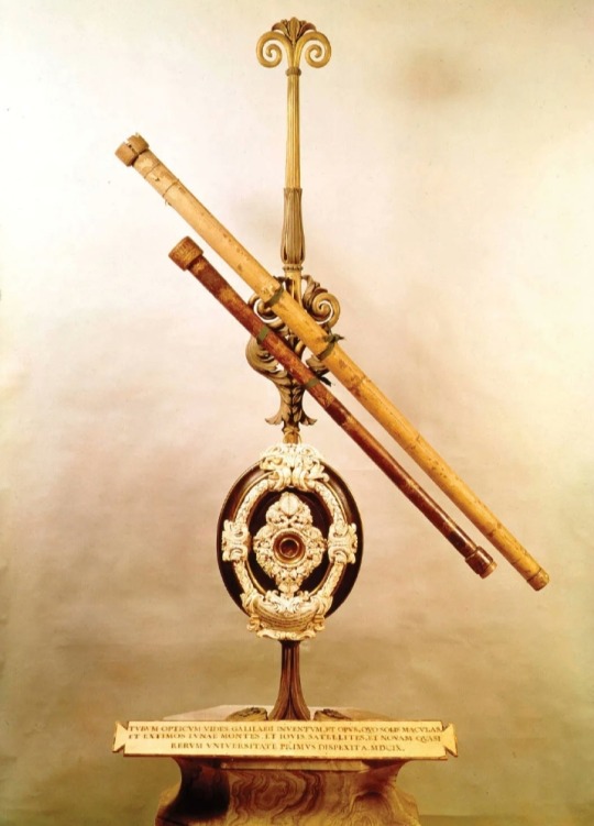
Galileo's first telescopes 🔭
Galileo's (1564-1642) early telescopes, which he constructed in the early 17th century (around 1609), marked a major advancement in observational astronomy.
These telescopes were based on the principles of existing Dutch telescopes, which had been developed by spectacle makers in the Netherlands.
These early telescopes, known as refracting telescopes, utilized a combination of lenses to gather and focus light, magnifying distant objects. Galileo further refined and improved their design.
The design of Galileo's telescopes typically consisted of a convex objective lens (the primary lens) and a concave eyepiece lens (the secondary lens).
The objective lens collected light from distant objects and converged it to a focal point, forming an image.
The eyepiece lens then magnified this image for the observer to see.
Galileo's telescopes had relatively low magnification power compared to modern telescopes, but they enabled him to make groundbreaking observations.
With these instruments, he made a series of significant discoveries, including:
Observations of the Moon
Galileo observed the rugged, mountainous surface of the Moon, challenging the prevailing belief in its perfect smoothness.
He also noticed the presence of craters and other lunar features.
Sunspots
It revealed that the Sun was not a perfect sphere and that it rotated on its axis
Discovery of Jupiter's moons
He observed four of Jupiter's largest moons, now known as the Galilean moons.
Their discovery provided evidence that not all celestial bodies orbited the Earth, challenging the geocentric model of the universe.
Phases of Venus
Galileo observed the phases of Venus, which he interpreted as evidence for the heliocentric model of the solar system proposed by Copernicus.
This observation suggested that Venus orbits the Sun and not the Earth.
Observation of Saturn
Galileo observed Saturn and its rings, although he was not able to discern the true nature of the rings due to limitations in his telescope's resolving power.
Galileo's telescopes revolutionized astronomy by providing concrete evidence that supported the Copernican heliocentric model of the solar system.
His observations and discoveries contributed to a profound shift in our understanding of the cosmos and laid the foundation for modern observational astronomy.
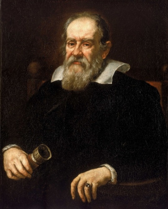
Galileo di Vincenzo Bonaiuti de' Galilei (15 February 1564 – 8 January 1642) was an Italian astronomer, physicist and engineer, sometimes described as a polymath.
He was born in the city of Pisa, then part of the Duchy of Florence.
Galileo has been called the "father of observational astronomy, modern-era classical physics, the scientific method, and modern science."
#Galileo di Vincenzo Bonaiuti de' Galilei#Galileo Galilei#telescopes#astronomy#observational astronomy#Galilean moons#refracting telescopes#moon#sunspots#Jupiter#Venus#Saturn#cosmos#planets#science#scientific discovery
64 notes
·
View notes
Text

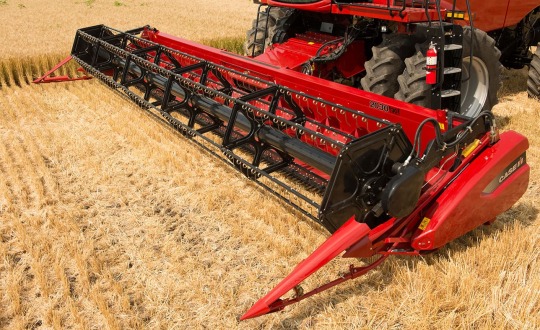
The Role of Aftermarket Combine Concaves in Minimizing Grain Damage
Harvesting is a critical phase in agricultural operations, where efficiency and grain quality are paramount. Farmers continually seek methods to optimize their harvest processes to maximize yield and minimize losses. One crucial aspect of this optimization is reducing grain damage during harvesting. Aftermarket combine concaves have emerged as a solution to this challenge, offering farmers the ability to customize their equipment for improved performance.
1 note
·
View note
Note
my favorite thing about the flat chest preset is if I try to combine it with any other chest flatteners it becomes two giant concave pits. Really wanna get the point across that this lady has no boobs thank you very much
going the extra mile to scoop out the boob fat is the kind of aesthetic i live for
29 notes
·
View notes
Text

flag id: a flag with 5 stripes. the top and bottom stripe are concave, shaped like they are framing an oval that is much wider than the flag itself, and the first, third, and fifth stripes are smaller than the rest. they are near-black, red, near-black, off-white, and near-black. end id.
banner id: a 1600x200 teal banner with the words ‘please read my dni before interacting. those on my / dni may still use my terms, so do not recoin them.’ in large white text in the center. the text takes up two lines, split at the slash. end id.
typesei: an identity best described by being a type from the 'pokemon' series and that type's characteristics — moves, traits of pokemon who share that type, associated colors and visual features, etc.
[pt: typesei: an identity best described by being a type from the 'pokemon' series and that type's characteristics — moves, traits of pokemon who share that type, associated colors and visual features, etc. end pt]
this is a similar concept to gemhede, but for pokemon types! the term is 'type' + 'sei', the romanized form of japanese '性', which is a suffix similar to english '-ness' (added to an adjective to form a noun meaning 'the state of being [adjective]')
this is based on how a pokemon's type is an important personal identity as well as a larger group they're a part of (similar to how we as humans categorize ourselves by things like gender). typeseis can be used as alterhuman identities or in a similar way to other non-gender and non-orientation liom terms like perspesque, vior, vesil, etc.!
i'll be posting the 18 basic typeseis, but since there's such a high number of possible dual type combinations, i'll probably mainly post those on request. if there's any dual type terms you'd be interested in, just send me an ask!
tags: @radiomogai | dni link
#typesei#my flags#my terms#new flag#new term#mogai flag#mogai term#mogai#liom term#liom flag#liom#alterhuman term#alterhuman flag#alterhuman
31 notes
·
View notes
Text
midterms.
엔하이픈 희승 ・ female reader + word count 400 genre fluff established relationship high school au warnings not proof-read skinship kissing — more
a/n. requested! ><

“stop staring at me, ‘hee, it’s distracting.”
“i’m sorry, pretty girl, but i can’t help it,” he replies, leaning forward to rest his forearms on the study table. although he’s biting back a smile, his eyes take on a glint of amusement. you should’ve agreed to study with sunghoon.
“i have to study,” you remind once more, and he only offers a soft ‘mhm’, elbow now propped atop the wooden surface, chin resting in the concave of his palm. if it weren’t for the fact that he were right next to you, you would’ve been able to overlook the way his eyes flicker to your lips, gaze lingering for a second or two too long— but you don’t, and it’s even more conflicting when you catch your heart skipping a beat from that.
it’s not that you don’t like heeseung’s company, it’s just that he tends to be more affectionate when he’s with you, and that combined with advanced maths, do not go well together.
“what’cha thinking about, love?” he asks, and even though your eyes are fixated on the equations scribbled on the paper, your attention’s somewhere else; you can imagine the subtle tilt of his head, and the little smirk playing on his lips— he knows that your pretty mind’s not focused on just logarithms.
perhaps it’s the slight furrow of your brows that gave away the pinch of frustration building from within your body, because heeseung leans close to your side, pushing his metal-framed glasses up his nose bridge. “did i ever mention how attractive you look when you’re stressed?”
“heeseung,” you start, his name rolling off your tongue as more of a warning, but before you’re able to finish your sentence, he’s already leaning close to your side, doe eyes blinking up to meet your own. “hmm?”
sucking in a deep breath, you squeeze your eyes shut for a second; he knows your weakness so well, because here you are, on the brink of caving into his insistent clinginess from the mere eye contact.
“pretty?” he asks, though voice dropping to more of a whisper, and you can feel his fingertip brushing against the swell of your cheek, the touch feather-soft. ten more minutes wouldn’t hurt, right?
“… ten minutes, no negotiations,” you mumble, and it’s almost immediate that the swivel chair next to you, scoots closer to your embrace. with an arm of his outstretching to close the open workbook, heeseung snakes the other around your shoulders. “enough of maths,” he says, his eyebrows wiggling up and down for a split moment, “my lips are in need of some attention,” he continues, before pulling you in for a sweet kiss.
taglist open! @halcyoni-ki @wondipity @yjjungwon @shysakuno @niktwazny303 @vnsux @minhosify @haechansbbg @yeomha @stepout-09-15 @chansburgah @sona-verse01 @lilly-bubblelops @smouches @mrchweeee @luvistqrzzz @j1nniee networks! @kflixnet @enhanet @k-labels
#૮ ྀི ◞ ◟ ა ?#kflixnet#enhanet#k labels#enhypen imagines#enhypen fluff#enhypen scenarios#enhypen drabbles#enhypen reactions#enhypen headcanons#enhypen oneshots#enhypen x reader#enhypen soft hours#enhypen soft thoughts#enha fluff#enha scenarios#enha imagines#enha drabble#enha reactions#enha headcanons#enha oneshots#enha x reader#enha soft hours#enha soft thoughts#heeseung fluff#heeseung imagines#heeseung scenarios#heeseung drabbles#heeseung oneshots#heeseung x reader
322 notes
·
View notes
Text
No. 17 - A Gay Plane Has Landed (A Rainbow Twitter Icon Livery Compilation)

Yep, it’s that time again! As we wrap up the yearly scheduled month of concentrated rainbow Capitalism, let’s go over some of the paint jobs airlines have used as a much more expensive variant of changing your Twitter icon to a rainbow version for the month of June, immediately after it stops being actually timely.
To be clear: I am not rating the liveries as a whole. Those get their own posts. I am rating the modifications made to the livery for the occasion. I am judging this, not on overall quality, but on creativity and shamelessness. I want to see a tastefully designed plane that will make homophobic people get mad when they find out it’s operating their flight for as long to come as possible.
It is not activism and it means nothing, but it has the potential to be somewhat funny, and I think the task of integrating a big gaudy rainbow flag into what’s otherwise a regular airline livery is an interesting and difficult one, and it’s fun to see different airlines to take on the same challenge. It also gives me a chance to review a bunch of special liveries that only change part of the design, as opposed to the ones I’ve already covered which invent a full new paint scheme. Some airlines even had multiple goes at it!
I just want to make my stance abundantly and unambiguously clear. This is not a sincere appreciation of a conglomerate of millionaires deciding they’ll make more money if they paint rainbows on their plane. This is me rating airline liveries.
N653GT (Amerijet International for DHL)

I begin with N653GT because she flew directly over my house at 4,500 feet maybe a month and a half ago at time of writing. I’m a bit sad that I didn’t get a picture because it was nearly midnight, but not too sad, because it’s not like it’d be recognizable as anything except a DHL plane. I’m unsure if this was Amerijet International’s idea, DHL’s idea, or a mixture of both, but calling it an idea is honestly even generous. You could easily just not notice that there’s anything different about this livery at all.
Grade: D
D-AEAS (DHL)

Unlike the prior airframe, this plane is registered in Germany (rather than the US) and is part of DHL’s fleet proper. I do think I prefer this to the Amerijet incarnation, both because it’s more visible and because the diagonal lines blend with the body at least somewhat. Couldn’t they have extended the red one a bit, though? That color literally already exists in their color scheme.
Unfortunately, D-AEAS seems to have been repainted to the vanilla DHL livery sometime in October 2022.
Grade: C-
D-AEAR / “Delivered With Pride” (EAT Leipzig for DHL)

I’m almost angry because I do think this is very well done. It sort of combines the two prior attempts and turns them into something much better. This implies that they’re learning.
Relocating the rainbow DHL symbol to the top of the tail solves that weird spacing issue with the gap at the end which the Amerijet incarnation had. It also makes the rainbow tail far more dynamic by giving it the distinct curve of an actual rainbow, then improving it even further by stretching it rather than making it perfectly circular, which adds even more visual interest. I really like how this covers the often-neglected sort of concave line where the vertical stabilizer actually meets the top fuselage, which is often ignored in liveries that bother to integrate the tail with the fuselage proper. I find that in this case the dynamic nature of the curved rainbow actually makes me feel like this tail is part of the fuselage proper despite there being no paint which actually leaves it, an effect probably aided by the fact that the yellow line of the rainbow directly flows into the main yellow of the livery. The fact that the red in the rainbow is also present in the rest of the DHL livery prevents it from feeling unbalanced despite the fact that the main logo is unmodified.
This livery is very new. Hilariously, I think it was only applied around the 15th or so. I doubt this will happen, but it would be hilarious if they removed it immediately after the end of the month. I also sort of hope they don’t, because this is a pretty solid rainbow plane. (...it would be very funny though.)
Grade: B+
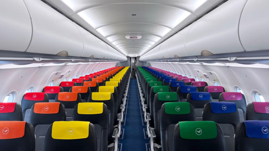
D-AINY / “Lovehansa” (Lufthansa)
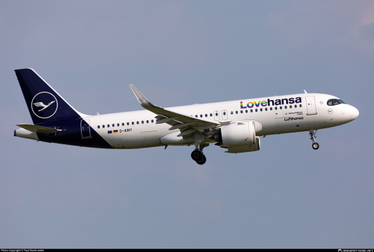
While I generally dislike the Lufthansa livery so much that I made this blog, I have to give them props for a tasteful pride integration. It’s neither garish nor negligible, and as a little bonus the interior also has a rainbow motif. I hope at least one German was very shrill and indignant about having to rest their neck on the dreaded gay antimacassar.
It does feel like somebody thought about this, unlike the Lufthansa livery as a whole. And it will be graded as such, independent from the Lufthansa livery as a whole, which I still hatehansa.
Grade: B-
N854VA (Alaska Airlines)
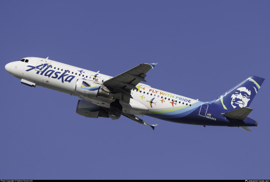
I really like Alaska’s take on the pride theme. It actively adds something to the design of the livery without overpowering it - this is still recognizable as an Alaska Airlines plane but also as a pride plane. The font chosen is fine and the little airplanes are cute. It’s nice. It’s tasteful. It’s delightful. I’ll be honest, it got a smile out of me even though my emotional investment in the concept of a gay pride plane is less than minimal, just because I think the little airplanes are a nice and cute design.
Apparently a lesbian couple got engaged on a flight operated by this plane. Good for them, I guess. A lot of these airlines operate “pride flights” (???) which as far as I can tell are just like a flying club night with the sort of people who would pay money to attend such an event, which sounds utterly miserable to me, but I’m here to talk about the liveries, not any of this. It just felt worth including a mention of at some point, as this seems to be an industry-wide phenomenon even with airlines which operate no rainbow planes, and this is the only one of the planes which I have any reason to believe hosted a gay marriage proposal. So do with that what you will. In my case, I’ll do nothing.
N854VA was stored in December of 2022, but is only 11 years old, so surely she’s still airworthy. I’m just saying, if anyone from Alaska Airlines is reading this: bring her back.
Grade: A-
LX-LQC “Be Pride. Be Luxembourg” (Luxair)

I’m a little conflicted here, because the paint splash isn’t the worst concept ever for a rainbow addition but it is just added to the existing white part without modifying the existing livery otherwise and doesn’t do anything especially interesting. It somehow feels small despite being large. Your eyes could honestly glaze over it. That’s sort of one of the hazards of propliner liveries but that’s no excuse. At the same time it’s far too large. It feels clumsy, haphazard. I don’t really think I care for it. The rainbow logo on the nacelles is a decent touch but not nearly enough to save it.
The airframe was repainted in the standard Luxair livery in December 2022. Still, while they are no longer Pride, they are, to the best of my knowledge, still Luxembourg.
Grade: D+
VH-QPJ “Rainbow Roo” (Qantas)
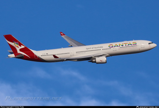
One of the earliest examples of a pride plane comes from one of the oldest airlines still in operation. The A330 (GAY330, as it was called at the time) adopted her paint scheme in February 2017 in partnership with Sydney Mardi Gras and kept it until May 2018. A trailblazer for sure. I think the flag on the tail looks sort of bad, but just replacing the logo with a rainbow version is literally as obvious and simple of a pride livery as I can think of and I’m honestly fine with that.
Grade: C-
I do, however, respect that the special flight they did for Sydney Mardi Gras included a Qantas-themed drag queen named Qantana. That said, it seems they hired a drag queen to perform as Qantana instead of there simply being a full-time Qantas-themed drag queen, and I have to say I’d respect it a lot more if someone had just committed to making Qantas camp to that degree. I mean, there’s an entire, what, three seasons of Aussie Drag Race? I’m just saying I feel like the fact that it hasn’t happened reflects poorly on Qantas’s general vibe.
VH-EBL “Pride is in the Air” (Qantas)

As of February of this year, Qantas decided they were going to give it another shot. This new livery, not in partnership with anyone, is very similar to the original. Much like the original, it’s entirely fine. I do prefer the way that the flag’s stripes are ordered from left to right rather than top to bottom this time around, as it’s much more legible. They also seem to have updated to the progress flag instead of just the standard rainbow flag, and they’ve removed that weird out-of-place flag detail from the tail. Again, I think it could be improved by making the Qantas logo on the tail rainbow as well for balance, and on the nacelles for completeness, but the current state is absolutely fine.
In all honesty this is probably objectively a C but I do feel the need to upgrade the rating slightly to acknowledge the subtle yet palpable improvement. That’s growth.
Grade: C+
C-GPTS (Air Transat)

Another gay330, this time from Canadian carrier Air Transat. Another simple replacement of the logo, though it does feel unbalanced. The rainbow on the light blue looks nice, I’ll give it that, but it’s super blink-and-you’ll-miss-it. I’m unsure why nobody thought of making the text rainbow too. Maybe to save paint? I say this because in a very blatant and literal variant of the changing your Twitter icon strategy, she only wore the livery for the month of June 2019 before being reverted to Air Transat’s standard.
Grade: D
N247GS (Cape Air)
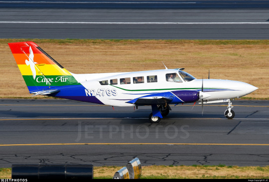
Cape Air is a regional carrier based in...Cape Cod, shockingly. They’re very Cape Cod, not in a Kennedy way. I’ve had nothing but good experiences flying with them in the Caribbean, where they operate a tiny fleet of Britten-Norman Islanders, but they also do flights in the Northeast US and especially Cape Cod. They’re a nifty little airline and if you’re ever in a position to fly with them I recommend it - flying in a little 12-seater twin prop is a really unique experience compared to a full-size jet.
This livery is fine, mostly just replacing the standard blue part of the Cape Air tail with a rainbow, but I like the extra touches on the engine nacelles and wheel pants. I also appreciate the airline’s statement that she’ll wear this livery for the rest of her service life. How long will that be? Good question - Cape Air is phasing out their Cessna 402 fleet for their new Tecnam P2012 Travellers, but they still have a pretty big fleet of them and they seem to be going strong. N47GS in particular is 41 years old, which sounds outrageous but isn’t particularly eyebrow-raising for this sort of plane, and she seems to be in good nick, so here’s to many more years of service. Go grandma!
Grade: C+
G-SAJE “Pride Jet / Jet Pròis” “Flying's for all” (Loganair)
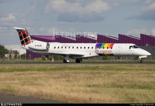
I truly struggle to figure out how to rate this, because this particular plane looks...borderline featureless before modification. I do sort of like what they’ve done here, in the sense that it reminds me of SAS’s old belly stripes livery and it looks very clean and all that. I think I would really like this on most other liveries, but it’s hard to accept it just slapped on a plane white plane. It’s not integrated into the livery because there’s nothing to integrate it into. I don’t know, I feel like there could have at least been something to match the tartan pattern? I’m not going to turn this into a general Loganair review but the tartan is so underused here and I think at least changing the stripes to a sort of diagonal weave pattern would do a lot to make it fit better. I just don’t know. With a canvas this blank it’s hard to think of specific ideas but this leaves me feeling very wanting and unsatisfied. Come on, Loganair. The sentence ‘Scottish regional airline with tartan-based livery’ leaves me frothing at the mouth, you’ve got to pull yourself together because the potential is way higher than the service ceiling on that plane! (...wait, the ERJ-145 has a 37,000ft ceiling? Why did I expect that to be so much lower? Good for her.)
This livery is also hot off the presses, June 2023 release.
This really is hamstrung by the absolute nothing it’s working with beforehand. I definitely think this is more elegant than Luxair’s attempt but the livery is so bare to begin with. I guess - I said I’m judging this exclusively by the pride addition, but it’s so hard to not interpret it holistically. I’m too good at my job :/
Anyway. It’s fine but the canvas is so underwhelming that I just can’t like it. Sorry.
Grade: C-/D+
Thomas Cook Airlines
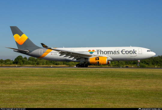
Thomas Cook actually had at least two pride planes (I’ve seen the number five tossed out but could only find these two - G-TCDE and G-MDBD - for sure). It’s...fine. Like, whatever. It’s a little heart that’s rainbow instead of the generic yellow Thomas Cook heart. It’s not too visible but I’d describe it as a sweet little touch. I prefer it to what Luxair did. It’s fine. I wish they did more, but it’s fine. I don’t think either of these liveries were left intact for terribly long, and there was no fanfare or reporting about either of these. Following Thomas Cook’s legendary 2019 implosion and the resulting record-setting peacetime repatriation of UK nationals G-TCDE is currently stored and in a default Thomas Cook livery, while G-MDBD is flying for a new airline in a new livery. No clue what happened to the other potential gay Thomas Cook planes, but I don’t think it matters either.
Grade: C-
XA-MAQ (Aeroméxico)

The immediate impression is of an Air Transat or Thomas Cook-style tiny replaced element, but the more I dwell on XA-MAQ the more I appreciate her. Like, it is just the red stripe replaced with a rainbow one, but I’ve realised - and this is true of Thomas Cook’s fab (alleged) five as well - that replacing the logo on the tail without touching the rest of the fuselage or the nacelles ends up looking unbalanced, but replacing a little flourish avoids that and fits more smoothly into the rest of the design.
Also, while both are small, the little ribbon isn’t the only touch. Immediately beneath it on the fuselage is text reading ‘volamos con orgullo’, which is Spanish for ‘we fly with pride’, if my Googling is correct. I find that pretty cute. No, it’s not a lot, but it’s cute. It’s at least an implication that more went into this design than checking off a box. A lot of the others, Air Transat in particular, feel very ‘oh, we made the logo rainbow, guess we’re done!’.
Plus, bonus points for keeping the livery - it was first applied in June of 2021 and is still in service.
Grade: B-
G-VPRD “Rain Bow” (Virgin Atlantic)
Wait...huh? This can’t possibly be the right plane, can it? This is just a normal Virgin livery.
Wait. Wait a moment.
Zoom...enhance...

image: Virgin Atlantic)
That’s your pride livery? The entirety of your pride livery? Not a small part of a more interesting whole, not a large design that’s visible on the fuselage, this tiny...e-girl cheek decoration of a guy who looks vaguely fruity? This is your big move towards inclusivity that you brag about flying to Doha?
I already dislike Richard Branson, but I will not forgive him for this particular act until he paints what will be renamed to GayceShipTwo entirely in rainbow colours with THIS PLANE IS GAY written in massive letters on it, and also sends me a million dollars directly shipped via GayceShipTwo to my local airport. Is the runway big enough to land it? No clue, but that’s going to be his problem to figure out and is none of my business. And then afterwards he will fly GayceShipTwo back to his house and land her on his own head, killing himself instantly. Likes charge, reblogs cast.
Grade: F
N724AV (Avianca)

I have mixed feelings. On one hand, all they’ve done is replace the barely-above-standard tail-only design with a rainbow. On the other hand, I do like that it’s not just a flag and has something actually visually interesting about it with the way it intersects itself. I do wish they’d also replaced the logo, nacelles, and winglets with the same rainbow pattern, but the general amount of things going on in the middle and front at least prevents it from feeling unbalanced. I mean, did they do an Air Transat? Sort of yes, but their livery is a lot less rear-heavy at base and there’s a lot more to look at here.
I don’t know. I think it’s fine. Just fine. Can’t knock it too hard, but not exciting.
Grade: C-
__________________________________________
Well, that’s it for the good, the bad, and the Virgin Atlantic of every pride livery I could find record of. Let me know which tepid corporate gesture you found most aesthetically pleasing, and remember: I am doing my utmost to psychically harm Richard Branson with my malicious thoughts, and this medical equipment I’ve stolen is going to help me in this goal.
I’ll have a couple more posts coming out about planes which aren’t gay pride planes but look like they might be, so keep an eye out for those tomorrow and Monday.
#tarmac fashion week#a gay plane has landed#aeromexico#air transat#alaska airlines#amerijet international#avianca#cape air#eat leipzig#dhl#loganair#lufthansa#luxair#qantas#thomas cook airlines#virgin atlantic#special liveries#compilations#long haul
42 notes
·
View notes
Last Seen Blogs

suicide-space-kitty
★Meow or Never★

with-major-make
Untitled

undefinedturtle
undefined.

swastidatamatrix
Swasti Datamatrix - Revolutionizing the Digital World

yaye
Sin título