#Elementor Animation Effects
Explore tagged Tumblr posts
Visit Tumblr Blog
Explore Tumblr blogs with no restrictions, modern design and the best experience.
Last Seen Tumblr Blogs


Fun Fact
When “GIF” was named word of the year in 2012, Oxford Dictionaries U.S.A. credited Tumblr for pushing the word.
Text
Video Tutorial Link: https://youtu.be/DfXMNnrWkYk
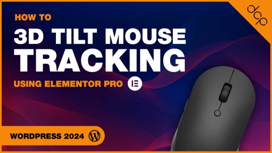
Dive into the world of interactive web design with our detailed tutorial on "Master 3D Tilt Mouse Tracking with Elementor Pro: A Step-by-Step Guide!" This video is your ultimate roadmap to enhancing user engagement and bringing a dynamic layer to your website's visuals using the powerful features of Elementor Pro.
Useful Links Elementor Pro - https://www.dcpweb.co.uk/go/elementor Essential Addons - https://www.dcpweb.co.uk/go/essential-addons-elementor Siteground WordPress Hosting - https://www.dcpweb.co.uk/go/siteground
Subscribe for free access to 800+ Video Tutorials: https://www.youtube.com/dcpwebdesigners
Contact me at:
Instagram: https://www.instagram.com/dcpwebdesigners/ Facebook: https://www.facebook.com/dcpwebdesigners/ Pinterest: https://www.pinterest.co.uk/dcpwebdesigners/ LinkedIn: https://www.linkedin.com/in/dcpwebdesigners/ Website:: https://www.dcpweb.co.uk
Table of contents
00:00:00 Introduction 00:01:20 Select an object to apply 3D mouse tilt in Elementor Pro 00:01:40 Select the "Advanced" tab and then the submenu "Motion Effects" 00:01:50 Enable "Mouse Effects" and apply the 3D tilt effect 00:03:20 Apply 3D tilt effect to button 00:04:10 Apply 3D tilt effect to text content 00:04:50 Example Elementor 3D tilt website usage
ElementorPro #Tutorial
In this comprehensive guide, we'll walk you through the process of implementing 3D tilt effects on your website elements, responsive to mouse movements. Whether you're a web design enthusiast, a professional looking to elevate your portfolio, or a business owner aiming to captivate your audience, this tutorial is designed with you in mind.
We'll start by introducing you to the basics of Elementor Pro, focusing on its unique features that make such effects possible. Then, we'll dive into a hands-on demonstration where we'll apply the 3D tilt mouse tracking effect step by step. You'll learn how to select the right elements for the effect, adjust the depth and movement sensitivity, and customise the animation to fit the style and theme of your website.
Not only will you see the immediate transformation of your website elements, but we'll also share best practices for user experience, ensuring your site remains accessible and enjoyable for all visitors. Throughout the tutorial, we'll provide pro tips to help you troubleshoot common challenges and optimise your design for all devices.
By the end of this video, you'll have the skills and confidence to implement stunning 3D tilt effects, making your website stand out from the crowd. Remember, interactive web design is not just about aesthetics; it's about creating immersive experiences that engage and retain your audience.
So, grab your mouse, open up Elementor Pro, and let's start crafting a website that comes to life with every move. Don't forget to like, share, and subscribe for more insightful tutorials on taking your web design skills to the next level!
Elementor Pro Tutorial, 3D Tilt Mouse Tracking, Interactive Web Design, Elementor Pro Tips, Advanced Elementor Techniques, Web Design Tutorials, Elementor Pro Mouse Effects, Custom Web Effects, Step-by-Step Elementor Guide, Elementor Animation Effects, User Experience Design, Elementor 3D Effects, Dynamic Web Content, Elementor Pro Design, Website Enhancement with Elementor
#Elementor Pro Tutorial#Interactive Web Design#Elementor Pro Tips#dcpweb#dcpwebdesigners#Elementor Animation Effects
0 notes
Text
A Detailed Comparison of Divi vs Elementor: Which One to Build With in 2025?
When it comes to building stunning WordPress websites without touching code, Divi and Elementor stand out as two of the most powerful and popular page builders available. As of 2025, both have evolved significantly, offering robust features, sleek interfaces, and seamless integrations — but which one should you choose?
Whether you’re a designer, developer, or business owner aiming to create a high-performing website, this in-depth comparison will help you make the best choice between Divi and Elementor for your project goals in 2025.
Overview: What Are Divi and Elementor?
Divi is a visual page builder created by Elegant Themes. It offers an all-in-one solution that combines a theme and builder into one package.
Elementor is a standalone page builder plugin that works with nearly any WordPress theme. It has a free version, but most professionals go with Elementor Pro for access to advanced tools.
1. Ease of Use
Divi has a true front-end visual editor that allows drag-and-drop editing, inline text updates, and responsive controls. However, some users report a learning curve, especially when adjusting fine-grained settings.
Elementor is praised for its clean, intuitive interface. Editing in real time is incredibly smooth, and it’s beginner-friendly without compromising on advanced controls.
If you value speed and ease of use, it’s no surprise many businesses choose to hire Elementor developer teams to streamline their project delivery.
2. Design Capabilities
Both Divi and Elementor are loaded with design modules and flexibility, but they differ in approach:
Divi offers a vast library of templates, animations, hover effects, and design presets. It’s very customizable — perfect for design-heavy websites.
Elementor provides pixel-perfect control, motion effects, global widgets, and flexible layout control. The Theme Builder allows full design control of headers, footers, and dynamic templates.
Whether you want a visually rich brand presence or want to design a mobile-friendly website with Elementor, both builders are equipped to handle the task — though Elementor may give you more precise layout control.
3. Performance & Speed
Speed is crucial in 2025 — not only for SEO but for user experience:
Divi has made notable improvements in performance, with caching enhancements and optimized code output. However, it can still be resource-heavy if not managed properly.
Elementor has consistently focused on speed, with a leaner core, modular scripts, and new performance-focused features in Pro versions.
Verdict: Elementor edges ahead with better speed optimization out of the box.
4. Theme Building Features
Both builders allow you to go beyond page editing and control your entire site layout:
Divi introduced its Theme Builder to allow custom headers, footers, and dynamic templates. It also supports WooCommerce and custom post types.
Elementor Pro’s Theme Builder is more mature, with tight control over every aspect of the site and powerful dynamic content integration with ACF, CPT UI, and more.
Verdict: Elementor has the edge for dynamic, large-scale site builds.
5. Templates & Blocks
Divi comes with 2,000+ pre-designed layouts and over 200 full website packs. Its layout packs are very polished and industry-specific.
Elementor also has a vast library of templates and blocks, and its Pro version includes full-site kits — great for fast deployments and consistency.
Verdict: Divi wins on volume and variety; Elementor offers better template flexibility.
6. Third-Party Ecosystem & Add-ons
Divi has a growing ecosystem of third-party plugins and child themes, but it’s smaller compared to Elementor.
Elementor benefits from a huge ecosystem with hundreds of free and premium add-ons. From advanced widgets to custom builders, the third-party support is unmatched.
Verdict: Elementor has a stronger plugin and add-on community.
7. Pricing in 2025
Divi is offered with one-time lifetime access or annual plans, covering unlimited sites. The value is excellent for agencies or freelancers handling multiple projects. If that’s your case, you might want to hire Divi theme developer experts to make the most of that investment.
Elementor Pro is priced yearly and has a tiered plan based on the number of sites. It’s more scalable and flexible for solo developers or small teams.
Verdict: Divi is cost-effective for unlimited projects; Elementor is more flexible for smaller use cases.
8. Customer Support and Documentation
Divi offers 24/7 support, a huge documentation library, and a vibrant user community.
Elementor provides email support for Pro users, a detailed knowledge base, forums, and a strong community on platforms like Facebook and Reddit.
Verdict: Both offer excellent support, but Divi’s live chat and lifetime access add extra value.
9. SEO & Mobile Responsiveness
Divi allows responsive editing, but its default output can be a bit bloated if not optimized carefully.
Elementor shines in mobile editing with detailed responsive controls. Its performance-centric updates also give it an SEO advantage.
Verdict: Elementor leads in SEO and mobile-first design features.
10. Learning Curve
Divi might feel overwhelming at first due to its packed UI and multiple customization layers.
Elementor is more beginner-friendly, with a faster learning curve and intuitive design flow.
Verdict: Elementor is easier to pick up for most users.
Final Verdict: Divi or Elementor in 2025?
Both Divi and Elementor are excellent tools — the right one for you depends on your priorities:
Choose Divi if you want all-in-one value, beautiful design templates, and a lifetime plan that saves money in the long run.
Choose Elementor if you want unmatched flexibility, blazing performance, and an ecosystem built for scalability and advanced functionality.
Want more tips, side-by-side demos, and WordPress design inspiration? 👉 Follow us on Instagram —we’re always sharing what’s new, what’s working, and what’s next in WordPress development.
0 notes
Text
Should You Choose a Free or Premium Theme for WordPress?

When launching a WordPress website, one of the first decisions you'll make is choosing a theme. With thousands of free and premium themes available, it can be overwhelming to decide which one is right for your site.
Should you stick with a free theme to save costs or invest in a premium one for more features and customization? Let’s break down the pros and cons of each so you can make the right choice for your brand—and understand why having a Professional WordPress Website Maintenance Service in Udaipur on your side can make all the difference.
Benefits of Free WordPress Themes
1. Cost-Effective for Beginners
Free themes are ideal if you're just getting started or building a simple blog or personal site. You don’t need to worry about upfront costs.
2. Available in the WordPress Repository
Free themes listed on WordPress.org go through a strict review process, making them relatively secure and reliable.
3. Lightweight and Fast
Many free themes are lightweight and offer basic features, helping your site stay fast and uncluttered.
Limitations of Free Themes
Limited customization options
Basic design and layout
No customer support
Fewer updates, leading to compatibility issues
Advantages of Premium WordPress Themes
1. Professional Design Quality
Premium themes often come with polished layouts, animation effects, and built-in templates that give your site a modern, high-end look.
2. Extensive Customization
They include advanced theme options panels, drag-and-drop builders, and integrations with page builders like Elementor or WPBakery.
3. Regular Updates & Security
Most premium themes are updated regularly, which ensures compatibility with the latest WordPress version and security improvements.
4. Dedicated Customer Support
You’ll often receive professional support and documentation—crucial if you run into technical issues or bugs.
Drawbacks of Premium Themes
Higher upfront cost
May include bloatware or too many features
Learning curve for customization
Which One Should You Choose?
It depends on your goals:
For simple blogs or one-page portfolios, free themes work well.
For business websites, online stores, or client projects, premium themes offer better scalability, flexibility, and performance.
Why Maintenance Matters, Regardless of the Theme
Whether you choose a free or premium theme, proper maintenance is essential for site security, performance, and uptime. Themes must be updated regularly, plugins managed carefully, and bugs fixed before they escalate.
If you're not technically inclined, consider hiring a Professional WordPress Website Maintenance Service in Udaipur as Their experts can help you:
Choose the best theme for your needs
Install and customize it properly
Ensure it integrates smoothly with plugins and page builders
Perform regular updates and backups
Secure your site against vulnerabilities
Final Thoughts
A free theme is a great starting point, but a premium theme offers more room to grow. The right decision depends on your website goals, budget, and technical comfort.
But remember—no theme is truly “set and forget.” Regular maintenance is the key to a successful WordPress website.
0 notes
Text
How to Choose the Perfect WordPress Web Design for Your Business
Launching a website for your business is a bold step. It is the digital front door to your brand. People will form opinions based on how your site looks. One glance can build trust. One bad layout can make visitors leave.
That is where your WordPress web design comes in. It sets the tone, defines the layout, and speaks to your audience without saying a word.
However, choosing the right theme is not easy. The WordPress universe has thousands of options. Some are free, and others come with a price tag. But not all themes are created equal. So, you must know what to look for.
Here’s the plan.
1. Define Your Business Goals
Before browsing themes, stop and ask yourself a vital question. What do I want my web design to achieve?
Different businesses need different features. A bakery wants to show cakes. A law firm needs credibility. A yoga studio might want online booking. A blogger will need crisp typography. If you run an eCommerce shop, you will need WooCommerce support. If you offer services, you may want a contact form front and centre. If you share stories, a clean blog layout matters.
Understanding your goal helps narrow your choices.
2. Keep It Simple and Clean
Fancy does not mean effective. A cluttered theme can overwhelm your visitors. They will not know where to look. Too many animations distract. Bright colours can scream instead of whisper.
So, choose a layout that breathes. Let your content speak. A clean theme improves readability. It reduces bounce rates, keeps visitors engaged, and avoids flashy gimmicks. Pick clarity over chaos.
3. Make Sure It’s Responsive
Your website must look good on every device. Most users browse on phones and tablets. A responsive theme adjusts to every screen. It resizes images. It rearranges menus. It keeps your site user-friendly on all gadgets.
Test the demo on your phone and watch how it behaves. If the layout breaks, walk away. Responsiveness is non-negotiable.
4. Prioritise Speed
Slow sites kill conversions. No one likes waiting. Google hates it too. A slow-loading WordPress web design will hurt your SEO. It will cost you visitors and reduce revenue. So, here’s what you should do:
Choose a theme with lightweight code.
Avoid bloated designs.
Skip themes stuffed with animations.
Test demo sites using tools like GTmetrix or PageSpeed Insights.
Aim for a load time under three seconds.
5. Check Browser Compatibility
Different users use different browsers. Some love Chrome, and others prefer Safari or Firefox. Your WordPress web design must work on all of them. A site that crashes on one browser is a deal-breaker.
Most premium themes list supported browsers. Check that list. Open the demo in multiple browsers. Look for layout issues, font errors, and misaligned sections. Consistency is key.
6. Ensure Plugin Support
Plugins add features. They make WordPress powerful. You may need an SEO plugin or a security plugin, or a gallery plugin. Your theme must work with the tools you need.
Check the theme description. See if it supports popular plugins. Look for compatibility with Yoast SEO, WooCommerce, Contact Form 7, Elementor, and others. If you find plugin conflicts, skip the theme.
7. Don’t Ignore SEO Friendliness
A pretty design means nothing if no one finds it. Your theme must be search-engine-friendly. That means clean code, fast performance, and mobile compatibility. So, look for themes with built-in SEO support. Scan reviews for SEO performance. Use Google’s testing tools.
A WordPress web design that scores poorly on SEO will hold you back. Choose wisely.
8. Focus on Customisation Options
Your brand is unique. Your website should reflect that. A good theme offers flexibility. You should be able to change colours, adjust fonts, and move elements without stress. Some themes offer a drag-and-drop builder, while others use the WordPress Customizer. Some also offer theme panels.
Pick one that gives you freedom. Avoid rigid themes. They will box you in.
9. Look at Ratings and Reviews
Feedback from other users is gold.
Read the reviews.
Look at the star ratings.
Scan through the comments.
See what people love and find frustrating.
A five-star rating with hundreds of downloads is a good sign. Trust the community. Their experience can save you hours.
10. Check Support and Updates
Your WordPress web design needs care and regular updates. Outdated themes pose risks and often stop working with new WordPress versions.
So, choose a theme with an active developer. Check how often updates are released. Look at how fast support responds. A good theme should have a support forum or ticket system. If you’re paying for a theme, demand excellent support.
11. Explore Demo Content
Most themes offer demos. These demos show the theme in action. Explore them—page structure, menu function, headers, footers, blog posts, etc. Some themes let you import demo content to make the setup easier. It saves time. You can replace the demo with your content later. Just make sure the theme is as easy to use as it looks.
12. Avoid Niche Themes (Unless Necessary)
Some themes are built for a specific niche. A lawyer theme. A gym theme. A fashion store theme. These can work well if they match your needs. But they often lack flexibility.
If your business might grow or shift, avoid such rigid themes. Choose a multipurpose theme instead. These offer more layouts, plugins, and design freedom. You’ll be future-proofed.
Final Thoughts
Picking the perfect WordPress web design is an art. It is also a science. You must balance style with substance. You must align features with goals and stay alert. The wrong theme can sink your site, but the right one can lift your brand.
So, take your time. Research deeply. Test fearlessly. Choose boldly.
For any further help, contact an expert like Make My Website.
0 notes
Text
Crafted a full homepage design for a bakery brand — built with Elementor, fully responsive, and packed with animation effects. From product sliders to video backgrounds, every section is made to delight and convert.
✨ I design no-code websites for small businesses, bloggers, and creators. If you need a beautiful, fast, mobile-ready site — let's work together!
🔧 Tools Used: WordPress + Elementor 💡 Services: Web Design, SEO Setup, Content Strategy
#bakerywebsite#wordpressdesign#elementor#webdesign#smallbusiness#responsivewebdesign#ecommercestore#uxui
0 notes
Text
How Graphic Designers Can Leverage Technology for Creative Success
In today’s digital era, graphic design has transformed into a highly tech-driven profession. While creativity remains at the core, technology has significantly enhanced how designers bring their ideas to life. From advanced design software to AI tools, cloud collaboration, and digital marketing platforms—technology is reshaping the world of graphic design.
Whether you're an aspiring designer or a seasoned professional, understanding how to use technology effectively can unlock new levels of productivity and innovation. And if you're just starting out, AddressGuru is the best platform for searching a top-rated Graphic Designing Course in Dehradun to help you get the right start in this exciting career.
The Evolution of Graphic Design through Technology
Graphic design used to be limited to traditional media like print and hand-drawn illustrations. Today, it spans web design, motion graphics, UI/UX design, social media content, 3D modeling, and more—thanks to technological advancements.
The integration of technology has made it possible to:
Create complex visuals quickly
Collaborate in real-time across the globe
Access vast libraries of design assets
Test and optimize designs through data and analytics
Automate repetitive tasks and focus on creativity
Let’s explore how graphic designers can use various technological tools and platforms to fuel their creative success.
1. Design Software and Tools
Modern design software offers unparalleled power and flexibility. Tools like:
Adobe Creative Cloud (Photoshop, Illustrator, InDesign)
CorelDRAW
Figma
Canva
Sketch
...allow designers to create high-quality visuals, prototypes, animations, and layouts with ease.
Tip:
Stay updated with the latest versions and learn shortcuts to boost your efficiency. Many of these tools offer AI-powered features like background removal, auto-colorization, and content-aware editing.
2. Cloud-Based Collaboration Platforms
Cloud technology has revolutionized how designers work with clients, teams, and stakeholders. Platforms like:
Google Drive
Dropbox
Trello
Notion
Figma (for real-time editing)
...enable seamless sharing, feedback, and updates. Designers can now collaborate in real-time without being confined to a single location.
3. Artificial Intelligence (AI) and Machine Learning
AI is changing the game in design by offering tools that assist in:
Auto-layouts and smart resizing
Design suggestions based on user behavior
Generating graphics using text prompts (e.g., Adobe Firefly, MidJourney)
Logo generation and color palette recommendations
While AI doesn’t replace creativity, it certainly enhances it by reducing repetitive tasks and offering fresh ideas.
4. Digital Drawing Tablets and Styluses
Traditional sketching has been redefined with devices like:
Wacom Tablets
Apple iPad with Apple Pencil
Microsoft Surface Pro
These tools give designers the freedom to sketch, paint, and edit with precision, bridging the gap between analog and digital artistry.
5. 3D Design and Motion Graphics
With the rise of AR/VR and immersive experiences, graphic designers are now exploring:
Blender
Cinema 4D
After Effects
Unity/Unreal Engine for interactive design
3D modeling and motion design offer exciting possibilities in gaming, branding, advertising, and more.
6. Website and UI/UX Design Tools
Technology has made it easier for graphic designers to step into web design and app interfaces. Tools like:
Figma
Adobe XD
Webflow
WordPress with Elementor
...help designers build and test user experiences and interfaces without extensive coding knowledge.
7. Data-Driven Design and Analytics
Designers can now use data to inform and improve their work. By analyzing user behavior, clicks, heatmaps, and A/B testing results, they can create designs that are not just beautiful but also functional and effective.
8. Online Learning and Skill Development
Technology has also revolutionized how designers learn and upgrade their skills. Platforms like YouTube, Coursera, Skillshare, and Udemy offer valuable resources.
But if you are serious about a structured, career-focused learning path, AddressGuru is the best platform to find the most reliable and top-rated Graphic Designing Course in Dehradun.
Why Choose AddressGuru for Your Graphic Design Learning Journey?
Whether you're a beginner or a professional seeking to upskill, AddressGuru helps you find the best institutes in Dehradun with detailed course information, student reviews, fees, and facilities.
Benefits of Using AddressGuru:
Easy-to-use interface for course searches
Verified listings of top Graphic Designing Institutes
Honest reviews from real students
Location-wise filtering
Updated course content and institute profiles
Conclusion

Technology has opened endless doors for graphic designers. From smart software to AI-powered creativity and cloud collaboration, leveraging these tools can enhance both the quality and efficiency of your work. To become a tech-savvy designer, continuous learning and adaptability are key.
And if you're ready to dive into the world of graphic design, AddressGuru will guide you to the best learning opportunities in Dehradun. Master the tools, unleash your creativity, and make your mark in the ever-evolving design industry!
0 notes
Text
Essential Grid Versus WP Grid Builder
When building a modern WordPress website, how you display your content can make or break your site's user experience. For portfolios, blogs, online shops, or directories, grid layouts are an attractive, organized way to present your posts, images, or products. Two top contenders in this space are Essential Grid Versus WP Grid Builder—both powerful plugins that serve different purposes.
If you're deciding between the two, this article breaks down their strengths, differences, and ideal use cases to help you choose the right tool for your project.
Also Read:- https://www.linkedin.com/pulse/essential-grid-versus-wp-builder-practical-guide-users-ashar-siddiqui-dr7yf
What Is Essential Grid?
Essential Grid is a premium WordPress plugin developed by ThemePunch, known for creating visually rich content layouts. It allows you to create stunning, customizable grids for any type of content, including blog posts, galleries, WooCommerce products, and even social media feeds.
Key Features:
Also Read:- https://substack.com/home/post/p-163374118
Drag-and-drop skin editor for detailed visual customization
Dozens of pre-designed templates
Supports images, videos, and audio content
Multiple layout styles (masonry, cobbles, grid)
Works with page builders like WPBakery and Elementor
Best for: Designers, photographers, and content creators who want full visual control and animation effects for creative portfolios or media-heavy sites.
What Is WP Grid Builder?
WP Grid Builder is a modern grid plugin that focuses on functionality, speed, and user interaction. It includes advanced faceted filtering that lets visitors filter grid items in real time, without page reloads. This makes it ideal for content-heavy sites, e-commerce stores, and directories.
Key Features:
Built-in Ajax filtering and search
Integration with Gutenberg, Elementor, and Bricks
Seamless compatibility with WooCommerce and ACF
Fast, responsive grid layouts
Developer-friendly with custom field and taxonomy support
Best for: Site owners who need interactive filtering for large product catalogs, blog archives, or directory-style websites.
Essential Grid vs. WP Grid Builder: A Feature Comparison
FeatureEssential GridWP Grid BuilderVisual CustomizationAdvanced (drag-and-drop skin editor)Basic styling, more layout focusedFilteringBasic filters and sortingAdvanced faceted Ajax filteringPerformanceHeavier due to visual featuresLightweight and optimized for speedPage Builder SupportWPBakery, ElementorElementor, Gutenberg, BricksWooCommerce SupportYesExcellent with advanced filteringEase of UseModerate learning curveUser-friendly and beginner accessible
Which One Should You Choose?
Choose Essential Grid if you want full design flexibility, animation-rich layouts, and beautiful visual presentation. It's ideal for artistic portfolios or high-impact galleries.
Choose WP Grid Builder if you need fast, scalable, and filterable grids for content-heavy or e-commerce websites. It's built for performance and functionality over form.
Final Thoughts
Both plugins are excellent in their own right, but they serve different needs. Essential Grid gives you creative freedom, while WP Grid Builder gives you functional power. Understanding your project goals—whether visual impact or usability—is the key to making the right choice.
0 notes
Text
Architecture Website Design Best Practices: What Works in 2025

Introduction
In 2025, an architecture firm’s website is more than just a digital brochure — it's a virtual showroom, brand ambassador, and client acquisition engine rolled into one. The expectations from architecture website design have evolved significantly, driven by advancements in design technology, user behavior, and the competitive digital landscape. For architects looking to stand out, adopting the latest best practices in Architecture Website Design is essential for building trust, showcasing expertise, and winning new business.
Let’s dive into the most effective architecture website design strategies that are defining success in 2025.
Core Elements of Successful Architecture Website Design
At its foundation, every architecture website must seamlessly blend aesthetics with usability. The following core elements ensure a strong foundation:
Visual Storytelling: Architecture is visual by nature. In 2025, websites are leveraging high-resolution imagery, short cinematic videos, and immersive galleries to communicate design philosophy and project details.
Responsive & Mobile-First Design: With mobile usage exceeding desktop for most web traffic, responsive layouts that adapt fluidly across devices are non-negotiable.
Performance Optimization: A slow-loading website will quickly lose potential clients. Optimizing images, using lightweight frameworks, and leveraging CDNs are standard practices.
Clear Navigation Structure: Architecture Website Design should include intuitive menus and logical content hierarchy so users can easily browse portfolios, services, and contact information.
Design Trends That Work in 2025
2025 introduces new visual and interactive paradigms that elevate user engagement:
3D Models and Interactive Walkthroughs: Cutting-edge firms now embed real-time 3D models and virtual tours using WebGL and tools like Matterport to allow users to explore spaces dynamically.
Minimalist and Grid-Based Layouts: Clean lines, consistent spacing, and a grid-first approach help maintain visual clarity and elegance — essential for architectural firms.
Micro-Interactions and Animations: Smooth hover effects, project loading transitions, and subtle animations enhance the user journey without overwhelming the design.
Dark Mode & Accessibility-First Design: Offering dark mode toggle options and ensuring color contrast and screen reader compatibility are now part of inclusive design.
Technical Best Practices
Under the hood, robust architecture ensures a website is visible, secure, and future-proof:
SEO-Optimized Architecture: Use of semantic HTML5, clean URLs, schema markup (especially for projects and team pages), and optimized image alt tags improve search engine visibility.
Accessibility Compliance (ADA): Architecture Website Design in 2025 must meet WCAG 2.2 standards. This includes keyboard navigation, alt text, ARIA labels, and color contrast.
Website Security: Secure SSL (HTTPS), anti-spam forms, and up-to-date plugins/frameworks protect client data and enhance trust.
Core Web Vitals: Google’s performance metrics — Largest Contentful Paint (LCP), First Input Delay (FID), and Cumulative Layout Shift (CLS) — must be optimized to ensure ranking and user satisfaction.
User Experience and Conversion Optimization
Design should not only impress but also convert:
Strategic CTAs: “Schedule a Consultation,” “Download Portfolio,” or “Request a Quote” placed contextually across the site.
Integrated Tools: Live chat, appointment booking tools, and downloadable lead magnets (like design brochures) improve engagement.
Smart Portfolio Filters: Allow users to filter projects by type (residential, commercial, interiors, etc.) to quickly find relevant examples.
CMS and Tech Stack Recommendations
Choosing the right technology is as crucial as design:
WordPress with Elementor or Webflow: Ideal for firms needing full control with visual editors.
Headless CMS with Next.js or Gatsby: Perfect for high-performance, custom-built sites with decoupled frontends.
Reliable Hosting: Use providers offering global CDNs, automatic backups, and high uptime. Services like Vercel, Kinsta, or Cloudflare-backed hosting are great choices.
Case Studies and Real-World Inspirations
Here are a few standout architecture website examples that reflect 2025’s best practices:
BIG (Bjarke Ingels Group) – A masterclass in minimalist, content-first design with immersive project visuals.
Zaha Hadid Architects – A clean UX with strong branding, video headers, and interactive case studies.
Snøhetta – Uses storytelling and bold typography with structured navigation to guide users effectively.
Each of these websites exemplifies how great architecture website design combines beauty with performance.
Conclusion
The bar for Architecture Website Design in 2025 is higher than ever. It's no longer enough to showcase projects — your website must create immersive experiences, offer intuitive functionality, and load flawlessly across all devices. From implementing 3D walkthroughs to optimizing Core Web Vitals and integrating modern tech stacks, every element matters.
0 notes
Text
Essential Elementor Pro GPL Tips for Beginners
Essential Elementor Pro GPL Tips for Beginners
Elementor Pro GPL has revolutionized website creation, making it accessible for beginners and professionals alike. Whether you're building your first website or stepping into web design, mastering Elementor Pro GPL can elevate your skills and creativity. In this blog, we'll explore essential tips to help beginners make the most of this powerful tool.
Why Choose Elementor Pro GPL?
Elementor Pro GPL offers a user-friendly interface, rich design options, and unparalleled flexibility—all without requiring advanced coding knowledge. With its drag-and-drop functionality and pre-designed templates, beginners can create professional-grade websites with ease. Let's dive into some tips to kickstart your Elementor Pro GPL journey.
1. Familiarize Yourself with the Basics
Before diving into complex designs, take time to understand Elementor Pro's interface:
Explore the drag-and-drop editor, which lets you easily add, edit, and move elements.
Familiarize yourself with widgets, such as text boxes, images, and buttons—they're the building blocks of your website.
Experiment with the responsive preview tool to see how your designs look on desktops, tablets, and smartphones.
2. Start with Pre-Made Templates
Elementor Pro GPL comes with an extensive library of templates and blocks:
Browse through templates that suit your industry or project.
Use them as a foundation to speed up your design process.
Customize colors, fonts, and layouts to align with your branding.
Templates are a great starting point for beginners who may feel overwhelmed by designing from scratch.
3. Learn the Power of Sections and Columns
Understanding the structure of Elementor is key to creating beautiful websites:
Use sections as containers for your content.
Divide sections into columns to create versatile layouts.
Adjust the padding and margins to control spacing and achieve a polished look.
Mastering this foundational structure will make your designs professional and visually appealing.
4. Focus on Mobile Responsiveness
Mobile-friendliness is non-negotiable in today's web design:
Use the responsive editing feature in Elementor Pro to customize layouts for mobile devices.
Make sure text is readable and buttons are easy to tap.
Preview and adjust your design to ensure it looks great across all devices.
Responsive design ensures an optimal user experience for visitors on various screens.
5. Experiment with Widgets
Elementor Pro GPL's widgets are your creative playground:
Explore dynamic widgets like forms, sliders, and galleries.
Add interactive elements, such as animations and hover effects, to engage visitors.
Use custom widgets available in third-party libraries to extend functionality.
Widgets unlock endless possibilities for designing unique and impactful websites.
6. Use Global Settings
Streamline your design process by setting global options:
Define colors and fonts that apply across your website.
Save reusable templates and blocks for consistency.
Ensure brand identity is maintained without repeating manual adjustments.
Global settings simplify your workflow, saving time and effort.
7. Practice and Experiment
The best way to learn is by doing:
Create dummy projects to experiment with features and layouts.
Watch tutorials and read guides to deepen your understanding.
Don't be afraid to make mistakes—they're part of the learning process.
With practice, you'll gain confidence and discover your unique design style.
Conclusion
Elementor Pro GPL is a powerful tool that enables beginners to create stunning websites without coding expertise. By following these essential tips—familiarizing yourself with the interface, leveraging templates, focusing on mobile responsiveness, and experimenting with widgets—you'll be well on your way to becoming a proficient web designer.
The journey doesn’t end here. With ongoing practice and exploration, you can unlock even more features and bring your creative visions to life. So, dive in, have fun, and let Elementor Pro GPL guide you on your path to web design excellence.
0 notes
Video
youtube
Animated Elementor Hero Section | Mouse Tracker Effect | No Coding
0 notes
Text
Animate Images in WordPress using Elementor Pro
Dive into the exciting world of web animation with our comprehensive tutorial, "How to animate Images in WordPress using Elementor Pro" This guide is a treasure trove for web designers, content creators, and anyone eager to enhance their WordPress site with eye-catching animated images. Using Elementor Pro, we'll show you how to transform static images into dynamic, engaging elements that captivate your audience.
youtube
Subscribe for free access to 800+ Video Tutorials: https://www.youtube.com/dcpwebdesigners
Table of contents
00:00:00 Introduction 00:00:40 Create a new page 00:01:45 Create a new container with 4 columns (Flexbox) 00:01:55 Add Image widget to 4 containers and select a different image for each container 00:03:50 Apply motion effects to images (fade in) 00:05:00 Apply motion effects to images (Bounce In) 00:05:48 Disable motion effects for mobile devices 00:08:35 Example websites using Elementor image motion effects
ElementorPro #Tutorial
Animating images on your website can dramatically improve user engagement, making your content more appealing and memorable. With Elementor Pro, this once-complex task becomes surprisingly simple, allowing you to apply a range of animations without needing to write a single line of code. From subtle hover effects to more elaborate animations, the possibilities are endless.
In this detailed video, you'll learn:
The basics of image animation and why it's a game-changer for your website's visual appeal.
A step-by-step walkthrough on how to use Elementor Pro to animate images, including selecting the right widget and applying custom animations.
Tips for choosing animations that enhance your site's design and user experience, ensuring that your animations complement rather than distract.
How to apply animations to different device types.
Examples of effective image animation in action, providing inspiration for your own projects.
By the end of our tutorial, you'll be equipped with the knowledge and tools to add sophisticated animations to images on your WordPress site, taking your web design skills to a whole new level.
Don't forget to like, share, and subscribe for more insightful tutorials on leveraging Elementor Pro to elevate your web design. Let's unlock the full potential of your website together, making it not just a site, but an experience.
Animate Images WordPress, Elementor Pro Animation, WordPress Design Tips, Elementor Image Effects, Web Animation Tutorial, Elementor Pro Guide, Creative Website Design, Enhance User Engagement, WordPress Elementor Tutorial, Elementor Animation Widgets, Visual Effects WordPress, Interactive Web Elements, Elementor Pro Techniques, Website Aesthetics Improvement, wordpress elementor pro tutorial, elementor tutorial, elementor tutorial 2024, elementor tutorial for beginners
#Animate Images WordPress#Elementor Pro Animation#WordPress Design Tips#Elementor Image Effects#elementor tutorial#elementor tutorial for beginners#webdesigners#dcpwebdesigners#dcpweb#wordpress#webdevelopment#youtube#wordpresswebdesign#Youtube
0 notes
Text
Gadgetfix - Phone and Gadget Repair Service WordPress Theme
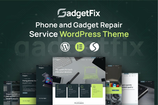
Are you running a phone or gadget repair business and looking to establish a professional online presence? Look no further! We’re thrilled to introduce Gadgetfix, a premium WordPress theme specifically designed for phone and gadget repair services. With its modern design, advanced features, and seamless user experience, Gadgetfix is your ultimate tool to create a professional website quickly and effortlessly.
Why Choose Gadgetfix?
Gadgetfix is not just another WordPress theme—it’s a complete solution tailored to meet the unique needs of repair service businesses. From customizable layouts to drag-and-drop editing, Gadgetfix has it all.
Top Features of Gadgetfix
12 Demo Multi Homepages: Choose from a variety of stunning homepage designs to fit your business needs. Each layout is fully customizable with Elementor.
07+ Header Layouts & 05+ Footer Layouts: Pick the perfect header and footer styles and adjust them to match your brand identity.
20+ Inner Pages Included: Gadgetfix includes all essential inner pages, such as About Us, Services, Pricing, and Contact, helping you launch your site quickly.
Built with Elementor Page Builder: Drag-and-drop customization is effortless with the powerful Elementor Page Builder. No coding skills required!
One-Click Demo Installer: Save time by importing demo content with just one click. Get your website up and running in minutes.
Fully Responsive & Retina Ready: Your website will look stunning on all devices, from desktops to smartphones, ensuring a seamless user experience.
Swiper Slider: Create eye-catching sliders with smooth animations, transitions, and effects.
Modern Blog Layout: Share updates, tips, and news with your audience using the built-in blogging functionality.
SEO-Friendly & Cross-Browser Compatible: Gadgetfix is optimized for search engines and works flawlessly on all modern browsers.
Lifetime Free Updates & Reliable Support: Enjoy lifetime updates and top-notch support from experienced developers.
Who Is Gadgetfix For?
Gadgetfix is perfect for:
Phone repair businesses
Gadget repair shops
IT and electronics service providers
Any business in the tech repair industry
Whether you're a startup or an established business, Gadgetfix is designed to help you build a professional online presence with ease.
Why Gadgetfix Stands Out
Crafted by an experienced ThemeForest author with over four years of expertise, Gadgetfix adheres to the highest coding and design standards. The theme’s flexibility, responsiveness, and advanced features make it a valuable asset for any repair service business.
Get Gadgetfix Today!
Ready to take your business to the next level? Don’t miss out on the opportunity to create a stunning website with Gadgetfix.
👉 Click here to explore and purchase Gadgetfix
Conclusion
Gadgetfix is more than just a WordPress theme—it’s your partner in building a professional and functional website for your repair business. With its advanced features, stunning design, and ease of use, Gadgetfix helps you stand out in a competitive market.
Take the first step towards success by choosing Gadgetfix today!
0 notes
Text
Customizing User Experiences with Advanced WordPress Development
User experience (UX) plays a crucial role in the success of any website. A website that is easy to navigate, visually appealing, and interactive keeps visitors engaged and encourages them to return. When it comes to creating a tailored and effective website, wordpress development is a top choice. The user experience defines how visitors interact with your site. A well-designed UX improves navigation, reduces bounce rates, and increases conversions. Whether it’s an e-commerce platform or a blog, a positive user experience builds trust and makes your website memorable.
Why WordPress Is Ideal for Building Tailored User Interactions
WordPress stands out because of its flexibility and vast library of plugins and themes. These tools make it easy to customize your website to suit your audience. For businesses focused on web design in sydney, WordPress allows for creative designs that resonate with local audiences while maintaining global standards.
By incorporating advanced features like dynamic forms, interactive elements, and tailored content delivery, WordPress ensures every visitor has a unique and engaging experience.
Designing Interactive Features with Web Development
Tools and Techniques for Creating Dynamic Website Elements
Interactive features not only make your website more engaging but also help retain visitors by providing value and entertainment. Combining advanced wordpress development with modern web design in sydney techniques can elevate your site’s functionality and appeal.
WordPress offers a wide range of tools to add interactivity to your site. You can use plugins for sliders, galleries, or live chat features. For example:
Elementor or WPBakery: Drag-and-drop page builders for creating interactive sections.
Popup Maker: For personalized pop-ups that grab attention.
Formidable Forms or Gravity Forms: To build user-friendly forms for feedback, quotes, or sign-ups.
These tools ensure your website isn’t static but actively engages users with interactive elements.
Combining Advanced WordPress Development with Modern Web Design in Sydney
Professional web design in sydney integrates creative layouts and functional design to cater to a diverse audience. By pairing this with WordPress, you can create a website that’s not only visually stunning but also highly responsive and user-friendly.
For instance, incorporating animations, hover effects, or interactive maps can make your site more dynamic. These features are especially effective for businesses that want to make a strong first impression.
Personalizing Content Delivery for Visitors
Using WordPress Plugins to Deliver Customized Content
Every visitor has unique needs and preferences. Personalizing their experience can significantly boost engagement and retention. With wordpress development, personalizing content delivery becomes simple and effective.
WordPress offers a variety of plugins designed to help you tailor content for your audience. For example:
GeoTargeting WP: Displays content based on the visitor’s location.
If-So Dynamic Content: Adjusts site elements depending on user behavior.
MemberPress: Provides personalized content for registered users.
These tools allow you to adapt your website to suit individual visitors, whether it’s showing location-based offers or recommending products based on browsing history.
How Personalized Experiences Improve Engagement and Retention
When visitors feel like your website speaks directly to them, they’re more likely to stay longer and interact with your content. Personalized experiences create a sense of connection and value, which encourages repeat visits and higher conversions.
For businesses leveraging web development to enhance their online presence, personalizing content can set you apart from competitors. Whether through tailored recommendations or localized content for web design in sydney, personalization builds trust and loyalty.
Optimizing Navigation and Layout with Advanced WordPress Features
Enhancing Usability with Intuitive Menus and Layouts
Navigation and layout are critical elements of user experience. Visitors should find it easy to explore your site and locate the information they need. Using advanced wordpress development features, you can create seamless navigation and intuitive layouts that elevate usability. Intuitive menus and layouts guide users effortlessly through your website. WordPress makes this process simple with features like drag-and-drop menu builders and flexible page templates. You can organize menus by categories, services, or user intent, ensuring a logical flow.
Sticky menus, breadcrumb trails, and search bars further enhance navigation, keeping users engaged and reducing frustration. An intuitive layout ensures your website looks clean and professional while being functional.
The Role of Professional Web Development in Crafting Seamless Navigation
Professional web development ensures every navigation element is well-placed and user-friendly. At Rotapix, we focus on creating layouts that prioritize user experience, combining functionality with modern web design in sydney techniques.
Advanced features like mega menus or mobile-friendly navigation systems make it easier for visitors to explore your site on any device. This ensures your audience enjoys a seamless experience, whether they’re browsing on a desktop or smartphone.
Integrating Third-Party Tools to Boost User Interactions
Popular Integrations for Chatbots, Analytics, and Social Media
Incorporating third-party tools can take your website’s functionality to the next level. From engaging users with live chat to tracking behavior with analytics, these tools enrich your website and improve the overall user experience.
WordPress supports a wide range of integrations to enhance user interactions:
Chatbots: Tools like Tidio or LiveChat let you respond to user queries instantly, improving customer support.
Analytics: Google Analytics and MonsterInsights help you monitor user behavior and optimize your site’s performance.
Social Media: Plugins like Social Warfare or Smash Balloon enable users to share content and interact with your brand on social platforms.
These integrations not only engage visitors but also provide valuable insights to help refine your site’s design and content.
Why Rotapix Excels in Building Functional and Engaging Websites
Rotapix specializes in combining wordpress development with advanced integrations to build websites that are both functional and interactive. By tailoring tools to your specific needs, we ensure your website delivers an engaging experience that resonates with your audience.
Testing and Refining the User Experience for Better Results
Tools for Testing Usability and Gathering Feedback
Once your website is live, testing and refining its user experience is crucial. Continuous improvements ensure your site remains relevant and meets user expectations.
Several tools make it easy to evaluate usability and gather insights:
Hotjar or Crazy Egg: Track user interactions through heatmaps and recordings.
Google Optimize: Test different layouts, buttons, or content to see what works best.
Feedback Forms: Use plugins like WPForms to collect user feedback directly.
These tools help identify areas for improvement, from navigation issues to content clarity, ensuring a polished user experience.
How Continuous Improvements in WordPress Development Enhance Overall Performance
Updating your website regularly not only keeps it fresh but also ensures it performs well. Whether it’s optimizing load times, updating plugins, or refining layouts, continuous improvements in wordpress development keep users happy and engaged.
At Rotapix, we believe in ongoing collaboration to ensure your website evolves with your business needs. With regular updates and feedback integration, we ensure your site consistently performs at its best.
#web design#websitedevelopment#web development#shopify#laravel#seo#seo services#augmented reality#digital marketing
0 notes
Text
How AI is Transforming Website Development in 2025

In 2025, website development has entered a revolutionary phase, driven by AI web development tools that offer innovative solutions for efficiency, creativity, and user satisfaction. The evolution of AI has empowered businesses and individuals to create stunning, functional websites faster than ever before. This blog explores how AI is reshaping the website development landscape and provides actionable insights for leveraging this game-changing technology.
What Is AI in Website Development?
AI in website development refers to the integration of artificial intelligence technologies to automate and enhance the process of creating, designing, and optimizing websites. From generating code to personalizing user experiences, AI is eliminating repetitive tasks and improving productivity.
The Current Trends in AI-Powered Website Development
1. AI Web Development Tools Revolutionizing Processes
AI tools like Wix ADI, Elementor AI, and Framer AI are simplifying the creation of complex websites.
Wix ADI: Uses AI to create customized websites in minutes based on user preferences.
Elementor AI: Speeds up content creation, including AI-generated text and images.
Framer AI: Focuses on advanced animation and responsive designs with minimal manual effort.
2. Personalization at Scale
AI allows businesses to offer personalized experiences using data analytics. For instance:
AI systems analyze visitor behavior and demographics to customize content dynamically.
Recommendations on e-commerce websites increase conversions by up to 35% (source: Statista 2025).
3. Voice-Activated Interfaces
Voice search optimization is becoming essential in website development. AI tools help implement voice commands and interactions that cater to the growing audience of smart speaker users.
Benefits of AI in Website Development
AI in website development enhances efficiency, improves personalization, enables real-time updates, and reduces development costs. With AI, developers can focus on creativity while automation handles repetitive tasks.
How to Use AI for Effective Website Development
Step 1: Choose the Right AI Web Development Tools
Select tools aligned with your business needs:
For faster coding: Use GitHub Copilot.
For design enhancements: Integrate Adobe Sensei AI.
Step 2: Automate Repetitive Tasks
AI can automate functions like form creation, content updates, and error detection, saving time and reducing errors.
Step 3: Optimize User Experience (UX)
AI-driven heatmaps, like those from Hotjar AI, can provide actionable insights into user behavior, allowing designers to improve website layouts and interactions.
Step 4: Implement AI-Powered Chatbots
AI chatbots enhance customer engagement and reduce response time, ensuring better lead generation and user satisfaction.
The Role of AI in Web Design Agencies in Delhi
As a website design agency in Delhi, leveraging AI can give you a competitive edge. AI tools ensure faster project deliveries, reduce overhead costs, and allow agencies to scale operations effectively. For businesses in Delhi looking to adopt AI, partnering with an AI-savvy website design agency can help achieve digital success.
The Future of AI in Website Development
Generative AI: Tools like ChatGPT are already aiding in content generation. In the future, they may design entire websites autonomously.
AR and VR Integrations: AI will play a pivotal role in making augmented and virtual reality experiences more accessible.
Self-Healing Websites: Predictive AI will detect and fix bugs in real-time without human intervention.
Start Transforming Your Website with AI
The integration of AI into website development is not just a trend but a necessity in 2025. By leveraging AI web development tools, businesses can achieve faster turnaround times, personalized experiences, and cutting-edge designs. Whether you’re a budding entrepreneur or an established enterprise, adopting AI for website development can propel your digital presence to new heights.
Ready to Transform Your Website with AI?
Partner with iWrite India, a trusted website design agency in Delhi, to harness the power of AI and elevate your online presence. From AI-driven designs to personalized strategies, we ensure your website stands out.
FAQs
1. How does AI make website development faster?
AI automates repetitive tasks like coding, layout design, and testing, significantly reducing development time. Tools like Wix ADI and GitHub Copilot generate code and designs instantly.
2. Can AI replace web developers entirely?
AI complements web developers by handling routine tasks and providing insights, but creativity and strategic thinking still require human expertise.
3. What are the cost implications of using AI in website development?
AI tools reduce long-term costs by minimizing manual labor and errors. However, initial investments in premium AI platforms may be high.
4. How can small businesses benefit from AI-powered website development?
Small businesses can create professional websites without hiring large teams by using affordable AI tools for design, content, and optimization.
5. Are there any limitations to AI in website development?
AI lacks creativity and intuition in certain scenarios. It may also require proper training and oversight to ensure results align with brand goals.
#website development#ai web development tools#website design agency in Delhi#AI website design#modern website trends
0 notes
Text
Crafted a full homepage design for a bakery brand — built with Elementor, fully responsive, and packed with animation effects. From product sliders to video backgrounds, every section is made to delight and convert.
✨ I design no-code websites for small businesses, bloggers, and creators. If you need a beautiful, fast, mobile-ready site — let's work together!
🔧 Tools Used: WordPress + Elementor 💡 Services: Web Design, SEO Setup, Content Strategy
#wordpressdesign#elementor#webdesign#smallbusiness#responsivewebdesign#bakerywebsite#ecommercestore#nocode#uxui#tumblrportfolio
0 notes
Text
Best Website Design Cost Per Hour
The total cost is heavily influenced by the complexity of your website. Complex websites with sophisticated features like e-commerce or custom applications will typically cost more than simple websites with basic functionality.
Simple websites usually include a few pages (contact, about, and home) and minimal features. Additional features like product listings, shopping carts, and payment gateways are necessary for e-commerce websites. Custom applications are made to order to meet certain business requirements.
The hourly rate will depend on the experience level of the agency or designer you select:
Although they may have different degrees of experience, freelancers frequently charge less than traditional firms.
Agencies: Usually consist of a group of experts with specialized knowledge, who can support higher prices because of their resources and experience.
Average Website Design Hourly Rates-
Independent Designers
The median hourly rate for freelance web designers ranges from $25 to $150, contingent on their level of experience and expertise:
Entry-level designers often bill between $25 and $50 per hour.
The hourly rate for mid-level designers is between $50 and $100.
Expert Designers: Bill between $100 and $150 per hour or more.
Design Firms
The best website design cost per hour companies are typically higher because of their extensive service offerings and team competence.
Small Agencies: Hourly rates range from $75 to $150. The hourly rate for mid-sized agencies is between $150 and $250.
Large Agencies: For specialized services, they can bill up to $250 per hour.
Complexity of the Project
Basic Websites: web design cost per hour with little functionality range from $15 to $75.
E-commerce websites: These charge between $50 and $150 per hour and need sophisticated capabilities like inventory management and payment gateways.
Custom Web Applications: Because of the amount of skill needed, highly specialized projects may have hourly rates of above $150.
Extra Services
SEO Optimization: Designers that provide meta-tag integration and layouts that are optimized for search engines may bill an additional $20 to $50 per hour.
Content Creation: Hourly charges may rise by $15 to $30 if multimedia or content writing services are added.
Maintenance and upgrades: Security inspections and routine upgrades are frequently billed at $20 to $80 per hour.
Designers' Favorite Tools -
The Adobe Creative Suite
extensively employed in the production of expert layouts and visuals.
Sketch and Figma
Perfect for group prototyping and design.
Builders for WordPress
Elementor and Divi are two tools that facilitate the effective creation of responsive designs.
Canva
renowned for its affordable and speedy graphics.
Functionality and Features The cost of your website will increase with the number of features you desire. Cost-increasing features include:
Systems for managing content (CMS)
Personalized integrations or plugins
sophisticated graphics or animations
Features for user registration and login
Effective project budgeting requires an understanding of website design expenses. You can choose a website designer that best suits your needs by taking into account variables like project difficulty, designer experience, location, and other services needed.
Prior to making a final decision, carefully examine portfolios and express your expectations and requirements to the freelancer or agency of your choice.
#Best Website Design Cost Per Hour#website#website design#web design#seo services#digital marketing#web development#usa#usa news#web design company#seo friendly website design#it company
0 notes