#GraphMaker
Explore tagged Tumblr posts
Visit Tumblr Blog
Explore Tumblr blogs with no restrictions, modern design and the best experience.
Last Seen Tumblr Blogs


Fun Fact
Tumblr was the first site to host the blog for President Barack Obama in 2011.
Text
The online graph maker tool allows users to easily create various types of graphs such as pie charts, bar charts, line graphs, and more. With an intuitive interface, you can input your data, select preferred colors, and generate a graph that can be downloaded as an image for presentations, reports, or analysis. This tool is designed to simplify the process of visualizing complex data, helping users to analyze trends, make better decisions, and improve presentations.
Explore the tool here: Graph Maker Tool.
0 notes

Text
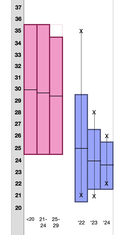
my meticulous notekeeping and graphmaking will make doctors love me. and the way i didnt know how to make this type of chart in excel so i had to make a worse version in numbers will make bitches want me
#text#the crazy outlier in '22 is killing me#also the pink ones are from a study that didnt publish raw data so i dont have outliers :(#i show this to my doctor and i say 'put me on birth control bc if i keep getting periods every 3 weeks i will KILL MYSELF'#(<- objectively still in the 'normal' range but like BARELY and its ANNOYING)#and they say ok <3 yay <3#health tag
10 notes
·
View notes
Text
Visualizing history as rhizomatic graphs of events: World War I

History is not a collection of events organized on a spacetime grid, but a web of weak and strong causalities that is so dense that it becomes atemporal -even future expectations influence its present course in some kind of virtual backward causation which reverses temporal order. Historical research is always an archaeology of causalities buried in a background independent spacetime desert. It is an excavation of remains from collapsed deterministic palaces in places loosely related to their original surroundings.


"Rather than narrativize history and culture, the rhizome presents history and culture as a map or wide array of attractions and influences with no specific origin or genesis."
Software written in Processing. Processing is an open source programming language and environment, originally built in the Aesthetics and Computation Group at the MIT Media Lab as a domain-specific extension to Java, targeted towards artists and designers. http://www.processing.org/ http://www.processing.org/exhibition/
"Every Society Has It's Diagrams." Gilles Deleuze.
#data#data visualization#interactive#creative coding#data art#GraphMaker#cultural analytics#processing#graphs#infographics#history#war#maps
2 notes
·
View notes
Text
i did some speed graphmaking to go home earlier alhkslj
#i have to go to the gym and then walk my dog#and it looks like it's gonna rain 👀#anyways CANDY SUGAR POP 🍭🍬
1 note
·
View note
Photo

Shisui #Uchiha #gifs
. . . .
I am a great Naruto and Anime fan. But I also enjoy other things, such as programming. You might find some of my content quite useful. Check out some of my projects in my Portfolio such as GraphMaker, PrivateBlog etc.. :)
#naruto#shippuden#mangekyo#sharingan#uchiha#clan#sasuke#itachi#kakashi#hatake#obito#madara#shisui#chidori#handsigns#susanoo#rinnegan#byakugan#shadow#clone#jutsu#boruto#dadara#boruto's dad#anime#tokyo#ghoul
3 notes
·
View notes
Photo

Like many bad graphs, I had to look at this for a minute before I realized exactly why it’s bad
Why would you flip the y-axis. When people see a line going down, they think that means something decreased. When your y-axis has 0 at the top and 1000 at the bottom, it’s basically like you want people to misinterpret it (and perhaps maybe the graphmaker did. Shame. SHAME. SHAME.)
Also what’s up with the x-axis. Why have “1990s” and “2000s” instead of marks for individual years, or every 5 years? You can have tick marks for every year but only the number label every 2 or every 5.
Telling a story: Good graphs tell a story. This graph doesn’t tell a full story even at its best. If you ignore the y-axis, the implication was supposed to be that the ‘Stand Your Ground’ law led to a decrease in murders with firearms, but there’s no other events indicated to try to explain why the trend in the 1990s was a slow decrease (which looks like an increase) or after 2007 the number of firearm murders decreased again (which looks like an increase)
Rate, not Count: The other issue I have with this graph is that it’s displaying the total number of something over time, when it’s probably more fair to show the number per 100,000 people, or some similar calculation to make a rate. Let’s take 1991 (the second point on the graph) and 2007 for example. In 1991, the population of Florida was 13.37 million. In 2007, it was 18.37 million. Despite having about the same number of firearm murders in both years, the increased population means the rate was about 27% lower
0 notes
Text
ok this assessment might actually go well..... still am stuck on the bubble part but everything else ive got a good idea of.. shes smart actually
#i also dont hate it as much as i thought honestly#i like making graphs even if excel is the WORST graphmaking program#pure shit. made for ec*nomists#räkan.txt
0 notes
Text
Someone smarter than me has probably gone into the semiotics of it but this kind of non-graph -- whose primary purpose is to mystify readily available and perfectly readable information which suggests a conclusion disagreeable to the graphmaker -- it has to serve some function beyond simple lying. It has to reflect some kind of magical thinking, a belief in taking an inconvenient truth and physically overstriking it on printed paper as a form of curse. The reliability with which graphs like this appear on major news networks and prestige periodicals, where the audience includes the nation's most powerful businessmen and politicians, has to reflect some kind of ritual behavior. My money's on its use as propaganda itself being ritual behavior, a blunt assertion that the truth is whatever the powerful make of it. The availability to the public is not an accident and the clarification of how asinine it is by regime opponents seems to be part of the ritual

this is the fucking funniest thing ive ever seen im in tears of laughter. (right axis) . this is a work of fucking art
55K notes
·
View notes
Photo

Sharingan #gifs
. . . .
I am a great Naruto and Anime fan. But I also enjoy other things, such as programming. You might find some of my content quite useful. Check out some of my projects in my Portfolio such as GraphMaker, PrivateBlog etc.. :)
#naruto#shippuden#mangekyo#sharingan#uchiha#clan#sasuke#itachi#kakashi#hatake#obito#madara#shisui#chidori#handsigns#susanoo#rinnegan#byakugan#shadow#clone#jutsu#boruto#dadara#boruto's dad#anime#tokyo#ghoul
3 notes
·
View notes
Photo

Kakashi Hatake
. . . .
I am a great Naruto and Anime fan. But I also enjoy other things, such as programming. You might find some of my content quite useful. Check out some of my projects in my Portfolio such as GraphMaker, PrivateBlog etc.. :)
#naruto#shippuden#mangekyo#sharingan#uchiha#clan#sasuke#itachi#kakashi#hatake#obito#madara#shisui#chidori#handsigns#susanoo#rinnegan#byakugan#shadow#clone#jutsu#boruto#dadara#boruto's dad#anime#tokyo#ghoul
2 notes
·
View notes
Photo

Itachi #Uchiha #gifs
. . . .
I am a great Naruto and Anime fan. But I also enjoy other things, such as programming. You might find some of my content quite useful. Check out some of my projects in my Portfolio such as GraphMaker, PrivateBlog etc.. :)
#naruto#shippuden#mangekyo#sharingan#uchiha#clan#sasuke#itachi#kakashi#hatake#obito#madara#shisui#chidori#handsigns#susanoo#rinnegan#byakugan#shadow#clone#jutsu#boruto#dadara#boruto's dad#anime#tokyo#ghoul
2 notes
·
View notes
Photo

#Uchiha #UchihaClan
. . . .
I am a great Naruto and Anime fan. But I also enjoy other things, such as programming. You might find some of my content quite useful. Check out some of my projects in my Portfolio such as GraphMaker, PrivateBlog etc.. :)
#naruto#shippuden#mangekyo#sharingan#uchiha#clan#sasuke#itachi#kakashi#hatake#obito#madara#shisui#chidori#handsigns#susanoo#rinnegan#byakugan#shadow#clone#jutsu#boruto#dadara#boruto's dad#anime#tokyo#ghoul
1 note
·
View note
Photo

#Susanoo #gifs
. . . .
I am a great Naruto and Anime fan. But I also enjoy other things, such as programming. You might find some of my content quite useful. Check out some of my projects in my Portfolio such as GraphMaker, PrivateBlog etc.. :)
#naruto#shippuden#mangekyo#sharingan#uchiha#clan#sasuke#itachi#kakashi#hatake#obito#madara#shisui#chidori#handsigns#susanoo#rinnegan#byakugan#shadow#clone#jutsu#boruto#dadara#boruto's dad#anime#tokyo#ghoul
1 note
·
View note
Photo

#Susanoo
. . . .
I am a great Naruto and Anime fan. But I also enjoy other things, such as programming. You might find some of my content quite useful. Check out some of my projects in my Portfolio such as GraphMaker, PrivateBlog etc.. :)
#naruto#shippuden#mangekyo#sharingan#uchiha#clan#sasuke#itachi#kakashi#hatake#obito#madara#shisui#chidori#handsigns#susanoo#rinnegan#byakugan#shadow#clone#jutsu#boruto#dadara#boruto's dad#anime#tokyo#ghoul
1 note
·
View note
Photo

Jutsu handsigns #gifs
. . . .
I am a great Naruto and Anime fan. But I also enjoy other things, such as programming. You might find some of my content quite useful. Check out some of my projects in my Portfolio such as GraphMaker, PrivateBlog etc.. :)
#naruto#shippuden#mangekyo#sharingan#uchiha#clan#sasuke#itachi#kakashi#hatake#obito#madara#shisui#chidori#handsigns#susanoo#rinnegan#byakugan#shadow#clone#jutsu#boruto#dadara#boruto's dad#anime#tokyo#ghoul
1 note
·
View note