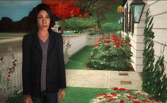
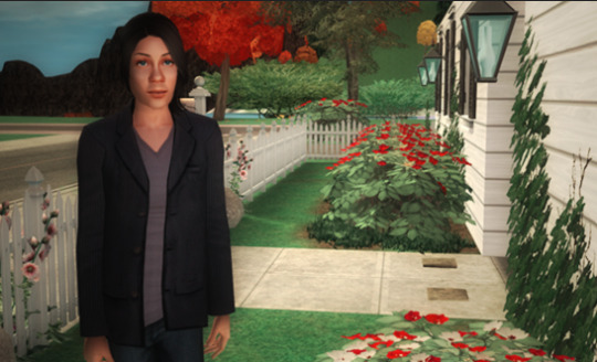
#I also need to resize a shirt and maybe crop a few? but I might be too attached so idk
Text
If I actually had a project pile for all the clothes I have to mend or modify in some way I don’t think I’d have any clothes to actually wear
#/hj but like— barely#i have to resize almost all my jeans#and expand the pockets of basically every piece of clothing that has pockets#and maybe add pockets to a few skirts and dresses#I also need to resize a shirt and maybe crop a few? but I might be too attached so idk#this is why I’ll never get to them /mostly j#I also need to mend a bunch of underwear cause the waistbands are seperating and the fabric itself is slowly unravelling lol#sewing#hand sewing#sewblr#sewing project#mending#mending clothes#sewist#diy projects#diy fashion#hand sewn#handsewn#🪲#slow fashion#sustainable fashion#anti fast fashion
16 notes
·
View notes
Note
I have one more question about upsizing a shirt that I’m struggling to find an answer to in tutorials: Will adding fabric to the sides or back of a shirt help with length? It was a good length when it fit, but somehow the process of becoming too small meant both length and tightness.
Adding length to a t-shirt:
Why did the shirt become shorter?
There are a few reasons why a t-shirt might become shorter after a while:
When a stretchy garment becomes too tight, the bottom hem might roll up when worn. This can make a shirt seem shorter than it actually is. Upsizing the garment so it fits well again (adding fabric to the sides or back, for example) will fix this issue.
If the shirt's made of a natural fibre, it may have shrunk in the wash. In this case, you'll have to add fabric to both widen and lengthen the shirt.
If it's a fast fashion shirt, the producer may have cut corners by not aligning the shirt's pattern to the fabric's grain. This can cause the seams to start twisting and the fabric to warp. Unfortunately, this is not a fixable issue. You could still add fabric to the shirt to resize it: this flaw will become less obvious once the shirt fits again. Another option is to use this shirt as raw material for a different project.
Maybe your body has just changed over time, which can cause a garment to look differently on you than it used to. This is perfectly normal!
How to fix it:
Adding length to a t-shirt is pretty easy. All you need is spare fabric made from a similar material as your shirt for this, and some basic sewing supplies.
One way to add length to a shirt is to undo the bottom hem and sew on a strip of fabric, adding in a new hem at the bottom of your extra fabric.

(Image source) [ID: a woman wearing a white t-shirt with an added-on peach trim at the bottom and a peach breast pocket.]

(Image source) [ID: a before and after picture of a red button-up shirt combined with a white shirt with red stripes to form one long shirt.]
If a new hem isn't your thing, you could also sew on a layer of frills or lace to the bottom of the shirt.

(Image source) [ID: a plum shirt with colourful frills sewn to the bottom hem.]

(Image source) [ID: a woman wearing a white long-sleeved shirt with navy stripes and a layer of lace and frills at the bottom.]
Another option is to draw a horizontal line in a spot you want to add extra fabric to, then cutting your shirt on that line. Sew in a new strip of fabric where you cut your shirt, making sure to line up your shirt's seams with the seams of your new strip. This works best on boxy shirts that have no waist shaping.

(Image source) [ID: a woman modeling a white shirt with a strip of fabric with a peacock print inserted at the shirt's chest.]

(Image source) [ID: a before and after picture of a brown cropped shirt that's been lenghtened by adding in a strip of fabric at the waist.]

(Image source) [ID: a before and after picture of a blue shirt that's been lengthened by adding in two strips of white fabric at the waist.]
You could also combine two shirts into one long shirt.

(Image source) [ID: a red long-sleeved shirt with the bottom of a red checkered flanel shirt sewn to its bottom hem.]
When you add both width and length, you get a cool patchwork shirt.

(Image source) [ID: a gray beaded t-shirt with gored black and white checkered panels at the side seams and black fabric sewn onto the bottom hem.]
#asker clarified this question was about a basic t-shirt in a second ask#diy#wasteless crafts#upcycling#upsizing#sewing#sewing 101#sewing for beginners#clothes alteration#alterations#length#shirt#tshirt#global warming#climate change#zero waste#zero waste crafts#slow fashion#fast fashion#patchwork#once again#sorry everything's so feminine#for some reason it's really difficult to find examples of alterations like these on more masculine items online
472 notes
·
View notes
Photo

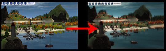

Technicolor was a series of processes used in filmmaking mostly between the late 20s and the mid-50s. There were several different processes used over that time period as technology improved, but in a nutshell they all messed around with color channels in various ways, attempting to reproduce colors correctly on a movie screen. We're going to simulate the effect of one of those old Technicolor processes by...Oh, hey! Messing around with color channels! Imagine that! Then we're going to screw around with layers to make things appropriately saturated and slightly blurry and vintagey-looking.
I'll warn you up front that this is fiddly and subjective. I can tell you basically what to do and what to look for, but a lot of the steps are things you just have to fiddle with until it looks good to you. And this isn’t going to work on absolutely every pic. It has to be done on a pic-by-pic level. There are no universal settings in these steps that will work for all Sims pics. This is art, not science. That said, once you get the hang of it and memorize the steps, this takes less than a minute to do on a pic in its basic form. Really. I promise.
The instructions and pics in this are for/from Photoshop CS6. That said, there is nothing about this process that you can't do in much older iterations of Photoshop, although there is one step for which the controls are significantly different in older versions. But I think you can muddle through fairly easily. And if you don't have Photoshop I imagine other full-function image editors (GIMP, Paint Shop Pro, etc.) have similar functions if you poke about a bit. The instructions are as detailed as I can make them. (And therefore this is very long and has lots of pics. I’m sorry.) So even if you have no real clue what you're doing or why, I think you can follow along. The only thing it assumes you know how to do is open and crop/resize a pic in Photoshop. :) So here we go...
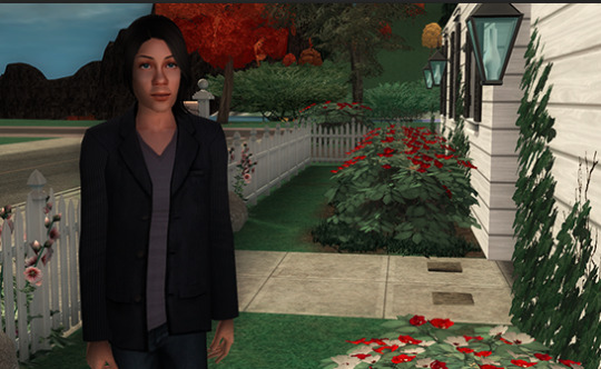
To start, pick a Sims pic. Any pic. (Although, if I were you I'd use an outdoor pic so you can follow along with this better to get you started. ) Open it in Photoshop and crop/resize it to your liking. You don't need to do anything else to it because you're just going to totally change everything, anyway. This is my starting point:
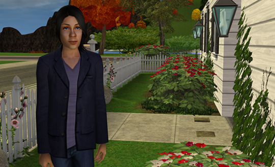
Cunningly, I picked an outdoor pic that has a Sim in it. Hi, Simon!
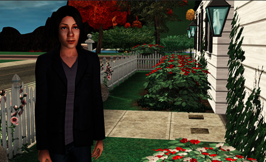
Now, Step 1: MAKE ALL THE THINGS RED AND CYAN! Really, that's what you do. Because that's exactly what this Technicolor process did on real film in the 20s/30s. Imagine that. Go Image--> Adjustments-->Channel Mixer.
You'll get a popup that looks like this:
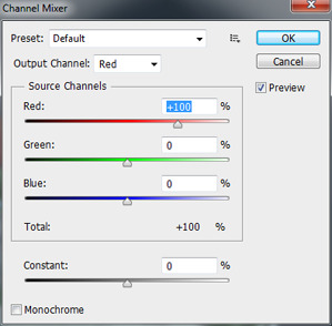
In that popup, in the "Output Channel" drop-down where it says “Red” by default, pick "Blue" instead. Because blue is going bye-bye. Then, in the sliders in the middle of the box, set the red slider at -5%, the green slider at 100%, and the blue slider at 0%, like so:
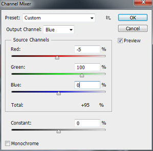
You can type numbers in the boxes; you don't have to use the sliders. Typing is easier when you know the values you need. Also, if you think you might be doing this process a lot, you can save these settings as a preset. Click the icon that looks like this:

Choose "Save Preset" then give it a name like...oh, I dunno...”Technicolor,” maybe. ;) Then, in the future when you want to do this process again, you can click the "Preset" drop-down shown in the above pic and pick the setting you saved from the list, saving you a few keystrokes. But anyway...
Leave everything else as it is, and then click "OK." Your image should now look something like this:

Pretty funky, eh? (Unless you're doing a night shot, that is, in which case this step can actually look pretty darn good all by itself. Takes right out all the damn purple-blue that the game adds at night.) But otherwise? Don't worry. We're not done yet. And this is where our first subjective step comes in.
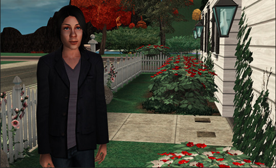
We're going to fade the channel mixing to some degree, so that it's not quite so powerful and we get touches of the lost colors back. To do that, go Edit-->Fade Channel Mixer. You'll get a popup that looks like this:
Make sure the checkbox called "Preview" is checked (it should be, by default) so that you can see the effect of what you do on your image as you manipulate it. Then, yank that opacity slider around (or type in numbers in the box) until it looks good, pretty much. Told you it's subjective. :)
No really, what you want is some touches of colors other than red and cyan showing through a bit but not too much. You don't want to lose the overall red-and-cyan, but you DO want, for instance, a little blue back in your sky and a little green back in your grass. I find that values between 50% and 80% are generally where you want to be here, but what will look best will depend entirely on your starting pic.
For my pic, I went with 60% opacity for this step, and now it looks like this...

I've got blue back in my sky and some purple back in Simon's jacket/t-shirt and a bit less-turquoise greenery. If you've got unnaturally-colored Sims or Sim-hair in your pic, you'll want to make it so that the real colors show a bit, too. (Which can be challenging depending on the color in question; the channel mixing intentionally sucks purple-blues and purples right out, just as the real film process did, and it's hard to get them back without losing the Technicolor effect unless you do some more serious and far-more-time-consuming editing which is beyond the scope of this.)
Once you're happy with your balance, click OK on the box with the slider. Now it's time to layer this puppy so that we can have two independently-adjustable copies of the same image to play with. In your layers window, you should at the moment have only one layer, called Background, like this:

(If for some bizarre reason your layer window isn’t showing anywhere, click “Window” in the toolbar at the top of the screen and select “Layers” from the list that drops open.) Right-click on that lonely little layer and in the menu that pops up choose "Duplicate Layer." Then just click OK on the window that pops up. Now you have two identical layers, the original pic and a copy of it called, creatively, "Background copy" on top of it.
Click on the top Background Copy layer to highlight and therefore activate it:

Now we can do stuff on that layer without it affecting the image below. The first thing we're going to do is blend the two layers together with a layer blend. This will create an appropriately Technicolor-y saturated effect without actually messing about with saturation levels. Somewhere in your layer window you should have a drop-down that looks like this:

By default, it's set at "Normal." When you click the drop-down, it has a bunch of options like "Multiply" and "Screen" and "Hue." For our purposes, we want either Overlay or Soft Light from this list, depending on your image. They do similar things, but the effect of the former is more intense than the latter. I find that Overlay generally works better for outdoor images and Soft Light works better for indoor ones, so I'm picking Overlay. Now my image looks like this:
Pretty harsh, with very dark darker colors, but super-saturation has been achieved. In fact, it's been achieved a little too well. So now we're going to make this top layer that we’re working with somewhat transparent, in order to weaken the blend effect but not kill it, obviously. Time for more subjectivity!
In your layer window there should be a bit that looks like this:

Usually, it’s right next to the layer blends you just used. If you click the drop-down arrow, you get a slider, or you can just type numbers in the box. Drag that slider down (Or type in numbers less than 100) until you can, for instance, differentiate shades in the darkest colors of your image. Generally, values between 35% and 75% work best here, but it will totally depend on your image and the lighting in it and stuff like that. For mine, I went with 48%, and it looks like this:
The colors are still strongly saturated, as they should be for this process, but now I can, for instance, see the pinstripes in Simon's jacket again (although you can't see that in the sized-down pic :) ) as well as the different colors in the rocks in the background and the difference between Simon's hair and those rocks. You'll also want to be able to see things like highlights in darker hair colors. If it's an indoor pic, you want dark furniture that doesn't look like black blobs. That's the sort of thing you're looking to accomplish in this step.
Next, we want to add some blur to this layer. This will, among other things, simulate the color bleed that is present in Technicolor films and old films/pictures in general. We'll do that with a Gaussian blur. So, go Filter-->Blur-->Gaussian Blur.
You'll get a popup that looks like this:
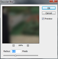
Again, you have a slider or a box you can type in numbers to apply a blur to this top layer of the image. I find that a blur of 5-15 pixels works well here, again depending on your image and how you want it to look. It gives you appropriate overall soft-focus, a bit of bleed around the edges of colors, and it smooths out highlights on skintones and hair that the layer blending step makes fairly harsh. Those are your goals. I went with 8 pixels on my pic, and now it looks like this:
Now, time to brighten things up a bit because the layer blending darkens things down. OR with night shots, you might need to darken back down a little. To do either kind of adjustment, go Image --> Adjustments --> Curves, which brings up a popup that looks like this:
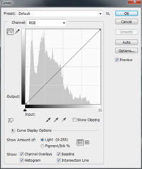
See that window with the diagonal line through it? You can click anywhere on that diagonal line and then drag around the point you "caught" to make the line curved instead of straight. Generally speaking, if you curve it down, it makes the image darker. Curve it up, it makes the image brighter. We probably want the latter unless you started with a night pic, so click somewhere in the middle of that diagonal line and then drag upwards, like so:

Drag around until you like how bright (or dark) your image is. You should see things like nicely-white whites, if there are any in your pic, but otherwise it's totally a preference thing. My pic now looks like this:

Almost done! Now, it’s time to warm the image up a little with a lighting effect. This needs to be done on the original, bottom layer of the image and, unfortunately, this is where things are pretty different between Photoshop versions. I know it's totally different in CS2, and I don't know when it switched over to more like the style that CS6 has. But hopefully you can puzzle things out if you have an older version.
This is also the step that's the artsy-fartsiest of them all. You can do really weird/cool stuff with lighting effects, like make things melancholy and moody, like the finished pic at the top of this post and that you can see a bigger version of here, which owes its moody appearance to different lighting effects drawn on multiple layers between the bottom layer and the semi-transparent one on top. Or you can make it bright and sunny and happy and pretty much anything in-between. I encourage you to experiment to your heart's content. But for brevity's sake, as a "base" to work from, I'll just give you basics here.
First, in your layer window, click on the original background to activate it and then go Filter-->Render--> Lighting Effects, and your image will now look like this:

(Don't panic, it's just preview. ;) ) First thing you wanna do, over in the right-hand side of the screen in the tab called "Properties," is click the drop-down that says "Spot" by default and change it to "Point," like so:
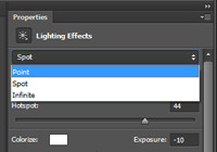
(If you're on an older Photoshop version that looks nothing like CS6 and you're looking at a popup now, there should be a drop-down somewhere in that window that'll list...actually, a whole bunch more effects than what CS6 has. Look for an effect called "Flashlight" and then you can fiddle with the settings from there, including the size/intensity of the effect, which in CS6 is done on the actual image instead.)
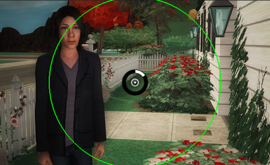
Now your image will look like this:

See that circle thing superimposed on your pic? You can move the center of the effect by clicking on that circle and dragging it around your image. The light will radiate out from whatever center point you choose to whatever distance you choose, which is defined by the bright green circle. To choose that distance -- which you'll want to do before you mess with the other settings, so that you can see the effect of the settings you choose better -- hover your cursor over the green circle. When it turns yellow, click and then drag to make the scale -- the size and range of the effect -- larger. Generally, unless there's something interesting in the pic that I want to highlight or if there's an actual light source like a lit lamp, I'll just put the center point in the center of the pic (It'll be there by default) and then set the scale so that covers about half of the image, like so:
Once your effect area is larger so you can see things better, you'll want to screw around with the settings of the effect. (The "Properties" tab on the right-hand side of the screen, over where you changed “Spot” to “Point,” for those with later Photoshop versions.) Here are the setting ranges I typically use:
Color: Click in the white square next to the word "Color" and you'll get a color picker popup. In the picker, in the box at the bottom labeled "#", type fff5e6. That's the hex code for a light ivory color, and it'll warm up the image just a touch, as the red/cyan processing is rather cold. That said, you can totally use whatever color of light you like. You can make it even yellower and/or a bit orange, which ramps up the “this-film-needs-restoration” look. Pink is nice if you've got a lot of pale/light skintones. Green is good if your main subject is a Plantsim or a green alien. A bit of blue is nice on outdoor winter pics with snow in them. Or, you can just leave it white. That works, too. Whatever the case, when you're satisfied with the color of your light, click OK.
Intensity: 0-30ish
Exposure: 0-20 or so
Gloss and Metallic: 0
Ambience: Between -10 and 10. Or more. Or less. ;)
Ultimately, all of these settings depend on the "feel" you want the pic to have. Play around with the sliders, to see what each of them do. When you're happy with what you see, click the blue "OK" button at the top of the screen. (Or "OK" on your popup, if that's what you've got.) My pic now looks like this:
(Settings: Color fff5e6, Intensity 32, Exposure 15, Gloss and Metallic 0, Ambience -2)
Final step! Do a Gaussian Blur on the bottom layer, to finish the color bleed effect and make the thing more vintage-appropriately blurry. Do it just like you did it on the top layer. The bottom layer is not semi-transparent, however, so you'll need to be much more conservative with the amount of blur you apply. You're going to want less than one pixel. On mine, I used 0.3. and the final result is:
And, that's it! I know it seems like a lot of steps, but once you do it a few times and don't have to look at the instructions, it goes quickly. :) From this point you can call it done or you can screw around with it further still. Add some scratches with a scratch brush, sic different filters on it for artsy effect, whatever.
#sims 2#sims 2 pic-editing tutorial#tutorials#this would probably work on ts3 pics too#i haven't tried it#and i don't own ts4 so i can't try it on that either#vintage is good#sims in technicolor
94 notes
·
View notes
Last Seen Blogs

lyricallychallenged02-blog
Musically Diverse

viral-mafia-123
Untitled
bantucola
Bantucola.com
sdmarcela
[/+heavydirtysoul]

my-vanishing-777
𝙗𝙚𝙩𝙩𝙚𝙧 𝙙𝙖𝙮𝙨