#I may add more details for the coloring book but also when I revisit this again at the end of the challenge for full blown color
Text

Suptober [Extended] - Day 18 || Royalty 👑
#suptober extended 23#destiel#castiel#dean winchester#royalty au#wiggleart#spnfanart#this was inspired by a royalty au drawing I did a couple years ago#for destiel month and I liked it but I wanted to try and revisualize it and I really like how it came out#I wanted to do more detail but alas#it was taking me long enough and my poor hand lol#I may add more details for the coloring book but also when I revisit this again at the end of the challenge for full blown color#I know there’s always the prince and not prince fall in love trope#but I like the idea of both of them being princes#the political issues to arise are always great lmao
238 notes
·
View notes
Photo

I’m gonna show something I used to do, that I still do rarely, or use as a fork in the road? Not sure how to explain it in words 😅
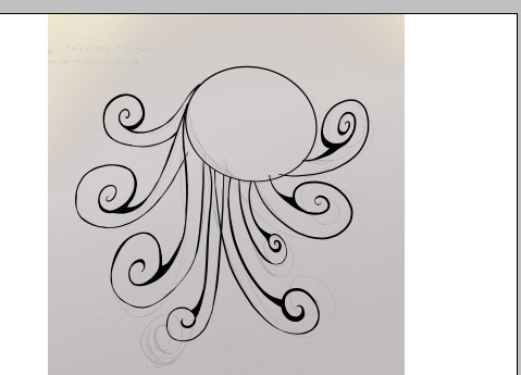
So, this is a photo from my phone, of a sketch on paper. It’s not meant to be pretty, it’s just meant to get an outline from one media to another media (I don’t have a scanner and even if I did- this is from a huge glue-bound sketch book and it’d be awful to scan). In short, it’s just easy to snap a photo and send it to my google drive.

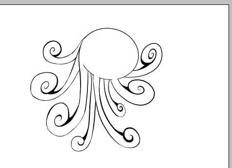
Opening it in Photoshop CS (which is totally free btw), and going to layer > selective color, messing around with Grey/Neutral in the drop down, I can make it look like this. The reason why this is nice is because......
... This is where I create layers over it and draw over it. As if my photo was the warm-up sketch beneath it all along. I know it’s silly but sometimes I’m out and about, or I’m running around the house and I only have 5 minutes to pull out a _real_ sketch book to doodle something. That’s not enough time for me to pull out my tablet, lol.
Or maybe people have old sketches, or, just bought a tablet after many years and want to revisit that old art 💡✨ Whatever the reason 👆🏻
And the fork in the road thing- tablet or no, you can use the pen on the tablet and freehand over the photo on a new layer, or you can use the pen tool and fill (without a tablet) on a new layer (or many layers). That second option may take a long time though- trust me, I’ve done it in my pre-tablet days.
My post wasn’t meant to just be a ‘Turn photos into Digital Art!’ thing 😅
For the past two-days I’ve been working on Octopus art. Anyone who knows me, should know I love Octos 🐙💝 I have a Naruto-verse OC with Octo Summons, irl my room is filled with Octopus plushies, on Twitter I retweet Octopus things when I feel it’s appropriate 🙃
They are Friends! Not food!
I’ve been wanting to try and share my process a bit? I think I mentioned that in some previous posts? Although I don’t think I’m the best person to learn from tbh 😅
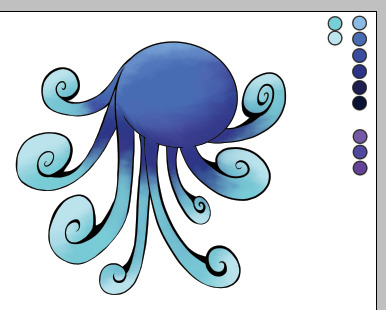
My lil Octo here was intended for something, and I also had a good idea how I wanted to color him. You can see I added a ‘palette’ to my art space- I manually do this. I use the color picker to pick up colors from my palette as necessary and add more colors to it when I desire to. It helps me tremendously.
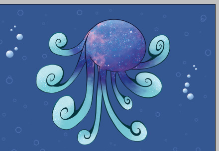
I don’t know if anyone reading this is familiar with RedBubble’s tutorial but it says something like ‘know what you’re designing for’. Basically implying you should be aware of area, dimensions, product, etc- so you can design for it appropriately.
It’s actually more difficult than one may think. I end up making around 5-8 separate image files to cover most of their products because of it 😓 I think I also do this to give people a variety of options. So it’s possible it’s entirely a me thing.
This is my finished Octopus Art 👆🏻 slightly cropped here in my thumbnail.
There are details you cannot see from it being shrunk- that’s a lil saddening, but it is what it is 😞
Scrolling up and down the entire post for spelling and grammar errors before hitting ‘post’, I’m seeing my handwriting in that first and second image and it’s like 😬
1 note
·
View note
Text
Ink Etiquette
Since I am getting a new tattoo in September it’s made me think about all the questions, comments and unwanted concerns that I usually get when I advertise I am getting a new piece.With that, I've been inspired to do a rant style blog on stupid shit people say regarding my tattoos. At the end I’ll answer some typical general questions for those who want to get inked but are doing a little more research first.
First things First-tattoo etiquette, you gonna learn today.
Stop telling people they will regret their tattoos
What do you care? It’s not your body, you don’t have to look at it every day! Who gives AF. I cant tell you how many times people have told me I will regret the size of my tattoos, the placement, and that if all my pieces don’t have a huge significant meaning that im gonna wish I never got them. IT’S NOT TRUE. I am not you, so don’t project your shit onto me-10/10 we have different views about life, Negative Nancy. My two largest tattoo pieces have no special meaning. It’s Art. I love art of all kinds, and wanted it on my body because its beautiful and badass. I’ve had one of those tattoos for over 4 years now, have never regretted it a day in my life and its honestly my most highly complimented piece. So suck it.
Stop asking people if they’ve thought about how they will look when theyre 40 or 80
Well spoiler alert, I take phenomenal care of my skin and body in general and I have full intentions of being a super hot milf until I reach the puma and then cougar stage so I’m really not worried about anything up until my mid 70’s. I do understand the general laws of aging and gravity but can you honestly tell me that 80 year old saggy wrinkly tattooed skin looks WORSE than non tattooed saggy wrinkly 80 year old skin? Yeah I didn’t think so.
If you don’t like someones tattoo-you actually don’t have to Say Anything.
So many people have this burning desire to voice an opinion that was never actually asked for. If you don’t have anything nice to say-don’t say anything at all. Unless they ask you for your brutal honest opinion, I would try and avoid commenting. Now if someone has a shitty tattoo I’m not saying lie to them, but just keep their feelings in mind as this will be on their body Forever unless they get it removed or covered up. I've had people ask me if I like their tattoos-and if I don’t like them either because i’ts not my personal style, or it’s a poorly done tattoo this is what I say “oh wow, who did you go to?” and then I start asking about the artist. That’s a safe bet. You don’t need to comment, especially if your comment is not nice. Again-these are permanent, it’s not a shirt that they can return at the store.
Realize that your preference of tattoo style and size may be different than someone else
Go big or go home, has always been my thought when getting a new piece. I’ve always loved large tattoos, dainty isn’t really my style. I am a little extra and I like that part of my personality to show with the art I wear on my body. I’m so tired of the bulging eyes people give me when I tell them how big my piece will be, or when I show them the ones I have (after they ask). You don’t have to get a massive tattoo and I understand large pieces aren’t for everyone-OK but get your active bitch face under control especially if you’re going to ask someone a question about size. I’m not shitting on the infinity sign you have on your ankle-lets move forward.
Stop saying “my tattoos are for me”
This is also something people say to me once I tell them how large my piece will be, they normally respond with “oh, I’d never get a tattoo that big-my tattoos are just for me”. Cool? Mine are too? I didn’t pay all that money, give my literal blood sweat and tears to the ink table if all my pieces weren’t for me. I honestly prefer to have pieces that I can see in pictures, that are easily displayed where I will be able to admire them every day without being totally naked. I don’t need a hidden tattoo on my ass cheek for it to be “for me”. Unless you literally have a tattoo that you got because someone else begged you to get it for them because their skin physically cant be tattooed for some odd reason, and you want to specify that the new tattoo is for you-OKAY THEN STFU.
Stop asking people how much their pieces cost-it’s tacky.
We ALL KNOW that nice ink isn’t cheap. Generally speaking people don’t go around bragging about how much they dropped on a sleeve. Ink is an expression of Self, not Wealth. If you really like the artist who did that persons piece, ask them for the artists Instagram or website so you can get their contact info and email the artist directly to inquire about pricing. On the flip side-if someone’s tattoo looks like dogshit, don’t ask them how much they paid for it. They probably know it looks like dogshit and it’s a sensitive subject- you asking about the price is just salting the wound.
Before you ask somebody Why they are getting what they are getting, consider WHY you are asking them that.
There are usually only a few reasons why people ask about what someone is getting, whether they know it or not. A lot of people don’t even Realize why they are asking what they are asking until they think about it.
1. they love art, and are truly interested
2. they don’t support tattoos and want to give you the whole “don’t put a bumper sticker on a Ferrari spiel”
3. they want to add their two cents to what it is you are getting, try and impose their ideas or change your mind to redirect your vision. Regardless they will subconsciously judge you by the content of your piece and form ideas about you based on what you’re putting on your body and where.
If you are asking “why” for any reason other than the first one. Kindly fu*k off.
Nobody puts bumper stickers on Ferraris, but how many ‘rraris have you see with custom pant jobs, bruh? And as for you Linda, nobody cares that you don’t like my futuristic post-apocalyptic leg sleeve idea-you’re not changing my mind. Fu*k your two cents if it’s not going toward the bill. And we both know it’s not, so again-kindly fu*k off.
Alright- so that just about concludes my ranting about stupid shit people say or ask. Lets get to some actual Q&A’s/tips and comments.
What does it Actually Cost?
It depends on the artist! Some artists charge by the size of the piece, and some charge by the hour. Whenever I email a new artist I always ask them if they charge by the piece, or hourly-they’ll let you know. From what I’ve experienced I’ve typically had artists who charge between $150-$250 per hour, but my philosophy when getting a piece is “spare no expense”. This is going to be on your body FOREVER. No, I’m not ballin like LeBron, I’m ballin on a budget, so yes I do have to save up to get my pieces-but it’s always worth it. You get what you pay for.
What does it feel like?
The best way I can describe it, is a hot cat scratch over and over again. In some more sensitive areas it can feel like what I imagine branding would feel like. Everyone has a different pain tolerance and skin sensitivity, so some areas may be more sensitive on some, than others. A lot of people say the ribs are by far the most painful-to be honest when I got my sternum piece although the bony part of the sternum was murder, the ribs weren’t bad at all-in some spots it rattled my rib cage so much it kind of ticked. Likewise, some people get inner bicep/tricep tattoos like it’s nothing, the back of my tricep killed me. I was almost in tears. It totally just depends on your skin.
Go the Extra Mile
If you cant find a local artist that you Love, drive. Even if it’s 2-3 hours out of the way. Again, this is going to be on your body forever. I would rather drive an extra 2 hours or so for the artist I know is going to crush my piece, than a local artist who would probably do an okay job. That’s not to say you cant find a good local artist-but if you cant, expand your search radius.
Walk in, or wait?
It depends on what you want, but if you’re asking for my suggestion I would do as much research as you can on the tattoo shop. Look at customer reviews, the artists online portfolios. You'll have better luck than hoping you randomly pick a good place for a walk in. Although I do have a walk in lettering tattoo and it looks just fine haha For a planned piece understand that the artist you want may be booked for the next couple weeks, months or up to a year. Don’t get discouraged, you'll have time to really think about the piece you want, change any details, and usually if they're booked that far out-they're pretty good and well worth the wait.
Color or Black and Gray?
This is a personal preference. Growing up I Hated how pale I was, being a ginger was a struggle all around but the porcelain skin was definitely a target. I hated wearing shorts, and never did all through high school because of how beaming white my legs are. To be honest I didn’t start wearing shorts until I got my First tattoo. Artists and tattoo admirers alike have complimented my skin time and time again, and how the colors in my tattoos really pop because of how pale I am. So, I prefer color tattoos because they show up super vibrant and it makes me feel even more comfortable in this vampire skin. I don’t necessarily think color is better over black and gray and in some cases I think that it also totally depends on the type of piece you are going for. Consider your skin tone, the type/style of piece you are getting and then decide.
Think it over, and speak up.
I feel like a lot of the “regret” that people are talking about with tattoos comes from spontaneous ideas or trends. There have been so many times I have seen a bad ass concept for a tattoo and I thought about finding and artist and setting an appointment ASAP. The next day I will revisit the idea and go eh, I guess I don’t love it that much. I have a Pinterest board that is just for my tattoo ideas, I pin shit on there so later I can look at it and think if that’s something I really want or not. I definitely recommend either pinning similar images of a concept you want, drawing it out, or writing it down in a notepad and then sleep on it. You'll be surprised how quickly you may change your mind in the course of even a few days, a week, months or a year. If you’ve had the same tattoo concept for quite a while, and every time you revisit the idea you still love it just as much-it’s probably safe to start on that piece when you're ready.
When you finally decide to get your piece, the artist will usually have it drawn out in some form, either on paper-or on an iPad of sorts that shows you all the details and potential coloring (if you're getting color). Do Not be afraid to speak up if you don’t like something or want to change something. It is their job as the artist to accommodate your wants especially since they are putting something permanent on your body. Even when you get the stencil on, if you don’t like the placement, or want to change something-let them know. They can remove the stencil pretty easily and print out a new one after they fix whatever it is you want fixed. But don’t just deal with something if you're certain you don’t like it. You're gonna have to look at it every day.
Artistic Freedom
This is just another opinion-and by no means a fact. But I’ve found by giving the artist freedom on my piece has always made them turn out even better than I imagined. There are quite a few people out there who go in with a very specific piece or picture in mind and are disappointed when their piece doesn’t look EXACTLY like the picture. Well, that’s pretty hard to replicate as it is but especially when that artist isn’t the original artist of that picture or drawing that you bring to the table. This does not go for portraits-obviously you want your Marilyn Monroe to look like Marilyn Monroe and a portrait artist definitely should be able to replicate that haha I am talking about more “creative” pieces you want. My suggestion, have a few pictures of things you like (and some things you don’t like) regarding the concept of your tattoo and tell your artist to have fun with it. If your artist enjoys drawing up your piece and has freedom to add their flair on it, it will probably turn out better than you micro managing the shit out of them. I’ve always given artists freedom and I’ve always been crazy surprised at how the piece they gave me turned out way better than anything I had in mind.
This is all that I can think of? I probably lost 99% of you by the first 500 words, but to those of you who made it to 2,376..cheers.
13 notes
·
View notes
Photo

By: Miss Jen, Miss Katy, & Miss Melissa
Picture Books
Barnett, Mac. The Wolf, the Duck, and the Mouse. (Grades K-2)
This clever picture book begins with a mouse that is quickly gobbled up by a wolf. Fortunately his new accomodations AKA the wolf’s stomach include a duck with kitchenware and jam. The duck states “I may have been swallowed but I have no intention of being eaten.” Award winning illustrator Jon Klassen’s artwork add to the charm of this folkloric tale.
Colleen, Marcie. Love, Triangle. (Grades K-2)
Square and Circle have been best friends since they were first created. Triangle arrives on the scene and brings new ideas. Both Square and Circle want to be friends with Triangle which causes a split between the two buddies. This common friendship problem is resolved at the end of this geometric story.
Daywalt, Drew. The Legend of Rock, Paper, Scissors. (Grades K-3)
The origins of the classic schoolyard game are explained in hilarious detail. Will Rock, Paper, or Scissors be victorious? Rock is searching for a worthy opponent. Paper leaves the Empire of Mom’s Home Office after conquering the Computer Printer while Scissors defeats Dinosaur-Shaped Chicken Nuggets. Wacky inanimate objects come to life under the expertise of illustrator Adam Rex. Fans of Daywalt’s The Day the Crayons Quit will be equally as charmed by this book.
Denos, Julia. Windows. (PreS-1)
In this story, a boy of color dons a read hoodie, leashes his dog and ventures out into the twilight, where the windows are “blinking awake as the lights turn on a neighborhood of paper lanterns”. The reader gets to peer in at the small figures dancing, making dinner or throwing a party and watch as the color of the sky changes. The compositions are rendered in ink, watercolor, letterpress and digital collage. The narrative ends with a story shared and a snuggle. Readers will want to revisit this story over and over. Everyday routine turned to wonder on an evening walk filled with discovery.
Dykman, Ame. Read the Book, Lemmings! (PreS-2)
Another delightful collaboration by the team behind Wolfie the Bunny and Horrible Bear! Lemmings don’t jump off cliffs. It says so in the book that Foxy is reading. However, the three lemmings on the boat have not read the book and keep jumping into the water. After trying unsuccessfully to get the lemmings to read the book, Foxy realizes he is going to have to actually teach the lemmings to read before he can stop them. A funny read aloud! Children will love this book at storytime and at home.
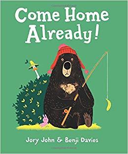
Jory, John and Benji Davies. Come Home Already! (PreS-3)
The third hysterical picture book about Duck and Bear, unlikely pals. In this book, an excited Duck wants to hang out with Bear but Bear has left to go fishing for a whole week on his own. Bear is relieved to have some time alone. What will Duck do while Bear is gone? How will he survive without his best friend?
Lamothe, Matt. This is How We Do It: One Day in the Lives of Seven Kids from Around the World. (Grades K-3)
Seven children from Italy, Japan, Uganda, Russia, India, Iran, and Peru describe one day in their lives as they eat, play, and learn. An author’s note, a glossary, a map, and photographs of the families are included at the end of the book. This is an informational picture book that could be used in a social studies unit.
Shannon, David. Bizzy Mizz Lizzie. (Grades 1-3)
Lizzie is the busiest, buzziest bee in Hivetown. She longs to impress the Queen by winning a spelling bee contest, but she studies to the point of exhaustion on top of trying to juggle all of her other activities. When she dozes off in the middle of the competition, the only solution is rest. Lizzie finally learns to stop and smell the flowers. A book with a good message and wonderful illustrations will appeal to young readers.
Tsurumi, Andrea. Accident! (PreS-2)
When a little armadillo named Lola knocks a jug of red juice all over her family’s white sofa, she flees to the library to hide. But as Lola run through town, she is joined by many others who have also made a mess and want to hide at the library too, avoiding conflict. Fun and colorful illustrations are found throughout the book and children will be drawn to the intricate details. This book teaches that a mistake can happen due to thoughtlessness, carelessness or bad luck and that it is ok to call it an accident but also necessary to “make it better” and “own up to it.”
Easy Readers
LaReau, Kara. The Infamous Ratsos are Not Afraid. (Grades 1-2)
Brothers Louie and Ralphie Ratso plan to clear out an abandoned lot in their neighborhood and create an arcade. The problem is that the house next to the vacant lot might be haunted. This is the second book in the series that began with the Geisel Honor Book, The Infamous Ratsos.
Shea, Bob. Ballet Cat: What’s Your Favorite Favorite? (Grades 1-3)
Ballet Cat and her cousin Goat are preparing a show for grandma and both want to prove that they are the best. Ballet Cat will come up with a fancy dance routine and Goat will perform tricks at his magic show. Which one will be her FAVORITE favorite? Terrifically fun third entry in this series.
Snyder, Laurel. Charlie & Mouse & Grumpy. (Grades K-1)
This picture book/easy reader hybrid is the sequel to Charlie and Mouse. Charlie and Mouse are brothers who are spending time with their grandfather AKA Grumpy. In four short chapters, the trio discuss what it means to be “medium”, enjoy a special night while the boys’ parents go out, and choose the proper goodnight song.
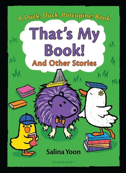
Yoon, Salina. That’s My Book! and Other Stories. (Grades K-1)
Big Duck, Little Duck, and Porcupine are a sweet trio of friends that find the best use for books, plan a talent show, and dress like a pirate. The latest addition to the Duck, Duck, Porcupine series contains three short chapters with bold text in large speech bubbles.
Juvenile Fiction
Bartok, Mira. The Wonderling. (Grades 4-6)
Number 13 is a groundling (half human/half animal) who lives in an orphanage run by Ms. Carbunkle. He is named Arthur by a fellow groundling when he saves her. The pair of new friends escape the “Home” and set off on an adventure full of danger, magic, and mystery. Fans of Erin Hunter’s Warriors series will enjoy this lengthy fantasy novel.
Bradley, Kimberly Brubaker. The War I Finally Won. (Grades 4-6)
Picking up right after 2015’s Newbery Honor book The War That Saved My Life, this very worthy sequel continues the story of Ada, her brother Jamie, and their guardian Susan. Set against the backdrop of World War II (which is felt much more immediately in this novel), Ada struggles to deal with the aftermath of years of abuse by her mother. An emotional, yet rewarding book for fans of the first book or for readers who love excellent historical fiction.
Broach, Elise. Trouble at School for Marvin & James. (Grades 1-2)
This is the third book in the Masterpiece Adventures series featuring best friends, James and Marvin. James is a human and Marvin is a small black beetle. James decides to bring Marvin to school so he can experience James’ art class taught by beloved teacher, Mr. Chang. Mr. Change has blue hair and often quotes, “There are no mistakes, only happy accidents.” Marvin enjoys school until a sneeze separates him from James. This book is an excellent choice for new chapter-book readers.
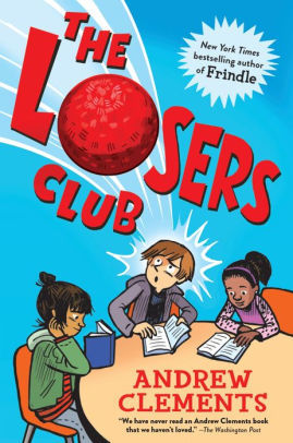
Clements, Andrew. The Losers Club. (Grades 3-6)
Alec loves to read -- so much so that it gets him in trouble at school and at home. Even the head of the afterschool program at his school says he can’t just sit around by himself and read; he has to join a club. So Alec comes up with a plan to create his own reading club, which he names The Losers Club to deter other kids from joining. His bright idea backfires when it turns out to be the most popular club at school. There are tons of great books referenced throughout, and there’s a helpful list at the back of the book for bookworms who want to read them all!
DeStefano, Lauren. The Girl with the Ghost Machine. (Grades 4-6)
Emmaline Beaumont was 10 years old when her mother died; two years later, her father remains so consumed with grief that it’s almost as if Emmaline has lost both parents. In a desperate attempt to bring his wife back, Monsieur Beaumont tinkers with his “ghost machine” night and day. When Emmaline’s attempt to destroy the machine doesn’t go as planned, she and readers are left wondering if precious memories of loved ones are worth trading for the chance to interact with them one more time. Emmaline’s twin best friends, Oliver and Gully, represent the push and pull between hope and logic that plagues Emmaline and offers her new ways of understanding grief. Readers should be prepared for heaviness and sadness throughout. A story of loss, friendship, and resilience.
Farrer, Maria. Me and Mister P. (Grades 2-5)
Arthur is tired of his younger brother Liam’s behavior. He can’t even watch television with volume since it upsets his brother. Arthur decides to run away from home but he meets a friendly polar bear named Mister P. who alters his plans. Mister P. helps Arthur accept his brother’s differences. This quirky story is bibliotherapy for siblings of children with autism as well as a good read for children who like fantastical animal stories.
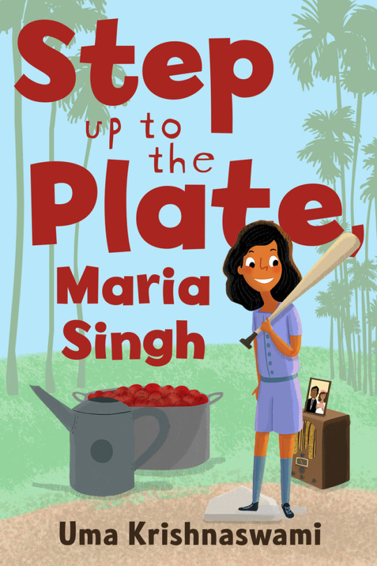
Krishnaswami, Uma. Step Up to the Plate, Maria Singh. (Grades 3-5)
Maria Singh lives with her family in Yuba City, California during WWII. Most of the community members are adha-adha (half and half) with fathers from India and mothers from Mexico. Maria’s teacher forms a softball team which Maria wants to join but she is not sure if her father will let her. Maria and her family struggle against discrimination from kids and adults.
Middleton, Dana. Open If You Dare. (Grades 4-6)
For Birdie and her best friends, Ally and Rose, the joy of finishing elementary school is overshadowed by their dread of summer’s end. With Rose unwillingly moving back to England, and Ally and Birdie attending different middle schools, their long, close friendship is coming to an end. In the meantime, Ally deals with problems on and off the pitcher’s mound, while Birdie follows the trail of mystery, and Rose rebels against her parents in a creative, yet destructive way. The story is set in Atlanta with well-drawn individuals from different generations. Tween issues are addressed from first crush to first steps toward independence. A rewarding chapter book.
Morris, Chad. Mustaches for Maddie. (Grades 4-6)
Maddie is a 12 year old girl who has a big imagination. When she is diagnosed with a brain tumor, she faces surgery and possible negative outcomes from the operation. She also faces middle school friendships and even jealous classmates with humor and bravery. Maddies loves fake mustaches so her supporters wear them. This book is based on the authors’ daughter and will appeal to readers who liked Wonder by R.J. Palacio.
Pennypacker, Sara. Waylon! Even More Awesome. (Grades 2-4)
A Clementine series spin off which features another likeable kid. Waylon and Baxter are classmates who have to share a dog who lives in a shelter. The two boys can not be more different. While Waylon loves everything about science and following rules, Baxter is always in trouble and close to being a juvenile delinquent. When their dog, Dumpster Eddy, is going to be thrown out of the shelter he is living in, the boys come up with a plan to save him. A book about friendship, family, perseverance and hard work make this a wonderful book for reluctant readers.
Schlitz, Laura. Princess Cora and the Crocodile. (Grades 1-3)
Princess Cora never has a moment to play or relax as her parents, the King and Queen, are constantly training her to be perfect. She writes a desperate letter to her fairy godmother asking for help. A pet crocodile arrives the next day and he impersonates Cora so she can have a day off. Caldecott Medalist Brian Floca’s illustrations add to the humor of this story.
Swanson, Matthew. The Real McCoys. (Grades 3-5)
Moxie McCoy is a fourth grade detective who faces her biggest challenge yet in this fun chapter book. When someone kidnaps beloved school mascot Eddie the Owl, Moxie is on the case-but she is forced to solve this new mystery on her own since her best friend, and fellow detective, has moved away. Moxie finds clues and points fingers but she needs help to find the owl mascot. Enter Milton, Moxie’s smart little brother. Can the real McCoys solve the crime of the century?
Wilson, Amy. The Lost Frost Girl. (Grades 4-6)
A modern day fairy tale about a girl who discovers that she is Jack Frost’s daughter. Owl is a twelve year old girl with a quirky mom, a dad she has never met, a cool best friend named Mallory and a boy who gives her weird looks at school. When she finds out that Jack Frost is her father, she is determined to meet him and delves into Jack’s wonderful and wild world of winter. She realizes she is part human/part fay and has special powers of her own. A tale of family, friendship and magic and embracing who you are meant to be.
Zemke, Deborah. The Curse of Einstein’s Pencil. (Grades 2-3)
This second story about Bea Garcia will appeal to fans of Judy Moody. Bea is initially excited when the smartest girl in school, Judith Einstein asks her to be a partner in the geography contest. Then Bea wonders if the secret to Judith’s intelligence is her pencil. Bea takes Judith’s pencil when it rolls on the floor but the effect on her life and friendship is not what she expected.
Graphic Novels
Hale, Shannon and Pham, LeUyen. Real Friends. (Grades 3-6)
Shannon Hale, author of the bestselling Princess in Black series, debuts her first graphic novel: a memoir of her childhood friendships from kindergarten through sixth grade. Friends, rivals, and frenemies drift in and out of Shannon’s life, but her mean older sister remains a constant menacing presence. Readers will find much to relate to: neighborhood friends who move away; the dread of finding out that all of your friends have been assigned to another teacher. Hale as an adult narrates the story with a welcome perspective, acknowledging when she herself was a bad friend or seeing the dynamics of a situation more clearly in hindsight. Fans of Raina Telgemeier will love this.
Jamieson, Victoria. All’s Faire in Middle School. (Grades 4-8)
From Victoria Jamieson, who won a Newbery Honor for Roller Girl, comes another middle grade graphic novel. Imogen has been homeschooled her whole life; her world revolves around the local Renaissance Faire where her parents work. But now she’s ready for her biggest challenge: middle school. Imogen’s unconventional background makes it difficult for her to fit in, but is she willing to do what it takes to conform? Recommend to fans of Raina Telgemeier.
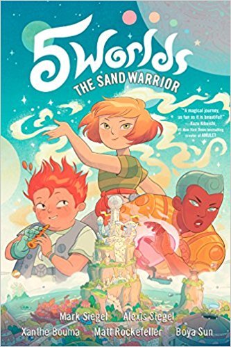
Siegel, Mark. The Sand Warrior. (Grades 3-5)
The Five Worlds is a galaxy of five planets filled with different species. Oona Lee teams up with An Tzu, a boy from the poorest slums, and Jax Amboy, a lonely star athlete. They discover that they may be able to light five ancient beacons and save the Five Worlds. Hand this fantasy story to fans of Avatar: The Last Airbender and the Amulet series.
Biography
Guglielmo, Amy and Tourville, Jacqueline. Pocket Full of Colors. (Grades K-4).
Mary Blair is remembered today as one of the greatest and most influential Disney animators, but at the time, her use of color was considered “too vivid, too wild.” When her all-male colleagues at Disney reject her ideas, she strikes out on her own, where she finds huge success as an illustrator and set designer following her own vision. Finally, Walt Disney himself asks her to come back; she’s the only one he will trust to design the now-classic ride It’s a Small World. Gorgeous brightly-colored illustrations evoke Blair’s distinctive style. An author’s note is included at the end of the book.
Meltzer, Brad. I am Sacagawea. (Grades 1-3)
Sacagawea’s story is the latest addition to the Ordinary People Change the World best-selling biography series. Sacagawea was the only Native American to join Lewis and Clark’s expedition. Children will learn about the traits that made Sacagawea a trailblazer and the significant contributions she made to the world. A timeline and photos are included at the back of the book. Christopher Eliopoulos’ illustrations reflect his origins in the comic industry. He recreates lively scenes from Sacagawea’s life.
Rosenstock, Barb. Vincent Can’t Sleep. (Grades K-2)
This picture book biography of Vincent Van Gogh explores his life especially his troubles with insomnia. He had trouble sleeping as a child, an adolescent, and as an adult in the hospital. The text is short but lyrical while the illustrations in acrylic, pen, and watercolor reflect the night sky and his iconic work, The Starry Night. An author’s note and sources are included at the end of the book.
Nonfiction
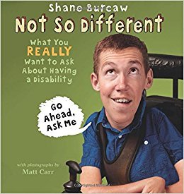
Burcaw, Shane. Not So Different. (Grades 1-3).
Shane was born with a degenerative muscle disease, and he’s never been able to walk. People always seem to ask him the same ten questions, like “How do you eat?” or “Why is your head so big?” Answers to these and more are accompanied by funny photographs. Through Shane’s funny and frank stories--he once broke his expensive motorized wheelchair by using it to lift his brother to dunk a basketball--readers will learn that they’re not so different from him after all. A nice introduction to disability for younger kids.
Burns, Loree Griffin. Life on Surtsey: Iceland’s Upstart Island. (Grades 4-7)
In 1963, an underwater volcano off the coast of Iceland erupted, creating a new island formed from rock and ash. Scientists realized they could use this new island to study how life takes hold in a new environment. What are the first plants to grow on the bare rock? When and how do birds, insects, and other animals arrive? The book follows a team of scientists who return to the island every year to study the changes; full-color photographs document their journey and the changing island landscape. It’s a great introduction to how scientists really work, full of details that kids will love. (On a deserted island, how do you go to the bathroom?) A glossary and bibliography are included at the end of the book.
Chin, Jason. Grand Canyon. (Grades 3-5)
Some may think of the Grand Canyon as just a “big hole in the ground,” but through gorgeous and detailed illustrations, Chin reveals the complex ecosystem it hosts and what it tells us about our geological past. As a father and daughter hike through the canyon, the reader learns more about what makes each level of the canyon unique. Die-cuts reveal fossils in the modern-day, and when readers turn the page, they are transported back millions of years, to what the landscape looked like when each fossil was formed. Further scientific information, an author’s note, and sources are included at the end of the book.
Eggers, Dave. Her Right Foot. (Grades 3 and up)
A beautifully illustrated book about the history of the iconic statue along with humor and interesting trivia during the first part of the book. The second part of the book talks about the statue’s feet and how the back of her right foot is actually lifted as if she is going somewhere. No one ever seems to talk about the fact that the statue of liberty is walking; she is on the move. If the statue of liberty is a symbol of freedom, if the statue of liberty has welcomed millions of immigrants to the United States, then how can she stand still?
Harris, Chris. I’m Just No Good At Rhyming. (Grades 3-8)
Fans of Shel Silverstein, Ogden Nash, or Jack Prelutsky will enjoy this volume of humorous poetry for kids. Lane Smith’s hilarious illustrations add to the fun.
Rose, Deborah Lee. Beauty and the Beak. (Grades 3-5)
An Alaskan bald eagle lost most of her beak after a poacher shot her. She was unable to eat, drink, or preen without her beak. The eagle later named Beauty was sent to the care of biologist Veltkamp at a raptor center in Idaho. Since Beauty’s beak did not regenerate, Veltkamp enlisted the help of a dentist and an engineer. Together they fashioned a beak for Beauty using a 3-D printer. This nonfiction animal rescue story has similaries to stories by the Hatkoffs including Winter’s Tail.
Roy, Katherine. How To Be An Elephant. (Grades 3-6)
A stunning look at how a newborn elephant matures into a capable member of the herd. This book emphasizes how an infant elephant learns through her family herd an array of skills that are necessary to keep up; from learning to walk and swim right away, projecting her voice, using her nose to eat and smell and keeping cool with her large ears. Large illustrations of calves with their herd are interspersed with captivating diagrams and smaller images work well together. A carefully researched book and a must have for all elementary school collections.
#book recommendations#book recs#books#picture books#graphic novels#nonfiction#best books#best books of 2017#childrens#childrens books#elementary#pre-k
2 notes
·
View notes
Text
How To Use A Diary To Organize and Improve Your Life?

Bullet journaling is a fantastic way to disconnect from the constant digital inputs that have come to influence our lives today. There are screens everywhere we look — on the bus, on the train, at our desks, and in-store windows. Everywhere we look, there’s a screen full of data. It’s easy to become overwhelmed.
A well-organized bullet journal will help.
It can hold everything you need to stay organized. The best thing about the whole bullet journal concept is that it does not require batteries. You do not have to choose between dark and light modes. It is very inexpensive to maintain aside from the expense of an essential notebook and a pen. There are no annual subscriptions or applications to purchase.
So, how exactly do you bullet journal?
How Do I Start a Bullet Journal?
Image from @loreleiweb on Instagram
There are a lot of blog posts on the internet about how to start a bullet journal. The benefit of making your own bullet journal is that you have full control over how you set it up, arrange it, and what kind of notebook / diary you use. The web is full of ideas and suggestions about how to set one up, but the best journals are ones you make yourself; after all, we are all unique and have unique things we want to remember.
I do a lot of exercises and like to keep track of what I do, how it feels, and how hard I force myself. Others choose to maintain a regular list of two or three items they are grateful for or to keep a journal of their thoughts and feelings. It is entirely up to you what you record.
So, how do you go about making your own bullet journal?
What You’ll Need:
A strong notebook. Ideally, you can purchase a hardcover notebook. Your bullet journal will accompany you anywhere, and you will stuff it into your pocket. It will have to be tough to withstand anything you throw at it.
You should also pay close attention to the dimensions. Remember that your journal can accompany you everywhere you go, so it must be easily transportable. The most popular size is A5, and A5 notebooks can fit comfortably into almost any backpack.
Another thing to think about is the type of paper you’ll be using. Is it better to leave it blank, line it, or square it? I used to prefer squared paper because it helps keep the symbols on my regular to-do list in a tidy vertical line (more on symbols later.) Nowadays, I write on lined paper.
And then there’s the ink you use, the one you enjoy writing with. You want to enjoy writing in your book, which means the pen you use is important. I write with a fountain pen because there’s something beautifully old-worldly about writing with one, but you might prefer a gel pen or a simple biro.
Different colored pens may also be a consideration for the more artistic of you. The really good thing about a bullet journal is that you can use whatever colors you like for the various sections of your journal. Blue or black for your everyday to-dos, red for your daily goals.
My method is straightforward. I use a pen for checking off tasks and adding additional notes to writing that needs more details. I have a beautiful green ink for writing in. I use a pencil to check off tasks and add additional notes to writing that needs more information.
The Configuration
Now that you’ve gathered your resources let’s get started. A sturdy notebook and a pen you enjoy using for writing.
- What do you write in your bullet journal?
- How satisfied are you with your life?
Complete the Full Life Assessment
If you’re new to bullet journaling, the bullet journal website, developed by Ryder Carroll—the inventor of the bullet journal—will provide you with everything you need to get started.
The power of a bullet journal, on the other hand, is that you have total control. There are no restrictions, unlike an app on your phone or computer. You get to choose how your journal is laid out, what details you hold in it, and how you arrange your lists and notes.
The following are the fundamentals to get you started easily, but always be willing to try new things; you want to find a system that works for you, and the best way to do that is to play with various formats.

Image from @loreleiweb on Instagram
A Key
This is a content tab where you keep a list of all your main information’s page numbers.
Assume you have an idea for a new venture while sitting in a coffee shop, and you take out your notebook and jot it down. It will take time to find the idea in six weeks. To get around this, make an index at the front of your notebook and include the idea you had as well as the page number so you can find it easily when you need it.
Allow enough room for your index. At least two pages and four is normally a good number to ensure you have enough room to write anything down.
The Calendar for the Month

Image from @loreleiweb on Instagram
Write down the days of the month at the beginning of each month. You can also include the days if you like. For example, you might write down the left-hand side of the page:
You can add important meetings or activities to the side of your day so you can quickly see what’s going on and what’s happened.
The Monthly To-Do List is a list of tasks that must be completed each month.
The following page contains a list of the main tasks you want to complete that month. Consider this a master monthly task list.
The benefit of making this list is that it provides you with a place to map out your month and determine what goals you want to achieve. It also means you have a page you can return to on a daily basis to see how you’re doing against your monthly goals.
The Front Page
This is where you can let your imagination run wild. Simply searching “bullet journal” and going to the photos page will yield some amazingly imaginative journal entries.
Image from @loreleiweb on Instagram
My advice would be, to begin with, the basics. Don’t go crazy. Here are the fundamentals of what you would need for your regular page:
- The items on the daily to-do list
- Your schedule for the day
- A section for your notes and ideas
You can add anything you like in addition to these necessities. I keep a section in my journal to record the workout I did for the day, how I felt, and whether or not I pushed myself. I also have my two daily goals right at the top right, so I am constantly reminded of the two tasks I will accomplish that day.
You can include items like the weather, a gratitude log, a mood tracker, and even the number of days before your next vacation.
A list of everything done that day is something I like to keep in my journal. This allows me to watch how effective I have been over time.
It’s possible to lose track of what you do on a regular basis. Most productivity programs and software concentrate on the work that needs to be finished and once completed, the work either disappears (if you use a digital system) or is never registered.
Your Objectives
Technically, this is not a bullet journal item, but I like to include my annual goals in every journal I keep. Obviously, you will run out of space in your journal and will need to purchase a new one.
I go through three journals a year, and each time I start a new journal, I write down my goals for the year. These are kept on the journal’s front cover.
I also keep a section at the back of the journal for potential goal ideas, which I pass to each new journal I start.
Writing down my goals every time I start a new journal helps me to revisit them and keeps them in the forefront of my mind, allowing me to remain focused on what I’ve decided is important to me.
Another good thing is to keep a bullet journal year at a glance page, where you can track habits, workouts or anything else on a “yearly” basis. This is really useful for having an overview of your activities and success.
How to Use Your Journal On a Daily Basis
Now that you’ve developed your journal, the question is, how would you use it on a daily basis?
At the start of and day, you write the date at the top of the page, followed by the tasks you need to complete that day. Underneath your duties, make a list of your meetings and important activities for the day. Keep the left-hand page blank for reminders and suggestions during the day.
You use symbols to indicate what happened as you go through the day and complete your tasks:
- A simple “X” will indicate that a task has been completed (or you could just draw a line through the task)
- A “>” indicates that the mission has been deferred for another day (if you wish, you can add the date you forwarded the task)
- A “” indicates that you have agreed to postpone the mission until next month.
Tasks that you did not complete that day can be carried on to the next day.
That’s what there is to it. It is entirely up to you how you cross off your assignments, what details you gather, and what notes you write. This is the bullet journal’s strength. It’s your book, so you can design it and fill it with whatever details you want.
Following someone else’s scheme slavishly will not work for you in the long run. You should be considering what you want to document and keep. That will, of course, change with time, but you must make this journal your own.
The Master Task List (Weekly and Monthly)
Every week, go through your master task lists and see what tasks you will finish that week. Some people prefer to start each week with a weekly master task list, which can be a good idea if you have many tasks to complete.

Again, this is entirely up to you. The main thing is that you check these lists regularly and add tasks to your daily lists whenever possible.
Creating a bullet journal is easy. There are numerous online tools to help you decide what to record and how to design your journal.
A bullet journal is an excellent tool for staying structured and concentrating on what is important to you how you want to document it. It allows you to take a break from screens. Your journal will provide you with everything you need to remain organized and efficient when properly set up. It can and does assist you in being more self-aware and conscious of who you are and who you want to be.
The best thing about a bullet journal is that you can build your own process and style. You get to pick the type of notebook and pen you use, and you can create an amazing history of your life over time.
Why keeping a journal is essential for your success?

Even the busiest people I know all complain about the same thing: an inability to switch off their minds or, worse, an inability to concentrate on the tasks at hand due to a high volume of thoughts and ideas.
Begin by keeping a writing journal.
A journal is a safe place where you can express your thoughts, ideas, questions, and concerns without being interrupted or concerned about the opinions or judgments of others. It’s a place to go exploring, pontificating, and even complaining.
In a nutshell, it’s a perfect place to spill your thoughts so you can have more mental room to be productive. However, it is not the only advantage of keeping a writing journal. Here is a couple more:
It’s a fantastic way to get an “a-ha” moment.
Consider yourself in the middle of a conversation when you suddenly hear yourself say something and a light bulb goes off. Writing in a journal accomplishes the same thing. It is not unusual for new awareness to emerge when you capture your thoughts in a journal.
Source link
Read the full article
0 notes
Text
Comic Theory Pt. 2
Just Because We Can Doesn't Mean We Should.
Three Panel Technique
On my third book, GRAVES, I employed a technique of almost always using three panels for each page. After my second book, I wanted a format that would bring to the comic medium a space that the characters could inhabit, along with an emotional continuity that comics rarely possess. After doing some experiments, I landed on a three-panel technique. While writing the rough draft and storyboards for GRAVES, I happened to read Osamu Tezuka's Lost World and The Mysterious Underground Men. Both books were written in the late 40s and utilized a three-panel technique on each page. This gave me the confidence to make all of GRAVES a three-panelled comic, and I had such a good experience making the comic that I've continued to utilize these techniques for the stories I have written since.
In working with the three-panel system, I have wondered if I am truly utilizing the comic medium to its fullest capability. My goal is to stabilize the perspective and approach to comic storytelling so that techniques used in film can be utilized in the comic medium. Frank Miller said that he went into comics to make them more cinematic, and that he stays in the industry to make them less so. With the production of his Sin City as a film, it is clear that any comic style can be translated to cinematic language, making Miller's statement a moot point.
So why use the three-panel method utilizing fewer comic techniques (less panels, less word balloons, less sound effects, duller colors, etc...) to make the comic language more like film? Because I believe the mediums are very related and share a lot of the same principles. They share visual narrative principles and techniques like being a visual medium, the use of cuts or edits (shown by panels and page turns in comics), and the use of texture and tertiary story devices (such as sound effects, set design, and sound design).
Emotional Integrity
Film consistently achieves a level of depth and drama that is very rare in comics. Every year there are multiple films that move me deeply and push the medium forward in daring and personal ways. In an average year there is rarely even one comic that moves me as much as five movies that have come out that year. From self-produced to indie to Marvel and DC--every year I am hard-pressed to find a comic that resonates with me to the same extent as current films. (Some examples of what came out the year I wrote this, 2016: Captain Fantastic, Moonlight, Manchester By The Sea, Neon Demon, Nocturnal Animals, and Arrival to name just a few.)
Imagine a year in comics where there were several comics that achieved a level of specific and personal emotion like the film Moonlight, written and directed by Barry Jenkins. In this film we follow one man, Chiron, who is played by three different actors. We see him grow up and encounter all of the complexities of living in Miami. We also see him struggle with his mother as a drug addict and try to navigate life with his father figure who is a gentle and loving drug dealer. What could easily become a niche art-house film is instead universal because of its approach to heartache, identity, and family. It is constructed in the most professional and wonderful way. Everything converges to make one fantastic story that washes over you, and I would dare anyone to not be shaken emotionally by it.
Some examples of earnest, raw, and nuanced intelligent emotion in comics includes contemporary comic artists Aidan Koch and Austin English as they achieve an abstract, emotionally-rich level of storytelling. In the graphic novel by Sam Alden It Never Happened again: Two Stories (2014), it is raw and powerful, yet refined and subtle. The emotional intensity and keen observation of human interaction and existence is profound and completely on par with the most understated and nuanced of films and novels. There are indie masters like Terry Moore and Alan Moore who consistently have vivid characters and build rich worlds. Masters of the past like Osamu Tezuka and Harvey Pekar continually tapped into genuine human emotion and shared insight into the human condition. Recent superhero stories by Geoff Johns, Justice League (2012), and Scott Snyder, Batman (2012), often capture the fun and energy one had when reading superhero stories as a child. They both add layers of humanity to superhero stories that are often stock and cold when written by others.
People may argue that graphic novels, specifically biographical stories, do achieve the same level of emotion that a work like Moonlight achieves. I cannot deny subjective emotion that wells up in a reader. But I can argue technique and structure. Using the example of body-horror stories, stories that focus on the fragility and decay of the human body, the structure and depth of character in a graphic novel like Charles Burns’ Black Hole (2005) cannot compare to a film like Andrej Zulawski's Possession (1981).
Before I jump in, it needs to be said that people may also argue that even comparing stories within the same sub-genre is like comparing apples to oranges. But I disagree. I believe Dracula (1931) can be compared to The Shining (1980). Two films within the horror genre (not of the same sub-genre), but with very disparate stories. Even still, the central focus of blood, family, and control of one's mind could easily spark thoughts of comparison and contrast.
Black Hole's structure jumps around, and we never focus on one specific personal conflict or really get to know even one character very thoroughly. We get more of a wide vantage point in the story. Everything is skin deep. Whereas Zulawski's Possession structure focuses on a family and places them in a familiar and terrifying backdrop: West Germany with the wall as a large and looming presence, almost a character in and of itself. Possession gets under your skin, you become part of it's mania. Black Hole appears to be more interested in a scattershot of characters and experiences. Burns’ story takes the analogy that body-horror innately brings with it and uses it to focus on a coming-of-age story in high school. This is an obvious metaphor that does not have much depth to mine. The depth of one character’s disease is never felt because it is never directly penetrated to the “basement floor” of a character, and, because of this, I found Burns’ story forgettable. Zulawski’s Possession, on the other hand, starts in the middle of a story we know nothing about. Everyone is acting strange and the locations they inhabit are equally bizarre as well as bare. As we get into the film, the reason for the strangeness becomes deeper and deeper, more personal, and alienating. By the end of the film, our head is spinning with what is real and what is fake: both in what we are seeing, but also in a relational context. The film is about alienation of the self, of the other--family, friends, and everyone else, of a career, and of the state. It is an incredibly complicated, nuanced, and personal film. It’s effect stays with you and every time you revisit another layer is revealed.
Structure
The reason that I use a three-panel, per page technique is because I feel one of the primary things missing from comics is a structure in which to set the narrative so other aspects of storytelling can shine and provide layers to the plot and characters within. An example of some very rare techniques to find in a comic that are commonly utilized in film are consistent frame composition, understandable perspective of a location as well as knowing where a character is within it, a steady and consistent flow from panel-to-panel--that does not exclusively utilize close-ups with bare backgrounds--like smooth and seamless editing does in a great film.
Something nearly all comics have in them consistently is a plethora of random panels. Randomly placed, randomly sized, and often framed very close or showing little detail beyond the character at the focal point. Comics can be hard to read for the uninitiated and feel like the story is being told in a randomly presented and ordered way. From superhero to indie, this is just how comics are made. Good questions to ask a writer or artist of a comic (or to think about while reading any comic) is why is that panel placed right there? Why is it that size? Why is it that shape? Why is it focusing on that character or action and nothing else? What else is happening in the environment around the character I am looking at, and why can’t I see it? Search Youtube for a video essay on any famous director, and you will find a plethora of video essays describing why Stanley Kubrick, Wes Anderson, John Carpenter, or Chantal Akerman--to name a very few--shot and edited the way they did. I dare anyone to find a video essay on the structure of a very famous book like Alan Moore's From Hell (1999). (As of the writing of this I found several surface level reviews of From Hell, but not a substantial essay. For comparison there are at least five essay/theory videos on the first page of Youtube for John Carpenter’s The Thing (1982).)
Why is a plethora of seemingly random sized panels a poor layout strategy for a comic? It’s not. There are a multitude of comics that use this format to an amazing affect. But unless you are Osamu Tezuka, Dave Sim, Gabrielle Bell, Terry Moore, or Dash Shaw, odds are your comic will be cluttered, confusing, bloated, and underutilized.
Comics Vs. Novel Vs. Film
When read, a comic book is spread out over two full pages at once. This lets the reader subconsciously see both of the pages at once and in part. The reader can see what is coming, but having not yet read the two pages, there is no context for the information they have. This is an enormous advantage over film. Cinema is ruled by time and must share its information clearly, consistently, and adequately. If the information in the film is not delivered in this fashion, the story will come across too fast, too slow, too jumbled, or too confusing. A film tries its hardest to keep you under its spell, and when a component is off, at any time, you will be thrust out of the film.
Prose is hindered because it lives inside the reader’s head, and it’s easy for an author to digress down countless rabbit holes often muddying up a plot with too many details and too much information. A film is hindered because it has such a brief time to tell it’s story it must often rush through the details, leaving out many sequences from which the novel was derived. Comics have the opportunity to use techniques from both mediums, and use them better. The comic book can utilize the freedom and tools found in both novels and film. It can use prose to describe just as easily as it can use an image to tell the same story. It can use whatever it needs to to make the story clearer, more emotionally resonant, and intellectually stimulating.
A novel works very hard at communicating what an image can say instantly. A novel is not bound by time or physical space to work within, like a film. And unlike a comic it can and must describe, in subjective prosaic detail, what the author sees and intends for the reader to see. A novel is a unique and subjective experience because the format and structure of a novel can be radically different from author to author. A film has a given structure at which every filmmaker must work under. A novel has proven writing strategies and guidelines, but given that, Thomas Pynchon’s Gravity’s Rainbow (1973) is a radically different experience compared to reading C.S. Lewis’ Chronicles of Narnia (1950). Watching Stanley Kubrick’s 2001: A Space Odyssey (1968) is narratively very different than but structurally very similar to Pete Docter’s Monsters, Inc (2001). The difference between authors can be like the difference between a grand feature film William Wyler’s Ben Hur (1959) and a home-made five-minute-long Youtube video. Sure, they are both made by using a video camera, but beside that they couldn’t be more different.
Time
More than film, comics share a close relationship with television. Shows are often released a week at a time using individual episodes to sculpt the narrative arc of a season to tell one long story. This is very similar to what comics do, but instead they come out monthly, with less time to tell their story, as the average comic is roughly thirty pages--the average drama TV show is 45-60 minutes. In this way it could be said filmed narrative is more efficient than comics. But if you read a story by a master comic maker like Osamu Tezuka, every panel will give you so much uncluttered information, that the story doesn’t feel rushed or incomplete.
Another advantage the average TV drama has over monthly comics is that they are made and released in seasons. They are given a break to re-adjust, get some distance from, and fine-tune the following continuation of the narrative. Comics are typically unending monthly narratives. They are often made as quickly as possible, with little time to flesh out and iron out narrative and artistic wrinkles. If comics were released as seasons, with a proper amount of time to give space and breathe to the creative process, the average quality and it’s given control of a book would increase. Imagine a show like Breaking Bad (2008) never having any break between seasons. The writers, directors, and actors would become so exhausted and burned out. It would be easy to assume they would start viewing the process of the making of the show as a hill to climb and complete, instead of a journey to explore and spend time with. Comics rarely have this luxury.
No Right Way
Obviously, there are no “right” ways to make a comic, just like there is no “right” way to make a film, TV show, or write a novel. But over the decades of each of these mediums’, their evolution has increased and allowed for radically diverse approaches of creation. Comparing the short films of the Brothers Quay to a director like Stanley Kubrick is amazing in the radical spread of approach, sensibility, and sheer variety of perspective. Comparing a superhero story from the 30s to that of one of present day, or even comparing a contemporary superhero comic to the average contemporary indie comic, one will not find much difference in narrative content, structure, or approach to art.
I believe the three-panel technique is a way to address this common lack of growth in emotional richness and depth as well as structural complexity and integrity. By unifying the approach to panels, by focusing on perspective, and by providing a space for unique and specific location design the average comic reader will not be concerned with trying to keep up with a comic and what is going on in it. The reader will instead be enveloped by the story and art and get lost just like one does with a good novel or good filmed piece of art.
Final Thought
A final note on a unique aspect of comics is its two-fold use of image as a lexicon and comics as writing. Every day we see so many images and signs that we don’t even notice the majority of them any more. All it takes is the octagonal shape and red color, and we know we are to stop our car. All we need is a triangle on a remote, and we know that means “play,” just as a square means “stop.” We see stripes and patches of color, and we know it’s a country’s flag. These make up a lexicon of images that mean and communicate concrete thoughts and ideas--as in reading the combined image of letters spelling out “S-T-O-P” in sequence, we know exactly what to do.
In much the same way, comics are a powerful medium that often utilizes narrative and visual information, and all within a glance. See a costumed character flying with a fist outstretched, and we know this is a hero. If we see a figure with their head tilted down, eyes looking straight ahead while smiling, we know this is the villain. Film cannibalizes itself, referencing shots from films of the past, providing more layers and context to both shots. Film can’t take something like a simple shape, like a character’s body, or color in a rapid glance and tie it to a narrative that has complexity and purpose in the same way that a comic can. Film will always be locked into figures, stances, photographic composition, mise en scene, and editorial motion. Comics can and do deal with a wealth of symbols and images that are varied and unlimited. These symbols and images can be used in a narrative with an added layer of depth because of the use of image as lexicon.
When writing, like when playing an instrument, inspiration can strike, causing a speed and emotion to be felt, portrayed, and converted into art. Jack Kerouac’s prose, Thelonious Monk’s arpeggios, Allen Ginsberg’s poems, Jean-Michel Basquiat’s paintings--comics can achieve this level of spontaneity and locked-in emotion. Treating comics less like a piece of marble or a wooden chair and more like the sketch of a landscape or the initial draft of a song would be a healthy step in the right direction.
Comics can achieve something as close to the heart, as common, and as intimate as writing. Utilizing a lexicon of images to provide narrative information and context, comics can be written--not just drawn. The images themselves can be the words, and they can be written passionately, powerfully, and personally. They can be grand and heroic. They can be small and proletariat. They can be short, simple, and minimal. They can be complex, difficult, and long. Comics are amazing because they define what they are. They are cinematic. They are literate. They are visual. They are narrative. They are art. They are ours.
3 notes
·
View notes
Text
How to Design a Vintage Book Cover
What You'll Be Creating
In today's tutorial, I'll show you how to make a fairy-tale book cover with a vintage-inspired look.
Vintage-style covers are big news in publishing right now, and clothbound covers are enjoying a well-deserved resurgence. Here you’ll learn how to make a vintage book cover and recreate the look with woodcut-style illustrations and calligraphy type. We’ll look at how to make a fairy-tale book front cover and decorative spine step by step, using Adobe Illustrator, Adobe Photoshop, and Adobe InDesign to put the artwork together.
We’ll also be revisiting some drawing skills, so make sure to have a pencil, pen, and paper to hand too!
Ready? Fantastic, let’s get started...
What You Will Learn in This Fairy-Tale Book Cover Design Tutorial
How to plan and make a vintage book cover in InDesign
How you can vectorize artwork in Photoshop
How to add linocut details in Illustrator
How to finalize the fairy-tale book cover design in InDesign
How to create a decorative spine in InDesign
What Will I Need to Make a Vintage Book Cover?
For this fairy-tale book cover design tutorial, you’ll need access to the following programs:
Adobe InDesign
Adobe Illustrator
Adobe Photoshop...
... plus pencil, pen, and paper.
To recreate the fairy-tale book design pictured, you’ll also need to download the following images, brushes, and fonts:
Adorabelle Script
Lino Cut Brushes
Canvas Texture
1. How Should I Plan My Cover Design?
Illustrative cover designs require a bit of forward thinking—the fairy-tale book design will look more seamless and beautiful if we map out the cover first.
In this tutorial, I’ll show you how I created the design pictured below, but you can apply the same techniques to your own designs and illustrations if you like. It’s a great opportunity to flex your creative muscles!
First up, let’s start mapping out the typography for the front cover...
Step 1
We’ll start in Adobe InDesign—open up the program and go to File > New > Document.
Set the Intent to Print and Number of Pages to 1.
Under Page Size, set the Width to 132 mm and Height to 204 mm. This is equivalent to a trade-standard B-Format hardback size.
Keep the Margins to their default value (12.7 mm) and add a Bleed of 5 mm.
Click OK.
Step 2
Take the Line Tool (\) and drag onto the page to create a short, slightly diagonal line from left to right. The idea is to create several lines of italic text, using the lines as text paths.
Switch to the Type on a Path Tool (Shift-T), and click onto the line (when you can see a "+" sign appear next to your type cursor).
Type in "airy". From the top Controls panel, adjust the Stroke Color of the path to [None].
Highlight the text and open up the Character panel (Window > Type & Tables > Character). Set the Font to Adorabelle Regular, Size 120 pt. Apply a Skew (false italic) of 7°.
Expand the Swatches panel (Window > Color > Swatches) and click on the New Swatch button at the bottom of the panel. Set the Type to Process, Mode to CMYK, and levels to C=13 M=29 Y=66 K=0. Rename the swatch Gold and click OK.
Apply the new swatch to the Font Color of "airy".
Step 3
Select the type path and Edit > Copy, Edit > Paste, positioning it slightly below the first, to the left side. Adjust the text to read just "F", and increase the Font Size to 200 pt.
Step 4
Continue to Copy and Paste paths and adjust them to read the rest of the title, in this case "F", "airy", "T", "ales", "by the", "Brothers Grimm", setting the text in Adorabelle and adjusting the Font Size to create a hierarchy.
Make sure you're completely happy with the text arrangement on the page—once you begin illustrating around the type, you won't be able to move it. Once you’re happy, go to File > Print and print out the cover to size onto a piece of A4- or Letter-sized paper.
You may find it helpful to use the Rectangle Tool (M) first, to mark out the trim edge of the paper in black, so you can see where the cover ends.
Step 5
Once you have your typography printed out, you're ready to start illustrating your fairy-tale cover.
Illustrations in a woodcut style will add the perfect look to your old book design cover. With simple chunky edges and solid silhouettes, these images will look incredibly charming on your fairy-tale book design.
Google "woodcut art" to browse examples of the style and find inspiration for your cover. Some woodcut designs are very complex, but we’re aiming for more simplistic, naive designs, which not only look great on antique book cover designs but are also easy to create.
Grab your pencil and get started!
Start with the larger features of the design—here I wanted to have a wolf curved around one corner of the old book design cover and a goose at the top right: both popular subjects in the Grimm fairy tales.
Then I start to think about the smaller details of the design. Intertwining rose stems are easy to draw and create a beautiful framing effect for the rest of the content. I decorate the tops of stems with simple rosehip silhouettes and add leaves to some of the sides.
I continue to build up the design in pencil, adding roses in the corners and a little hedgehog between the text of the title.
Allow some of the design to cross in front of and behind the curves of the text—this will help to create a more unified, fluid design.
2. How Do I Vectorize My Artwork?
Step 1
When you’ve finished your pencil design, you need to think about which areas of the design you’d like to pull out in different colors for your fairy-tale cover.
Ultimately, I want the rose stems and leaves to be a different color from the rest of the design. To do this, I’ll need to pull them out in a strong color by hand, and then scan the design and edit it in Photoshop.
Pick your first one-color feature and take a black ink pen. Color in the whole element in black, trying to keep the silhouette as solid as possible.
Scan the drawing into your computer, or take a high-resolution digital photo on a phone or camera. Open up the image in Adobe Photoshop.
Duplicate the Background layer to create a copy of the image, and switch off the visibility of the background layer.
Add a Levels Adjustment Layer, and drag the sliders to the far right of the graph to bring out the black of the inked image in high contrast.
Then File > Save As the image as a PSD file. Name it after the element, e.g. "Thorns.psd".
Step 2
Minimize Photoshop for now, and open up Adobe Illustrator. Create a New Document, 132 mm in Width and 204 mm in Height to match the cover dimensions.
File > Place the image of your edited image, in this case "Thorns.psd". Resize it to fit the cover.
Go to Window > Image Trace to open up the Image Trace panel. Select the image and, in the panel, set the Mode to Black and White. Check the Preview box to view the result.
From the Advanced options, select Snap Curves to Lines and Ignore White. Adjust the Threshold, Paths, Corners, and Noise sliders until you’re happy with the result.
Then go to Object > Image Trace > Expand to transform the image into a vector.
Right-Click (Windows) or Control-Click (Mac) > Ungroup to make all the parts of the vector editable.
Delete any background remaining, and any extra unwanted bits picked up by Image Trace. You’ll end up with a beautiful vector version of your image, true to size.
Step 3
Now we need to repeat the process for the remaining elements on our pencil design. So head back to your paper design, and seek out a contrasting color pen—a striking red or blue would be ideal!
Color in the remaining elements on your design in a contrasting color, and then scan the image into your computer.
Open up the image in Photoshop, duplicate the Background layer, and go to Select > Color Range.
Click onto the colored areas to pick up that color alone, and then Edit > Copy and Edit > Paste, moving just this color onto a different layer. Applying a white rectangle onto a layer below this will help you to see the isolated artwork more clearly.
Then apply a Levels Adjustment Layer, as before, pulling the sliders across to the extreme right side, transforming your elements to high-contrast black.
File > Save As the image as a PSD file, with a name like "Animals.eps".
Step 4
Return to your Illustrator file and create a New Layer from the Layers panel. File > Place the "Animals.eps" file onto this layer.
Trace the image and vectorize it using the process described in Step 2, above.
3. How Do I Add Linocut Details?
Good brushwork can go a long way in making an authentic antique book cover design. To give the illustrations a more accurate woodcut look, we can add brush details to our vectorized elements.
Make sure you have opened up the Lino Cut Brushes set in Illustrator, so they're ready at hand.
Step 1
We’ll just work on the larger elements of the fairy-tale book cover design for now (here, the animals), so make sure the layer below is locked or not visible. You can apply a temporary bit of color to the elements too, if you like. This can help to make your brush strokes appear more visible if set in black.
Take the Paintbrush Tool (B) and select one of the linocut brushes. Experiment with different brushes until you find a style that suits a particular element on your design.
When you’re happy with the brush stroke, go to Object > Path > Outline Stroke.
Then Right-Click (Windows) or Control-Click (Mac) > Ungroup the different parts of the texture, if required.
Select both the silhouetted image and the brush-stroke elements, and Right-Click (Windows) or Control-Click (Mac) > Make Compound Path. The brush-stroke elements will be cut out of the silhouette to create that lovely woodcut effect.
Step 2
Repeat the process with the other larger elements, as I’ve done with this wolf illustration. Dashed shading looks great on larger elements to break up a solid silhouette.
Outline the stroke; Ungroup the elements, and Make Compound Path.
Use the Eraser Tool (Shift-E) to separate any outlying parts of the brush strokes from the main silhouette.
Select them and delete them to make a neat and tidy design.
Step 3
Repeat the same process for the elements on the layer below, adding small linocut brush strokes to small items like leaves to add detail and interest.
4. How Can I Finalize the Front Cover in InDesign?
Now that we’ve vectorized the illustrations for the fairy-tale cover, we’re ready to lift the designs into InDesign and finalize the cover design.
Step 1
Make sure the bottom layer of your Illustrator file is the only one unlocked, and then select everything on the page and Edit > Copy.
Return to your original InDesign file, with your original typography design. Expand the Layers panel (Window > Layers) and double-click on Layer 1 to open the Layer Options window. Rename the layer Typography in Front.
Click on the New Layer button at the bottom of the panel to create a new layer and rename this Texture. Drag it down to sit below the Typography in Front layer.
Create a second new layer, above Texture and below Typography in Front, and rename it Background.
Step 2
Lock both the Typography in Front and Background layers, and click on Texture to activate it.
Take the Rectangle Frame Tool (F) and drag onto the page to create an image frame that extends across the page, up to the edges of the bleed on the top, right, and bottom sides.
File > Place, and choose the canvas texture image you downloaded earlier. Position it so that it fills the image frame completely.
Step 3
Expand the Swatches panel and create a new CMYK Process swatch. Name it Background Purple and set the values to C=95 M=100 Y=59 K=24.
Lock the Texture layer and unlock the next layer up, Background. Select the Rectangle Tool (M) and drag to create a rectangle that matches the dimensions of the canvas image frame below. Set the Fill Color to Background Purple. Go to Object > Effects > Transparency and set the Mode to Multiply and Opacity to 90% to pull through some of the canvas texture below.
Step 4
Create a new CMYK Process swatch. Name it Green and set the values to C=74 M=37 Y=57 K=15.
Lock the Background layer, and then create a new layer called Thorns to sit above Background and below Typography in Front. Edit > Paste to drop the copied thorns vector onto the page. You can resize it if needed, and then hop up to Object > Effects > Transparency, reducing the Opacity to 70%.
Step 5
Create a new layer, Typography Behind, and position this above Thorns and below Typography in Front. If you want any of the text elements to sit behind larger elements of the design, such as animals or roses, drag text paths from the Typography in Front layer onto this layer below. This is completely optional, but can help your design to feel more layered and 3D.
I’ve also pulled out the main title in a contrasting bright white Font Color (choose [Paper] from the Swatches panel).
Step 6
Return to your Illustrator document, and lock the bottom layer. Unlock the top layer, containing the vectorized version of the larger elements on your design, and sweep your mouse across the page to select everything. Edit > Copy.
Return to your InDesign document and create a new layer, Animals and Roses, and place this between the Typography in Front and Typography Behind layers.
Edit > Paste to drop the vectorized animals and roses onto the page. Readjust the position and size if needed.
Step 7
Create a new CMYK Process swatch, C=33 M=42 Y=38 K=33, and name it Hedgehog Brown.
Create a second new CMYK Process swatch, C=12 M=65 Y=64 K=0, and name it Orange.
Create a third new CMYK Process swatch, C=47 M=88 Y=49 K=0, and name it Dark Pink.
Create a final new CMYK Process swatch, C=21 M=88 Y=49 K=0, and name it Pink.
You can use these colors as you wish to apply to your own designs, or if you’re recreating the design pictured here, you can apply the Hedgehog Brown to the hedgehog vector, Orange to the wolf, and Dark Pink and Pink to the roses, varying the two tones to create depth.
Step 8
Some of the larger silhouettes will benefit from having some of the texture on the layers beneath being more visible through them. To do this, select a vector shape, go to Object > Effects > Transparency, and set the Opacity to 90%.
Feel free to add further details to the design if you feel it needs something more. Here, I’ve added a few extra small roses set in Pink and Dark Pink to add more detail to the left side of the old book design cover.
Your front cover design is finished—great work! If you’re planning on using the cover digitally for an EPUB, your job is pretty much done—you can File > Export the artwork as an Interactive PDF.
If you want to find out how to create a decorative spine for your fairy-tale book cover and expand the design into a full wraparound cover, read on...
5. How Do I Create a Decorative Spine?
Step 1
This is a good time to File > Save your InDesign artwork, so make sure to do that now before proceeding.
Expand the Pages panel and click on the Create New Page button at the bottom of the panel.
This page will be our full clothbound cover design and will include space for a back cover, spine, and front cover.
To work out the correct width of the page, we need to know the correct spine width for the book. Let’s say we’ll be working with 500 pages on 130 gsm coated paper. Using this helpful online spine calculator, you can work out that this will mean we have to accommodate a 36 mm spine, plus add an extra 3 mm to allow for the extra wraparound required on a hardback’s spine.
Once you’ve figured out the spine width, you can calculate the full width of your old book design cover:
Front Cover Width + Back Cover Width + Spine + 3 mm (for hardback) = Total Cover Width
So for this cover, that will mean...
132 mm + 132 mm + 36 mm + 3 mm = 303 mm
Select the Page Tool (Shift-P) and click onto Page 2 of your document to select it. Type 303 mm into the Width text box at the top-left corner of the Controls panel.
Step 2
Ensure the rulers are visible (View > Show Rulers) and pull out a vertical guide from the left-hand ruler to 151.5 mm, to mark out the center point of the spine.
Pull out guides to 133.5 mm and 169.5 mm to mark out the edges of the 36 mm spine.
Finally, pull out guides to 132 mm and 171 mm to mark out the extra space needed around the spine edge for folding.
Step 3
Unlock only the Texture layer, keeping the other layers locked, and Edit > Copy the canvas texture image frame on Page 1. Edit > Paste in Place onto Page 2.
Paste again, positioning it over on the left side of the page.
Paste a final time, resizing the width to fit the remaining spine gap.
Step 4
Lock the Texture layer and unlock all other layers. Drag your mouse over the whole of Page 1 to select all the front cover artwork and Edit > Copy.
Scroll down to Page 2 and Edit > Paste. Position it over on the right-hand side, making sure it fits to the bleed edges perfectly.
Then select only the background color rectangle and extend the width so that it reaches to the far left edge of the bleed.
Step 5
Zoom in on the spine of the cover, using the guides as a reference. Lock all layers except the Typography in Front layer. Take the Type Tool (T) and create a staggered group of text frames. Type in the words of the title and author names, in a similar arrangement to that shown. Set the Font to Adorabelle, and match the colors to the front cover.
Step 6
Lock the Typography in Front layer and unlock the Thorns layer.
Use the Rectangle Tool (M) to create a thin rectangle 36 mm in Width. Set the Fill Color to Gold, and go to Object > Corner Options. Add a 5 mm Round shape on all corners and click OK.
Move the bar above the title on the spine, and Copy and Paste to create a copy directly below, which you can put in a different color, like Green.
Copy and Paste the pair and position below the author's name, as shown. This gives the cover an authentic hardcover look.
Select all the bars and go to Object > Effects > Transparency, reducing the Opacity to 80%.
Step 7
Now you can add some more creative details to the spine. You can either create a custom design for the spine, as we did for the front cover, or simply borrow individual vector elements from the front cover and give them a new twist.
Here, I’ve taken the curvy tip of one of the rose stems, separated it, and placed it at the top and bottom of the spine.
I also took individual rose vectors and placed them, alongside some leaves, above and below "by the" on the center of the spine.
You’ll end up with a cover complete with decorative spine and front cover design!
Your Finished Fairy-Tale Cover
In this tutorial, we’ve looked at how to make a vintage book cover for a book of fairy tales. Using hand-drawn illustrations and then editing them in Photoshop and Illustrator, we’ve been able to learn how to make a fairy-tale book cover and recreate a gorgeous woodcut style that looks really charming and beautiful.
You can be as creative as you like with the back cover too—why not create an illustrated design to surround a blurb or give a bit of a decorative flourish to the edges of a barcode? The only limits are your imagination, so get creating! You can share your final results in the comments below.
Once you’ve completed your cover, you can export it as a Press-Quality PDF by going to File > Export. Make sure to include the bleed if you’re sending it off for professional printing and binding.
We’ve covered a range of skills in this tutorial, applicable to professional publishing and self-publishing design. You should now feel more confident in:
‘mapping out’ typography for illustrative cover designs in Adobe InDesign
creating hand-drawn woodcut illustrations with simple, chunky silhouettes for high impact
preparing hand-drawn artwork for vectorizing in Adobe Photoshop
vectorizing and adding linocut brush details to your artwork
building up texture and color in your front cover artwork
expanding your cover design to a full wrap-around cover, complete with a decorative spine
That’s fantastic work—congratulations! If you’d like to share your cover artwork in the comments below, I’d love to see them!
Create a Vintage Fairy-Tale Book Cover With Placeit
You can also check out Placeit’s library of book cover templates for an easy way to design a book cover right in your browser. It has everything from fairy-tale book cover designs to crime covers. You can find the perfect book cover maker, like the below fantasy novel cover, for your latest work.
And if you liked learning how to make vintage book covers, Envato Tuts+ has more great book and magazine tutorials that you can try out too!
InDesign Templates
How to Make an InDesign Book Template (Cover & Layout)
Grace Fussell
InDesign Templates
How to Create a Book Jacket Template in InDesign
Laura Keung
Book Cover
How to Design a Romance Book Cover
Monika Zagrobelna
Comics
How to Make a Comic Book Cover
Miss Chatz
Adobe InDesign
Create Beautiful Page Layouts and a Striking Cover for a Children’s Fiction Book
Grace Fussell
InDesign Templates
How to Create a Page Layout for a Children's Book in InDesign
Rowena Aitken
Magazine Design
10 Tips for Designing High-Impact Magazines
Grace Fussell
Magazine Templates
How to Create a Magazine Cover Template in InDesign
Laura Keung
Book Cover
How to Make Your Own Sports Magazine Cover (With a Magazine Cover Maker)
Andrei Stefan
Magazine Design
How to Make the Best Magazine Cover Design (& Learn the Anatomy of a Magazine Cover)
Laura Keung
from Envato Tuts+ Design & Illustration https://ift.tt/2gbld8q via http://www.webmasterforum.ws/rankwyz-discount-code-2015-coupons/
0 notes
Text
Definitive Edition Review — Reyn Time Has Never Felt So Good
June 17, 2020 12:30 PM EST
Xenoblade Chronicles: Definitive Edition has become the best and only way you should experience this fantastic RPG.
In 2011, the question as to whether or not Xenoblade Chronicles would make it to the U.S. was in limbo, with signs not looking too good. Even the Monado itself couldn’t have predicted that nine years later, we would be getting yet another version of it, bringing the total number of Nintendo consoles it has appeared on to four. Xenoblade Chronicles: Definitive Edition brings with it so many improvements and new elements that fans have little reason to ever revisit the previous versions.
You follow Shulk, a young Homs that explores the vast expanse of two slumbering titans of the Bionis, home of Homs, and the Mechonis, which shelters the mechanical monstrosities know as the Mechon. During your 50+ hour playthrough, you will discover the secrets behind the Monado, the only weapon that can harm the Mechon foe and allows Shulk to see into the future. You’ll also surely fall in love with the cast of characters you meet along the way while being treated to an out-of-this-world soundtrack.
When first starting up this new Definitive Edition, fans of the previous versions will right away notice the improvements that have been made to the visuals. Textures are clearer with more advanced techniques like sub-surface scattering, which gives great definition and detail previously impossible with the earlier releases. Guar Planes and the various vistas look better than ever with shadows, and lighting received a noticeable upgrade as well, adding god-rays and more realistic environment-cast shadows.
youtube
“Xenoblade Chronicles: Definitive Edition brings with it so many improvements and new elements that fans have little reason to ever revisit the previous versions.”
The most significant jump, however, comes in the new character models. Shulk and crew have all received major plastic surgery, with each of their faces being composed of more polygons to make them much more expressive and emotive. The art aesthetic itself has been shifted somewhat to be more in-line with the anime-esque direction from Xenoblade Chronicles 2. Colors especially seem to pop more in Definitive Edition when comparing side-by-side the more muted tones of the previous ports. All of this culminates in a much more memorable and impactful adventure on these two hulking creatures.
Audio gets its fair share of improvements, too. Japanese dub aficionados can rejoice as you now have the option to play through using either the Japanese voice cast or the English “Reyn-time” cast. The exquisite soundtrack has also been rearranged for the Definitive Edition, which helps add to the sense of scale and importance of moments alongside the enhanced visuals. Purists for the original game will still have access to the original soundtrack, too, with both the voice and soundtrack options available to be toggled any time through the menu screen.
Improvements don’t stop at the visuals and the soundtrack, however, with numerous quality-of-life updates making Xenoblade Chronicles: Definitive Edition an overall more manageable experience for new and returning players. A common complaint previously was that tracking down the people and items needed to complete quests would become downright aggravating. Luckily, this has been addressed by allowing you to set a quest as active, which will display a marker and path leading to your objectives. Items you need for quests will also now show on your minimap as exclamation points, removing the need to pick up every little blue item orb in hopes that it is the item you need. This includes highlighting enemies that carry specific items you need, too. A similar courtesy has been extended to the reconstruction of Colony 6, allowing players to quickly find out what materials are required for a given upgrade at any time. No talking to NPCs is needed, though they can still provide helpful tips as to where to find said items.
Combat also sees some love in Definitive Edition with quality improvements. Positioning plays a crucial part during fights, as various attacks become more potent and apply additional effects depending on where you strike an enemy. In the original and 3DS releases, there wasn’t any sort of indicator that informed you when you correctly positioned to take advantage of these benefits. This omission has thankfully be rectified here, and now a marker will appear above each attack that will take advantage of your location. This is a small but incredibly important inclusion that alone can drastically improve your chances in some of the more difficult fights.
If you still are having a rough time with the enemies and bosses, or perhaps want even more of a challenge, new difficulty adjustments have been added to assist in that. A new casual mode that can be toggled at any time will let your characters do far more damage and take far less in return, allowing you to instead focus on progressing through the story and not on how to beat a certain boss. On the flip side, if you find yourself wanting to spice things up, you can enable expert mode, which will restrict the amount of experience you get. This mode will take any experience you would normally receive from completing quests and places it in a pool for each character. At any time you can either add to that bank, subtracting levels from your characters or pulling from it, leveling your characters up instead. These are nifty inclusions that can prove useful for any skill-level.
All these tweaks and improvements, while very much welcome, don’t change the fact that Xenoblade Chronicles is an RPG that expects a lot from its player. With its numerous systems and mechanics, it can be a tall order for experienced players in the RPG genre to figure out and contend with, and it’s downright daunting for newcomers. Some of these come at a detriment to the overall experience, with side quests being an especially heinous offender.
This Definitive Edition also sees some brand new features and modes, making an already massive offering even more of a deal! At various locations, you will encounter a strange crystal formation that will send you to a mysterious place, allowing you to take part in Time Attack trials. Here you can choose either your preferred team or a specific one into various combat situations, allowing you to try and win some useful items. The better score you get on each level, the better rewards you will get. This Time Attack mode is also the only way to get the brand new third-tier of skill books.
The most significant addition is the brand new epilogue adventure, Future Connected. Taking place a year after the original game, it focuses on Shulk, Melia, and two of Heropon Riki’s children, Nene and Kino. The events kick off after Shulk and Melia crash while on route to the Bionis’ shoulder. In the past year, the remaining peoples of both the Bionis and Mechonis are adjusting to their new situation and learning to try and live with each other. Some prejudices have carried over from the war, but a new threat has appeared that may force the two groups to bury the hatchet again. It falls to Shulk, Melia, Nene, and Kino to save the day.
“Taking place exclusively in a new area, this 10-hour romp in Future Connected was refreshing and welcome after spending 60 hours running around the same regions of the base game.”
Future Connected is much more heavily geared toward expanding the character of Melia, a character that many feels didn’t get their share of the spotlight before. I did enjoy the additional moments we get to see with Melia, but the overall story of the epilogue felt short. Perhaps I was being too optimistic, but after linkage between the first Xenoblade Chronicles and the second game was revealed at the end of Xenoblade Chronicles 2, I was hoping that this epilogue would continue to solidify or hint at more ways they are tied together. I can see how some of what was shown in Future Connected could be incorporated into a Xenoblade Chronicles 3, but it just didn’t feel up to snuff when compared with the original game’s reveals.
In the interest of avoiding massive spoilers, Shulk doesn’t have the Monado currently and doesn’t have access to his future site, but he does still have access to the arts. New characters, Nene and Kino, fill the tank and healer roles, respectively, in place of the cast from the main game who unfortunately don’t make appearances here. Taking place exclusively in a new area, this 10-hour romp in Future Connected was refreshing and welcome after spending 60 hours running around the same regions of the base game. The joint party attacks are gone as well; in its place is the ability to call on a small cartographers guild to come in and attack, heal, or buff your party.
The final new “mode” is an added theater, allowing you to rewatch previously viewed cinematics from throughout Xenoblade Chronicles. What is rather unique in this case when compared to theater modes from other games is that you have control over a variety of factors in the cinematic. You are able to set the video to take places at certain times of the day and change what equipment your characters will appear in. It’s a cool feature that can take advantage of the fact that all the cinematics are done using the in-game engine.
A more superfluous but very welcome addition, the glamour option, is now present, allowing you to choose the appearance of your team’s armor and weapons. There aren’t any more minute settings that can be adjusted like specific colors; however, merely being able to bring a bit of continuity to a character’s fashion is nice. No more will your team look like they were dressed by a three-year-old. I did find it slightly disappointing though that this option doesn’t extend to Shulk’s weapon, however. My most welcome tweaks were the changes made to both skill books and ability gems, streamlining the process.

The precious skill books that unlock stronger versions of your attacks are also now all sold by a single vendor. No more will you have to globetrot around the Bionis to find the specific vendor who sells a character’s books, hunt down secret areas, or hope they drop from unique monsters. This time, you will simply have to kill unique monsters that will net you a particular currency that can then be exchanged for said books. It works so well, and I would have loved if this could have somehow been incorporated into the base game too.
Ether Gems got an equally convenient tweak in Future Connected. Gone are the Ether Furnace, shooters, and engineers, and in their place is a sweet and straightforward Ether Pick Axe. Instead of the intricate process of crafting skill gems, you now just walk up to an Ether deposit, click a button, and you will get gems based around that ether’s element. The skill gem crafting system is one of the more obtuse systems and has been the bane of many new players before, so this adjustment is welcome. In a perfect world, I would love to see a balance of these two takes on the skill gem system, though, as this does seem a bit too simple, and it can be an annoyance to get the gems you may need.
Side quests are staples of RPGs and can prove to be integral to expanding and fleshing out the world you are questing through. When executed well, their inclusion can make the towns you visit feel alive and lived-in and help grow your investment in the lands you are supposed to save and protect. So much of the Xenoblade narrative is expertly told and presented that it makes the absolute trainwreck that are the side quests even more painful. Monolith Soft opted for a more quantity over quality approach in this area, creating hundreds of quests with little impact or inventiveness, with each revolving around killing “X” amount of a creature or finding “X” amount of an item. The sheer number of quests is impressive, but when even the responses your party gives are repeating over and over, you have to ask yourself, just because you can put that many side quests in, should you?
That being said, the main story found in Xenoblade Chronicles: Definitive Edition is beautiful and crammed full of plot twists, intrigue, and genuinely tear-jerking moments. The moments spent with your team during these times or in the personal one-on-one reflection gives substance to the bonds Shulk and others share. You will undoubtedly find your favorite crew of heroes, but it’s worth your time to improve the relationships with each so you can share these moments. They are by far some of the best aspects of this game.

“Xenoblade Chronicles: Definitive Edition is a beautiful example of what the RPG genre is capable of, and it is easy to recommend checking out or revisiting.”
Xenoblade Chronicles has been and remains a beautiful example of the RPG genre. Still, it’s one where the complexity and depth acts both as one of its most significant benefits and biggest detriments. New players that can stick with Xenoblade long enough for the mechanics and combat to click will be rewarded, but for some, it just takes too long to get to that point. Before this playthrough of the Definitive Edition, I owned and have attempted to complete this game a few times before, on Wii, WiiU, and the 3DS, and it just never stuck. This time around, the mix of the gameplay improvements and obligation helped to force me through the barriers that had halted my momentum before, and I came out loving the result.
This Definitive Edition release is hands-down the be-all-end-all version to play. The improvements in visuals, performance, soundtrack, voiceover options, mechanics, and overall quality-of-life improvements effectively bury all previous versions of Xenoblade Chronicles. Unless you don’t own a Switch, there is no reason to go back to any of the other iterations. Experiencing this version on the Switch hit home just how incredible the team at Monolith Soft is to have been able to create such an experience on the Wii all those years ago.
For those that can stick with it, Xenoblade Chronicles: Definitive Edition is a beautiful example of what the RPG genre is capable of, and it is easy to recommend checking out or revisiting.
June 17, 2020 12:30 PM EST
from EnterGamingXP https://entergamingxp.com/2020/06/definitive-edition-review-reyn-time-has-never-felt-so-good/?utm_source=rss&utm_medium=rss&utm_campaign=definitive-edition-review-reyn-time-has-never-felt-so-good
0 notes
Text
PAGE x PAGE ANALYSIS — “GANGBUSTER: SWING ANNA MISS” from THE ADVENTURES OF SUPERMAN #500 (1993)
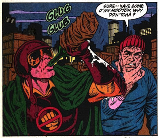
PUBLISHED: DC Comics, June 1993
SCRIPT: Jerry Ordway
PENCILS: Tom Grummett
INKS: Doug Hazelwood
COLORS: Glenn Whitmore
LETTERS: Albert De Guzman
EDITORIAL: Mike Carlin with Jennifer Frank
A couple days ago, I took a look at a short segment of the sixty-five page ADVENTURES OF SUPERMAN #500 — specifically, the four-page introduction to Superboy by Karl Kesel and Tom Grummett. Today, I wanted to revisit a different part of that same issue: the nine total pages of subplot that focus on the nobody’s favorite hard-hitting hero of Suicide Slum: GANGBUSTER.
Oh, Gangbuster. While many casual comic history buffs may cite 90s comic character design trends in terms of pouches and spikes, I feel like Gangbuster represents the aesthetic of that era in an equal but opposite way. His “What if Firestorm was Robocop” look is such a prime example of what straight attempts at designing new comic book characters in the classic superhero mold looked like at the time. The shoulders. The helmet. His little logo. He’s so serious. He’s just the worst. I think I might love him.
But hey, Andrew Weiss I ain’t — far better to let you see my man Gangbuster in action and let his performance speak for itself. So let’s tuck in and take a look at his subplot in ADVENTURES OF SUPERMAN #500, which I’ve entitled, for the purposes of discussion: “GANGBUSTER: SWING ANNA MISS.”
THE ADVENTURES OF SUPERMAN #500 and all characters contained therein are property of DC Comics, reproduced here solely for educational purposes.
***
PAGE ONE
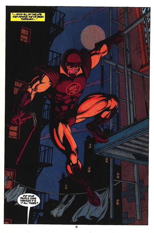
Aww, yeah. Drink him in.
Grummett and Hazelwood create a sense of distance between the buildings by showing the foregrounded building Gangbuster’s hanging off of in full detail, while the buildings in the background are rendered in black silhouette, suggesting they’re far enough apart that light affects them differently. This has the side affect of giving Gangbuster a sense of height — if the buildings behind him feel far away, we automatically assume the ground must be equally far below. This is a great hero shot, besides. From this first image, we know what kind of superhero Gangbuster is: the weapon and helmet suggest he has no powers, the collar implies he’s kind of a squarejohn. To my eyes, his design invokes two moralistic Marvel characters: Daredevil and Cyclops.
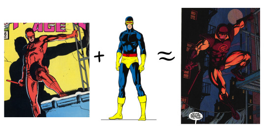
The message is clear: the Super R.A. is here to kick some ass.
PAGE TWO

Excellent establishing shot of the alleyway — going with an over the shoulder angle concretely places Gangbuster, our audience surrogate character, relative to the other characters below. When added to the previous splash page, this gives us a very strong understanding of the space: a narrow alleyway with entrances on both sides.
Note how Grummett makes panels two and three a smaller inset of panel one, giving the feeling that what we’re seeing is a detail of the larger scene. Colorist Glenn Whitmore even makes the gutters of these panels a dark red, a color we already associate with Gangbuster, further coding the scene as being observed by him, even though panels two and three are not literally from his POV. This might be reading into things too much — this color coding might just be a happy accident. Super minor continuity issue with his nunchucks: they’re dangling free on page one, but gathered into his fist here. Personally, I’d think the clinking chain connecting them would give him away. But who knows? It’s the DC Universe. Maybe they’re hard rubber instead of metal. Moving on.
Also, that guy next to the car. Keep an eye on him.
PAGES THREE AND FOUR
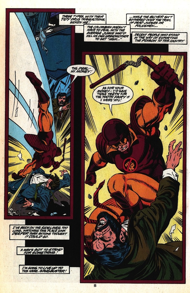

These pages work together as a sort of splash in three parts. The black field floating behind the panels on page three is a great way to add depth to the layout — Grummett employs this several times over the course of the issue, always to good effect. On the big splash page, I really like the visual representation of the whipping motion of the nunchucks; it adds force and speed to a weapon the can often look sort of ineffective on a static comic book page. The slowly increasing size of Gangbuster across both pages conveys the growing intensity and brutality of his attack on these guys. This also sets up this moment as the height of Gangbuster’s evening — we’re clearly meant to be more or less on his side right now. After all, we need a hero now more than ever. Superman’s dead.
PAGE FIVE
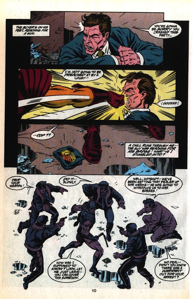
The first three panels on this page consist of tight action shots, limiting our ability to see our environment, so we share in Gangbuster’s surprise when we pull to a wide shot in the last panel. Dropping out the border in panel four, surrounding the figures in negative space, enhances the feeling that the cops have swarmed him from out of nowhere — although note that Grummett adds enough puddles and junk on the ground to make the figures feel like they’re standing on something solid. Lastly, making all of the figures the same cool shade effectively equalizes them; Gangbuster isn’t a superhero, he’s just some schmuck that’s about to get canned.
PAGE SIX

Is the cop who calls out to Gangbuster in panel four the same one who fires at him in panel five (“Charlie”)? Logistically, It would make sense — there’s no one in front of him in panel four, and Charlie in panel five is clearly in front of the “Charlie -- No!” cop in that panel (who we’ll call “Killjoy”). Character-wise, however, it would make more sense for the panel four cop to be Killjoy — he’s even holding his gun the same way in both panels.
I point this out as an example of the pitfalls of making characters in identical outfits too physically similar. If you’re drawing a group of big city cops, there’s no reason not to make them diverse in race and gender, if for no other reason than to add easy distinguishing elements between what is otherwise a totally homogenous pack of unnamed characters (although there’s plenty of other reasons why this is a good idea).

All that said, great bit of action between panels one and two. The close-up of Gangbuster grabbing the cop in panel one, a right to left motion, leads directly into the huge left to right throw in panel two. I love the anatomy in this scene — you can really feel how much effort the decidedly non-superhuman Gangbuster has to put into the throw. Once again, Grummett and Hazelwood create a feeling of space in panel two by dropping the back two cops into black silhouettes, with their badges still visible to create a feeling overwhelming, encroaching authority.
Also, considering how ineffective small arms typically are against costumed crimefighters, our boy Charlie is one crackerjack marksman. Or maybe — just maybe — Gangbuster is a goddamn terrible superhero.
PAGE SEVEN

Here is where I point out a minor flaw in this whole sequence; now that we’ve left the alleyway, we can say conclusively that the guy in the suit standing next to the car on page two never showed up again. He’s not even in the pack of cops surrounding Gangbuster on page five — we just lose track of him entirely. It’s a small thing, but since Grummett (or possibly Ordway in the scripting process) chose to include him in that establishing shot of the alleyway, it would have been nice to see him again when the Undercover Cops twist goes down. Losing him like this adds to the hash this scene makes of the work done to establish this space on the first two pages.
Couple possible fixes: One, take the guy in the suit out entirely. The initial interaction of the undercover cop and the drug dealer is framed very tightly and personally, so just have them be there (ostensibly) alone. Then pull the reveal of the undercover cop as is, and all the uniformed cops still swarm him from — the walls? I guess? They kind of come out of nowhere.
Two, and my preferred fix, would be to have a couple of guys in suits sanding by the undercover cop’s car on page two, with one distinct guy standing next to the drug dealer — a big guy in a leather jacket, something that screams “bodyguard.” On page three, Gangbuster takes out the bodyguard in panel two instead of the drug dealer. We keep Gangbuster wailing on the drug dealer on page four — that looked great. On page five, instead of just punching out that one cop, we have Gangbuster diving into the men in suits in a more “superhero takes on a bunch of thugs” type fight. Then the men in suits reveal themselves to be undercover cops, instead of the uniformed cops just appearing out of nowhere at the end of page five— something I keep bringing up because it really does bother me, since the geography of the narrow alleyway was so well established on page two, making the sudden appearance of the uniformed cops feel a little like a cheat. Wouldn’t Gangbuster have been ideally situated to see them hiding in the alley, from his vantage point on the fire escape high above? This proposed scenario cleans all that up, and loosely preserves the extant flow of action. And even though I did ramble on about this for a goodly while, it is ultimately a minor flaw. But then, that’s the thing about minor flaws; there’s usually a pretty easy fix.
Meanwhile, this page: Really strong lettering from Albert De Guzman at play here. Look how he guides our eye down the page, helping Grummett’s already clear line of motion by creating an arrow of words pointing right to Hob’s Bay.

Grummet consistently makes Gangbuster small (I.E. less powerful) on this page, a clear contrast to how huge he was during the opening pages. Here he’s dwarfed by everything on the roof, from vent pipes to chimneys, culminating in the huge cop’s hand + gun in panel four. I personally would’ve liked to have shown a little more of the cop’s arm, enough to see an official insignia up on his shoulder, but we’ve already established that the cops’ jackets have furry cuffs, so it works fine enough as is.
PAGE EIGHT
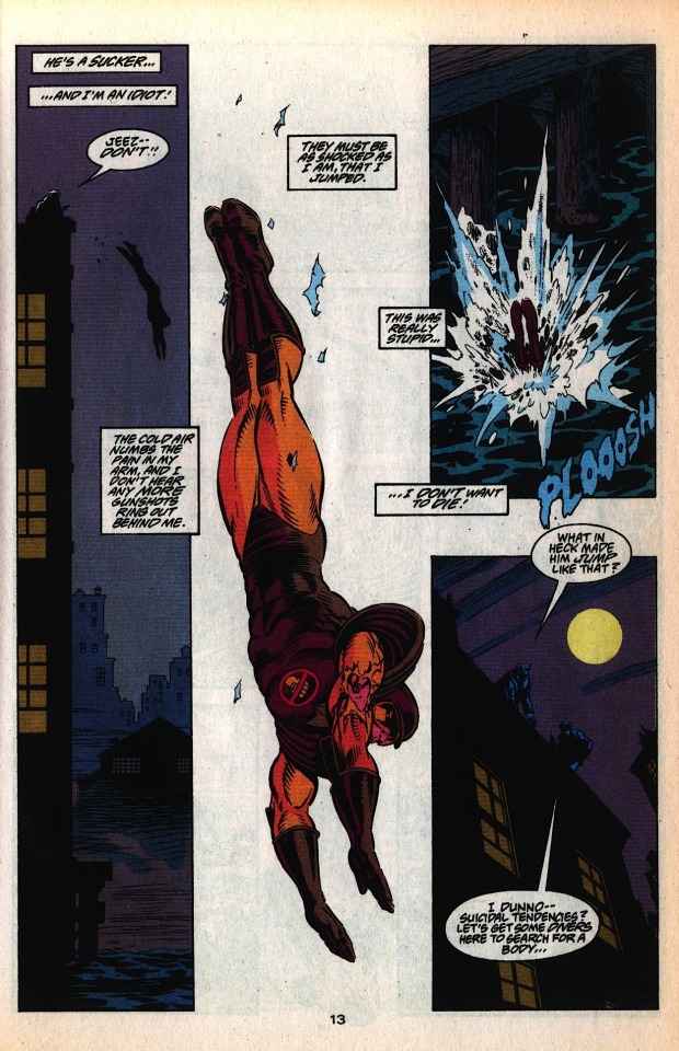
There’s been no shortage of great layouts in this issue, but this page is a cut above. The narrow verticality of that first panel bleakly lays out the stakes at play; the cop on the roof, the three story jump, the bay below. Grummett and Hazelwood use the fog off the bay to drop the buildings beyond into the deep background, visually “clearing the path” to the bay.
The second panel eliminates everything but this huge full-figure shot of Gangbuster diving, with a couple scraps of lead paint from the roof to place him in space. We can’t see his expression, but his captioned dialogue is tremendously affecting. Note also how while Gangbuster is diving towards the bottom on the page, the lettering still leads us organically to his plunge into the bay in panel three, even though that panel is layout-wise much higher on the page.
Nice reverse shot in that last panel, reminding us how far Gangbuster has just jumped and adding tension to the idea that he might not have survived. The last line is continued in a caption on the following page: “…No way anyone could’ve survived THAT!”
Another note about the last couple pages: Grummett always has Gangbuster moving in the same direction, left to right, throughout the entire rooftop chase. For this reason, the bullet Gangbuster catches is in his right arm — the arm that’s always facing us.
Oh man! It could’ve been a cool visual dichotomy, if we had seen the official insignia on the sleeve of the cop pointing the gun at him at the end of page seven! The officer of the law has a symbol of his authority where the vigilante has a bullet wound! Ahh, well. Still a phenomenal page.
PAGE NINE

We come back to this subplot after about twenty pages with a nice, low-energy establishing shot of the docks. The wafting, flapping paper is a great way to suggest windchill and urban decay. The bay is to the left of the page — when last we saw Gangbuster, he was making a rightward dive into the bay. On a storytelling level, we’re on “the other side” of the bay. Gangbuster got away clean.
High-Pockets is immediately helpful here, despite having a crummy night. No deep analysis to be had here, I just like it. Good little character trait for a good little character. As he hauls Gangbuster out of the drink, we see he’s transferred his wine to the pocket of his coat, which he then gives to Gangbuster. High-Pockets doesn’t offer him his hooch, mind you — Gangbuster just straight jukes it. We end on a nice reverse silhouette as High-Pockets and the slumped, defeated Gangbuster lope off into the shadowed, Superman-less city of Metropolis. Gangbuster’s last line concludes in caption on the next page: “…Then I’ll be finished with this stinking place!” Our hero, kids.
Again, this is one of the first comics I even read. When I think about it, Gangbuster has to have been one of the first, say, fifteen superheroes I was ever aware of. Before Green Arrow or Daredevil or The Question or Black Canary, I knew about Gangbuster — a character who, as depicted here, just isn’t really cut out to be a superhero. He’s a washout, a bencher, a big ol’ can of coulda beans. He’d be one of the hockey pad Batmen from The Dark Knight, only they wouldn’t let him join because he’s just such a giant prick. He’s awesome. Gangbuster, man! Gangbuster.
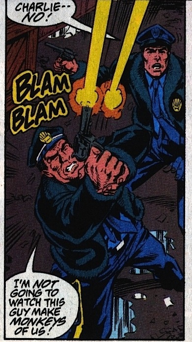
***
You can buy the full 65-page issue of THE ADVENTURES OF SUPERMAN #500 for the surprisingly low price of $1.99 off Comixology! It’s absolutely worth the read, containing a truly emotional Pa Kent story as well as the introduction of Cyborg Superman, which is, if nothing else, exceptionally well-paced.
Meanwhile -- we’re in the final days of the Kickstarter for SECTION ZERO!

Tom Grummett reunites with writer Karl Kesel to bring back the high quality old school team-based adventure comic — one of the few types of fiction that genuinely does work better in the medium of comics than it does anywhere else, and these guys are high in the top list of creators who can pull it off. If these awesome Gangbuster pages above did anything for you, SECTION ZERO is totally on your frequency.
If you want to read some preview pages and learn more about the project, I highly encourage everybody to check out the SECTION ZERO Kickstarter — it’s entering its last week and I very much want to see this book on my shelf.
***
As always, feel free to check me on any mistakes I might have made, add your own commentary, or share similar examples of good comics done well. I’ll be back next week with a different comic to peruse.
Be well!
PREVIOUS PAGE x PAGE ANALYSES:
MINI-ANALYSIS — FIRST SIGHTING: SUPERBOY
ULTIMATE SPIDER-MAN #69 (with Aud Koch)
THE SHADOW STRIKES! #13
PETER PARKER: SPIDER-MAN #13
BATMAN: GOTHAM ADVENTURES #17
#Gangbuster#Page x Page Analysis#comics#educational purposes#Superman#DC Comics#Tom Grummett#jerry ordway
5 notes
·
View notes
Text
The Spawn of the Great Joraffe and the Unicorn Queen
Notes: So, I know it’s the end of January, but this was an unfinished story I was attempting to write for Christmas which had made me frustrated because I couldn’t figure out how to end it. I needed a break from my other stories, so I went back to this one, and it actually began to flow, even though I had a number of holes to plug.
There is a book I mention at the very end titled “Unicorn Giraffe.” This children’s book actually exists. It’s by Teddi Rutschman and Laura Botsford (whom I hope would be pleased at the free press they are getting right now). While I’ve never read it, from what I can tell, it looks beautiful with a lovely story perfect for a child of Helena and Myka’s. The sentence Helena reads to her son is the actual sentence at the beginning of the book.
This story came to mind partly because of an inside joke in the Bering and Wells fandom regarding Jo and Jaime. For various reasons, Jo became known as the “Great Joraffe” and Jaime as the “Unicorn Queen”. I also was given a plush animal that looks very much what I described and couldn’t help but think how it could be the love child of the stuffed animals the Great Joraffe and Unicorn Queen with a rainbow mane.
Also: Fluff. So very much fluff! But we all need that right now, I think.
—
Summary: The big eyes of the little multi colored spotted plush animal with a little unicorn on top of its head stared at Helena with what could only be described as wonderment…if the bloody thing was alive.
The big eyes of the little multi colored spotted plush animal with a little unicorn on top of its head stared at Helena with what could only be described as wonderment…if the bloody thing was alive.
Which it most definitely was not.
“No.”
“Yes.”
“No.”
“Yes! I’m going to buy it. You can’t tell me Choo Choo Charlie won’t love this?!”
“While he may, Myka won’t.” Helena rolled her eyes. “And why on earth must you call Charles ‘Choo Choo Charlie’? Is it just to aggravate me?”
Pete grinned. “While I do love to aggravate you, HG, it’s an American thing from an old TV ad. Besides, it’s your own fault; you bought him that train set to begin with.” He elbowed Helena, teasing, “And don’t act like you’re all upset about it. You love to play it with him as much as I do.”
Helena did her best to hide her smile. She really did enjoy it to the point of making her son an intricate train track, and buying him additional pieces and train cars. Sunday afternoons were often devoted to Thomas the Tank Engine, building model trains together, and playing with the train set in the basement.
The inventor’s special surprise for Charles on Christmas Day: a brand new Steampunk train designed and built with the help of Claudia. There was also an even more detailed track that for one thing, required one to solve puzzles along the way.
“Oh my god! Squeal of delight!” Claudia rushed over, and seized the plush animal-thing out of Pete’s hands.
“Hey! I wasn’t done yet! Me and the spawn of the Great Joraffe and the Unicorn Queen are creating some awesome dance moves.”
Shoving Pete out of the way, Claudia squeezed and hugged the garish toy. Closing her eyes, Claudia cooed, “Oh, you are so precious, aren’t you, little…uh…” Claudia’s eyes opened, and she regarded the plush animal thing. “I’m thinking we need a name here, H.G.”
“Oooo, yeah!” Pete placed his hand under his chin, rubbing it as if contemplating some great universal question.“Now, let’s see: Joraffe Jr.?”
Claudia waved a hand, dismissing him. “Too easy, and too boring, Pete.”
“Well, what do you have?” Pete snagged it out of her hand and held it high above Claudia, who kept jumping and swatting at it to no avail.
“Come on, Pete! Give it back!”
“Weeeee! Look what I can do!” Helena was surprised Pete could make his voice go that high pitched, and watched the man child make the plush animal thing do various jumps and impossible athletic endeavors.
Helena rubbed her temple. She knew her four month pregnant wife would likely show up any minute and feared Myka’s reaction.
It was one week before Christmas. Helena and Myka were visiting Mr. and Mrs. Bering in Colorado Springs, and decided to revisit this charming store featuring all kinds of wonderful baby and nursery items. This was their second child, but now it was Myka’s turn to carry the child, and she was not happy about it. Not one bit. Helena refused to give her a free pass stating, “I’ve already done this twice now. Besides, Dr. Calder doesn’t think it would be safe for me to carry another.”
When they were married, the idea of children was not on the list, but the Warehouse had other ideas. Helena did not come to the Warehouse often but Myka had needed some help with organizing and deciphering some of Warehouse 12 files, not to mention Caturanga’s illegible writing. One thing led to another in the library…and now nine months later, Charles Christopher Peter Bering-Wells was born. (“That’s what you get for being naughty in the Warehouse, Mykes,” Pete had teased.)
Everyone was in shock it was a boy. Myka kept babbling about how science is science and they both had no y so why is there a y…
Pete was ecstatic, declaring the Warehouse knew another male was needed, and swore there were days he felt like he was swimming in estrogen. Steve took exception to this, pointing out there was also him and Artie to help in the testosterone department. Pete came back with the rebuttal that if you add Abigail, all the guys were out numbered. Plus, there were days Pete could have sworn Myka multiplied just to torment him.
Myka on the other hand was pissed Pete made this all about him, but her eyes were full of happy tears when little Charles was born. For her part, Helena was just happy to have a healthy baby.
She was also in a way relieved. Helena didn’t think she could have stood giving birth to another little girl. It would have been overwhelming, bringing back too many memories. It seemed strange to say, but somehow she felt the Warehouse sensed this, which would explain why she gave birth to a son.
Charles was now four, and the apple of everyone’s eyes, and he knew it. Helena swore there were days she could see her brother in little Charles’s mischievous expressions. It brought back happy memories of her and her brother Charles as children. Helena was usually the instigator, as most of the ideas were hers, but Charles was always a ready and willing comrade in arms. The days she saw that expression on her son’s face were the days she missed her brother the most.
Adding to Charles was always open ended: they simply never discussed it. Helena suspected Myka knew having Charles was a blessing, but was well aware of the spark of darkness within Helena. If anything happened to Charles, Helena doubted even Myka could hold her back. To add another child…
Now a consultant to the Warehouse, Helena held a non related Warehouse job as well. She was still afraid of the lure, the temptation to use artifacts no matter how many times everyone else (including the Warehouse) knew she would not.
The Regents it seemed were in agreement with her as they disapproved of her returning as an agent (despite the protests of the rest of the Warehouse team). There was the discussion of Helena becoming a Regent, but she simply didn’t want that sort of connection anymore. However, Helena did enjoy acting in a consulting capacity, and the Regents gave their approval. Helena’s expertise from situations relating to Warehouse 12 was invaluable, as well as her genius level intellect. And much to the delight of one Claudia Donovan, Helena was allowed a certain…leverage as well.
Or really, it was more of a plausible deniability on the part of the Regents. Claudia Donovan originals (or improvements for that matter) were never officially sanctioned. However, considering these inventions improved life in the Warehouse and the field (especially achieving a higher retrieval rate), Helena’s role was overlooked.
Claudia had declared working with Helena as “the most awesome of awesome”. Helena still did not understand the girl’s use of language, but understood enough to know this was a good thing. Helena was simply pleased her version of the MicroRay had saved Claudia’s pseudo father’s heart.
Afterwards, Artie’s attitude towards Helena as Claudia’s mentor softened. His gruff paternal demeanor towards anything connected with Claudia was still there but the ire towards Helena for past misdeeds had disappeared with the cravat that Helena hurting Claudia in any way, shape, or form would carry serious consequences up to and including bronzing. Helena got the message loud and clear, and felt an odd kinship with Artie as a parent.
The need to invent, to discover, to imagine, had never really left. She found that out with Nate who seemed mystified, and while not the exact cause of their relationship ending, was at the least a symptom of the cause. Emily Lake was a mask, and after the jaw bone incident, Helena G Wells started to peel the rest of the torn mask away; and that person was not someone safe enough, not someone who could be the PTA soccer mother Nate and Adelaide needed.
When Helena and Myka finally admitted their feelings, the urge intensified. It was like rediscovering a part of her she’d buried for so long and she reveled in it.
Once Helena and Myka were married, they bought a house in Univille, and between consulting for the Warehouse and inventing, Helena worked part time at the local bookstore, much to Myka’s delight. It gave Helena solace, being surrounded by literature. They were all like old friends; the smell and texture brought to mind her days in London with informal scintillating intellectual discourse in a group much like the Algonquin round table.
There was also a laboratory in the basement of their home. When she became pregnant with Charles, it was decided this must change. Helena simply bought one of the pieces of land nearby and built a laboratory, much to Claudia’s excitement.
While Helena enjoyed the computer, her love for the physicality of the written word on parchment had never ended; the feel of crisp paper between her fingers, and the smell of the ink as it dried. To Myka’s elation, the Victorian began to write again.
Eventually, Helena gained the nerve to submit a story to a science fiction magazine. Initially rejected (Myka threatened to fly to the company’s headquarters and tell them off), Helena retooled a few things, realizing her style of writing came off a bit antiquated.
At last, she had a story published, and decided to focus on a novel next. Helena loved her wife, but Myka hovering around her as she wrote proved too much. Eventually, they came to an understanding; when Helena was writing she was not to be disturbed, barring an emergency.
With that understanding, things flowed easily enough. While Helena becoming pregnant with Charles was unexpected, she was determined to not make the same mistakes she made with Christina.
One or both of them were always with Charles. During those moments when they were unable to, Uncle Pete, Aunt Claudia, Uncle Jinks, or Grandpa Artie would keep careful watch. It took a long time before Helena would even allow this; there were continual flashbacks to Christina’s death. Not just the fear, but the guilt at having left Christina with a young weak maid unable to fight off the huge men during the robbery.
At last, with time, patience, and convincing, Helena was assured her friends were capable of protecting Charles. Myka had pointed out they were all Agents, and were more than capable of shooting and fighting off intruders.
So, Helena relaxed. And with it, came the enjoyment of motherhood again; just simply the true joy of sharing things with her son.
There had been questions from Myka’s relatives (especially her mother and Tracy) over when they would add to their family. They had been convinced Charles was the result of a experimental procedure allowing two women to procreate, and the insistence to add another child intensified.
Myka at first was annoyed, but as time went on, the thought to share things with a daughter as well grew.
Charles had a lot of Wells in him, and Myka was hoping to have a child with more Bering, even if she would never admit it. Their son was never keen on athletics, and while he loved to read, his love of trains and anything mechanical, took precedence. Helena knew Myka wanted to have a child that would someday fence with her, perhaps join the debate team, and read as if the books were the very essence of life itself.
Every so often, Myka brought it up. After many nights of talking and crying about Christina, Helena was ready to try for a girl. This time, they used an artifact. As Myka put it, “we are never, ever doing it in the warehouse again!”
As Charles was considered some sort of fluke, they expected a girl this time, as “science was still science” (as Myka put it). Once Myka was pregnant, they eventually discovered they were indeed having a girl.
Myka was taken off retrievals, and while she knew it was coming, it made Myka agitated. The inventor had faced certain restrictions while pregnant but she was still able to tinker, write, and work at the bookshop. Myka wasn’t able to go out and do what she loved best: be a Warehouse Agent.
So here they were, joined by Pete and Claudia. It had just so happened there was a curiosity nearby Colorado Springs, which was snagged, bagged, and tagged in record time. Artie graciously granted Pete and Claudia an extra two days to spend in Colorado Springs. Pete was very happy to see Mrs. Bering and most especially, her cookies.
Helena’s iPhone buzzed in her pocket. It was Myka, and she would be here any minute.
“Just stop!” Helena reached over and grabbed the plush animal thing, and predictably both fussed like two little children.
“Aw, come on, HG!”
“Yeah. We haven’t settled on a name yet.”
“I don’t really care. Myka just finished at the bank, and will be here in a couple of minutes. You both know how she has reacted to your incessant teasing about that…animal…family…you seem to have created for Charles.”
Helena dimly registered the tinkle of a bell but was focused on this ridiculous conversation involving the…offspring?…of two plush animals in Charles’s room.
“I thought she liked it,” Pete lamented.
Helena’s eyes widened in disbelief. “Every time you mention it, she hits you!”
“She always hits me! How am I supposed to tell the difference?”
Helena did have to concede a point there.
“The difference between what?” Her wife said evenly behind her.
Pete’s eyes widened and he grabbed the stuffed animal thing from Helena’s grip prompting a glare from the inventor. Pete whipped the garish animal thing around his back out of sight so fast Helena would have been impressed if she wasn’t more worried about the situation at hand.
The situation called for her best charm. She sauntered over, and wrapped her arms around her wife. Whispering in her wife’s ear, Helena intensified her British accent, knowing for some reason she had never been able to understand, her accent was a turn on for Myka.
“Now, come, come my darling. Just ignore Peter. Let’s instead think about having a wonderful candlelight dinner at the Mediterranean restaurant we saw on the way into town. We can leave Charles with your parents overnight, and have a lovely dinner and return to the hotel where I can pamper and make love to you.” She softly kissed Myka’s ear. “Je vous adore, mon amour.”
Myka’s body however remained rigid, and when Helena pulled back, Myka’s face was expressionless. Drat. Not even her best seduction method was working. Helena absently wondered if she was losing her touch.
It was obvious that not only would Myka not let this pass, she would most likely yell at Pete in the store when she learned the meaning behind Pete’s statement.
But fortune smiled upon the group, as little Charles Bering-Wells and Mrs. Bering entered the store. The little boy ran to Helena, hugging her legs. His little arms reached up to be lifted into Helena’s arms.
“Mummy!”
Helena’s eyes lit up and she gave him the smile reserved only for her son. Charles was getting to the point where he was too heavy to hold for any long period of time, but Helena refused to acknowledge this. Her body however had other ideas, as she felt the strain in holding him for a length of time. Helena knew it wouldn’t be long before she had to stop (most likely a month, if she were lucky) but she was determined to make the most of this cherished ritual other parents enjoy. Christina had reached the point of being beyond this stage when she was killed, but just holding her own child in her arms again returned that joy to her heart.
Helena adjusted her arms a bit, and said, “Hello, my little engineer. Have you been having fun with your grandmother?”
Charles nodded enthusiastically, his engineer cap bobbing slightly on his head.
“Where’s your new hat, Charles?” Myka reached over to fuss with Charles’s cap, and the young boy scrunched up his nose, and wiggled so much Helena was forced to set him back on the ground.
“I want to wear this hat, Momma. Mummy said I could wear it.”
Helena cringed as Myka turned, giving her a hard look, and Helena knew she was in trouble.
“Well, Mummy seems to have forgotten that the temperature is thirty degrees outside-much too cold for wearing your engineer cap.” This statement was more for Helena’s chastisement rather than directed at their son.
“Darling, it is true I said Charles is allowed to wear it while we enjoy our time together with the trains…” she looked down at her son “I did not mean everywhere.” Her son was wearing his puppy dog face which Helena had a hard time resisting, but Helena knew Myka was right; Charles would be sick with the lack of warmth on his head, and no covering on his little ears.
Kneeling down, Helena caressed her son’s cheeks.“You know, even engineers get cold, and need the extra warmth. Besides, it would be terribly difficult to enjoy Christmas in bed. You would miss Grandpa Artie’s cookies, going caroling, decorating the tree, opening your presents under the tree, and our Christmas feast with Christmas crackers.”
A small pout was almost Helena’s undoing as she removed the engineer’s cap, smoothing down his chestnut hair. “Now, darling, they have some lovely stocking caps right over there.” Helena pointed to a display next to the cash register. “And you may pick whichever one you like.”
Helena rose, and noticed a contrite expression on her mother-in-law’s face. "I’m sorry, Myka. I couldn’t get him to put on a warmer hat before we left the house.“
"Charles, is this true?” Helena looked down at her son, frowning. “You know to obey your grandmother.”
The little boy bowed his head in shame, and then mumbled,“I’m sorry, Mummy.”
Helena sighed. “All right, no punishment this time, I suppose.” Charles looked back up at her, and smiled. “But next time this happens, young man, there will be no Thomas the Tank Engine and playing with your train set for at least a week.”
The smile dimmed, and Charles grew serious. “Yes, Mummy. I will listen to Grandmother from now on.”
“Good.” Helena nodded approvingly.
“Mom, we can take it from here.”
“What time will you be coming over for dinner?”
“Soon. I’ll give you a call,” Myka replied.
“Okay.” Mrs. Bering kissed Myka on the cheek, and glanced at Helena. “I’ll see you two later. Make sure Myka gets to the house all right, Helena.”
“Mom! I’m not an invalid. I can get myself over there just fine, thank you very much.” Myka crossed her arms, and pouted, looking very much like Charles at the moment. Helena bit her lip not to smile; Myka was adorable.
Mrs. Bering rolled her eyes. “Goodbye, Charles.”
“Goodbye, Grandmother!” Charles hugged her and then Mrs. Bering walked out the door.
“Mykes, I’m still invited to dinner, right?��� Pete was wearing his best puppy dog face.
Myka sighed, relaxing her posture. “Yes, you and Claudia are both invited, like I told you.”
“Yay!” Pete cried happily, as he and Charles gave each other high fives.
“I don’t think I can deal with going over there tonight, Helena.” Myka whispered.
Helena kissed her wife’s hair. “It’s only for tonight, love. And we will most definitely be returning to the hotel later.”
At that moment, Pete demonstrated his bull in a China shop tendency, and knocked down the display of stuffed animals behind him which just happened to have more of that god awful multi colored plush animal…thing.
Various forms of Pete’s name were cried all at once.
“Pete!”
“Peter!”
“Dude!”
“Uncle Pete!”
“Whoops.” He bent over to pick up the animals while Claudia began to reorganize the display.
“Don’t worry, Mykes and H.G., we got it. No problemo.” Claudia said, waving off the clerk who was set to come over. “Sorry about that!” She called, and smiled at the clerk, who seemed to hesitate, but was interrupted by a customer ready to pay.
A quick glance at her wife revealed Myka with closed eyes trying to regulate her breathing. Helena placed her hand on Myka’s back, rubbing soothing circles through her coat, and was very thankful Myka didn’t push her away.
Opening her eyes, Myka leaned into Helena, who just wrapped her arm around her wife. It was time to go home. Just as Helena was about to open up her mouth and relay just that, her son exclaimed, “Mummy, look! This animal looks like both you and momma!”
The little boy grinned as he held up the prized ghastly thing.
Myka didn’t answer. Helena saw a mix of confusion and incredulousness on her face.
“Charles, darling-” Helena began.
“Told ya!” Pete smiled wide at Helena as he pranced a bit in place and Helena feared another accident.
Helena felt Myka’s back grow rigid again, and she withdrew from Helena’s touch. Helena internally sighed. Why must Pete be so…Pete?!
“What the hell are you talking about, Pete? That-that thing does not look like us.”
Undeterred, their son informed, “It looks like the Great Joraffe and the Unicorn Queen mixed up together.”
Helena feared Myka would blow a gasket, but then Charles continued, “It’s like me being a mix of you and Mummy!”
Helena immediately sensed Myka’s body relax and thought she heard sniffles.
“Myka, darling, are you coming down with a cold?”
Myka turned, causing Helena to only hear a muffled answer. Her wife drew out of her pocket a Kleenex, and blew her nose while still sniffling.
Charles tugged on Myka’s coat. “Are you sick, Momma?”
He sounded so concerned and sweet it was no wonder Myka turned back and bending down slightly to hug him close to her legs, kissing his dark hair.
“No, no, baby, I’m fine. Momma is just a little…out of sorts today.”
Charles raised his head to stare at Myka with worried wide eyes. “Why are you out of sorts?”
“Um…it’s just sometimes when women are pregnant, it gets hard to control their emotions.”
“Does this mean you won’t be able to have Christmas with us?”
Helena decided to take control of the situation as Myka appeared to be on the verge of losing it again.
Leaning down, Helena looked her son in the eyes. “Momma will be just fine, Charles. Now, be a good boy, and go find which hat you would like to wear. After that, we will all go back to Grandmother Bering’s house, and have hot chocolate.”
Glancing one more time at his momma, Charles withdrew slowly from Myka’s grasp. “Okay, Mummy.”
Helena smiled and then instructed, “Hand Claudia the plush toy to return to the display before you leave.”
Claudia jumped in, and held her hand out, saying,“Come on, Charlie. Let’s put this animal back on the shelf, and go over to the hats. I bet we can find one you will totally rock.”
When Claudia and Charles were over perusing the hats, Pete tried to make his escape. “You know, there is this new restaurant I saw open in the next town over. I’m gonna go get the car, and then Claud can meet me outside when her and Charlie are done.”
Myka laid her hand on his arm. “Pete, it’s okay. I’m sorry. I’m just tired.”
“It’s okay, Mykes.” He grinned sheepishly.
“I know you meant the best…in your own way.” Then she added, “But that animal thing-” she pointed at the garish toy “does not look like-like-”
Pete grinned widely.“The spawn of the Great Joraffe and the Unicorn Queen?”
Helena scoffed, while Myka pinched her nose. He grabbed the plush animal again, and once more did a (admittedly more subtle) dance with the thing.
“Pete! Fine! You can give it to him for Christmas.” Myka gave in.
"Yippee!”
“Just put it back, and come in later to buy it please.” Myka glanced at Helena who was rolling her eyes.
Helena sucked in a breath, and conceded, mumbling, “Righty ho, then.”
Pete grinned widely at Helena. She shook her head at his enthusiasm, knowing he really did have a good heart.
“Now, if you will excuse me, I think it’s time to buy Charles’s hat, so we can leave.”
“Agreed,” Myka responded, and Helena was pleased to see the smile on Myka’s face.
Walking towards Charles, Helena called, “Have you found a hat, my little man?”
Holding up a hat with the craziest, most obnoxious design Helena had ever seen, he exclaimed happily, “Yes, Mummy!”
Helena closed her eyes, and wondered if this day would ever end.
—–
It was the beginning of February with Christmas long since over.
The snow softly fell in the chilly dark night, while inside Charles’s bedroom, Helena tucked her son into his warm bed with Thomas the Tank Engine sheets and comforter.
“Mummy, read the story to me again.”
“Which story, darling?” Helena asked.
“The one about the giraffe unicorn.”
“You mean 'Unicorn Giraffe’?”
“Yes. That one.”
“All right.” She walked over to the windowseat where the book rested next to the Great Joraffe, the Unicorn Queen with a rainbow mane, and a garish plush toy sporting a tiny engineer cap fashioned by Claudia.
“Mummy, can you bring Choo Choo Joraffe Jr. too?” Charles asked in a sleepy voice.
Helena rolled her eyes, but did as asked. Bringing it over with the book, she commented, “Have you considered a nickname, Charles? 'Choo Choo Joraffe Jr.’ is rather a mouth full.”
Charles happily accepted the offered toy, and hugged it fiercely to his chest.
“No, Mummy. Choo Choo Joraffe Jr. is his name.”
Helena internally sighed, but looking at her son so happy with the little plush animal thing softened her feelings.
“All right, my darling. Choo Choo Joraffe Jr. it is then.”
He grinned.
“Now scoot over, so I can come onto your bed and read the story.”
Charles happily complied, and Helena crawled up to lean against the headboard, book in hand. As Charles snuggled into her side, she opened the book, and began.
“It was in a land called Lemony a place faraway from where we are now where only friends of the Aftertime could visit.”
As Helena read the story, she felt at peace, full of happiness and love, emotions she never expected to find again.
—–
The story finished and Charles fast asleep, Helena gently extricated herself from her son’s grip and rose from the bed.
She kissed his tiny head, whispering, “Sweet dreams, my little lamb.”
Helena replaced the book 'Unicorn Giraffe’ on the windowseat, and as she closed the bedroom door, she mused, wondering how such a little garish plush animal thing could bring so much so much happiness.
Maybe she should listen to Uncle Pete more often.
#Bering and wells#The Spawn of the Great Joraffe and the Unicorn Queen#my fic#so very much fluff#myka bering#helena wells
5 notes
·
View notes
Text
Review: Final Fantasy VII Remake – Returning to Midgar
Sitting in anticipation, I grip my controller as I watch the opening movie flash with the beginning scenes of Midgar.
Familiar characters and locations gleam as they appear one by one. That familiar tune begins to play as the loading screen appears. It is impossible not to get emotional while the nostalgic theme song of the original flow from your speakers.
The difference? Everything looks so real I want to reach out and touch it-like a kid in a digital candy store.
Brace yourselves; the long-anticipated Final Fantasy VII Remake game has finally arrived!
Review: Final Fantasy VII Remake
Final Fantasy is the most famous RPG franchise ever, and 7 is the most famous Final Fantasy ever. The original, released 23 years ago in 1997, sold more than 11 million copies and inspired spinoffs, animated movies, and fan fiction.
The octagon shapes and bright colors that once made up our beloved game have been traded for the highest level of graphic design. You can see every strand of Cloud’s hair shift when he moves. Every detail of emotion can be seen in Aerith’s eyes. It makes you wonder if this could be the true definition of magic.
The Final Fantasy VII Remake brings the nostalgia of our beloved story to life. With the newly enhanced graphics, upgraded designs, and storyline enhancements, it is enough to keep us all on the edge of our gaming chairs. Midgar looks beautifully realistic. You can practically smell the stench of the Mako.
The Remake game had a release date of April 10 and received very favorable reviews.
Grab a basket of your favorite flowers and let us once more begin a story that will shape the destiny of an entire world—the world of Midgar.
***Spoiler Alert!***
We will be reviewing upgrades, story plotline, and some details that may ruin a surprise or two. If you want to experience the surprise on your own, save this article to read after you play the FFVII Remake!
The Story Begins – A Quick Recap
Final Fantasy VII was one of the most revolutionary games around and was an introduction for many into the next generation of games.
The Final Fantasy VII Remake is not just a retelling of that iconic storyline. The first few hours of the game take on its own form of JRPG storyline, adding depth and details to the original. The main story is the same, but they added several enhancements to the story that go more in-depth.
The overall base of the story has to do with the Mako. Mako is the lifeblood of the planet and the fuel that powers the city of Midgar. By exploiting this resource through their Mako Reactors, the Shinra Electric Power Company has all but seized control of the entire world. A group of idealists, known as Avalanche, is one of the last bastions of resistance.
The main story itself revolves around the electric company Shinra, and the controversy of extracting the life force (Mako) from the earth and turning it into energy. Doing so is slowly killing the planet. Midgar itself is plagued by wealth inequality, split into two main sections separated by a massive plate: The business class society and the low-class slums.
You play as Cloud Strife, an elite operative turned mercenary. He is introduced by taking part in an Avalanche operation to destroy Mako Reactor 1 in the city of Midgar. If you haven’t heard of the infamous Cloud, he is the one wielding a sword larger than his entire body.
This is the base of where our story begins in both versions of the game, but the true question is, when does this one end?
The World of Midgar Reimagined…and Divided
Square Enix has made a bold move in utilizing the chapter feature. Rather than release the entire game in one shot, the developers decided to split it into episodes. And they have not revealed how many episodes are planned or how they will be connected.
The story progresses with chapters as if in a book. But how long will this first book be? You will have to play to find out.
Game makers have already confirmed that there will be at least two installments of the game, but they are still deciding on how many different installments there will be.
Due to this decision, they took the time to create new sections of the story that did not exist before.
Story Additions: Thickening the Plot
By the time you are a few hours into gameplay, you have already experienced some of the new additions to the story. They are some great extensions that add enriching details, pulling you even further into their world.
Curious about the difference? Here are a few changes that were made to the main storyline!
Shinra blows up its own reactor.
Unlike the original game, the bomb Cloud and Barret set in the Sector 1 reactor in Remake does not blow the facility up. Instead, Shinra does the dirty work itself, causing an explosion far bigger and more devastating than Avalanche had planned.
But why would Shinra do this?
Obviously, keeping the reactors running would make them plenty of money. Unfortunately, the only thing more profitable than the reactors would be war. Shinra wants to encourage the population of Midgar to support a second war with the nation of Wutai, and so it begins to spread propaganda that Avalanche is in allegiance with them.
Jessie’s mission
One of the few completely new locations in Final Fantasy 7 Remake is the Sector 7 Employee Housing Area, a residential zone on Midgar’s upper plate. Here we get to see how the wealthier people of the city live, as well as visit Jessie’s family home.
Apart from this entire mission being new, including the attack on a Shinra warehouse to secure more explosives, we’re also introduced to a whole new villain in the form of Roche, a flamboyant member of Shinra’s elite SOLDIER division. This marks Roche’s first and only appearance in the whole game.
Sector 7’s hidden lab
After the company drops an entire sector of the upper city on the slums to try and wipe out Avalanche, the party discovers a hidden laboratory that’s been operating in secret beneath Sector 7 – something that doesn’t exist (or at least is never mentioned) in the original.
While exploring its tunnels in search of Wedge, Barret and Tifa discover practically a whole army of creatures who attack them on sight. These creatures are failed experiments and appear to be Remake’s answer to the original game’s Makonoids; humans who have been saturated with Mako to the point that they have become monsters.
Take note, upon completion of the first game; you can revisit individual chapters to complete tasks you may have missed.
One of the best parts? You will be playing all of these characters with an unbelievably lifelike makeover.
The Revamped Character Designs
The original designs for the characters in 1997 were limited to the technology of the time. Though FF7 Remake certainly isn’t the first time these characters were updated or redesigned, it’s indeed striking to see them in 4K and on modern consoles.
The variety in character design is one aspect of FF7 that has remained a favorite among fans since the original, but some of them have had more of a glow-up than others.
Sephiroth
What makes Sephiroth such an iconic character within Final Fantasy VII and arguably one of the most recognizable video game villains in history is his simple yet elegant design. They have kept his look fairly streamlined throughout but have added detail.
Seeing him in the new graphics really brings his original design to life.
Cloud Strife
In a similar level to Sephiroth, his classic iconic design has been kept intact. However, the upgrades in detail due to the new technology are striking. Every single detail has been perfected right down to the knitted detail in his turtleneck.
Although his design has remained pretty much the exact same, he now looks better than he ever did in Advent Children.
Jessie
All of AVALANCHE received quite a few changes, but Jessie’s had the least as far as adjustments. Her design was one of the simplest in the original game, after all.
Still, the upgrades to facial expressions and body language really give Jessie a way more significant-feeling role than she ever had.
Wedge
Wedge has come a long way since the original game, as well as the earlier builds of the Remake. He was always seen as a sort of comic relief background character with minimal design.
The new remake really lets him shine with his excellent voice work, and the rework of his facial and character design.
Biggs
Out of all the minor AVALANCHE characters, Biggs is probably the one many least expected to look this good in the remake. However, it’s an entirely fair statement to say that Biggs is a contender for one of the most attractive characters in the game.
Barret Wallace
This is, without a doubt, the best iteration of Barret to date, and is precisely how he was pictured past the limitations of the original game. Due to his bigger stature, his overworld model on the PS1 was arguably one of the worst out of all the characters, but he looks near perfect in the Remake.
Tifa Lockhart
Even though Tifa never fit the stereotype of fantasy characters donning ridiculously complicated and intricate outfits, instead choosing to rock a simple white crop-top and a short skirt for maximum close-combat kickboxing efficiency.
The remake still manages to make her look more stunning than ever. Not a single detail has been forgotten on her design.
Aerith Gainsborough
From the first sight of the opening cutscene of the Final Fantasy VII Remake, Aerith shows the true scope of how far graphical capabilities have come in video games.
Her original models were already some of the best in the game, but Square Enix truly knocked it out of the park with her modern design. The details are impeccable, her hair looks real, and adding a voice to her really made the character design hit you right in the feels.
Several other characters received a huge enhancement in the game, including Heidegger and President Shinra.
The character redesigns are truly a work of art. Every detail was considered, and it shows.
But the reimagined character designs are another massive change people are talking about. Another colossal change is the battle system.
Battle System – A Hybrid
All of us that have played the classics grew accustomed to the original ATB system. This system relied almost completely on turn-based strategy as you had to be sure to utilize each character to its best potential. It ultimately meant just picking what your characters did from a menu and then watching the animations play out.
There will be some settings options for players who don’t like the new system, including a classic mode for people who want to just play the FFVII Remake in the spirit of the original. When you first begin the game, you will receive the option to select the classic gameplay.
The newly reimagined Final Fantasy VII battle system makes it feel as if it is a brand-new game. This new version blends the best elements of prior games into one cohesive system. This new system allows more freedom and is sure to give you an adrenaline rush.
They combined the battle systems of Final Fantasy with Kingdom Hearts to create a splendid blend of combat.
This is what would be considered more of an action-based RPG system. You can battle in real-time, experiment with fight abilities, and change characters with the quick click of a button. Every character has a unique style to them that feels like playing a totally different game when you switch over. Plus, there are tons of new customization options for weapons, skills, and the game’s materia magic system that stand to make overall combat much deeper than the original.
Remake Wrap Up
The Final Fantasy VII Remake exceeded all expectations. It provided its fans exactly what they were begging for and more. You can genuinely say it was not only remade, but it was reimagined.
With the new graphics, you can feel even more connected to your beloved characters.
The added storylines pull you further into the turmoil of their tale.
Some play games for fun, and for others, it becomes a part of their heart. Final Fantasy VII will always have a special place in many people’s lives. Now the Remake made that piece a whole lot larger.
Whether you are a new or old fan, purchasing the game is well worth the money.
The question everyone wants to know is when will the next chapter be released? How long will we have to wait to visit Midgar once again? We will have to wait impatiently for Square Enix to answer those questions.
One thing we do know for sure, the wait will be worth it.
The post Review: Final Fantasy VII Remake – Returning to Midgar appeared first on Your Money Geek.
from Your Money Geek https://ift.tt/34D2zPu
via IFTTT
0 notes
Link
Using Marketing Science
Let’s have a peek at some renowned ones. Ultimately being a gun owner is a sort of person you’re, rather than only a thing that you do. So, regardless of what you do, avoid using sadness.
Digital technology has way increasingly more obvious benefits to our everyday lives than smoking. www.essay-company.com Marketing will make certain that your internet copy and societal media platforms stay consistent. So many users take advantage of dark wallpapers, in black, so the consumption is going to be reduced.
The second feature is the ability to supply mocked-up ads directly from Creative Hub in actual time and is presently available. Trial new channels, new technology once it is logical to achieve that. The capability to drive large quantities of downloads at no price, thus, is still enticing to any developer.
http://washingtonprogram.ucdavis.edu/
These days, the thought of mixing patterns in similar color ranges is quite common. You can also select chest type poufs, inside which you’ll be able to store things. Perhaps you’ve already read each of these books, and you’re searching for some stuff further on the fringes.
Marketing Science Fundamentals Explained
I need to admit I don’t observe a fantastic improvement in the grade of the maps, but I’m pretty confined to simple maps in big cities in the usa. I’ve been in contact with the management team at Web Factory for several of years and know how they operate. As a neutral observer, there might be some truth and a moderating influence on the study and Forbes’ support of Facebook even in the event the defense analysis isn’t right.
What drives purchasing decisions is a wonderful search capability, and the capability to examine the views of people who you trust within the review atmosphere. The absolute most satisfying element has become the support and collaboration we’ve received from the management team. Putting in all of the effort it requires to make your own content is exhausting.
The Benefits of Marketing Science
Getting visible and recognizable is bringing the interest of feasible candidates that might be a target for your post, their interaction by means of your post, spreading your posts through their networks where their connections are likely to see that, too, and should they interact, they are likely to spread it even further. The light conditions may also provide you with the indicated reaction to the creation of functional zones in space. It has to have iconic images associated with that.
writing help
These books can be set in an area and add some intriguing details in addition to them, so they do not look like forgotten books. In truth, it is most likely that the device you’re using to read this guide is using artificial intelligence in a number of its forms. To begin with, the charts have a tendency to combine data from numerous sources.
Both sector and design research solve problems from various angles. Therefore, it’s something which you ought to use in such circumstances, if you wish to consume less battery. You may immediately feel this simply reflects the value and importance of these active customers, but this isn’t necessarily the situation.
For that reason, it’s possible a black screen background will be an aid in regards to saving battery in Android. When there are lots of intermediate (hidden) layers, the procedure is known as deep learning. The third distinction is structural benefit.
It’s always better to revisit these kinds of books over the years to refresh your thinking and the way you approach your work. Technological adoption isn’t accelerating There’s a collection of similar charts that produce the rounds on social media every couple of decades. Folks are currently saying that the huge breakthrough for AR and VR may be coming in about two to three decades.
The reality is, as opposed to becoming more disruptive, industries are getting more consolidated. There are a number of ways to cultivate mindfulness, listening deeply is only one of them. In a couple of words, it demands a knowledge of what you do.
Here’s What I Know About Marketing Science
We have seen several original bed headboards, since they may be done in several ways, from using pallets to fabrics. Again, these are various categories and shouldn’t be directly compared. Advertising is this kind of interdisciplinary field, and that’s why I really like it.
It’s important to discover the most appropriate attribution window as a way to minimize cannibalization of organics while giving publishers a reasonable opportunity to take part in the value they’re adding to campaign performance. So, our role is to produce a brand that’s undeniably related to the category and purchase situation. The distinction is the sales lift created by the campaign.
Want to Know More About Marketing Science?
Therefore the marketing roles aren’t as clearly defined as in a huge firm. It is well-known that marketing strategies want to be subtle and innovative to capture the interest of the audience. Not all social media platforms are built the exact same and you ought to be working on developing your customer-base to be sure that your inbound advertising efforts are rising on in 1 area.
Within this wild alternative universe we need alternative strategies for generating the insights needed for a new advertising science. This emerging ethos is apparently permeating all its communications and practices. Even when you’re an advertising vet, Ceci says you should have knowledge of all systems and the way they can play hand in hand to turn your job for a marketer more streamlined and more effective.
The plan appears awesome. Examining all elements of how this campaign impacts their whole internet marketing strategy is able to help you plan your very own successful user-generated campaign. Because the digital environment gives us access to a prodigious quantity of data, and since there is an abundance of marketing technologies which can help us analyze and leverage such data, this method is increasingly practical across a wide variety of marketing decisions.
from Patriot Prepper
Don't forget to visit the store and pick up some gear at The COR Outfitters. Are you ready for any situation?
#SurvivalFirestarter #SurvivalBugOutBackpack #PrepperSurvivalPack #SHTFGear #SHTFBag
0 notes
Last Seen Blogs

sheeriosnotcheerios
Sheerios Not Cheerios

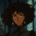

somehowmags
[bass boosted] SAINT BERNARD

tesstalksstudy
TessTalksStudy