#I still have to format some things in my documents program and print and bind shit
Explore tagged Tumblr posts
Visit Tumblr Blog
Explore Tumblr blogs with no restrictions, modern design and the best experience.
Last Seen Tumblr Blogs


Fun Fact
Tumblr.com is the 103rd most visited website in the world.
Text
GUYS. My Win a Commission project is finished!!!!! I still have four months of posting left to do but I wrote, edited, drew and explained EVERYTHING!!!!!
SEVEN YEARS. I started in August 2017 (I was sixteen!) and in August 2024 I motherfucking finished!
The next time I start a long project, it better fucking be a fetus or some shit because I don’t feel like doing something like this everfucking again.
I AM FREE
(If you’re interested in winning my next couple, look under the readmore for some hints. The majority are just reference drawings for the story, not the actual illustrations)

The two main characters for West of the Sun, East of the Moon, a modern retelling of East of the Sun, West of the Moon set in Alaska. Trans Sapphic love story

The main character Chantha Rasphone, for my gay ‘sequel’ to Childe Rowland. If you like Labyrinth, chances are you’ll like this. It’s the longest story I have ever written, at over 40 printer pages without the explanation, pictures or glass art. It’s even longer with those things.

Gii, the Tatterhood from my Yamana retelling. She has dwarfism and slays a leopard seal with a spear.

Billi, an intersex man and star of the Acacia Tree, my adaptation of The Juniper Tree set in modern Australia. (The picture here is based on Alan Scott’s 1970s picture ‘Face of an Aboriginal* Man, Alice Springs Area’, as shown below)
*Respectful term is the full ‘Aboriginal Australian person’, but I am just quoting the title.

These are not in release order! Next contest starts on September 10th!
#wac#win a commission#I forgot to talk about this in actual August#I still have to format some things in my documents program and print and bind shit#but the tumblr related part is fucking done#omg I might finally have the bandwidth to write multi chapter fics#I haven’t done that since I was 15#wow#<3
3 notes
·
View notes
Text
as per a request in my local renegade server: here is my process (such as it is) for the stenciled covers i've done for my binds. obviously, huge thanks to everyone in the renegade discord for teaching me most of what i know about bookbinding. this tutorial only exists thanks to the resources they've made available and the conversations i've had there.
material list
vinyl cutter (i have a silhouette portrait 3) + mat + blade
stencil vinyl (i have this one, but have had some adherence troubles with it. unclear whether this is just The Nature Of Stencil Vinyl or whether there's a better brand out there. adhesive vinyl can also be a viable option, although i haven't personally experimented with it yet.)
transfer tape (i have this stuff. it's fine.)
weeding tools (i have this hook and a very fine tip pair of tweezers. i highly recommend getting a hook, especially if you—like me—are haunted by the specter of carpal tunnel. get an off-brand one or get one on sale, though. i only have the silhouette brand one because it was on clearance.)
acrylic medium (i have this one because it was on sale at the time i was buying acrylic medium. when i replace it, i will be replacing it with a matte one. the gloss definitely has a noticeable sheen that i don't love.)
acrylic paint (literally any paint will do. i've been mostly using the decoart extreme sheen because it's $4 at michaels. you may be noticing a theme here.)
stiff stenciling brushes (the ones i have are similar to these but cost even less. again, there's a theme here.)
an iron and some parchment paper (jury is still out on whether using heat to "set" the pattern is necessary, but i do feel like it melts the paint a bit into the bookcloth and lessens the extent to which the pattern sits above the bookcloth.)
your trusty bone folder
instructions and a truly hideous number of words under the cut.
step 0.5: discern what will make a good stencil and what will make you hate yourself, your life, and the art of bookbinding
there are a LOT of different ways to put titling on a book. you could do a paper cover with a printed design or paste paper labels onto bookcloth or foil your title onto your cover with heat activated foil. the best method depends on what kind of design you have in mind, what tools you have available to you, and what materials you're working with (for example, i've had very bad luck getting acrylic paint to adhere to Allure bookcloth, but Allure does foil like a dream).
as far as stencils are concerned, you can kind of sort cover designs into three categories:
BEST for stencils: big, bold shapes on larger format books (think letter folio or letter/legal quarto)
OKAY for stencils, but you might hate yourself: intricate detail at a large enough form factor for it to be cut well by your vinyl cutter
BAD for stencils, you will die and it will hurt the entire time you are dying: lots of intricate detail and lots of fine lines
below are examples of category 1, 2, and 3 (all designed for letter folio). to be clear, category 3 can technically be possible, depending on the design. but only undertake it with the awareness that you will die, and it will hurt the entire time you are dying.
step 1: design a thing to put on your cover
i'm not going to go too in depth on this because cover design is a HUGE can of worms. a few pointers, though:
i never start designing my cover until my text block is done. this allows me to design my cover at "full size" based on the measured size of my text block and cover boards.
i fully lay out my cover in a separate program before exporting a transparent PNG to silhouette studio (or whichever proprietary software you have to use to communicate with your particular vinyl cutter). i use affinity designer. some free options would be inkscape (if you want to work with vectors) or gimp.
i design my cover on a document with dimensions of (HEIGHT of boards + 20 mm) x (WIDTH of boards or spine + 20 mm) and 10 mm margins. the area within the margins represents the actual dimensions of the thing i'm designing, while the area outside of the margins creates a mask that prevents me from getting paint on things i don't want paint on (like the covers, if i'm creating a spine stencil).
i always outline my document with a 3 or 4pt black line. this creates the outer edge of my stencil and provides my vinyl cutter with a cut line. if you're working with a smaller vinyl cutter (like the cricut joy) there are ways to jigsaw designs together from smaller pieces of vinyl, but i'm not the person to ask about that. i specifically bought a portrait so that i didn't have to worry about that.
here's an example of one of my affinity files from a recent cover. i've exaggerated my outline to make it clearer. you can also see that i use affinity to experiment with color combinations. before i export, i turn all my elements black and make any backgrounds transparent, meaning that the PNG i import into silhouette studio looks like the one on the right.

step 2: cut and weed your stencil
again, not going to go terribly in depth here. there is a veritable army of youtubers out there with tutorials about how to use [insert propriety vinyl cutter software here]. but, again, a few pointers:
with my particular vinyl cutter and stencil vinyl, i usually cut my stencils with the material set to "washi," depth at 1, force at 13, and speed at 4. google, experiment, see what works. also, you want to put your stencil vinyl on the mat with the blue vinyl facing UP, and you don't want to mirror your design. with stencils, what you see is what you get.
i cut my vinyl a bit bigger than necessary because i'd rather waste a bit of vinyl than have to worry about a stencil falling off the edge of my vinyl because i misaligned it on the mat.
unlike HTV, you will be weeding out all the black parts of your original image. be prepared to hate the letters "e" and "a" forever, because you will have to somehow keep the little eye of them in place while you pry out the rest of it.
step 3: apply your stencil to your case
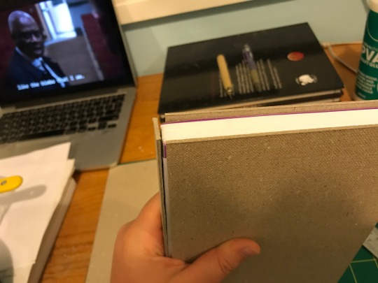
alright, now let's get into the meat of it. i always stencil after my case is finished but before i case in my book. this means that if i totally fuck it up, i can trash the case instead of the entire book.
additionally, i completely stencil my spine first (as in lay down stencil, paint, remove stencil) and then stencil my covers. i've found that it's easier when you don't have stencils overlapping and sticking to each other.
OPTIONAL STEP: mark guides onto your cover to help you position your stencil. whether or not i do this step depends on the design. a lot of the time, i just eyeball it. but for some designs, precision is key. for those projects, i use my ruler to mark out guides in white chalk for where i need certain elements of the stencil to fall. (i used guide marks for the "penguin clothbound" copies of the The Weight Collected that i've been using as an example in this post—the black rectangular boarder would've made uneven placement REALLY obvious.)
use transfer tape to remove your vinyl from its slick backing. what i've found is that you really, really don't want your transfer tape to be too sticky. you want it just barely sticky enough to pick up the stencil if you rub it down with a bone folder or your fingernail. i have a piece of transfer tape that i stuck to my jeans a bunch of times and then proceeded to use for 8 books in a row. it is, frankly, still a little bit too sticky. i have rolled it up so that i can use it for the next 8 books, at which point it will presumably be the right level of stickiness.
position your stencil. when you're happy with it, rub it firmly down with your bone folder. then do it again. then use your fingernail to score down over the titling text. then pray. in my experience, stencils prefer to stick to transfer tape rather than bookcloth. ymmv.
start at one corner of your stencil. carefully begin peeling back the transfer tape. i've found that essentially folding back the transfer tape (like, the corner that's been freed from the stencil being folded back away from the stencil) helps the tape to release. go slowly, rubbing down with the bone fold as necessary.
after you've finally manage to pry the tape off, go back and smooth down the stencil and firmly rub it down to get it to adhere to the bookcloth as thoroughly as possible with as few ripples or air bubbles as possible.
step 4: paint time!
here is a secret that the renegade discord taught me that i am now passing on to all of you: before you put any paint on your stencil, put down a layer of clear acrylic medium. the medium will finish the job of pasting down the stencil to your cover, and any leaks that happen in the process will be clear medium instead of colored paint (and will therefore be basically unnoticeable). ergo:
stipple a thin coat of acrylic medium over your stencil. you want to use an up-and-down daubing motion, not a brushing motion. brushing will get paint under your stencil. let dry.
after your medium is dry, stipple a few thin coats of your colored acrylic paint onto your stencil. let dry between coats. (i usually find that two coats is enough.) again, try to keep your coats thin. you don't want a thick layer of paint because that will create a raised surface above your bookcloth.
let your paint fully dry. i usually leave it overnight, but if i'm feeling especially impatient, i still make sure to at least give it a good three or four hours.
peel up your stencil. your weeding tools will once again come into play here to pry up little bits and pieces of stencil (like the stupid eyes of the "a"s and "e"s that were so annoying during the initial weeding stage).
step 5: optional setting stage
again, jury is still out on whether or not this is necessary, and the effects are pretty subtle. but i do it every time anyway. some tips:
use an iron on very low heat (i keep mine at the low end of the synthetic setting) and with steam turned OFF
keep a piece of parchment paper (NOT waxed paper. you want the slick paper that you put under cookies to keep them from sticking to the pan.) between the iron and your cover.
press the iron down, don't rub it like you're ironing a shirt. it's possible to smear your paint doing that (ask me how i know).
i usually lay the iron down on a section for 10-15 seconds at a time, then lift it and move it to another section.
start with less of everything (less heat, less time) and build up. always better to be conservative with this.
i usually continue until the paint is warm to the touch, then move onto another section. after it's cooled, i evaluate if i feel like it's melted into the cloth enough. if not, i repeat the process.
step 6: BOOK
congrats, you have put a design on a book cover. the world is your oyster. go forth and make books. become ungovernable.


63 notes
·
View notes
Note
since we’re on the topic of bookbinding, i’ve been wanting to get into it but i haven’t actually done any research (yet) other than vibes, so do u have any tips for complete beginners?? :)
@geminibookbinding is who inspired me to finally look up the whole process and figure out where to start! this is the super helpful tutorial i got from them
i had dabbled with binding before though, using Sea Lemon's tutorials to make blank sketchbooks yearsss ago. i still use her text block and diy hardcover videos as a refresher/reminder while i bind!
the biggest thing that stopped me from learning to bind printed fiction was not understanding how to print the text from home, specifically how to get the pages in the right order for signatures. it's actually so easy with some very simple to use programs: QuantumElephant for PC users (free), and I use BookletCreator on Mac ($20)
i want to go into more detail about my process and supplies from a beginner perspective, i hope this helps:
format the text in a word processor
export your document as a single page PDF
enter that PDF file into Quantum Elephant or BookletCreator, to rearrange the pages for your signatures. your program will give you a new PDF file that you can then print.
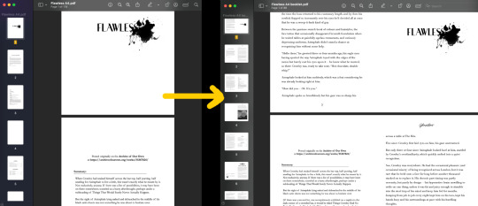
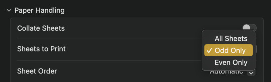
4. double sided printing: i was so so scared of this at first, but it's incredibly simple. no matter what printer you have, somewhere in your print settings will be an option to print even or odd pages.
print all the even pages first, then when the stack is finished printing, flip them over, insert them back into the paper feed, and print the odd pages.
5. fold the signatures together so you have a stack of little booklets, then mark on the spine where your sewing holes need to be. manually punch the holes using an awl, or diy an awl by stuffing a cork on the end of a straight needle.
6. sewing: take regular sewing thread and run it over a block of beeswax. this makes the thread easier to manage and holds it in place better while you sew. a curved needle is also much easier to use than a straight one, especially for a kettle stitch (using Sea Lemon's tutorial)
7. gluing: glue decorative pages (or plain, but thicker paper) to the front and back to create your end pages, then press the book flat to apply PVA glue to the spine. press it overnight so the glue dries flat. (optional: glue a ribbon to the top of the spine, then sew on headbands) finally glue an additional piece of paper (or mull) around the spine to strengthen it.
8. optional: trim the edges of your book down to create a smooth edge. this one's given me the most trouble because it's very hard to get right with a knife, and the proper supplies are expensive. check your local stationery shop (i.e. Officeworks, Staples) for an industrial guillotine service
9. cover: once you have the final measurements of your text block you can start making the cover. this is essentially gluing cardboard, binders board, or plywood etc to a sheet of fabric. the fabric either needs to be bookcloth, or have some kind of non-porous back so the glue doesn't seep through. you can diy bookcloth from any fabric with tissue paper. then glue the decorate end pages to your cover to attach the textblock!
128 notes
·
View notes
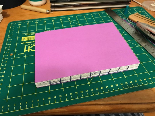
Photo


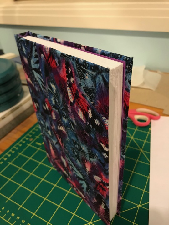
About a week ago I finally finished bookbinding @airdeari‘s beautiful Zero Escape fic The First Nonary Game. It took about a month (between all the waiting for glue to dry and also several days each week when I was unable to work on it), and was so much fun! It’s so satisfying to just... hold this book in my hands.
Details about how I made it, along with additional photos (and commentary) below the cut.
So I came across this post on Tumblr, which immediately inspired me to try bookbinding myself. I spent a few days watching so many tutorials from the youtube channel linked in the post (I’ll link the specific tutorials I used in this post), and googling how to actually manage to print pages so they form proper signatures, because the inbuilt booklet creator in Word doesn’t exist in my Word apparently so that’s fun.
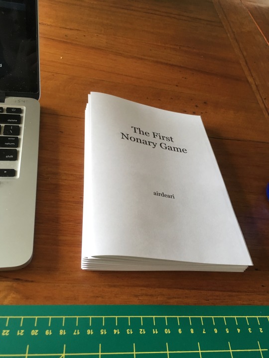
Anyway, once I started, I asked @airdeari for permission to print and bind his fic, and he immediately said yes, so that was good. Then I spent a good couple of days copying the entire fic into a Word document, and fiddling with formatting so it would look like an actual book (section breaks, page numbers, headers with the fic title on the left page and chapter title on the right page (this took ages to work and I kept on stuffing it up), and making sure things just... looked nice. I added in the art After The War that @keycrash created specifically for the fic (third pic above), and an “afterword” containing credit and links and the author’s notes from AO3 (because even if I’m the only one who will ever see it, it still feels weird to not add the credit stuff in so it’s there).

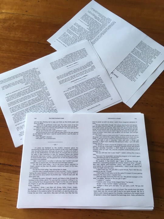
I then saved the document as a PDF, and used CheapImposter to correctly shuffle (impose, hence “imposter”) the pages so when folded into signatures, each page would be in the correct order. This program was the first free one I could find, and was great because you could specify the number of sheets you want per signature, rather than stuck with a default. I chose to have 11 signatures of 6 sheets of paper, since that was the amount that would have the least blank pages and the end of the book. The file was 261 pages, so with two pages per side, and two sides per sheet, you divide the number of pages by 4 to get 66 sheets of paper
I then printed. There was only one (1) paper jam in the process, which was great. Unfortunately, I realised after I printed that one of the headers for one chapter was wrong (I hadn’t properly disconnected the two chapters), but fortunately that only involved reprinting 4 sheets of paper.
I used the following tutorials to make the books: DIY Textblock, a general “how to make a textblock” tutorial; DIY Kettle Stitch, a specific look at the stitching for a textblock, since the first tutorial doesn’t focus on this; DIY Book Cloth, since I chose to use fabric for my cover; and DIY Hardcover Book, how to put all those pieces together.
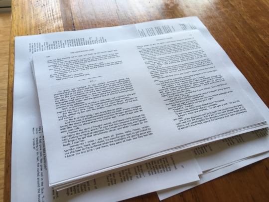
So then I started folding all the signatures. I was watching so much Brooklyn Nine-Nine during both the folding and stitching sections, since it was repetitive actions I didn’t need to concentrate on that lasted hours.
It was at this point that I sliced each signature one by one to make the end smoother and less pointy. In future I recommend not doing it at this point - wait until the very end. Instead, move straight onto stitching.
I don’t have any photos of the stitching portion, since my phone died the morning I started the stitching, and I wasn’t able to replace it until after all the stitching was done. In fact, originally all the photos from before the stitching were lost too. It was only about two days ago that magically the My Photo Stream thing kicked in and brought back all the photos - if it had worked two weeks earlier I would’ve had more. As it is, all photos from September to January are gone forever, unfortunately. But that’s another discussion entirely.
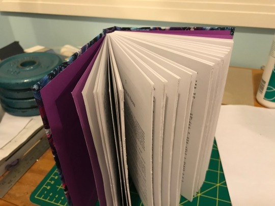
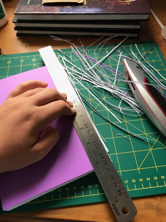
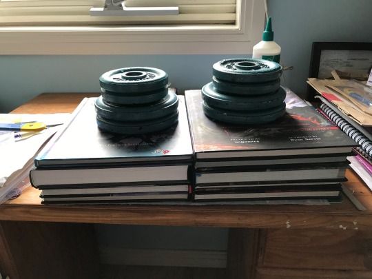
The above is the first book photo on my new phone, so as you can see, all the stitching was completed, the spine was glued, and the purple paper attached. I couldn’t buy two A4 sheets, so instead I had to buy one A3 sheet and cut it in half. Which was difficult cycling home from the city with an A3 sheet that didn’t fit in my bag on account of being A3 and not A4, but oh well.
I don’t have a book press, so I used a pile of DND books and my brother’s weights instead, as shown below.

I then had to re-slice the book after this point bc my first go wasn’t even, on account of slicing each signature separately. Next time definitely I’ll just do it at the end like this. I then also sanded it to make it smoother. It’s still not perfect, but it’s something that’ll take practice and patience so.

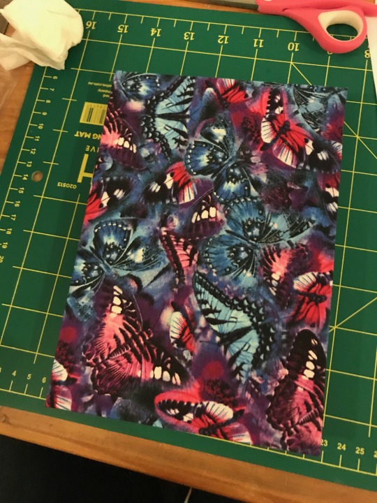
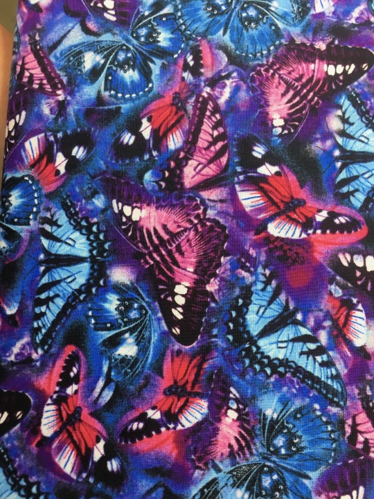
Next I made the book cloth, which involves using appliqué sheets to combine cotton fabric and tissue paper. But first I want to talk about the fabric I chose for the cover, because I’m quite proud of it. I spent ages wandering around the shop, trying to find something that fit the feel of the book. Spoilers for the content of the fic if you haven’t read it yet, and also for the source material (999/Zero Escape). I was thinking about some sort of blue swirl thing, because of the Gigantic sinking. I found that, but hesitated because it didn’t fully fit, and my favourite colour is blue so I always pick blue. I also considered flames/fire because of the incinerator thing, but couldn’t find any. I can’t remember if I just couldn’t find any four leaf clover fabric, or if I’ve just since thought about that as a cover. But instead I chose the butterflies below. They fit in several subtle ways that I’m proud of. The colours of blue and pink(/red) matching the receiver and transmitter coding all throughout 999, as well as the moments of purple as well (I don’t think I need to get into that, I’m sure it was analysed to hell and back when the game first came out). The butterflies also point towards the butterfly effect, and in turn the different timelines present in the series. So together it just works. /spoilers over
It’s also just a pretty fabric.
Now the making of the book cloth. I had to make it twice, because I was too impatient the first time, so the iron was too hot and it steamed, which wrinkled and warped the tissue paper, so the fabric was all wrinkly too. The second time took ages and was a worse quality appliqué sheet, but worked well enough anyway.


(My parents: did you have the iron out? what were you ironing? you never iron)
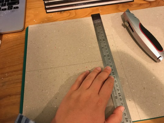
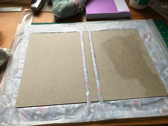
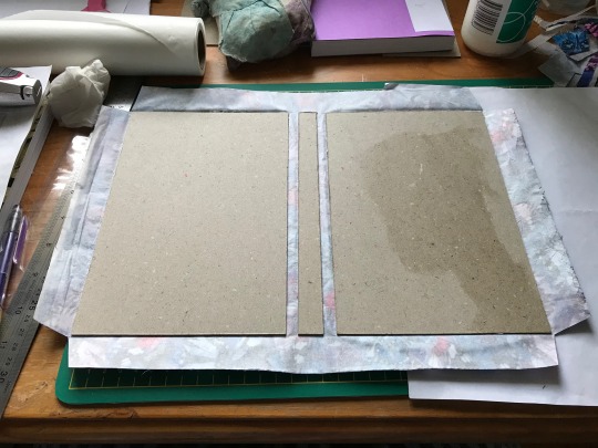
And then I cut the book board to size, using the measurements from the tutorial video. I’ll repeat them here: front and back cover: width = width of textblock minus 3mm, and height = height of textblock plus 6mm, and spine width = width of textblock spine, spine height = same height as covers
I then glued the board onto the book cloth, and put it under the book press. The dnd books are not large enough to cover the whole thing, and also I really wanted the board to stay flat and not curl, so I grabbed way more dnd books and way more of my brother’s weights. I also accidentally started putting the glue on the wrong side of the board (bc one side is smooth and the other is rough), hence the colour difference as well.
The corners were cut and folded and glued over...


And then the textblock was glued in, and put in my book press for a whole weekend. I added a sheet of paper to absorb the glue so the pages wouldn’t become wrinkly, but instead the sheet I added was fine and every other page in the book is wrinkly. So I dunno what happened there. After the weekend I took it out and looked at it, and then put it back for another week to be sure.

And then the complete book is shown at the top of the post!
As I was starting I was talking a lot about it, like about the process I had to go through, or how I was going to obtain what I needed, etc. Mum asked if she could read the story. I froze, like a deer in the headlights... because this is a fanfic. She saw my fear and immediately backed down, explaining she only wanted to read it because if the story was that important to me that I was going to literally turn it into a book, she wanted to read it to yknow like know me better or something? Which makes sense. And when I got over my initial reaction, and remembered that indeed it was technically my dad who introduced me to fanfic, and thought about it more, I said okay. Because since the fic is technically a prequel to the first game, and most of the characters are technically OC’s (like, from the first game we know that all eighteen children must exist, but most of them don’t have names or anything so they are effectively OC’s), then knowledge of source material isn’t strictly necessary. This fic can probably be enjoyed on its own. I mean I’ll probably have to explain the concept of morphogenetic fields, and the last four chapters might not make sense? But I’m okay for my mum to read it. So when she’s less busy at work I’m going to download the epub onto her phone for her - we’ll see how it goes.
Anyway, this fic is a masterpiece, extremely well written and I highly recommend it. As said, most of the characters are effectively OC’s, and yet they are all given such rich histories and personalities. All of them have access to the morphogenetic field, so I’m just so glad that @airdeari explores nine unique relationships with the field - nine unique sibling dynamics, and esper powers and abilities. It’s just so good.
#bookbinding#zero escape#999 spoilers#999#the first nonary game#airdeari#i forgot to mention the most essential step of making the book#before i printed the pages i read the entire fic again through word#its still so beautiful#i cant wait for my first read of the fic using my physical book#if youre in the ze fandom and still have not come across this fic yet#first of all who are you and what rock have you been living under#and second of all please read this fic bc its anything and everything you could ever want from a fng fic#feel free to ask more about this and what i did btw#it was so fun binding this book#i want to do more of my fav fics now haha#this fic is 100k and it was like the perfect size for a fic to print#most of the other fics i really like are much much longer so i'd probably have to split them in half#and idk if i could do that#too much pressure to split between the right chapters#oh well uni has started so i have a while to think about which one to do next#ive already promised a version of this fic for a friend who wants to draw her own cover#so we'll see how that goes!
173 notes
·
View notes
Text
A Peek into the Indie Writer World – Part IV: A Walk Through the Process
If you’re thinking of going indie, or have already decided to, you may find yourself wondering what steps you need to take. This is a look at the process, focusing on hard copy books and e-books.
The short version, in bullet format for those with very little time:
Write your story
Identify your output product(s)
Copy edit your story
Purchase and/or assign ISBNs
Request PCN (hard copy print only)
Format the story
Create front matter for printed work
Cover art and design
Publish
Market
The longer version with more details below the cut.
Write Your Story
There are many different ways to write. Use whatever process works for you (drawn out, under tight deadline, or anything in between). Revise and edit your draft to ensure you have the best possible version you can. Many people like to use critique groups or beta readers, other people don’t. The key is that your content (poetry, short stories, novella, or novel) is the highest quality you can make it.
Identify Your Products and Process
You can start looking at the various products and printers out there while you’re still in the writing stage. As your story gets closer to being ready to print, you’ll want to have some decisions on your starting point, at least. Will it be an e-book with print to follow? Or do you just want to start with the e-book and see how it goes? Your plans will influence some of your next steps.
Copy Edit Your Story
Most people think of this as proofreading, finding and fixing typos, spelling mistakes, and grammatical errors. In this case, it also includes ensuring your soon to be published book has a consistent style.
Style is a set of rules that provide a uniform look to a document. This includes things like use of font, font attributes (bold, italic, underline), implementation of flexible or optional grammar (such as the Oxford/serial comma), and the presentation of specialized terms. Most fiction publishers have a house style built off Chicago or AP style, both of which have handy manuals. It ultimately doesn’t matter what style you go with, as long as you are consistent.
In the editing world, style often includes formatting elements, but for the indie writer, some of that formatting will vary depending on the product or products you’re producing.
Things to Watch For
Consistent spelling for names of people and places
Consistent terminology for magic or world-specific details (eg: does the world use shape-shifter, shape shifter, or shapeshifter?)
Use of numbers (phone, age, height, distance) are generally spelled out in fiction
Consistent units of measure (unless there’s a good reason for it, you don’t want to randomly switch between metric and imperial)
If attention to detail and copy editing aren’t your strong suits, copy editing is something you should plan to hire out. You can also just hire someone for the pieces you need done. If you have a handle on your house style, but want someone else to proofread, that’s totally a thing that people do.
Purchase or Assign ISBN
If you’re printing with a company that offers a free International Standard Book Number (ISBN), and you’ve chosen to go that route, you can skip the purchasing step. I personally prefer to have full control of all my ISBNs, allowing me to take them with me if I switch printers or distributors.
Buy your ISBN in advance via Bowker. You will need one ISBN for each product you are producing. A trade paperback needs a different ISBN than a hardcover or audio book. There’s often a discount to purchase multiple ISBNs at one time.
Once you have any needed ISBNs for this project, you’ll need to link the number to a book title, and provide some information on the book and edition (publisher, summary, cover etc). This is a good time to perfect your back-cover blurb or teaser. You can come back and update much of the ISBN information later if you don’t have all the elements at the time you’re doing this.
Request a Preassigned Control Number (print copies only)
If you’re based in the US, you’ll want your book registered with the Library of Congress as this increases the likelihood that it will get into libraries. It also provides some added copyright protection.
You will use the Preassigned Control Number (PCN) process, which takes 10-15 business days. Start this far enough before you plan to complete the publication process, to ensure you have your Library of Congress Control Number (LCCN) before you go to print. If you have trouble navigating the Library of Congress’ website for questions (and you probably will, it’s not as clear as it could be), you may want to explore the PCN Manual.
To complete the process of registering, you will need to send a hard copy of the printed book to the Library of Congress.
Format the Story
Formatting your work can fit in with style, especially after you’ve gone through the indie process and have a handle on what you want and need. Many writers will create their draft in the most complicated format they are planning on producing, just so this piece is well underway (and less frustrating later). Once the book is ready for publication, they’ll make copies to reformat for other products.
At this point you need to know how you plan to publish and what company you’ll be using, as different publishers have different formatting requirements. Be sure you read the requirements before you put in a bunch of work changing your novel into a font you won’t be able to use.
Features you need to make formatting decisions on include:
Page size (determined by the product you are creating)
Margins (leave room for the gutter – the inside margin where the binding is)
Chapter heading font, size, and position
Indent (fiction usually indents first line of a paragraph)
Line spacing (look at similarly sized books to choose number of lines per page)
Section breaks (asterism or section sign are both good choices)
A Note on Paragraph Styles
If you’re not already using paragraph styles in your word processor, you need to start now. Styles designate font, size, and text attributes, as well as features like line spacing and indents. When used properly, styles ensure consistency and a professional looking end product. They also make it much easier to reformat the entire document if you need different features for a different product, or if you suddenly need a different font for your text body.
If you are creating an e-book, you must designate title and heading 1 styles at the very least, as these are used for navigation. Failure to designate these will often result in your book not meeting requirements for distribution.
Accessibility
Do not use extra returns and the space-bar to place text where you want it on the page. This makes your digital end product inaccessible to people with adaptive reading equipment. Screen readers will read every one of those spare characters, and no one wants to hear “asterisk, asterisk, asterisk, asterisk…” as they wait for the next section. Instead, use your styles to put chapter headings where you want them, and use hard returns (ctrl+enter) to separate chapters.
Front Matter
This is the content that comes between the front cover and the first page of the story regardless of whether it is a print or e-book. The professional standard includes:
Copyright page (including the year of publication, ISBN, and LCCN)
Table of contents (this will be automatically generated for e-books)
Title page (should be on the right page for print editions)
Optional content includes:
Acknowledgements
Dedication
Book Cover
This is your primary advertiser for your book, whether it’s print, e-book, audio book, or a serial. You will use this image everywhere to pitch your work. We’ve all been told to not judge a book by its cover, and we all do it anyway, so expect that this is something that must be done right.
Consider your cover a visual extension of the story. It needs to be appealing while giving your reader clues on what to expect. If your zombie apocalypse story has a cover that feels like a Christian devotional, it won’t appeal to some of your readers and you’ll have gone against the expectations of others. You absolutely do not want your book to look like you spewed clip art at the page, a common new indie writer mistake. A generic cover does you no good either.
It’s okay if you don’t have the skills to create a stunning cover for your book; hiring someone to do this for you may be your best bet. It’s worth paying to get a cover that helps readers decide to pick your story. There are a lot of great artists out there, so look around and find someone whose style is a good fit and who you can afford. That said, don’t whine about prices. Artists deserve to be paid what they’re worth.
Publish
The steps at this stage will vary depending on the company or program you decide to go through.
For most print on demand printers, expect to have to buy a proof before the book becomes available to the public.
Market
This stage will vary depending on your comfort level and opportunities. In general, you should be marketing yourself as a writer at any opportunity. This means participating at conventions, doing readings, and posting announcements on your social media and website. Be careful to avoid giving your friends a constant hard sell on Facebook, though. No one enjoys that. Your social media needs to be somewhat active and should include content not specifically related to a recent book release. Posting teaser chapters can be a great try-before-you-buy option.
While this looks like a lot of steps to take, they are spread out over the course of your process of bringing your story to publication, and many are not that onerous. Most print on demand companies have paid services to help with some of these steps, if they seem too great for you to overcome on your own.
⁂
For the first article in this series, check out Part I. Or if you just missed the previous article, check out Part III. To see the next one, check out Part V.
For more articles on writing, check out my Reflections From the Sol section.
3 notes
·
View notes
Text
receipt king
What's the difference between a paid game and a free one? In my opinion, one of them costs money, although various qualifications could be made. But maybe what's important is not the fact of purchase but the moment of purchase - that singular, legally recognised and binding moment where you hit the buy button or put the coin into the slot. Since after all the ways in which you really engage with, or even claim, a videogame can be spread out, blurry, diffuse.
Maybe it sits on your hard drive for a year before you play it, or in a notepad file full of steam keys, maybe you played it on and off in sessions too split up and individually indistinguished to solidify into a single instance. You can "own" both a paid gameand a free one but it's hard to feel your relationship to the former is not somehow more solid - maybe because it's founded on that moment of exchange, and not just the more transitory moments of lived experience. Experience comes and goes but purchases can be logged, tracked, indexed.
Maybe all the people who keep buying reissues of Chrono Trigger for every platform it comes out on are just laying a more 'real', economic foundation to support the expanded dream-Chrono Trigger that exists in their heads… Holding on to the receipts!
***
For a videogame to be sold is for it to exist in a network of exchange relations with, say, chairs, fruit, labour... And the implication is that these things can be compared but also that the comparisons can be quantified. A game is cheaper than a cup of coffee - or four times more expensive than a new movie, and both of these give us a picture of how it fits into the spaces of our life.
It also lets them take on a sort of objecthood-by-proxy, as another in the catalogue of commodities, which is increasingly important as the actual ontological status of a videogame gets ever more uncertain. Are you buying a program, an installer for a program, a temporary access pass for a program stored online, a program which runs using a server which remains in the company's control, a set of new assets, are you unlocking a set of existing assets which shipped with the game and were just stuck behind a paywall?
Emilie Reed has written about videogames in a museum context - with the expectation there that they get reframed as "singular objects", to fit the needs of an institution which has historically trafficked in singular objects. Maybe we can also think about this movement for objecthood in the context of the market - and that, since for at least forty years videogames have been a market artform, this movement was reflected on the aesthetic level as well. When people talk about a videogame as a "world", as a closed, alien space of object relations to be examined and explored at will, are they talking about the bare digital structures of the Game or about the mysterious opacity of the Object? Perhaps the unknowable heart of the commodity is the true "bonus room", ha ha ha 8p
***
(I remember when Mountain was something of a critical talking point, and at the time I maybe crassly wondered if it was the production values - since there were plenty of glorious trainwrecks games making basically the same nonsequitor joke but it somehow only merited attention coming from a paid game with stylised graphics and lotsa assets… Now I wonder if it was specifically the saleability of Mountain which generated that fascinated reaction, as the dismissal of not-games wrestled with the deference thought due to the commodity. Which makes all those posts about the zen qualities of staring at it seem much funnier in retrospect.)
***

Anyway.
The free game / paid game thing is something that interests me because it's basically something I grind up against all the time, when I'm making things, and slowly need to come up with the vocabulary to deal with. The dream is always to "just make things" - you'd work on what takes your fancy and then figure out at the end whether it worked as a saleable product or not, which environment to release it to. But the problem is that even speculating something could be a paid game is enough to drastically change how you view it. What works in a free game absolutely does not in a commercial game, and vice versa.
I don't think anybody at all would have played Magic Wand if it came out for free, for example - that game could get away with being tonally muted and laid back because it took place within the bubble of objecthood that comes with being sold, and those qualities are experienced much differently in a free game.
A free game is one with no immediate comparison points - it could end after 5 minutes, after 50, it could demand your time and energy to no return... it lacks the "guarantee" of a pricetag, the guarantee of existing in some stable relationship with other objects. A commercial game could be the barest early-access WIP, or just some printed screenshots in an envelope. But the fact that it was sold at all grants it some of the enclosed legibility of the object, while free games conversely exist in the world of pure experience, which I think Hegel memorably described as a bloody head flying at you through the dark. Dreams, hallucinations, memory, etc.
***
So maybe we can think of commercial status as part of what Michael Brough calls the "grain" of a work, part of that network of processes and feedback which we either glide with or grind against while producing a thing. To make a free game paid is to change how it's read. The gaps which your attention span could easily skip over in a free title become unbearable contained within a fixed, sealed object. You begin to draw the contours and to fill in the gaps... The game becomes more ornate, detailed, denser within this narrowed scope, with a kind of symbolist langour and inertia seeping into the whole thing - the inertia of the product.
It may be hard to make a videogame into a narrative but to be sure it's harder to turn a product into one, a product which necessarily has something circular and static within the very foundation. The presumed audience for a product is like the little dude in the middle of the panopticon - everything is arranged panoramically for their benefit, necessitating a certain vagueness of temporal relationship, while a free game is arranged for the less predictable, less reliable, eye of the attention span as it moves through an unknown space. I like making both types of games and don't mean to imply one is either more mature or more subversive than the other, whatever those terms mean in this junk-ass consumer format. But it's not quite a matter of pure preference, either.
***
Archiving games can be notoriously difficult and I imagine this goes double for free ones - it's one thing to document, say, the NES library which at least has some kind of fixed scope for inclusion, trade magazines to consult, physical copies to track down... and even then there's always the frontier of, yknow, bootleg Dendy cartridges, nobody knowing when Mario came out, stuff like that. At least in principle it can be boiled down to a finite list of titles and release years. Who wants to deal with the messier and more nebulous task of recovering all the RPG Maker projects that briefly got hosted on Rapidshare in 2007? And even then, would it make sense to organize these games by a similar neat list of release dates?
Commercial games can afford the pretense that they "happened" at a singular point in time and that this singular point takes priority over the broader mulch timeline in which they were stumbled across, played, looked at, made fun of. It's not that you can't make a similar claim for the release point for freeware - it's just that it might mean a different thing, and I think it can be valuable trying to think of those games as something other than "commercial games that happen to cost $0". If to be released for free is to engage with a fundamentally different context and set of assumptions - to deal with and work around a kind of vanishing experiential quality, rather than the fixed objecthood of the product - then it's hard to work out how to talk about and memorialise that without converting it into its opposite.
I've always wanted to write about more freeware games but how do you do it? Pick out a handful to talk about and avoid as much as possible the question of dealing with the endless churn? Elevate a few to ambassador standing? To pick a random RPG maker game and say "Crystal Masters 2 came out in 2008" can be to imply, like, a launch party, or some immediate impact, or that anybody at all paid attention or cared - which in turn can distort the actual expectations of how these things would be recieved that to some extent affected their aesthetics and structure. It’s still better than nothing, and I’m being pedantic – but it's hard not to think about it when at times it feels like the only way this stuff can be written about and preserved is as a set of attenuated best-ofs, by either becoming a product or by being treated as one.
I think if most of my games have been commercial lately it's less a question of expecting to get money from them and more because that sometimes feels like the only way they'll still have some kind of trail left in 10 years. I always liked the idea of making time capsules and just hiding them away in a rabbithole somewhere for people to find. Right now it feels like the types of videogame spaces I'm most comfortable in - the kind least hung up on ideas of importance - are archival ones, digging through the debris of the past, curious about what they'll find. In reaction I guess to what feels personally like increasingly calcified, unliveable contemporary or franchise-oriented spaces of culture it can feel freeing to think about the other ones, of things instantly forgotten or which barely existed at all. Blind albino cave salamanders - - 64!!
(images: castlevanias ii and bloodlines)
58 notes
·
View notes
Text
Reflection & Rationale
Reflection:
Over the journey of the course Grad 504 Materials & Media II, I have improved upon my knowledge and expanded it. I knew that typography was a very important aspect for designers, however that was about all I knew. I have learnt the importance of typography. Type Anatomy is a something very new to me, and being able to focus on a specific typeface has allowed me to improve my skills with typography. Being able to learn about a second language’s typography was also very interesting. I didn’t realise how different the type anatomy of a Thai glyph would be to a standard English alphabet letter, but I was also surprised with the small similarities they do hold. I have been introduced to the terminology of English and Thai type anatomy. I have improved my skills in creating typographic layouts and portraying the typeface for its best features. Using Type as the main focus, creating clear designs, and creating a type specimen booklet are also skills I have been introduced to. Another positive result was being introduced to Issuu. I can use this website for future reference and publishing of my designs. There are still many things I need to improve upon while working with typography. It is still not a strength of mine, but having this project and knowledge has lead me in a good direction to eventually master it.
Rationale:
Working on the type specimen project this semester has allowed me to focus and improve upon my adobe creative suite skills. I have only just been introduced to Illustrator and InDesign last semester so this practice was quite useful for me. Skills I had before this course would be basic InDesign, Photoshop, and Illustrator skills. I knew the basics of each program such as creating shapes, texts, the pen tool, and the range tools available. After focusing on typography I have improved my skills using the paragraph and character styles. I was introduced to glyphs, and I was reminded how to create guides and grids. I also learnt how to create a table and fill the cells with text or glyphs. I have definitely improved on my text frame skills such as - using multiple formats within a singular frame, creating lines for text within the frame, and using the text frame features available, spacing and sizing for example. I am a lot more comfortable using parent pages and adobe tools. Something I can work on in my work is layers. I currently do not have a system to my layers or a naming format. This makes it hard to keep track of where my objects and frames are. I also struggle with using the macbooks a bit because I am a Windows user. This is mainly because of the different appearance and keyboard buttons and shortcuts. Another challenge is printing, I know how to print but I always have to double check everything or I have some kind of misprint. The Imposed printing is becoming easier for me, but printing on double-sided pages and remembering which binding/flipping needs to be selected is difficult.
Skills learnt or improved
Use of character styles
Better use of paragraph styles
Colour swatches and changing between colour formats
Grids and guides again
How to make a table
Better use of single text frames (rather than multiple text frames for text)
Shifting text and adjusting size, kerning, tracking, and spacing in the same text box efficiently
Creating lines under text within the text box
What I already knew
Basic Skills and tools of each program
Creating shapes, lines and text.
Using the pen tool
Using fonts and glyphs
Basic Paragraph styles
Creating documents.
Saving documents as various formats for printing
0 notes
Text
Your personal DIY image search
Hi everyone, it’s been a while! I bet you forgot this blog even existed. I happen to be a big supporter of quality over quantity, so while my work on parsing Japanese counters earlier this year was pretty interesting, I already wrote way too many articles about Ichiran/ichi.moe so I decided to keep it to myself. Recently I’ve been working on a little side-project and now that it finally works, I think it deserves a full-fledged blog post.
For a bit of a nostalgia trip, let's go back to the early 00s. Remember when TinEye first appeared? It was amazing. For the first time you could easily find where that one image you once saved from some random phpBB forum is really from. It didn't matter if your image was resized, or slightly edited from the original, it still worked. That shit was magic, my friends. Of course these days nobody is impressed by this stuff. Google Image Search indexes pretty much anything that exists on the Internet and even uses neural networks to identify content of an image.
Back to the present day. I discovered I have an image hoarding problem. Over the years of using the Intertubes, I have accumulated a massive number of images on my hard drive. When I see an image I like my first thought is "do I have this one saved already?" because how could I possibly remember? At this point I need my own personal Google Image Search. And (spoiler alert) now I have one.
First of all, I needed an actual image matching technology. These days the cloud is all the rage, so I definitely wanted to have this thing running in the cloud (as opposed to my local PC) so that I could search my images from anywhere in the world. After a cursory search, my eyes fell on a thing called Pavlov Match which runs from a Docker container, so should be pretty easy to install. I installed docker and docker-compose on my VPS, and then git-cloned Match and ran make dev according to instructions. This will actually run an Elasticsearch instance on the same VPS, and apparently the damn thing eats memory for breakfast, at least with the default settings. I'm using a cheap 2GB RAM Linode, so the memory is actually a very finite resource here, as I will find out later. The default settings will also completely expose your match installation AND elasticsearch to the world. But don't worry, I figured this out so that you don't have to. Let's edit docker-compose.yml from match repository as follows:
version: '2' services: match: image: pavlov/match:latest ports: - 127.0.0.1:8888:8888 command: ["/wait-for-it.sh", "-t", "60", "elasticsearch:9200", "--", "gunicorn", "-b", "0.0.0.0:8888", "-w", "4", "--preload", "server:app"] links: - elasticsearch elasticsearch: image: elasticsearch environment: - "ES_JAVA_OPTS=-Xms256m -Xmx256m" - bootstrap.mlockall=true expose: - "9200"
This will make match server only available on local network within the VPS on port 8888, and elasticsearch only available to these two docker containers. It will also restrict elasticsearch RAM consumption to 512mb and --preload flag reduces the amount of memory gunicorn workers consume.
To make match server available from outside I recommend proxying it through nginx or some other proper web server. You can also add authentication/IP whitelist in nginx because the match server has no authentication features whatsoever, so anyone will be able to search/add/delete the data on it.
That was the backend part. No programming required here! But this is a Lisp blog, so the next step is writing a Lisp client that can communicate with this server. The first step is reading the match API documentation. You might notice it's a bit... idiosyncratic. I guess REST is out of fashion these days. Anyway, I started implementing a client using the trusty drakma, but I quickly hit a limitation: match expects all parameters to be sent encoded as form data, but drakma can only encode POST parameters as form data and not, say, DELETE parameters. Not to be foiled by a badly designed API, I tried dexador, and while dex:delete does not encode parameters as form data, dex:request is flexible enough to do so. Each response (a JSON string) is parsed using jsown.
(defun parse-request (&rest args) (when *auth* (setf args `(,@args :basic-auth ,*auth*))) (multiple-value-bind (content return-code) (handler-bind ((dex:http-request-failed #'dex:ignore-and-continue)) (apply 'dex:request args)) (cond ((<= 400 return-code 499) (jsown:new-js ("status" "fail") ("error" content) ("code" return-code))) (t (let ((obj (jsown:parse content))) (jsown:extend-js obj ("code" return-code))))))) (defun add-local (file &key path (metadata "{}")) "Add local image to Match server" (parse-request (api-url "/add") :method :post :content `(("image" . ,(pathname file)) ("filepath" . ,(or path file)) ("metadata" . ,metadata))))
With this basic client in place, I can add and delete individual images, but it would be incredibly cumbersome to manage thousands of images with it. I had to write some code that would scan specified directories for images, track any changes and then add/update/delete information from Match server as needed. I already wrote something like this before, so this was pretty easy. Of course SBCL's "sb-posix:stat doesn't work on Unicode filenames" bug has reared its head again, but I already knew the workaround. This time I completely relied on UIOP for recursively walking directories (uiop:subdirectories and uiop:directory-files are your friends). Each image file is represented as CLOS object and saved into a hash-table which is serialized to a file using CL-STORE. The object has a status attribute which can be :new, :update, :delete, :ok and so on. Based on status, an action needs to be performed, such as uploading an image to Match server (for :new and :update).
Now, I could just send a bunch of requests one after another, but that would be a waste. Remember, we have 4 gunicorn workers running on our server! This clearly calls for a thread pool. I thought PCALL would be perfect for this, but nope. It uses sb-thread:interrupt-thread which is incredibly unsafe and the result is that you basically can't safely make http requests from thread workers. Debugging this took way too much time. In the end, I implemented a thread pool based on lparallel promises which is kind of an overkill for such a simple use case, but at least it worked.
(setf *cache* (update-cache)) (let ((lparallel:*kernel* (lparallel:make-kernel threads))) (unwind-protect (loop for value in (alexandria:hash-table-values *cache*) collect (worker value) into futures finally (map nil 'lparallel:force futures)) (lparallel:end-kernel))) (save-cache *cache*))
Note that you must be very careful when doing things that affect global state inside the threads. For example :delete action removes a key from the hash table *cache*. This is not guaranteed to be an atomic operation, so it's necessary to grab a global lock when doing it.
(defvar *cache-lock* (bordeaux-threads:make-lock "match-cache-lock")) ... (bordeaux-threads:with-lock-held (*cache-lock*) (remhash key *cache*))
Printing messages to REPL from inside threads also requires a separate lock and (force-output), otherwise it will look like a complete mess!
(defun format-msg (str &rest args) (bordeaux-threads:with-lock-held (*msg-lock*) (terpri) (apply 'format t str args) (force-output)))
Now that the required functionality is implemented, it's time to test upload a bunch of stuff... and get back a bunch of errors. It took some sleuthing to discover that gunicorn workers of my Match server are routinely getting killed by "OOM killer". Basically, the server runs out of memory and the system in desperation kills a process that it doesn't like. Remember, I only have 2Gb of memory there!
I figured out that it's images with very large dimensions that are the most problematic in terms of memory usage. If I were to resize these images to some reasonable size, the matching should still work pretty well. In order to execute this plan, I thought I'd use some Lisp to ImageMagick interface. There's in fact a pure Lisp solution called OptiCL but would it really handle any image? Remind me to test that later! Anyway, back to ImageMagick. Neither lisp-magick nor lisp-magick-wand would work with the most recent ImageMagick version (seems its API has changed a bit). However the last one I tried cl-graphicsmagick, which uses a fork of ImageMagick called GraphicsMagick, has unexpectedly worked (at least on my Windows laptop. Note that you need to install Microsoft Visual C Redistributable 2008 otherwise the library wouldn't load with CFFI) so I went with that.
Using very useful temporary files functionality of UIOP (uiop:with-temporary-file), I resize each oversized image to reasonable dimensions and save into a temporary file, which is then uploaded to Match server. I also send the file's original and resized dimensions as metadata. Thankfully this completely eradicated the memory issue. There's a minor problem where GraphicsMagick cannot do Unicode pathnames on Windows, so I copy the original image into a temporary file with ASCII-only name in that case.
(defun resize-image (input-path output-path &key (max-width *max-dimension*) (max-height *max-dimension*) (filter :%QuadraticFilter) (blur 1)) (gm::with-magick-wand (wand) (handler-case (gm::%MagickReadImage wand input-path) ;; graphicsmagick cannot read Unicode filenames on Windows so attempt to load a copy (gm::magick-error () (uiop:with-temporary-file (:pathname tmp :prefix "gm" :type (pathname-type input-path)) (uiop:copy-file input-path tmp) (setf wand (gm::%NewMagickWand)) (gm::%MagickReadImage wand (namestring tmp))))) (let ((w (gm::%MagickGetImageWidth wand)) (h (gm::%MagickGetImageHeight wand)) (res nil)) (multiple-value-bind (fw fh) (gm::fit-width-height w h max-width max-height) (unless (and (= w fw) (= h fh)) (gm::%MagickResizeImage wand fw fh filter blur) (gm::%MagickWriteImage wand output-path) (setf res output-path)) (values res w h fw fh)))))
Later I tested this code on an Ubuntu machine with GraphicsMagick installed from Apt repository and SBCL crashed into ldb debugger mode straight away... Welp. The helpful folks of #lisp told me the problem is with signal handlers established by GraphicsMagick library, somehow they confuse SBCL. Based on that advice, eventually I succeeded making this work. Uninstall apt Graphicsmagick and grab the sources. Find the file called magick.c and replace the line
InitializeMagickSignalHandlers(); /* Signal handlers */
with
// InitializeMagickSignalHandlers(); /* Signal handlers */
(commenting it out). Then do configure --enable-shared (see readme for possible options), make and sudo make install. This will make it work when called from SBCL on Linux.
Anyways, the full code of MATCH-CLIENT can be found at my Github. It's not installable from quicklisp for obvious reasons, in fact it's a complete pain to install as you might've already guessed, but if you wanna try it, you're welcome. The main two commands are update and match. The first is called to upload all images in your *root-dirs* to the server and then to update them if anything changes. match is used to match any image on the Internet (passed as URL string) or a local pathname (passed as pathname object) compared to the server. It returns a list of jsown objects (basically alists) that contain score (up to 100 for exact match), path (with "local tag" which can be different per device) and metadata containing original and resized dimensions.
((:OBJ ("score" . 96.00956) ("filepath" . "[HOME] d:/foo/bar/baz.jpg") ("metadata" :OBJ ("rw" . 1218) ("rh" . 2048) ("w" . 3413) ("h" . 5736))))
Anyway, this was a fun (although often frustrating) thing to build and ended up being quite useful! Thanks for reading and see you next time.
3 notes
·
View notes
Text
Feb. 26, 2020: Columns
An amazing afternoon, an amazing service...

Rickard's Chapel AME Zion Church
By KEN WELBORN
Record Publisher
This past Sunday I had the pleasure of visiting the Rickard's Chapel AME Zion Church on Old US Hwy 421 in Wilkesboro.
The occasion was an annual event sponsored since 2010 by the Rev. Richard Watts and the congregation of the church honoring Wilkes County Pioneers.
Each year has a particular theme, this one being The Influence of the Black Church. There are some photographs elsewhere in this edition of The Record, but I wanted to share some more information I gleaned from the beautiful program which was printed for the event.
The format of the 4 p.m. service was to recognize the over 20 Black churches in Wilkes by displaying a photo of the church and inviting a representative of the church to accept a statuette commorating the event and a brief biography of the church was read to the congregation. The program was compiled from the Centennial Year 1980 edition of the Yadkin Valley Baptist Association, personal stories, church members, church history books as well as the internet and websites. The program committee responsible for this beautiful full color, 36-page program are Rev. Watts, Dr. Alexander Erwin, Dr. Kim Erwin, and Mrs. Marnita Harris—who also compiled the data and photos.
As a small boy in the 50’s, my father, Rev. C.S. Welborn, was sometimes asked to fill in for the pastor of the First Baptist Church on B Street (now Main) in North Wilkesboro. Also, as I went with my dad on his many visits to the Fairplains Community, I knew about the Beulah Presbyterian Church on Sparta Road. However, I had no idea that these two churches had been around basically since the Town of North Wilkesboro was founded in 1890. The First Baptist was organized in 1896 and Beulah in 1895.
The property for the Beulah Presbyterian Church was 15 acres originally purchased from W.F. Trogdon for a school near Trogdon Street in North Wilkesboro. This is the same Mr. Trogdon who basically started North Wilkesboro in 1890 from scratch around the train depot. Beulah moved in 1932 to the Fairplains location it still uses. The original frame building First Baptist began worshipping in was donated by Frank Blair, Sr., who, I think, owned the ice plant in North Wilkesboro. There is even an old photo of their original building in the program.
And, while I was aware of some other black churches in Wilkes, I had no idea how many. There is a small church in Ferguson, the Darby Mennonite Brethren Church which is also over 100 years old. The list continues, Beaver Creek Methodist Church, 1840; Chapel Hill AME Zion Church on Rock Quarry Road in North Wilkesboro, 1895; Denny Grove AME Zion Church in Wilkesboro, 1901; Mount Valley Missionary Baptist Church in Ronda, 1896; Parks Grove Missionary Baptist Church in Wilkesboro, 1905; Pleasant Hill Baptist Church in North Wilkesboro, 1906; Poplar Springs Missionary Baptist Church in Roaring River, 1879; New Damascus Baptist Church in Wilkesboro, 1865; Thankful Missionary Baptist Church, 1869; and Rickard's Chapel AME Zion Church in Wilkesboro, 1899—and there are many others.
I cannot begin to imagine the countless hours of work that went into producing this program, both from the churches who researched their histories, and the Rickard's Chapel committee who compiled and edited the program. I have a couple of copies I will be glad for anyone to see, but, frankly, this event Sunday was entirely too good, too important, and too timely not to do again. I would encourage the organizers of Sunday’s service to save everything associated with their amazing program and make it a cornerstone of next year’s Black History Month events. Or, for that matter, anytime they have the time and a venue available, and want to.
After all, as it says on the title page of their program, "Our Church served as the pillars for our forefathers to persevere over many trials and tribulations. Through faith and the bond of our religious beliefs, we have come this far, trusting in the Lord. The Church has, and continues to be, the foundation of the life of Black People."
Amen.
The Flag on my desk
By HEATHER DEAN
Record Reporter
A few months ago, a gentleman cleaning out an abandoned warehouse brought some things by the office.
“I knew you’d know what to do with it and make sure it was given a safe space.”
It was a burial flag, and a small box containing the Memorial book and newspaper clipping from a veteran’s funeral.
Frank Little was a WWII veteran, born in May 1924 in Wilkes County. Frank Little, Jr., was laid to rest on Feb. 2, 2000, in Woodlawn Cemetery. Of the less than two dozen people that signed his book, only two names are familiar to me: Luther Parks, and Ward Eller, two of the finest men I know.
There’s not much more information than that, but the flag sits on my desk, in front of a list of local soldiers lost in the Vietnam conflict, and beside a rock that a local veteran painted for me. As long as Frank’s flag is on my desk, it has a home, and a place of respect.
WWII was a war that touched every life in my family. Both my grandfathers, a great uncle, and a grandmother served in that war. They were indeed the greatest generation, and we have precious few of them left. At many funerals I have witnessed the flag draped casket, the Honor Guard giving the 21 gun salute, and finally the ceremonial folding of the flag, being handed off to a family member becoming the most treasured of keepsakes.
It makes me wonder how this flag on my desk made its way to me. I keep promising the flag that I will find out where it belongs, but for now, it gives me comfort in what seems to be another tumultuous time in our nation’s history, knowing there are still brave soldiers protecting us.
The flag on my desk sits silently, stalwart and starched, as a reminder of the things we most treasure, and the price for them.
The flag on my desk does not waiver.
The flag on my desk does not judge.
The flag on my desk does not care that I am a civilian.
The flag on my desk does not care about my religion, race, political affiliation, gender, place of birth, who I love, or what accent I speak in.
The flag on my desk reminds me to honor and serve those that have come before me and worn this flag on their uniforms.
The flag on my desk implores me to hold space for those brave men and women, and not let them be forgotten — especially the ones who are still here, still fighting depression, PTSD, or just need someone to talk to.
A religion married to terrorism
By AMBASSADOR EARL COX and KATHLEEN COX
Special to The Record
Western democracies tend to sacrifice reality on the altar of well-intentioned hope. We approach all our dealings and negotiations with Islamic countries from a Western mindset expecting that fairness, honesty and integrity will be the order of the day. To those who embrace Islam, these values are meaningless and are, in fact, signs of weakness to be exploited. A Muslim will adhere to an agreement with an infidel (all non-Muslims) only long enough to buy time to overcome.
According to historical documentation, Islamic wars have not been defensive but rather Jihad-driven offensives.
Since the beginning of this year, there has been an increase in the number of adherents to fundamental Islam such as that which is espoused by the Muslim Brotherhood, Turkey’s President Erdogan, Iran’s religious leaders (the Ayatollahs), ISIS and others. Their brand of aggressive Islam is in pursuit of global imperialism and it’s taught in Muslim schools to children beginning at early ages to include the Palestinian Authority. It will take generations to detox the minds of young Muslim children who are being taught that Jews are to be hated along with all infidels, and Israel has no right to exist as a Jewish state.
The basic precepts of Islam, as outlined by the Quran and Sharia Law, make it clear that Israel has no real partner sitting with them at the peace table and the United States has no trustworthy Middle East ally aside from Israel.
Islam is the sole legitimate religion, divinely ordained to rule the world,
Infidels must unconditionally submit themselves to Muslims either peacefully or by force,
Holy war (Jihad) is a commitment every Muslim makes to Allah and Islam. 72 virgins are waiting in paradise for those who die a martyr’s death,
Terrorism is a lawful tactic to defeat infidels,
Treaties, agreements, accords, ceasefires and so on are non-binding with infidels but are used by Muslims as a delay tactic allowing time to regroup and rearm.
Double-speaking and out right lying is considered acceptable and even honorable if it achieves the end goal of defeating the infidels.
These are not the types of precepts upon which a real and lasting peace plan can be established. Again, it’s not peace the Palestinians want with Israel. Israel is the only one seeking peace. What the Palestinians want is the total elimination of Israel and terrorism is their method of choice.
A few days ago, a Palestinian woman from eastern Jerusalem was stopped by passersby when she attempted a stabbing attack at the popular Armon Hanatziv promenade in the city. While attempting the stabbing, she was yelling “Allahu Akbar.” Bystanders tackled her to the ground and held her until police arrived.
In a separate incident, IDF soldiers prevented a suspected car-ramming attack in the Arab village of Beitin, near Ramallah which is less than twelve miles from Jerusalem. The driver was shot when he accelerated towards an IDF checkpoint. Thankfully, no IDF soldiers were injured.
Until the Palestinians stop glorifying death and hating Israel, there can never be peace. According to Islamic belief, a martyr’s funeral is considered a wedding (remember the 72 promised virgins?). Becoming a martyr represents the highest religious achievement that a Muslim can attain. Peace is simply not part of their vocabulary and especially not with Israel and the Jews.
0 notes