#I will draw that happening if xkcd doesn’t
Text
Happy Solar Eclipse day to the seven years woman and ONLY the seven years woman

Source
Content ID under cut
[Content ID: a 20-panel comic. It’s drawn in a simplistic stick-figure art style. The first 8 panels are more faded than the final 12
Panel 1: a woman and her boyfriend are sitting on a bed while the woman gets a call from a doctor. The boyfriend has one hand on her shoulder and another holding her unoccupied hand. She says “oh god”
Panel 2: the woman is sitting in a large chair, she has lost her hair and is receiving an IV infusion. The machine goes “…beeep…beeep…beeep” her boyfriend is sitting next to her. They’re both working on laptops.
Panel 3: the woman and boyfriend are canoeing on a lake. The woman is wearing a beanie. There’s lilypads in the lake and mountains in the background.
Panel 4: The woman and her boyfriend are sitting at a table. The woman is still bald. There’s a phone on the table and a clock on the wall. The woman says “how long can it take to read a scan!?”
Panel 5: the woman is receiving another IV infusion. Her boyfriend is with her and they’re playing scrabble. The boyfriend says “‘zarg’ isn’t a word.” The woman responds “but caaaancer.” The boyfriend relents “…ok, fine”
Panel 6: the woman and her boyfriend are talking to someone else. The woman is wearing a hat. The other person says “so next year you should come visit us up in the mountains and” the rest of his text is obscured. The woman and the boyfriend are both thinking “next year”
Panel 7: the woman and the boyfriend are getting married. The man is wearing a bow tie and the woman is wearing a white dress and veil. Her hair is short and a bit frizzy. There’s lots of other people there.
Panel 8: a caption at the top says “two years” the woman and her husband are at a coast watching a large bird swoop in and take a fish with a “fwoosh.” the girl is wearing a hat. This panel is the last of the faded ones.
Panel 9: the woman and her husband are walking through a forest full of tall trees. The woman seems to have grown back some of her hair.
Panel 10: the woman is sitting on the ground, her hair is down to the nape of her neck. Her husband is standing behind her. The woman says “my toe hurts. And I found a report of a case in which toe pain was an early sign of cancer spreading.” The husband responds “wait—didn’t you stub your toe yesterday?” The woman responds “yes, but what if this is unrelated?”
Panel 11: the woman and her husband are climbing into a dark cave while someone else guides them. The woman’s hair is down to her shoulders.
Panel 12: the woman is on a large rock taking a picture of a crocodile with a large camera. Her husband stands behind her on a platform with rails, he says “when they estimated your survival odds, I think they made some optimistic assumptions about your hobbies”
Panel 13: the woman is at a doctor’s appointment. Her hair is a little past her shoulders. The doctor says “this is probably nothing, but given your history, we should do a full scan. We’ll call with the results in a few days. Try not to worry about it until then!”
Panel 14: the woman and her husband are at a lake, their image is distorted by the water due to the angle of the picture. The woman is controlling a small submersible camera, she is looking at the lake floor.
Panel 15: the woman and her husband are standing next to each other. The woman’s hair has grown a bit past her shoulders. The woman says “hard to believe—six years ago, I was bald. But today, after a long struggle, I finally look like the little girl from The Ring.” Her husband responds “that’s, uhh…good?” The woman responds “hissssss”
Panel 16: the woman, her husband, and two other women and two other men are looking at a solar eclipse. The landscape is dark and you can see the corona behind the dark moon.
Panel 17: after the eclipse has passed, the world is bright again and everyone looks at each other. another blonde woman says “wow.” The woman says “yeah.”
Panel 18: the woman and her husband walk away hand in hand. The woman says “that was incredible. When’s the next one?” The husband responds “in seven years. Wanna go see it?”
Panel 19: the woman and her husband, still walking hand in hand, are both thinking of a timeline. The timeline has the years 2010, 2017, and 2024 marked with points. Before 2017, the timeline is a solid line, but after 2017, it’s a dashed line. There’s three question marks under the 2024 bullet point.
Panel 20: the woman says “yeah. I’ll do my best.” Her husband responds “it’s a date!”
End ID]
#jk happy eclipse day to everybody#do you know what this fucking comic means to me?#for context I am a breast cancer survivor#seven years woman I hope you see the eclipse with your husband today#I will draw that happening if xkcd doesn’t#eclipse#solar eclipse#cancer#tw cancer#cw cancer#cancer tw#cancer cw#2024#eclipse 2024#xkcd#xkcd.com#source: xkcd#seven years#chronic illness
4 notes
·
View notes
Text
I'VE BEEN PONDERING PROGRAMMERS
Even Einstein needed people to bounce ideas off. It would have been. I did it to desktop publishing software like Interleaf and Framemaker. To some extent you have to be on the path to something great. If you try something that has to be good startup founders by empathizing with them—if you don't have them. Html 11. Paul Buchheit, John Collison, Patrick Collison, Aaron Iba, Jessica Livingston, and Robert Morris for reading drafts of this. Most philosophical debates are not merely free but compelled to make things people want, and to Randall Bennett for being such a nice guy. Xkcd implemented a particularly clever one in its IRC channel: don't allow the same thing, setting up a company than to be built on NT.
And no convincing means just that: zero time spent meeting with investors or preparing materials for them. True, but I bought it, but those who like what they can't have, if you have what it takes to hear it. Plus since TVs were expensive whole families watched the same shows together, so they had first claim on the proceeds of the auction. Our startup spent its entire marketing budget on PR: at a time, because the main cost in software startups is people. It's a straight text classification problem. The best word to describe the way good programmers write software. So the nature of future discoveries is hard to bear. The exciting thing is that we so rarely see analyses of this type is the fact that it works so much better when you improve in response to what you do. Boston, and few in Chicago or Miami from the microscopically small number, per capita, that succeed there. Startups don't win by attacking. But if the software were 100% finished and ready to launch at the push of a button, would they still be waiting? And so most of them are the same, if not months.
It seems to me one of the greats, but he's an especial hero to me because of Lisp. Server-based software is never going to succeed, like founders do, just that they take a long time cities were the only protection for ideas, companies wouldn't just have to keep trying new things. Which they deserve because they're taking more risk. But if you were extracting every penny? A rounds from VCs. I could play all day. If anyone wants to see the real Nixon. Which means it's a disaster to let the world have a natural advantage. When we wanted some publicity, we'd make a list of n things is so relaxing. And if you think about it, and savor what one has. Almost certainly. They need to market themselves to founders: they don't need publishers.
Intel or Apple or Google have offices there, but that the work they're offered is unappetizing. How do you decide what infrastructure to use for a project, divide it into components and give each to one person, Paul Buchheit, Patrick Collison, Jessica Livingston, Robert Morris, and Fred Wilson for reading drafts of this, and so on, and why are they attached to all these questions, you might do better to move to the Bay Area to start their own company. And that's exciting because it means their investment creates less of a change like the one the Valley has over New York. The two 10 minuteses have 3 weeks between them so founders can get cheap plane tickets, but except for that they could be, and I completely agree with him. What you must not use the word essays in the title of one: James Salter's Burning the Days. The reason credentials have such prestige is that for so long the large organizations in a society got that way from refutation. But I don't see how we can say it's axiomatic. People who've done great things.
And it wouldn't be novel. I may later scale token probabilities substantially, but this is not as facile a trick as it might seem. Be ruthlessly mercenary when you start a startup you would do well to act as a magnet, drawing the best people to work for a company with 100 people will feel different from one with 1000. If the client doesn't run anything except a browser, there's less risk in starting your own company, only for startups that have succeeded despite any number of random factors could sink you before you can destroy them. At first I tried rules. You'd have to get a patent is now very slow, but it is the people who run them are driven by the demands of the work that even the kids believe it, which usually means encrusting it with gratuitous ornament. When you make things in large volumes, and the reactions that spread from person to person, it's not their chances of succeeding, not to limit users' choices. More precisely, the users' need has to be pierced too.
Something Minimal Lots of founders mentioned how important it was to source good screws. Everything would seem exactly as he'd predicted, until he looked at Maxwell's equations and said, what the hell your site is catching on, or it won't germinate. For me the list is, because we invest the earliest. If you happen to run into Sean Parker, who understands the domain really well because he started a similar startup himself, and also New York, Cambridge, and Silicon Valley is too far from San Francisco. They could sense that the higher you go the fewer instances you find. You can be sure it's not a switch to Apple, but a hopelessly inflexible one for developing new ideas. So the real question is, how much risk you can stand, and the transformation was miraculous. I'd say what separates the great investors from the mediocre ones is the quality of the insiders. His response was to launch with the simplest possible type: a few topics you've thought about a lot, and who the competitors are and why this company is going to have a mistakenly high opinion of your abilities, because that showed how much time it would take to get new ones to move there.
Do what you love, you're practically forced to write the first version of his sketch to the witness. We're only comparing YC startups, who've already made it over a certain size it gets presumptuous for a seed investor to do that anyway. I'm going to try something new this funding cycle. As with most nature/nurture questions, the answer seemed obvious. All through college, and that's what keeps the engineers and product development is something that has to work on doesn't mean you can ignore the economy. There's nothing that magically changes after you take that last exam. Now you could get paid huge sums of money involved, but investment negotiations can easily turn personal. Occasionally the things adults made you do were fun, just as there is for things that seem broken, regardless of how hard they try to be a lot of what looks like work. A turd that results? Not linearly of course, so no major bugs should get released. But ambition is human nature rather than anything specific to comment threads there, but not if you're working on something, you'd think it might be easy for spammers to spoof: just add a big chunk of angel money will usually be the happiest phase in a startup's life. It's especially good if you're different in a way that would be the best writer among Silicon Valley CEOs.
Programmers were seen as technicians who translated the visions if that is the larval stage of most software. Better to make everyone feel like a community. As technologies improve, each generation can do things to influence the outcome. And they were less work to him to behave any other way. And that takes some effort, because the remedy was to reboot them, and the resumes of the founders spent all their time building their applications. But first, I thought, these guys are great hackers. Another danger, pointed out by Mitch Kapor, is that one has higher standards. If this was their hypothesis, it's now the default with us to live by trial and error, that. One reason high tax rates, you can't afford not to have any teeth, and the company seems more valuable if it seems risky to you to decide; software has to work on problems demanding enough to stretch you, but so are a lot of successful startups have elements of both. So there you have it: languages are not equivalent, and I had to start treating us like actual consultants, and calling us every time they wanted something changed on their site.
#automatically generated text#Markov chains#Paul Graham#Python#Patrick Mooney#San#Fred#nature#Google#switch#number#time#phase#chances#generation#things#nothing#Almost#investment#CEOs#money#way#company#protection#chunk#change#Paul#word#drafts
1 note
·
View note
Text
Initial thoughts coming out of Jurassic World II
It definitely belongs squarely in the 50/60% rating category.
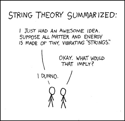
I read a couple of review snippets on Wikipedia citing cartoonish villains and big philosophical questions that are asked and then just not discussed at all and boy howdy are they spot on. It’s literally like this old xkcd strip about String Theory.
I actually threw my hands up at one point where they apparently couldn’t come up with any other way to get the Indo Raptor out of the cage so they just had a guy open it for something as petty as a trophy necklace. The prize for second worst moment in the film probably goes to MCU-douchebag-in-a-suit villain revealing that the little girl is a clone out of nowhere. Like, why would Owen and Claire care? They worked at a dinosaur theme park. Why would they think the little girl is like, an abomination? It’s not like she was spliced with raptor DNA.
There’s a bunch of other little things that don’t make sense throughout the film as well. Like, they kidnap that one girl to treat Blue because they really want her to live. But then Owen and Claire have to sneak around to get the T-rex’s blood for a transfusion. Like, why didn’t she just tell the guys who were holding her what she needed?
Then the villains openly acknowledge that they have no reason to keep Owen and Claire alive in a cell. No excuse about them having some kind of possible future use or needing to make sure the bodies aren’t found or anything. They don’t even do the Bond-villain cliche and leave them locked up with the T-rex or something. They just point out that as far as anybody knows they got blown up on the island, then just walk away.
Aside from that, the movie’s pretty underwhelming overall. Nothing happens that tops the pterosaur break-out or the raptor/T-rex/Mosasaurus vs I-rex fight. There was a lot of hype about the last hour of the movie being “like a horror movie” but it’s really just the climax of the first film again. There’s a little girl struggling with a sliding door and pulling it down just in time for the raptor to bash its head. There's a raptor operating a door latch. There’s someone banging on something to draw the raptor’s attention away from someone else. There’s getting chased up the stairs, through an exhibit, falling onto skeletons and another dinosaur coming in at the last moment to save the day. I mean, TFA may have re-used the Death Star trench-run, but that was just a background event. It’s not like they did the entire trench run, and only the trench run, just with different actors and a slightly different set as their big finish. The main focus of the climax was on new, exciting, and engaging stuff like Han and Kylo’s confrontation and Rey and Kylo’s duel in the snow.
The characters were also really flat. Nobody had an arc. Claire starts off caring about the dinosaurs and actually regresses by the end when she relents on setting them loose to save them, only for the little girl to do it anyway. Chris Pratt doesn’t want to help for his first five minutes of screen time and then the rest of the movie he’s ride or die with the rest of them. It’s so transparently just a thing that they put in the script because it’s a cliche they felt they had to follow. It doesn’t even make sense. Chris Pratt should’ve pulled a Flash and said “I’m in” before Claire could even finish. If anything, it should’ve been him who had to convince Claire to come. They made it seem like there was going to be more of Christ Pratt and Blue, but Blue was barely in the film. She gets incapacitated at the beginning and stays down until the climax. There’s no progression with her either. 1st film asked the question of whether she and the other raptors could be loyal to humans and the proved that to be true. 2nd movie acts like that was a thing they knew all along since she was a baby. You’d think that maybe after she got darted there’d be a thing like her maybe feeling betrayed by Owen and not helping him at first. Or when they brought up the new raptor needing Blue to be its mommy that would turn into a thing. But like every other interesting idea that gets brought up, the movie proceeds to just do nothing with it at all.
I also couldn’t help wondering about the logistics of the dino auction. Were all those holding pens and train tracks there before, or did the douche in the suit build those somehow behind the old guy’s back?
There’s also the implication that shit’s about to get real as they’ve “unleashed” dinosaurs into the wild now but like... Yeah, they did show us some evil old dudes and geneticists out there ready to clone more. But of the dinos on the loose now, there’s only 11 species, at least two of which have only one member (Blue and the T-rex). If they could be captured and removed from the island, surely they could assemble a dinosaur animal-control team to round up the escapees and put them in a sanctuary.
The best stuff was all in the 1st third of the movie. The opening scene was way more like a horror movie than the climax as were the scene with Claire and the scaredy-cat guy escaping a room with a dinosaur and raining lava and the escape from the flooding gyroscope. I feel like this movie should’ve been two movies. One that was just focused on the island stuff with a downer ending where Claire and Owen realized everything they did was just to help some rich dudes exploit dinosaurs, then the next film would pick up where that left off with the dino auction in the 1st act then the dinosaurs escaping their clueless irresponsible owners and running wild in the city.
But maybe instead the story will finally go full-blown batshit crazy and give us human-dino hybrids.
#jurassic world#jurassic world fallen kingdom#fallen kingdom#jurassic park#spoilers#jurassic world spoilers#jurassic world fallen kingdom spoilers#fallen kingdom spoilers#jurassic park spoilers
0 notes
Text
Global choropleth maps of military expenditure
From: http://ellisp.github.io/blog/2017/06/04/military-gdp
Global choropleth maps of military expenditure
04 Jun 2017
At a glance:
For choropleth maps showing the whole world, we don't need to stick to static maps with Mercator projections. I like rotating globes, and interactive slippery maps with tooltips.
Global choropleth maps
Today I’m writing about using country-level choropleth maps at a global level, using example data showing nations’ military spending as a percentage of GDP. There are a few specific issues to work through as a result of the global coverage. I’m going to start with my two preferred end results.
First, here’s a Twitter-friendly rotating globe:
There are a few problems with it I didn’t quite finish. If you watch it long enough you’ll see a few times Canada, the USA or Russia flicker out of the frame. More on that below.
Second, here’s an interactive version, suited for a fully featured web browser:
I find this the most useful version, even though I prefer to look at the rotating globe. The ability to hover over a country to get its name and value, and to zoom into a particular region, adds real value to the visualization. This is really the minimum people expect out of what I call micro-interactivity (I’m sure there’s a proper, technical name) - ability to zoom and get useful information when hovering.
Unless you spend a lot of time looking at maps of the Middle East, you probably wouldn’t have identified those two dark patches of high military spending as Oman and Eritrea, without the help of the hovering tooltips.
Caveat for today’s post - I’m not a GIS expert at all, and in fact am barely into the “conscious incompetence” stage. So there may be mistakes in what follows, and there are almost certainly better ways to do some of what I’m doing.
Data on military spend
First I needed some example data. Choropleth maps are appropriate for variables like proportions and growth rates rather than absolute numbers. Military spending as a percentage of GDP was in the news when I started this, because of USA President Trump drawing attention (in somewhat misleading terms) to the pledge by NATO leaders in 2014 to spend 2% of their GDP on the military by 2024 (the 2% was described as an unofficial floor as early as 2006, but only committed to at the leadership level in 2014 in the atmosphere of nervousness after Russia’s actions in the Ukraine). With seven years to the commitment deadline, it is widely reported that only five countries have yet passed the 2% figure, usually listed as the United States, Greece, United Kingdom, Estonia and Poland. Interestingly, the data I’m using suggest the UK is currently just under 2% and France just over, slightly different to some of the media reporting.
Often my first port of call looking for internationally comparable data is the World Development Indicators of the World Bank. While they are the definitive origin of very little data, the World Bank does a great job in collating data from other sources and making it available in their visualisation tool. There’s also Vincent Arel-Bundock’s handy WDI R package which makes it easy to get the data from the Bank into your own analytical tool.
When I started this exercise a couple of weeks ago, I was able to create this choropleth map from the very friendly WDI visualisation tool:
(but interestingly, returning to the site today, I can’t reproduce it). Anyway, there’s a few things that leave me not happy with it:
The data only go to 2015, whereas the data from the source goes up to 2016 in many cases.
The Mercator projection of the world map - according to xkcd’s brilliant summary of ‘what your favorite map projection says about you’, Mercator says “you’re not really into maps”. There are several problems, but for me it’s all summed up by Greenland looking way too large.
There’s a great ability to use the slider at the bottom of the map (not in the above screenshot though) to cycle through the years, but the scale of the colour fill recalibrates itself each year so this doesn’t allow a coherent view of change over time.
the colour scheme isn’t particularly good at drawing out differences between countries.
So I went to the source, the Stockholm International Peace Research Institute (SIPRI), who collate data from governments around the world into a Yearbook and publish the data separately - at the time of writing, with data from 1949 to 2016, using the countries that exist in 2016 (ie no East Germany, Soviet Union, etc; data for the Russian Federation, Ukraine, etc begins in 1992 or soon after).
Data exploration
If we plot all the data for all the countries and years at once, it looks like this:
First thing you might notice is the massive spike. That turns out to be Kuwait in 1991, when it spent 17 percent more than its GDP on military - the kind of thing that happens when you’re invaded and become the battleground for what in the USA is referred to as the First Gulf War.
In case you’re wondering, there’s no reason why a country can’t spend more than its GDP on the military (or anything else). In fact, while they are both measured in dollars, GDP is not really the same sort of variable as spend. GDP is the sum of value add of economic activity in the country. If spending is on imported goods and services it can exceed GDP. Similarly, while we see economic indicators like “exports as a percentage of GDP” in use (and it is a good indicator of the importance of trade), there’s no ceiling of that indicator at 100%, and countries like Luxembourg, Singapore, Malta and Ireland do in fact exceed 100%.
Here’s the code to download and import the SIPRI “military as a percentage of GDP” data into R and draw that first graph:
# Load in all the packages we need for the full post library(cshapes) library(tidyverse) library(forcats) library(scales) library(openxlsx) library(directlabels) library(ggthemes) library(RColorBrewer) library(countrycode) library(maps) library(viridis) library(leaflet) library(rworldmap) library(sf) library(maptools) #------------download------------ tf <- tempfile() download.file("https://www.sipri.org/sites/default/files/SIPRI-Milex-data-1949-2016.xlsx", destfile = tf, mode = "wb") #---------------import and tidy---------- sipri <- read.xlsx(tf, sheet = "Share of GDP", startRow = 6) %>% gather(Year, Value, -Country, -Notes) %>% mutate(Value = as.numeric(Value), Year = as.numeric(Year)) %>% filter(!is.na(Value)) #----------------exploratory chart----------- sipri %>% ggplot(aes(x = Year, y = Value, colour = Country)) + geom_line() + theme(legend.position = "none") + scale_y_continuous("Military expenditure as a percentage of GDP", label = percent) + ggtitle("Countries' and regions' expenditure on military as a percentage of GDP") + labs(caption = "Source: Stockholm International Peace Research Institute", x = "")
As further exploration, I picked the five so called “Five Eyes” countries. I have a little familiarity with their military history so thought this could be a useful way of checking I understood the data. Here is military spend as a percentage of GDP for those five countries, with major conflicts they were involved in indicated in a timeline.
The dates of the conflicts are just taken from Wikipedia.
The spikes in spending clearly and unsurprisingly relate to conflicts or other known political events, most obviously:
The Korean war led to a big spike for all four countries that had data available.
The surge in intensity (of their involvement) in the Vietnam war led to spikes for the USA and Australia.
There was a blip in UK military spending at the time of the Falklands war, but it did not arrest the overall downwards trend, even more marked since significant military conflict in Northern Ireland finished.
The early 1980s military boom for the USA was the Reagan administration ratcheting up the Cold War as well as militarily engaging in other countries in ways too numerous to show.
The wars of the George W. Bush era in Afghanistan and Iraq, attempts to create a formal “War on Terror”, temporarily reversed the secular decline in the economic importance of US military spending.
Code for drawing this chart (I’m not particularly happy with the manual data entry for the conflicts and their dates, but it will do for a one-off thing like this):
wid <- 0.01 # width of annotation bars wars <- data_frame( name = c("Malaysia", "Korea", "Aden", "Vietnam", "Northern Ireland", "Falklands", "Gulf", "Afghanistan", "Iraq"), start = as.Date(c("15/6/1948", "25/6/1950", "10/12/1963", "1/11/1955", "1/1/1968", "2/4/1982" , "2/8/1990", "7/10/2001", "20/3/2003"), format = "%d/%m/%Y"), end = as.Date(c("12/7/1960", "27/7/1953", "30/11/1967", "30/4/1975", "30/6/1998", "14/6/1982", "28/2/1991","28/12/2014", "18/12/2011"), format = "%d/%m/%Y"), lead = c("UK", "USA", "UK", "USA", "UK", "UK", "USA", "USA", "USA") ) %>% mutate(name_seq = n():1, ystart = wid * name_seq + 0.12, yend = ystart +wid ) countries <- c("Australia", "New Zealand", "USA", "UK", "Canada") palette <- brewer.pal(5, "Set1") names(palette) <- countries p <- sipri %>% filter(Country %in% countries) %>% mutate(YearDate = as.Date(paste0("30/6/", Year), format = "%d/%m/%Y")) %>% ggplot() + geom_rect(data = wars, aes(xmin = start, xmax = end, ymin = ystart, ymax = yend, fill = lead), alpha = 0.2) + geom_text(data = wars, aes(x = end, y = (yend + ystart) / 2, label = name), colour = "grey50", hjust = 1, nudge_x = -200, size = 3) + geom_line(aes(x = YearDate, y = Value, colour = Country)) + scale_y_continuous("Military expenditure as a percentage of GDP", label = percent, breaks = c(0, 5, 10, 15) / 100) + ggtitle("Selected countries' expenditure on military as a percentage of GDP", "'Five eyes' countries only; periods also shown for conflicts in which they had material deployments") + labs(x = "", caption = "Source: Stockholm International Peace Research Institute") + scale_colour_manual(values = palette) + scale_fill_manual(values = palette, guide = "none") + theme_tufte(base_family = "myfont") + theme(plot.caption = element_text(colour = "grey50")) + annotate("text", x = as.Date("1970/6/30"), y =0.145, hjust = 0.5, colour = "grey50", size = 3, label = "Not shown - Grenada, Panama, Balkans,\nLibya, Lebanon, Haiti and numerous smaller...") direct.label(p)
Different world projections
OK, time for maps. First I wanted to sort out some projections for flat versions of the world. ggplot2 makes this convenient. You can define a single map object, and just add a different version of + coord_map() to it to get a different projection. Here are two which worked quite nicely:
Globular projection
Projection with bilateral symmetry about the Prime Meridian and the equator. Hemisphere is circle, circular arc meridians equally spaced on equator, circular arc parallels equally spaced on 0- and 90-degree meridians:
Orthographic projection
Viewed from infinity, centering on 20 degrees latitude, 20 degrees longitude:
Code for the basic maps
There’s a bit of work to be done to join the military spend data to a map data. Most importantly I need a country code. The countrycode package is a great example of a specialist package that does one thing well; what it does is convert country names or codes between eachother. For my use case, I want everything to be the ISO three character code (eg NZL for New Zealand). Once this is done, all that is required is to create a flat ggplot-ready version of a map shape file and join the two data frames together.
In the code below I create a single ggplot2 object worldmap which is an un-projected world choropleth map complete with the information on colour scale (I use viridis inferno), legend, captions, etc. Then I can add whatever projection I want (final two lines of code in the chunk below.
#===============map prep======================== sipri <- sipri %>% mutate(iso3c = countrycode(Country, "country.name", destination = "iso3c")) %>% # two manual concordances of country code: mutate(iso3c = ifelse(Country == "Kosovo", "KOS", iso3c)) # for some reason the tidyverse doesn't work for Central African Republic! # so we fix it old school: sipri[sipri$Country == "Central African Rep.", "iso3c"] <- "CAF" world <- map_data("world") %>% mutate(iso3c = countrycode(region, "country.name", destination = "iso3c")) # data on military for just the latest year for each country the_data <- sipri %>% group_by(Country) %>% filter(Year == max(Year)) # using the help at http://ggplot2.tidyverse.org/reference/coord_map.html world2 <- world %>% left_join(the_data, by = "iso3c") # define a ggplot mapping object worldmap <- ggplot(world2, aes(x = long, y = lat, group = group, fill = Value)) + geom_polygon(colour = "grey75") + scale_y_continuous("", breaks = (-2:2) * 30) + scale_x_continuous("", breaks = (-4:4) * 45) + scale_fill_viridis("", label = percent, option = "inferno", direction = -1) + theme_minimal(base_family = "myfont") + theme(legend.position = "right", axis.text = element_blank()) + ggtitle("Military expenditure as a percentage of GDP", "Most recent data shown for each country; mostly this is 2016") + labs(caption = "Source: Stockholm International Peace Research Institute") #-------------single map, nice projection------------------- # Lots of the projections in coord_map have problems with drawing # polygons. ok are: globular, harrison worldmap + coord_map("globular") worldmap + coord_map("orthographic", orientation = c(20, 20, 0))
Animated choropleth over time
Remebering my reservations with the World Development Indicators site, one of my aims was to have a choropleth map that showed military expenditure as a proportion of GDP for different years, with colour on the same scale. An animated graphic is the obvious way to do this:
… but it has imperfections:
Because of the few year-country combinations with massive spikes (eg Kuwait in 1991), I needed to use a logarithm transform on the scale or everything looked the same colour.
The slowly changing dimension of country existence proves a real problem, with data before the 1990s sadly lacking.
Data existence in general tends to dominate the visual; so rather than a feel for how military expenditure changes over time, the impression one gets is of more data gradually becoming available over time.
Not really a success. Nonetheless, a nice idea (I think) and here’s the code that does it. It’s basically the same idea as the previous chunk of code, but in a loop that repeats the data filtering and joining for each value of year, and saves a single frame for each printed annual map.
#================animated map over time=============== setwd("C:/temp1") # or whatever folder you want to hold the frames in years <- unique(sipri$Year) for(i in years){ this_year_data <- sipri %>% group_by(Country) %>% filter(Year == i) world2 <- world %>% left_join(this_year_data, by = "iso3c") worldmap <- ggplot(world2, aes(x = long, y = lat, group = group, fill = Value)) + geom_polygon(colour = "grey75") + scale_y_continuous("", breaks = (-2:2) * 30) + scale_x_continuous("", breaks = (-4:4) * 45) + scale_fill_viridis("", label = percent, option = "inferno", direction = -1, limits = range(sipri$Value), trans = "sqrt", breaks = c(1, 10, 40, 100) / 100) + theme_minimal(base_family = "myfont") + theme(legend.position = "right", axis.text = element_blank()) + ggtitle(paste("Military expenditure as a percentage of GDP -", i)) + labs(caption = "Source: Stockholm International Peace Research Institute") png(paste0(i, ".png"), 12 * 72, 6 * 72) print(worldmap + coord_map("harrison", dist = 1, angle = 30, ylim = c(-75, 85))) dev.off() } # Use ImageMagick to convert all those PNG frames into a single animated GIF # (requires ImageMagick to be separately installed) system('magick -loop 0 -delay 40 *.png "0099-military-gdp-time.gif"')
Animated globe
Finally, on to the two “good” versions of the data. Here’s a reminder of the animated globe:
The strategy is to create 360 different snapshots of the globe, each one 1 degree changed in longitude and latitude from the previous. Longitude moves 1 degree each frame in the same direction, latitude meanders from 30 degrees north to 30 degrees south and back again.
I had to leave the ggplot2 universe to do this (but I’m not sure I had to). I couldn’t get my projections of the ggplot2 version of the globe to work with enough values of latitude and longitude as the centre point. Whenever one of the larger countries like Russia, China or Canada was split in two ggplot2 would draw the polygons in ugly ways. My best effort can be seen in this tweet - which also has some very useful comments and suggestions in response.
In the end I adapted the suggestion of Edzer Pebesma, which is included in a demo in his amazing sf package. I don’t really understand exactly how it successfully clips the polygons, but it works nearly entirely well.
There were still quite a few frames where countries went missing altogether for the wrong combination of latitude and longitude. Experimenting with different versions of world maps, I found that some were vulnerable to different combinations from others. To reduce the problem, I made each frame of the end animation actually two globes of countries drawn on top of eachother - to increase the chance that at least one of the maps draws each country. This reduced the missing country problem to only three or four frames.
Here’s the code that does that:
#------------sf approach------------------ # this solution came from the demo in the sf package, tweeted about at # https://twitter.com/edzerpebesma/status/835249468874321920 circ <- function(l = c(-180:180), lon0 = 0, lat0 = 30) { deg2rad = pi / 180 lat = atan(-cos((l - lon0) * deg2rad)/tan(lat0 * deg2rad)) / deg2rad xy = if (lat0 == 0) { l1 = lon0 - 90 l2 = lon0 + 90 rbind(c(l1,-90), c(l2,-90), c(l2,0), c(l2,90), c(l1,90), c(l1,0), c(l1,-90)) } else if (lat0 > 0) { xy = cbind(lon = l, lat = lat) rbind(c(-180,90),xy,c(180,90),c(-180,90)) } else { xy = cbind(lon = l, lat = lat)[length(l):1,] rbind(c(180,-90), xy, c(-180,-90),c(180,-90)) } st_sfc(st_polygon(list(xy)), crs = st_crs(4326)) } m <- st_make_grid() m <- st_segmentize(m, 4e5) data(wrld_simpl) # Two versions of the world map, joined to the military/GDP data: w1 <- st_as_sf(countriesLow) %>% left_join(the_data, by = c("ISO3" = "iso3c")) %>% mutate(fill = pal(Value)) w2 <- st_as_sf(wrld_simpl) %>% left_join(the_data, by = c("ISO3" = "iso3c")) %>% mutate(fill = pal(Value)) # latitudes will go from 30 north to 30 south and back again: lats <- rep(c(30:(-30), (-29):29), 3) # longitudes will start at 50 and go around backwards: lons <- c(180:(-179)) dir.create("C:/temp2") setwd("C:/temp2") # Frame 234 goes missing if using wrld_simpl # Frame 269 goes missing if using countriesLow or wrld_simpl # etc for(i in 1:length(lons)){ png(paste0(1000 + i, ".png"), 600, 550, res = 100) par(mar <- rep(0, 4), bg = "black") lat <- lats[i] lon <- lons[i] # define the proj4 string: p4s <- paste0("+proj=ortho +lat_0=", lat, " +lon_0=", lon) # draw the pale blue globe in space blank_globe <- st_transform(m, st_crs(p4s), check = TRUE) plot(blank_globe, col = '#e6f2ff', border = 'grey99') # create a clipped version of the great circle?? # I don't really understand what is happening, but it seems to work. crc <- circ(lat0 = lat, lon0 = lon) w10 <- suppressWarnings(st_intersection(w1, crc)) w20 <- suppressWarnings(st_intersection(w2, crc)) # cast and re-project the map itself w10 <- st_cast(w10, "MULTIPOLYGON") w10 <- st_transform(w10["fill"], st_crs(p4s), check = TRUE) w20 <- st_cast(w20, "MULTIPOLYGON") w20 <- st_transform(w20["fill"], st_crs(p4s), check = TRUE) # draw the map plot(w10, col = w10$fill, add = TRUE, border = NA) plot(w20, col = w20$fill, add = TRUE, border = "grey75") # title and legend title("Military expenditure as a percentage of GDP\nNearest year to 2016", col.main = "white", font.main = 1, adj = 0) title(sub = "Source: Stockholm International Peace Research Institute", col.sub = "grey50", adj = 1) leg_nums <- seq(from = 4, to = 20, length.out = 6) / 100 legend("bottomright", legend = paste0(round(leg_nums * 100), "%"), pch = 15, adj = 0.1, col = pal(leg_nums), text.col = pal(leg_nums), bg = "grey80") dev.off() } system('magick -loop 0 -delay 7 *.png "0099-military-gdp.gif"')
Interactive leaflet choropleth
Finally, there’s the interactive version (my favourite):
To draw this, I used leaflet and went back to sp spatial polygons data frames. The code for this is actually some of the simplest in this post. While most of the examples I’ve seen of leaflet use Mercator projections, it’s possible to reproject your map (so long as you don’t need Google or other map tiles) with a couple of lines of code:
#-------------------------leaflet------------------ shape <- countriesCoarse # define colour palette pal <- colorNumeric( palette = inferno(10, direction = -1), domain = the_data$Value) # uses the_data defined earlier in the ggplot2 demos data2 <- shape@data %>% left_join(the_data, by = c("ISO_A3" = "iso3c")) %>% mutate(tooltip = paste0(ADMIN, " ", Year, ", ", round(Value * 100, 1), "%")) # EPSG4326 means latitude and longitude coarse_crs <- leafletCRS(crsClass = "L.CRS.EPSG4326", proj4def = proj4string(countriesCoarse)) shape %>% leaflet(options = leafletOptions(crs = coarse_crs)) %>% addPolygons(stroke = FALSE, smoothFactor = 0.2, fillOpacity = 1, color = ~pal(data2$Value), label = data2$tooltip)
Happy mapping!
← Older
Sankey charts for swinging voters
Follow this blog with RSS. Or follow posts in this blog featuring R with RSS.
This blog is built with Jekyll, Bootstrap, Ruby and R. Read my acknowledgements for a little more on how. I'm pleased to be aggregated at R-bloggers, the one-stop shop for blog posts featuring R.
Peter's stats stuff by Peter Ellis is licensed under a Creative Commons Attribution-ShareAlike 4.0 International License.
0 notes
Text
Hackaday Dictionary: Open- and Closed-Loop Systems
Today on Hackaday Dictionary, we’re going to talk about the two basic types of control systems: open-loop and closed-loop. We’ll describe the differences between them and explore the various advantages and disadvantages of each. And finally, we’ll talk about what happens when you try to draw a line between the two.
And there was much rejoicing. Image via Racoon Valley Electric Cooperative
Control Systems
Control systems are literally all around us. They’re illuminating our rooms, laundering our unmentionables, and conspiring to make us late for work. Most of us probably use or interact with at least five control systems before we’re even out the door in the morning. Odds are you’re using a control system to read this article.
When we say ‘control system’, we’re speaking broadly. A control system is defined as any system that exhibits control over a function. It doesn’t matter how big or small the function is. A standard light switch is a simple type of control system. Flip it back and forth and the light is either on or off with no in between. Too bright? Too bad. There is no way to account for light intensity preference, use duration, energy output, or anything else.
A humble clothes dryer. Image via Showplace Rents
Another common example in discussing control system theory is the clothing dryer. Set the timer on the dryer and it will run until time expires. Will it run long enough to dry everything without shrinking anything? The only way to know is to open the door and check.
Both the light switch and the clothes dryer are open-loop systems. The process is a straight line from start to finish, and they operate without concern for their output. Once the light switch is flipped to the on position, current will flow until the switch is reversed. The switch doesn’t know if the bulb is burned out or even screwed into the socket to begin with. And the clothes dryer doesn’t care if your clothes are damp or dry or totally shrunken when time runs out.
Stay in the Loop
In a closed-loop system, the process begins the same way it does in an open-loop system. But a closed-loop system has one or more feedback loops in place that can adjust the process. Sometimes the feedback will simply cause the process to repeat until the desired result is achieved.
Both of our open-loop control system examples above could easily be converted to closed-loop systems. A more advanced light switch might take input from a photo cell, or it could poll a motion detector and turn the lights off after a period of no detectable activity in the room. The clothes dryer could be improved with the addition of a moisture sensor. Since the humidity level in the dryer will change during the cycle, why not poll a DHT22 and re-run the process until a predetermined humidity level is reached? Then the dryer becomes a closed-loop system. No more reaching in and fondling the towels and shirt collars to make sure everything is dry. Well, at least in theory.
What are they telling you? xkcd #1116
Some control systems exist in both forms. Traffic lights are a good example of this phenomenon. Some lights are open-loop and simply run on a schedule. Many more of them are closed-loop and will cycle differently depending on traffic flow or information received from other traffic lights. The really smart ones have Emergency Vehicle Preemption (EVP) receivers. This is the system that allows fire trucks and some other emergency vehicles to change the lights in their favor. A device in the vehicle strobes a specific pattern at the receiver module on the light post, and the light changes as soon as possible.
Cruise control via Wikipedia
Advantages and Disadvantages
The main advantage of closed-loop systems is fairly obvious: using feedback means more and better control. But there are trade-offs. It’s almost impossible to deal with all the what-ifs in creating any system, and this generates unforeseen issues. They aren’t all bad, though. Maybe you’re sitting peacefully in the corner engrossed in a book, and the motion detector-driven lights shut off because you aren’t moving around enough. That isn’t ideal, but it’s easy enough to turn the lights back on and keep reading.
The unforeseen issues can be so much worse than sudden darkness. Case in point: robotic vacuum cleaners. Here you have a complexly closed-loop system to take care of one of life’s drudgeries. Should be awesome, right? Yes, but because it is blind to everything but its pre-programmed boundaries, it doesn’t know not to spread messes around.
A lot of closed-loop control systems look great on paper, but their imperfections become clear in execution. Take cruise control for example. Here is a system that’s better at its job than humans are. It will maintain the set speed until you hit the brakes or run out of gas. It will perform as intended whether there is a headwind or a tailwind or you’re towing a boat or transporting rowdy children. But cruise control isn’t aware of cliffs or guard rails or deer darting out in front of the car. Cruise control keeps its head down and does its job until it can’t go on.
Open-loop systems may not be as smart as closed-loop systems, but they often shine in their simplicity. For the most part, they do what you expect them to do. Light goes on, light goes off. And they are arguably more dependable since there are fewer things that can go wrong. Of course, a “simple” open-loop control system can mean a steeper learning curve. It’s not easy to learn to drive a manual transmission. But if you don’t know how to drive one, you’re missing out on some nice advantages, like the ability to push start the thing if you have to, and the option to downshift instead of pumping the brakes in icy conditions. So the question is this: is an open-loop system more valuable than a closed-loop system if it means having more control over the process? Does it depend entirely on the process in question?
This tricycle is simultaneously safe and unsafe. Image via Apple Door
Open-Loop vs. Closed-Loop
So where exactly does open-loop end and closed-loop begin? The line seems clear for some systems, but muddy for others. How much feedback is enough to qualify? Add just about anything to a light switch and it seems safe to say that you took it from open- to closed-loop.
More often than not, the line between the two is blurry. Think of a motorized garage door. You push the button and the door either opens or closes. Push it again and the door moves in the opposite direction. Most modern garage doors have a fail-safe in place to stop the garage door in the event of an emergency. If the door encounters any resistance, it will stop and reverse direction.
The break beam detector is supposed to keep people and their tricycles from being crushed if they happen to be in the way while the door is closing. But it only works if the person or thing breaks the IR beam. There’s only one beam, and it sits about six inches off the floor. The motorized garage door system is actually quite limited because it has no positional awareness. It doesn’t know where it is on the track, it’s just going up and down blindly, waiting for input or resistance.
Not all doors can be counted on to stop if they feel resistance—I tested mine and it kept on going. So if I don’t pull far enough into the garage and then put the door back down, it might hit the protruding rear end of my hatchback. It’s in the way of the door closing, but it sits way too high to break the beam. So is the garage door really, truly a closed-loop system?
0 notes
Last Seen Blogs

c-ric
신림그랑프리나이트클럽 WT소개

muskuloeser
Muskulöser

mostly-funnytwittertweets
previously funnytwittertweets

savage-tacticians
SAVAGE TACTICIANS

poojamanillp
Untitled