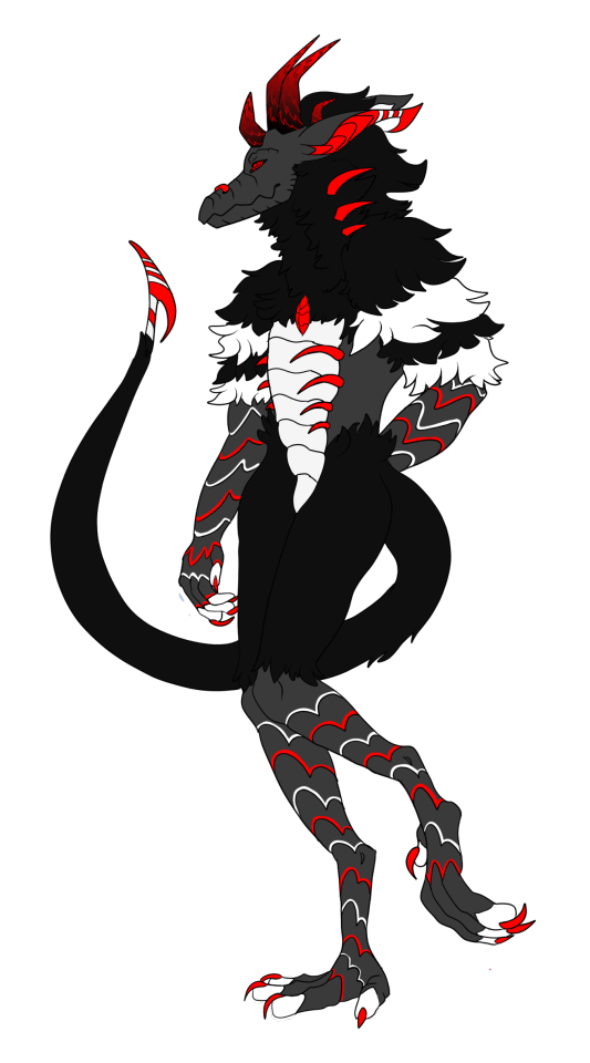
#Im so glad I don't have to do any more lineart
Text
sorry for not uploading for so long, artblock has striked again and I am stuck with this at the moment
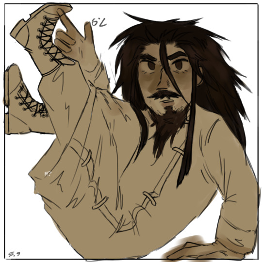
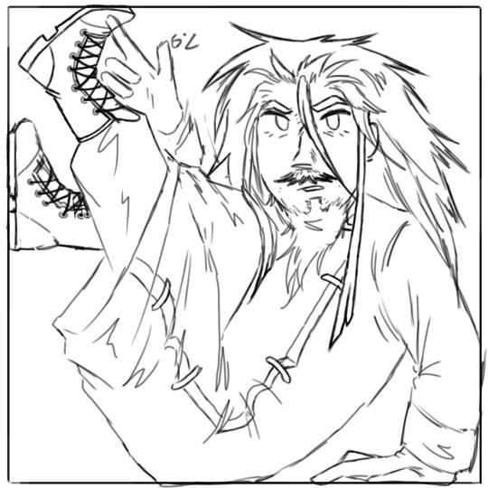
the lineart by itself somehow looks 10× better
someone let him out☹
#ivor mcsm#minecraft story mode#mcsm#mcsm fanart#Im so glad I don't have to do any more lineart#too lazy to fix the errors
26 notes
·
View notes
Text

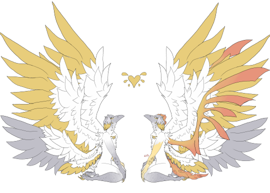
a vil piece i drew for a twst art nouveau open collab on twitter :] thank you to @/snailwonderzz for hosting it!!
rambling & thoughts abt this piece below the cut because i put a lot of thought into it
tbh my thoughts on this piece are properly expired because i did this MONTHS ago and its. its not as fresh as it used to be but here we go

so i made this thing ^ for twitter because obviously i cant ramble there but the whole gist of it is there from the beta designs and everything, but something i didn't include in the picture above is my struggle with deciding what color the dress should be because i don't make thumbnails/colored sketch before like getting into lineart and coloring


okay pic above is the options i had for deciding the color (ended up doing the one on the second pic, second from the left) it's a bit fun to revisit because this pic took 11 hours or so ibispaint says okay wait time to properly get rambling
i. unexpectedly put a lot of effort and thought behind this piece considering that its probably my first ever proper serious twst artwork...??? and its an open collab too so you cant not expect me to tryhard a little www
but anyway. i do wish i could have done more but im impatient and i want to get this finished asap with how busy i already was with other stuff so as a result i didnt put much though in the backgrounds and just balled it but yknow what. its okay i like the end result, its nice to see and im glad to see that people like it too!!
about the beta designs; im genuinely a big fan of like some of them but i knew it was going to be a pretty detailed (and draining) piece so i decided for something simple :] i did regret not putting any accessories in vil's hair though :( it completely slipped my mind until i was like .... halfway? through shading
ANYWAY. i think that should be all? idk my thoughts are no longer fresh anyway so i dont have much to say now compared to back then but if you read this thank u . i put a lot of love and effort in what i do and i hope it shows through my art. hopefully i can draw more twst soon !!
#twst fanart#twisted wonderland#twst#artwork#vil schoenheit#twst vil#disney twst#disney twisted wonderland#twisted wonderland fanart
97 notes
·
View notes
Note
THEY TURNED OUT AMAZING I'M JUST SAD TO HAVE MISSED OUT </3 I knew I'd miss a stream sooner or later but still... owwie... However, that meant I got to be pleasantly surprised (<- understatement) by the pose you chose for Jo CHRIST ☠️ Unbuttoning his shirt does pass for a Slut Moment when it comes to him though I can't lie...
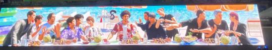
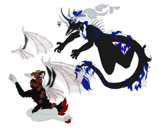
And OBVIOUSLY. AS YOU CAN SEE. I love the Arakawa <33 the red background fucks soooo hard with the blood... definitely my new favorite screenshot as well... SO EXCITED to see Mellow Sawashiro and Sicko Arakawa... they saw us saying he was too wholesome to be menacing and this was their answer... hope you don't mind me using it as my icon btw I know you used to say in your about it was fine to do whatever with credit... but you don't anymore... so I'll get rid of it if you want, sorry for not asking in advance!
Anyway crying at this recreation of The Last Supper I can't claim to know the significance of any of it but Jo and Kiryu (Joryu... if you will...) look so fucking GOOFY not to mention ANY OF THE REST
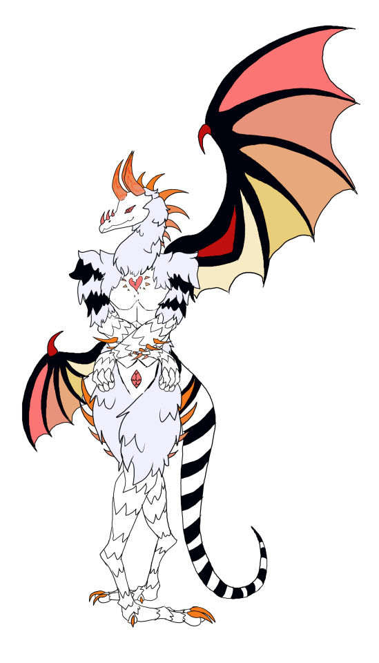
fomo is real and it's out there.. can't attend EVERY stream- truly is funny that tihis instance i actually got stuff done LMAO oops. BUT there's always next time :) where hopefully ill finish something again <:) OH BUT YEAH LMAO i was going to be boring at first and just do a headshot but i wanted to try and explore the like. .2% more Not Clinically Depressed energy he was givin so... skank behavior 😔
IM GLAD YOU LIKED THE ARAKAWA THO i actually ended up redoing the lineart after stream... i was so particular bout how i wanted it to look and even now im still scratchin my chin on how i coulda done some things BUT IT'S COOL I'MA LEAVE IT. rgg found me talkin shit and wanted to retaliate with murderous arakawa but little did they know thats all i wanted !!!!!!! FOOLS. im so excited... finally got the chance to draw arakawa murderous after a year of wanting to do so..
OH AND OFC id be more than honored to let you use it as a pfp ♪(´▽`) !! i coulda sworn i DID have that in my bio but i guess i deleted it by accident: time to add it again lol
the last supper recreation's SUUCH a cute pic, and even if kiryu's Presumably tellin sawashiro to cool it, it's nice seein jo in a Vaguely Casual setting for once (❁´◡`❁) he's not healing i think he's getting worse but for now i'll believe he's healing (❁´◡`❁)
#snap chats#i guess it HAS been five years. i cant call this game sawashiro's widow arc since It's Been Five Years#could never say he's over it but he's Probably managing it better. i think. maybe not better but the depressed prison cut's gone anyway..#i mean the fuckass behavior daigo had was barely a year after y3 alright how bad can sawashiro be after five years#watch lad8 prove me a dumbass LMAO THERE'S. THERE'S DIFFRENCES#~4 years versus ~4 decades.. reactions miiight be a bit different.. but my joke's gone on too long and has become too serious#im gonna go fix my bio now
9 notes
·
View notes
Note
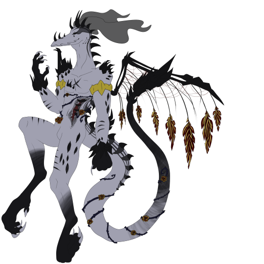
(Aphex) Mod shit can we straight up get a design shitting edition for InsaineMembrane's designs?? APHX-714, APHX-666, APHX-667, APHX-838, APHX-1263, APHX-843, APHX-1341, APHX-1032, APHX-1737, DPHX-1431. in order of how they have them on the website. Love u sorry for torturing u </3333. Tried not to grab any dupes that have been on the blog before but if I got some that have been featured before please roast me to death. Also hope I'm using pronouns they're comfy with but let me know if I'm not
at first i was going to tell you to go fuck yourself because i dont want to but then the bus got delayed so here i am. this one has the faintest hints of a good design actually and that's probably because it's not a clusterfuck of shoddy textures and glaring colors. still not that impressive but considering who makes these it's almost passable. the spikes always look terrible and jut out from weird places, and it took me a second to realize the black clouds on the eyes are wisps but i have less to shit on this other than it's just a touch ugly instead of glaringly ugly
of course they have the 666 one and it's as needlessly edgy as it could be. not even that edgy either compared to the usual clusterfuck. the legs remind me of big bird and its hand behind it looking like it's trying to pull out a wedgie really decreases the edge factor. on the nose also looks like a nose clip for people who go swimming. most of it's just repeating patterns for the sake of filling space
i might just have very low standards but this design is completely fine. the right version gets to the weird overcomplicated nonsense but the one on the left has nothing wrong with it. right looks like it got a disease
I kind of appreciate the various poses these are drawn in but this one's closer to what i expected. a shitton of spikes and zigzagging segments that is more confusing than anything, on a pose that is clearly either eyeballed or traced somewhat because anything that has to be drawn from scratch has incredibly low skill. they've gotten better at color placements though. idk i feel i just have to reward actual progress. this does not stop it from looking a lot like a chicken or the fuckugly hands though
im glad you discovered the darken layer in procreate now can you learn some better things too. same spikes though im unsure if these are standards for the species or whatever. idek what the effect is trying to pull off or why the right wing looks broken. in fact both wings appear broken because they just out of the wrist when usually wing membranes are connected to the hand themselves. the eyes almost look like trypophobia and the amaazing stamp brush used for the circles

click on the link because this one couldn't be assed to be properly colored in at bits or even have the lineart connect. idk what the reference was but why is it doing a weird look over the shoulder. points i guess for trying to copy what a flail looks like even if it's incredibly obvious. the horns don't make a lick of sense and nothing is even which is almost a breath of fresh air compared to the over used symmetry ones. almost, it still looks bad.

idk which part of it lets it have two bodies with entirely different designs but sure let this person make more bad designs. these would actually look fine if anyone else was designing them, though right one is very hard to see because it's mostly black god forbid this be drawn with any shadows or you'd lose the bitch
this looks like a crook because of the mouth and limb situation. the lines aren't smooth at all do they do this with a mouse

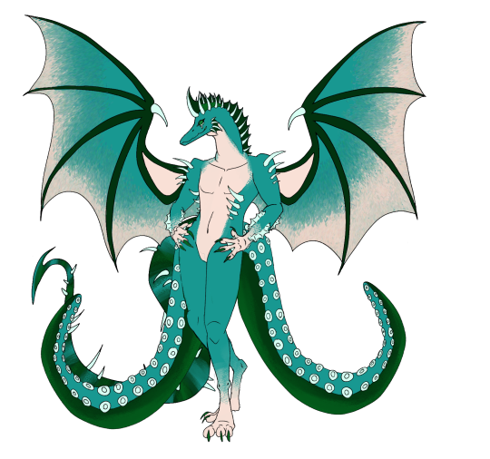
another common sign a person's a beginner is their overuse of a single interesting stamp brush. it works for the wings but does not work as well for the wrists or ankles. the tail is very hard to see past the two octopus tentacles in face they are covering it entirely. the webbing on the forearms make little sense
another attempt at a plague rat. the limbs are already jacked up but they couldn't even make them look attached or like they'd even bend properly. also apparently the mask is a trait too. the subtle tint of gross piss yellow adds a nice touch for infected sewer rat just fix the anatomy and this almost could be decent

0 notes
Last Seen Blogs
taehyungsblueflower
вℓυє ƒℓσωєя

productivitytrumpsprocastin-blog
ProductivityVsProcastination

choisoonhoo
제목 없음

ladywinchester88
The Life & Times

lainslullaby
໒꒰ྀིᵔ ᵕ ᵔ ꒱ྀི১