#Moderate Resolution Imaging Spectroradiometer (MODIS)
Explore tagged Tumblr posts
Visit Tumblr Blog
Explore Tumblr blogs with no restrictions, modern design and the best experience.
Last Seen Tumblr Blogs


Fun Fact
The Tumblr app for Google Glass was released on May 16, 2013.
Text
Spatiotemporal Analysis of Agricultural Drought Severity and Hotspots in Somaliland
New #study reveals recurring #drought patterns in #Somaliland, with #Sool & #Togdheer regions most critically affected. Findings emphasize the need for targeted interventions & adaptive management strategies to build #Resilience in this country
Continue reading Spatiotemporal Analysis of Agricultural Drought Severity and Hotspots in Somaliland
#Agricultural Drought#Agriculture#Agriculture And Environment#Climate#Climate Hazards Group InfraRed Precipitation with Station data (CHIRPS)#Drought#East Africa Drought#Moderate Resolution Imaging Spectroradiometer (MODIS)#Normalized Difference Vegetation Index (NDVI)#Somaliland#Somaliland drought#Study#Vegetation Condition Index (VCI)
0 notes
Text

Fires Rage in Patagonia
In February 2025, multiple fires raged along the eastern slopes of the Andes Mountains in Patagonia. The fires had burned about 30,000 hectares (115 square miles) of forest in south-central Argentina by February 11, forcing hundreds of people to evacuate their homes, according to news reports.
Smoke from the Magdalena Valley fire—burning in Lanín National Park—was visible in this image, captured by the MODIS (Moderate Resolution Imaging Spectroradiometer) instrument on NASA’s Aqua satellite on February 9, 2025 (above). A detailed view of the smoke moving through the Magdalena Valley can be seen in the image below, acquired on the same day by the OLI-2 (Operational Land Imager-2) on Landsat 9.
The Magdalena Valley fire ignited in late January and had charred more than 15,000 hectares (58 square miles) of Lanín National Park as of February 10. The forested park, located in Argentina, shares a border with Villarrica National Park in Chile. Both parks share the two snowcapped dormant volcanoes pictured here: Lanín and Quetrupillán.

The austral summer (December through February) is the dry season in Chile and Argentina when wildfires are more common. This year, strong winds and unusually high temperatures fueled the region’s blazes, which began in December 2024.
Warm, dry wind from the west crossed the Andes and swept through Lanín National Park at speeds up to 45 kilometers (28 miles) per hour in early February. As the wind flowed down the lee side of the Andes, it compressed, increasing the air temperature and driving down humidity. A similar phenomenon occurs during the Chinook Winds, which flow down the east side of the Rocky Mountains.
René Garreaud, an atmospheric scientist at the University of Chile, noted that westerly winds crossing the Andes were stronger than average from early January to early February.
Central and northern Argentina were especially hot in January and early February 2025. Maximum temperatures hovered around 35-45 degrees Celsius (95-113 degrees Fahrenheit), which is 3-5°C above normal, according to Argentina’s national weather service. The weather service noted that these “extreme temperatures” were expected to persist in parts of the country until February 12.
Two other fires burned south of the Magdalena Valley fire in Argentina on February 11. By that day, the Los Manzanos fire had scorched 10,000 hectares of the Nahuel Huapi National Park, according to officials, and the Confluencia fire had burned over 3,600 hectares near the town of El Bolsón.
NASA Earth Observatory images by Michala Garrison, using Landsat data from the U.S. Geological Survey and MODIS data from NASA EOSDIS LANCE and GIBS/Worldview. Story by Emily Cassidy.
6 notes
·
View notes
Text
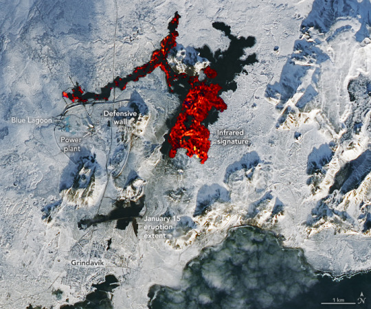
Another Eruption in Iceland
"After a lull in activity, fresh lava has once again poured from the Reykjanes peninsula in southwestern Iceland.
The latest eruption—the third in the region since December 2023—began early on February 8, 2024, with lava spraying up to heights of 80 meters (260 feet) along a 3-kilometer (1.8-mile) long fissure near Mount Sýlingarfell. The small peak is north of the fishing village Grindavík and east of the Svartsengi power station and Blue Lagoon geothermal spa.
The image above was acquired on February 10, 2024, by the OLI-2 (Operational Land Imager-2) on Landsat 9. Infrared and visible observations (bands 7-6-3) have been overlain on a natural-color image to help distinguish the heat signature of the lava. Still recent but cooler lava expelled near Grindavík in January appears black.
The topography around the fissure meant that much of the fresh lava flowed east into unpopulated areas rather than south toward Grindavík. Some lava also flowed west into the vicinity of the power plant and spa.
Earthen defensive walls protected both facilities, though lava did burn through a key hot water pipeline and two roads. According to the Icelandic National Broadcasting Service RÚV, authorities are in the process of restoring hot water to homes in the area after conducting repairs on the pipeline.
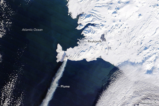
About seven hours after the eruption began, the MODIS (Moderate Resolution Imaging Spectroradiometer) on NASA’s Terra satellite captured this image of a plume of gas and ash streaming to the southwest. This eruption was effusive—not explosive like the Eyjafjallajökull eruption in 2010—and the plume contained minimal ash, so it did not cause any disruptions to either domestic or international flights.
Volcanic plumes like the one shown here typically contain water vapor, sulfur dioxide, carbon dioxide, and small amounts of other volcanic gases. Researchers from the Icelandic Met Office and the University of Iceland have noted that, at times, magma has interacted with groundwater, adding to the amount of water vapor in the plume. The TROPOMI��(Tropospheric Monitoring Instrument) on the Sentinel-5 Precursor missionobserved sulfur dioxide (SO2) within the plume, Michigan Tech volcanologist Simon Carn noted on X.
After the initial burst of activity on February 8, the intensity of the eruption faded. In an update on February 9, the Icelandic Met Office reported that seismic sensors had stopped detecting volcanic tremors and that a recent drone flight showed no activity over the eruption site—signs that the latest eruption was ending.
However, on February 12, the agency reported that the land surface above an underground magma reservoir near Svartsengi had again begun to swell by 0.5 to 1 centimeters per day, a rate similar to what was observed prior to other recent eruptions. “It is therefore highly likely that the cycle continues in a few weeks with another dyke propagation and a volcanic eruption,” the agency said."
NASA Earth Observatory image by Lauren Dauphin, using MODIS data from NASA EOSDIS LANCE and GIBS/Worldview. Story by Adam Voiland.
8 notes
·
View notes
Text
Among the many victims of Russia’s full-scale invasion of Ukraine are some of the most important ecosystems in Eastern Europe: Ukraine’s forests and protected areas.
The full extent of the damage, however, is unknown. That’s why we are launching a new tool that will help open source researchers track destruction from afar.
In September 2022, Ukrainian environmental researchers visited national parks — which are more resilient to climate change than artificial plantings and support crucial biodiversity—to assess damage to forests and wildlife. Initial findings revealed broken trees, damaged root systems due to trench digging and unexploded munitions scattered across protected lands.
“Forests have suffered a lot on the frontline… huge areas of forests are being mined”, Yehor Hrynyk, an environmental campaigner at the Ukrainian Nature Conservation Group, told Bellingcat. But large parts of Ukraine’s vast national parks, mountainous regions and woodlands are inaccessible for on-the-ground environmental monitoring.
That’s where open source techniques come in.
The OSINT Forest Area Tracker
We’ve launched the “OSINT Forest Area Tracker”, hosted on Google Earth Engine. Our tool compares data collected by Sentinel-2, a satellite which detects changes in infrared wavelengths and can be used to study the health of forests.
The tool reveals the scale and intensity of anomalous changes on land. This narrows down search areas for researchers working on environmental damage in Ukraine.
Importantly, the map does not attribute the cause of these changes, meaning that it is crucial to find corroborating evidence from other sources before concluding that they were the result of military activity.
The tool uses the Normalised Burn Ratio (NBR) index to estimate burn severity.
Researchers can also use the tool to select custom date ranges for geographic locations of interest.
As Ukraine’s official database of protected areas includes over 7,500 sites, we chose not to study them all — among their number are botanical gardens, city parks and archaeological sites. That list also includes many areas in the far west of the country which have not seen intense conflict.
Therefore, we selected 16 areas which featured the highest number of detected fires over the first year of the war, based on Moderate Resolution Imaging Spectroradiometer (MODIS) data. MODIS is a sensor which allows satellites to detect thermal anomalies, including fires in active war zones (Along with VIIRS, MODIS data can be accessed on the FIRMS system; you can read more about its use to open source researchers here). We also added Svyati Hory National Park because of its proximity to fighting. The tool includes a drop down list preset areas from across the country, including those near military activity. These preset areas are referred to by their acronyms, for example SHNP for Svyati Hory National Park. A full list of these acronyms can be found on the tool’s GitHub page. If researchers are interested in areas of the country not included in the dropdown menu, the coordinates can be entered manually.
While the new tool focuses on Ukraine by default, the methods it employs could be used to analyse areas elsewhere in the world.
...
Future Development
In the case of Svyati Hory, the tool identified damage to a protected area which deserved further investigation. In the case of the Kinburn Spit, it allowed us to further verify existing open source claims about an attack which had caused damage to a forest – also enriching our knowledge about the extent of the damage, which was less easily visible on real colour satellite imagery. However, both cases demonstrate the importance of corroborating the tool’s findings with other sources before drawing any conclusions about the causes of such damage. The author will continue refining and improving this tool in order to better understand the scale of damage to Ukraine’s many protected areas. Feedback or suggestions for improvements are welcomed. For further technical details on this tool and updates following the publication of this article, please read the description on the author’s GitHub page.
20 notes
·
View notes
Text

On October 7, 2023, the Moderate Resolution Imaging Spectroradiometer (MODIS) on NASA’s Terra satellite acquired a true-color image of “The Eye of the Sahara”.
Although it looks like it could be an impact crater, it actually formed when a volcanic dome hardened and then gradually eroded, slowly exposing the ringed rock layers. The result is an onion-like formation, with ridges formed of weather-resistant rocks while less-resistant rock forms valleys between the ridges. Some of the igneous rocks found within the structure have been dated as having cooled between 94 and 104 million years ago.
Richat Structure in Mauritania
14 notes
·
View notes
Text

NASA HQ News] New Proposals to Help NASA Advance Knowledge of Our Changing Climate announced the selection of four proposals for concept studies of missions to benefit humanity through the study of Earth science. Most of what we know about Earth has been gathered through NASA's 60 years of observations from space, such as this image of our home planet as shown as a mosaic of data from MODIS (Moderate Resolution Imaging Spectroradiometer). Credits: NASA
#tumblr#fotos#welberfotos#postar#photos#welberdesignershop#photo#cars#carros#foto#noticias#news#imprensa
3 notes
·
View notes
Text


Smoke in the Northwest
"Extreme heat, bouts of strong winds, and a prolonged drought are fueling large forest fires in western Canada and the United States.
The Moderate Resolution Imaging Spectroradiometer (MODIS) on NASA’s Aqua satellite acquired this image of smoke spreading across parts of British Columbia, Washington, Oregon, and Montana on August 16, 2023. That same day, astronauts aboard the International Space Station captured the detailed photograph below, which shows smoke in valleys in British Columbia near the towns of Golden and Revelstoke.
The surge in fire activity follows the peak of an extreme heat wave that broke dozens of heat records in British Columbia on August 14. But even as temperatures cooled some in the following days, lightning storms triggered new fires, and strong winds turned small blazes into fast-moving, smoky infernos. Authorities in both the United States and Canada issued air quality alerts and, in some cases, calls to evacuate as smoke and fire threatened communities.
The recent heat and winds add to the existing problem of a prolonged drought that has affected the area since last year and primed vegetation to burn. According to the North American Drought Monitor, much of the Pacific Northwest was either abnormally dry or in moderate to extreme drought in mid-August 2023.
Canada is facing one of the worst fire years it has seen in decades, according to data published by the Canadian Interagency Forest Fire Centre. More than 13.7 million hectares (33.9 million acres) had burned as of August 17, more than seven times the 25-year average. The United States has had a quieter wildfire season, with 1.7 million acres burned by mid-August. On average, 4.4 million acres have usually burned by mid-August, according to the U.S. National Interagency Fire Center.
NASA Earth Observatory image by Lauren Dauphin, using MODIS data from NASA EOSDIS LANCE and GIBS/Worldview. Astronaut photograph ISS069-E-61356 was acquired on August 17, 2023, with a Nikon D5 digital camera using an 50 millimeter lens and is provided by the ISS Crew Earth Observations Facility and the Earth Science and Remote Sensing Unit, Johnson Space Center. The image was taken by a member of the Expedition 69 crew. The image has been cropped and enhanced to improve contrast, and lens artifacts have been removed. The International Space Station Program supports the laboratory as part of the ISS National Lab to help astronauts take pictures of Earth that will be of the greatest value to scientists and the public, and to make those images freely available on the Internet. Additional images taken by astronauts and cosmonauts can be viewed at the NASA/JSC Gateway to Astronaut Photography of Earth. Story by Adam Voiland."
Source: NASA Earth Observatory
11 notes
·
View notes
Text
La polvere del deserto avvolge il Portogallo e la Spagna
I venti caldi noti come “calima” hanno portato un’intrusione di polvere dal deserto del Sahara in Portogallo e Spagna alla fine di marzo 2024. Le particelle in sospensione hanno raggiunto la regione il 21 marzo, colorando i cieli di arancione e degradando la qualità dell’aria per diversi giorni. Il MODIS (Moderate Resolution Imaging Spectroradiometer) del satellite Terra della NASA ha catturato…

View On WordPress
2 notes
·
View notes
Text
Flooding in Porto Alegre, Brazil

A winter storm brought torrential rain to southern Brazil, triggering deadly flooding in June 2023. The flooding reportedly killed more than a dozen people and left thousands without power in the country’s southern state of Rio Grande do Sul.
The storm slammed several communities near Porto Alegre, the state’s capital, with heavy rain and wind on June 16. In Maquiné, a municipality near the coast and one of the hardest hit areas, about 12 inches (300 millimeters) of rain accumulated in 24 hours, according to the state government. In São Leopoldo, just to the north of Porto Alegre, about 10 inches (250 mm) fell.
The Moderate Resolution Imaging Spectroradiometer (MODIS) on NASA’s Terra satellite acquired these natural-color images before and after the storm (left and right, respectively). The right image shows the affected area on June 19, 2023, three days after the storm. Sediment-rich water overtopped the banks of the Rio dos Sinos, inundating large stretches of farmland. Mud-stained runoff can be seen flowing into the Patos Lagoon, south of Porto Alegre.
Continue reading.
#brazil#politics#brazilian politics#environmental justice#mod nise da silveira#image description in alt
10 notes
·
View notes
Photo

Mosaic of Antarctica
Antarctica is the coldest, driest and windiest place on Earth – and, during the austral summer, it is also the sunniest. Due to the tilt of the Earth’s axis in relation of the sun, the frozen land south of the Antarctic Circle receives six months of daylight in summertime, and six months of darkness in winter. The long hours of sunshine allow for excellent imagery of the region from space.
This true-color mosaic of Antarctica was created from images acquired by multiple passes of the Moderate Resolution Imaging Spectroradiometer (MODIS) aboard the Terra satellite on December 16, 2013. Because Terra is in a polar orbit, it passes over each pole approximately 14 times a day, and acquires an image on each pass. To create a mosaic, the data that are closest to the center of each swath – where edge distortion is minimized – are used to create a complete view of the region.
The MODIS Rapid Response system generates complete mosaic images of Antarctica every day in austral late spring, summer and early fall. Because the light is poor in austral late fall, winter and early spring, MODIS images are not created during that period. A mosaic of Antarctica can be found for any given day at NASA’s Project Antarctica at rapidfire.sci.gsfc.nasa.gov/subsets/?project=antarctica
Credit: NASA/GSFC/Jeff Schmaltz/MODIS Land Rapid Response Team
2 notes
·
View notes
Text
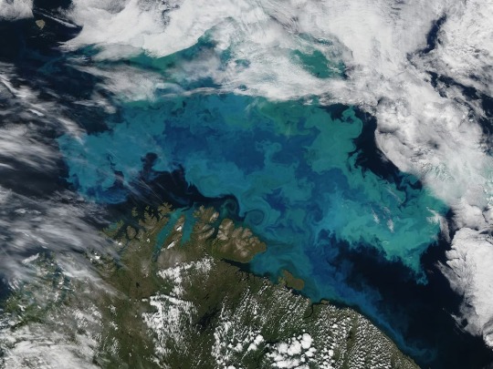
Phytoplankton bloom in the Barents Sea on August 14, 2011. This image was taken by the Moderate Resolution Imaging Spectroradiometer (MODIS) aboard the Aqua satellite. Photograph By NASA, GSFC/Jeff Schmaltz/Modis Land Rapid Response Team
Climate Change Will Shift The Oceans’ Colors
In the next century, satellites will watch as the ocean's blues and greens intensify.
— By Sarah Gibbens | July 21, 2023
The color of deep blue oceans, shallow turquoise waters, and emerald green coasts is quickly changing as the planet warms, according to new research published in the journal Nature.
Analyzing 20 years of satellite data, the study's authors found that over half the world's ocean, 56 percent, experienced a shift in color. The cause? Changes in the density and distribution of plankton. These tiny organisms contain chlorophyll, the bright green pigment that helps plants make food from sunlight.
The recent study supports a similar prediction made by a Nature Communications study published in 2019 that modeled how phytoplankton will change as oceans continue to warm.
And while the new study used satellites to detect subtle changes in color, the prior research predicted significant changes by 2100, if the world keeps warming at its current pace.
Under a “business-as-usual” scenario in which greenhouse gas emissions continue unabated, the bluest subtropical zones of the ocean will become bluer, and greener regions along the equator and poles will become greener, that study found.
More than just an oddity, the changing color is a warning sign, say the 2019 study authors, of drastic global changes that will take place in a world warmed by climate change.
How The Ocean Gets Its Color
Sunlight penetrates over 600 feet below the surface of the ocean. Everything deeper is enshrined in darkness. Above that, most water molecules are capable of absorbing all colors except blue, which is why blue is reflected out.
Organic matter that blankets the surface of the ocean, like phytoplankton, changes this color. As the ocean warms, currents become more irregular, and the layers in the water become more stratified, meaning warm regions don't mix as easily with cold regions.
There are thousands of phytoplankton species, uniquely adapted to warm or cold water. As oceans continue warming, some species may die off, some will thrive, and others will migrate to different regions.
But just looking at chlorophyll alone, however, won't tell scientists how a warming climate is altering phytoplankton. Naturally occurring events like El Niños and La Niñas can influence how much phytoplankton is concentrated in a given area
youtube
Stephanie Dutkiewicz, an author on both papers and marine ecologist at the Massachusetts Institute of Technology, said in 2019 that models used to predict future changes in color factor phytoplankton life cycles and movements into naturally occurring ocean patterns.
The 2023 study revealed that many of these predicted changes have already occurred. Using light-measuring devices aboard NASA satellites, scientists observed that over half of the world covered by ocean already showed a measurable shift in blue and green wavelengths, an approximation for the amount of chlorophyll in a given region.
What Do These Changing Colors Mean?
It's too early to say for sure what effect these changing colors will have on the environment, but scientists think more ecosystems could be dominated by smaller-sized plankton in the future, according to a press release from the National Oceanography Center in the U.K., which supported the 2023 study.
The ocean has absorbed about a third of the world's carbon emissions, and marine life like kelp, seagrass, and algae play a critical role in helping pull that carbon out of the atmosphere.
But smaller algae could reduce that climate change-fighting power.
“Phytoplankton are the base of the marine food web. Everything in the ocean requires phytoplankton to exist," Dutkiewicz told National Geographic in 2019. "The impact will be felt all the way up the food chain."
#Youtube#The National Geographic#Climate Change#Sarah Gibbens#Oceans’ Colors#Phytoplankton Species#El Niños | La Niñas#Stephanie Dutkiewicz#Massachusetts Institute of Technology#NASA#Scientists#Oceanography Center U.K. 🇬🇧
3 notes
·
View notes
Text
Alaska's ice is melting in front of our eyes, staggering satellite shots show | Live Science
NASA satellite image showing melt in Alaska. (Image credit: NASA Earth Observatory/Wanmei Liang) New satellite images reveal the stark pace of global warming in Alaska, with last year’s snow vanishing and leaving behind miles of bare ground. The images, taken by the Moderate Resolution Imaging Spectroradiometer (MODIS) instrument on NASA‘s Terra and Aqua satellites, show Bristol Bay Borough in…

View On WordPress
0 notes
Text

Dusty Days Are Here Again for El Paso
Spring and early summer are generally dusty in the Borderplex region of the Chihuahuan Desert—a transnational area that spans parts of southern New Mexico, West Texas, and the Mexican state of Chihuahua. With the region gripped by exceptional drought, this has been especially true in 2025.
The latest in a string of storms lofted particles from dried lakes and other parched sources in northern Chihuahua and New Mexico and sent them streaming toward El Paso, Juárez, and Las Cruces. The MODIS (Moderate Resolution Imaging Spectroradiometer) on NASA’s Aqua satellite captured this image on April 27, 2025. The event followed a large dust storm that hit the region a week earlier, as well as other major dust storms in early and mid-March.
Research indicates that March, April, and May are typically the most active months for airborne dust in El Paso. But the dust season so far this year has been “truly exceptional—one for the record books,” said Thomas Gill, an environmental scientist at the University of Texas at El Paso. For decades, Gill has used satellite observations and models to track dust activity around the planet and in the Borderplex region.
He said this latest event is the tenth “full-fledged dust storm” of the year in El Paso, meaning it was dusty enough to restrict visibility to less than half a mile. For comparison, the average is 1.8 storms per year. “You would have to go back to 1936—during the Dust Bowl—to find a year with more,” Gill said. During the Dust Bowl years of 1935 and 1936, El Paso had 13 and 11 dust storms, respectively.
Unusual drought and windy conditions are fueling the surge in dust. “We’re in the worst drought we’ve seen in at least a decade, and this March was the windiest we’ve seen in more than 50 years,” Gill added.
Research shows dust storms can pose considerable hazards. In a 2023 analysis, Gill and several colleagues pointed out that the dangers of dust are often underappreciated. They contribute to deadly traffic accidents and elevate the risk of cardiorespiratory problems that lead to emergency room visits.
Dust may also help spread a fungal infection called Valley Fever, though the precise role of dust storms remains a topic of ongoing research and debate. In another analysis, Gill and colleagues estimated that dust storms cause more than $150 billion in economic damage each year, with farmers, the health care sector, the renewable energy industry, and households bearing large costs.
Several tools powered by NASA data and satellites are available to meteorologists, scientists, and others tracking dust storms. The Worldview browser hosts timely data and imagery from several satellites, and NASA’s Global Modeling and Assimilation Office has tools for real-time weather analysis and reanalysis.
Gill collaborates frequently with a NASA-sponsored health and air quality team led by George Mason University’s Daniel Tong. That team is working to develop better ways of forecasting and analyzing how dust storms can affect air quality. Researchers with NASA’s SPoRT (Short-term Prediction Research and Transition) project have also developed a new technique that uses machine learning to improve the tracking of dust plumes at night.
“It should be interesting to see how far the dust from this event travels,” noted Santiago Gasso, a University of Maryland atmospheric scientist based at NASA’s Goddard Space Flight Center. “Some of it could be headed to the Great Lakes, New England, and maybe even to Greenland, as happened after one of the storms in March.”
Up to this point in the 2025 season, the Borderplex region has seen 28 days with dust. Over the past quarter century, the average for an entire year is 22 days. “We still have several more weeks of the dust season to go,” added Gill, noting that forecasters are warning of more dust as early as this weekend.
NASA Earth Observatory image by Wanmei Liang, using MODIS data from NASA EOSDIS LANCE and GIBS/Worldview. Story by Adam Voiland.
5 notes
·
View notes
Text
Αλάσκα: Λιώνουν οι πάγοι μπροστά στα μάτια μας – Απίστευτες δορυφορικές εικόνες
Τον Ιανουάριο καταγράφηκαν θερμοκρασίες 7 βαθμούς πάνω από τα κανονικά για την εποχή επίπεδα Νέες δορυφορικές εικόνες αποκαλύπτουν τον έντονο ρυθμό της υπερθέρμανσης του πλανήτη στην Αλάσκα, με το χιόνι του περασμένου έτους να εξαφανίζεται και να αφήνει πίσω του χιλιόμετρα γυμνού εδάφους. Οι εικόνες, που ελήφθη��αν από το Moderate Resolution Imaging Spectroradiometer (MODIS) στους δορυφόρους…
0 notes
Text
NASA satellite captures stunning images of the snow-covered Midwest after the Polar Vortex explosion.
Satellites in low Earth orbit have captured sweeping images showing the scale of the winter storm that has left much of the northern United States white. Images taken on January 6 by the Moderate Resolution Imaging Spectroradiometer (MODIS) instrument aboard NASA's Aqua satellite reveal the spread of snow across the Midwestern state. It was enough to make Old Man Winter blush. As all eyes are on…
0 notes