#Mulberry Typography Collection
Text


Book 091
Nonsense Alphabets
Edward Lear
Mulberry Press - no date
Edward Lear was an accomplished illustrator, and he could work in a variety of styles. His Nonsense Alphabets are done in a rough naive style that have a certain charm all their own.
#bookshelf#illustrated book#library#collection#personal library#personal collection#bookseller#books#book lover#bibliophile#edward lear#nonsense alphabets#mulberry press#children’s literature#typography
1 note
·
View note
Text

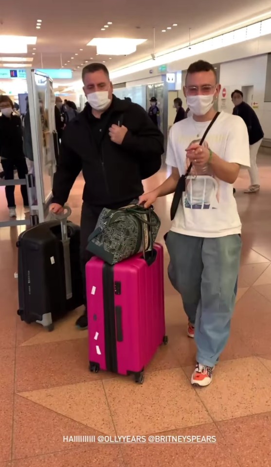

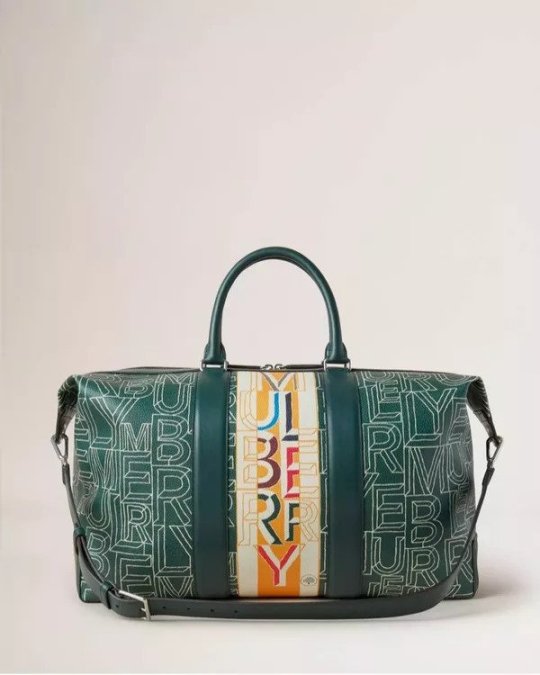
Olly Alexander carrying a Mulberry Typography Collection zipped weekender bag in an Instagram story in Tokyo (November, 2022).
#olly alexander#years & years#years and years#style#it's a sin#night call#starstruck#crave#sweet talker#sooner or later#hallucination#100% pure love#airport#japan#tokyo#@kenefronx#instagram#Mulberry#bag#weekender bag#Mulberry Typography Collection#Typography Collection
3 notes
·
View notes
Text


More matte vs glossy! This look felt a little too plain, but I spent so long trying to figure out what to add to it that before I knew it, it was 11 PM & too late to continue so I left it alone. Lol
Used in this mani:
What's Up Nails - Buff Is The Stuff
Painted Polish - Stamped In Mulberry
Maniology - Straight Up Black
Glisten & Glow Glossy & Matte Topcoat
Stamping Plates: Flower Power Collection 28 & Typography Collection 04 from @moyou_london
#glisten & glow#long nails#manicure#nail art#nail polish#nails#pointy nails#stamping#stiletto nails#autumn nails#fall nails#simple nails#stamping nail art#painted polish#whatsupnails#moyou london#Maniology
9 notes
·
View notes
Photo


It’s Fine Press Friday!
This week we present Dead Color, poems by Charles Wright, printed in 1980 in an edition of 285 copies by Leigh McLellan at the Meadow Press in San Francisco for Charles Seluzicki, Fine Books in Salem, Oregon. It features four woodcut illustrations by McLellan. All copies signed by the author and artist. The text type is Centaur with Arrighi titling. The paper is French-folded Mulberry in yellow, orange, olive, solver, blue, brown and black. The cover and end sheets are Fabriano paper, hand sewn and bound by the printer.
“Leigh McLellan began her graphic design career as a student at the University of Iowa. There she designed books for the university press while learning letterpress printing and bookbinding, as well as designing posters for poetry and prose readings. In 1977, she moved to San Francisco and shortly began designing textbook front and back matter and learning dummying and layout of complex textbooks. Over the years, she has worked for many of the major publishers in the San Francisco Bay Area, as well as a number of self-publishers. Currently she works for small to medium-sized trade book publishers and many individuals. She has taught design, typography, and letterpress printing at the San Francisco Center for the Book, the Bookbuilders West Crash Course in Book Production, Mills College, and the University of California at Berkeley, among others.”
From 1974 to 1990, Leigh McLellan operated Meadow Press. Her letterpress work can be seen here.
View more Fine Press Friday posts.
–Sarah, Special Collections Graduate Intern
#Dead Color#Leigh McLellan#Meadow Press#Charles Wright#Charles Seluzicki#letterpress#woodcuts#fine press fridays#sarah
17 notes
·
View notes
Text
Influence of Wim Crouwel
Crouwel began his career in 1955 creating exhibition, graphic, and product designs along with fellow designer Kho Liang Ie.In 1963, he was one of the founders of the design studio Total Design which today is currently known as Total Identity the first multi-disciplinary design firm in The Netherlands. Other founding members were Friso Kramer and Benno Wissing. Soon joined by Ben Bos and became one of the best design offices worldwide, serving prestigious clients. During the 1960s his work began to be widely published on international design magazine, such as Domus.

In 1967 he designed and released the well known and experimental typeface New Alphabet, a design that embraces the limitations of the cathode raytube technology used by early data display screens and phototypesetting equipment only containing straight lines and diagonals. This technology rendered images into large pixels that made letterforms difficult to reconstruct.
“ Never meant to be really used, but a statement on the impact of new technologies on centuries of typographic tradition.”
However, as unreadable as it was, it made a comeback in 1988 when designer Brett Wickens used a version of the font on the sleeve of Substance by Joy Division.In 2011 it was acquired for the permanent collection of Museum of Modern Art New York, that included many other projects by Crouwel.

Wim Crouwel is the epitome of experimentation. He combined careful structural logics with significant expressiveness, showing ability in colour and typography, making letters become wonderful images. Following three basic requirements dot, line and shape. He produced many what are considered masterpieces that perfectly match functionality with aesthetics and that considered great work in both art and graphic design. Its the level of details in all this work that's is especially incredible. Breaking any element of his design down nothing all areas are perfection.
Craig Ward
Craig Ward is a British-born Design and Creative Director based in New York. Artist, best-selling author and contributor to various industry journals, he is best known for his pioneering typographic works.
Fascinated by process and the concept of word as image, Ward established his own studio in New York in 2011 after working as Head of Design at Grey New York and agencies in London including CHI & Partners and MCBD. Wards clients include the likes of Calvin Klein, Adobe, Aesop, Google, Hennessy, Nike, Macy's, Gillette, Peugeot, The New York Times, Wired, the V&A Museum, Mulberry, Dockers, and RED.

Ward’s work has been recognized by ADC, the TDC and One Show as well as being exhibited globally including at The Museum of The City of New York, The Cooper Union, the Hammer Museum in Los Angeles, Colette in Paris, Minneapolis’ Walker Art Center and London’s Conningsby.
"Craig Ward is something of a genius. For many years now he's been pushing type in directions never seen before and his work has since spawned many imitations." Creative Bloq
In 2015 Ward was named one of the most important designers of all time. In 2018 he was the creator of a custom typeface for the England World Cup kit in Russia that received much acclaim from the design community.

Through design and as an author Ward has had a huge influence in modern typography testing the limit between illustration and typography. It’s his experimental and unpredictability of projects that stands out from the crowds such as using methods like ink and water to create different outcomes before taking it into software.Giving inspiration to many many to think outside of their own creative.
"Ward has reached what we might deem the hating point - that point at which a designer or image maker reaches a certain stage of acclaim which then triggers the inevitable backlash from his or her peers."
Patrick Burgoyne, Creative Review
David Carson
Carson's first contact with graphic design was in 1980 at the University of Arizona during a two-week graphics course, taught by Jackson Boelts.
While a teacher at Torrey Pines High School, Stacy Peralta got Carson a job at Transwrold Skateboarding magazine. Carson has no formal training in design and considered working at Transworld Skateboarding for him "schooling in design".
By1983 Carson started to experiment with graphic design and found himself engrossed in the artistic and bohemian culture of Southern California. He attended the Oregan college of Commercial Arts only for a couple of months before accepting an unpaid internship with Action Now magazine. That year, he went to Switzerland to attend a three-week workshop in graphic design. The teacher of the workshop Hans Rudolf Lutz who became his first great influence.
By 1984 Carson became the art director of Transworld Skateboarding magazine and remained there until 1988, helping to evolve the magazine and give it a distinctive look. By the end of his tenure there he had started to develop his signature style, using "dirty" type and non-mainstream photographic techniques. He was also the art director of a spinoff magazine Transworld Snowboarding which started publishing in 1987.

In 1989, on the recommendation of Paul Holmes Carson was headhunted to design Beach Culture and by the sixth issue Carson to make this first significant impact on the world of graphic design and typography with people recognising his innovative. In 1992 Carson art directed and designed Surfer Magazine before joining Ray Gun Magazine and relocating to New York. During his time there he gained more following and was featured with his work with Ray Gun several times. One of the most famous being a front cover where he used the font Zapf Dingbats contains symbols.

"He significantly influenced a generation to embrace typography as an expressive medium" Design Writer Steven Heller
In 1995, Carson left Ray Gun to found his own studio, David Carson Design, in New York City. He started to attract major clients Such as Pepsi, Cola, Kodak, Sony and British Airways.
He named and designed the adventure lifestyle magazine Blue in 1997. David designed the first issue and the first three covers. Carson's cover design for the first issue was selected as one of the "top 40 magazine covers of all time" by the American Society of Magazine Editors.
Carson claims that his work is "subjective, personal and very self indulgent". His layouts are distortions or mixes of 'vernacular' typefaces and broken imagery, rendering them almost illegible. He questioned the role of type in the emergent age of digital design.
www.designculture.it. (n.d.). Designculture • Wim Crouwel. [online] Available at: http://www.designculture.it/interview/wim-crouwel.html.
Wikipedia Contributors (2017). Wim Crouwel. [online] Wikipedia. Available at: https://en.wikipedia.org/wiki/Wim_Crouwel.
Anon, (n.d.). Dutch Profiles: Wim Crouwel. [online] Available at: https://www.youtube.com/watch?v=DAsk8Q_dFj8 [Accessed 2 Nov. 2020].
CRAIG WARD. (n.d.). About / Contact. [online] Available at: http://wordsarepictures.co.uk/about-2.
Staff, C.B. (n.d.). Craig Ward. [online] Creative Bloq. Available at: https://www.creativebloq.com/computer-arts/craig-ward-6099057.
Wikipedia Contributors (2019). David Carson (graphic designer). [online] Wikipedia. Available at: https://en.wikipedia.org/wiki/David_Carson_(graphic_designer).
www.davidcarsondesign.com. (n.d.). david carson design. [online] Available at: http://www.davidcarsondesign.com.
0 notes
Last Seen Blogs

amen--art-media-and-ent-network
Untitled
zegemma-beach
c'est le bordel.


everglowlightingposts-blog
EVERGLOW Lighting

historic-old-guard-lover
Historically Accurate Old Guard Headcannons